Kitchen cabinets tend to outlast almost every other design choice in the room.
Walls can be repainted, hardware can be swapped, and finishes can change, but cabinet color often stays in place for years.
That’s why some kitchens continue to feel comfortable long after trends move on, while others start to feel dated surprisingly fast.
Timeless kitchen cabinet colors don’t rely on what’s popular at the moment.
They work because they respond well to light, materials, and daily use.
The selections below focus on cabinet colors that have earned long-term trust by adapting quietly, allowing kitchens to evolve without needing constant visual resets.
This is another series of our findings of the best kitchen interior series. I have covered the best paints for kitchen cabinets review. Now, read about the timeless paint choices.
Kitchen Cabinet Colors Stand the Test of Time
Some cabinet colors last because they follow trends well. Others last because they avoid them entirely.
The colors below have earned long-term trust by adapting to changing layouts, materials, and lighting conditions without losing their relevance.
1. Classic White
White cabinets are not timeless because they are neutral; they’re timeless because they are structurally flexible.
White acts as a visual reset button. It allows countertops, hardware, lighting, and even appliances to change without forcing the cabinets to follow.
What separates a lasting white kitchen from a dated one is restraint. White works best when it isn’t trying to be the star of the room.
In some homes I’ve seen, white cabinets soften shadows, make corners disappear, and help kitchens feel organized even when they’re busy.
They also tolerate wear well. Minor scuffs, age-related changes, and small design mismatches are far less noticeable than they would be on darker colors.
Why designers still trust it: White doesn’t anchor the kitchen to a specific decade. It gives future decisions room to breathe.
Read more to know Best white paint for kitchen cabinets
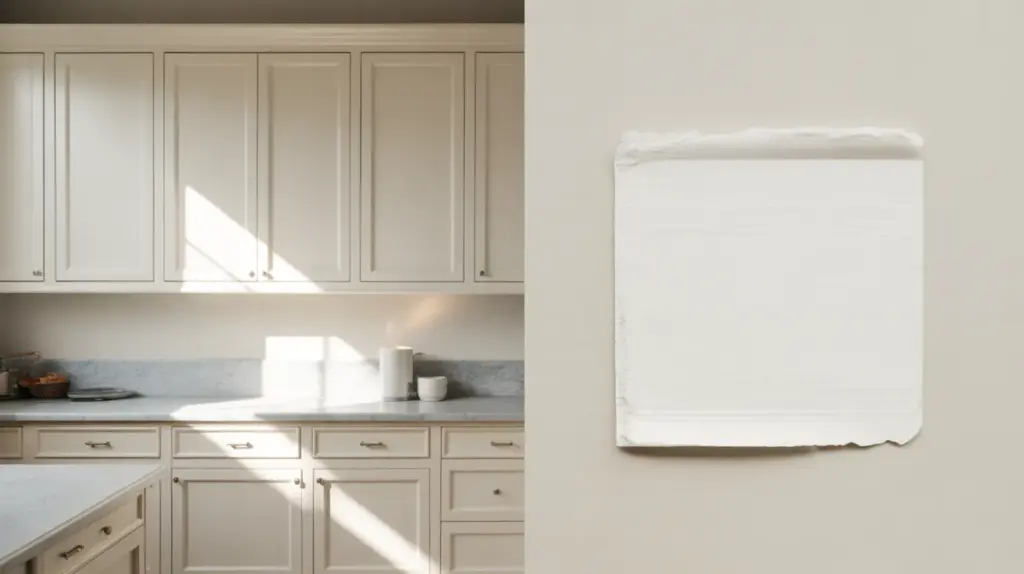
2. Soft Off-White
Off-white is where many kitchens succeed after failing with pure white.
These shades have just enough warmth to feel human. They don’t glare under artificial lighting, and they don’t turn cold in shaded kitchens.
In kitchens, off-white cabinets are easier to live with.
They hide subtle wear better than bright white and pair more naturally with warm flooring, aged metals, and stone countertops.
Off-white also ages gracefully. As trends change, it rarely feels “wrong,” just quieter or warmer depending on what surrounds it.
Why it lasts: It reduces contrast fatigue in kitchens with warm finishes and adapts well to both classic and updated interiors while staying visually balanced as lighting conditions change.
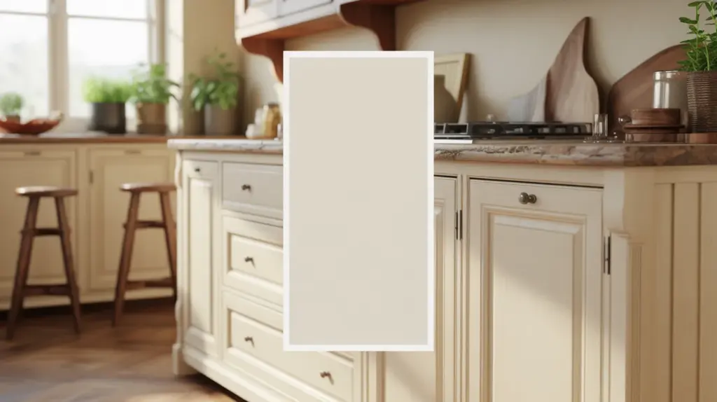
3. Cream
Cream cabinets often get overlooked because they feel traditional, but that’s exactly why they last.
Cream has depth. It reacts to light differently throughout the day, giving kitchens a soft variation rather than a flat look.
In kitchens with stone countertops or classic tile, cream acts as a bridge between old and new.
It doesn’t fight decorative elements, and it doesn’t demand contrast to feel complete.
Cream also performs well in homes where warmth matters more than brightness. It creates comfort without slipping into yellow when chosen carefully.
Why did it last? Cream introduces warmth without relying on trend-driven undertones, making it compatible with stone, wood, and traditional materials that rarely fall out of favor.
4. Light Natural Wood
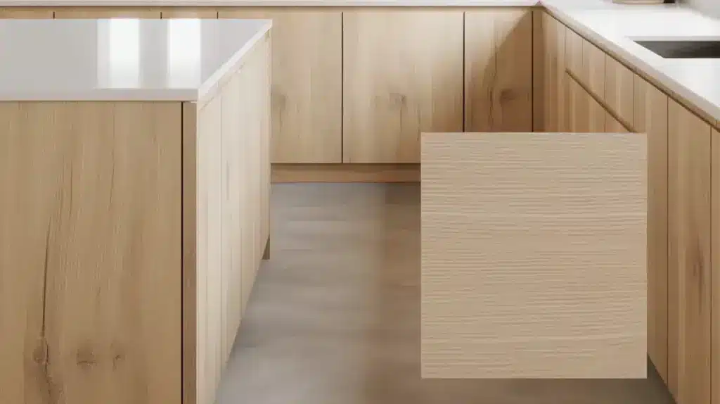
Light wood cabinets succeed because they are material-driven, not color-driven. The grain, texture, and natural variation do most of the work.
Unlike painted cabinets, light wood doesn’t feel “chosen”; it feels inherent. That quality helps it age well. Even when styles shift, wood still reads as honest and intentional.
In modern kitchens, light wood feels clean and architectural. In traditional spaces, it feels warm and familiar. That duality is rare and valuable.
Why does it last: Light wood relies on material character rather than color appeal, which allows it to age naturally and remain relevant even as design styles shift.
5. Medium Natural Wood
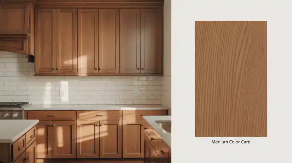
Medium wood tones are often the most forgiving long-term choice.
They don’t darken the space like deeper woods, and they don’t show wear the way very light woods can.
These tones ground a kitchen visually. They feel stable, especially in family homes where the kitchen sees constant use.
Medium wood also pairs well with both light and dark countertops, making future updates easier.
Why does it last: Medium wood tones offer visual stability without feeling heavy, helping kitchens stay grounded while still allowing flexibility in countertops and backsplash updates.
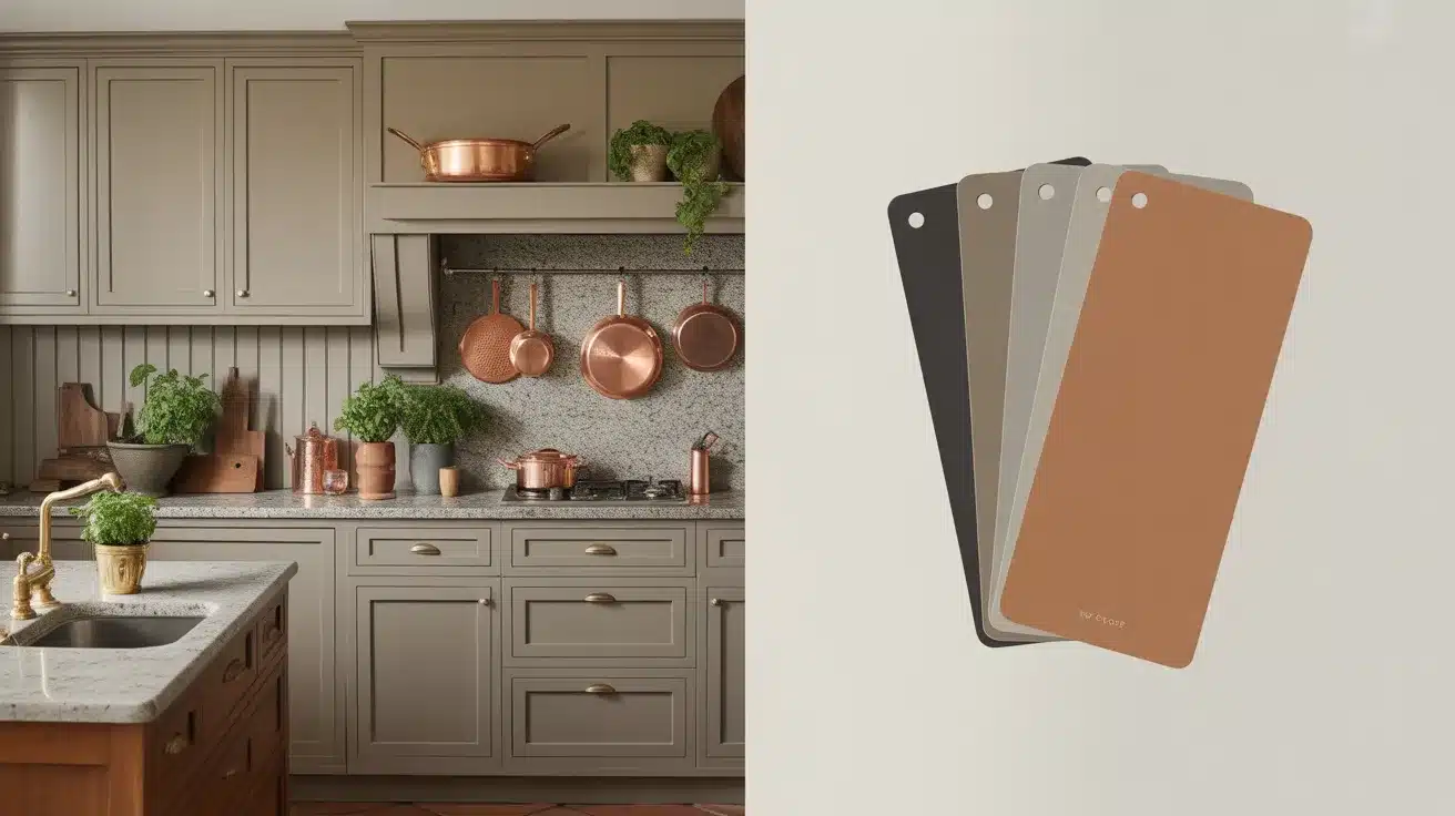
6. Warm Gray
Warm gray cabinets remain relevant because they solved the biggest problem with early gray kitchens: coldness. Warm gray has enough softness to work alongside wood, brass, and natural stone.
In open layouts, warm gray performs particularly well. It transitions smoothly into adjacent spaces and doesn’t demand matching finishes everywhere.
What makes it timeless is subtlety. When gray stops trying to look modern, it starts to last.
Why does it last: Warm gray avoids the cold, dated feel of early gray trends by maintaining enough warmth to work with wood, stone, and softer metal finishes.
If you already have a gray floor, then you can look at the best kitchen cabinet colors to complement your gray floors.
7. Greige
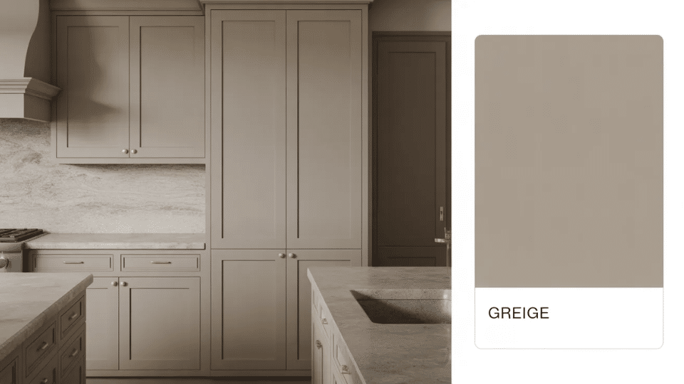
Greige is less about color and more about behavior. It shifts depending on lighting, surrounding finishes, and time of day.
That adaptability is exactly why it holds up. Greige cabinets rarely feel locked into a style. They can lean warm or cool without clashing, which makes them ideal for kitchens that evolve slowly over time.
Why designers favor it: Greige adjusts to its surroundings, subtly shifting between warm and cool depending on lighting and finishes, which prevents it from feeling locked into a single design era.
8. Beige
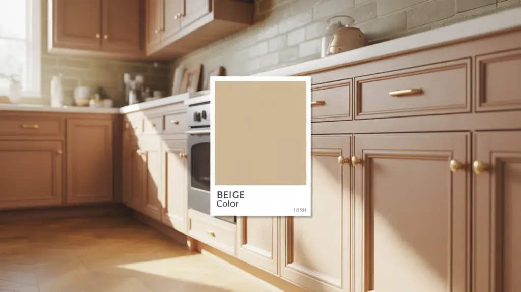
Beige cabinets shine in kitchens where other elements are visually active. Patterned countertops, textured backsplashes, or dramatic lighting all benefit from a calm cabinet base.
Beige also ages well because it doesn’t rely on contrast to look intentional. It feels settled, which is why it often reads as more timeless than trend-driven neutrals.
Why it lasts: Beige supports visually active kitchens by providing a calm cabinet base that doesn’t compete with patterned surfaces or textured materials.
9. Navy Blue
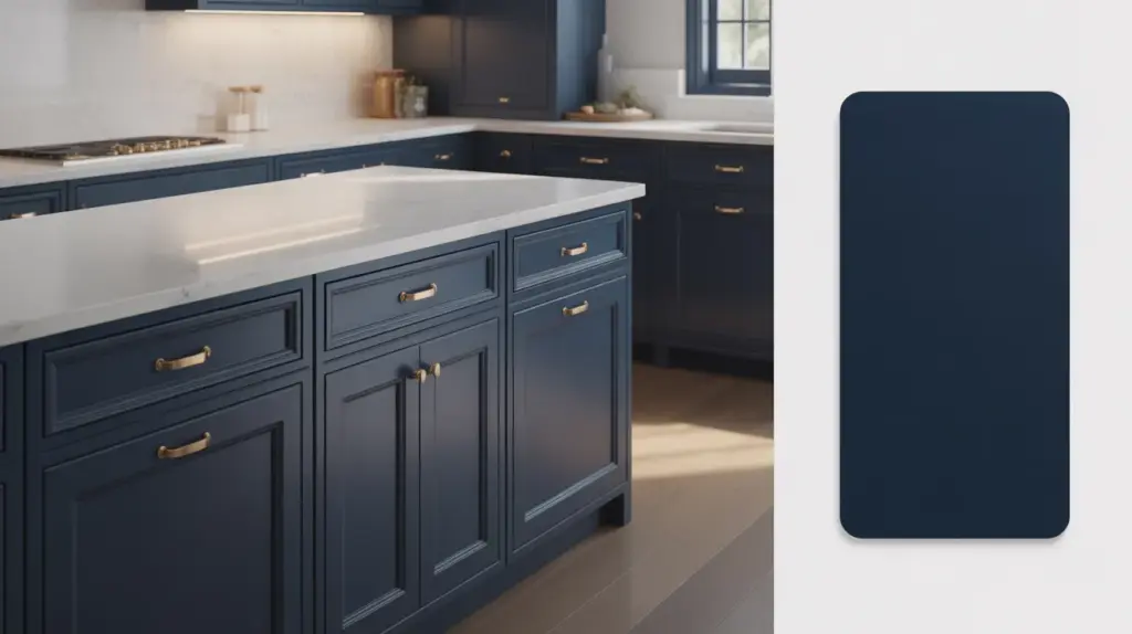
Navy works because it behaves like a neutral with depth. It adds weight without drama and contrast without harshness.
In long-term kitchens, navy cabinets tend to feel intentional rather than bold. They hold their presence quietly, especially when balanced with lighter surfaces.
Navy also avoids the problem many colored cabinets face: visual burnout.
Why designers still rely on it: Navy delivers contrast without visual aggression, allowing it to function like a neutral while still adding depth and structure to the kitchen.
10. Muted Blue-Gray
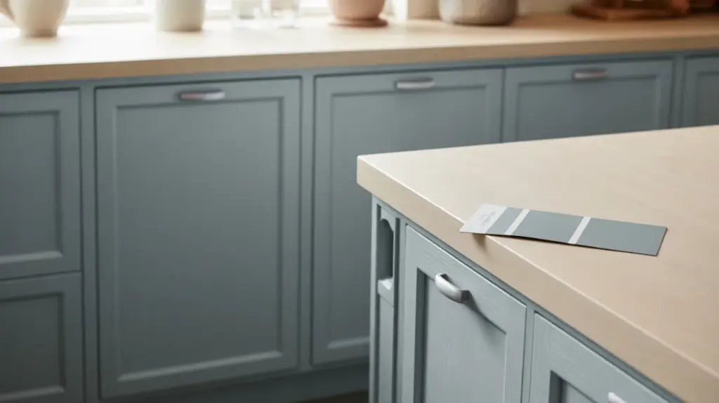
Muted blue-gray cabinets sit comfortably between color and neutral. They feel calmer than blue and more expressive than gray.
These shades age well because they don’t rely on brightness or novelty. In real kitchens, they feel relaxed rather than styled.
Why does it last: Muted blue-gray introduces color in a restrained way, avoiding saturation-heavy tones that date quickly and become tiring over long-term use.
11. Charcoal
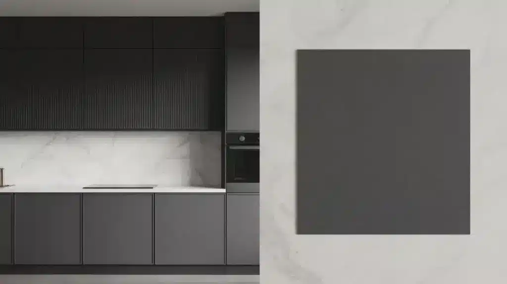
Charcoal cabinets bring depth without the severity of black. They define space while remaining flexible.
Charcoal works particularly well in kitchens that need grounding, large layouts, high ceilings, or minimal detailing.
Why designers choose it: Charcoal adds definition and weight without the harshness of black, making it suitable for kitchens that need contrast without visual dominance.
12. Soft Black
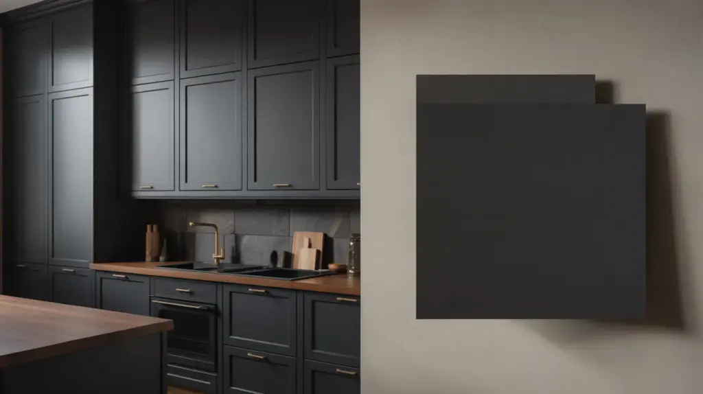
Soft black cabinets feel permanent in the best way. They anchor the kitchen and make surrounding elements feel intentional.
Unlike trend-driven dark colors, soft black has been used in cabinetry and furniture for decades. That history matters.
Why does it last: Soft black has historical use in cabinetry and furniture, giving it a sense of permanence that feels intentional rather than trend-driven.
Related reads: 4 best paint for kitchen cabinets without sanding (with diy)
13. Sage Green
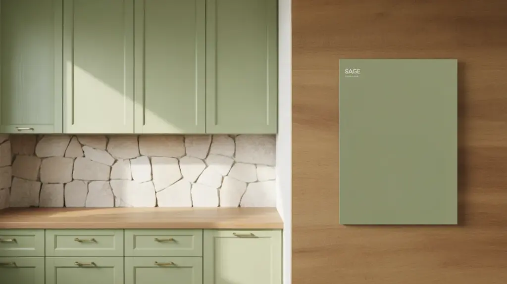
Sage green has proven its longevity by staying subtle. It doesn’t shout color, it suggests it.
In kitchens with natural light and organic materials, sage feels calming and stable. It reads as a neutral with personality.
Why it lasts: Sage sits between neutral and color, allowing it to complement natural materials while remaining calm enough for long-term everyday use.
14. Olive Green
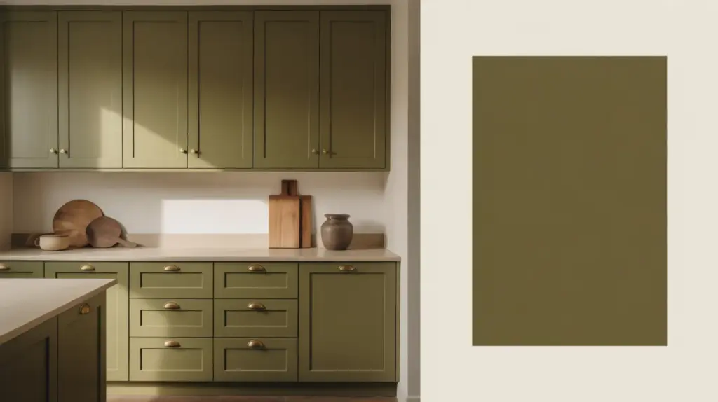
Olive green is deeper and more grounded than sage. It works well in kitchens that lean warm and earthy.
Olive holds its own without overpowering the space, which is why it feels more lasting than brighter greens.
Why it lasts: Olive carries depth and warmth without brightness, which helps it age more gracefully than trend-focused green shades.
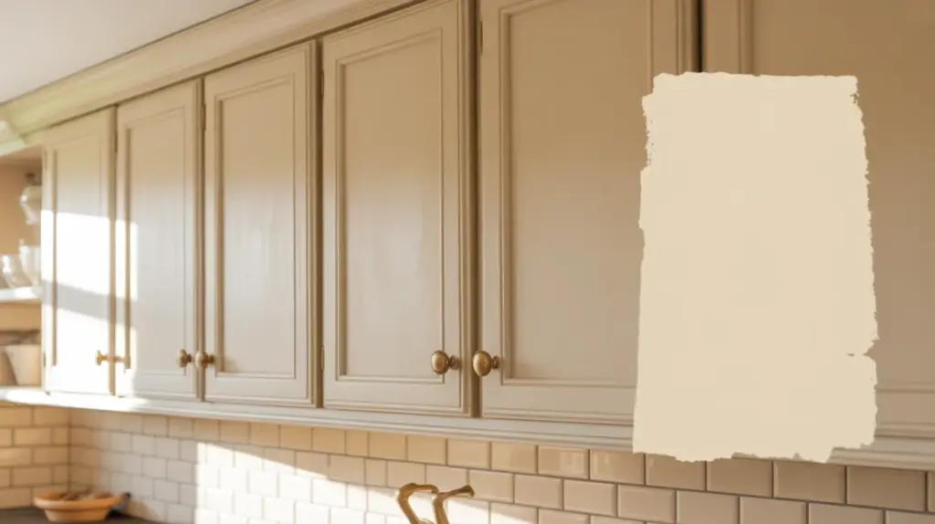
15. Taupe
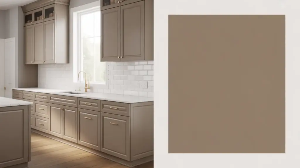
Taupe cabinets succeed because they refuse to choose sides. Warm enough to feel inviting, neutral enough to stay flexible.
Taupe performs especially well in homes where finishes may change gradually rather than all at once.
Why it lasts: Taupe balances warmth and neutrality, allowing it to support gradual updates without pulling the kitchen too far in any stylistic direction.
Tips for Choosing a Timeless Kitchen Cabinet Color
Choosing a timeless cabinet color is less about preference and more about understanding how color behaves in a real kitchen over time.
Start with fixed elements first: Flooring, countertops, and backsplash materials change far less often than paint. Cabinet colors that work with these elements tend to age better.
Pay attention to undertones, not just the color name: Two shades in the same color family can behave very differently once lighting and surrounding finishes are introduced.
Think in decades, not seasons: A cabinet color should still feel comfortable after hardware, lighting, or wall colors change.
Use contrast carefully: High-contrast kitchens can feel striking at first, but may become visually tiring over time.
Let cabinets be the steady element: Timeless kitchens allow cabinets to stay consistent while smaller design features evolve.
Conclusion
Timeless kitchen cabinet colors work because they are chosen with context, not trends, in mind.
These shades succeed by responding well to light, materials, and daily use rather than trying to make a statement.
When cabinets remain visually steady, kitchens can evolve through smaller updates without losing cohesion.
This approach reduces long-term regret and limits the need for frequent refinishing or replacement.
By prioritizing balance, undertones, and adaptability, cabinet colors become a durable design decision rather than a temporary one.
A well-chosen cabinet color supports change instead of resisting it, allowing the kitchen to remain functional, current, and visually comfortable for years to come.

With a Master in Architectural Studies from University of Pennysylvania, Marwa Haydar has pioneered living spaces since 2005. Her expertise, initially honed in a prestigious architectural firm, is evident in her approach to creating environments. Marwa became part of our team in 2019 and has since been a driving force in our home improvement section, known for her practical yet stylish solutions. She’s been spearheading our design workshops since then, infusing her passion for teaching into her work. In her leisure time, Marwa enjoys exploring historic architecture and is an enthusiastic pottery hobbyist, further enriching her understanding of form and texture.