Picking the right paint color can feel tricky. Blue shades, in particular, can shift a lot depending on lighting and nearby colors.
Debonair Sherwin-Williams (SW 9139)is one of those blues that stays calm and balanced.
This guide explains everything about Debonair, including: Undertones, Light Reflectance Value (LRV), Lighting effects, Coordinating colors, and thebest rooms to use it.
What Color is Debonair by Sherwin-Williams?
Debonair SW 9139is a blue paint color with gray undertones. It sits right in the middle of the blue spectrum. It is not a bold navy, but it is also darker than pale blues. Because of the gray base, the color feels relaxed and slightly muted.
Basic Color Details
- Color Name: Debonair
- Brand: Sherwin-Williams
- Color Code:SW 9139
- Color Family:Blue
- LRV:Around 34
- Color Type:Blue-gray
Debonair Sherwin-WilliamsUndertones
Undertones make a big difference in how paint looks on the wall. Debonair has cool undertones, mainly gray with a hint of slate blue. These undertones soften the blue and keep it from feeling too bright.
What You Might Notice
- In bright natural light, the blue tone stands out more
- In dim lighting, the gray tone becomes stronger
- In warm lighting, the color looks softer
Debonair SW 9139 LRV Explained
LRV stands for Light Reflectance Value.
It measures how much light a paint color reflects on a scale from 0 to 100.
- 0: very dark
- 100: very bright white
Debonair has an LRV around 34, which places it in the medium range.
What This Means For Your Space:
- It reflects a moderate amount of light.
- It works well in rooms with decent lighting.
- It may look slightly darker in small or dim spaces.
- Because of its medium depth, Debonair often feels calm and grounded rather than bright.
Best Rooms to Use Debonair SW
Debonair works well in several areas of the home. Its balanced tone makes it flexible.
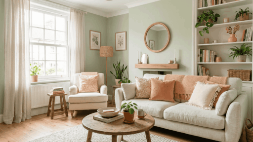
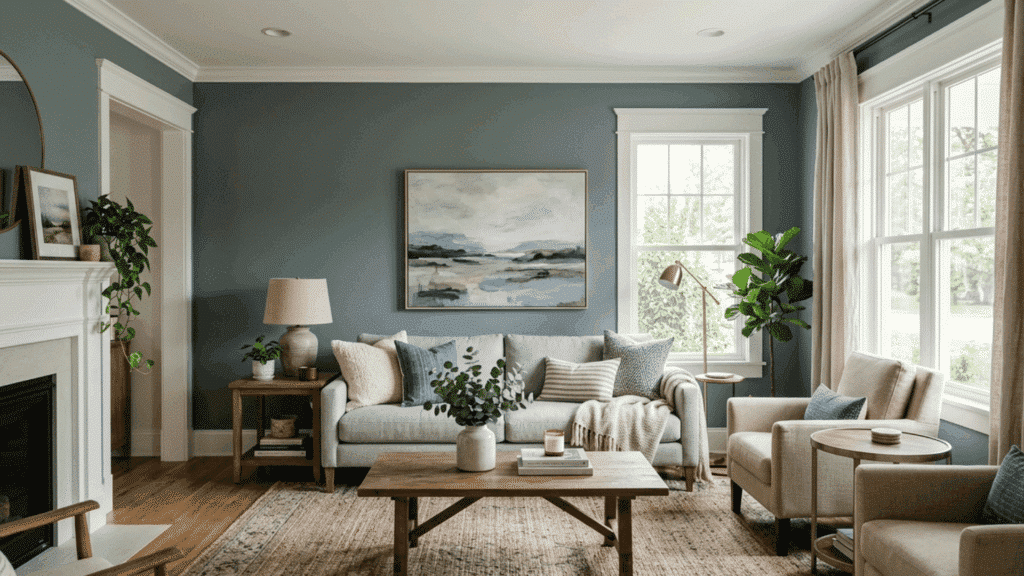
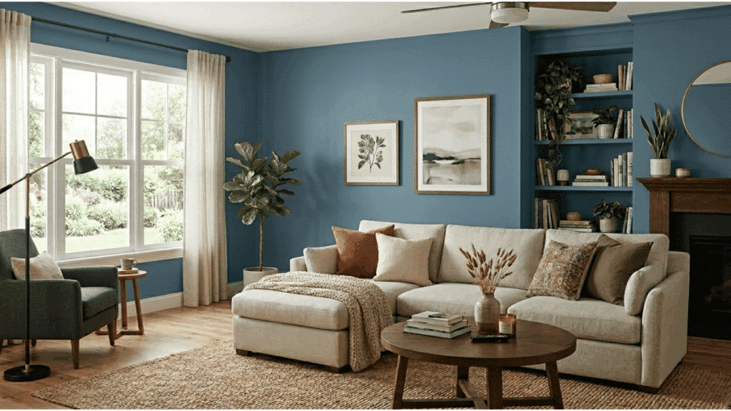
1. Living Room
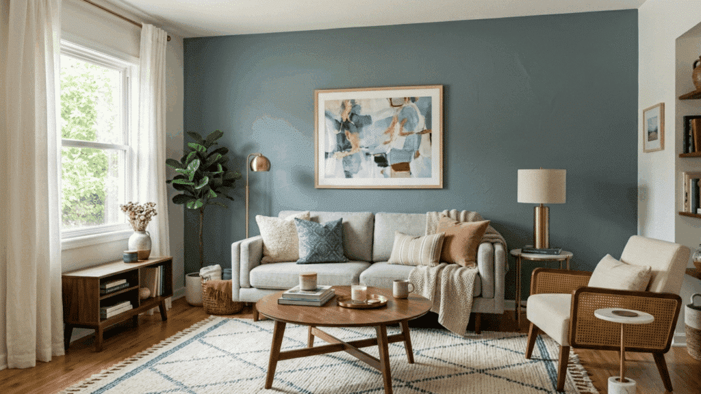
Debonair works well in living rooms because it creates a calm and balanced backdrop. The muted blue-gray tone adds depth without making the space feel heavy.
It pairs nicely with light sofas that help brighten the room and keep the palette soft. Natural wood furniture also complements the color, adding warmth that balances the cool undertone.
Textured rugs, woven throws, and neutral cushions can bring extra comfort and dimension. Together, these elements help create a relaxed seating area that feels inviting, cozy, and visually balanced for everyday living.
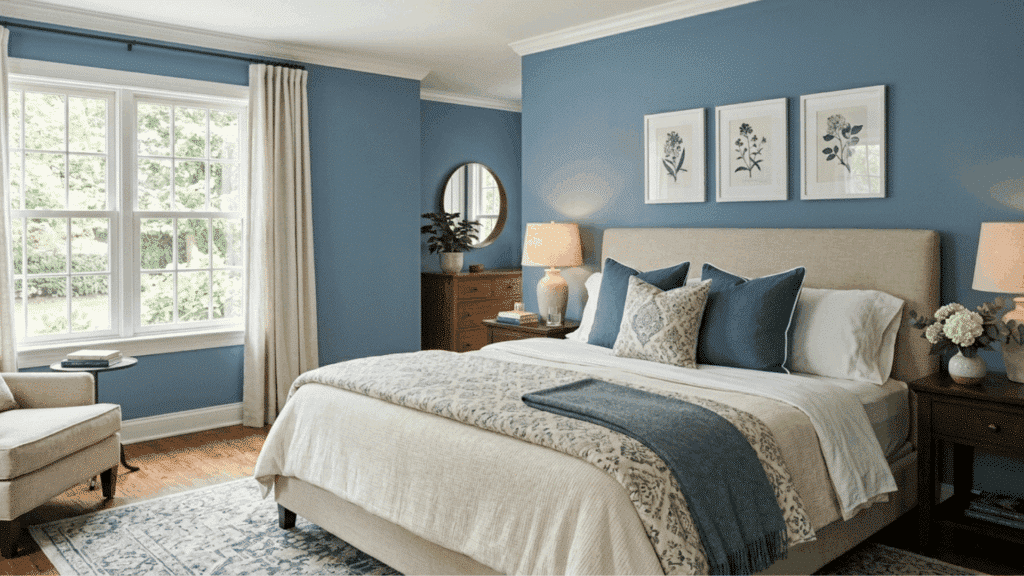
2. Bedroom
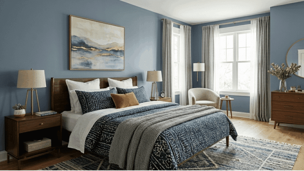
Debonair is a great choice for bedrooms because blue tones often help create a relaxed and restful setting. Its soft blue-gray shade adds depth while still feeling calm and comfortable.
This color works well for a full accent wall behind the bed, drawing attention to the sleeping area without overpowering the room.
It can also be used on all bedroom walls for a cozy and balanced feel. Another popular option is painting the headboard wall in Debonair while keeping the other walls light, creating a simple and peaceful bedroom setup.
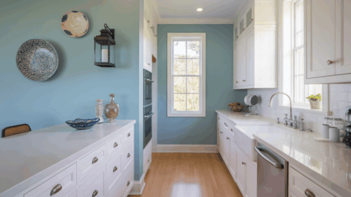
3. Kitchen
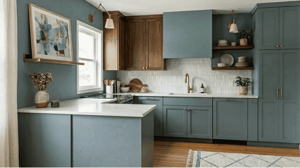
Debonair works beautifully on kitchen cabinets, especially in spaces that need a soft but noticeable color. The muted blue-gray tone adds character without feeling too bold.
It pairs well with white countertops, which help brighten the kitchen and balance the deeper cabinet shade.
Brass handles or knobs bring a warm contrast that stands out against the cool blue tone.
Marble backsplashes also complement Debonair nicely, adding texture and a clean look that ties the whole kitchen design together while keeping the space fresh and welcoming.
4. Bathroom
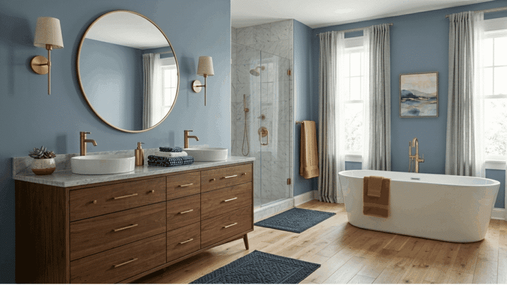
It also works nicely in bathrooms, creating a calm and clean look. The soft blue-gray tone adds color without making the space feel heavy.
It pairs well with white tile, which helps brighten the room and keeps the overall design fresh. Chrome fixtures complement the cool undertones and add a polished touch.
Light wood vanities balance the color by adding warmth and natural texture. Together, these elements create a bathroom that feels relaxed, balanced, and comfortable for everyday use while still looking neat and stylish.
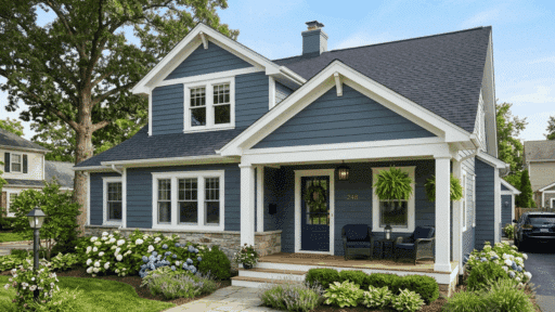
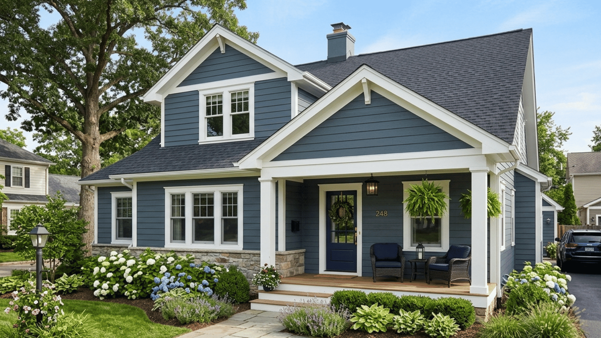
5. Exterior Use
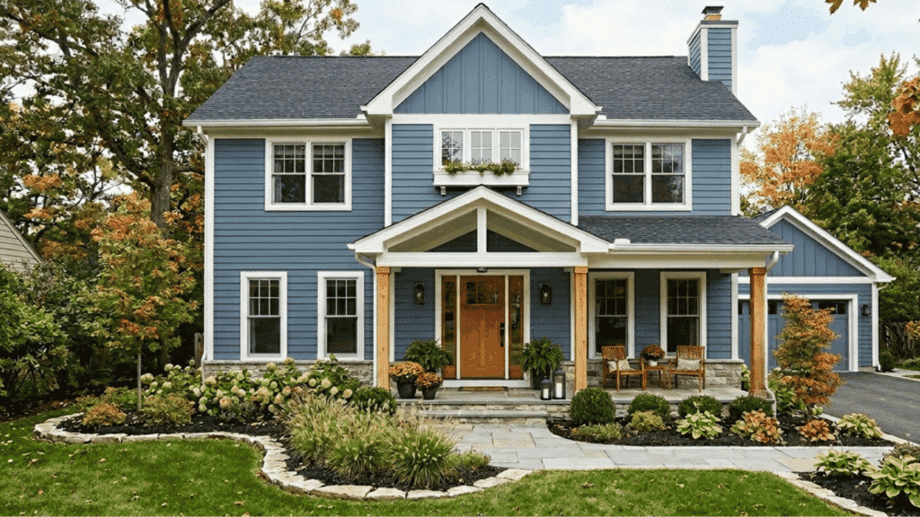
It can also work well for exterior projects. Its balanced blue-gray tone adds character to a home without looking too bold or too dark.
The color often looks slightly lighter outdoors because natural sunlight reflects more strongly. Debonair works nicely for exterior siding, shutters, or front doors.
It pairs well with white trim, stone accents, and natural wood elements. This combination helps create a clean and welcoming look while still giving the home a bit of color and personality.
Testing a sample outside is helpful since outdoor lighting can change how the shade appears.
Coordinating Colors for Debonair SW 9139
Choosing the right coordinating colors helps highlight Debonair’s blue-gray tone and keeps the overall palette balanced and cohesive.
| Color | Description | Best Use |
|---|---|---|
| Mountain Air (SW 6224) | A soft, light blue that brightens the palette while keeping the cool tone consistent. | Works well on nearby walls, trim, or small accent areas to balance Debonair. |
| Site White (SW 7070) | A neutral light gray that complements Debonair without overpowering it. | Ideal for walls, trim, or adjacent rooms for a clean and balanced look. |
| Waterloo (SW 9141) | A deeper blue-gray that adds contrast and richness to the palette. | Best for accent walls, cabinetry, or decorative elements needing a darker tone. |
Similar Colors to Debonair SW 9139 from Other Brands
If you’re open to buying similar shades from other popular paint brands, here are some great alternatives:
1. Benjamin Moore Cloudy Sky (2122-30)
Cloudy Sky is often considered one of the closest alternatives to Debonair, especially for those looking for a similar blue-gray tone. It carries a slightly cooler feel, which can make it appear a bit crisper in certain spaces.
Depending on the lighting, you may notice a faint green undertone, particularly in rooms with cooler natural light.
Despite this subtle shift, Cloudy Sky still maintains a calm and balanced appearance. It works well in living rooms, bedrooms, or accent walls where a soft and soothing blue-gray shade is desired.
2. Benjamin Moore Van Courtland Blue (HC-145)
Van Courtland Blue is a muted, classic blue from Benjamin Moore that brings a slightly deeper and richer look compared to Debonair. While it has more depth, the gray undertones keep it from feeling too bold or overwhelming.
This balance makes it easy to use in a variety of interior spaces, including living rooms, dining areas, and bedrooms. It works well with wood furniture, neutral fabrics, and traditional décor, creating a comfortable and timeless feel without making the space look too dark.
3. Behr French Colony (N480-4)
French Colony is a medium blue-gray shade that closely matches the depth of Debonair, making it a strong alternative for a similar look. It carries a balanced mix of blue and gray, which helps it feel calm and easy to use in different spaces.
This color works well on walls, kitchen cabinets, or accent areas where a soft but noticeable tone is needed. It pairs nicely with white trim, natural wood, and neutral décor, helping create a clean and balanced interior without feeling too bold or too light.
Tips Before Using Debonair Paint
Testing paint samples can save time and money. Before committing to the color, it helps to check how it behaves in your space.
- Paint a Large Sample Patch: Apply a generous sample area on the wall so the true color becomes easier to see. Small swatches can be misleading.
- Check Lighting at Different Times: Look at the color in morning and evening light to see how it changes throughout the day.
- Place Furniture and Décor Nearby: Bring sofas, rugs, or décor pieces close to the sample area to understand how the color works with your room elements.
- Use Sample Boards: Try movable sample boards and place them in different parts of the room for a better comparison.
Conclusion
Debonair Sherwin-WilliamsSW 9139 is a calm blue-gray paint color that works in many homes. Its gray undertones soften the blue, making the color easy to pair with furniture, trim, and décor.
It works especially well in living rooms, bedrooms, cabinets, and bathrooms. Lighting can change how the color appears, so testing samples first helps ensure the right result.
For residentswho want a blue that feels relaxed and balanced, Debonair is a strong option.

Alex Guerrero, a graduate with a Fine Arts degree from the Rhode Island School of Design, has been a visionary in the world of color and design for over 15 years. His professional journey began in the heart of the fashion industry in Milan, where he developed an acute sense for color harmonies and trends. Alex joined our team in 2018, offering fresh and innovative perspectives on color utilization in various spaces. Renowned for his ability to blend contemporary trends with timeless elegance. Outside of work, Alex is an accomplished painter and a volunteer art therapist, his artistic talents further enriching his professional insights.