
Green is one of those colors that can feel calm, fresh, bold, or rich depending on what you pair it with. That is why choosing the right matching shades matters so much.
Some colors make green feel softer and more natural, while others bring out its depth and contrast.
In this blog, you will learn what complementary color means and which colors work best with green in real-life settings.
From warm shades like rust and terracotta to safe neutrals like beige, cream, and gray, each pairing creates a different effect.
What is a Complementary Color?
Before jumping into combinations, it helps to understand the basics. Complementary colors sit opposite each other on the color wheel, creating strong contrast and helping each color stand out more.
Using colors that go well with green can make your space, outfit, or design look more balanced, but using them in the right amount is the key. Think of it like seasoning in cooking.
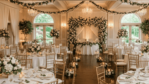
A little goes a long way. When used wisely, this green-and-red pairing can add energy, depth, and visual interest to almost anything.
That’s why designers and artists have relied on this color duo for centuries to create work that truly catches the eye.
Colors That Make Green Truly Shine
These green complementary colorpairings help green look more balanced, stylish, and easy to use in real life.
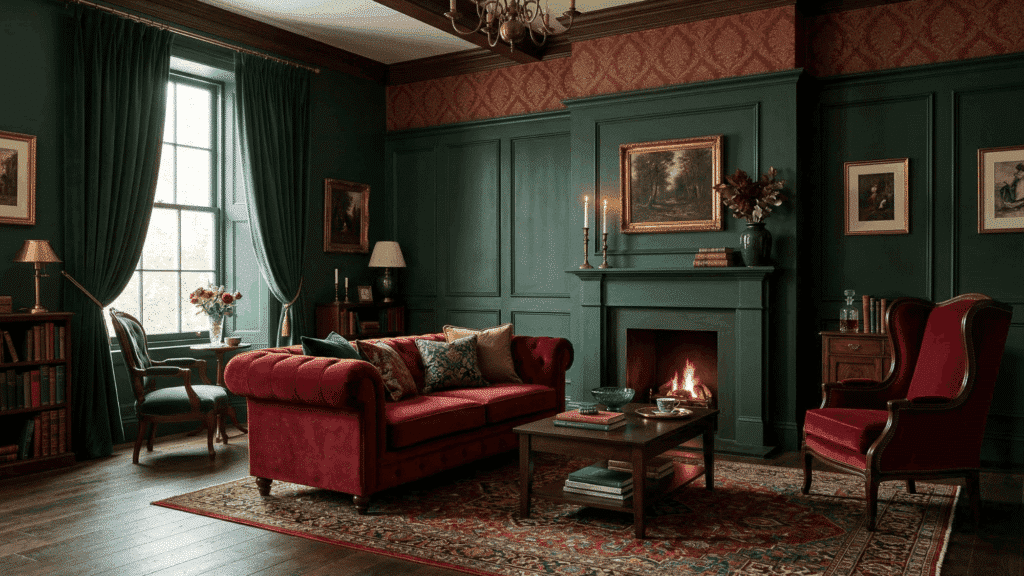
1. Red
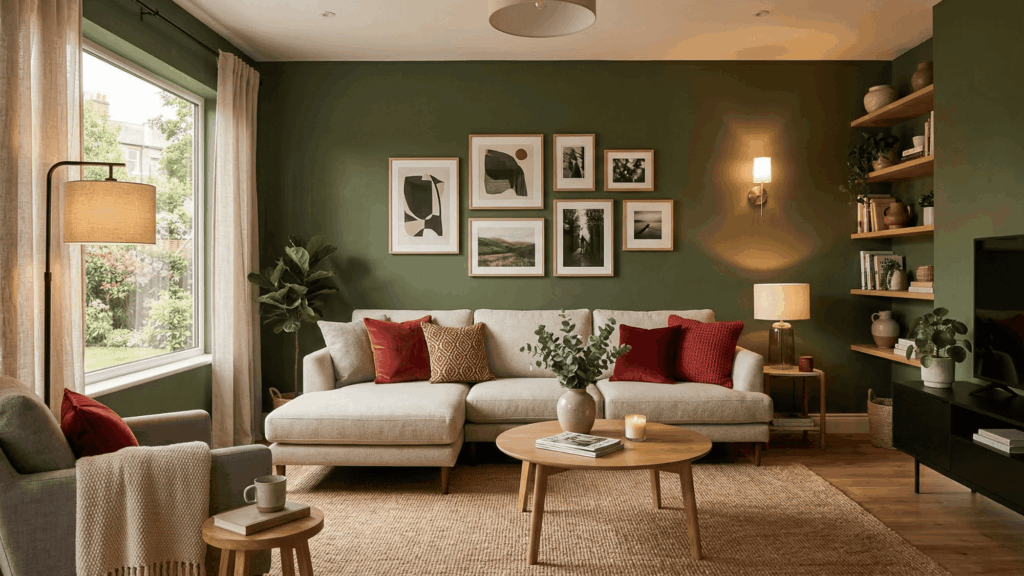
Red is the direct opposite of green on the color wheel, which makes this pairing stand out instantly. It creates a strong contrast and adds energy to any space or outfit.
Using too much red can feel overwhelming, so it works best in small accents. Pair it with neutral tones to keep everything balanced. This combo is often seen in festive themes and bold interiors.
2. Crimson
Crimson offers a deeper, more refined shadeof red. It pairs well with darker greens, such asemerald or forest green.
This combination feels bold but more controlled and less sharp. It adds depth without making the overall look too loud.
Crimson works well in formal or classic settings. It brings warmth while still feeling strong. This pairing is great when you want contrast without harsh brightness.
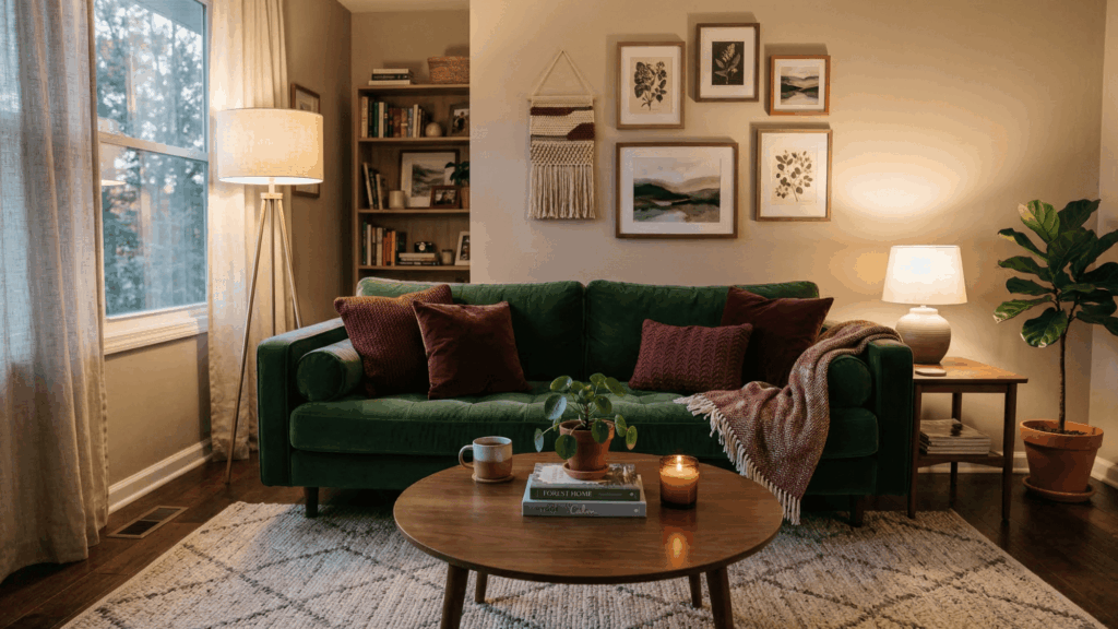
3. Burgundy
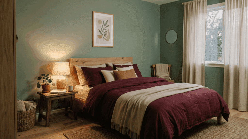
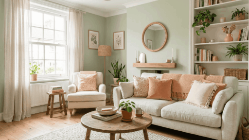
Burgundy brings warmth without the brightness of red. It works beautifully with olive and sage greens for a cozy feel. This pairing feels calm yet rich at the same time.
It’s a great choice for relaxed and grounded color schemes. Burgundy adds depth to the palette. It works well in both home decor and fashion. This combo feels stable and visually easy to maintain.
4. Maroon
Maroon is darker and more muted than red, making it easier to work with. It blends smoothly with deeper green shades.
This combination creates a steady and balanced look. It adds depth without a strong contrast. Maroon is ideal for subtle styling. It doesn’t overpower the main color. This pairing works well in spaces that need a calm but strong presence.
5. Coral
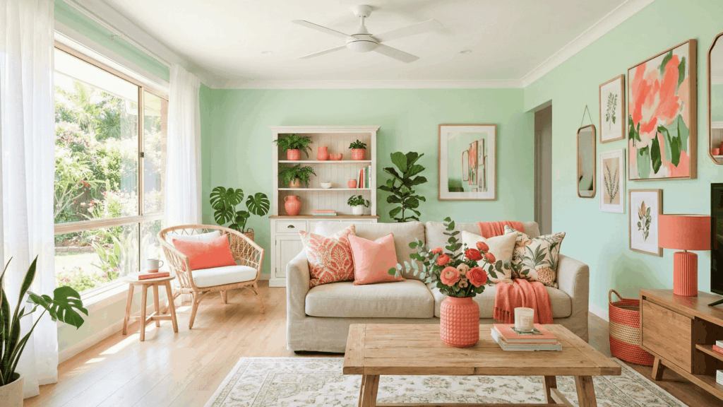
Coral adds a lively and bright touch that softens green’s intensity. It creates a lighter contrast compared to red. This pairing feels cheerful and easygoing. It works well in casual and playful settings.
Coral brings a youthful vibe to the palette. It pairs nicely with lighter greens. This combo is great for adding brightness without harsh contrast.
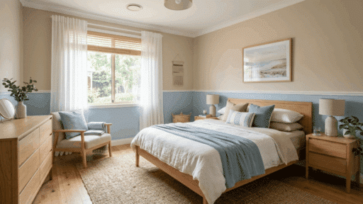
6. Blush Pink
Blush pink tones down the boldness of green and keeps things light. It pairs especially well with softer greens, such assage.
This combination feels calm and gentle. It’s perfect for simple and relaxed designs. Blush pink creates a soothing color mix. It works well in minimal setups. This pairing is easy to use without much effort.
7. Dusty Rose
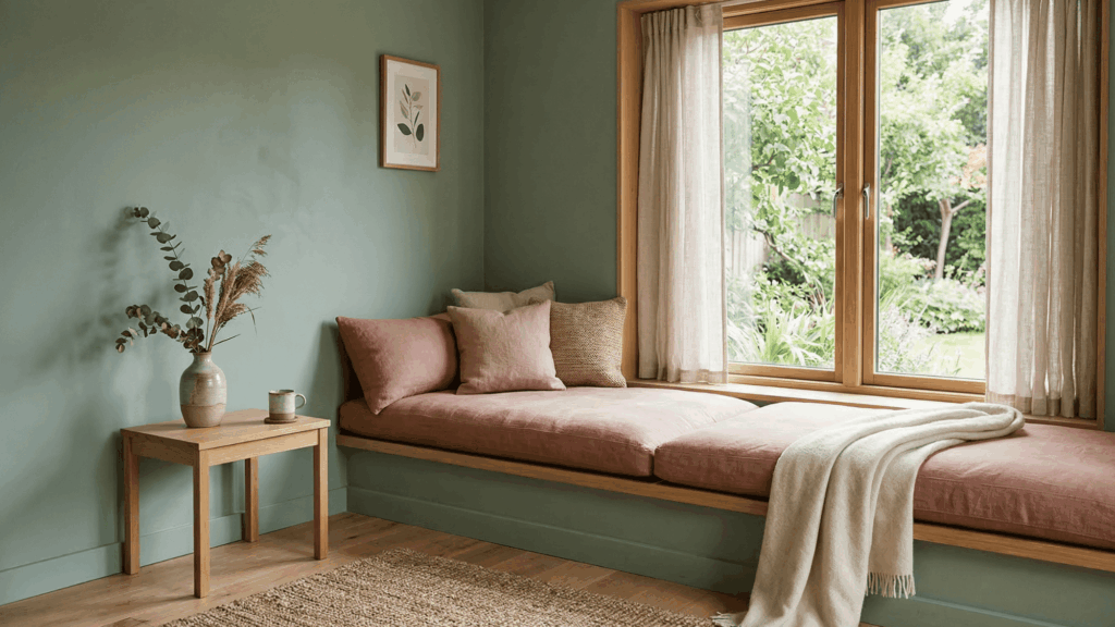
Dusty rose has a muted tone that blends smoothly with green. It creates a soft and balanced look without sharp contrast. This pairing feels cozy and easy to style. It’s a great option for subtle color palettes.
Dusty rose adds a slight vintage feel. It works well in relaxed environments. This combo keeps things calm and controlled.
8. Peach
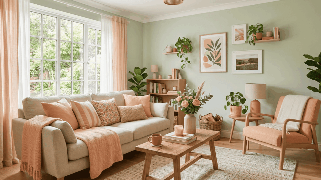
Peach brings warmth while still keeping the look light. It pairs well with fresh and light green shades. This combination feels welcoming and soft. It works well in bright,open spaces.
Peach adds a friendly tone to the palette. It helps reduce visual heaviness. This pairing is great for simple and cheerful setups.
9. Mauve
Mauve mixes soft purple and pink tones for a calm effect. It pairs well with muted greens for a smooth look. This combination feels modern and balanced.
It works well in simple and clean designs. This pairing is visually easy to maintain. Mauve adds a soft touch of color and keeps the palette from feeling dull.
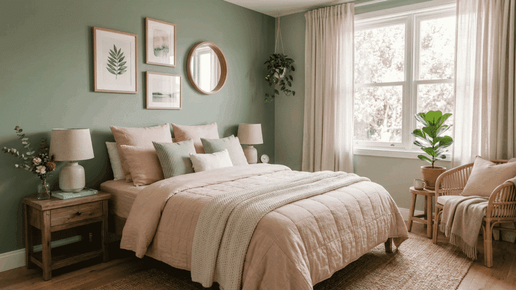
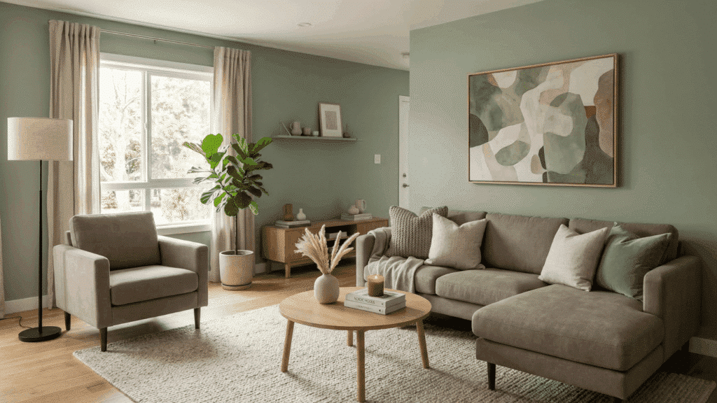
10. Beige
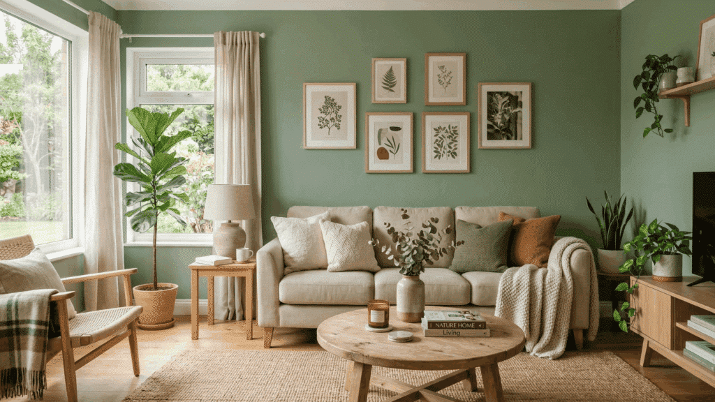
Beige is one of the easiest colors to pair with green. It balances bold shades without taking attention away. This combination feels natural and calm. It works in almost any space.
Beige helps tone down strong colors and blends smoothly with different greens. This pairing is simple and easy.
11. Cream
Cream adds warmth while staying soft and neutral. It pairs well with both light and dark greens. This combination feels inviting and comfortable. It softens the overall look easily.
Cream adds a gentle brightness. It keeps the space from feeling too sharp. This combo works well in cozy environments.
12. Ivory
Ivory is softer than white and blends smoothly with green. It creates a light contrast without being too sharp. This pairing feels clean and subtle.
It’s perfect for simple and neat designs. Ivory adds a refined touch. It works well in minimal setups. This combination feels light and balanced.
13. Tan
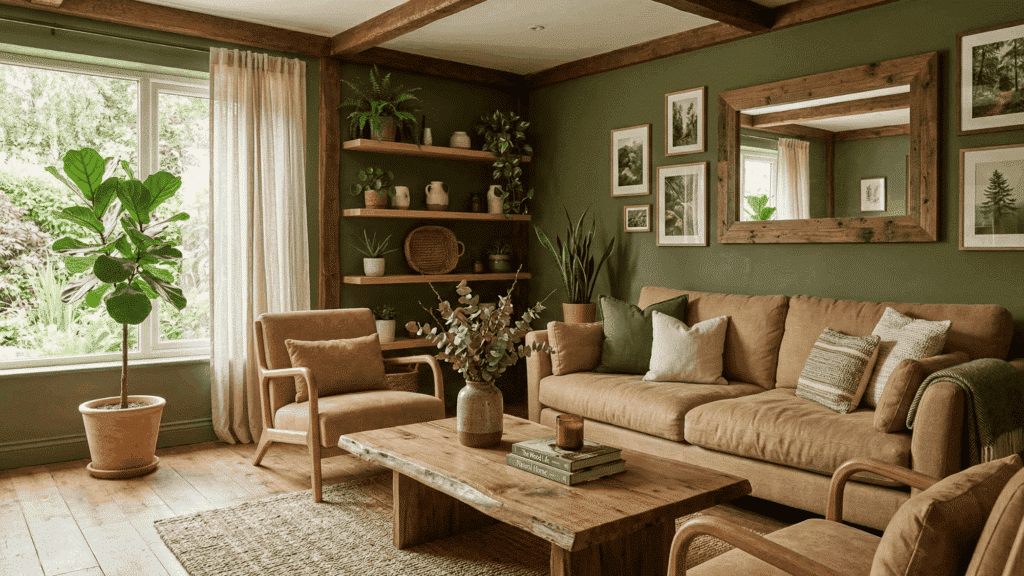
Tan adds a natural and earthy tone to green. It works especially well with olive and muted greens. This combination feels grounded and relaxed.
It’s easy to use in everyday settings. Tan creates a warm base. It supports green without competing. This pairing feels natural and stable.
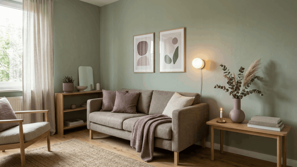
14. Taupe
Taupe sits between gray and brown, making it very flexible. It pairs well with most green shades. This combination feels steady and balanced. It works well in neutral color schemes.
Taupe helps connect different tones. It keeps the palette smooth. This pairing is practical and easy to use.
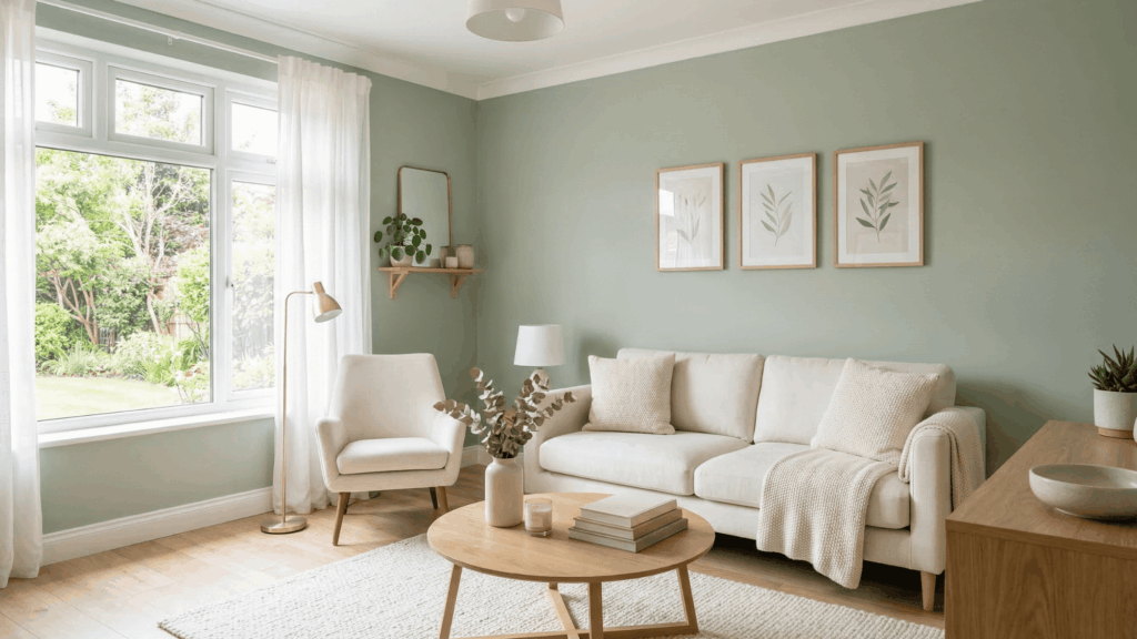
15. White
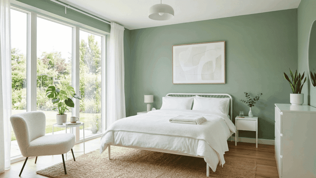
White makes green stand out clearly while keeping things fresh. It creates a simple and bright look. This pairing feels clean and open. It works in both modern and classic styles.
White adds clarity to the design. It prevents the space from feeling heavy. This combo is timeless and easy.
16. Gray
Gray adds a cool and steady tone that pairs well with green. It creates a balanced and simple look. This combination feels modern and clean. It works well in everyday designs.
Gray helps reduce color intensity. It keeps the palette neutral. This pairing is practical and widely used.
17. Charcoal
Charcoal provides a deeper contrast thangray. It pairs well with lighter greens for a bold look. This combination feels strong but controlled.
It adds depth without being too bright. Charcoal creates a solid base. It improves lighter tones. This pairing is great for modern styling.
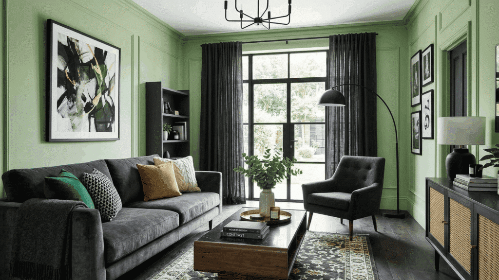
18. Black
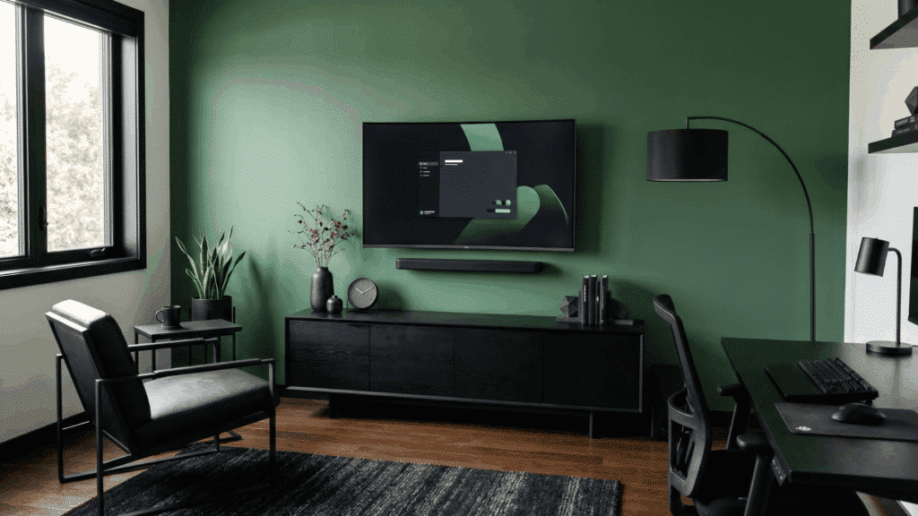
Black creates a clear and defined contrast with green. It works with both light and dark green shades. This pairing feels bold and structured.
It’s best used in small amounts. Black adds clarity and shape. It strengthens the overall design. This combo is simple but powerful.
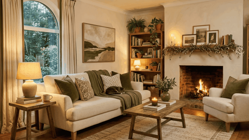
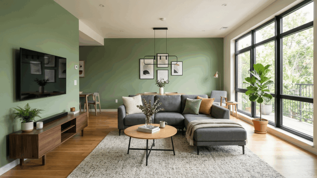
19. Brown
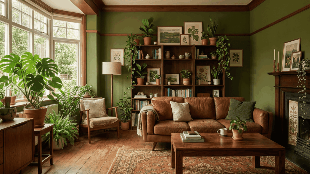
Brown and green naturally go well together. They reflect colors found in nature. This combination feels warm and comfortable.
It’s a safe and easy pairing. Brown adds stability to the palette. It supports green naturally. This combo feels familiar and relaxed.
20. Chocolate Brown
Chocolate brown is deeper and richer than regular brown. It pairs best with darker green shades. This combination feels cozy and grounded.
It adds depth to the overall look. Chocolate brown brings richness to the palette. It improvesdarker tones. This pairing feels strong and warm.
21. Terracotta
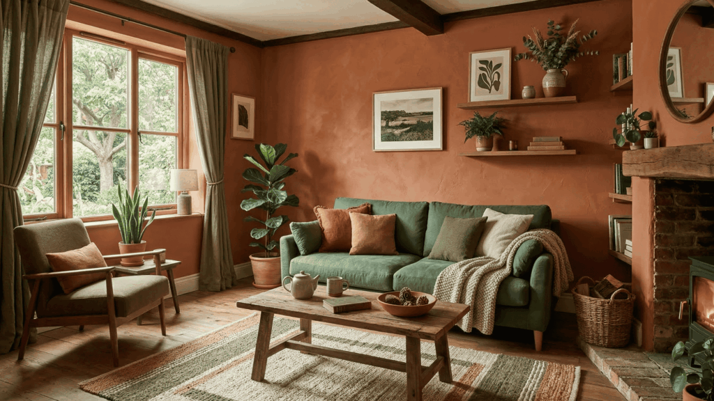
Terracotta adds a warm,earthy tone to green. It pairs well with muted greens. This combination feels natural and relaxed.
It adds warmth without being too bold. Terracotta creates a grounded look. It works well in simple palettes. This combo feels calm and balanced.
22. Rust
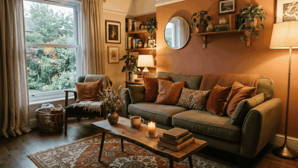
Rust has a reddish-brown tone that adds depth to green. It pairs beautifully with olive and deep greens. This combination feels rich and grounded.
It works well in warm settings. Rust adds character to the palette. It improves earthy tones. This pairing feels strong yet natural.
23. Gold
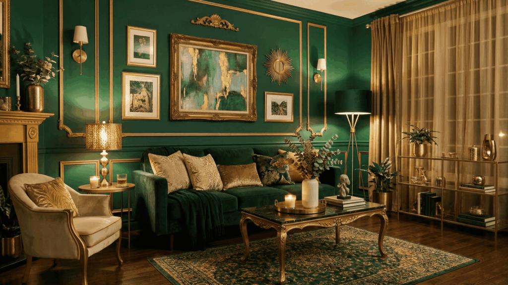
Gold adds brightness and a slight shine to green. It works best as an accent color. This pairing feels rich and noticeable.
It highlights small details beautifully. Gold adds warmth and depth. It draws attention to key areas. This combo works best in limited use.
24. Brass
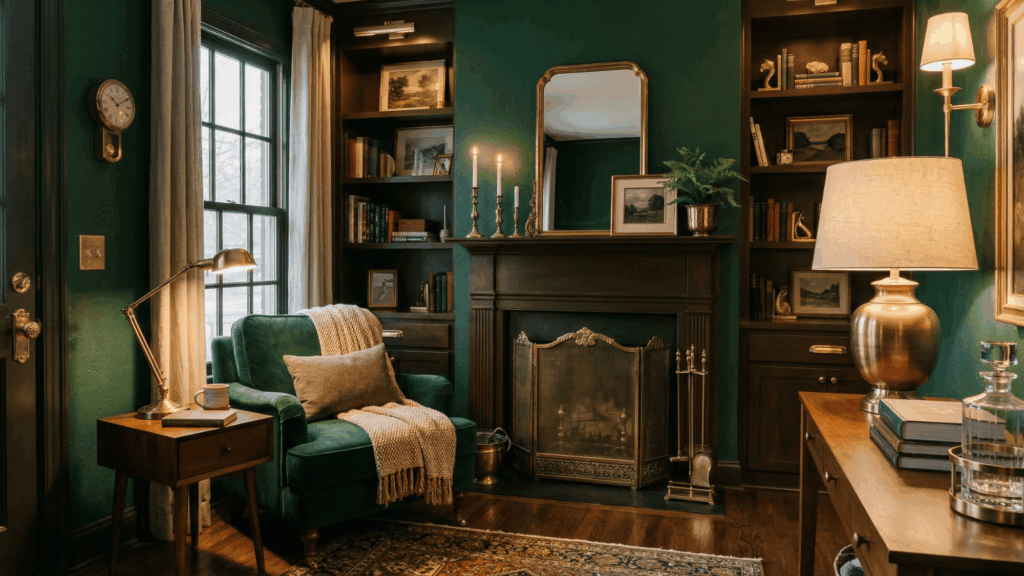
Brass has a softer shine than gold, making it easier to use. It pairs well with deeper green tones. This combination feels warm and balanced.
It adds subtle detail without being flashy. Brass creates a calm metallic touch. It blends well with muted palettes. This pairing feels understated and neat.
25. Copper
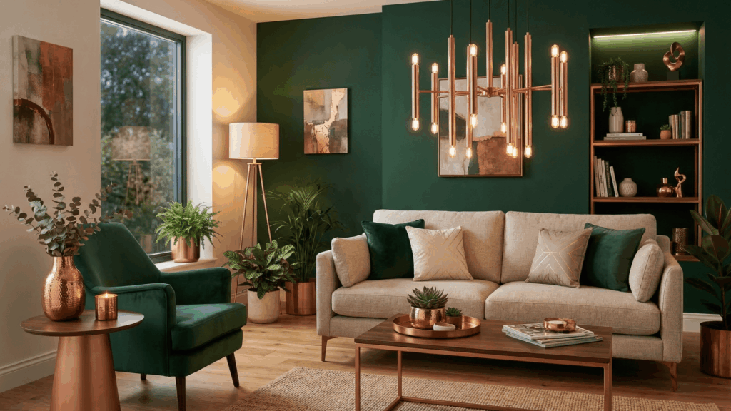
Copper brings a warm reddish tone that blends smoothly with green. It creates a natural and balanced look. This pairing feels soft but noticeable.
It works well for small highlights. Copper adds a gentle glow andincreases warmth in the palette. This combo feels simple yet effective.
How to Use Green Complementary Colors In Real Life
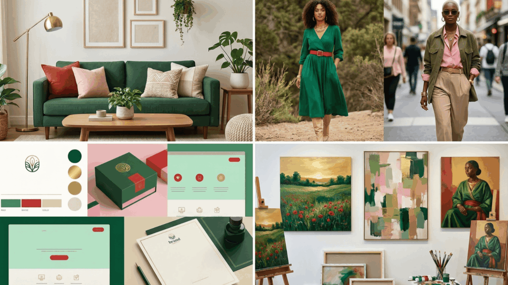
Knowing the colors that go with green is helpful, but using them correctly makes all the difference.
| Use Case | Color Pairing | How to Use | Result |
|---|---|---|---|
| Home Decor | Green with beige, cream, red, rust, gold | Pair green walls with neutral furniture, add warm accents, and metallics | Balanced and inviting space |
| Fashion | Green with pink, peach, white, tan, gold | Mix soft tones with neutrals and add gold accessories | Clean and stylish look |
| Graphic Design | Green with red, white, gray | Use red for highlights, neutrals for readability | Clear and professional design |
| Art and Painting | Green with red, warm tones, neutrals | Create focal points, layer tones, and keep the background simple | Strong contrast with depth |
Common Mistakes to Avoid
Even the best color combinations can fall flat if a few key details are overlooked, so avoiding these common mistakes can help keep your green pairings balanced and visually pleasing.
- Using too much red with green, which can feel overwhelming
- Mixing too many bold colors without balance
- Ignoring undertones like warm or cool shades
- Not testing colors before final use in real lighting
- Choosing the wrong shade of green for the space or purpose
- Overusing dark tones makes the space feel heavy
- Skipping neutral colors that help balance strong combinations
Wrapping It Up
Color is one of the most powerful tools we have, and knowing how to use it wisely can change everything. Green complementary colors are not just a design trick.
They are a language that speaks to the eye before the mind even processes it.
If you are refreshing your living room, putting together an outfit, or working on a creative project, the right colors that go well with green can make all the difference.
Start small, experiment freely, and trust your eye. Once you understand how complementary green colors work, you will begin to see the world around you in a whole new, more colorful way!

Alex Guerrero, a graduate with a Fine Arts degree from the Rhode Island School of Design, has been a visionary in the world of color and design for over 15 years. His professional journey began in the heart of the fashion industry in Milan, where he developed an acute sense for color harmonies and trends. Alex joined our team in 2018, offering fresh and innovative perspectives on color utilization in various spaces. Renowned for his ability to blend contemporary trends with timeless elegance. Outside of work, Alex is an accomplished painter and a volunteer art therapist, his artistic talents further enriching his professional insights.