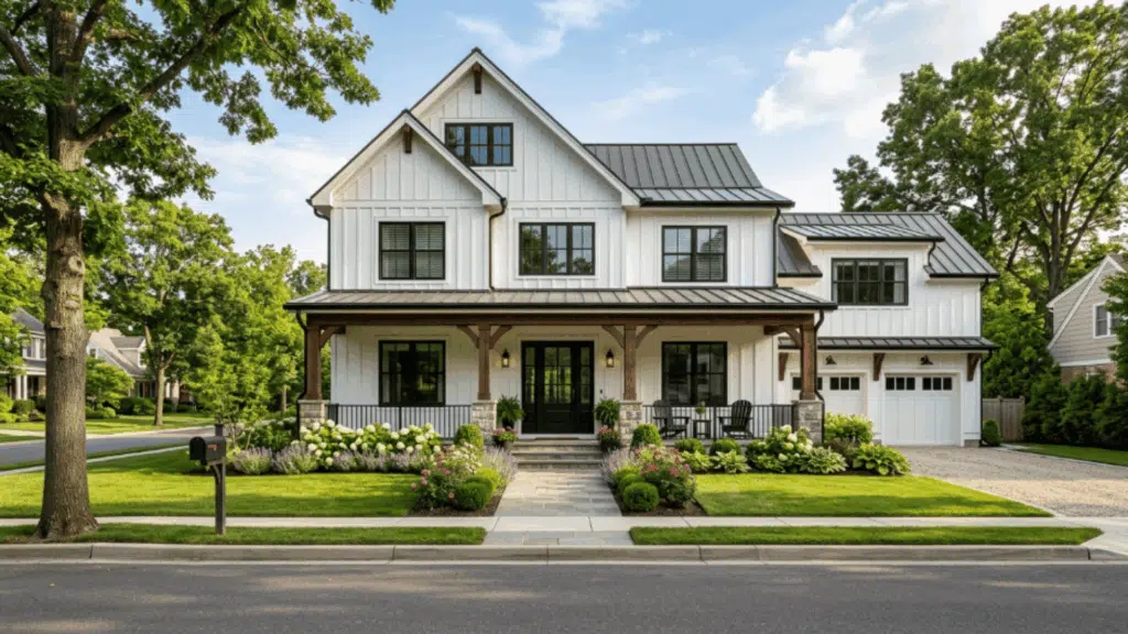
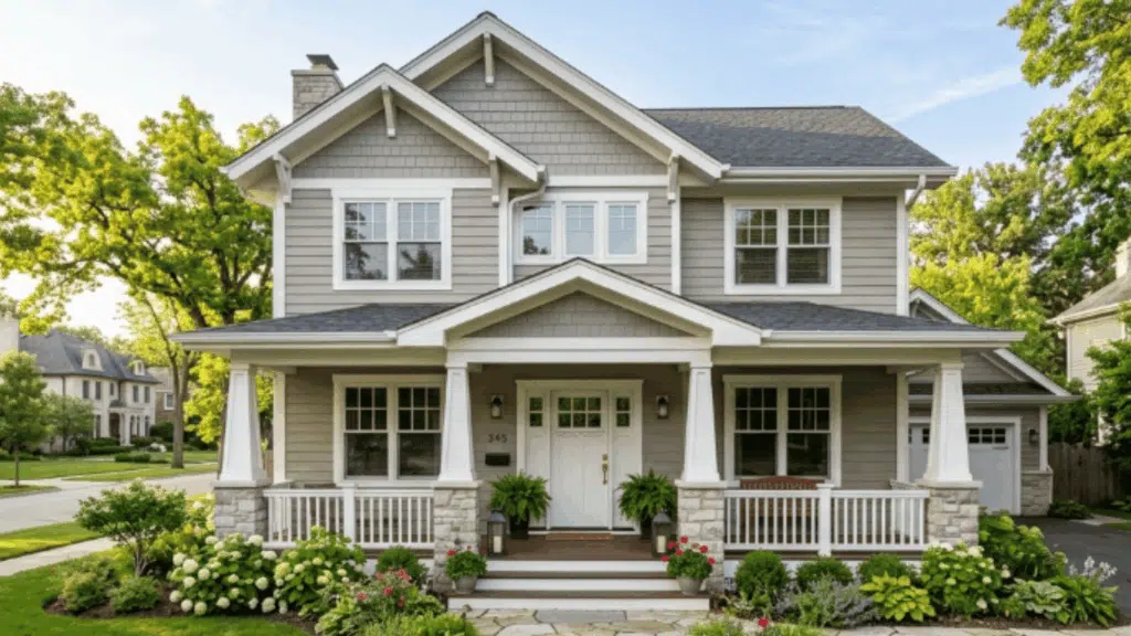
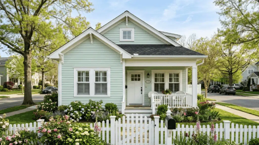
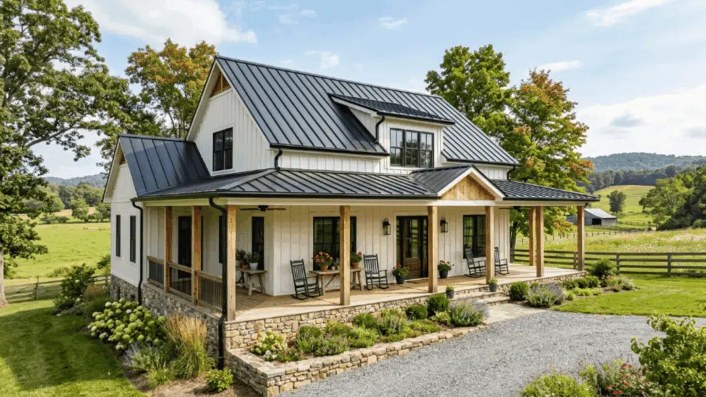
Choosing the right exterior color schemes can completely change how a home looks from the street. That’s why many people look at proven palettes before painting.
Still, choosing the best colour combination for the house exterior is not always easy. A colour that looks great on a small sample may look very different once applied outdoors.
To help with ideas, this blog shares inspiring exterior colour schemes that highlight beautiful exterior house colours and help you find the best colour combination for your house exterior.
How Exterior Colour Schemes Change Appeal
The right exterior colour scheme plays a major role in how a home looks from the street. Exterior paint influences property impression through colour choices.
Well-balanced exterior house colours help highlight windows, rooflines, porches, and entryways, making the architecture easier to appreciate.
Lightershades can make a home appear larger, while deeper tones can add depth. Coordinated colours also help the house blend with landscaping and surrounding homes.
Thoughtful colour planning can strengthen curb appeal and make the property look more welcoming to visitors and potential buyers.
Exterior Color Schemes to Inspire Your Home
These colour schemes show how siding, trim, and accent shades work together to improve curb appeal.
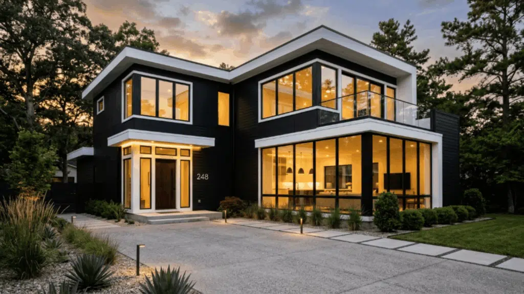
1. White Siding with Black Window Frames
A sharp black-and-white combo gives a modern, high-contrast look. It makes the home feel crisp, bold, and easy to notice from the street.
It pairs well with flat roofs. Outdoor lighting stands out more against darker accents. It helps highlight clean lines in newer builds. Simple landscaping looks defined against this backdrop.
Suggested palette:
- Siding: Sherwin-Williams Alabaster SW 7008
- Trim:Sherwin-Williams Pure White SW 7005
- Windows / Door:Sherwin-Williams Tricorn Black SW 6258
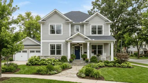
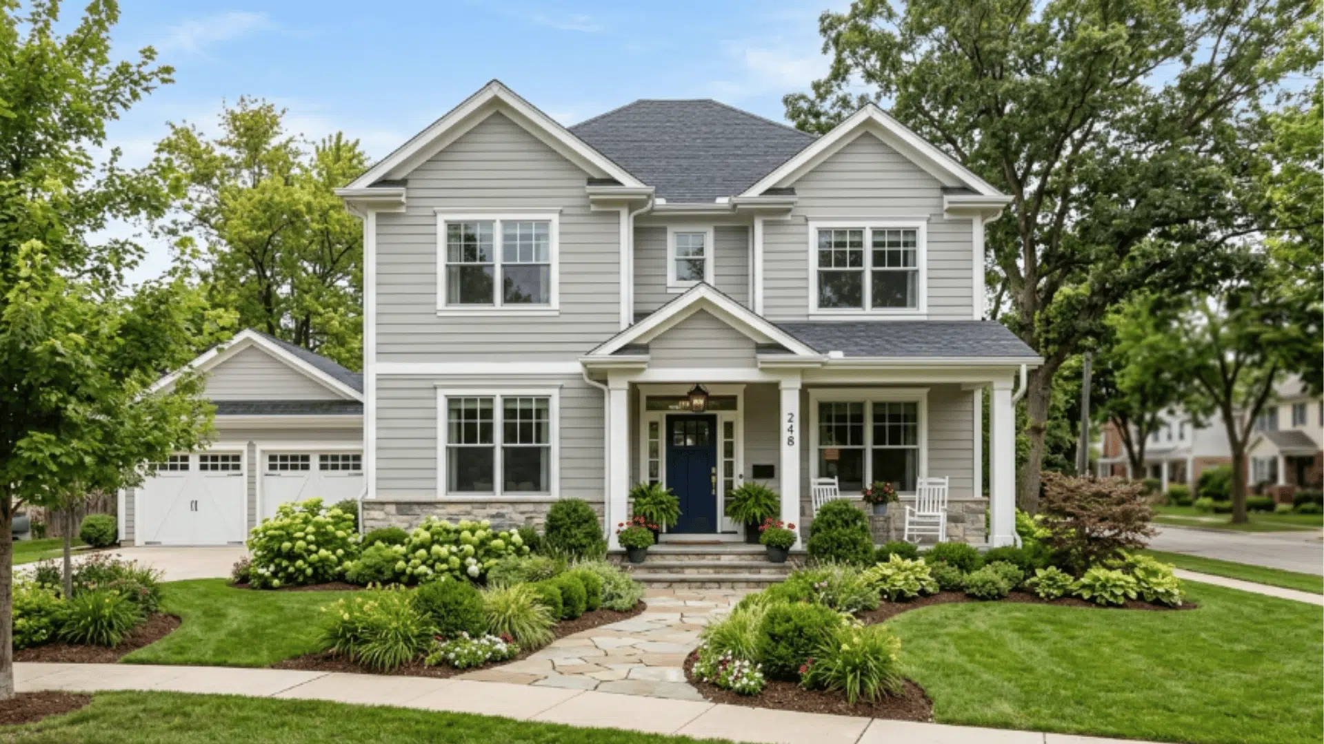
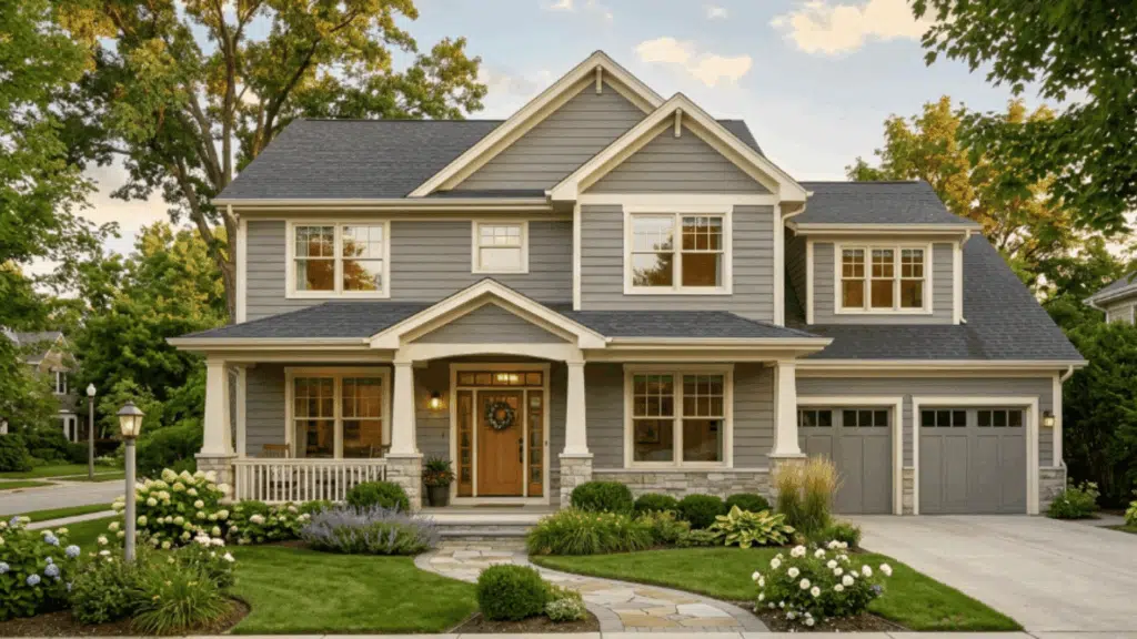
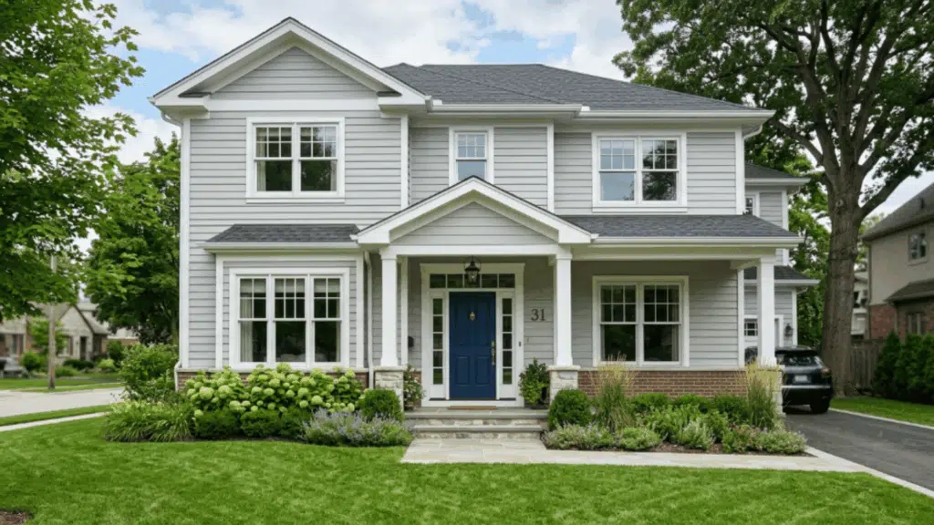
2. Soft Grey with White Porch Columns
Soft grey creates a calm, neutral base that doesn’t overpower the design. It pairs well with many styles and keeps the home looking balanced.
It’s a safe choice for people who want a clean exterior without being plain. Grey tones age well and rarely go out of style. It also works nicely with both light and dark roofing.
Suggested palette:
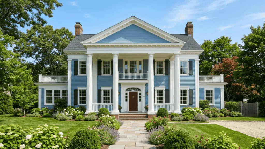
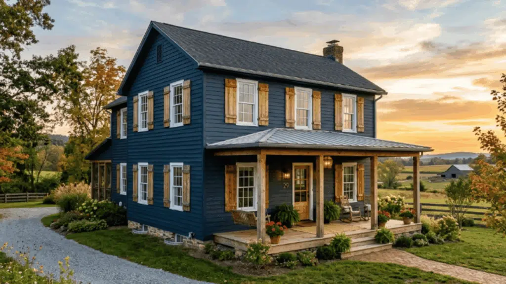
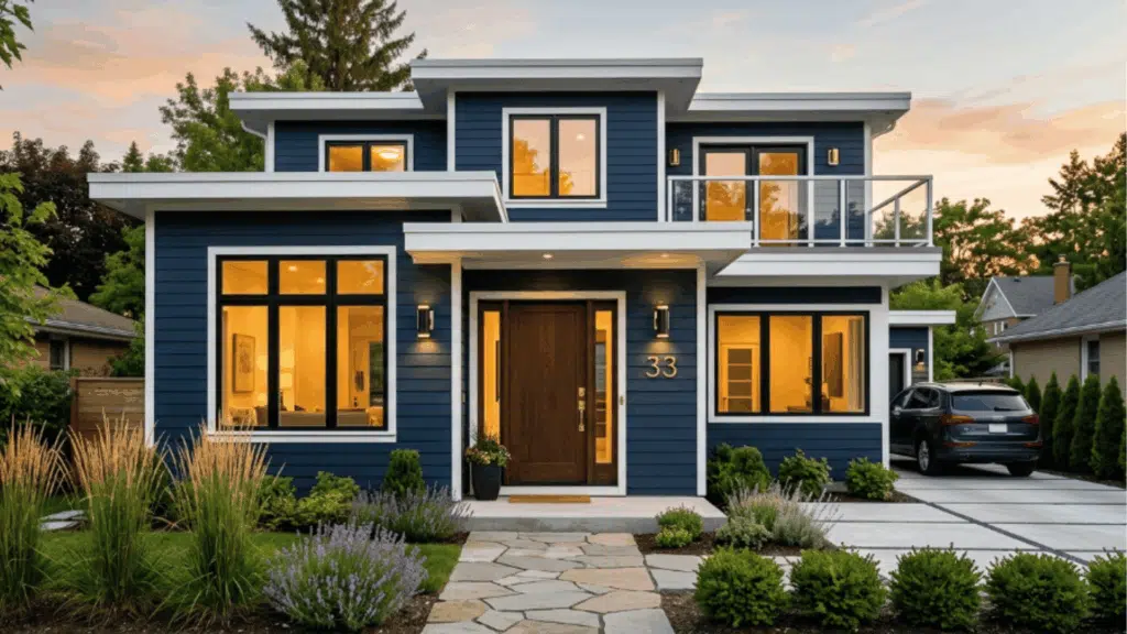
3. Navy Blue with Crisp White Trim
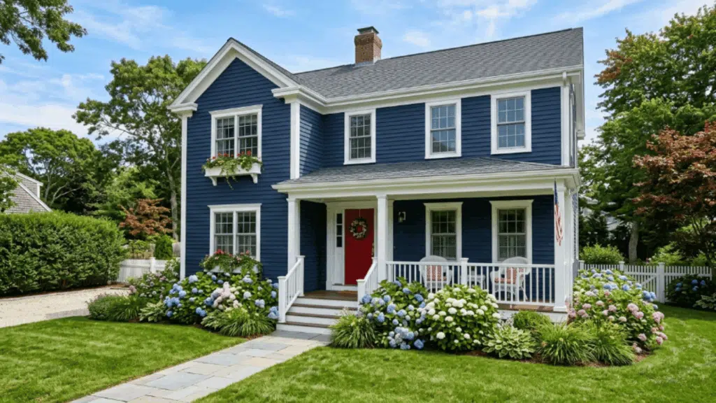
Deep navy adds richness and makes the exterior feel more grounded. The contrast keeps the home visually striking without feeling too dark.
This color also looks great under both sunny and cloudy skies. It pairs well with metal or matte black fixtures.
Suggested palette:
4. Warm Beige with Cream Trim
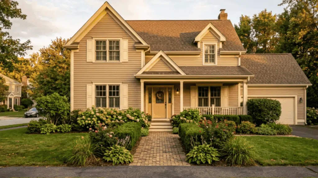
Warm beige brings a cozy, lived-in feel. It works especially well in sunny areas and blends nicely with natural surroundings.
This combo helps the home look well put together without drawing much attention. It’s ideal for traditional homes. Outdoor elements like plants and stone paths look more connected.
Suggested palette:
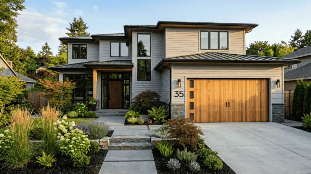
5. Charcoal Grey with Natural Wood Door
Dark grey gives a strong, modern edge, while the wood door adds a natural touch that softens the overall look. It also pairs well with glass or metal railings.
This color scheme is great for homes with simple, clean architecture. The contrast creates a focal point at the entry.
Suggested palette:
- Siding: Sherwin-Williams Iron Ore SW 7069
- Trim: Sherwin-Williams Pure White SW 7005
- Door: Natural wood finish
6. Sage Green with White Trim
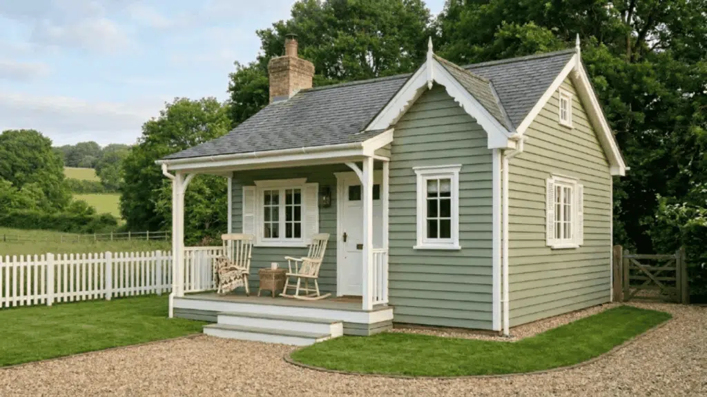
Sage green offers a relaxed, earthy vibe. It feels subtle yet fresh, making the home blend well with outdoor spaces. White trim adds clarity without making the design feel too sharp.
It looks great year-round, not just in spring. It also pairs nicely with muted landscaping tones. This color feels easy on the eyes from a distance. It works well for homes with wide front yards.
Suggested palette:
7. Pale Yellow with White Trim
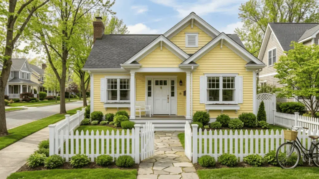
Pale yellow introduces a light, cheerful color scheme that feels bright but not overwhelming. White trim keeps the edges clean and easy to notice.
This is often considered the best colour combination for a house exterior in a cottage-style home. This shade works well in neighborhoods with soft color palettes.
Suggested palette:
8. Olive Green with Cream Trim
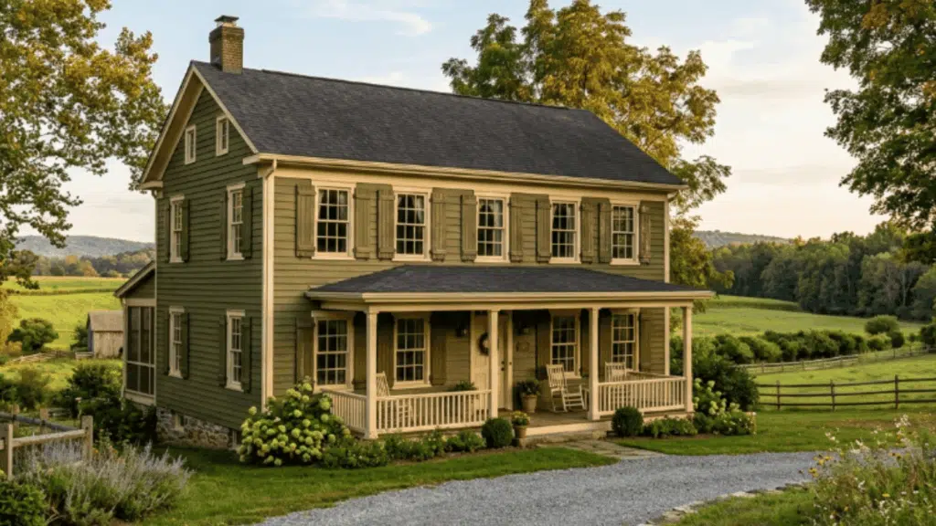
Olive green creates a grounded feel, connected to natural surroundings. It brings a steady, earthy tone to the overall design.
It blends smoothly into garden-heavy or shaded spaces. The color helps hide dust and outdoor wear. It keeps the home looking settled. It creates a cohesive look with natural landscaping.
Suggested palette:
9. Blue Grey with White Trim
Blue grey offers flexibility that shifts slightly with light, adding quiet variation. It creates a clean and modern feel without strong contrast.
The tone remains soft even under bright sunlight. It helps larger surfaces feel less flat.
Suggested palette:
10. Sandy Beige with Brown Trim
Sandy beige forms warm exterior color schemes that feel steady. It gives the home a natural base that doesn’t feel too light or too dark. It hides dust more easily than lighter shades. Brown trim adds depth while keeping the look soft and grounded.
Suggested palette:
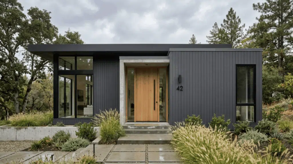
11. Black Exterior with White Trim
Black siding creates a bold look that feels sharp and modern. It gives the home a strong presence without needing elements. It works well for homes with simple shapes. This color scheme creates a striking contrast that stands out from the street.
Suggested palette:
12. Forest Green with White Windows
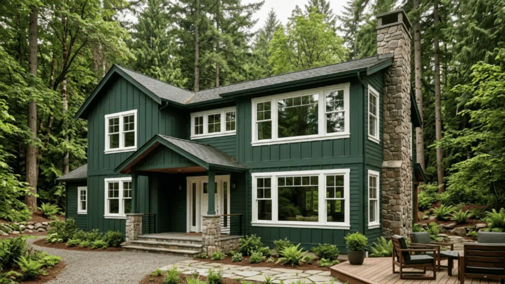
Forest green brings a rich look that feels grounded and connected to nature. White window details keep the design from looking too dark.
This shade works well in areas with lots of greenery. It pairs nicely with wooden decks or fences. The tone looks deeper in shade and softer in sunlight. It suits cabin-style homes well.
Suggested palette:
13. Cream Exterior with Burgundy Door
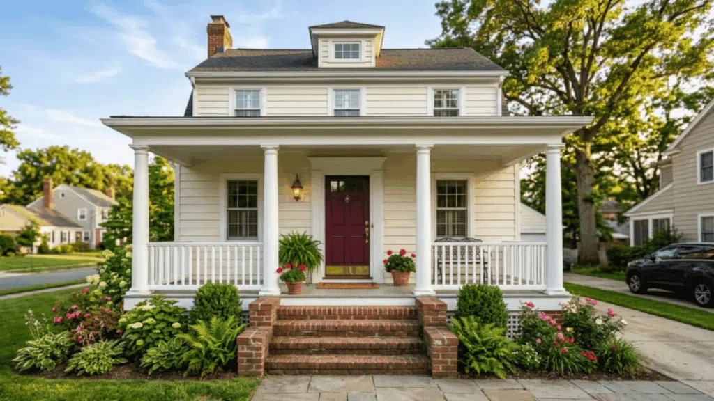
Cream siding feels light without being too bright. It offers a neutral base that works across styles. A burgundy door adds a rich focal point at the entry.
Suggested palette:
14. Terracotta with Beige Trim
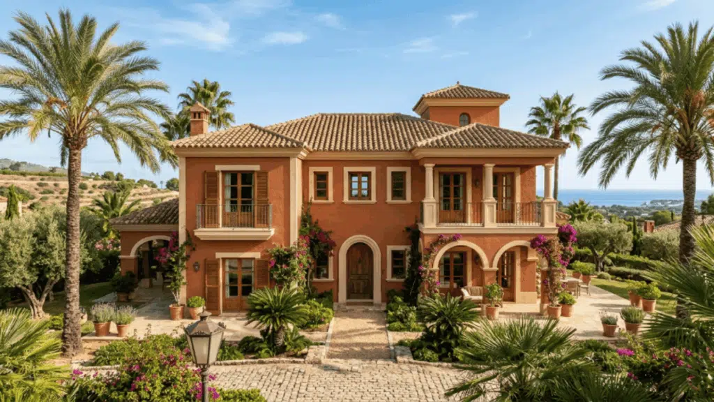
Terracotta adds earthy warmth, giving the home a sun-baked, grounded look. It stands out without feeling too bold.
This color works well in warm climates. Beige trim softens the palette and keeps the eye at ease. This is considered the best colour combination for the exterior of Mediterranean-style homes.
Suggested palette:
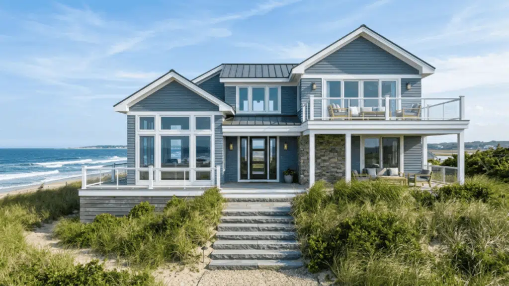
15. Light Blue with White Porch Railings
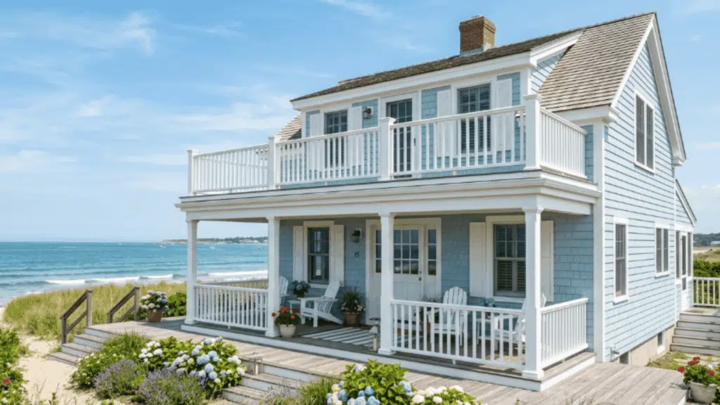
Light blue creates a fresh look that feels airy and open. It adds brightness without being too strong. White railings keep the porch area clean and noticeable.
This is often considered the best colour combination for the exterior of coastal-style homes. It works well in open spaces with lots of daylight. The color stays soft even in bright sunlight.
Suggested palette:
16. Taupe with White Trim
Taupe offers a balanced color scheme that sits between warm and cool tones. It adapts well to changing light throughout the day. The tone hides minor dirt and wear.
White trim keeps the design clear. It pairs easily with various roof colors. It blends well in mixed-color neighborhoods.
Suggested palette:
17. Slate Blue with Grey Trim
Slate blue adds depth while keeping the look soft. This exterior color scheme reduces harsh contrast and feels easy on the eyes.
Grey trim keeps the look subtle. This pairing is often chosen as the best colour combination for house exterior for understated homes. The shade shifts slightly under different lights.
Suggested palette:
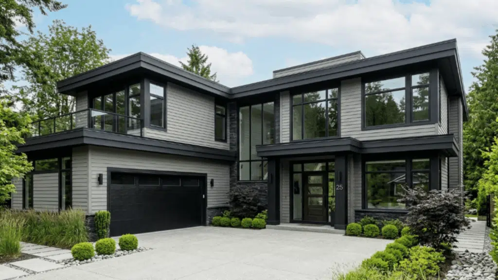
18. Greige with Black Windows
Greige blends grey and beige to form flexible exterior house colors that suit many styles. It feels neutral but still interesting.
Black windows create a sharp and defined outline. It keeps the exterior looking current. It works well with minimal design elements. It pairs nicely with metal and glass features.
Suggested palette:
19. Brick Red with White Trim
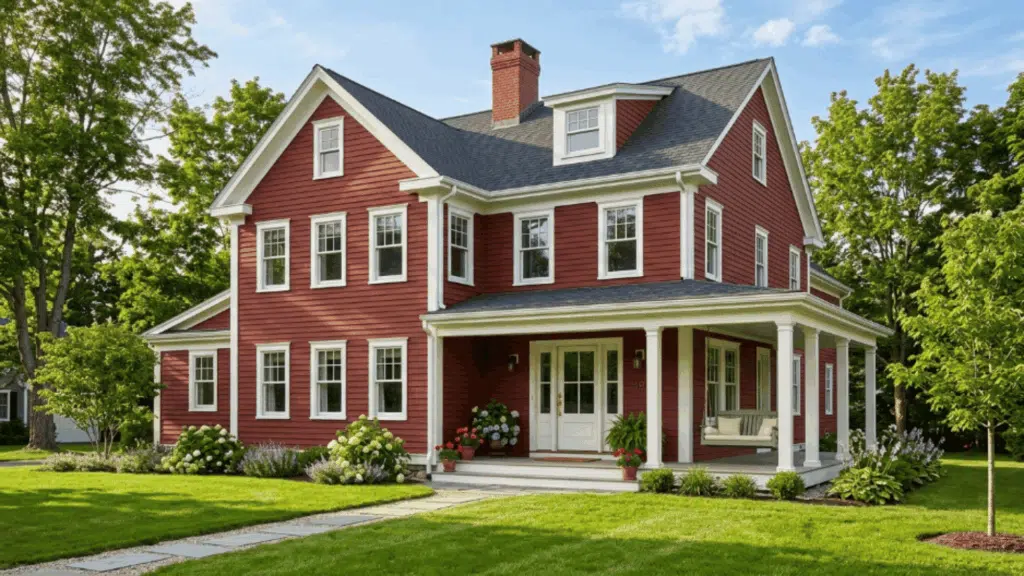
Brick red delivers a strong exterior house color that feels warm and noticeable. It adds character without needing extra detail. It works well in green or natural surroundings.
It pairs nicely with classic architecture. The color holds its depth over time. It keeps the home visually strong. White trim lightens the look and balances the richness.
Suggested palette:
20. Moss Green with Stone Accents
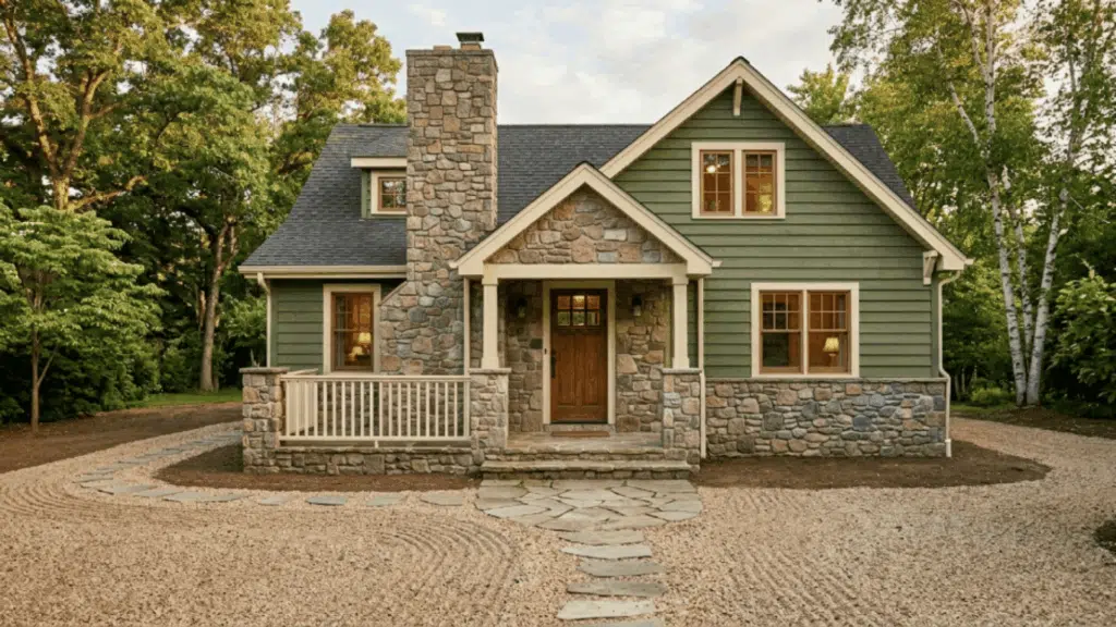
Moss green creates natural exterior house colors that blend easily with outdoor elements. It gives the home a soft, grounded look.
Stone accents add texture without strong contrast. This is often seen as the best colour combination for house exterior for homes surrounded by greenery. It creates a cohesive finish.
Suggested palette:
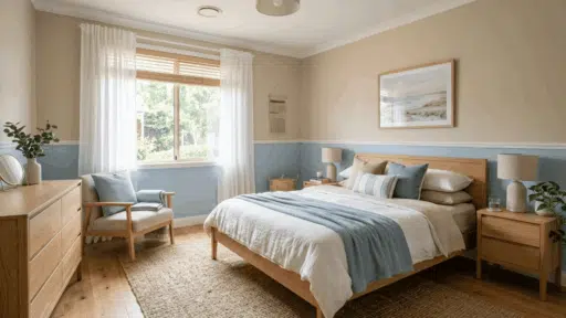
21. Dusty Blue with White Trim
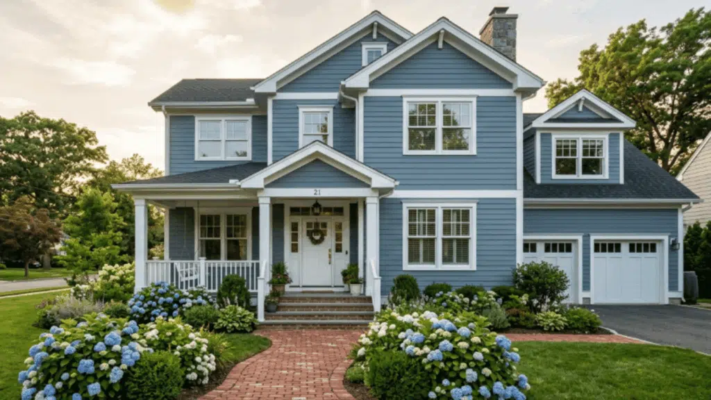
Dusty blue creates a soft, calming look that feels slightly muted. It brings a gentle tone that doesn’t feel too bold or too plain. It gives the homely appearance.
This shade works well in areas with changing light conditions. It pairs nicely with neutral roofing and stone features. The color feels similar in both sunny and cloudy weather.
Suggested palette:
22. Dark Grey with Wood Accents
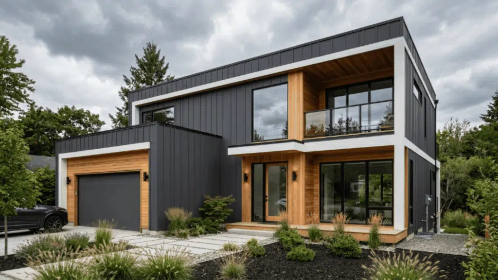
Dark grey creates a strong look that gives the home a solid and modern feel. It adds depth without making the design feel heavy. The contrast creates a clear visual balance.
These colors feel structured while still looking updated. Wood accents bring warmth and break up the darker tone. It suits homes with clean architectural lines.
Suggested palette:
23. Mint Green with White Trim
Mint green feels fresh and cheerful. It adds brightness without being too strong. White trim keeps the edges neat and easy to follow.
This shade works well in sunny and open areas. It pairs nicely with simple outdoor decor. The color gives the home a soft and lively feel. This tone adds a pop without overpowering.
Suggested palette:
24. Chocolate Brown with Beige Trim
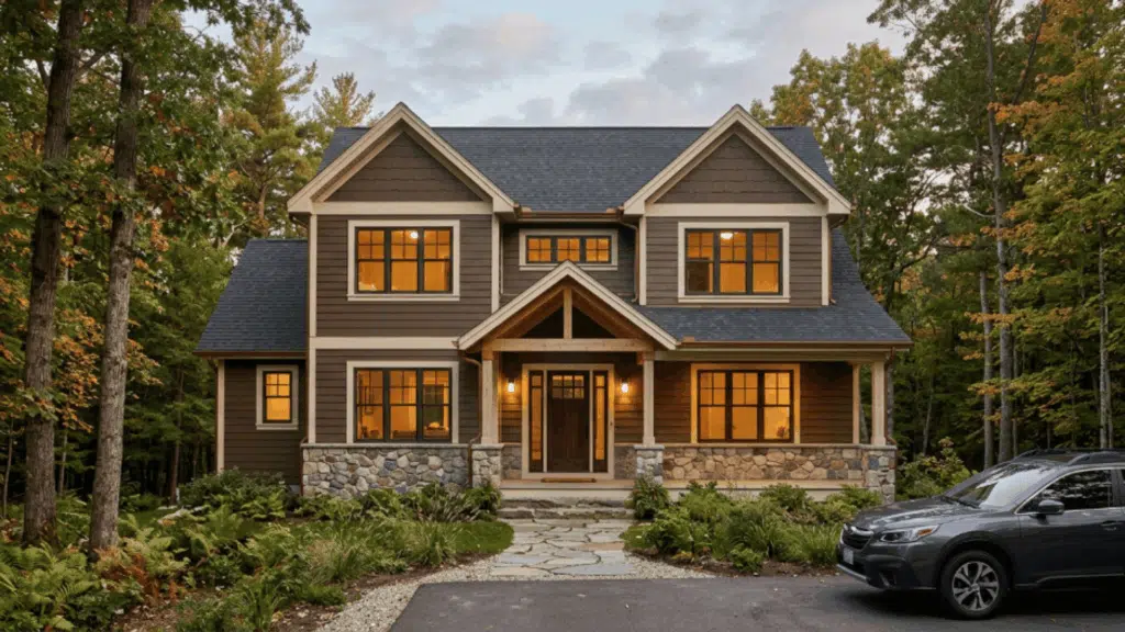
Chocolate brown creates a deep look that feels rich and grounded. It adds warmth without needing bold contrast. Beige trim softens the look and keeps it approachable.
This pairing works well in natural or wooded settings. It blends nicely with stone and earthy materials. The darker tone helps hide dirt. This combination feels strong yet comfortable.
Suggested palette:
25. Stone Grey with Black Trim
Stone grey works across many home styles. It offers a neutral base that doesn’t feel flat. It works well with minimal landscaping.
Black trim adds sharp contrast and clearly defines the structure. This pairing is often chosen as the best colour combination for a house exterior for a sleek finish. It keeps the exterior looking simple and up to date.
Suggested palette:
26. Sky Blue with White Columns
Sky blue feels open and airy. It reflects light, making the home look fresh. White columns add structure without making the design feel heavy.
This shade works well in sunny climates. The color keeps the home looking cheerful. It works well for homes with porches. This tone adds a soft and relaxed look.
Suggested palette:
27. Warm Grey with Cream Trim
Warm grey creates a balance that feels soft and neutral. It adapts well to both bright and low light. Cream trim adds warmth without creating a harsh contrast.
It works well in both modern and classic homes. It hides minor dust and wear over time. It keeps the exterior looking neat and consistent.
Suggested palette:
28. Ivory With Dark Wood Door
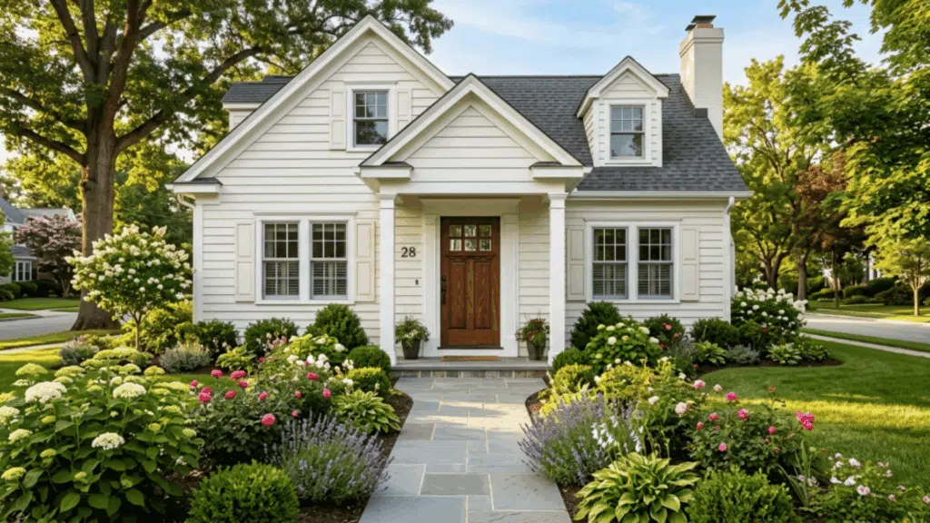
Ivory feels clean and welcoming. It offers a soft base that works across many styles. A dark wood door adds depth and creates a clear focal point.
This pairing works well for entry-focused designs. It blends nicely with natural materials and textures. The color keeps the home looking bright without glare. It suits small and large homes.
Suggested palette:
- Siding:Benjamin Moore Ivory White OC-9
- Door: Walnut wood finish
29. Deep Blue with Wood Shutters
Deep blue adds depth to the structure. It gives the home a more defined look. Wood shutters bring warmth and break up the darker tone.
This combination works well in both modern and classic homes. It adds character without needing extra detail. This pairing keeps the exterior visually interesting.
Suggested palette:
- Siding:Benjamin Moore Newburyport Blue HC-155
- Shutters: Natural wood
30. Sandy Tan with Olive Trim
Sandy Tan blends easily with the outdoor surroundings. These exterior color schemes work well in green landscapes.
Olive trim adds a subtle contrast without being sharp. This is the best colour combination for a house exterior in earthy designs. It helps the home blend into its environment.
Suggested palette:
31. Pale Grey with Navy Door
Pale grey feels calm and understated. It offers a neutral base that doesn’t overpower the design. A navy door adds depth and creates a clear focal point.
This pairing works well for modern and traditional homes. The contrast feels subtle but noticeable. It gives the home a neat and polished appearance.
Suggested palette:
32. White with Stone Foundation
White creates bright exterior house colors that reflect light and make the home feel open. It provides a clean and simple base.
A stone foundation adds texture and breaks up the plain surface. It keeps the design from feeling too flat. This pairing feels fresh but still grounded. It works for homes of different sizes.
Suggested palette:
- Siding: Sherwin-Williams Alabaster SW 7008
- Foundation: Natural stone
33. Navy with Brass Door Hardware
Navy adds strength to the overall look. It gives the home a defined presence. This is one of the exterior color schemes that creates a contrast that feels classic yet updated.
Brass hardware adds a warm metallic touch that stands out at the entry. This pairing is often seen as the best colour combination for house exterior for homes with bold accents.
Suggested palette:
- Siding:Benjamin Moore Hale Navy HC-154
- Hardware: Brass finish
34. Light Taupe with Charcoal Trim
Light taupe creates a balanced exterior palette that feels soft and neutral. It works well across different lighting conditions. Charcoal trim adds depth without making the design too harsh.
This pairing suits both modern and traditional homes. It blends easily with the surrounding buildings. It offers a practical exterior finish. This combination looks clean without feeling plain.
Suggested palette:
35. Grey with Natural Wood Garage Door
Grey feels structured and steady. It gives the home a neutral base that works in many settings. This offers a mix of cool and warm tones.
A natural wood garage door adds warmth and breaks the monotone look. This is often considered the best colour combination for the exterior of modern, simple homes.
Suggested palette:
- Siding:Sherwin-Williams Repose Grey SW 7015
- Garage door: Natural wood finish
Color Mistakes to Avoid
Choosing the right exterior color schemes takes planning. Small mistakes in selecting exterior house colours can reduce curb appeal and make the home look unbalanced.
| Mistake | What It Means | What to Do Instead |
|---|---|---|
| Too Many Colors | Using too many shades makes the design look messy | Stick to 2–3 balanced exterior colours |
| Ignoring Fixed Elements | Roof, brick, or stone colors are not considered | Match paint with existing materials |
| Skipping Paint Samples | Colors look different in natural light | Test samples before finalizing |
| Choosing Clashing Colors | Colors don’t match the surroundings or each other | Pick tones that blend with the environment |
| Not Testing at All Times | Colors change throughout the day | Check shades in the morning, noon, and evening |
Conclusion
Modern traditional interiors help create homes that feel inviting and practical.
Small updates in furniture, lighting, and materials can change the overall look of a room and make everyday spaces feel refreshed and visually interesting.
Similar thinking applies when choosing exterior color schemes or updating exterior house colors to give the home a stronger visual identity.
Start with one simple idea today and slowly shape a home that reflects your style and makes every space enjoyable every day.

Alex Guerrero, a graduate with a Fine Arts degree from the Rhode Island School of Design, has been a visionary in the world of color and design for over 15 years. His professional journey began in the heart of the fashion industry in Milan, where he developed an acute sense for color harmonies and trends. Alex joined our team in 2018, offering fresh and innovative perspectives on color utilization in various spaces. Renowned for his ability to blend contemporary trends with timeless elegance. Outside of work, Alex is an accomplished painter and a volunteer art therapist, his artistic talents further enriching his professional insights.