If you’ve been staring at plain walls, wondering how to make them look better without a full renovation, two-tone wall colors might be exactly what you need.
The idea is simple: pick two shades, paint them on the same wall, and watch the room come alive. It’s one of those ideas that looks way more complicated than it actually is.
You don’t need to hire a designer or spend a fortune. Whether it’s your bedroom, living room, or hallway, this technique works everywhere.
This blog compiles two-tone wall paint ideas to help you find the right look for your home.
Why Two-Tone Wall Colors Work So Well?
Two shades on the same wall do something a single color simply cannot. They give the wall a layered look that makes the whole room feel more put-together.
It is a small change, but the difference is noticeable the moment you walk in. If you have an open floor plan, two-tone wall colors are genuinely useful beyond just looking good.
A color shift on the wall can visually separate a dining area from a living space without putting up a single partition.
Two-tone wall paint ideas let you bring in bold color without the room feeling heavy. You get the depth of a strong shade below, and a lighter tone above keeps everything balanced.
Creative Two-Tone Wall Color Ideas
These ideas cover a wide range of styles, moods, and room types. If you prefer soft and neutral or bold and graphic, there is something here for every kind of space.
1. Classic White and Navy
The navy grounds the room and adds a sense of structure, while the white above keeps things feeling open and bright.
- Best for: Living rooms, dining rooms, and hallways. This pairing fits naturally into both traditional and modern homes without feeling out of place.
- Styling Tip: Keep furniture light or neutral to balance the dark navy. Add soft textures, such as rugs or cushions, in beige, cream, or light gray.
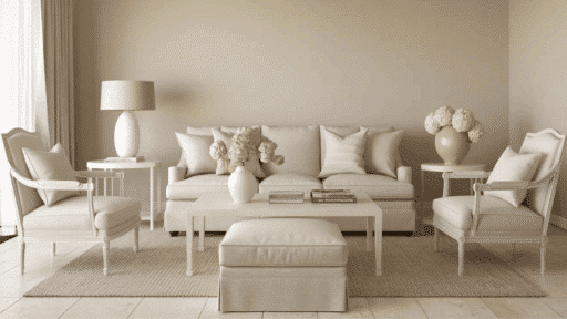
2. Soft Beige and Warm White
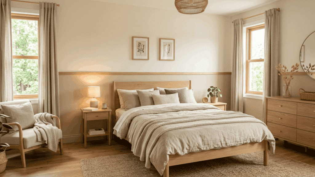
Soft beige on the lower half and warm white above create a quiet, layered look that feels calm and collected. This is not a dramatic combination, and that is exactly the point.
- Best for: Bedrooms, reading nooks, and quiet sitting areas. This subtle palette works especially well in rooms where rest is the priority.
- Styling Tip: Pair with natural linen, cotton textiles, and warm wood tones to keep the softness consistent throughout the room.
3. Sage Green and Cream
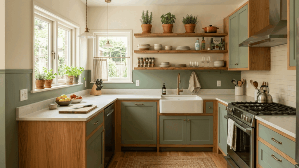
Sage green on the lower portion of the wall, paired with cream above, brings a natural, organic quality into the room. The cream softens the sage and stops it from feeling too heavy.
- Best for: Kitchens, bathrooms, and bedrooms. This nature-inspired combination works in any room where a calm and grounded atmosphere is the goal.
- Styling Tip: Pair with terracotta pots, woven baskets, and wooden shelves to bring in natural texture and warmth.
4. Light Gray and Charcoal
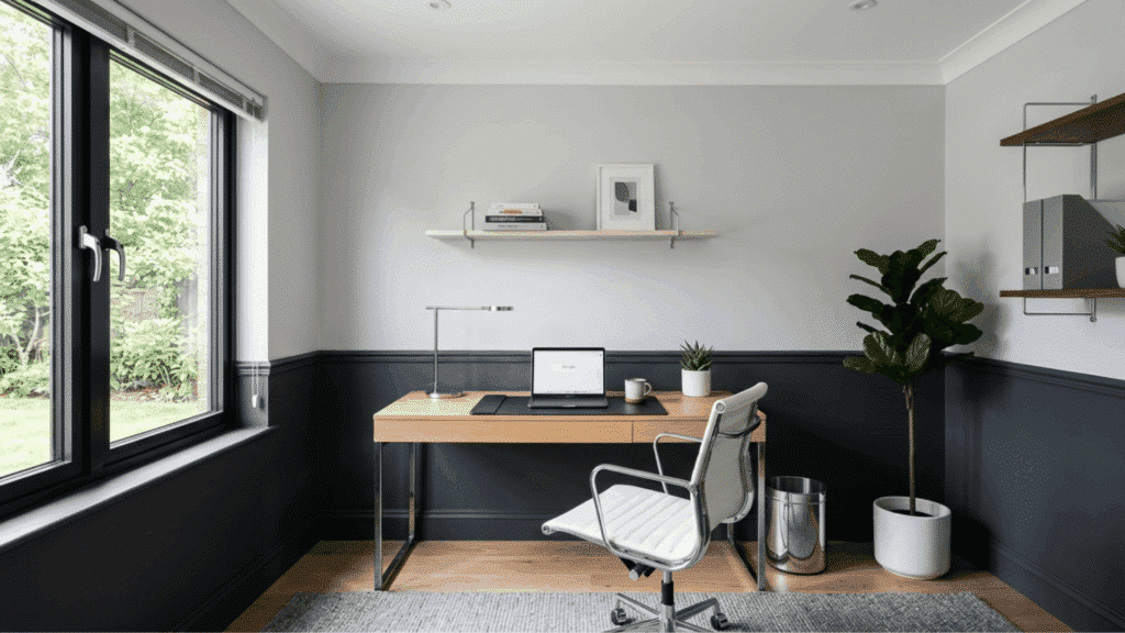
Light gray on the upper wall and charcoal on the lower half create a clean, modern contrast that suits contemporary interiors well.
- Best for: Home offices, modern living rooms, and studios. This pairing suits spaces where a focused and composed atmosphere is important.
- Styling Tip: Pair with white or light-colored furniture and keep accessories minimal to let the contrast remain the focal point.
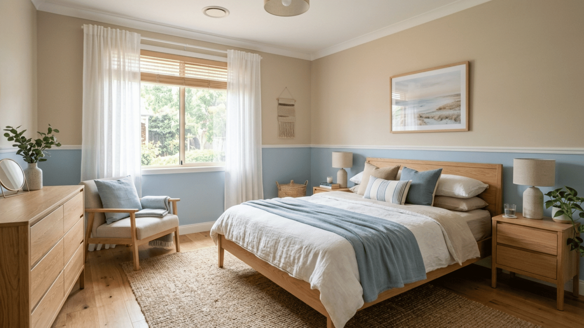
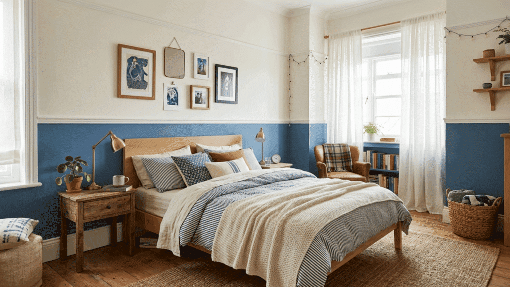
5. Dusty Blue and Crisp White
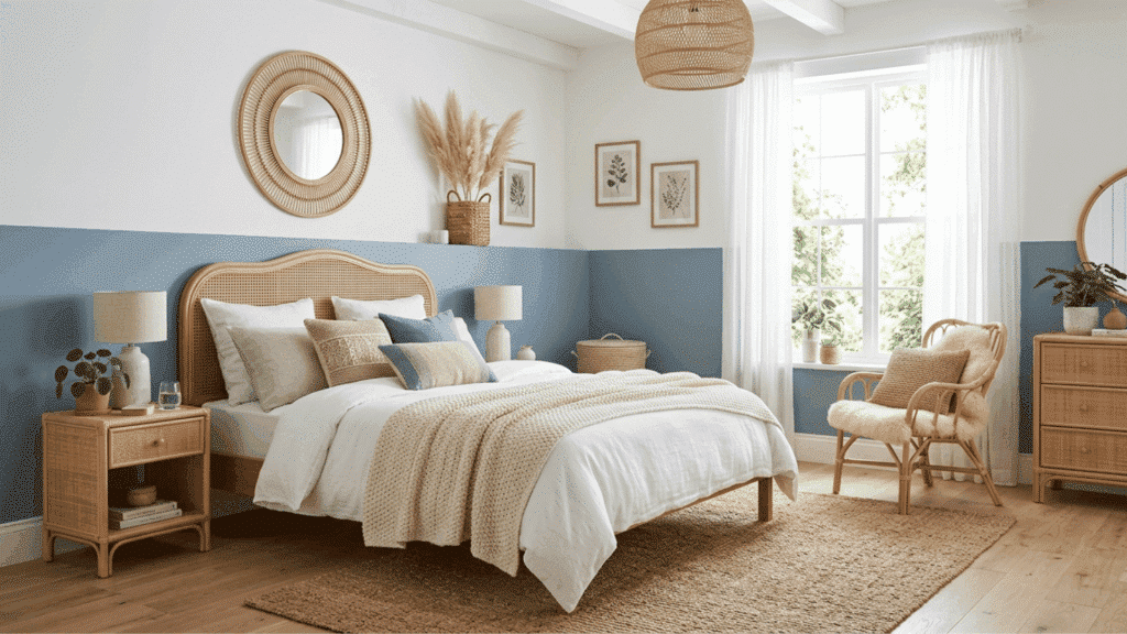
Dusty blue on the lower section of the wall with crisp white above gives a room a breezy, relaxed quality without going too coastal.
- Best for: Bedrooms, bathrooms, and light-filled lounges. The soft tone of dusty blue makes it one of the most versatile shades in the blue family.
- Styling Tip: Pair with white bedding, rattan furniture, and soft woven textures to enhance the relaxed and airy feel.
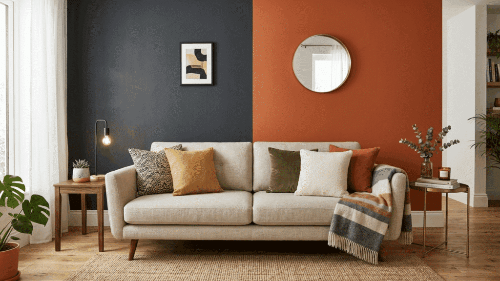
6. Terracotta and Warm Sand
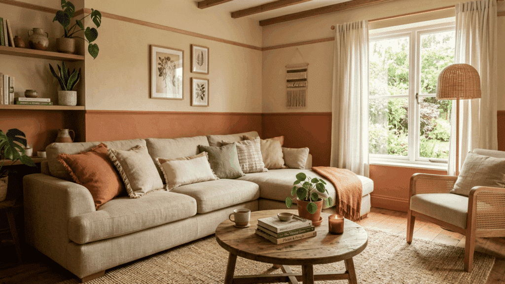
Terracotta on the lower wall and warm sand above bring an earthy, sun-warmed quality into the room. It is a combination that feels grounded and welcoming without being dark or heavy.
- Best for: Living rooms, entryways, and casual dining areas. This earthy palette creates a warm first impression and suits homes with a relaxed, natural aesthetic.
- Styling Tip: Pair with warm wood tones, linen cushions, and natural fiber rugs to enhance the organic feel of the palette.
7. Blush Pink and Soft Gray
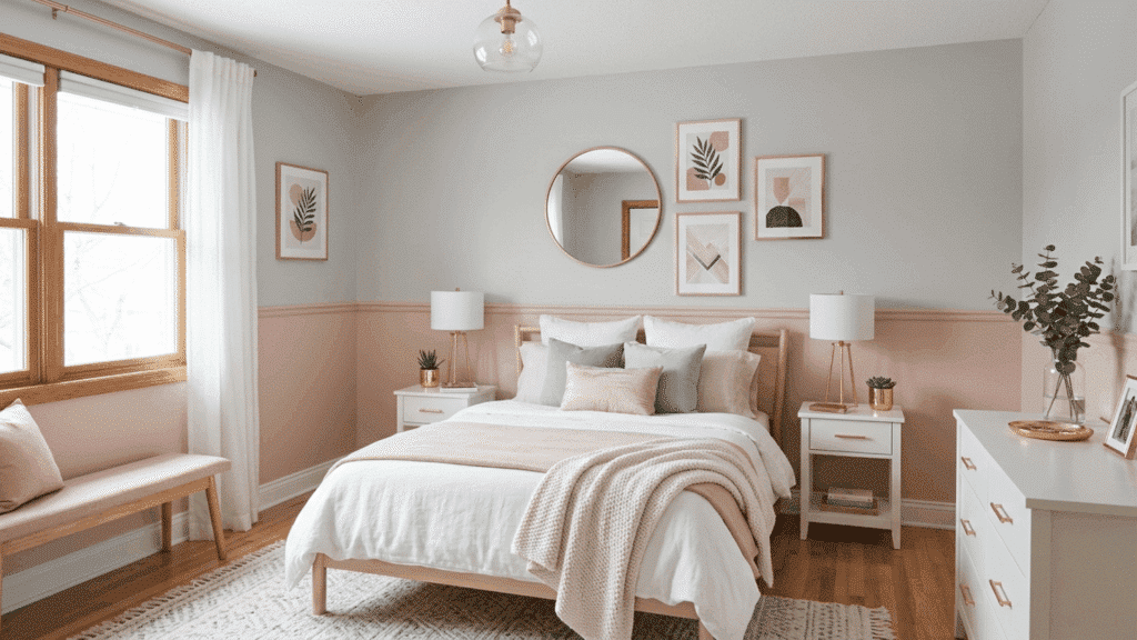
Blush pink on the lower half and soft gray above is a grown-up take on a pink room that feels calm and well-balanced. The gray brings enough neutrality to prevent the blush from feeling overly sweet.
- Best for: Bedrooms and dressing rooms. This pairing works for adults and children alike and strikes a good balance between warmth and calm.
- Styling Tip: Choose a muted, dusty blush rather than a bright candy-pink for a more refined, sophisticated result.
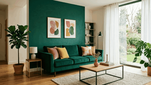
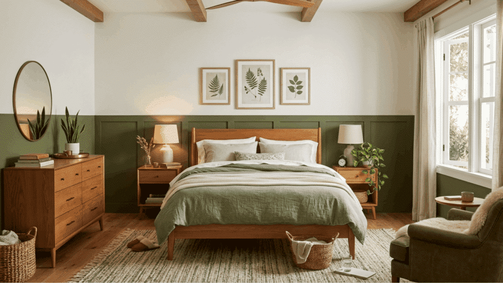
8. Forest Green and Light Beige
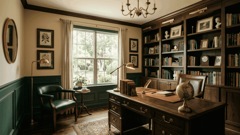
Forest green on the lower portion of the wall, paired with light beige above, creates a rich and grounded combination that feels almost library-like. It gives you a tropical feel.
- Best for: Living rooms, home offices, and studies. This pairing suits both period homes and modern interiors looking for a sense of depth and permanence.
- Styling Tip: Pair with dark wood furniture, warm lighting, and layered textiles to bring out the richness of the forest green.
9. Sky Blue and White Half
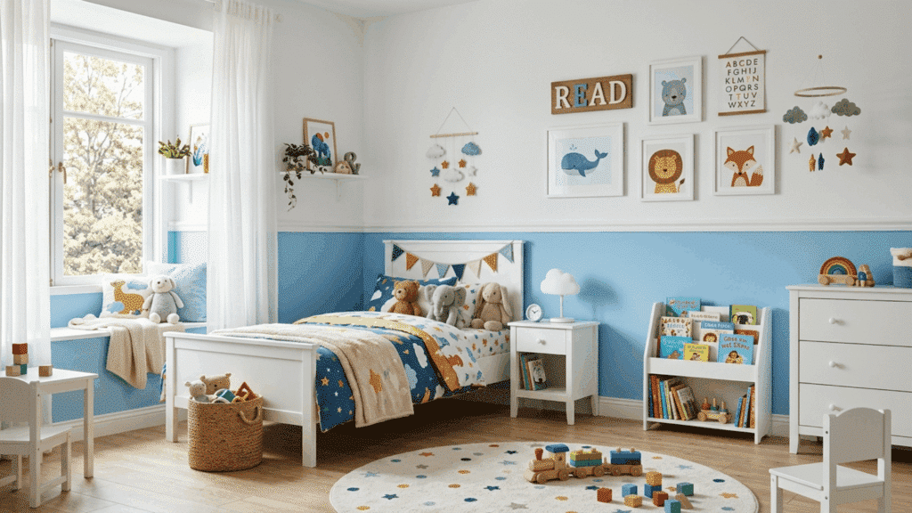
Sky blue on the lower half of the wall and white above make a bright, cheerful combination that works especially well in children’s rooms and playrooms.
- Best for: Kids’ rooms, playrooms, and hallways. This bright and friendly pairing creates an uplifting atmosphere that works well in high-traffic family spaces.
- Styling Tip: Pair with white furniture and simple, colorful accents to keep the room feeling fresh and easy to update as children grow.
10. Mustard Yellow and Cream
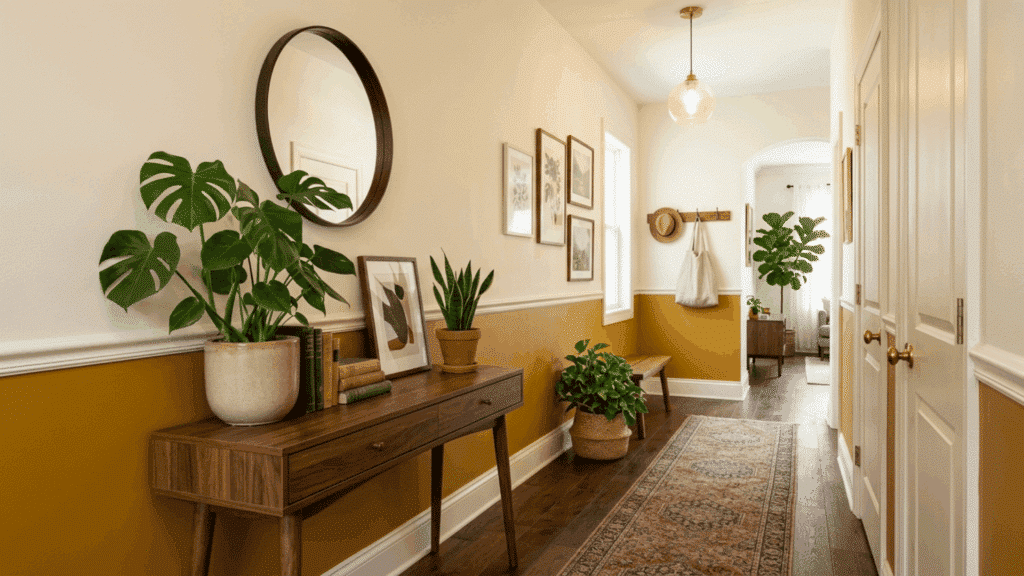
Mustard yellow on the lower third of the wall with cream above is a warm and inviting combination that suits entryways and hallways particularly well.
- Best for: Entryways, hallways, and kitchens. This warm and inviting palette sets a positive tone for the rest of the home and works well in narrower spaces, too.
- Styling Tip: Choose a deep, golden mustard rather than a bright neon yellow and pair it with warm wood tones and simple greenery for a grounded result.
11. Navy Blue and Mustard Yellow
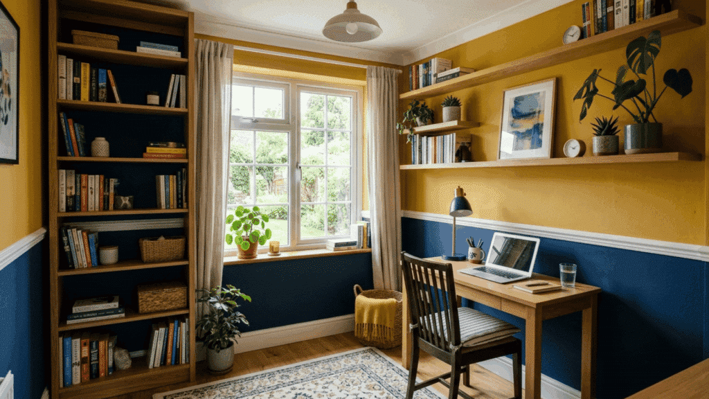
Deep navy on the lower portion of the wall paired with mustard yellow above creates a bold yet balanced combination that feels warm and modern.
- Best for: Living rooms, dining areas, and creative spaces. This pairing works well in rooms where you want a bit of personality without going too bright.
- Styling Tip: Pair with neutral furniture like beige, cream, or light wood to keep the bold colors from feeling heavy.
12. Black and Burnt Orange (Vertical Two-Tone)
Splitting the wall vertically with two contrasting colors creates a bold and graphic effect that feels very current. Two colors run side by side with a clean, straight line between them, and the result is modern and confident.
- Best for: Feature walls in living rooms and home offices. Vertical color blocking works best when the wall is wide enough to give both colors room to breathe.
- Styling Tip: Choose colors with strong contrast for the most impact and make sure the dividing line is perfectly vertical using a level and painter’s tape.
13. Blue and Orange (Diagonal Two-Tone)
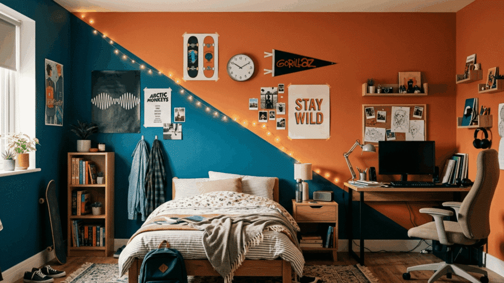
A diagonal paint line across the wall creates a dynamic and unexpected effect that adds real energy to a room. Use painter’s tape at an angle, apply your two colors on either side, and the result is a wall that feels modern and creative.
- Best for: Teen bedrooms, creative studios, and feature walls. The diagonal format adds a sense of energy and direction that suits expressive and active spaces well.
- Styling Tip: Use a spirit level and long strip of painter’s tape to keep the diagonal line clean, sharp, and consistent from one end of the wall to the other.
14. Olive Spring and Pure White
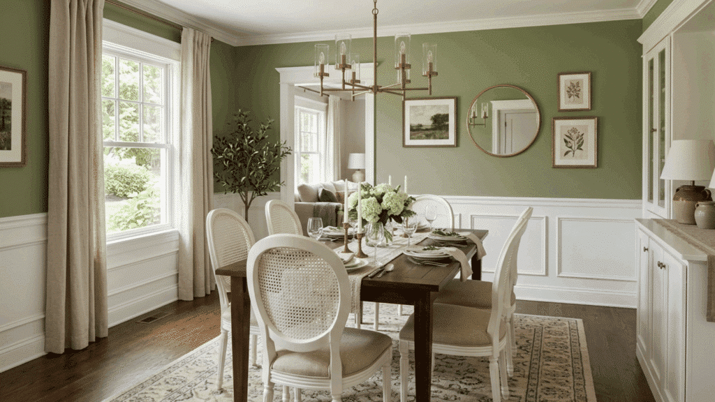
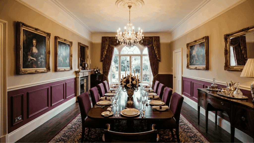
Chair rail molding running horizontally along the wall creates a natural and finished-looking divider between two paint colors.
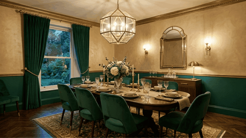
- Best for: Dining rooms, living rooms, and formal spaces. The chair rail adds structure and a sense of craft, uplifts the two-tone effect beyond a simple paint job.
- Styling Tip: Paint the lower section in a richer, deeper color and the upper section in a lighter shade to give the room grounding and visual balance.
15. Moss Green and Off White
Painting the lower half of the wall in a solid color and leaving the upper portion in a plain neutral is one of the most flexible two-tone wall paint ideas available.
- Best for: Rentals, bedrooms, and rooms where furniture and artwork are the main focus. This approach works well when you want color without overwhelming the overall design.
- Styling Tip: White or off-white on the upper section pairs with almost any color below, making this one of the easiest two-tone combinations to get right on the first try.
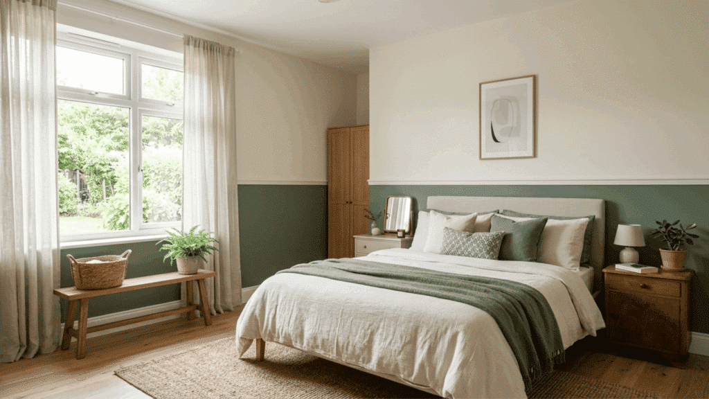
16. Olive Green and Off-White
Olive green on the lower wall, with off-white above, creates a calm, natural palette with a slightly vintage quality. It is a combination that feels comfortable and unfussy.
- Best for: Bedrooms, casual living rooms, and home offices. Olive green has a grounded, organic quality that suits rooms designed for comfort and long periods of time spent inside.
- Styling Tip: A matte finish on the olive green gives a softer, more organic result than a satin or gloss finish, keeping the mood relaxed rather than polished.
17. Teal and Light Gray
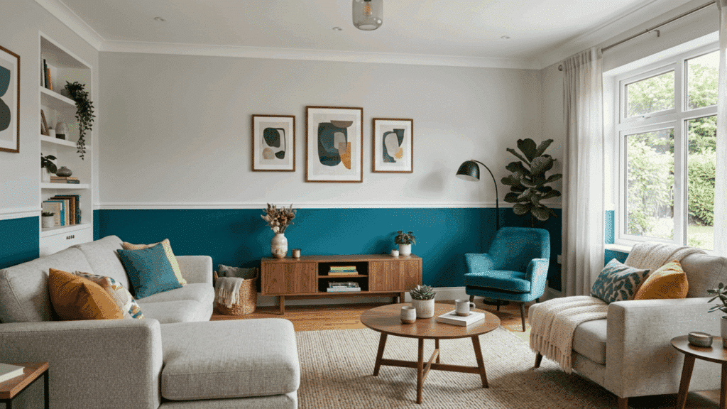
Teal on the lower portion of the wall, paired with light gray above, creates a fresh, contemporary pairing that suits modern interiors well. The teal brings energy and color while the gray provides a cool, composed backdrop above.
- Best for: Kitchens, modern living rooms, and home offices. Teal is bold enough to make a statement, but the gray above keeps the overall look composed and easy to work with.
- Styling Tip: Pair with white or light gray furniture, and keep accessories simple to let the teal remain the dominant, most interesting element in the room.
18. Lavender and Soft White
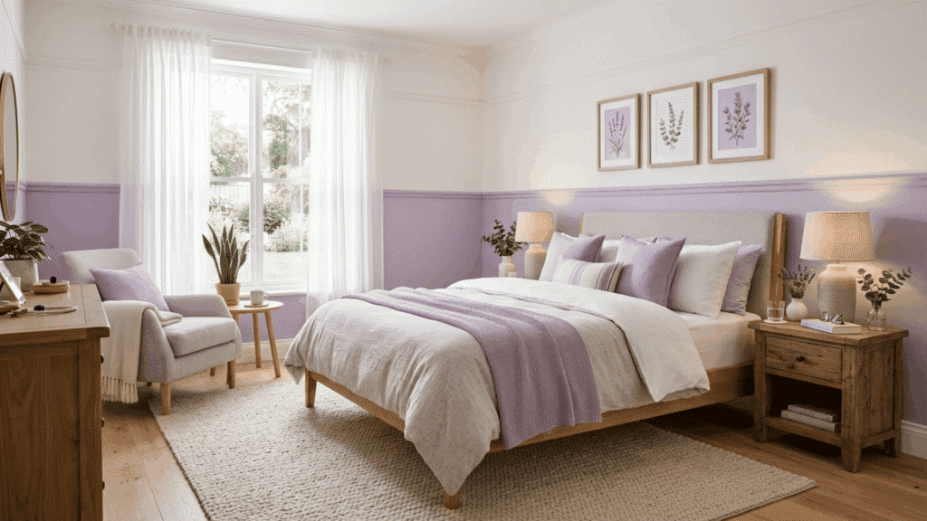
Lavender on the lower half of the wall, with soft white above, creates a gentle, restful combination that works beautifully in bedrooms.
- Best for: Bedrooms and reading rooms. A muted lavender paired with soft white creates one of the most genuinely calming color environments you can put together.
- Styling Tip: Keep furnishings simple, light, and uncluttered to let the softness of the lavender and white do its work without visual competition from the rest of the room.
19. Clay Brown and Cream
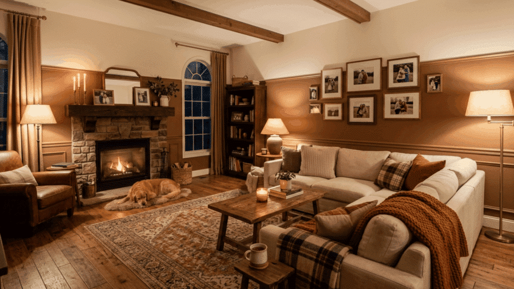
Clay brown on the lower wall and cream above create a warm and cozy combination that feels genuinely comfortable to be around.
- Best for: Family rooms, bedrooms, and cozy living spaces. Clay brown has a comforting, enveloping quality that makes rooms feel safe and lived-in without feeling heavy.
- Styling Tip: Pair with wooden furniture, warm-toned lighting, and layered, textured soft furnishings like knit throws and woven cushions for a complete, cohesive look.
20. Mint Green and Pale Yellow
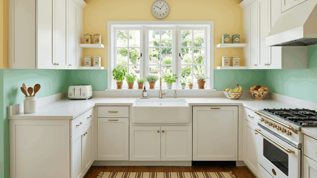
Mint green on the lower wall, paired with pale yellow above, creates a cheerful, fresh pairing that suits kitchens and breakfast areas particularly well.
- Best for: Kitchens, breakfast nooks, and children’s rooms. This light and happy palette works best in rooms that receive good natural light throughout the day.
- Styling Tip: White cabinetry and countertops complement this palette well, keeping the look fresh and clean without introducing competing colors.
21. Black and White
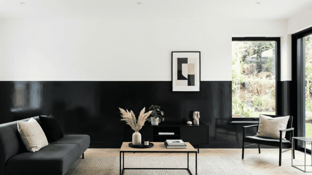
A black lower wall against a bright white background makes a strong, deliberate visual statement that suits minimalist and modern spaces.
- Best for: Modern living rooms, hallways, and home offices. The graphic quality of this pairing suits spaces where design confidence and bold choices are the intention.
- Styling Tip: Keep furniture and accessories to a minimum to let the contrast remain the clear focal point. Too many competing elements will soften the impact of the bold wall.
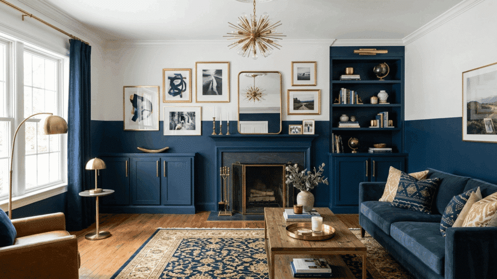
22. Dark Blue and White
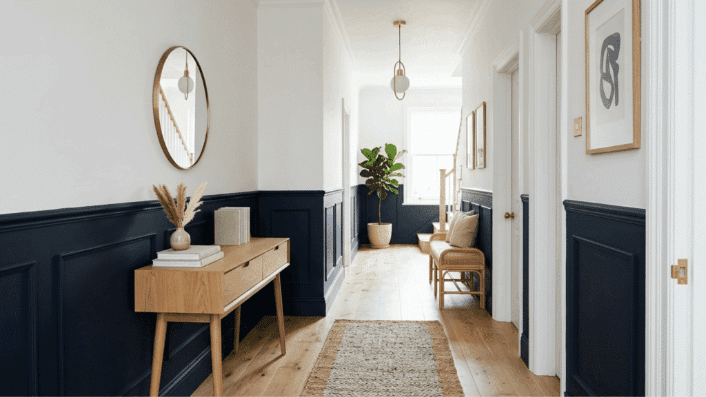
Deep navy or dark denim blue on the lower portion of a wall with white above creates a dramatic effect without painting the entire room dark.
- Best for: Hallways, living rooms, and behind beds or sofas. Using dark blue on only the lower portion of the wall gives you the impact of a deep color without the risk of the room feeling enclosed.
- Styling Tip: Pair with light-colored or natural furniture to balance the visual weight of the dark lower section and keep the room feeling comfortable rather than heavy.
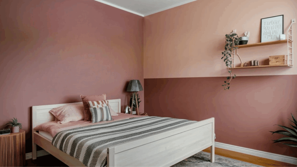
23. Coral and Peach
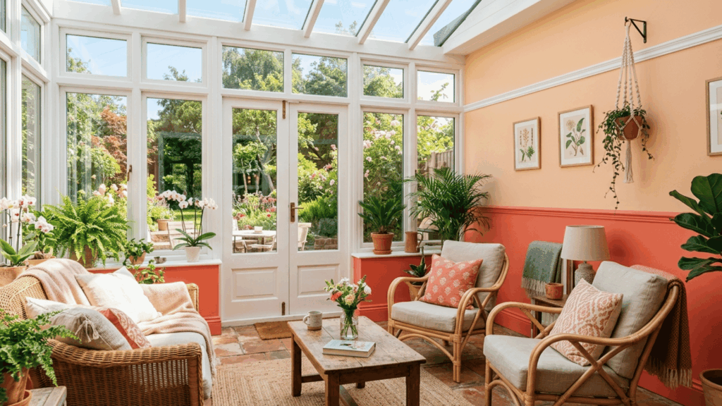
Coral on the lower half of the wall and peach above creates a warm, sun-filled combination that brings energy and lightness into a room.
- Best for: Sunrooms, kids’ rooms, and casual dining areas. The warmth of coral and peach together creates a lively, welcoming atmosphere that suits relaxed, informal spaces.
- Styling Tip: Natural light brings out the warmth of both tones, so try to use this palette in rooms that receive plenty of daylight throughout the day.
24. Burgundy and Beige
Burgundy on the lower wall with beige above gives a room a sense of richness and depth without feeling overwhelming. Burgundy adds drama and formality, while the beige above keeps the room relaxed.
- Best for: Dining rooms, living rooms, and home libraries. Burgundy has a formal, considered quality that suits rooms designed for entertaining or for long evenings spent indoors.
- Styling Tip: Pair with dark wood furniture and warm lighting to bring out the full richness of the burgundy and create a layered, atmospheric feel in the room.
25. Denim Blue and Warm White
Denim blue sits between navy and sky blue in tone, and it is one of the most relaxed and easygoing shades you can use on the lower portion of a wall.
- Best for: Bedrooms, bathrooms, and casual living rooms. Denim blue has an unpretentious quality that suits rooms designed for everyday comfort and relaxed living.
- Styling Tip: Pair with natural materials and simple, unfussy furniture to keep the laid-back quality of the combination consistent throughout the room.
26. Cream and Orange (Two-Tone with Arched Paint Design)
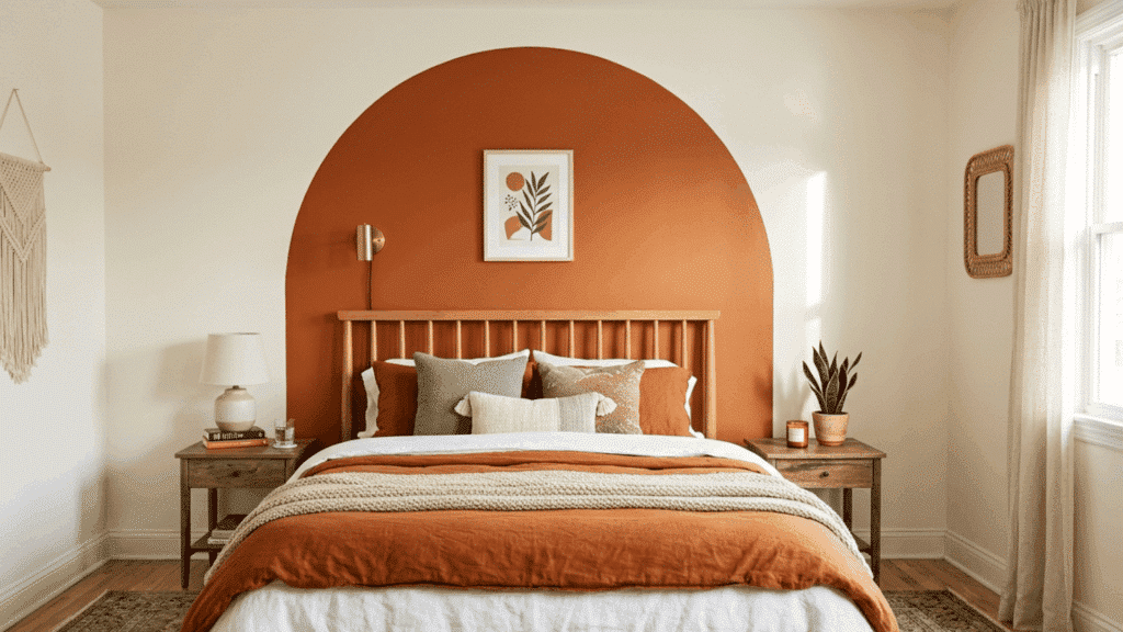
Painting a large arch in a second color creates a wall feature that feels artistic and intentional without requiring any structural changes.
- Best for: Above beds, behind sofas, and in reading corners. The arch adds a soft architectural quality to the wall that feels considered and creative without being difficult to achieve.
- Styling Tip: Use a pencil and string compass to draw a clean and even arch before applying any paint. Taking time with the outline makes the finished result look precise and deliberate.
27. Olive Green and Dusty Rose
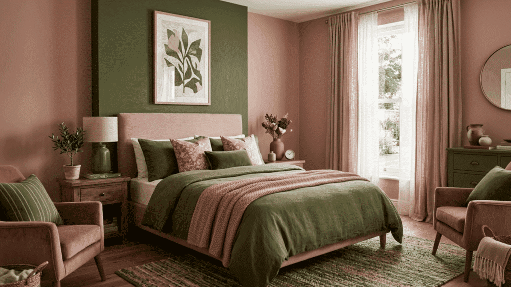
Olive green on the lower wall paired with dusty rose above creates a soft, earthy combination that feels warm and relaxed. The olive adds depth and a natural base, while dusty rose brings a gentle touch of color.
- Best for: Bedrooms, living rooms, and cozy corners. This pairing works well in spaces meant for comfort and quiet moments.
- Styling Tip: Pair with natural materials like wood, linen, and woven textures to enhance the organic feel.
28. Sage Green and Navy Blue
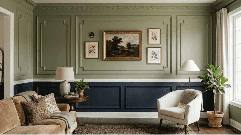
Installing simple molding or paneling in a grid or rectangular pattern, and painting the inside of each panel in one color while keeping the outer frame in another, creates a formal, structured look.
- Best for: Entryways, dining rooms, and formal living spaces. Wall paneling adds architectural quality to a room, making it feel more considered and well-crafted than paint alone.
- Styling Tip: Use a deeper color inside the panels and a lighter shade on the surrounding wall to give each panel a sense of depth and make the overall pattern stand out clearly.
29. Dusty Rose and Muted Peach
Choosing two shades that sit close to each other on the color spectrum and blending them softly at the meeting point creates a wall that shifts gently from one tone to another.
- Best for: Bedrooms, nurseries, and calming retreat spaces. This approach suits rooms where a soft and peaceful atmosphere is the priority over bold contrast or graphic impact.
- Styling Tip: Choose shades from the same color family for the most natural and smooth result. Two blues, two greens, or two warm neutrals blend much more convincingly than colors from opposite ends of the spectrum.
30. Orange and Off-White (Two-Tone with Painted Border)
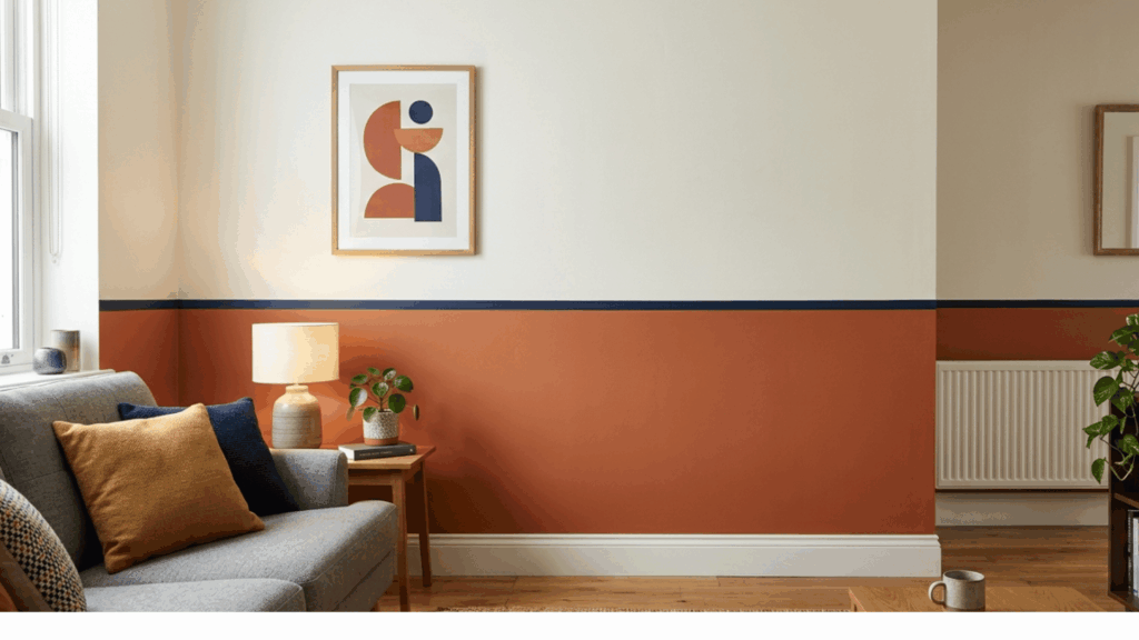
Using a thin painted stripe as the dividing element between two wall colors adds a deliberate and finished quality to the design.
- Best for: Living rooms, hallways, and any room where the two-tone effect needs more definition and polish. The painted border is a small detail that adds a noticeable level of refinement.
- Styling Tip: Choose a border color that ties into troom’s existing palette. A tone that picks up on a color already present in the furniture or soft furnishings naturally connects the wall to the rest of the room.
31. Warm Taupe and Ivory
Warm taupe on the lower half of the wall and ivory above create a soft and quiet combination that suits neutral interiors well.
- Best for: Living rooms, bedrooms, and spaces with statement furniture or artwork. This understated palette lets other elements in the room take the lead without the walls competing for attention.
- Styling Tip: Pair with natural textures, warm lighting, and simple accessories in similar tonal ranges to maintain the quiet, cohesive quality of the palette throughout the space.
32. Emerald Green and Gold-Beige
Emerald green on the lower portion of the wall, with warm gold-beige above, creates a rich, considered combination that feels genuinely distinctive.
- Best for: Dining rooms, home libraries, and feature walls in living spaces. Emerald green has a bold and confident quality that makes it well-suited to rooms designed for entertaining.
- Styling Tip: Warm lighting and natural wood tones complement this palette well. Avoid cool or overly bright lighting as it can flatten the richness of the emerald and reduce the warmth of the gold-beige.
33. Sage Green and Cream (Vertical Stripe Walls)
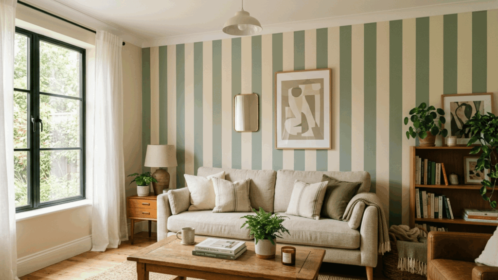
Alternating vertical stripes of sage green and cream create a wall that feels full of character without being loud or overwhelming.
- Best for: Living rooms, dining rooms, and bedrooms. Vertical stripes work especially well in rooms with standard ceiling heights.
- Styling Tip: Pair with warm wood furniture, linen soft furnishings, and simple indoor greenery to complement the natural quality of the sage and cream palette.
TipsFor Choosing The Right Two-Tone Wall Colors
Before trying two-tone wall paint ideas, keep a few simple design tips in mind. These small choices help the colors look balanced and natural in the room.
- Use darker shades on the lower half and lighter tones above to keep the space feeling grounded and open.
- Stick to colors from the same family for a smooth, natural transition between the two tones.
- Use a chair rail, molding strip, or painter’s tape to keep the dividing line between colors clean and sharp.
- Always test paint samples on the wall first, as lighting can change how colors look throughout the day.
- Match your wall tones to existing furniture, flooring, and decor so the room feels cohesive.
- In smaller rooms, lighter colors on top and deeper tones below help the space feel taller and more open.
Wrapping It Up
Two-tone wall colors are one of the simplest ways to refresh a room without spending a lot of time or money: just two shades, a good brush, and a clear idea of the look you want.
Whether you go for bold contrast or a soft, subtle shift, two-tone wall paint ideas add personality and depth to any space.
Try a half wall in your bedroom, a vertical split in your home office, or a striped feature wall in your living room.
Pick one from these two-tone wall paint ideas and get started. Sometimes a small paint change is all it takes to make a space feel fresh and new.

Alex Guerrero, a graduate with a Fine Arts degree from the Rhode Island School of Design, has been a visionary in the world of color and design for over 15 years. His professional journey began in the heart of the fashion industry in Milan, where he developed an acute sense for color harmonies and trends. Alex joined our team in 2018, offering fresh and innovative perspectives on color utilization in various spaces. Renowned for his ability to blend contemporary trends with timeless elegance. Outside of work, Alex is an accomplished painter and a volunteer art therapist, his artistic talents further enriching his professional insights.