
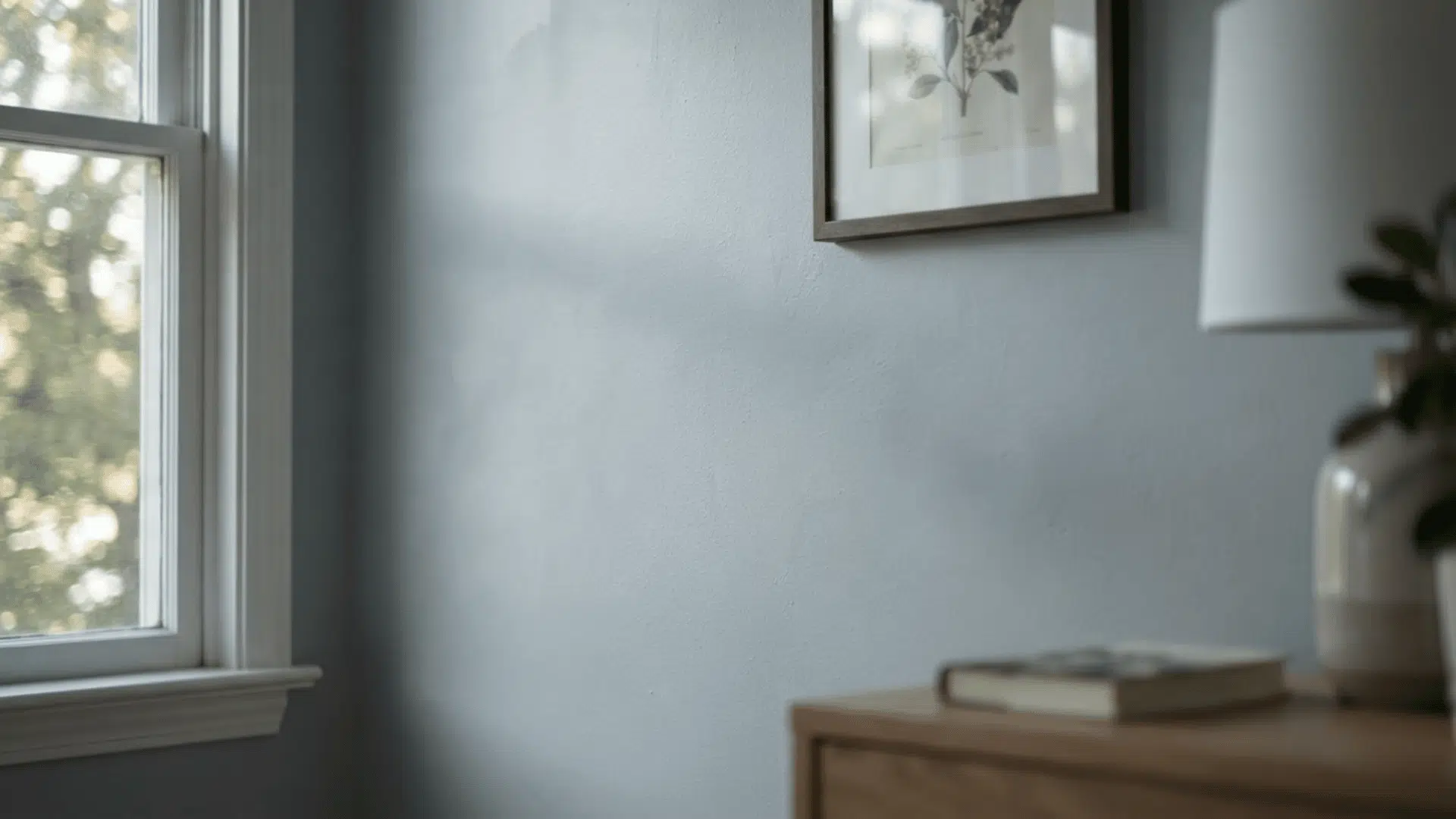

Picking a paint color always sounds easy until you actually try it. You grab a swatch of Sherwin-Williams Ice Cube, hold it up against your wall, and think… wait, is this white? Is it gray? Why does it suddenly look blue?
You are not imagining things. Ice Cube is one of those colors that changes depending on the light in your room, the time of day, and even your light bulbs.
That can feel confusing when you are trying to pick one color for your whole house.
In this post, I will break it all down for you. I will cover how Ice Cube looks in different lighting, which rooms it works best in, what trim and colors pair well with it, and how it compares to similar shades.
By the end, you will know exactly what to expect on your own walls.
Is Sherwin-Williams Ice Cube White, Gray, or Blue?
Ice Cube (SW 6252) is a cool light gray with a soft blue undertone. Its LRV sits around 77, which means it reflects a lot of light. To me, it lands somewhere between a crisp white and a gentle pastel blue.
If you are like me and worried it might turn into baby blue on a big wall, I understand that fear completely. The truth is, it can lean that way in the wrong light.
“One small tip before you go further: paint a sample on at least two different walls in the same room, since even one wall can look different from another depending on where the light hits it.”
What Real Homeowners are Saying About Ice Cube’s Blue Tint
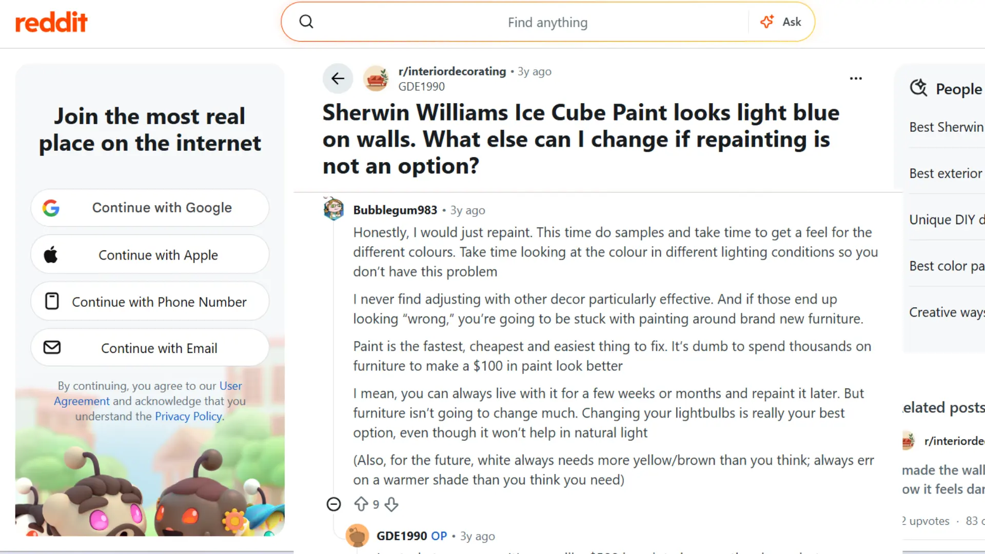
I came across a Reddit discussion where someone painted their living room and bedroom in Ice Cube, only to watch it turn noticeably light blue in natural daylight.
Several commenters pushed back on trying to fix the color with furniture or trim alone, saying it rarely works as well as people hope and often just adds cost.
One tip that stuck with me was about trim: warm white trim tends to make the blue look stronger, while a cleaner, brighter white trim helps balance it out.
Someone also mentioned that cool accent colors like navy or teal can pull focus away from the blue, while warm tones tend to make it stand out more.
How Ice Cube Changes in Different Light
I noticed pretty quickly that this color does not act the same way in every room of my house. The light coming through your windows, and even your bulbs, changes everything.
1. North Facing and Low Light Rooms
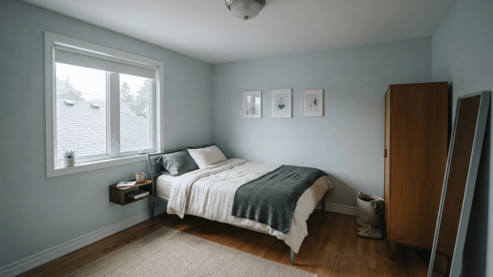
In a north-facing room, the blue really comes out. The light in these spaces is cool and indirect, so it pulls that undertone forward fast.
If your room does not get much sun during the day, do not be surprised when Ice Cube leans toward a soft, chilly blue instead of a plain gray on your walls.
“If you still want to use it here, try pairing it with warm wood furniture or a warm-toned rug to soften the effect instead of fighting it with lighting alone.”
2. South and West Facing Rooms
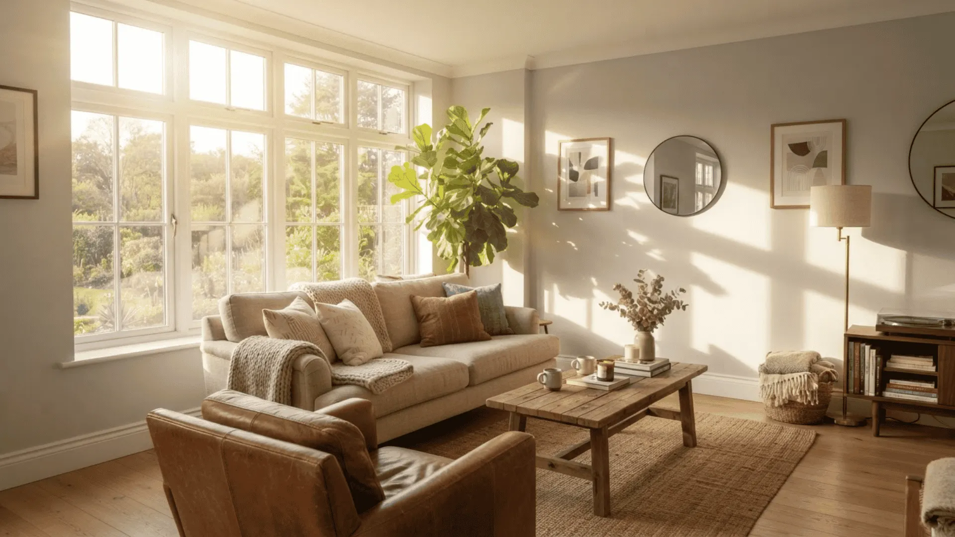
This is the exposure I trust the most. Warm afternoon sun pours in and calms down the cool undertone almost completely.
In south-facing spaces, Ice Cube settles into a soft, balanced gray that looks close to the actual paint chip.
If you want the safest bet for predictable results, this exposure gives you the best chance of getting the color you expected when you first tested it.
3. Artificial Lighting and Bulb Temperature
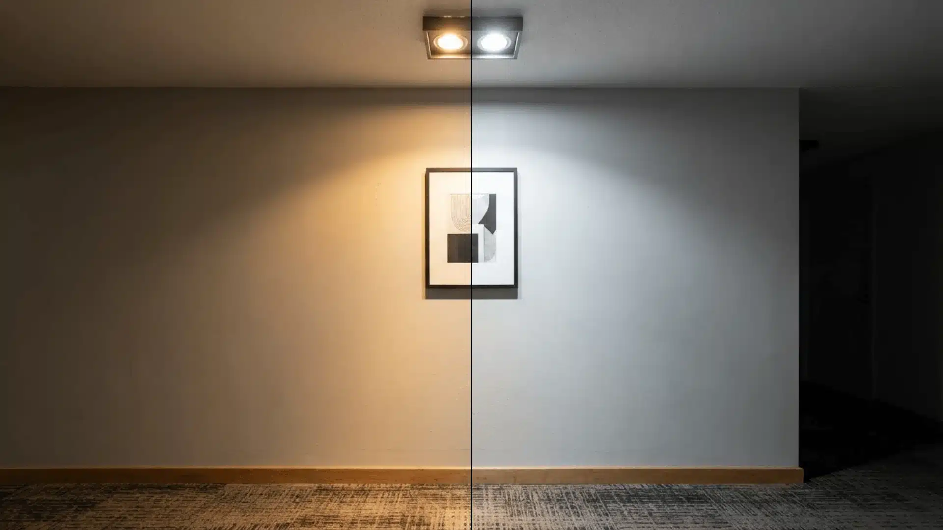
I learned this lesson the hard way in my own hallway. Warm, yellow-toned bulbs made the color look a little muddy and off compared to daylight.
Once I switched to bulbs in the 3000K to 4000K range, the color looked crisp again.
I also noticed textured ceilings held onto shadows, which made the blue tone stand out even more, especially at night when natural light was not around to balance things out.
Using Ice Cube on Walls in Your Home
Once I understood how light changes this color, the next question was simple. Where should I actually use it, and where should I hold back?
Best Rooms for Ice Cube
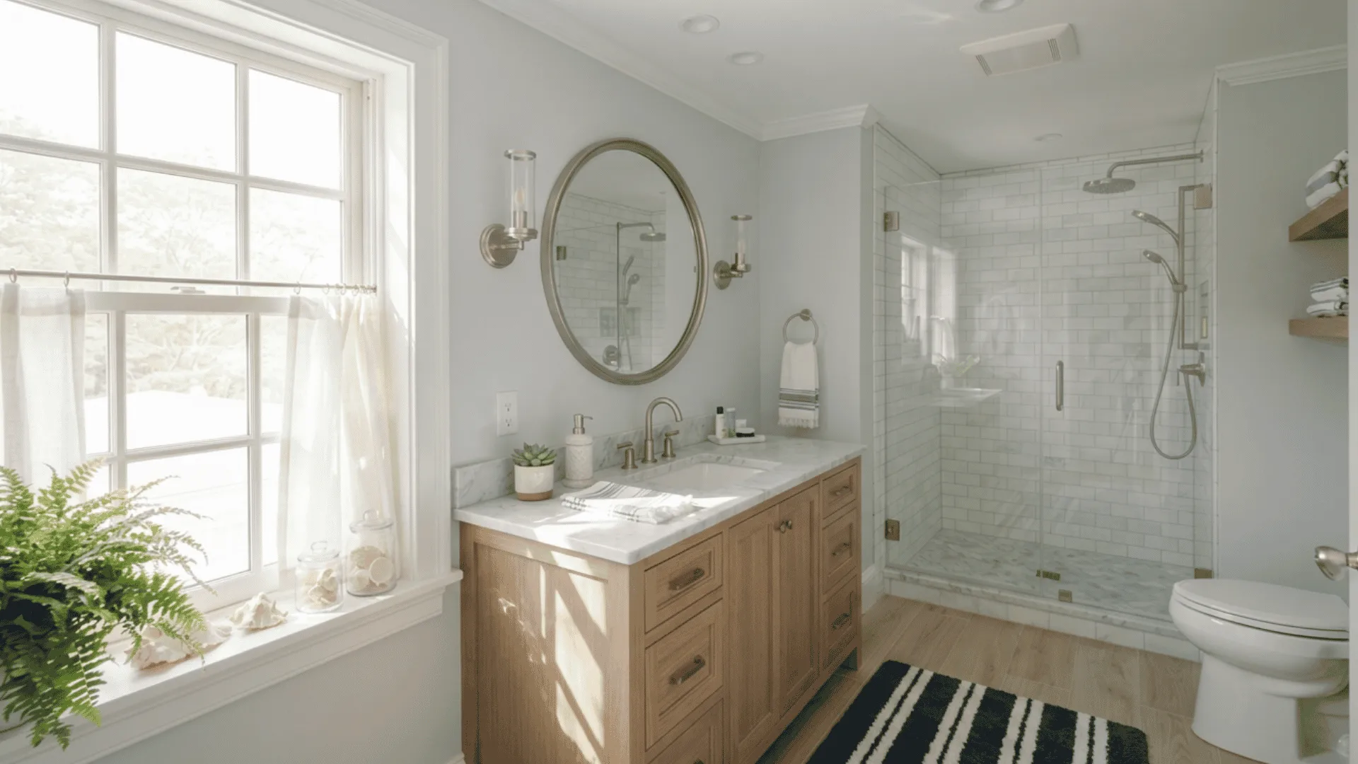
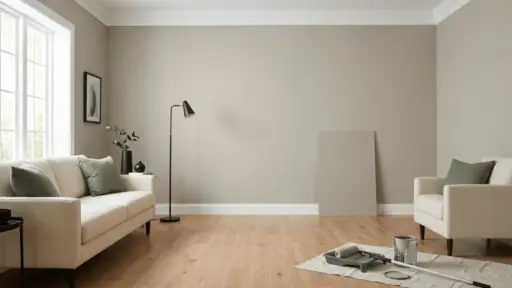
This color works well in bedrooms, bathrooms, entryways, and open living spaces that get plenty of natural light.
It gives coastal and modern rooms a clean, airy feel without going too pale.
If your goal is a bright, flexible neutral for most of your house, these are the spaces to start with first, since they tend to show the color at its most reliable and true to the swatch.
Rooms to Approach With Caution
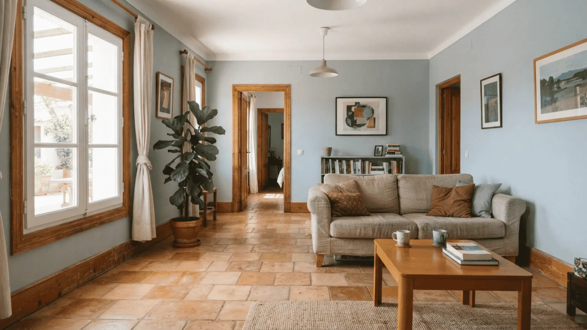
I would think twice before using Ice Cube in a dark room with small windows or a north-facing exposure. Spaces with warm materials, like terracotta tile or amber-toned wood, are worth extra caution too.
Those combinations tend to make the cool undertone feel more obvious by contrast rather than blending in.
A quick sample test on the actual wall will tell you far more than the paint chip ever could.
Pairing Ice Cube With Trim
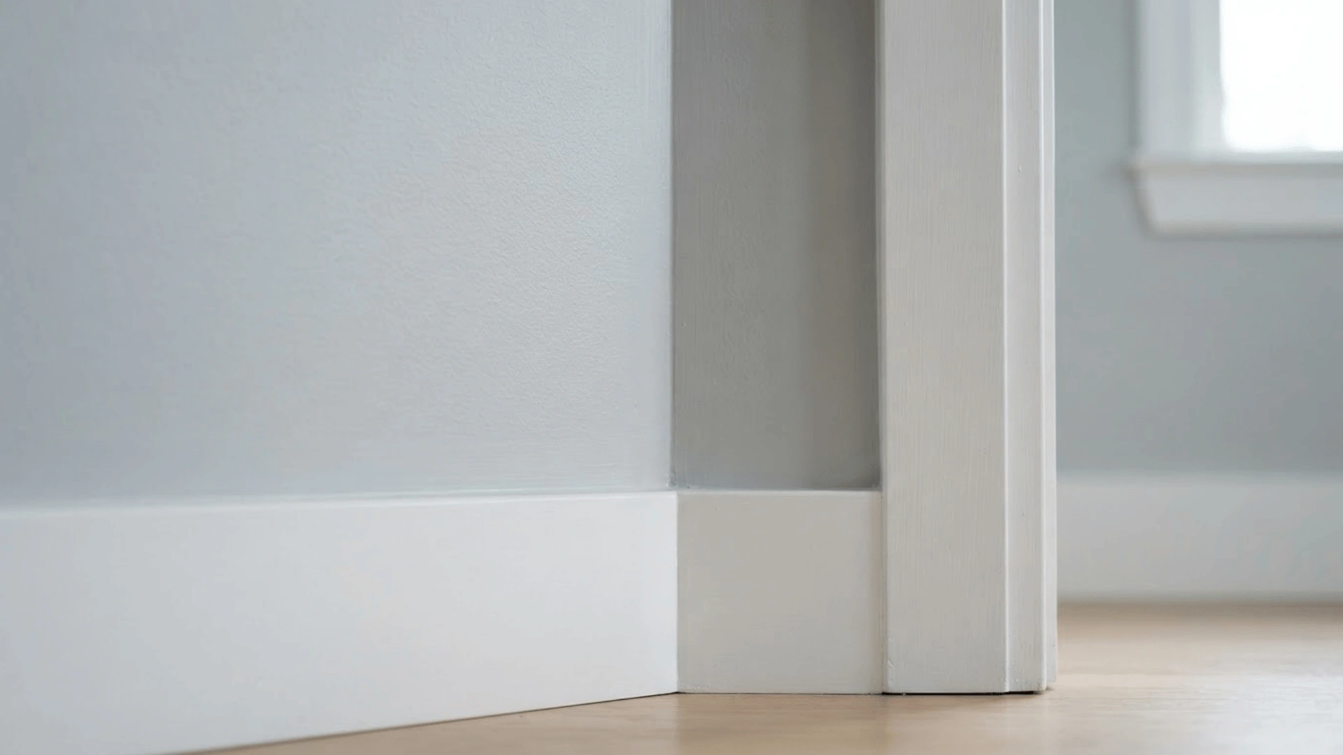
Once I settled on Ice Cube for my walls, trim was my next decision. I went with a crisp white, and I really liked the clean contrast it created against the wall color.
If you want something a little softer, a warmer white trim works too and eases the transition between wall and trim. Sheen matters here as well.
I used a flat finish on my walls, which softened the blue undertone a bit. For trim and doors, a satin or semi-gloss finish added a nice, sharp edge.
One thing I noticed in my own home is that a very stark white trim made the undertone in my walls more noticeable by contrast, so keep that in mind when picking yours.
Colors that Pair Well With Ice Cube
Picking trim was only half the puzzle for me. The other half was figuring out which accent colors actually made Ice Cube feel finished instead of flat.
Cool and Dark Accent Colors
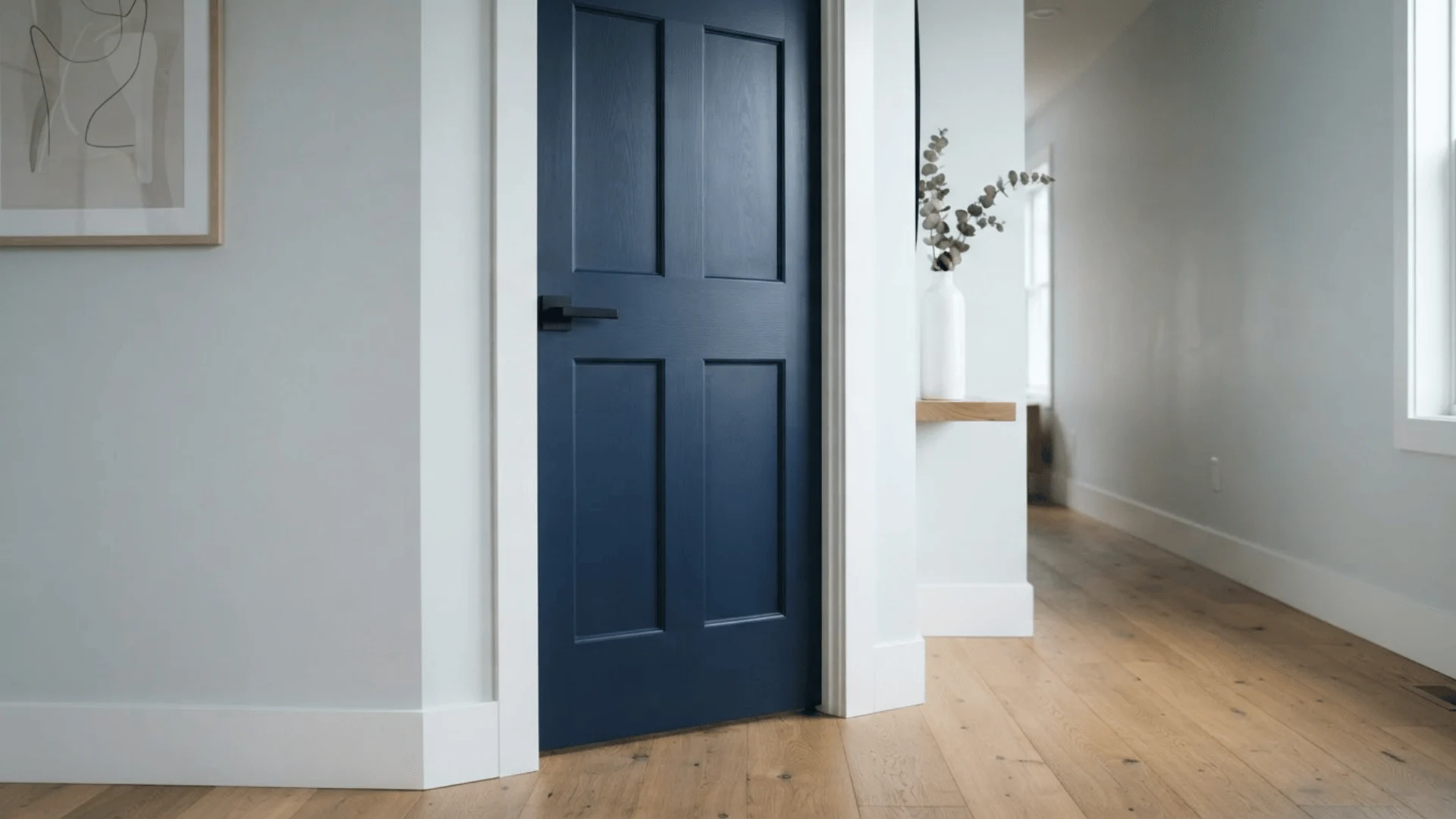
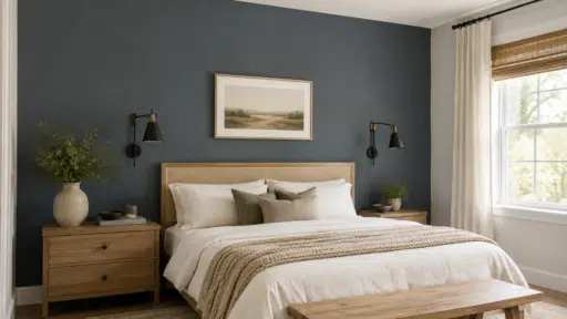
Darker blue grays and navy tones work well alongside Ice Cube since they pull out the same cool undertone instead of fighting against it.
Try this pairing on an interior door, and it gives the space a grounded, intentional look instead of one flat, pale color spread across every wall. It also helps the lighter walls feel more purposeful rather than accidental.
Warm Counterbalance Colors
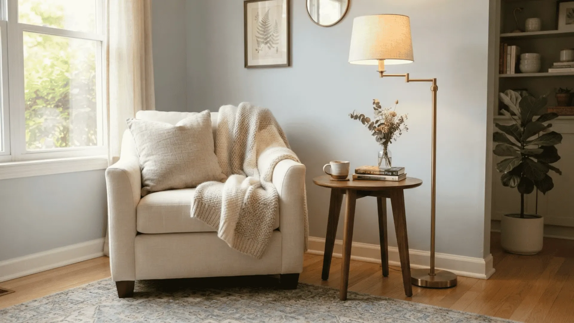
To keep rooms from feeling too cold, lean on warm wood tones like walnut and oak, along with brass hardware and cozy textiles like linen.
These small touches make a noticeable difference in how a room feels day to day.
If your space already feels a bit cool from the lighting, this kind of balance helps warm things up without covering up the color you chose in the first place.
Ice Cube Compared to Similar Sherwin-Williams Colors
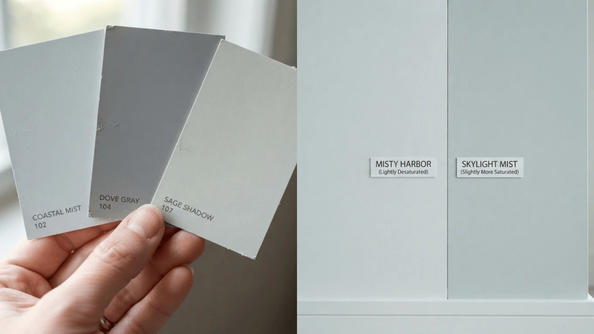
Before landing on Ice Cube, I looked at a few other Sherwin-Williams shades side by side to see how they really stacked up.
Each one shares a similar light, cool base, but the small differences in LRV and undertone end up making a bigger impact on the wall than you would expect from a paint chip alone.
Here is a quick breakdown of how each one compares and where it tends to work best.
| Color | LRV | Undertone | Best For |
|---|---|---|---|
| Ice Cube | ~77 | Blue-gray | Balanced, versatile spaces |
| Olympus White | Slightly lower | Deeper blue-gray | Bright, sun-drenched rooms |
| Nebulous White | Lower | Moodier gray | Rooms wanting more depth |
| Rhinestone | ~77 | Minty green | Warm wood or terracotta pairing |
Understanding LRV and Why Ice Cube Shifts so Much
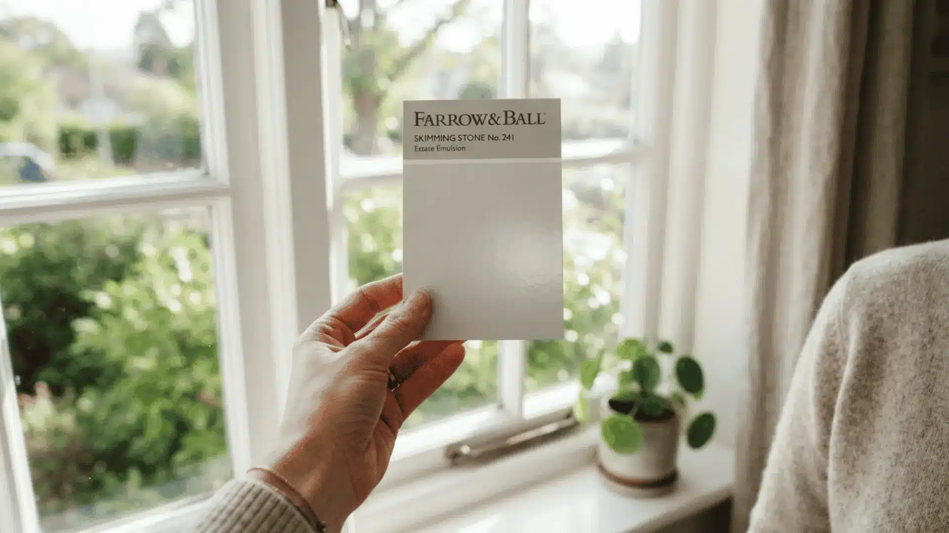
Once I learned what LRV actually meant, so much about my own walls started to make sense. LRV stands for light reflectance value, and it measures how much light a paint color bounces back into a room.
The scale runs from 0 to 100. Ice Cube sits around 77, which is high, so it reflects a large amount of whatever light is around it. That is exactly why my walls looked different from room to room in my own house.
A high LRV color like this one soaks up the light nearby, if that light is warm or cool, and shows it right back at you.
Primer and Application Tips for Ice Cube
Before I picked up a paintbrush, I wish someone had told me a few of these things. Here is what actually made a difference on my own walls.
- Use a gray-tinted, high-hide primer: I skipped the plain white primer and went with a gray-tinted one instead. It kept old warm tones from peeking through and gave me a much truer base for the Ice Cube to sit on.
- Apply two full coats: This lighter shade shows roller marks if you spread it too thin. Two full coats gave me even coverage and helped the color look consistent across the whole wall.
- Keep a wet edge while rolling: Working in sections and keeping a wet edge stopped streaky lines from showing up once the paint dried completely.
Final Thoughts
After living with this color on my own walls, I can say it rewards a little patience. It is not a color you can judge from one glance at a swatch.
Between the lighting in your room, the bulbs you choose, and the trim you pick, Ice Cube can look completely different from house to house, and even room to room.
What I have learned is simple. Check your light direction first, choose your trim and sheen with intention, and always test a sample before committing to gallons. Do that, and this color can give your home a soft, clean, put-together feel.
If you decide to try Ice Cube in your own space, I would love to hear how it turned out for you. Drop a comment below and let me know which room you used it in.
Frequently Asked Questions
Does Ice Cube Work on Kitchen Cabinets?
Yes, it can work well on cabinets, especially with brass or nickel hardware. I would test a sample door first, since cabinet lighting often differs from nearby wall lighting.
Is Ice Cube a Good Color for Small Rooms?
Yes, its high LRV helps small rooms feel more open and airy. Just watch your lighting closely, since small rooms with few windows can pull the color cooler.
Can I Use Ice Cube on My Home’s Exterior?
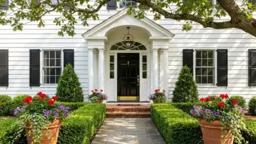
Yes, it works outdoors, especially on homes with lots of trim detail. Shaded, wooded lots may bring out a slightly greener or grayer cast than expected.
Does Ice Cube Look Good With Gray Countertops?
Yes, gray countertops usually pair nicely since they share a similar cool base. I would still bring a sample home to check it against your actual stone.

Alex Guerrero, a graduate with a Fine Arts degree from the Rhode Island School of Design, has been a visionary in the world of color and design for over 15 years. His professional journey began in the heart of the fashion industry in Milan, where he developed an acute sense for color harmonies and trends. Alex joined our team in 2018, offering fresh and innovative perspectives on color utilization in various spaces. Renowned for his ability to blend contemporary trends with timeless elegance. Outside of work, Alex is an accomplished painter and a volunteer art therapist, his artistic talents further enriching his professional insights.