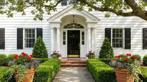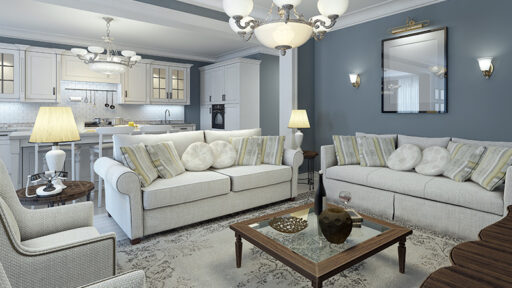
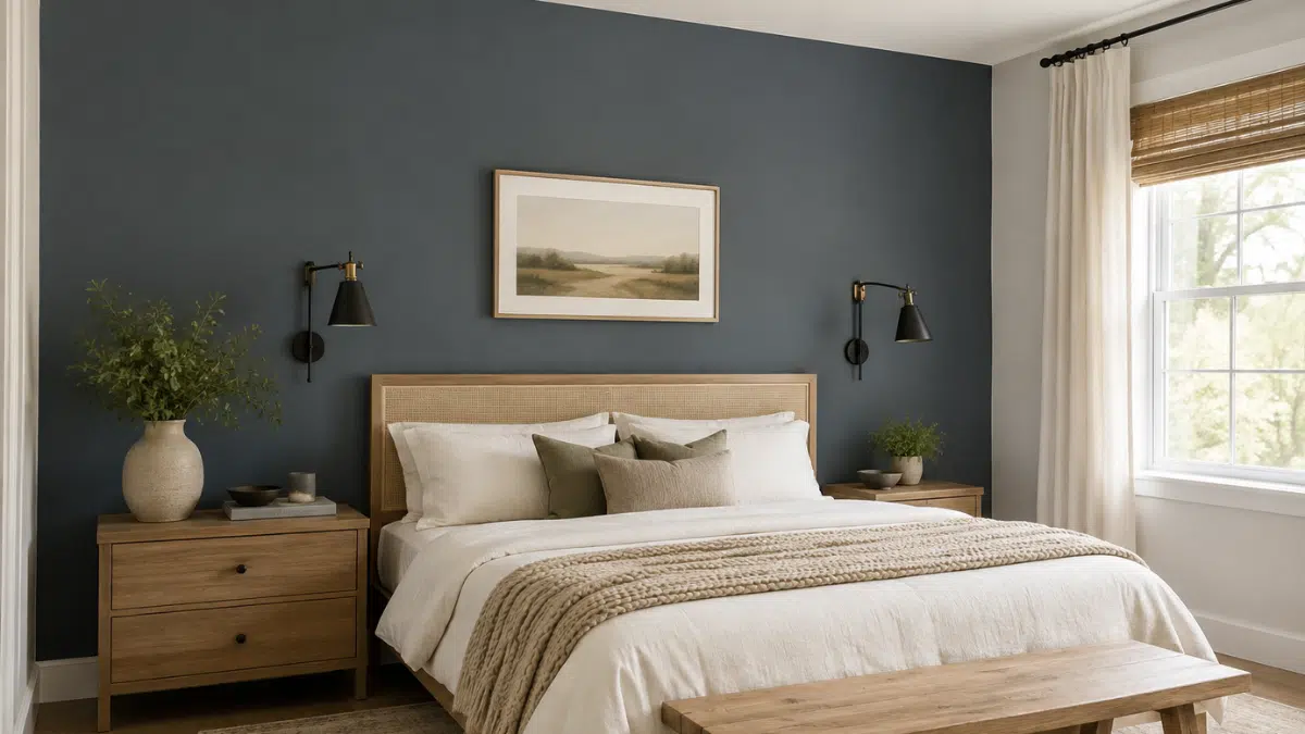

Slate Tile Sherwin-Williams (SW 7624) is a deep blue-gray that adds contrast without the harshness of black.
With an LRV of around 15, it sits firmly in the dark color range, but the balance between blue and gray shifts constantly.
In bright natural light, the blue undertone comes through more prominently; under warm artificial lighting, it reads softer and slightly warmer.
Real rooms show it working on shiplap, barn doors, cabinetry, bedrooms, laundry rooms, and exteriors, and I’ve gathered those examples below alongside sampling guidance.
My advice before you buy a gallon: order a peel-and-stick sample, move it around your own space, and judge it in your light rather than on a screen.
The recurring complaint isn’t the color; it’s the coverage. Dark blue-grays like this often need three coats over a light base.
Inside the Slate Tile Shade
Slate Tile is a dark blue-gray rather than a true navy or a flat charcoal.
When I look at it closely, the base reads gray with a clear blue tint and a faint green cast in certain light, which is what stops it from feeling dull.
At an LRV of around 15, it reflects very little light, so I’d use it on focal areas: one wall, a door, a run of cabinetry. Besides warm whites, I find the blue jumps forward.
In shaded rooms, it settles into gray. Natural light pulls out its cooler side. Treat screen images as reference only; my monitor never renders this shade the way a wall does.
Slate Tile Sherwin-Williams vs. Similar Blue-Grays
Here’s how each similar blue-gray shade compares with Slate Tile:
- Waterloo (SW 6221): Leans grayer with very little blue, so it may look flatter in low light.
- Grays Harbor (SW 7674): Appears lighter overall and lacks the distinctive blue tint found in Slate Tile.
- Smoky Blue (SW 7604): Shows more visible blue and reads closer to a true blue-gray.
For a lighter, warmer alternative, see how Popular Gray Sherwin-Williams works in different rooms and lighting conditions.
Overall, Sherwin-Williams Slate Tile stands out for its balanced mix of deep gray and subtle blue undertones.
Knowing About Slate Tile Sherwin-Williams Before You Sample It
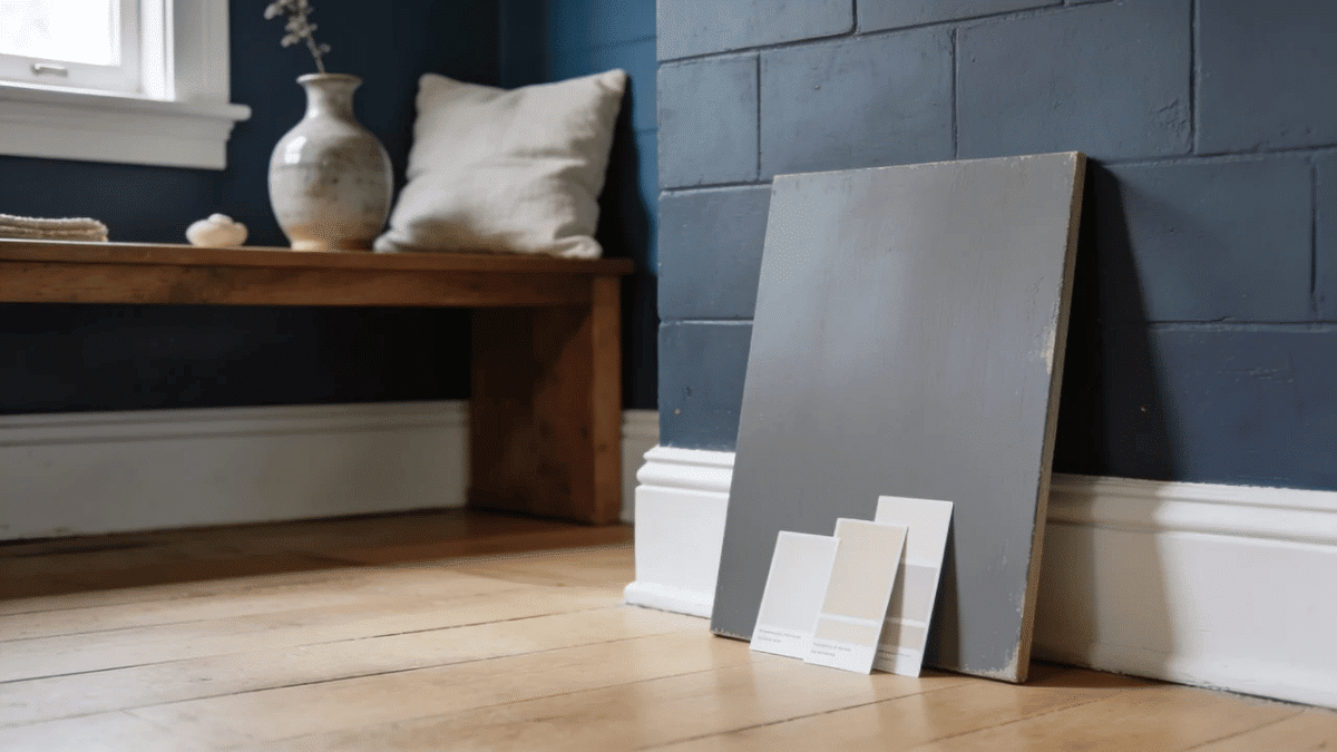
I get asked the same handful of questions about this shade every time it comes up. Here they are answered in one place, before we get to the real-room examples.
| Feature | What To Expect |
| Colour Code | Slate Tile SW 7624. |
| Colour Family | Deep blue-gray, with a gray base and a blue tint. |
| LRV | Around 15, so it reflects very little light. |
| How It Reads | Dark and quiet rather than harsh, unlike black. |
| Best Uses | Accent walls, doors, cabinetry, shiplap, exteriors. |
| Bright Natural Light | Cooler, and the blue becomes obvious. |
| Low or Warm Light | Grayer, softer, noticeably deeper. |
Where Slate Tile Sherwin-Williams Looks Best?
A color this dark works best where it has a job to do: a focal point, a textured surface, a clear boundary.
Never a default.
The best reference I have found is one home that used Slate Tile across several rooms rather than mixing three different darks, and that restraint is the lesson worth taking
1. Shiplap and Textured Walls
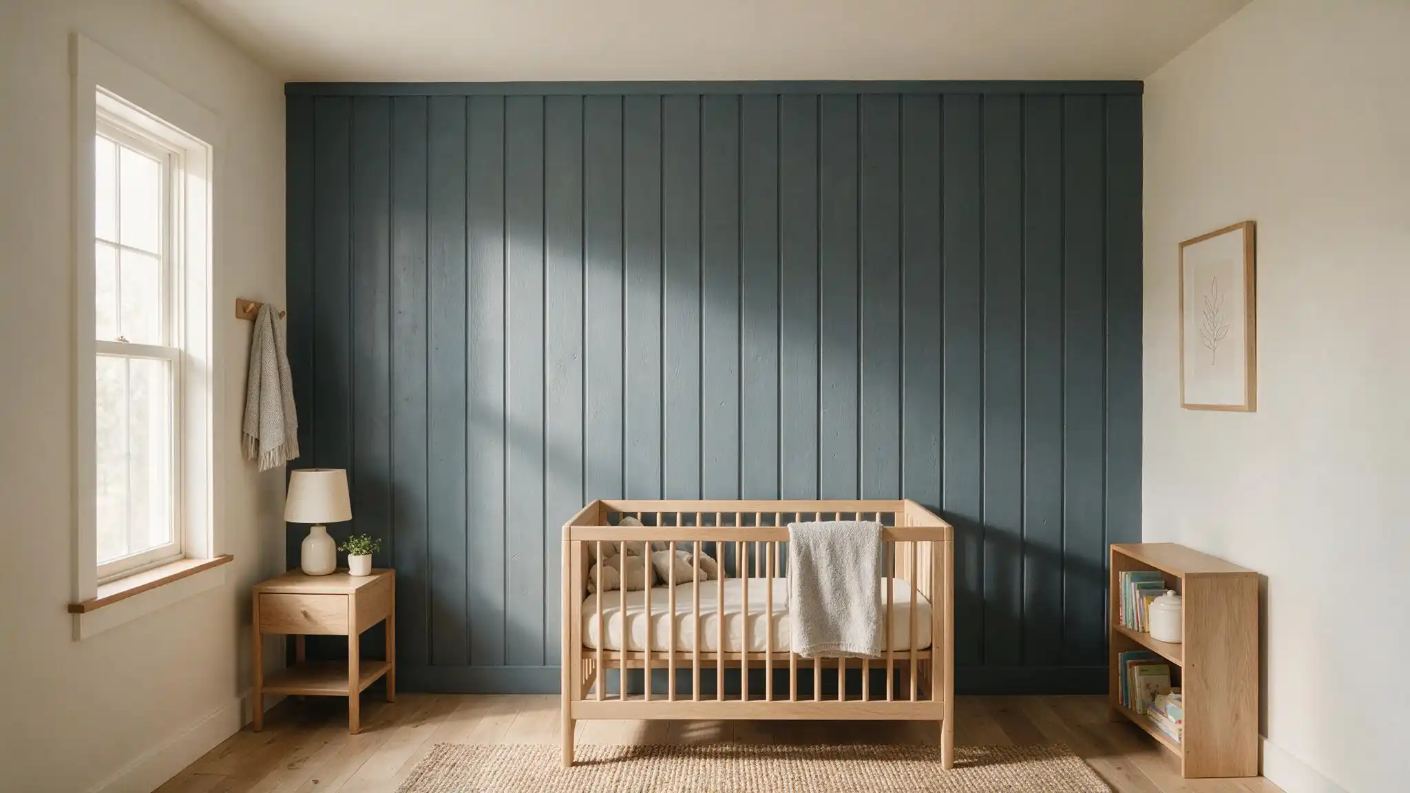
Texture is what sells this color.
Every board edge throws a small shadow, so the wall reads as several tones instead of one flat block.
Horizontal boards widen a narrow room, vertical boards lift a low ceiling, which is why vertical shiplap works behind a crib.
Sample textured surfaces separately, because grooves darken the result.
2. Exterior Doors and Shutters
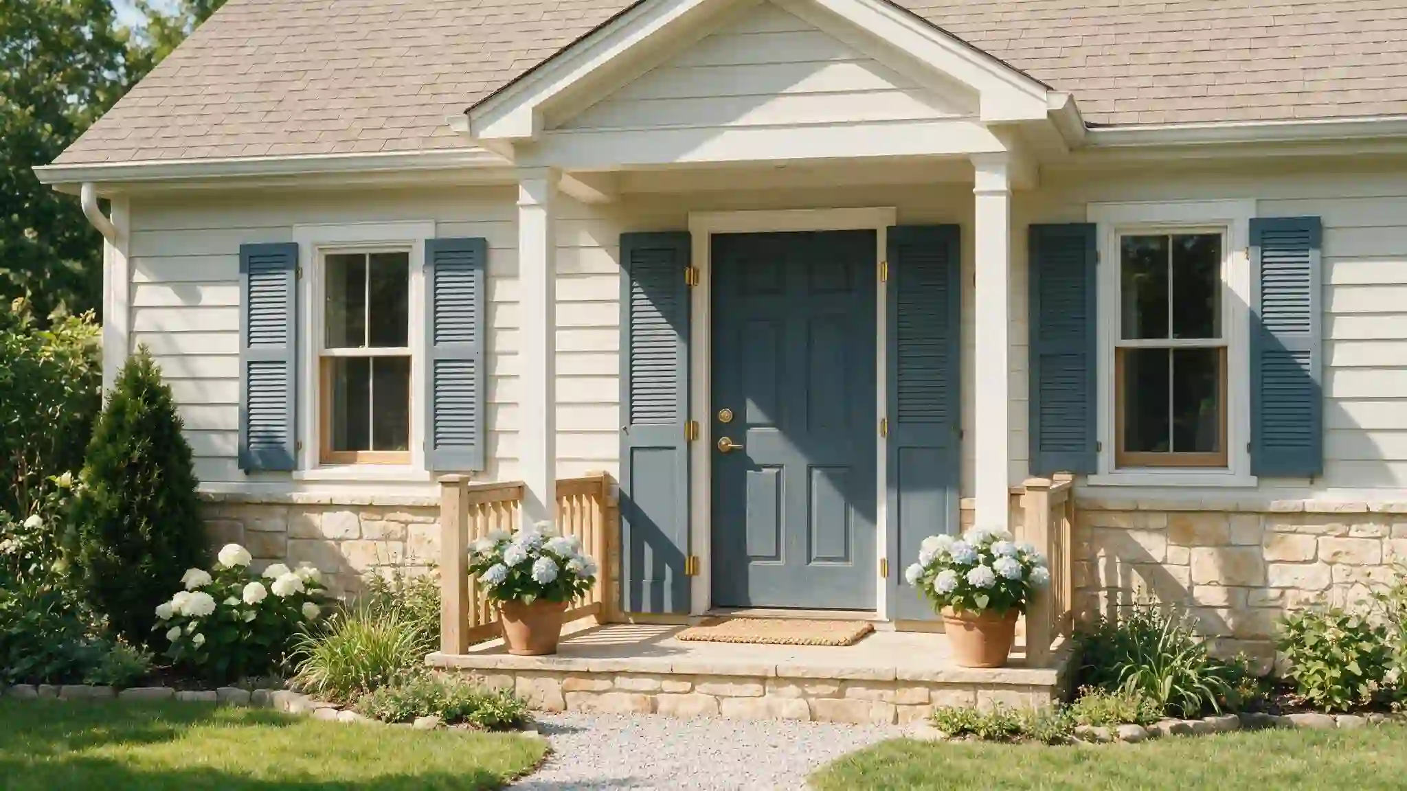
The detail that ties inside to outside, signaling the interior palette before anyone walks in.
Use an exterior-grade product such as Emerald or SuperPaint rather than interior paint tinted to match.
Check the color against your roof and stonework in both sun and shade, and expect south-facing elevations to fade sooner.
3. Bedroom and Guestroom Accent Walls
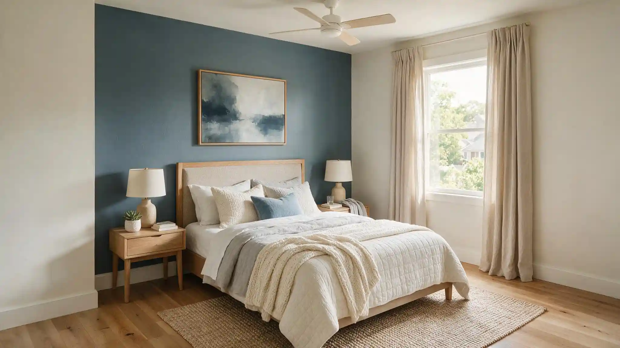
Behind the bed, where a headboard breaks up the expanse.
Keep the other three walls light, and the room gains depth without losing daylight.
Two coats over white is the minimum, three if the old wall was pale.
Guest rooms are the low-risk place to start, since you are not living in there daily.
4. Full Rooms and Partial Walls
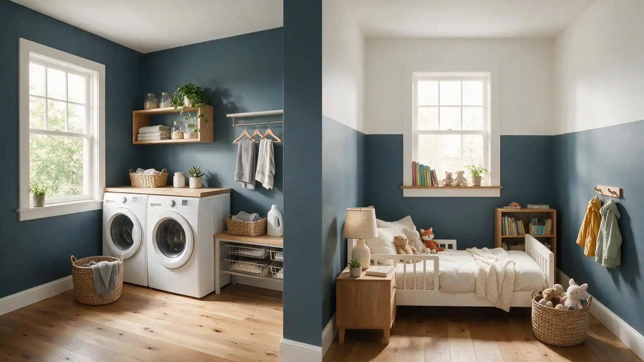
The laundry room example shows what this color does across four walls, and it holds up, though without strong daylight I would not paint a whole room at 15 LRV.
Painting three-quarters of the way up is the safer compromise: depth where your eye lands, white above, air kept in the room.
Use tape and a level, since a few millimeters of wobble shows badly.
5. Barn Doors and Feature Doors
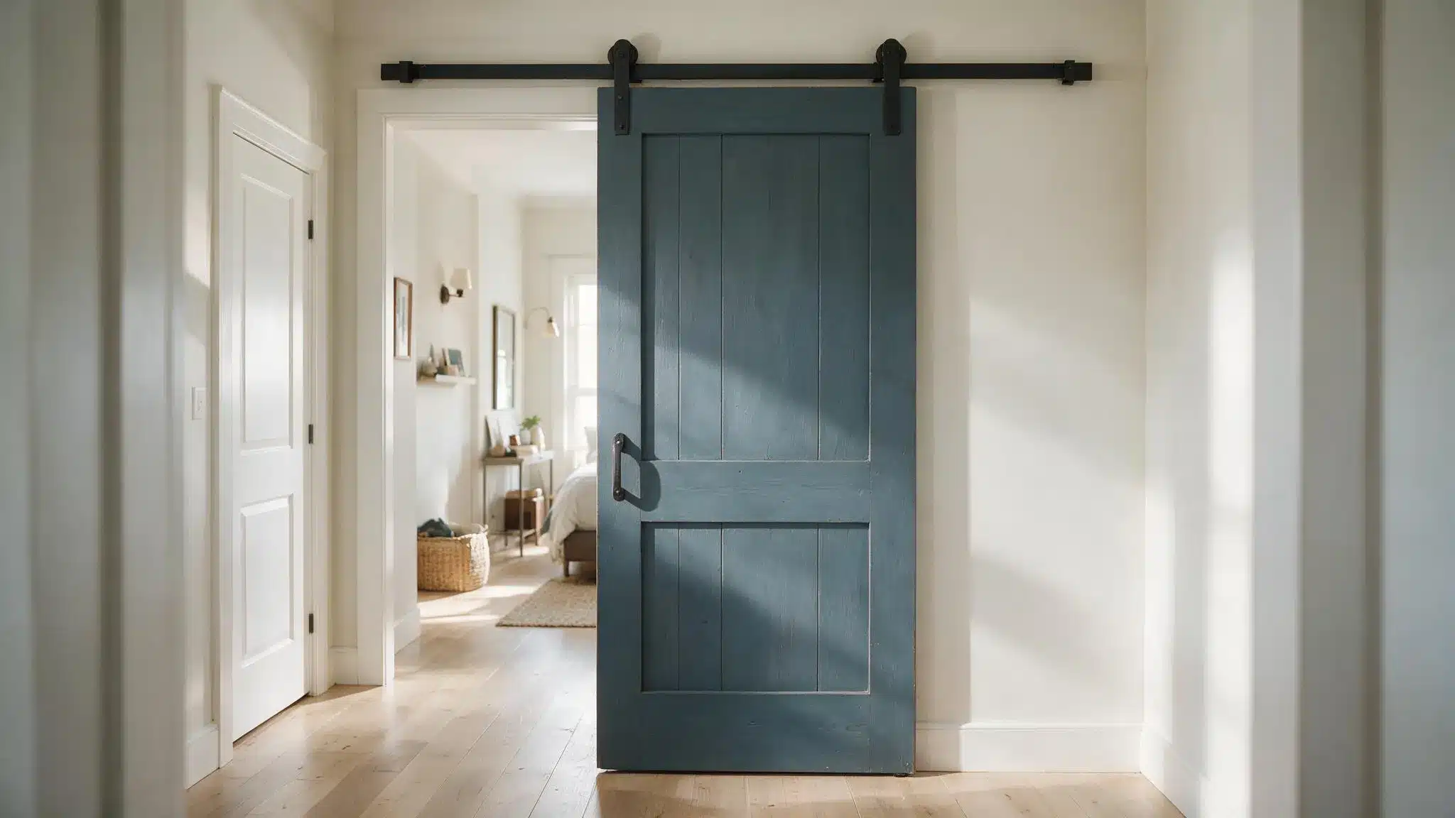
A sliding barn door against pale walls is the strongest single use in the set.
All the drama for one quart of paint, and since a barn door is already an architectural feature, painting it dark reads as finishing rather than decorating.
Keep your other doors white, or the focal point becomes a corridor.
6. Cabinets and Mudrooms
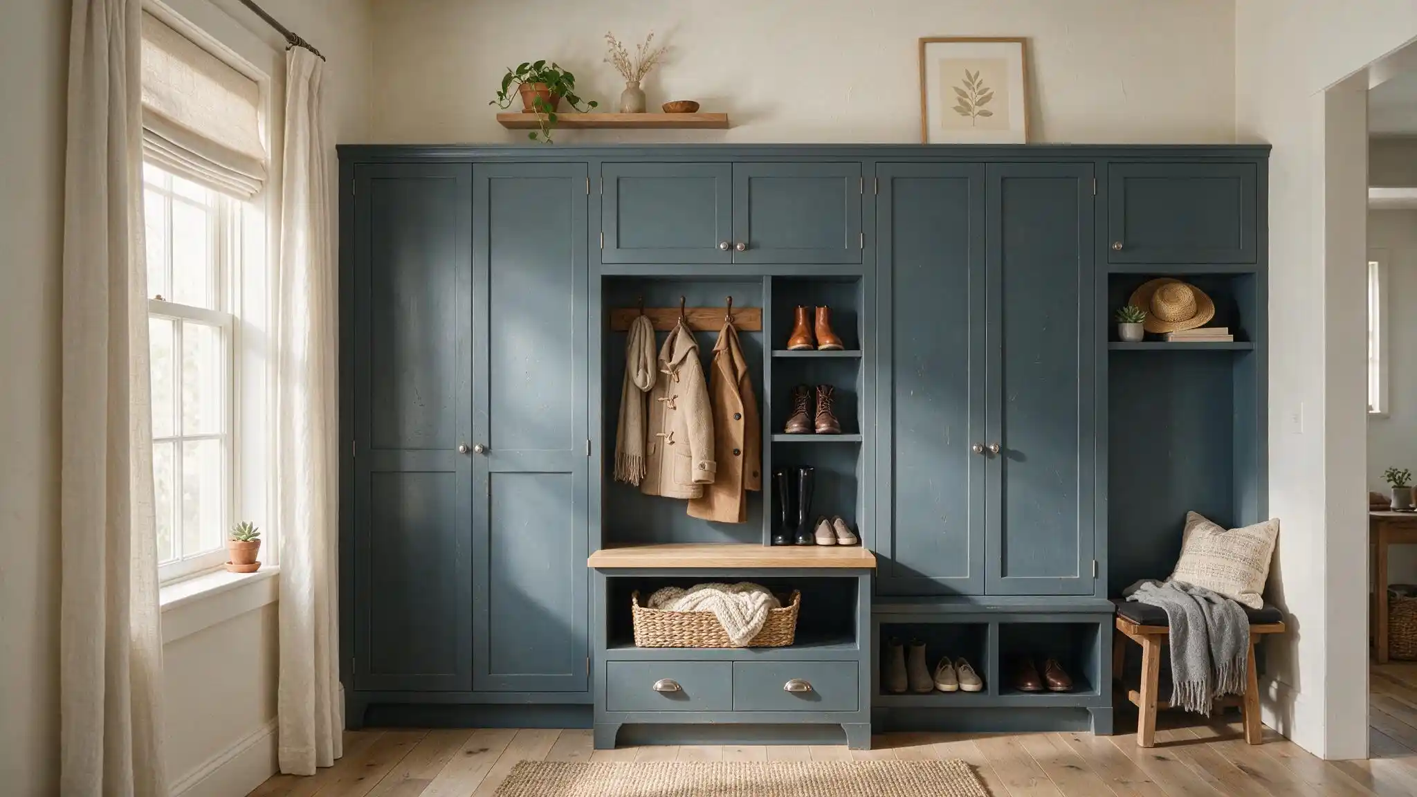
Mudroom cabinetry is where this color earns its keep, hiding the boot marks and scuffs; white advertises.
Pair it with light walls above so the run reads as built-in furniture rather than a cave.
Kitchen cabinets and vanities work too, though brass warms it and matte black sharpens it.
Use cabinet-grade enamel.
7. Basement Feature Walls
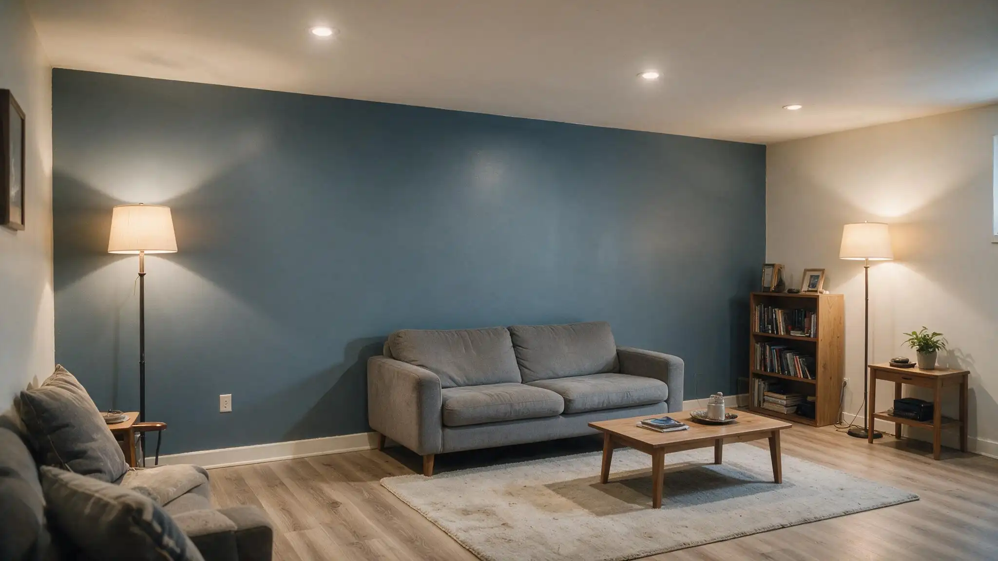
Basements carry the least risk, because the light is already artificial and there is no daylight to lose.
One wall behind a sofa or media unit, everything else pale, and the room stops announcing itself as a basement.
Check for damp first, since dark paint shows efflorescence and patching far more clearly than white.
How to Sample and Buy Slate Tile from Sherwin-Williams?
Sherwin-Williams offers more ways to see this color than most people realize. A free color chip is fine for a first comparison and useless for a final decision.
Peel-and-stick samples start around $6.01, with a larger 15 by 18-inch version near $9.95, and those are what I would actually order, because you can move them wall to wall without opening a tin.
A traditional sample pot suits anyone who wants two proper coats on a board.
Beyond samples, you are choosing between interior and exterior product lines, which matters for siding and doors.
Not every option here does the same job, and the differences matter more than the prices. Here is what each one is actually good for.
| Listing type | Best for | Approximate Price |
|---|---|---|
| Free color chip | First comparison | It is free of cost. |
| Peel and stick sample | Moving between walls | Around $3.96 each. |
| Paint sample pot | Final wall testing | Priced at around $7.49. |
Which Slate Tile Sample Should You Choose?
Three formats, three jobs.
A chip narrows the field, a peel-and-stick moves between walls, and a painted board tells you the truth. With dark paint, scale decides everything.
1. Free Color Chip
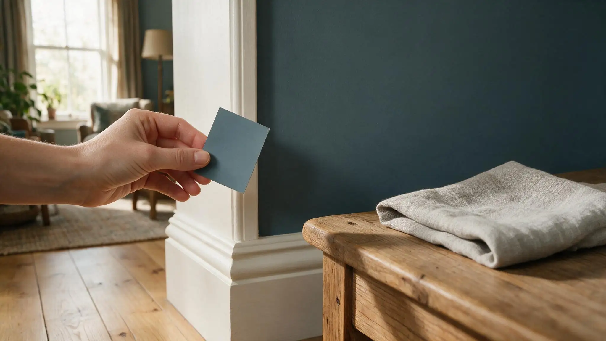
A chip is the right tool for narrowing four blue-grays down to one.
It travels in a pocket, holds up against trim, flooring, and furniture, and costs nothing.
What it cannot do is show you what a whole wall looks like, because dark colors gain depth with scale. I would never let a chip make the final call.
- Main advantage: Quick, free, and portable.
- Main Limitation: Reads lighter than reality.
2. Peel and Stick Sample
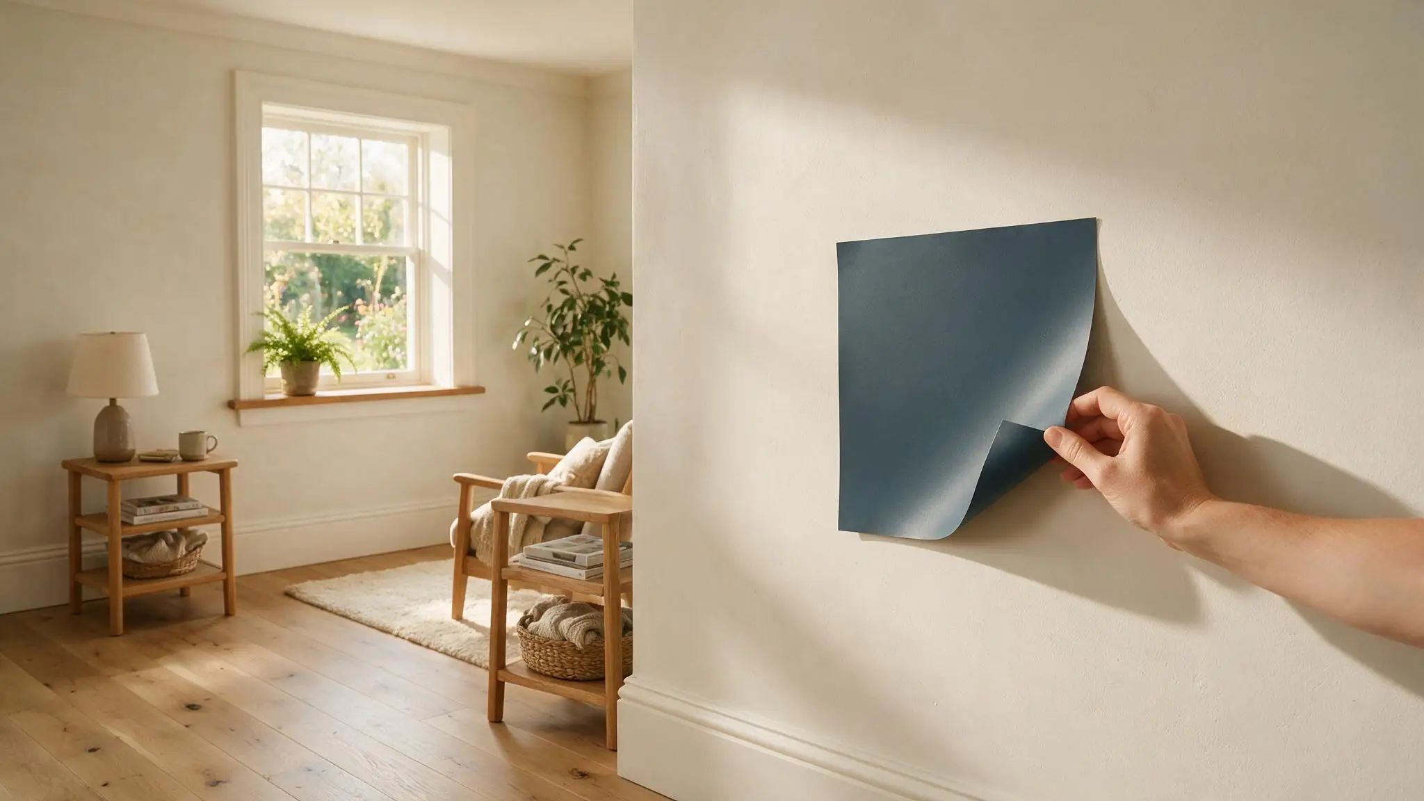
This is the format I recommend most often.
You can move it between walls in minutes, check a north-facing room against a south-facing one, and take it down without touching your paint.
It will not reproduce sheen or wall texture, so treat it as a strong comparison tool rather than a final preview.
- Main Advantage: Easy to Reposition
- Main Limitation: Misses sheen and texture.
3. Painted Sample Board
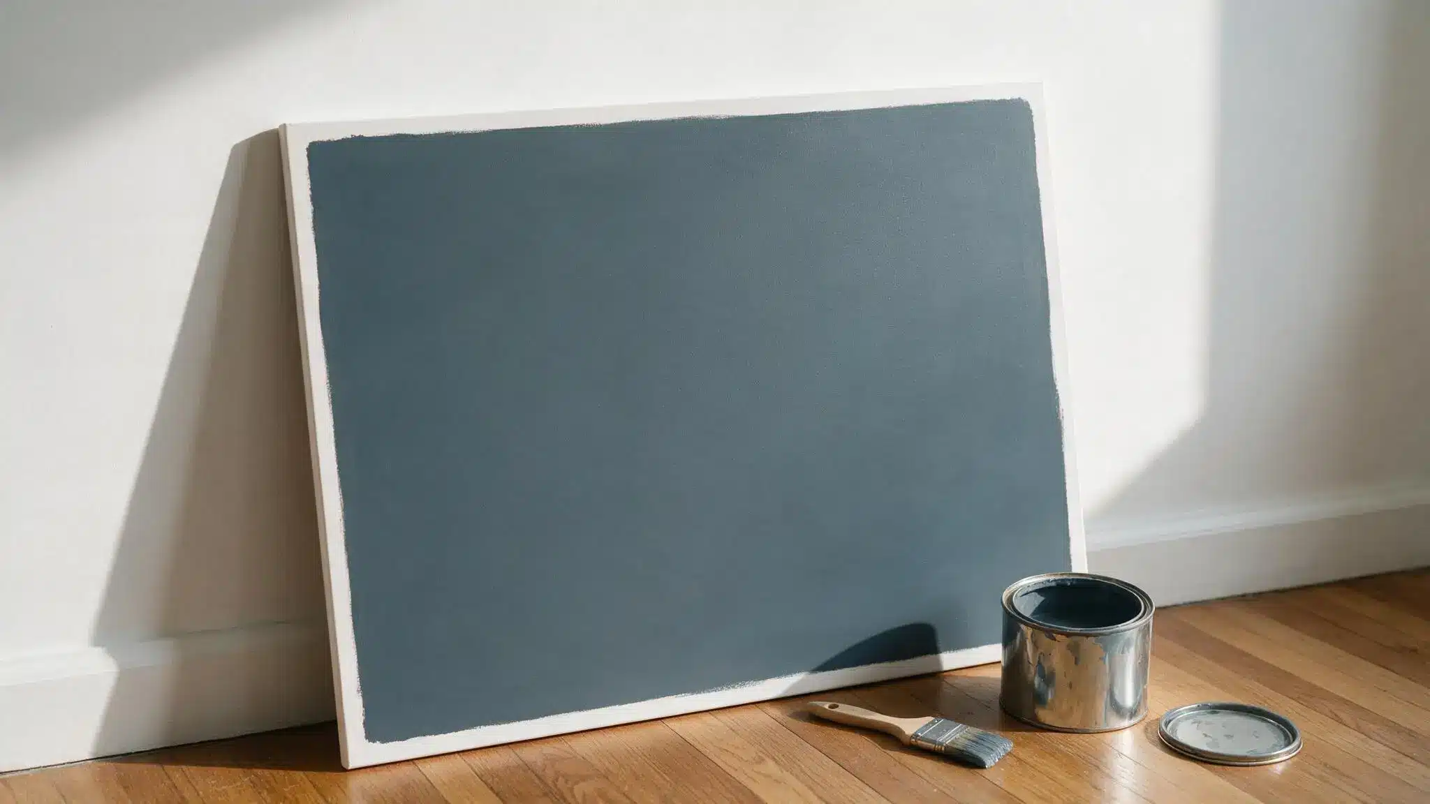
Two coats on white board give you the most honest preview available.
It shows real sheen, real coverage, and the actual depth of the color, and you can carry it room to room without committing your walls.
- Main Advantage: Most realistic result
- Main Limitation: Needs prep and drying time.
How Lighting Changes Slate Tile
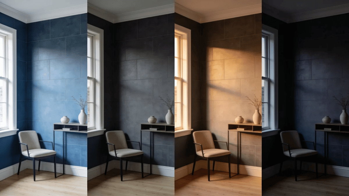
I have seen this look almost navy in one room and nearly charcoal in the next, on the same afternoon.
Slate Tile sits between blue and gray, with a faint green cast that keeps it from settling into navy.
Large areas read stronger than a swatch, so test your least-lit room first.
| Condition | Likely Appearance |
| Bright daylight | Cooler, blue unmistakable |
| Overcast or north facing | Grayer, closer to charcoal |
| Warm 2700K bulbs | Softer, blue muted |
| Cool 4000K bulbs | Sharper, blue forward |
| Beside crisp white | Bluer, stronger contrast |
| Beside natural wood | Balanced, less severe |
| Direct exterior sun | Lighter than indoors |
Can Slate Tile Sherwin-Williams Work on Exteriors?
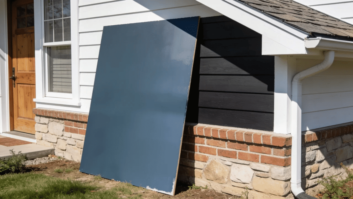
Yes, and Sherwin-Williams lists Slate Tile for both interior and exterior use, which the real-home references back up.
Outside, the color behaves differently in one way worth knowing.
Strong daylight makes dark paint read lighter and bluer than it does indoors, so the shade many people find too heavy in a hallway can look right on siding.
Shaded elevations go the other way and drift toward charcoal. It suits siding, brick, shutters, entry doors and trim details equally well.
What decides the result is everything around it: roof color, stone, wood garage doors, even the planting.
Test with a large board outdoors rather than an indoor chip, and look at it in sun, shade, and cloud.
Slate Tile Buying Checklist
Complete these checks before ordering the final quantity, especially when the color will cover cabinets, an exterior, or an entire room.
Ten checks, and none of them take long.
Before you buy:
- Confirmed the exact color, Slate Tile SW 7624, not a competitor match.
- Checked the LRV of 15 against how much light the room actually gets.
- Ordered a physical sample rather than judging from a screen.
- Moved it between at least three walls.
- Viewed it in morning light and again after dark with the lamps on.
- Compared it against flooring, trim, counters, and anything built in.
- Tested the finish you plan to use, since sheen shifts the color.
- Confirmed the product is rated for your surface, interior or exterior.
- Verified seller, size, price, and return policy on any marketplace listing.
- Calculated quantity last, after approving the sample.
Final Thoughts
Slate Tile is a dark, muted blue-gray, and at an LRV of 15, it never recedes.
The examples show it working on shiplap, barn doors, cabinets, partial walls, full rooms, and siding, a wider range than most dark colors manage.
What shifts is the undertone. Daylight brings the blue out, shadow pulls it toward gray, and some lights reveal a blue-green cast.
I have never trusted a digital preview with a color this deep. The idea worth keeping is repetition: on a few focal points, this color ties a house together without darkening another wall.
Slate Tile rewards patience. Test it properly, and you will know within a week whether it belongs in your house.
Frequently Asked Questions
What Colors Go Well With Sherwin-Williams Slate Tile?
Warm off-whites like Egret White, crisp trim whites, natural wood, pale flooring, neutral stone, matte black hardware
Does Slate Tile Need a Primer?
Primer is recommended over patched, stained, glossy, porous, or significantly lighter surfaces for smoother coverage and a more even finish.
Can Slate Tile Be Used On Interior Trim?
Yes. Slate Tile can create dramatic trim, especially beside light walls, but test the combination before painting the entire room.
How Can You Keep Slate Tile Walls Looking Clean?
Dust regularly and wipe marks gently with a damp microfiber cloth, following the cleaning instructions for your selected paint product.

Alex Guerrero, a graduate with a Fine Arts degree from the Rhode Island School of Design, has been a visionary in the world of color and design for over 15 years. His professional journey began in the heart of the fashion industry in Milan, where he developed an acute sense for color harmonies and trends. Alex joined our team in 2018, offering fresh and innovative perspectives on color utilization in various spaces. Renowned for his ability to blend contemporary trends with timeless elegance. Outside of work, Alex is an accomplished painter and a volunteer art therapist, his artistic talents further enriching his professional insights.