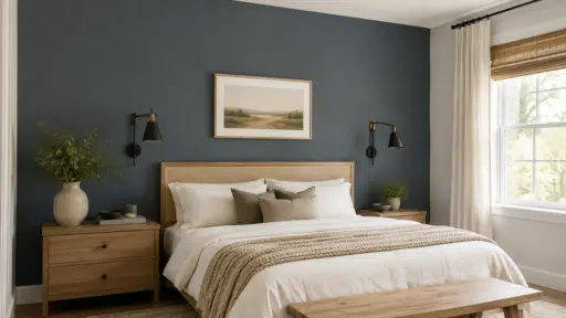

Choosing three colors sounds easy until the final mix feels too loud, dull, or disconnected. Triadic colors solve that problem by using three shades placed evenly around the color wheel.
This creates strong contrast while keeping the palette balanced and clear. I find this method useful because it gives you structure without limiting your choices.
You can use it for websites, logos, rooms, social posts, packaging, and many other projects. The key is to let one color lead while the other two support it.
Ready-made palettes, HEX codes, visual examples, and simple use tips can make the process much faster. With the right balance, triadic color schemes can feel bright, controlled, and easy to apply across different designs.
What are Triadic Colors and How do they Work?
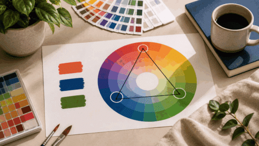
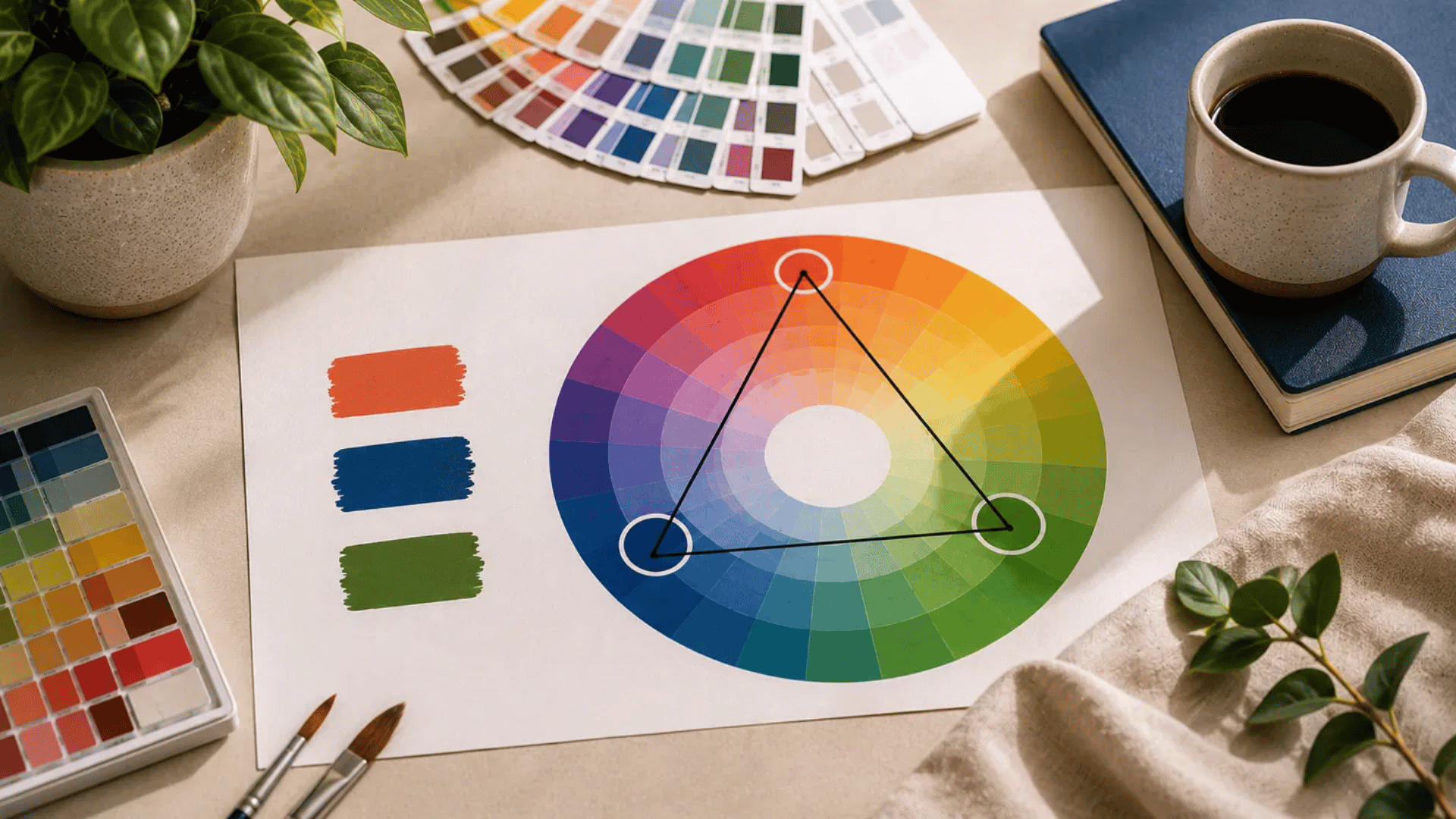
Triadic colors are three colors spaced evenly around the color wheel. When connected, they form a triangle, which is where the name comes from.
This arrangement creates a palette with noticeable contrast while still feeling balanced, making it a popular choice for many types of design.
Instead of competing with each other, the three colors work together to create a lively but organized look.
A classic example is red, yellow, and blue. You can also build softer or darker versions by changing the shade or saturation of each color.
Using one color as the main focus and the other two as supporting accents usually gives the best results.
Ready-to-Use Triadic Color Schemes
These palettes give you a clear starting point for websites, rooms, branding, packaging, and print projects without making the color selection process feel confusing.
Use the categories below to compare shades, HEX codes, and suitable applications.
1. Bright Triadic Color Schemes
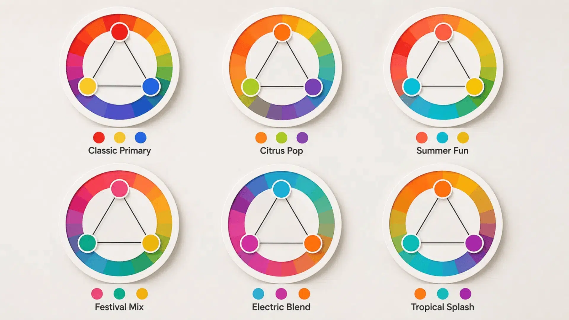
Bright triadic colors create strong contrast and suit projects that need a lively, clear, and noticeable color mix.
| No. | Palette | Colors | HEX Codes | Best For | Suggested Dominant Color |
|---|---|---|---|---|---|
| 1 | Classic Primary | Red • Yellow • Blue | #E63946 • #F4D35E • #2563EB | Educational materials and children’s graphics | Blue |
| 2 | Citrus Pop | Orange • Lime • Violet | #F97316 • #84CC16 • #8B5CF6 | Events, posters, and youth brands | Orange |
| 3 | Summer Fun | Coral • Aqua • Lemon | #FF6B6B • #22D3EE • #FDE047 | Social posts and summer campaigns | Aqua |
| 4 | Festival Mix | Hot Pink • Teal • Golden Yellow | #EC4899 • #0D9488 • #EAB308 | Music events and promotional graphics | Teal |
| 5 | Electric Blend | Cyan • Magenta • Amber | #06B6D4 • #D946EF • #F59E0B | Gaming graphics and digital campaigns | Cyan |
| 6 | Tropical Splash | Mango • Turquoise • Fuchsia | #FB923C • #14B8A6 • #C026D3 | Resorts, travel posts, and beach events | Turquoise |
2. Soft Triadic Color Schemes
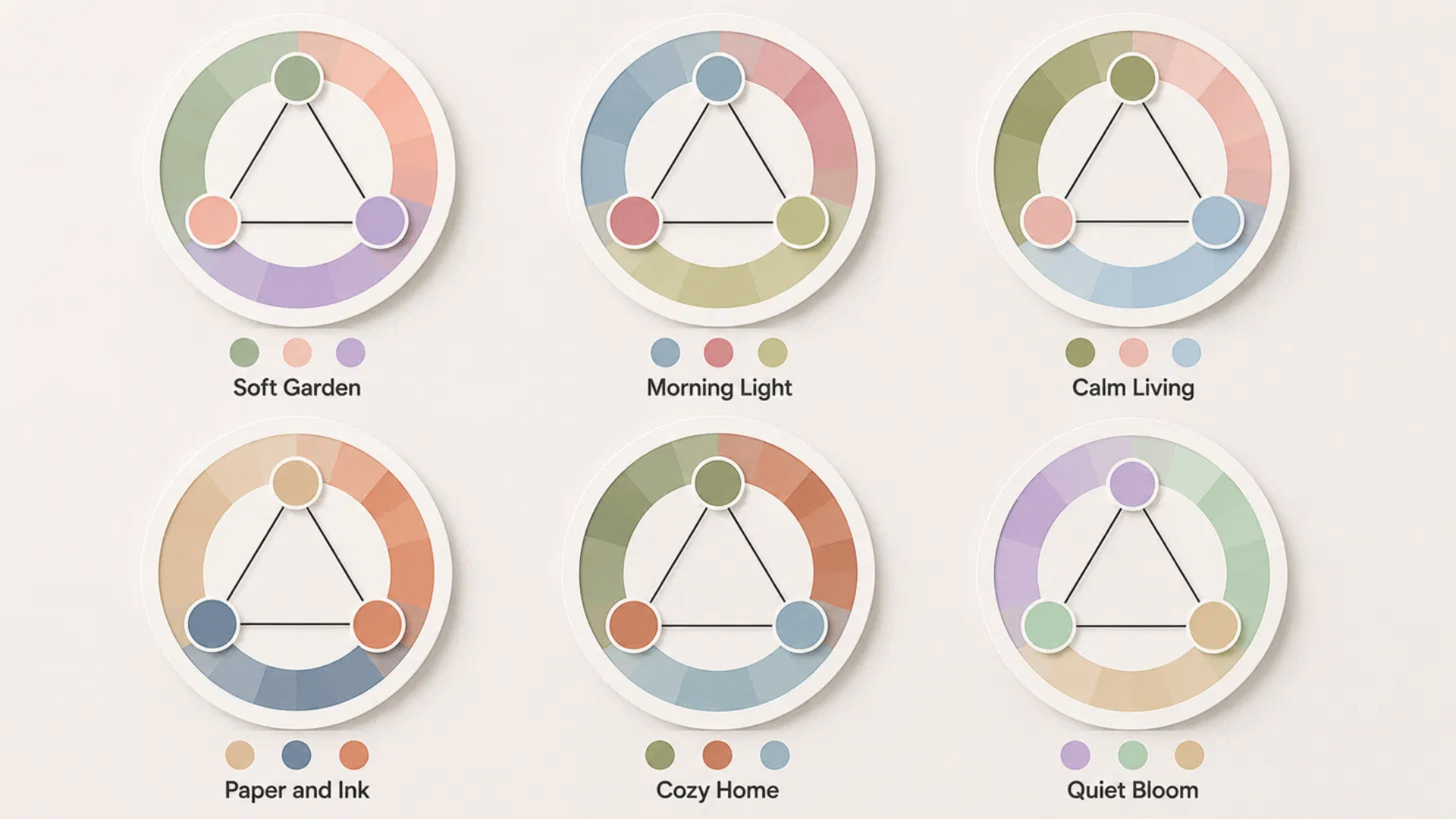
Soft combinations keep the three-color contrast but reduce intensity, making them easier to use in calm, welcoming layouts.
| No. | Palette | Colors | HEX Codes | Best For | Suggested Dominant Color |
|---|---|---|---|---|---|
| 7 | Soft Garden | Sage • Peach • Lavender | #A3B18A • #F2B5A7 • #B9A7D8 | Personal blogs and lifestyle graphics | Sage |
| 8 | Morning Light | Dusty Blue • Muted Rose • Pale Olive | #8FA9B8 • #C98F91 • #B5B98A | Beauty brands and stationery | Dusty Blue |
| 9 | Calm Living | Olive • Blush • Powder Blue | #8A956B • #E7B7B2 • #A9C6D8 | Home décor and wellness content | Olive |
| 10 | Paper and Ink | Warm Beige • Slate Blue • Soft Terracotta | #D8C3A5 • #71879B • #C9826B | Invitations and printed materials | Warm Beige |
| 11 | Cozy Home | Moss • Clay • Soft Blue | #7F8C6A • #BC8064 • #9BB7C9 | Interior blogs and home brands | Moss |
| 12 | Quiet Bloom | Lilac • Mint • Sand | #C3AED6 • #A8C7B5 • #D7C5A2 | Wedding stationery and gift packaging | Mint |
3. Earthy Triadic Color Schemes
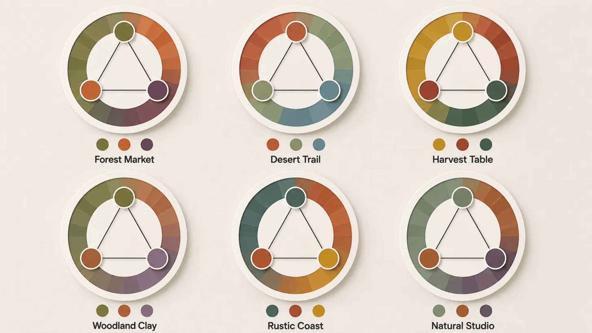
Earth-based shades feel grounded and practical, making them useful for products and spaces connected with food, nature, or handmade work.
| No. | Palette | Colors | HEX Codes | Best For | Suggested Dominant Color |
|---|---|---|---|---|---|
| 13 | Forest Market | Olive Green • Burnt Orange • Deep Plum | #66734C • #B85C38 • #65405D | Farmers’ markets and food packaging | Olive Green |
| 14 | Desert Trail | Terracotta • Sage • Dusty Blue | #B7654A • #849D78 • #718EA4 | Outdoor brands and travel content | Sage |
| 15 | Harvest Table | Mustard • Brick Red • Forest Green | #C49A35 • #9A4A3A • #3F6652 | Cafés and restaurant branding | Forest Green |
| 16 | Woodland Clay | Moss • Clay Brown • Muted Violet | #68735A • #A46F55 • #75627A | Pottery, crafts, and home accessories | Moss |
| 17 | Rustic Coast | Deep Teal • Warm Rust • Ochre | #376E6F • #A9593F • #BE9237 | Coastal homes and artisan goods | Deep Teal |
| 18 | Natural Studio | Eucalyptus • Cinnamon • Smoky Purple | #718C74 • #9A6245 • #675A70 | Skincare packaging and studio branding | Eucalyptus |
4. Dark Triadic Color Schemes
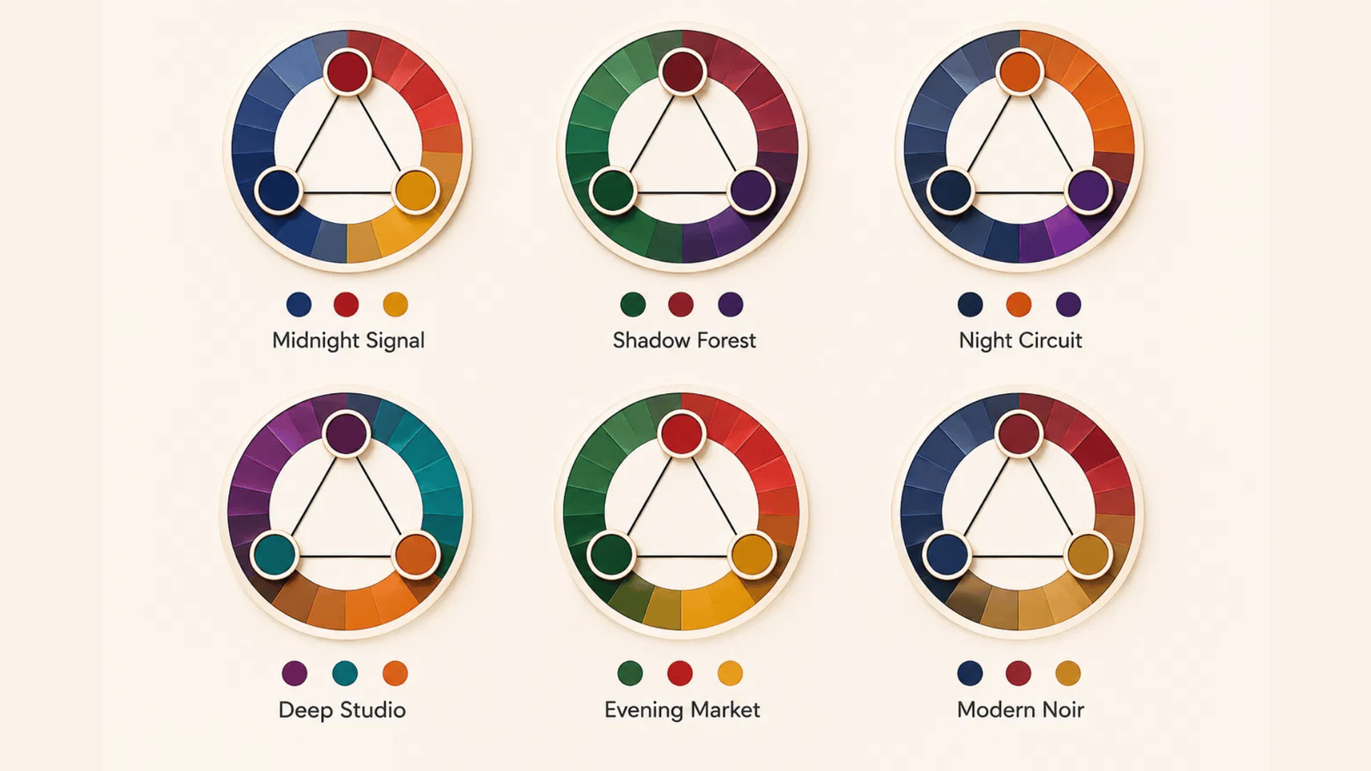
Dark palettes work best when one shade controls the background while the other two provide clear focal points and supporting details.
| No. | Palette | Colors | HEX Codes | Best For | Suggested Dominant Color |
|---|---|---|---|---|---|
| 19 | Midnight Signal | Navy • Dark Red • Deep Gold | #172A46 • #7A2E3A • #9C7A2B | Technology sites and formal presentations | Navy |
| 20 | Shadow Forest | Forest Green • Burgundy • Dark Indigo | #24463A • #702F3B • #37345D | Portfolios and restaurant branding | Forest Green |
| 21 | Night Circuit | Charcoal Blue • Burnt Orange • Dark Violet | #293B4D • #A8512D • #493A63 | Gaming interfaces and app screens | Charcoal Blue |
| 22 | Deep Studio | Plum • Dark Teal • Bronze | #56344F • #245C5A • #8E6B3E | Creative portfolios and product labels | Dark Teal |
| 23 | Evening Market | Deep Green • Wine Red • Muted Mustard | #294D3D • #6D3342 • #9F813E | Food packaging and boutique branding | Deep Green |
| 24 | Modern Noir | Ink Blue • Maroon • Antique Gold | #24364B • #6B2F3A • #A28A50 | Formal invitations and premium products | Ink Blue |
5. Pastel Triadic Color Schemes
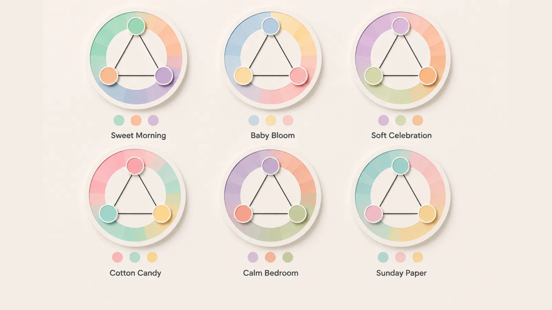
Pastel triads bring color into a project without creating harsh contrast, which helps them suit light, friendly, and relaxed settings.
| No. | Palette | Colors | HEX Codes | Best For | Suggested Dominant Color |
|---|---|---|---|---|---|
| 25 | Sweet Morning | Mint • Peach • Lavender | #B8E0D2 • #F6C1A6 • #C7B8EA | Bakeries and party invitations | Mint |
| 26 | Baby Bloom | Powder Blue • Soft Yellow • Pale Pink | #B9D6E8 • #F6E7A7 • #EFC2CD | Baby products and nurseries | Powder Blue |
| 27 | Soft Celebration | Lilac • Pale Green • Apricot | #D2C1E8 • #C6DDB8 • #F3C3A0 | Weddings and greeting cards | Lilac |
| 28 | Cotton Candy | Soft Pink • Mint Blue • Butter Yellow | #F2C4D3 • #BCE2DE • #F7E5A7 | Beauty packaging and dessert shops | Mint Blue |
| 29 | Calm Bedroom | Dusty Lavender • Pale Coral • Soft Sage | #C4B6D7 • #E8B1A7 • #B9C9AD | Bedrooms and home textiles | Soft Sage |
| 30 | Sunday Paper | Powder Teal • Blush • Light Mustard | #B1D5D2 • #E9C0C3 • #E8D29A | Journals, blogs, and stationery | Powder Teal |
6. Seasonal Triadic Color Schemes
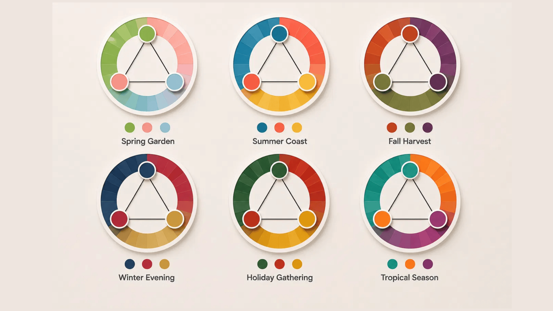
Seasonal palettes help match a project with a specific time of year while keeping all three colors visually connected.
| No. | Palette | Colors | HEX Codes | Best For | Suggested Dominant Color |
|---|---|---|---|---|---|
| 31 | Spring Garden | Fresh Green • Soft Pink • Light Blue | #79B473 • #E8A6B5 • #91BFD1 | Spring events and floral packaging | Fresh Green |
| 32 | Summer Coast | Ocean Blue • Coral • Sunny Yellow | #2686A6 • #F47C6C • #F1C453 | Travel posts and beach campaigns | Ocean Blue |
| 33 | Fall Harvest | Rust • Olive • Deep Plum | #A65335 • #737442 • #63405E | Fall décor and food promotions | Olive |
| 34 | Winter Evening | Navy • Berry Red • Muted Gold | #253B5C • #8A3C4A • #B89B55 | Winter invitations and seasonal branding | Navy |
| 35 | Holiday Gathering | Pine Green • Warm Red • Golden Yellow | #305D43 • #A94442 • #D6A83A | Cards, wrapping, and seasonal displays | Pine Green |
| 36 | Tropical Season | Lagoon Teal • Mango Orange • Orchid Purple | #218C88 • #F39A45 • #9B4F96 | Resort branding and summer events | Lagoon Teal |
How to Use Triadic Colors in Different Projects
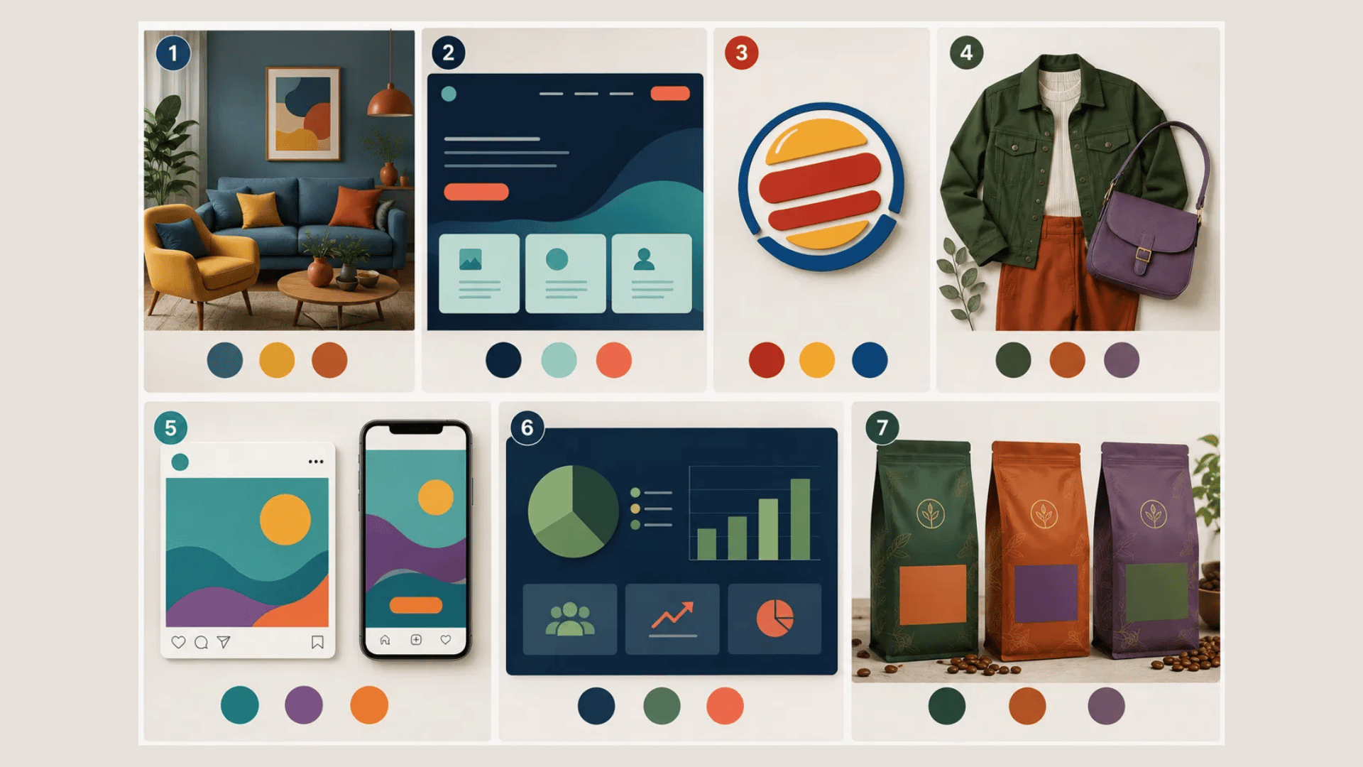
Each project needs a different mix of contrast, color strength, and placement to keep all three shades clear.
1. Living Room
A triadic living room feels balanced when the largest surfaces use calmer shades and decor carries stronger color.
- Best Palette Style: Muted blue, soft mustard, and terracotta
- Color Balance: Use blue on walls or furniture, mustard on fabrics, and terracotta on small decor
- Practical Example: Pair blue walls with a mustard chair and terracotta cushions
- Avoid: Using three bright shades across walls, sofas, and rugs at the same time
2. Website
Website colors should separate content, support readable text, and guide visitors toward buttons or other key actions.
- Best Palette Style: Navy, mint, and coral
- Color Balance: Use navy as the base, mint for content blocks, and coral for buttons
- Practical Example: A navy landing page with mint feature cards and coral sign-up buttons
- Avoid: Placing bright colors behind long text or using several competing button colors
3. Logo
A logo needs one strong lead color, while the other two should support its shape and message.
- Best Palette Style: Red, yellow, and blue
- Color Balance: Let one shade cover most of the logo and use the others on smaller details
- Real-Life Example: The Burger King logo uses red, yellow, and blue in separate, easy-to-read areas
- Avoid: Giving all three colors equal space or adding details that disappear at small sizes
4. Clothing
Triadic clothing looks more wearable when one garment leads and the other colors appear in smaller amounts.
- Best Palette Style: Forest green, rust, and muted purple
- Color Balance: Use green on the main garment, rust on a second piece, and purple on accessories
- Practical Example: Pair a green jacket with rust trousers and a muted purple bag
- Avoid: Wearing three highly saturated garments or mixing several bold patterns
5. Social Media
A fixed color role across posts helps followers recognize the brand and read each message more quickly.
- Best Palette Style: Teal, violet, and warm orange
- Color Balance: Use teal for backgrounds, violet for headings, and orange for calls to action
- Practical Example: Create a teal post with a violet heading and an orange shop button
- Avoid: Changing color roles on every post or placing small colored text over busy backgrounds
6. Presentation
Presentation colors should organize information and highlight key facts without making every slide compete for attention.
- Best Palette Style: Navy, muted green, and coral
- Color Balance: Use navy for backgrounds, green for sections, and coral for key numbers
- Practical Example: Place coral on sales figures while keeping charts green and slide backgrounds navy
- Avoid: Using bright backgrounds on every slide or adding all three colors to each chart
7. Product Packaging
Packaging colors should identify the product, separate details, and remain readable on shelves and online listings.
- Best Palette Style: Deep green, burnt orange, and muted violet
- Color Balance: Use green as the base, orange for product type, and violet for flavor or scent
- Practical Example: A coffee bag can use green packaging, orange roast labels, and violet flavor notes
- Avoid: Crowded labels, weak text contrast, or equal amounts of all three colors
How to Create Your Own Triadic Color Scheme
Building a triadic color scheme is easier than it looks.
Once you understand how the colors relate to one another, you can adjust them to suit almost any project, from websites and logos to interiors and packaging.
Follow these six steps to create a balanced palette that is both attractive and practical.
Step 1: Choose Your Main Color
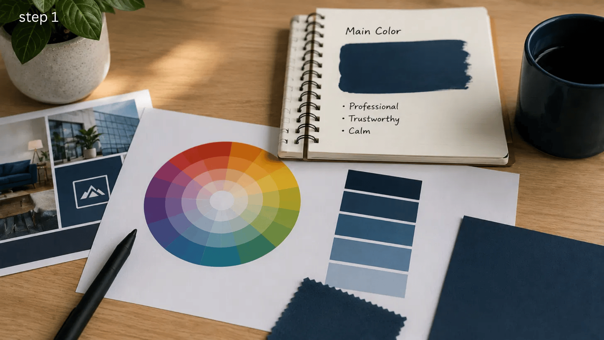
Start by selecting the color that best represents your project. This shade will appear most often, so think about its purpose before you choose.
A professional website may benefit from navy or deep green, while a bakery or lifestyle brand might suit peach or sage.
I usually choose the main color first because it makes every decision that follows much simpler. It also helps keep the palette focused instead of looking random.
Step 2: Find the Matching Triad
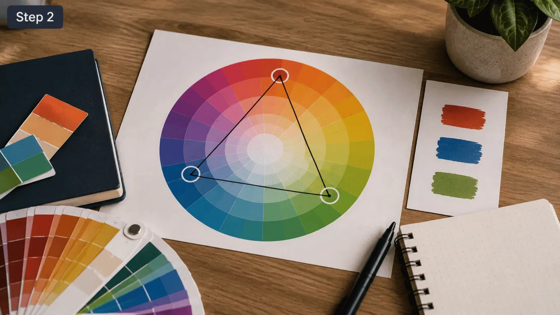
After choosing your base color, locate the other two colors that sit evenly around the color wheel.
On a standard 12-color wheel, they are four spaces apart, forming a perfect triangle.
If you prefer a faster approach, Adobe Color automatically generates a triadic palette after you select the Triad harmony rule, making it easy to experiment with different starting colors while keeping the correct spacing.
Step 3: Adjust Brightness and Saturation
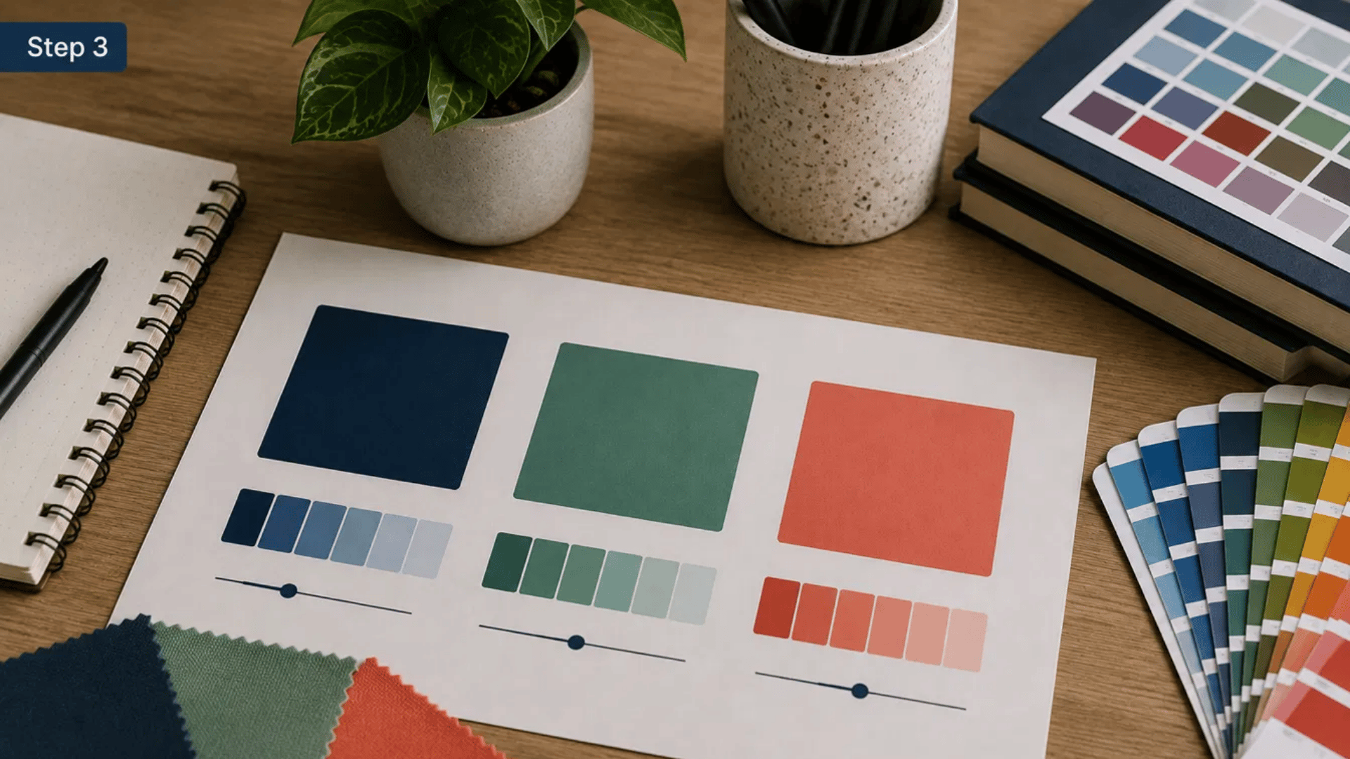
The first combination you create may feel brighter than your project needs, and that’s completely normal. Instead of changing the three hues, adjust their brightness or saturation.
Softer shades usually work better for interiors, stationery, and beauty brands, while stronger colors suit posters, children’s products, and promotional graphics.
Keeping the same triadic relationship while changing intensity gives you far more flexibility without affecting the overall balance.
Step 4: Apply the 60–30–10 Rule
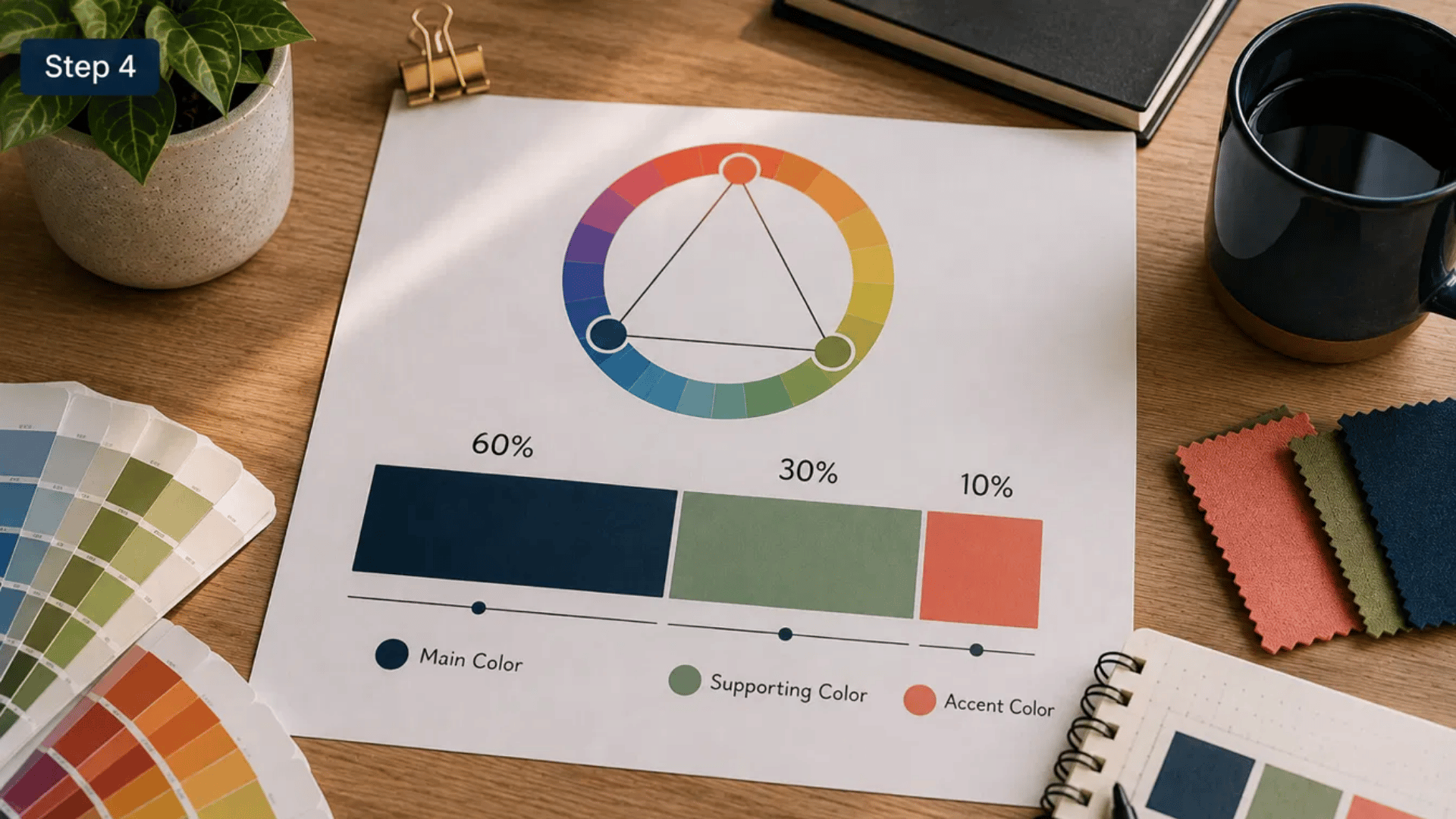
A common mistake is giving every color equal attention. Most successful triadic palettes rely on one dominant color, one supporting color, and one accent color.
The 60–30–10 rule is a useful starting point because it creates a clear visual hierarchy.
| Color Role | Suggested Use |
|---|---|
| Main color | 60% |
| Supporting color | 30% |
| Accent color | 10% |
You can adjust these proportions slightly, but keeping one color clearly dominant usually produces a cleaner result.
Step 5: Check Contrast
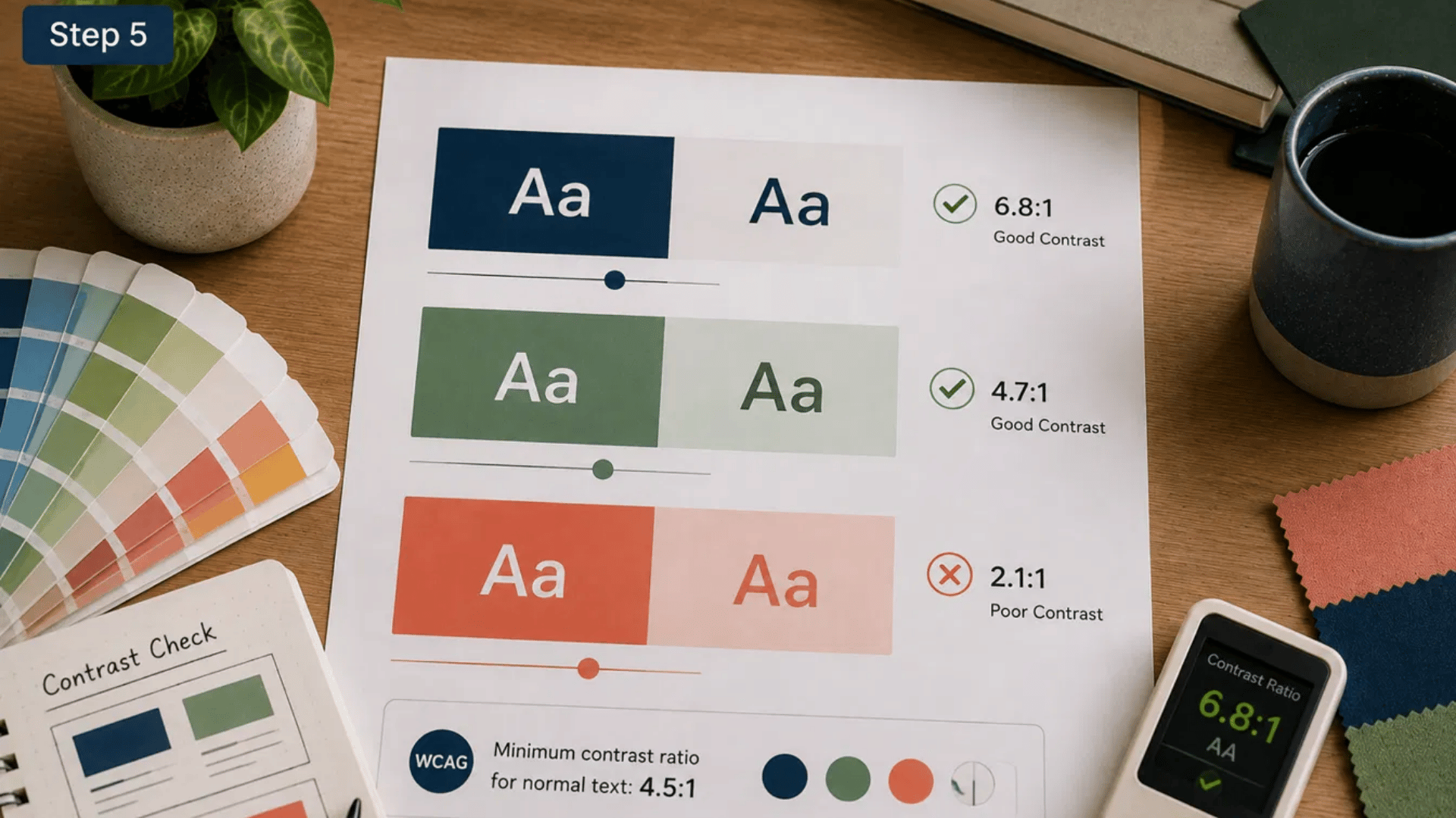
A beautiful palette loses its value if important text or buttons become difficult to read. Before finalizing your colors, test how they perform together in real layouts.
The Web Content Accessibility Guidelines (WCAG) recommend a minimum contrast ratio of 4.5:1 for normal text to improve readability for more users.
A quick contrast check can prevent problems that may not be obvious during the design stage.
Step 6: Test Before Finalizing

Never judge a palette by looking only at three color swatches.
Apply it to a sample webpage, room layout, presentation slide, package, or social media post to see how the colors interact in context. View the design on different screens or under different lighting if possible.
Small adjustments at this stage often make a noticeable difference and help the final design feel more balanced and easier to use.
A well-tested triadic palette feels clear, balanced, and purposeful across every surface where the finished design appears.
Common Triadic Color Mistakes
Small mistakes in balance, intensity, and placement can make a triadic palette feel crowded. These fixes keep the colors clear and useful.
- Giving Every Color Equal Weight: Equal use makes all three shades compete. Let one color lead, one support, and one appear only in smaller details.
- Choosing Three Overly Bright Shades: Highly saturated colors can feel harsh together. Soften one or two shades to keep the contrast strong without overwhelming the design.
- Ignoring Text and Background Contrast: A balanced palette can still reduce readability. Test every text-and-background pairing, especially when using yellow, orange, or pale green.
- Adding More Accent Colors: Extra bright shades weaken the original triad. Use lighter or darker versions of the same colors when you need more variety.
- Filling Every Area With Color: Too much color can make rooms and layouts feel crowded. Add white, gray, beige, black, or natural materials for breathing space.
- Using Color as the Only Signal: Color alone may not explain warnings or selected items. Add labels, icons, borders, or patterns so the meaning stays clear.
Triadic Colors vs Other Color Schemes
Color schemes differ in contrast, complexity, and mood. This comparison helps you choose the right structure based on how many colors your project needs.
| Color Scheme | Color Placement | Typical Effect | Best For | Simple Example |
|---|---|---|---|---|
| Triadic | Three colors spaced evenly around the color wheel | Colorful, balanced, and energetic | Branding, posters, websites, packaging, and illustrations | Red, yellow, and blue |
| Complementary | Two colors placed opposite each other | Strong contrast with a clear focal point | Promotions, buttons, sports graphics, and product labels | Blue and orange |
| Analogous | Three neighboring colors on the wheel | Calm, connected, and easy on the eyes | Interiors, nature themes, backgrounds, and lifestyle branding | Blue, blue-green, and green |
| Split Complementary | One main color plus two colors beside its opposite | Noticeable contrast with more flexibility | Illustrations, social graphics, clothing, and beginner projects | Blue, red-orange, and yellow-orange |
| Tetradic | Four colors arranged as two complementary pairs | Varied and visually active | Detailed artwork, advanced branding, events, and editorial layouts | Blue, orange, red, and green |
Triadic schemes offer more variety than complementary palettes while remaining easier to control than four-color combinations.
Best Free Tools to Generate Triadic Colors
Each tool handles color selection a little differently. Some build exact triads from a base color, while others help you compare shades, save palettes, or find ideas quickly.
1. Adobe Color

Adobe Color is a strong choice when you want precise triadic spacing and more control over each shade.
- Best for: Branding, websites, and professional design work
- Useful feature: The Triad rule generates two matching colors from your chosen base shade
- Good to know: You can adjust brightness, saturation, and contrast before saving the palette
2. Coolors

Coolors works well when you want to create and compare several combinations without spending much time on setup.
- Best for: Fast palette creation and early design planning
- Useful feature: Lock colors you like while changing the remaining shades
- Good to know: Check the final three colors on a color wheel to confirm true triadic spacing
3. Canva Color Wheel

Canva Color Wheel keeps the process simple, making it suitable for readers who are new to color theory.
- Best for: Social posts, presentations, invitations, and beginner projects
- Useful feature: Select the triadic option after choosing your main color
- Good to know: The generated palette can be carried into Canva designs with little extra setup
4. Paletton
Paletton gives you more control over how the three colors appear in lighter, darker, or softer forms.
- Best for: Web layouts, detailed palette testing, and shade comparison
- Useful feature: Preview how the colors may look across sample interface sections
- Good to know: The controls may take a little longer to understand than simpler generators
5. Color Hunt

Color Hunt is better for browsing finished palettes than building exact triads from one starting color.
- Best for: Mood boards, creative ideas, and early planning
- Useful feature: Browse palettes by themes such as pastel, dark, warm, or seasonal
- Good to know: Not every palette is triadic, so confirm the spacing before using it
Adobe Color and Canva suit quick triad creation, while Coolors and Paletton provide more room for shade testing and refinement.
Printable Triadic Color Cheat Sheet
Use this compact reference when you need a quick palette idea without reviewing every option again. Each combination offers a different tone and practical use.
| Style | Example Palette | Best Use |
|---|---|---|
| Bright | Red • Yellow • Blue | Educational graphics, posters, and children’s products |
| Soft | Sage • Dusty Rose • Powder Blue | Bedrooms, lifestyle blogs, and home décor |
| Earthy | Olive • Terracotta • Mustard | Packaging, cafés, handmade goods, and natural brands |
| Dark | Navy • Burgundy • Forest Green | Premium branding, portfolios, restaurants, and formal designs |
| Pastel | Lavender • Peach • Mint | Weddings, bakeries, baby products, and stationery |
| Modern | Teal • Coral • Sand | Websites, mobile apps, social posts, and creative businesses |
Save the palette that fits your project, then adjust its brightness and proportions before applying it to the final design.
Final Thoughts
A strong triadic scheme depends less on the three chosen hues and more on how they are used. The main shade should control the largest area, while the other two guide attention, separate details, or add contrast.
Small changes in brightness can also make the same palette suit a calm bedroom, a bold poster, or clear product packaging.
Before finishing, check the colors in their real setting. Look at text contrast, screen size, room lighting, and the amount of space each shade covers.
These checks can prevent a good palette from feeling crowded or hard to read.
Choose one combination from the list and test it on a small sample first.
Then share your final color mix and where you plan to use it.
Frequently Asked Questions
Can Triadic Colors Include Neutral Shades?
Yes. White, gray, beige, or black can support the three main colors without changing the original triadic relationship.
Do Triadic Palettes Work in Photography?
They can guide clothing, props, and backgrounds, helping subjects stand out while keeping the full composition visually connected.
Can One Triadic Color be Replaced?
Replacing one hue breaks the exact triad. A nearby shade may still work, but it creates a different color relationship.
Are Triadic Schemes Suitable for Small Rooms?
Yes, when softer shades lead. Keep stronger colors on smaller items so the room does not feel closed or crowded.

Alex Guerrero, a graduate with a Fine Arts degree from the Rhode Island School of Design, has been a visionary in the world of color and design for over 15 years. His professional journey began in the heart of the fashion industry in Milan, where he developed an acute sense for color harmonies and trends. Alex joined our team in 2018, offering fresh and innovative perspectives on color utilization in various spaces. Renowned for his ability to blend contemporary trends with timeless elegance. Outside of work, Alex is an accomplished painter and a volunteer art therapist, his artistic talents further enriching his professional insights.