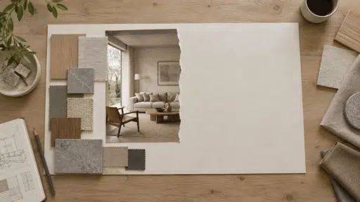
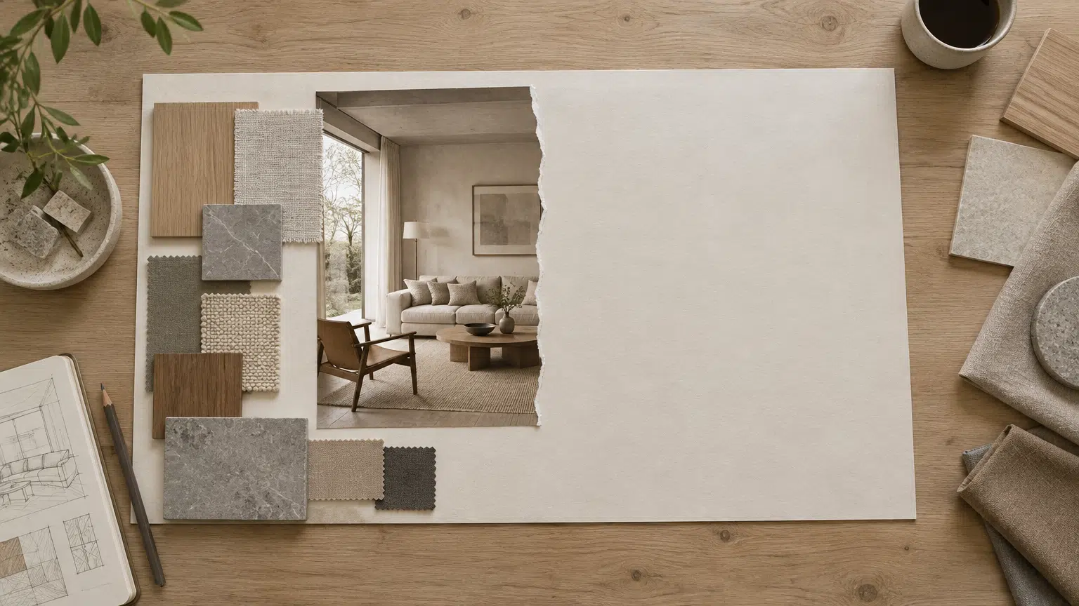

Interior design moodboards help turn scattered ideas into a visual direction. Designers collect room photos, material samples, furniture references, lighting examples, and color notes to show how a space might feel. The challenge is that reference images rarely arrive in the exact shape needed for a presentation.
A narrow furniture photo may need to fit a wide board. A vertical room image may need extra space for a title or color label. A product photograph may have a distracting crop that does not match the rest of the moodboard. AI image expansion can create additional background space while preserving the original reference. When you use ai expand image, the goal is to adapt the image to the layout without changing the design idea it communicates.
What a Moodboard Needs to Show
A useful moodboard is more than a collection of attractive images. It should communicate a relationship between materials, colors, shapes, and atmosphere.
Before expanding any image, decide why it is on the board. A room photograph may show natural light, while a fabric sample may represent texture. A chair reference may demonstrate a silhouette, and a tile image may provide a color cue.
Knowing the role of each image helps you decide where to add space. A room photo may need room for a caption, while a fabric close-up may need more background to fit a grid.
Plan the Board First
Start with the final board size and arrangement. Moodboards can be horizontal presentation slides, vertical proposal pages, square social posts, or printed sheets.
Mark where the image will appear and what will sit beside it. If a title will be placed on the left, expand the image toward the right or keep a quiet area near the title. If several images need to align in a row, use similar proportions.
Planning before editing prevents unnecessary changes. You may discover that a simple crop or white margin is enough. Use AI expansion when extending the original image will create a more natural visual result.
Choose Strong Reference Images
The source image should be clear enough to communicate its design role. A low-resolution room photograph may become softer when enlarged, while a heavily filtered product image may give misleading color information.
Choose images with visible texture and stable lighting. Avoid references where the main material is hidden behind objects or strong reflections.
Keep a record of the source and its context. Note the material name, product source, photographer, or location when the image is used in a professional proposal. Expanding the canvas does not remove the need for proper credit or usage rights.
Create Negative Space for Labels
Moodboards often include short notes, color names, material descriptions, or product information. A busy image may not leave a suitable place for text.
AI expansion can create a quiet wall, floor, sky, or tabletop area beside the main subject. This gives the designer room for a label without covering the important reference.
Describe the type of space you need. A neutral plaster wall, warm wood surface, or soft daylight background will support different design directions. Avoid asking for a completely empty area if the rest of the image has visible texture; the new space should feel connected.
Expand Room Photography
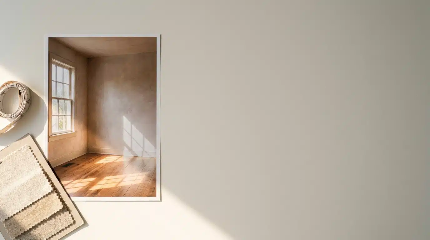
Interior photographs frequently need to be adapted from vertical to horizontal formats. Expanding the sides can preserve the room’s architecture while creating space for a project title or notes.
Keep structural elements stable. Walls, windows, doors, ceiling lines, and flooring should continue in a believable direction. If a window or doorway is near the edge, inspect it carefully after expansion.
Do not let the tool invent a new room layout. The purpose is to extend the frame, not to add an extra wall or change the position of furniture.
Extend Material and Texture References
Designers use close-up images of stone, wood, fabric, paint, metal, and tile. These references may need to fill a larger card or background area.
Textures should repeat naturally. Look for sudden seams, oversized patterns, or changes in color. Wood grain should follow a believable direction, and fabric weave should not become a set of random lines.
If the texture is meant to be used as a swatch, a small amount of variation may be acceptable. If it will guide a real material choice, keep the original sample visible and compare the expanded version with a physical reference.
Furniture and Product Images
Furniture photographs often include a chair, lamp, table, or accessory against a simple background. Expanding around the object can create space for dimensions, price, or design notes.
Protect the outline and proportions of the item. Legs, handles, cushions, and edges should not bend. Reflective surfaces and polished finishes require close inspection.
If the object is shown at an angle, keep the perspective consistent. A generated extension should not make the furniture appear to sit on an impossible floor or float above the surface.
Keep Colors Reliable
Color is one of the most important parts of an interior moodboard. A slight shift in a wall, fabric, or paint sample can change the visual direction.
Compare the expanded image with the original. Check neutral whites, warm wood, gray stone, and muted paint colors. AI may introduce a warmer or cooler tone in the new area.
For color-sensitive work, use the original image for the material sample and place the generated extension only around it. This keeps the reference trustworthy while still allowing flexible layout.
Lighting and Shadow Continuity
Interior scenes often rely on soft window light, overhead lighting, or warm lamps. The expanded area should follow the same light direction and intensity.
Look at shadows under furniture and along walls. A new area that is brighter or darker than the original may create a visible boundary.
If the moodboard is conceptual rather than technical, small differences may be acceptable. For a presentation that communicates a real renovation plan, keep lighting and shadows as consistent as possible.
Build Consistency Across the Board
A moodboard feels more professional when images share a similar visual treatment. That may include the same border, background color, spacing, or image proportion.
AI expansion can help align images without cropping away key references. However, use a consistent rule. If one image has a large generated background and another has a tight crop, the board may feel unbalanced.
View the full board at a distance. Individual images may look good, but the group should also have a clear rhythm.
Use AI as a Layout Aid
The purpose of expansion is to fit the design, not to invent an entire interior. Keep the original room, furniture, and material details central.
If you need to show a different layout or furniture arrangement, create a separate concept image rather than stretching a reference photograph beyond its meaning. This keeps the moodboard honest about what is a source reference and what is a new idea.
Label conceptual images when the distinction matters. Clients should understand whether an image shows an existing product, a mood reference, or an imagined scene.
Review Architecture and Perspective
Interior design images contain many straight lines. Wall edges, shelves, cabinets, tiles, and floorboards can reveal errors quickly.
After expansion, check verticals and horizontals. Make sure shelves continue at the same height and that floor lines converge naturally.
If the image has strong perspective, a small correction may be enough. Avoid using a large generated region where structural accuracy is essential.
Add Text and Graphics After Expansion
Keep labels, arrows, dimensions, and logos in the moodboard editor rather than embedding them into the generated image. This keeps text sharp and easy to revise.
Place annotations in the negative space created by expansion. Check contrast and alignment so that the text supports the reference rather than covering it.
For client presentations, keep the original image and notes available separately. This makes revisions faster and avoids rebuilding the image if the wording changes.
Export for Presentation and Print
A digital moodboard may be viewed on a laptop, tablet, or projector. A printed board requires enough resolution and careful color handling.
Export a high-quality master, then create copies for email or web sharing. Avoid repeatedly compressing the same image. Fine textures and neutral colors can change after multiple exports.
Review the final board in the format where it will be shown. A text label that is readable on a monitor may be too small on paper.
Rights and Attribution
Moodboards often include images from furniture brands, photographers, material suppliers, and design publications. Track the source of each reference and follow the relevant usage terms.
AI expansion changes the canvas but does not change the ownership of the original image. Keep attribution and permission records when the moodboard is shared outside an internal process.
If an expanded image could be mistaken for an actual product or completed room, label it clearly as a reference or concept.
Common Problems
One problem is using expansion to hide a weak source image. If the original room is blurry or the material color is inaccurate, adding more background will not solve the underlying issue.
Another is creating inconsistent scale. A chair may appear much larger in one image than in another because the expanded canvas changes the visual balance. Use size notes or a scale reference when necessary.
A third issue is overloading the board. More images and larger backgrounds do not always improve communication. Leave enough space for the viewer to understand relationships between references.
A Practical Moodboard Workflow
Use this process:
- Define the moodboard purpose and audience.
- Set the final board size.
- Gather approved reference images.
- Mark where labels and notes will go.
- Expand only the edges that need space.
- Check architecture, texture, color, and shadows.
- Add text and graphics in the layout editor.
- Compare the full board for balance.
- Export a master and sharing copies.
- Keep source files, attribution, and notes.
This keeps the AI step focused on layout flexibility.
Final Thoughts
AI expansion can help interior designers adapt room photographs, furniture references, and material samples to a moodboard without cutting away important details. It is especially useful when a strong image has the wrong aspect ratio or lacks quiet space for notes.
The most reliable results come from a clear layout plan, accurate reference images, and careful review of lines, textures, colors, and light. Keep the original design idea visible and use generated space mainly to support the presentation.
A well-made moodboard should help people understand a design direction. When AI expansion gives each reference enough room without changing its meaning, it becomes a practical design aid rather than a distracting effect.

With a Master in Architectural Studies from University of Pennysylvania, Marwa Haydar has pioneered living spaces since 2005. Her expertise, initially honed in a prestigious architectural firm, is evident in her approach to creating environments. Marwa became part of our team in 2019 and has since been a driving force in our home improvement section, known for her practical yet stylish solutions. She’s been spearheading our design workshops since then, infusing her passion for teaching into her work. In her leisure time, Marwa enjoys exploring historic architecture and is an enthusiastic pottery hobbyist, further enriching her understanding of form and texture.