Ever walked into a room and felt instantly at peace? That’s the magic of the right white paint color.
Benjamin Moore’s Ballet White (OC-9) isn’t just another neutral on the paint chip wall. This sophisticated off-white carries gentle beige undertones with the faintest hint of green. It creates depth that ordinary whites simply can’t match.
What makes Ballet White special? It strikes the perfect balance between warmth and brightness. Unlike stark whites that feel cold, Ballet White offers a comfortable style that works year-round.
This guide covers everything about Ballet White. You’ll learn about its undertones and Light Reflectance Value of 71.97. We’ll explore room applications, color combinations, and furniture pairings. You’ll also see how it compares to similar whites like White Dove.
Ready to change your home? Let’s start with understanding Ballet White’s unique qualities.
Understanding Benjamin Moore’s Ballet White (OC-9)
Color Terminology
| PROPERTY | VALUE |
|---|---|
| LRV (Light Reflectance Value) | 71.97 |
| Color Category | Considered a warm off-white color (LRV between 71) |
| Reference | Pure white: ~90 LRV, Black: ~0 LRV |
| RGB Value | Red: 229, Green: 224, Blue: 208 |
| Hex Code | #E5DED0 |
Undertones
- Ballet White has subtle beige undertones with the faintest touch of green
- It’s a warm off-white with a slightly creamy influence
- Not a flat or one-dimensional white, but a refined, complex neutral with noticeable softness
Psychology of Warm Off-White Colors
Warm off-whites like Ballet White create a sense of welcoming comfort and timeless grace.
- Luminous qualities: Offer brightness without starkness
- Beige-tinted whites: Evoke warmth, stability, and classical refinement
- Benefits: More subtle than stark whites, adds substantial presence to spaces, creates a soft backdrop for both colorful furniture and textural elements
Ballet White provides the perfect balance for those seeking a considerable off-white that isn’t too yellow or overwhelming.
Its subtle beige undertones, with a whisper of green, make it particularly versatile in spaces with western or southern exposure. Here, it helps maintain balance while contributing a sense of refined warmth.
Why Choose Benjamin Moore Ballet White?
The balanced warmth of Ballet White evokes a sense of understated refinement and comfort that promotes balance in any environment.
This enduring color carries complex undertones that shift subtly with changing light, ensuring your space feels both contemporary and timelessly graceful.
Key Features
Benjamin Moore Ballet White offers exceptional versatility across different lighting conditions. It maintains its gentle warmth in bright spaces while creating a soft, inviting atmosphere in rooms with varied or limited natural light.
Its timeless, neutral quality provides a refined backdrop that complements both bold elements and natural textures without appearing overly stark or yellow.
Adaptability
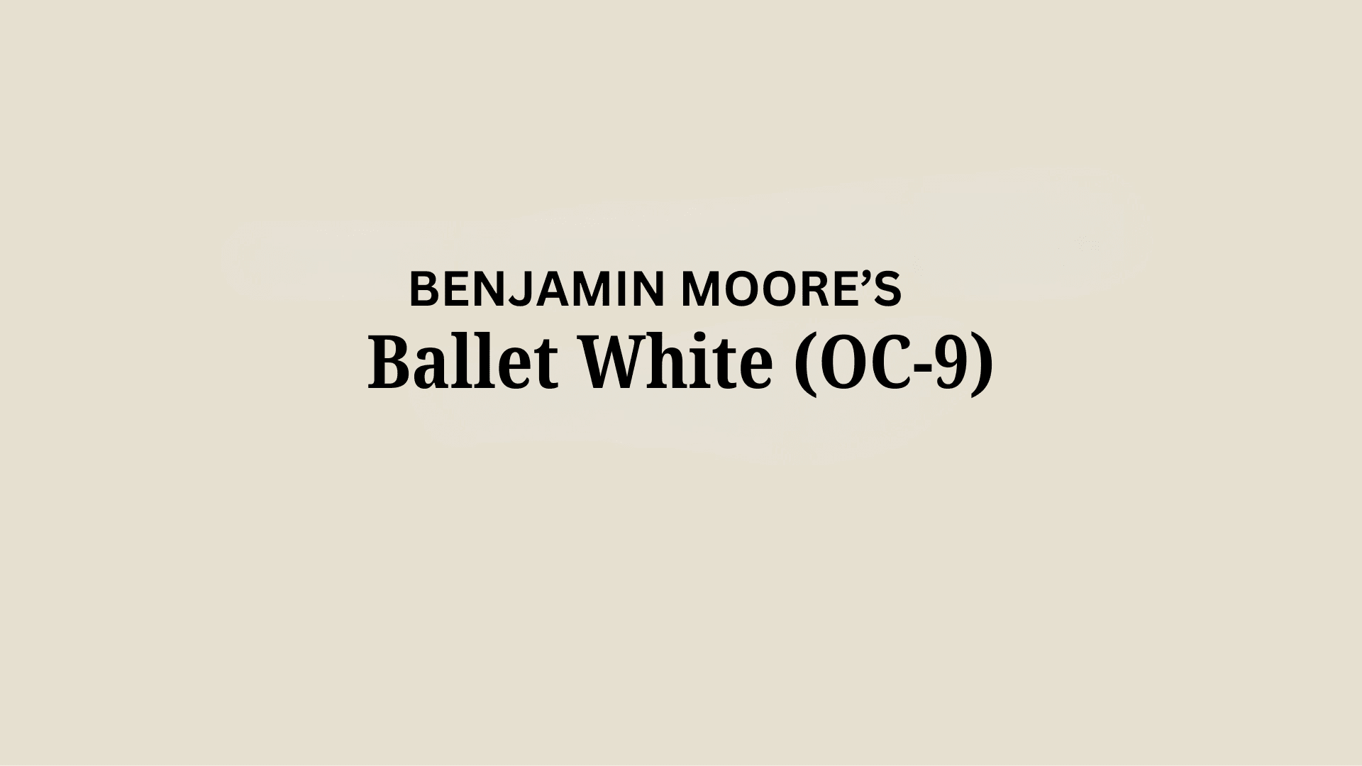
Benjamin Moore Ballet White demonstrates remarkable adaptability with existing elements like dark-colored furniture and natural wood fixtures, creating a beautiful balance between spaces.
It provides enough brightness to feel substantial and welcoming while maintaining a refined, enduring quality that won’t quickly date your interior design choices.
This versatile off-white works equally well as an all-over color for creating cohesive, atmospheric environments or as a complementary element to more saturated accent walls.
Note: Works especially well with classic furniture, mixed metals, and layered textiles.
Durability
Benjamin Moore Ballet White, particularly in premium finishes like Aura or Regal Select, delivers outstanding durability with excellent coverage in both new and repainted areas.
Its warm tone and subtle beige-green undertones maintain a refined appearance throughout your home while providing a forgiving surface for everyday living.
This paint resists yellowing and maintains color consistency even with regular cleaning when properly applied.
Practical tip: Avoid using matte finish in high-traffic areas; choose eggshell or satin for easy cleaning and better light reflection.
Texture Patterns
Benjamin Moore Ballet White creates a soft, velvety texture that adds subtle dimension to walls and infrastructural features. Its complex undertones produce a beautiful light play that enhances moldings and adds visual interest to even simple walls.
When applied to different finishes, it can gracefully highlight details while maintaining a consistent, refined appearance throughout connected spaces.
Clarify benefit: Highlights crown molding and trim without overpowering them.
Room-by-Room Color Recommendations with Ballet White
1. Living Spaces and Open Floor Plans
- Ballet White works exceptionally well as an all-over color in open floor plans, creating a cohesive space while maintaining a refined, timeless palette.
- The 71.97 LRV of Ballet White provides a substantial, brightening feel that makes spaces appear more open and refined without feeling cold or sterile.
- Use Ballet White to unify different areas in larger spaces while allowing textural elements and artwork to stand out against its warm backdrop.
Quick Lighting Tip: Layer your lighting with warm white LED bulbs (2700K-3000K) to enhance Ballet White’s beige undertones. Use table lamps and floor lamps to create pools of light that make the space feel cozy in the evening.
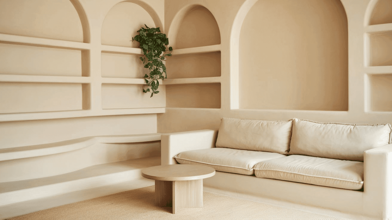
2. Bedrooms and Relaxation Areas
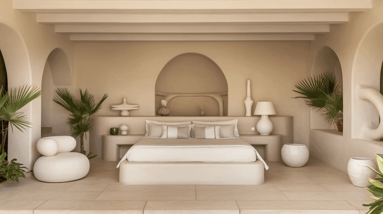
- Ballet White creates a soothing, gentle atmosphere in bedrooms that promotes relaxation and rest.
- The subtle beige undertones in Ballet White evoke a sense of comfort while creating a refined backdrop for bedding and furniture of any style.
- Consider Ballet White for all walls to create a serene sanctuary that feels both spacious and intimate without sacrificing warmth.
Quick Lighting Tip: Install dimmer switches on overhead lights and use soft, warm bedside lamps. The warm light will bring out Ballet White’s cozy beige tones, making your bedroom feel like a peaceful retreat.
3. Kitchens
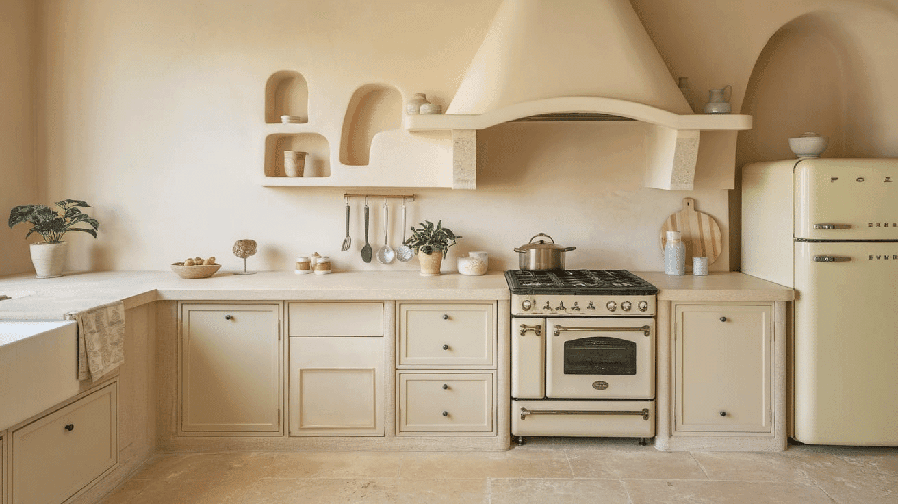
- Ballet White in an eggshell or semi-gloss finish on cabinets creates a timeless element that contrasts beautifully with dark-colored islands or accent pieces.
- The warm depth of Ballet White enhances both dark countertop materials and brushed nickel fixtures, making it adaptable to various kitchen styles from farmhouse to transitional.
- Ballet White upper and lower cabinets paired with a subtle accent wall create an appealing balance that brightens the kitchen while maintaining a refined, cohesive feel.
Quick Lighting Tip: Add under-cabinet LED strips in warm white to highlight Ballet White cabinets and prevent shadows on countertops. Pendant lights over islands should use soft white bulbs to keep the warm, welcoming feel.
4. Bathrooms and Spa-like Retreats
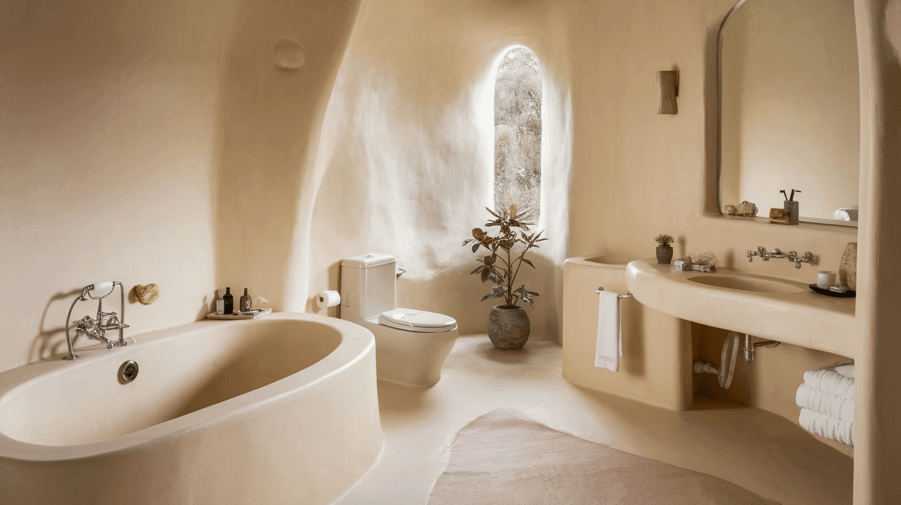
- Benjamin Moore Ballet White creates a warm, refined atmosphere in bathrooms. Its subtle beige undertones establish a sense of comfort while complementing various fixtures.
- This versatile shade pairs beautifully with both chrome and brass fixtures, natural stone, and warm wood, creating a timeless, refined retreat that feels both grand and inviting.
- Use Ballet White on all walls in smaller bathrooms to create a sense of spaciousness without sacrificing character.
Quick Lighting Tip: Choose vanity lights with warm white bulbs and add a small table lamp or candles for ambient lighting. The soft light will enhance Ballet White’s spa-like qualities and prevent harsh shadows on your face.
Ballet White Color Combinations
Ballet White is a warm, refined off-white with subtle beige and the faintest green undertones. Its high Light Reflectance Value (LRV) of 71.97 makes it a substantial, brightening foundation that adds openness and versatility to spaces while maintaining a refined warmth.
Complementary Trim Colors
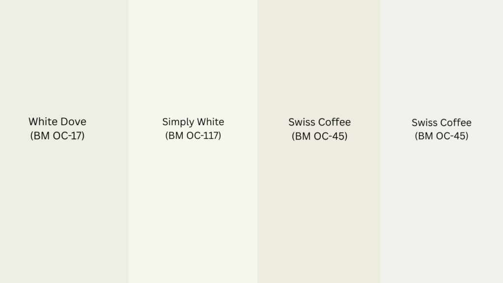
- White Dove (BM OC-17) – A soft white that creates subtle distinction with Ballet White
- Simply White (BM OC-117) – A clean, warm white that complements Ballet White’s softness
- Swiss Coffee (BM OC-45) – A versatile off-white that enhances Ballet White’s warm quality
- White Heron (BM OC-57) – A crisp white that contrasts with Ballet White’s warm undertones
Coordinating Wall Colors
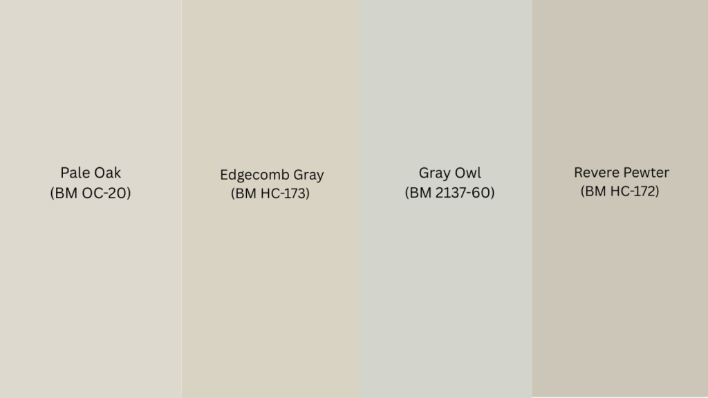
- Pale Oak (BM OC-20) – A light warm beige that extends Ballet White’s warmth
- Edgecomb Gray (BM HC-173) – A versatile gray that creates a balanced, cohesive palette
- Gray Owl (BM 2137-60) – A light, cool gray that balances Ballet White’s warmth
- Revere Pewter (BM HC-172) – A warm gray that provides depth while complementing Ballet White
Accent Colors
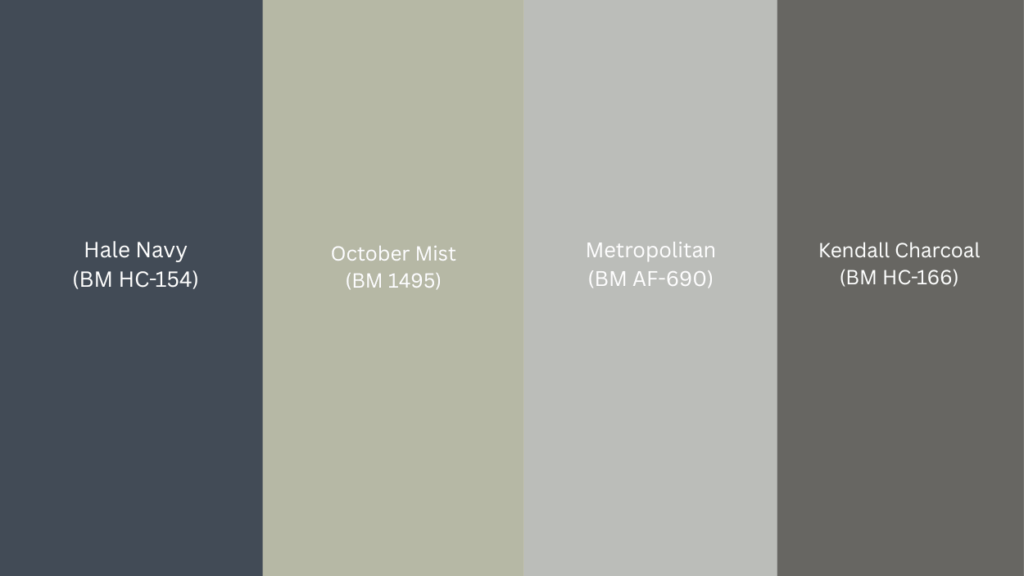
- Hale Navy (BM HC-154) – A deep navy that creates a classic contrast with Ballet White’s warmth
- October Mist (BM 1495) – A soft sage green that enhances Ballet White’s subtle green undertone
- Metropolitan (BM AF-690) – A refined gray that adds depth to a compatible palette
- Kendall Charcoal (BM HC-166) – A deep gray that grounds Ballet White’s airy quality
Coordinating with Furniture and Decor
1. Wood Tones
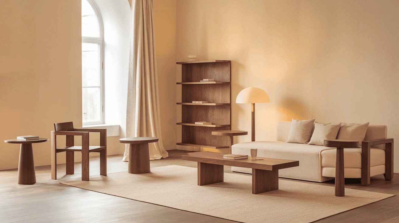
Ballet White works with almost any wood finish you choose the secret lies in understanding how each wood type changes your room’s personality.
Dark woods, such as walnut, cherry, and oak, create a striking contrast against Ballet White’s warm backdrop. This combination feels rich and inviting. Light woods such as maple and ash extend Ballet White’s gentle warmth for a cohesive look. Think clean Scandinavian style that feels fresh and airy.
Gray-washed or white-washed woods bring out Ballet White’s sophisticated side. This pairing creates a modern, transitional style that feels current.
Natural, unstained wood highlights Ballet White’s depth and complexity. The organic contrast adds warmth while maintaining authenticity.
2. Metals
Ballet White works beautifully with both warm and cool metal finishes. Each type creates a different mood in your space.
Cool metals like pewter and brushed nickel add contrast without overpowering Ballet White’s warmth. These finishes create a balanced, transitional look that feels timeless. Warm metals such as brass and gold pair exceptionally well with Ballet White’s beige undertones. They enhance the cozy feeling while adding a touch of sophistication. Choose from antiqued or brushed finishes for a refined look.
Matte black fixtures create a bold contrast that highlights Ballet White’s brightness. This combination feels fresh and contemporary.
Bronze and copper finishes complement Ballet White’s warm character perfectly. These rich metals add depth while maintaining the cozy, inviting feeling.
3. Decor
Natural fibers like linen, cotton, and jute in various textures create dimensional interest against Ballet White walls while complementing its organic warmth. Colorful accents in muted or earth tones, such as terracotta, olive, and navy, offer a refined complement to the warm backdrop.
Glass, ceramic, and stone elements in warm tones add weight and prevent Ballet White from feeling too neutral in spaces with abundant natural light.
Introducing natural elements with varied textures—like wool, leather, or woven materials—reinforces the organic balance inherent in this versatile off-white while adding tactile interest.
Similar Paint Colors: Perfect Alternatives to Ballet White
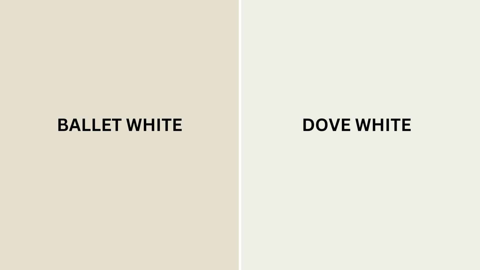
Ballet White vs. White Dove
Ballet White (Benjamin Moore OC-9)
- A warm off-white with subtle beige and faint green undertones
- Medium-high LRV (71.97) that creates bright, welcoming spaces
- Works well in transitional, traditional, or farmhouse interiors
- Best for spaces where you want a substantial, refined warmth
White Dove (Benjamin Moore OC-17)
- A versatile soft white with slight yellow undertones
- Medium-high LRV (83.16) that creates a brighter, adaptable backdrop
- Contains warm undertones that create a more traditional atmosphere
- Popular for creating bright, warm environments that work with many design styles
Key Differences:
- Ballet White has more noticeable beige undertones, while White Dove has yellow undertones
- White Dove appears slightly brighter in most lighting conditions
- Ballet White creates more warmth and depth, while White Dove is more versatile and bright
- They serve similar roles in design – both as warm neutrals with slightly different characters and undertones
Final Thoughts
Ballet White (OC-9) surpasses trends, representing the perfect balance between warmth and refinement that makes it a perennial favorite among designers and homeowners seeking smart, flowing spaces.
Its subtle complexity allows it to adapt effortlessly to changing styles and seasonal accents, ensuring longevity in your design choices.
Whether softening your walls in afternoon light or creating a canvas for textural elements, Ballet White delivers a timeless quality that both upgrades and warms a space.
In choosing this exceptional shade, you’re selecting a color that values peace and lasting beauty in the spaces we call home.
Ready to transform your space with Ballet White? Start by ordering a sample and testing it in your room’s lighting conditions.
If you’re more interested in color type reviews and expert insights, click here to explore paint color guides and design tips.

Alex Guerrero, a graduate with a Fine Arts degree from the Rhode Island School of Design, has been a visionary in the world of color and design for over 15 years. His professional journey began in the heart of the fashion industry in Milan, where he developed an acute sense for color harmonies and trends. Alex joined our team in 2018, offering fresh and innovative perspectives on color utilization in various spaces. Renowned for his ability to blend contemporary trends with timeless elegance. Outside of work, Alex is an accomplished painter and a volunteer art therapist, his artistic talents further enriching his professional insights.