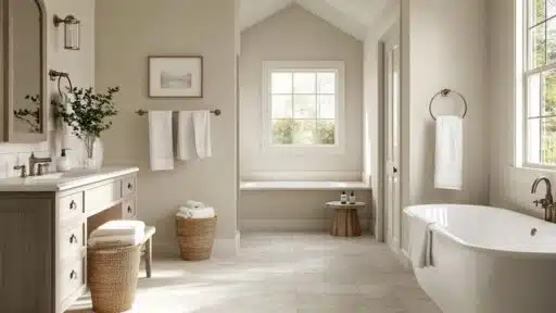
Looking for the perfect paint color that works everywhere in your home?
This super-popular warm gray paint has become a favorite for good reasons.
With its friendly mix of gray and beige (called “greige”), Revere Pewter converts ordinary walls into spaces that feel just right.
It works like magic in different lighting, showing warm beige tones in morning light and cooler gray shades in the evening.
It makes rooms feel bright without being too stark or too dark.
If you have a modern apartment or a cozy farmhouse, this versatile color creates the perfect backdrop for your furniture and decorations.
Understanding Benjamin Moore’s Revere Pewter
Revere Pewter is a hugely popular warm gray paint color by Benjamin Moore.
It alters ordinary walls into refined, inviting spaces that feel just right in any home.
You can identify the color as HC-172 or as 973.
Color Terminology
Let’s look at what makes this color a hit.
These numbers help you understand the real character of this amazing paint.
| PROPERTY | VALUE |
|---|---|
| LRV | 55.05 |
| RGB | 203, 198, 184 |
| HEX | #CBC6B8 |
With its middle-range LRV of 55.05, it brightens rooms without being too stark.
Keep these RGB and Hex codes handy when shopping for matching decor online.
Undertones:
- It carries gentle green and warm taupe undertones
- It’s a friendly chameleon color that shifts slightly throughout the day
- Not a flat gray, but a complex, cozy beige that feels alive
Psychology of Neutral Colors
The paint colors we choose impact our daily moods and home atmosphere, especially versatile ones like this.
- Balanced grieges: Help create peaceful, stress-free environments.
- Refined neutral shades: Make decorating almost foolproof
- Adaptable wall colors: Adjust beautifully to changing natural light
- Advantages: Forgives wall imperfections, coordinates with everything, creates a polished look
People love this color because it feels both classic and current at the same time.
You really can’t go wrong with this color – it’s like the perfect pair of jeans for your walls!
Why Choose Benjamin Moore Revere Pewter?
Benjamin Moore Revere Pewter is a warm, light gray paint that makes rooms feel cozy and inviting.
It’s super easy to use because it plays well with almost any furniture or decor style you already have.
1. Versatility
This color changes slightly throughout the day in really pretty ways.
Morning light brings out its warmer beige tones, while evening light shows more of its soft gray side.
This friendly color works in kitchens, living rooms, hallways, and bedrooms.
It looks just as good in a farmhouse as it does in a modern condo, making it truly foolproof.
2. Key Features
It strikes the perfect balance between warm and cool.
With its medium LRV of 55.05, it brightens spaces without being too stark or washed out.
This color has been popular for over a decade because it has a timeless quality that doesn’t scream “trendy.”
Once it’s on your walls, you’ll notice how it improves the appearance of everything else in the room.
3. Durability
When applied in Benjamin Moore’s Aura or Regal Select formulas, it handles everyday life with ease.
The neutral beige tone hides small smudges and dirt better than stark whites, making it ideal for busy family homes.
Its quality pigments maintain their beautiful color even after years of cleaning, so your investment lasts longer.
4. Texture Patterns
This color creates a soft, velvety look that instantly makes rooms feel put-together.
Its subtle green-gray undertones add just enough interest without overwhelming your space.
This versatile shade makes crown molding and trim look crisp and clean.
It flows beautifully from room to room, creating a cohesive feel while letting your furniture and accessories be the stars.
Room Color Recommendations: Benjamin Moore Revere Pewter
This is a warm, light gray paint that makes rooms feel welcoming and put together.
It looks slightly different as the day goes on, showing more beige in morning light and cooler gray tones in the evening.
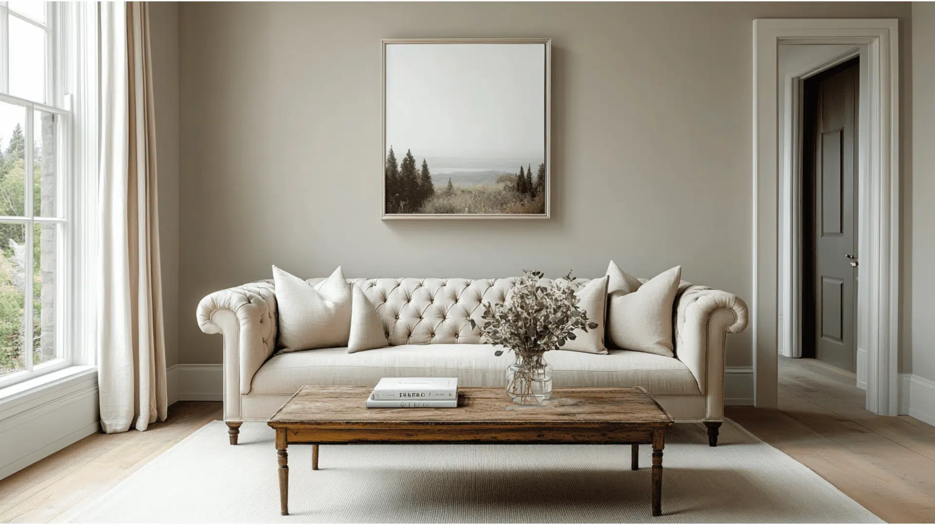
1. Living Spaces and Family Rooms
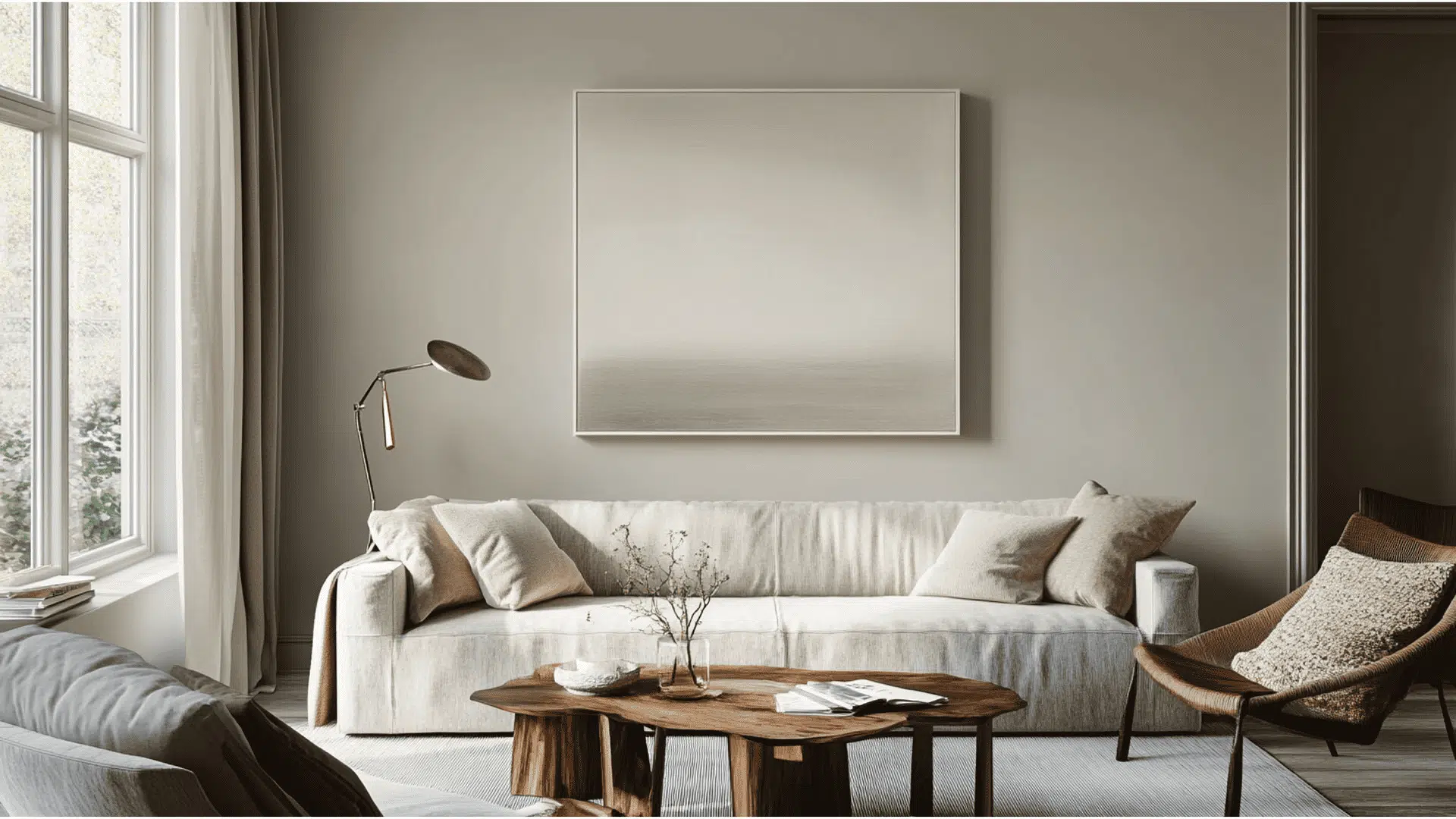
- This versatile color creates a perfect backdrop in living rooms, letting your furniture and colorful accessories be the stars of the show.
- The neutral color works with both traditional and modern furniture, so you don’t have to worry about repainting when you update your style.
- Try pairing this with white trim and dark wood floors for a balanced look that feels both fresh and cozy.
2. Kitchens and Dining Areas
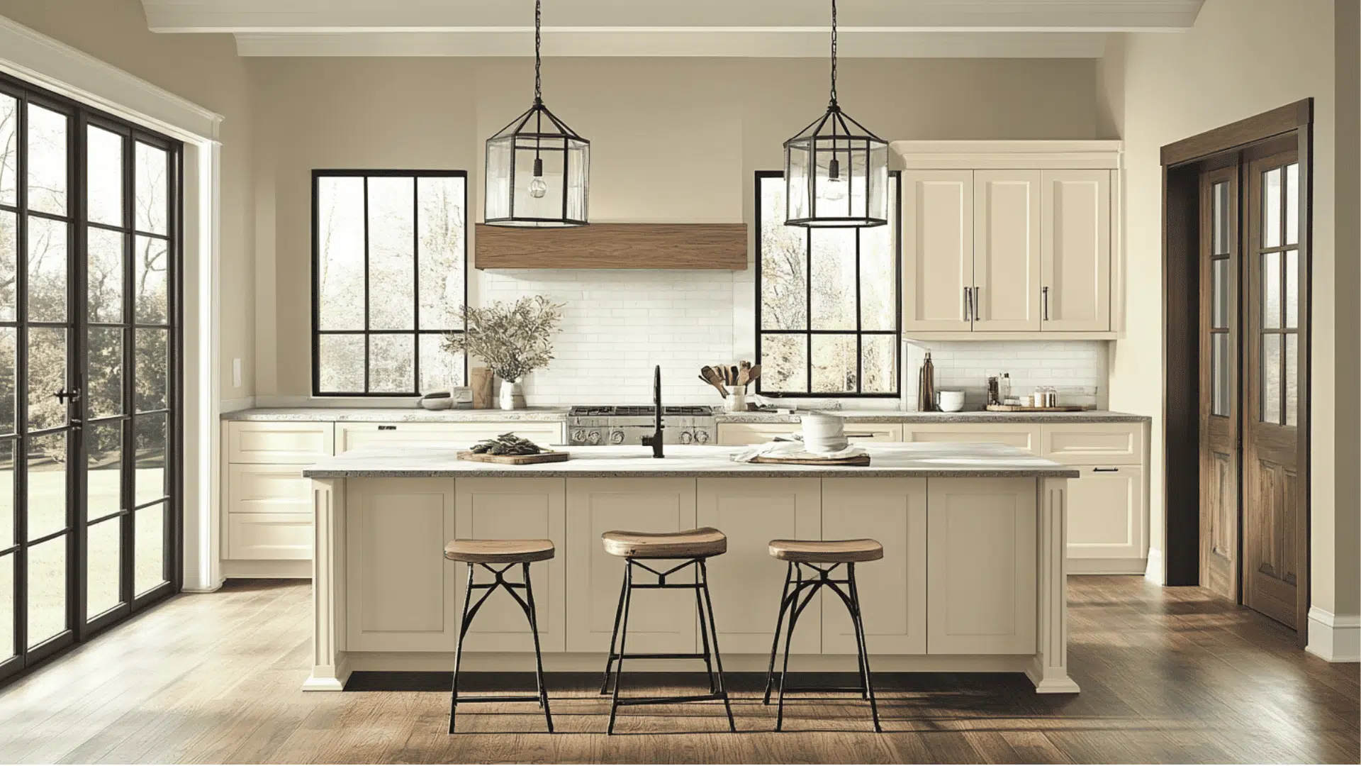
- It makes kitchens feel clean and bright without the harsh feeling that comes with pure white walls.
- The soft color complements both white cabinets and dark wood cabinets equally well, making it super versatile for any kitchen style.
- In dining rooms, this gentle neutral creates a relaxed atmosphere that makes mealtime more enjoyable and conversation flow more easily.
3. Bedrooms and Relaxation Spaces
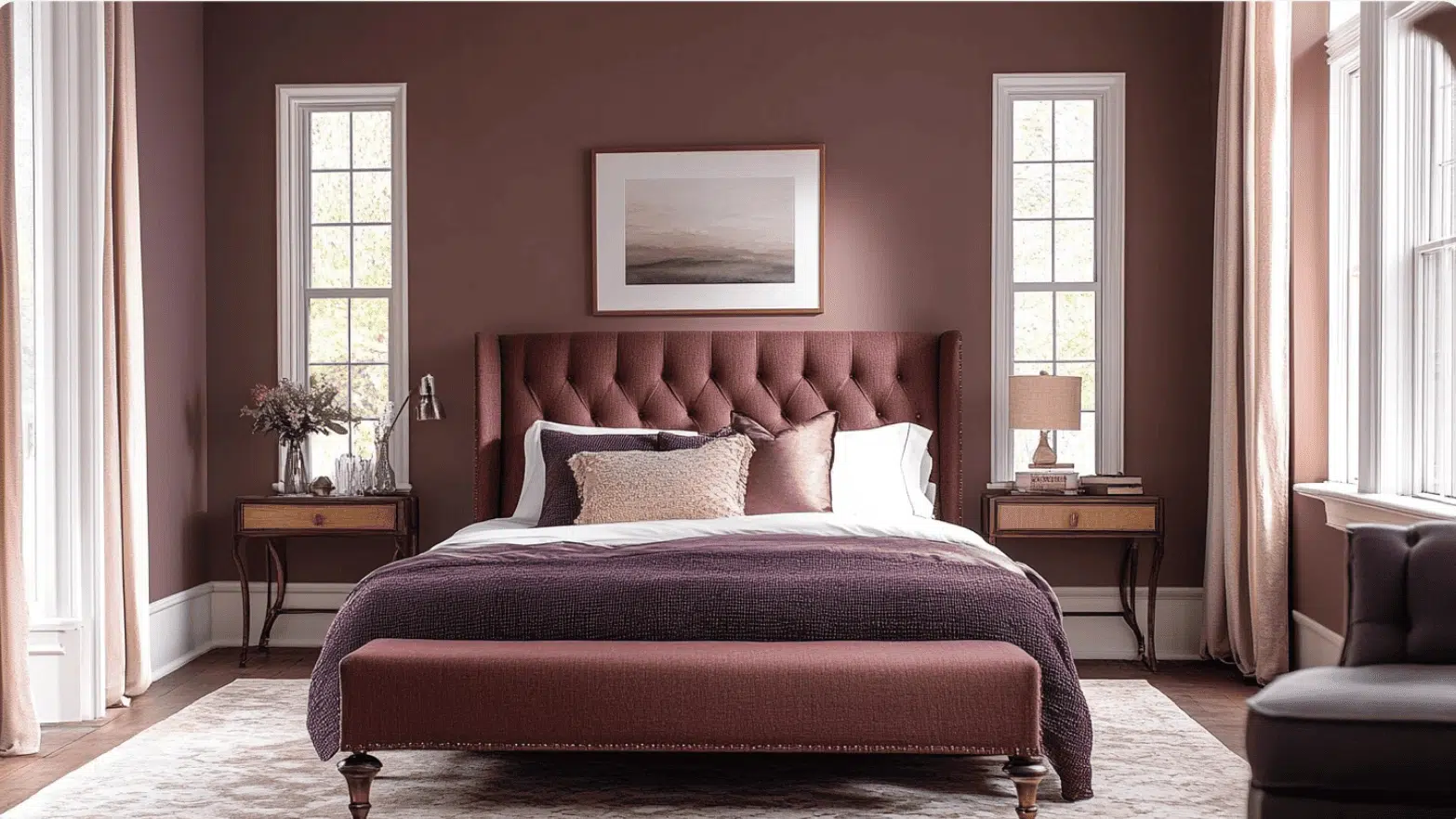
- Turns bedrooms into calm retreats that feel peaceful and not too stimulating when you’re trying to wind down.
- The balanced undertones work beautifully with any bedding colors from crisp whites to rich blues or soft pinks.
- This color makes small bedrooms feel bigger and airier while still keeping the cozy feeling that helps you sleep better.
Color Pairings and Combinations for BM Revere Pewter (HC-172)
This is a friendly light gray-beige that works in almost any room.
Its medium LRV of 55.05 creates bright, welcoming spaces that feel both cozy and graceful.
Here are the perfect partner colors for this super versatile shade.
Complementary Trim Colors
Choosing the right trim color can really change how it feels in your home.
These specific colors create beautiful relationships with their warm, soft tones.
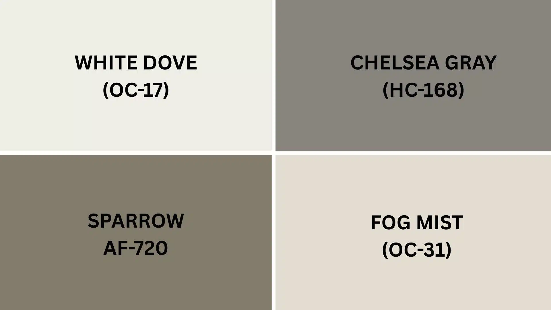
1. White Dove (OC-17)
A soft, warm white that pairs perfectly with the color, creating a clean but not stark contrast that works beautifully in kitchens, living rooms, and throughout the whole house.
2. Chelsea Gray (HC-168)
A rich, medium gray that adds drama when used with the color on cabinets or as an accent wall, creating a refined look that’s not too bold for everyday living.
3. Sparrow (AF-720)
A deeper, earthy brown-gray that makes a gorgeous accent color when this is your main wall color, perfect for adding a touch of coziness to dining rooms or bedrooms.
4. Fog Mist (OC-31)
A lighter, airier version of gray that creates a subtle, layered look, ideal for creating flow between connected rooms without everything looking the same.
Creating Cohesive Color Schemes
Benjamin Moore Revere Pewter works great with lots of other colors to make your whole house feel connected.
This warm gray-beige shade is a perfect starting point for many different design styles.
Here are three different color schemes that use it as the main color.
Here is the table formatted as requested:
| SCHEME | MAIN WALLS / AREAS | TRIM / ACCENT / CEILINGS | OTHER ROOMS / ACCENTS |
|---|---|---|---|
| Monochromatic | Revere Pewter (HC-172) | White Dove (OC-17) | Edgecomb Gray (HC-173), Horizon (OC-53) |
| Warm | Revere Pewter (HC-172) | Chelsea Gray (HC-168) | Pale Oak (OC-20), Sparrow (AF-720) |
| Cool | Revere Pewter (HC-172) | Wickham Gray (HC-171) | Fog Mist (OC-31), Stonington Gray (HC-170) |
NOTE: All colors shown are Sherwin-Williams paints. Colors will look different depending on your lighting, so always test samples on your walls before buying full gallons.
Coordinating with Furniture and Decor
This is a warm color that makes your furniture and decorations look their best.
Its warm gray-beige tone creates a soft backdrop that lets your favorite things shine without competing for attention.
1. Wood Tones
This paint color works amazingly well with dark woods like walnut, espresso, and dark oak.
These rich woods create a beautiful contrast against the light walls, making a cozy, welcoming look.
Medium woods like maple and cherry blend flawlessly with the color, creating a balanced flow.
When paired with this versatile neutral shade, light woods like blonde oak or pine add brightness and a casual feel.
2. Metals
Brushed nickel and chrome fixtures look clean and modern, adding a touch of refinement without being flashy.
Oil-rubbed bronze and antique brass create a warm, timeless feel that complements the cozy undertones in the paint.
Matte black hardware pops nicely against the light walls, creating defined lines that add character to kitchens and bathrooms.
3. Decor
Bold colored fabrics like navy, burgundy, and forest green stand out beautifully, creating focal points without overwhelming the space.
Soft pastels like blush pink, light blue, or sage green blend gently with the neutral background, creating a calm, peaceful feeling.
Patterned rugs, textured throw pillows, and natural elements like woven baskets add interest and depth to rooms painted in this versatile, forgiving color.
Similar Paint Colors: Perfect Alternatives to Revere Pewter
These colors all create warm, welcoming spaces with a cozy, neutral feel.
They’re great options when you want a versatile color that works in any room.
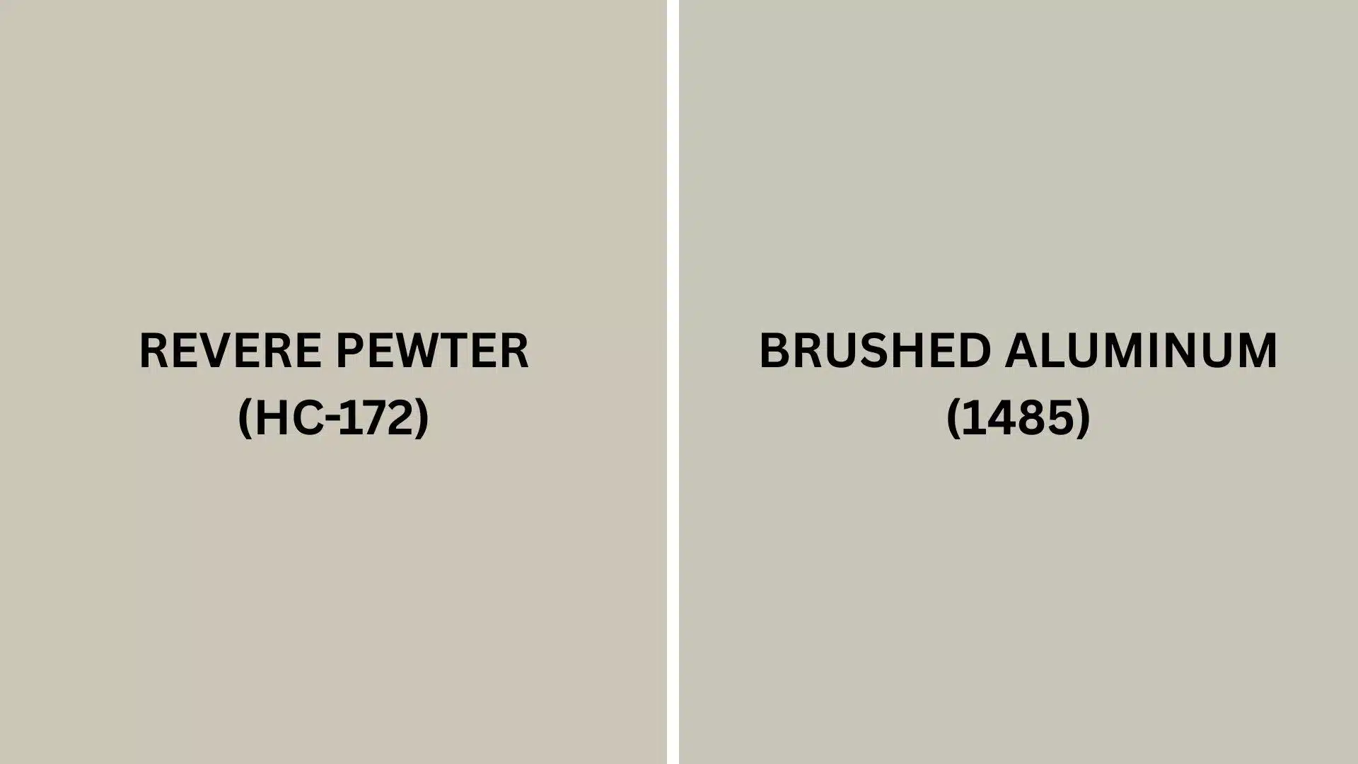
Revere Pewter vs. Brushed Aluminum
If you’re stuck between these two popular neutrals, understanding their differences will help you decide.
Both colors create beautiful spaces, but they have different personalities that affect how your room will feel.
Revere Pewter (HC-172)
- Warmer with green-beige undertones that create a cozy, lived-in feeling
- More versatile in different lighting conditions, looking good from morning to night
- Pairs beautifully with both cool and warm accent colors for flexible decorating
Brushed Aluminum (1485)
- Cooler with blue-gray undertones that create a more modern, crisp feeling
- More sensitive to lighting changes, sometimes appearing silvery in bright light
- Works especially well with blues and greens for a fresh, contemporary look
Final Words
Benjamin Moore Revere Pewter truly earns its reputation as a perfect neutral for any home.
This adaptable color pairs beautifully with everything from dark wood furniture to bright accent colors, making decorating so much easier.
Its balanced green-gray undertones create spaces that feel both fresh and cozy at the same time.
This paint color works wonderfully in every room, from brightening kitchens to creating calm bedrooms and professional-looking home offices.
It hides wall imperfections better than stark whites and stands up to daily life in busy households.
When you’re stuck between paint choices, this beige neutral is the reliable friend that never disappoints.
Ready to transform your home with this designer favorite? Get a sample today and experience the magic for yourself!
Share your experience in the comment section below!
If you’re interested in more informational color review content, feel free to click here and explore other blogs that you might enjoy.

Alex Guerrero, a graduate with a Fine Arts degree from the Rhode Island School of Design, has been a visionary in the world of color and design for over 15 years. His professional journey began in the heart of the fashion industry in Milan, where he developed an acute sense for color harmonies and trends. Alex joined our team in 2018, offering fresh and innovative perspectives on color utilization in various spaces. Renowned for his ability to blend contemporary trends with timeless elegance. Outside of work, Alex is an accomplished painter and a volunteer art therapist, his artistic talents further enriching his professional insights.