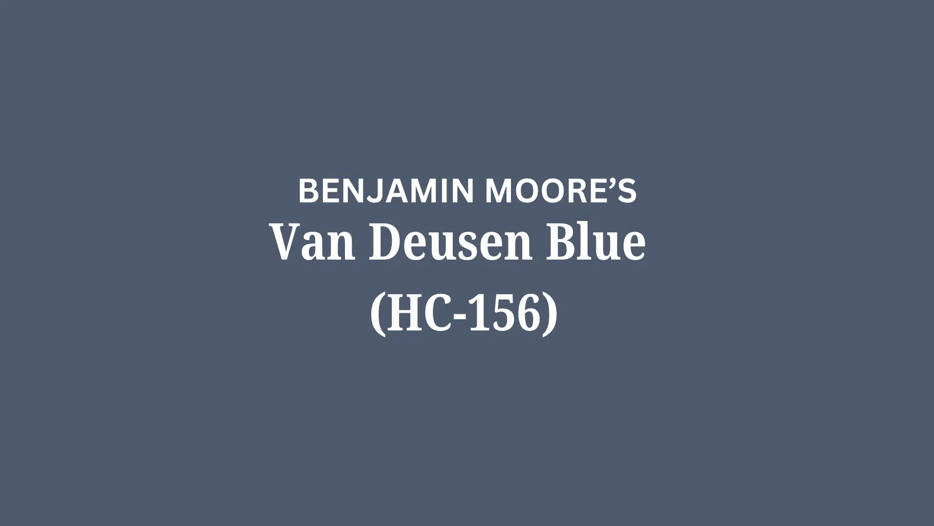
Picture a paint color that shifts from deep navy to soft slate as daylight moves across your walls. Van Deusen Blue HC-156 by Benjamin Moore does exactly that.
This rich blue-gray paint works in nearly every room. In bright morning light, you’ll see hints of teal. By evening, it turns into a cozy charcoal blue that makes spaces feel warm and inviting.
What makes Van Deusen Blue special?
Its complex undertones create depth without feeling heavy. Unlike flat navy paints, this shade brings life to your walls through subtle color shifts.
In this guide, we’ll show you how Van Deusen Blue looks in different lighting, which rooms benefit most from this shade, and the best color pairings that make it shine. Let’s explore why designers love this versatile blue-gray.
Understanding Van Deusen Blue Undertones
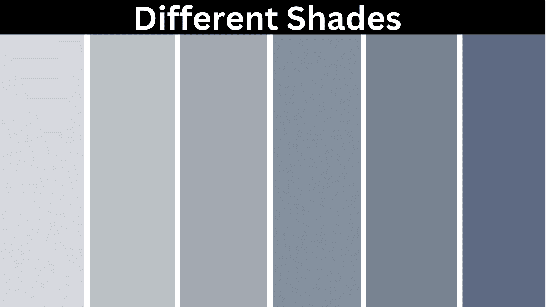
Van Deusen Blue has soft gray and teal undertones. These hidden colors show up differently depending on your lighting. In bright rooms, it might look more deep blue.
In darker spaces, the gray might come out more. Sometimes, you’ll see hints of purple when the sun hits it. These undertones make Van Deusen Blue change throughout the day as the light changes.
This is why it’s important to test the paint on your walls before painting the whole room. The undertones are what make Van Deusen Blue work so well with many other colors.
Color Terminology
| Attribute | Value |
|---|---|
| Color Code | HC-156 |
| Light Reflective Value (LRV) | 11.97 |
| Hex Code | #485B6E |
| RGB Value | 72, 91, 110 |
Psychology of Navy Blue Shades
Navy blue colors, like Van Deusen Blue, can significantly influence room vibe and emotional responses. Let’s jump into why navy blue is so popular.
- Navy blue creates a sense of calm and stability in a room
- Deep blue promotes focus and concentration, perfect for offices or studies
- Navy adds refinement and classiness without being too formal
- It pairs beautifully with both warm and cool accent colors
- Navy blue can make a room feel cozy and intimate in colder months
- Using Van Deusen Blue can help make your home feel grounded yet refined without being overwhelming.
Why Choose This Color?
Van Deusen Blue by Benjamin Moore adapts to various home styles, from coastal to traditional.
It changes beautifully with different lighting – appearing more gray in artificial light and richer blue in natural daylight.
If you find light walls too casual, Van Deusen Blue offers a refined touch of color without being too intense.
This color works well in dining rooms, home offices, bedrooms, and even as an accent in kitchens. It creates intimate, cozy spaces while adding enough depth to feel stylish and timeless.
Key Features
- Rich, complex navy blue that balances between cool and warm undertones
- Works with many other colors, from crisp whites to warm woods and metallic accents
- It makes large spaces feel more intimate while adding character to smaller rooms
- It provides a dramatic background that showcases artwork and light furniture beautifully
Durability
Benjamin Moore Van Deusen Blue maintains its appearance exceptionally well over time. The color stays rich and doesn’t fade quickly, even in rooms with good sunlight.
It handles everyday wear better than lighter colors, hiding minor marks and scuffs.
When you need to clean or touch up walls, the color blends easily without showing patch differences between existing and new paint.
Texture & Finish Recommendations
- For walls, a matte or eggshell finish reduces glare while highlighting the depth of the color.
- Satin finish works best in bathrooms and kitchens for easier maintenance.
- Semi-gloss provides stylish contrast on trim against matte walls.
- For cabinets and furniture, choose satin or semi-gloss for durability and a subtle sheen.
Where to Use Benjamin Moore’s Van Deusen Blue?
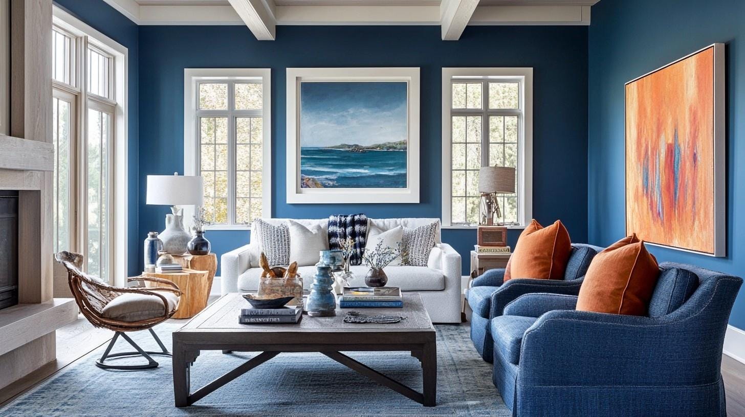
1. Living Spaces & Open Floor Plans
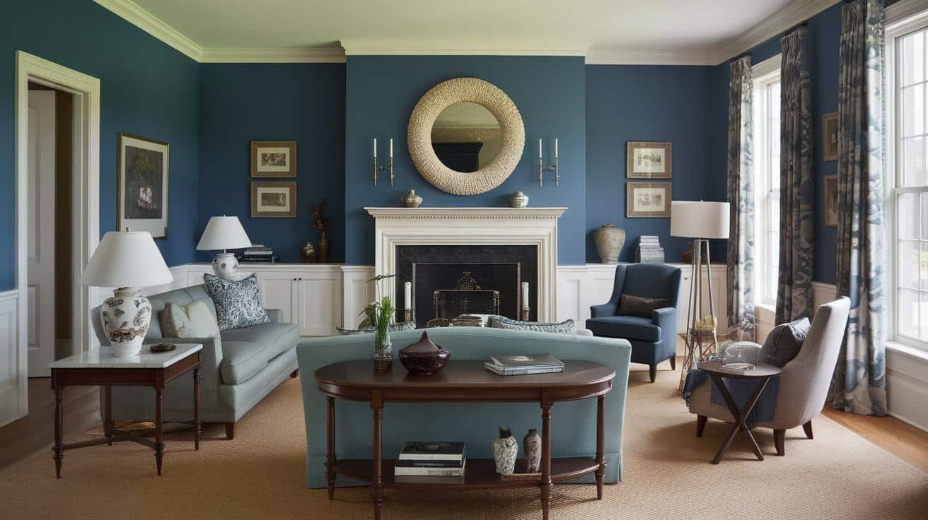
Van Deusen Blue creates a refined, cozy feeling in living areas. It makes light furniture and artwork stand out dramatically against the deep background.
Small Tips:
- Use plenty of warm lighting to balance the depth of the blue
- Paint trim Alpine White for a crisp contrast that defines the space
2. Bedrooms & Relaxation Areas
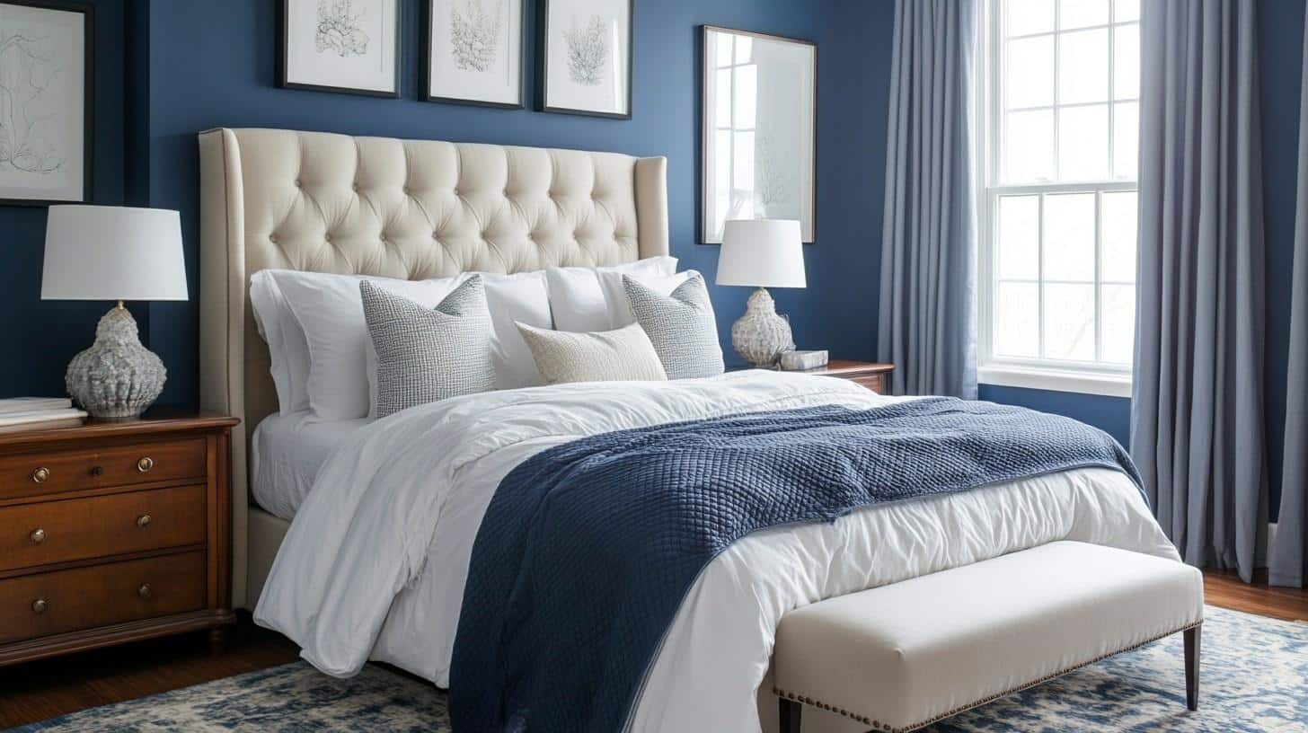
This rich navy creates a cocoon-like atmosphere perfect for restful sleep. It works beautifully with most bedding colors and creates a serene, enveloping environment.
Small Tips:
- Add warm metal accents like brass or gold to bring warmth to the cool blue
- Use cream or white bedding for a striking contrast that keeps the room feeling balanced
3. Kitchens & High-Traffic Zones
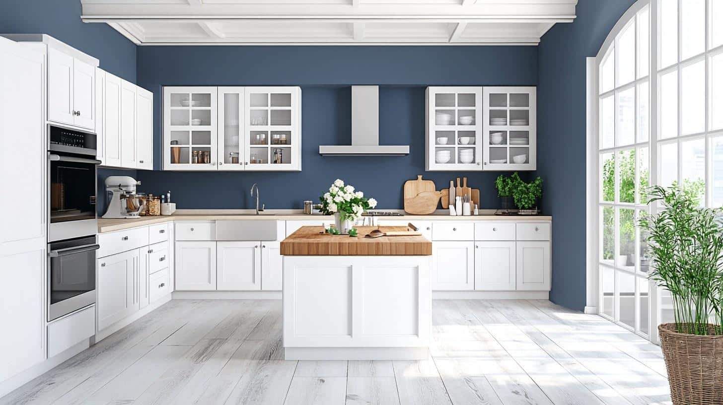
Van Deusen Blue makes a stunning statement on kitchen islands or lower cabinets. It hides marks well and creates depth without darkening the space too much.
Small Tips:
- Pair with marble or white quartz countertops for a timeless, stylish look
- Choose brushed nickel or chrome hardware for a modern touch that complements the blue
4. Bathrooms & Spa-Like Retreats
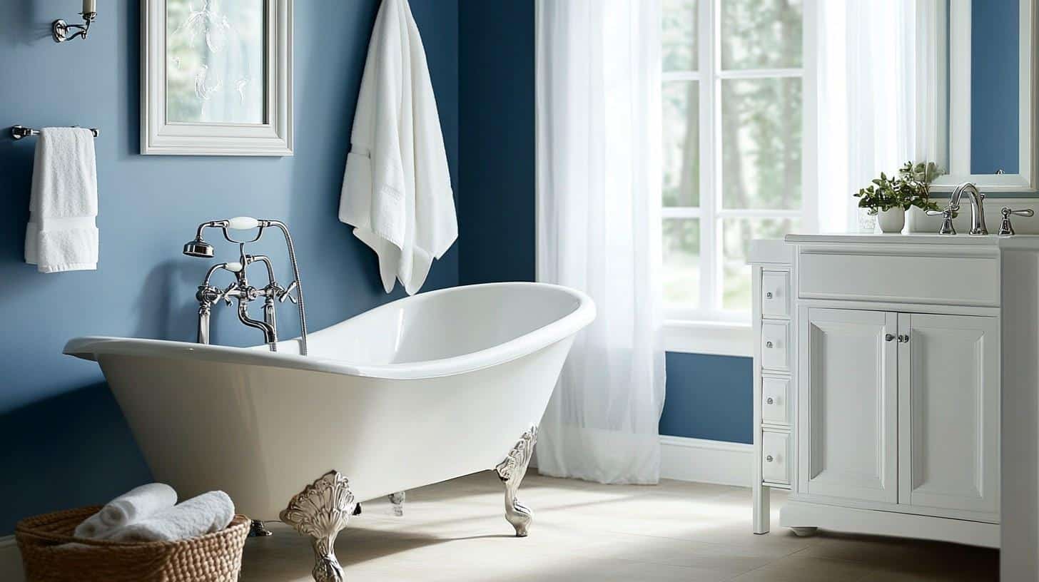
The deep blue tone creates a luxurious feeling in bathrooms. It works exceptionally well with white fixtures and most tile selections.
Small Tips:
- Add plenty of mirrors to reflect light and prevent the space from feeling too dark.
- Use plush white towels to create a dramatic contrast against the navy walls.
Color Pairings & Combinations for Van Deusen Blue
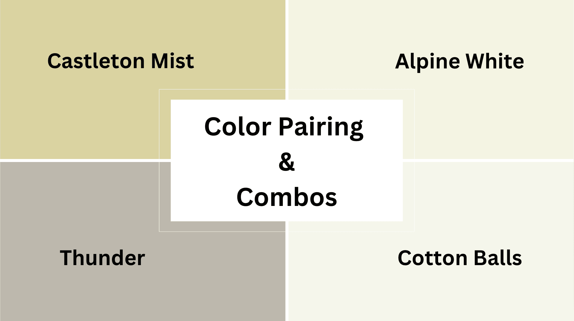
1. Alpine White (OC-124)
Alpine White creates stunning contrast when paired with Van Deusen Blue in any room. The combination creates dramatic, crisp spaces that feel both modern and timeless.
2. Castleton Mist (HC-1)
Castleton Mist complements Van Deusen Blue with a soft, sage-green shade. This team works beautifully in living rooms and bedrooms for a balanced, natural feeling.
3. Thunder (AF-685)
Thunder is a refined, warm gray that softens Van Deusen Blue when used together. These colors work well in offices and dining rooms for a stylish, coordinated look.
4. Cotton Balls (OC-122)
When matched with Van Deusen Blue, cotton balls bring warmth and lightness. This mix is excellent for creating contrast in any room, making spaces feel balanced and well-designed.
Take a Look at Purples & Timeless Blues
1. Violet Sparkle 1422
This beautiful purple brings the magic of twilight indoors. With its rich undertones and subtle shimmer, Violet Sparkle creates a sense of luxury and creativity in any space.
It is perfect for accent walls in living rooms or as a statement color in creative studios.
2. Gray Timber Wolf 2126-50
Gray Timber Wolf is a soft, refined gray that mimics the subtle coloring of its namesake. This versatile neutral provides warmth while maintaining an airy feel.
Gray Timber Wolf works beautifully in modern spaces, creating a calm backdrop that allows furniture and décor to shine.
3. Nickel 2119-50
This metallic-inspired gray carries cool undertones that evoke the sleek appearance of its namesake metal. Nickel offers a contemporary vibe that pairs wonderfully with both warm and cool accents.
It is ideal for kitchens and bathrooms, where it creates a clean, polished look.
4. Oxford Gray 2128-40
Oxford Gray is a deeper, more authoritative gray that brings substance and depth to any room. Its subtle blue undertones give it a scholarly, refined appearance.
This color works brilliantly in home offices, libraries, or as an accent in dining rooms where it lends gravitas.
5. Bachelor Blue 1629
Bachelor Blue is a playful yet refined mid-tone blue that balances between casual and stylish. It evokes clear summer skies and creates an uplifting atmosphere.
This versatile color works beautifully in bedrooms, bathrooms, or any space where you want to create a fresh, welcoming feel.
6. Blue Heron 832
Inspired by the majestic shorebird, this deep, reflective blue carries the calmness of still waters.
Blue Heron brings a sense of serenity and introspection to a space, making it perfect for bedrooms or meditation areas where calm is paramount. Its depth also makes it an excellent choice for cabinetry and built-ins.
Coordinating with Furniture & Decor

1. Wood Tones
Van Deusen Blue looks exceptional with medium- to dark woods like walnut and mahogany. Light maple and oak create a beautiful contrast that makes the blue feel even richer.
2. Metals
This paint color works stunningly with brass and gold for a classic, luxurious look. Silver, chrome, and blackened metals provide a more contemporary contrast that improves the blue’s refinement.
3. Fabrics
Crisp whites, creams, and soft grays look best with Van Deusen Blue. Adding various textures, such as velvet, linen, or wool, enhances the room’s visual interest while maintaining color balance.
4. Decor
White or cream artwork in simple frames creates dramatic contrast against Van Deusen Blue walls. Brass lamps, natural wood elements, and touches of green plants bring warmth and life to balance the cool blue.
Comparing It with Newburyport Blue
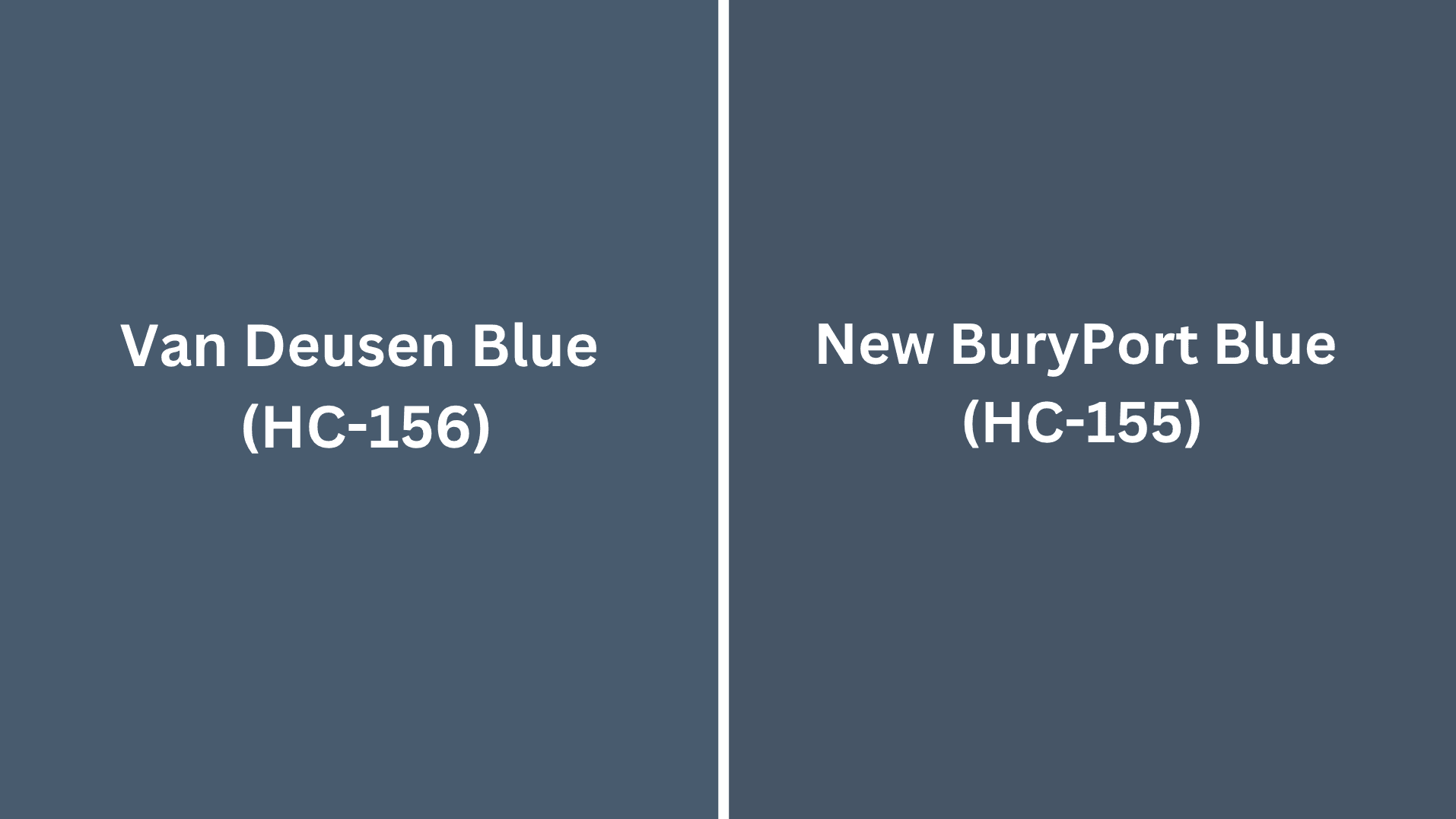
How Van Deusen Blue Differs from Newburyport Blue (HC-155)
Van Deusen Blue feels more grounded because it has gray undertones, while Newburyport Blue feels sharp with its clearer blue undertones.
- Van Deusen Blue is slightly deeper than Newburyport Blue.
- Newburyport Blue has slightly more deep blue.
Van Deusen Blue has more gray in it. When placed side by side, Van Deusen Blue looks more refined, and Newburyport Blue appears slightly brighter.
In evening light, Van Deusen Blue looks rich and cozy, while in the same light, Newburyport Blue can maintain more of its blue clarity.
Van Deusen Blue works beautifully in formal dining rooms and studies where you want a refined atmosphere. It pairs excellently with traditional furniture and classic constructive elements.
Newburyport Blue is great for bedrooms, living rooms, and spaces where you want a slightly brighter navy. It works well with coastal themes and transitional décor styles, maintaining enough depth while being somewhat more approachable.
Final Thoughts
Van Deusen Blue stands out as one of the most versatile navy paint colors available. It works in virtually any room and complements most furniture styles.
Its gray and teal undertones shift beautifully throughout the day, giving walls subtle dimension as light changes. This color creates intimate, cozy spaces while maintaining timeless style.
Ready to Try It?
Before painting your entire room, order a sample and test it on multiple walls. Watch how it changes from morning to evening. For more ideas, explore our guide to [choosing the perfect blue paint colors for your home].
Tell us: Which room are you considering — bedroom, living room, or kitchen? Do you prefer pairing Van Deusen Blue with warm brass accents or cool chrome finishes? Share your plans in the comments below!

Alex Guerrero, a graduate with a Fine Arts degree from the Rhode Island School of Design, has been a visionary in the world of color and design for over 15 years. His professional journey began in the heart of the fashion industry in Milan, where he developed an acute sense for color harmonies and trends. Alex joined our team in 2018, offering fresh and innovative perspectives on color utilization in various spaces. Renowned for his ability to blend contemporary trends with timeless elegance. Outside of work, Alex is an accomplished painter and a volunteer art therapist, his artistic talents further enriching his professional insights.