

Neutral paint colors fill most modern homes for good reason. They add warmth without taking over a space and work well with many styles of furniture and decor.
Swiss Coffee (7002-16) stands out among these neutral options. While many whites can feel too stark or too yellow, this shade offers something special that makes walls look fresh yet cozy. Don’t let the “neutral” label fool you – this color is far from boring. It has subtle notes that change with lighting and room setup.
In this blog, I’ll show you:
- What makes Swiss Coffee different
- Help you decide if it’s right for your space
- Provide tips for pairing it with other colors
Trust my tested insights to help you pick the perfect paint for your walls without any regrets.
The Deep Undertones that Make Swiss Coffee Stand Out
Swiss Coffee is a soft, warm white known for its creamy undertones and inviting feel. It’s a popular choice in both classic and contemporary spaces. The subtle beige tint gives it a cozy character without looking yellow. This makes it perfect for walls, ceilings, trim, and even cabinetry.
| PROPERTY | VALUE |
|---|---|
| LRV | 81.91 |
| RGB | 238 / 236 / 225 |
| Hex Code | #EEECE1 |
Thanks to its high LRV, Swiss Coffee bounces light beautifully, helping to open up smaller rooms. Pair it with wood tones, brass finishes, or soft grays for a timeless and balanced look.
How Swiss Coffee Affects the Feel of A Room?
I’ve seen Swiss Coffee work wonders in many homes. This color brings a warm, welcoming mood that makes spaces feel lived-in and cozy without being too dark or heavy.
The magic of Swiss Coffee is how it changes with light. In the morning sun, it appears brighter and shows more of its creamy side. By afternoon, it settles into a soft, muted tone. Under lamps at night, it takes on a golden glow that makes everyone look good.
Your north-facing rooms will benefit most from Swiss Coffee. I’ve painted my own north-facing office with it, and the color fights off that cold, bluish light that can make spaces feel unwelcoming.
In large, open living rooms with lots of windows, Swiss Coffee creates an airy feeling without the harshness of pure white. But it also works in smaller spaces like bathrooms or hallways, where it feels clean yet warm.
One surprise I found: Swiss Coffee pairs wonderfully with wood tones. If you have oak floors or wood trim, this color won’t fight against them—it complements them instead.
The best part? This color lets your furniture and art stand out while providing a background that feels intentional, not just blank.
What Makes Swiss Coffee a Great Choice for Any Space?
I’ve used Swiss Coffee in dozens of homes with totally different styles. This color fits almost anywhere you put it—that’s what makes it so useful.
Swiss Coffee doesn’t pick sides. It works just as well in a country farmhouse with shiplap as it does in a clean-lined modern condo. Your style doesn’t matter—this color adapts.
Why does it work so well? The color isn’t trying too hard. It’s not a bright white shouting for attention. It’s not a bold color that might look dated in five years. It sits quietly in the background, letting your furniture and art do the talking.
Have you noticed how some whites feel cold and others feel too yellow? Swiss Coffee finds the middle ground.
I once painted a client’s entire house in this color. Each room had different furniture styles—traditional in the living room, mid-century in the dining room, and more modern pieces in the bedrooms. The paint worked everywhere.
Your other color choices become easier, too. Swiss Coffee pairs well with:
- Deep blues and greens
- Warm wood tones
- Black accent pieces
- Soft pastels
The best thing about this color? Years later, you won’t look at your walls and think, “That was so 2025.” Good design lasts, and Swiss Coffee helps make that happen.
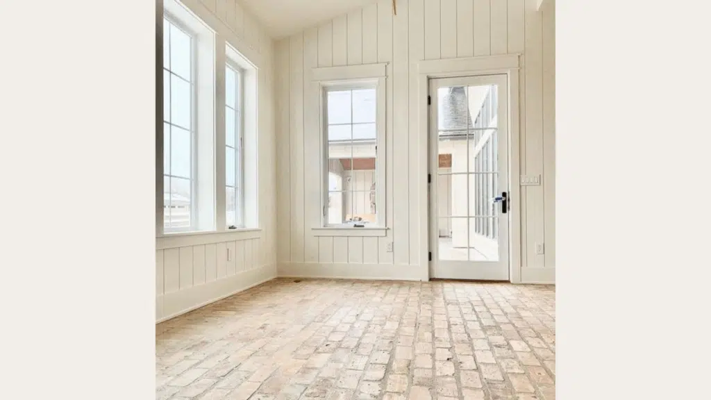
Top Spots to Use Swiss Coffee Around Your Home
Swiss Coffee is a warm, soft white paint color that works well in many parts of your home. This gentle off-white shade brings a clean, fresh feel without looking too stark or cold. These are the best places to use Swiss Coffee paint in your house:
1. Living Room Walls
I’ve found that Swiss Coffee shines brightest in living rooms. When painted on all walls, it creates a warm backdrop that feels open but not empty. Your couches, art, and decor will stand out against it without fighting for attention.
Swiss Coffee works especially well in living rooms with less natural light. It brightens these spaces without the harsh feel of pure white. If your living room serves as the heart of your home, this color helps create that welcoming feeling guests notice right away.
2. Kitchen Spaces
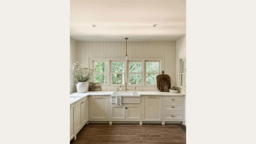
Kitchens need to feel clean but not cold. Swiss Coffee hits this balance perfectly. I painted my own kitchen cabinets with this color, and they look fresh without the sterile hospital feeling that brighter whites can create.
This color hides small marks better than stark whites. Anyone with a busy kitchen knows how helpful this can be! Your splashes and fingerprints won’t show as easily, but the space still feels neat and tidy.
3. Restful Bedrooms
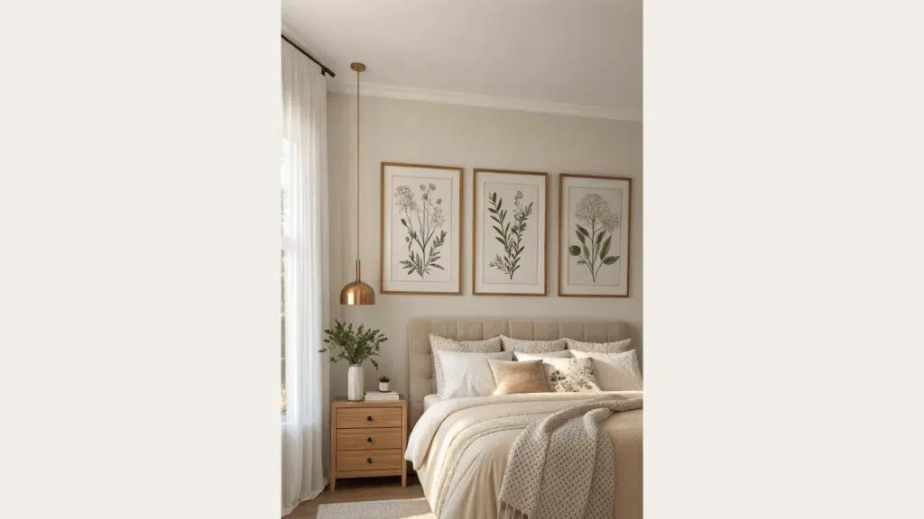
Your bedroom should feel like a retreat. Swiss Coffee on bedroom walls creates a calm base that helps you relax. It’s not too bright to keep you awake, but not so dark that the room feels small.
I love how this color looks in bedrooms with the evening light. It takes on a soft, golden quality that makes the whole room feel warm and safe. Your bedding colors will also look rich against these walls, no matter what palette you choose.
4. Fresh Bathrooms
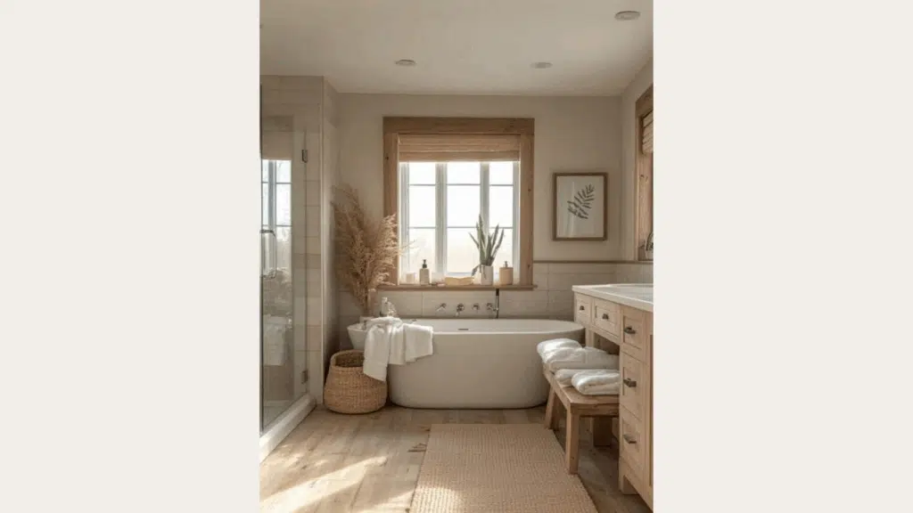
Bathrooms need to feel clean, but who wants to shower in a cold, stark box? Swiss Coffee gives bathroom walls a fresh look with just enough warmth to feel cozy.
Small bathrooms benefit most from this color. It reflects light well to make tight spaces feel bigger, but adds enough warmth that the room doesn’t feel empty or echo-y. Your towels, shower curtain, and other bathroom accessories will stand out nicely against this background.
Flooring Styles that Work Best with Swiss Coffee
Swiss Coffee pairs wonderfully with many floor types, making it a flexible choice for your home. Here are some floor styles that match perfectly with this soft white shade:
1. Light Wood Floors
Light wood floors paired with Swiss Coffee walls create a bright, open feeling in any room. I’ve seen oak, maple, and ash floors look beautiful with this paint color. The light woods bring out the warm undertones in Swiss Coffee without making the space feel too yellow.
You’ll notice how rooms feel bigger and more airy with this combo. If you have a smaller space or one with limited natural light, this pairing helps bounce light around and open things up. The overall effect feels clean and fresh without being stark or cold.
2. Dark Hardwood Flooring
Dark wood floors create a beautiful contrast with Swiss Coffee walls. This pairing works in both modern and traditional homes. I once worked on a home with walnut floors and Swiss Coffee walls, and the contrast made both elements stand out in the best way.
Your furniture will sit nicely between these two elements regardless of its color. The warm walls soften the contrast of dark floors, making the overall feel rich but not heavy. This combo works especially well in dining rooms and studies where you want a more grounded, formal feeling.
3. Neutral Tile and Stone
Stone and tile floors in greige, taupe, or soft beige tones layer beautifully with Swiss Coffee. I recommend looking for flooring with warm rather than cool undertones to match the warmth in the paint.
Travertine, limestone, and neutral porcelain tiles all work well. Your space will feel layered and thoughtful rather than flat or one-dimensional. This combination brings a subtle, earthy quality that feels grounded and timeless in kitchens and bathrooms.
4. Flooring to Avoid
Be careful with very cool-toned floors like gray-washed woods or bluish stones. I’ve seen these clash with Swiss Coffee’s warmth, making both elements look off. The walls can end up looking too yellow when paired with cool grays.
You should also avoid floors with strong yellow or orange tones if you don’t want to bring out more of those colors in your walls. Very red-toned cherry floors can sometimes make Swiss Coffee look pinker than you might want.
Swiss Coffee vs. Other Sherwin-Williams Colors
Swiss Coffee stands out among other white paint colors from Sherwin-Williams. When compared to similar shades, you can notice small but important differences that might affect how your room looks and feels.
| Feature | Swiss Coffee | Alabaster | Pure White |
|---|---|---|---|
| Warmth | Warmest with cream undertones | Medium warmth | Crisp and clean |
| LRV | ~84 | ~82 | ~84 |
| Best Use | When you want warmth without being beige | For versatility with less warmth | For modern, clean spaces |
| Room Fit | Living rooms, bedrooms, and traditional spaces | Open floor plans, transitional areas | Kitchens, bathrooms, and modern rooms |
| Look at the Walls | Cozy and forgiving | Soft backdrop | Bright but shows marks |
I find Swiss Coffee is the “just right” option – not too stark like Pure White or too bland like some other off-whites. It works when you want a space that feels warm but still fresh.
Conclusion
Swiss Coffee stands out as a warm white that works in almost any room. Its creamy undertones bring comfort while keeping spaces bright and open.
What makes this color special is how it changes with light, yet always looks good. It pairs well with both light and dark floors, and fits many home styles from modern to traditional. I’ve used Swiss Coffee in countless homes, and it rarely disappoints. But remember – your eyes are the best judge.
Always test this color on your walls before committing. Paint a sample area and watch it through a full day. See how it looks in morning sun, afternoon shade, and under your lamps at night.
Trust what you see in your own space more than any review. Your lighting, furniture, and personal taste matter most when picking a paint color that will make your home feel just right.
Want to see another beautiful Sherwin-Williams shade? Check out my review of Sherwin-Williams’ Sea Salt (SW-6204) for another flexible option that works in almost any space.

Alex Guerrero, a graduate with a Fine Arts degree from the Rhode Island School of Design, has been a visionary in the world of color and design for over 15 years. His professional journey began in the heart of the fashion industry in Milan, where he developed an acute sense for color harmonies and trends. Alex joined our team in 2018, offering fresh and innovative perspectives on color utilization in various spaces. Renowned for his ability to blend contemporary trends with timeless elegance. Outside of work, Alex is an accomplished painter and a volunteer art therapist, his artistic talents further enriching his professional insights.


Hi. And Help! I have the original BM (OC) – 45 Swiss Coffee eggshell and bought their ‘new aka 2023’ Regal formula yesterday and NOT the same colour! Is this Sherwin-Williams (or any other brand) closer to my older (and paint perfection!) version. Why oh why do companies mess *read ruin a perfectly crafted color. I don’t want whiter (on my edging walls now) no yellows, no greys, and need that breath of ‘almond’ neutrality to give the subtlest tone of colour against many pieces of winter white furnishings (touches of gold and platinum) accents. Any help or direction is GREATLY appreciated here!
A little lot confused – pls help. Review is Sherwin-Williams Swiss Coffee, but the specs are Ben Moore’s. Research is showing Sherwin-Williams uses the Valspar code but is a bit creamier. Super confusing as I don’t know which version of Swiss Coffee painters put on my walls and I bought the BM OC – 45 and it’s too white – not matching at all! I love the green, yellow, grey of what I have now… any advise is SO welcomed…