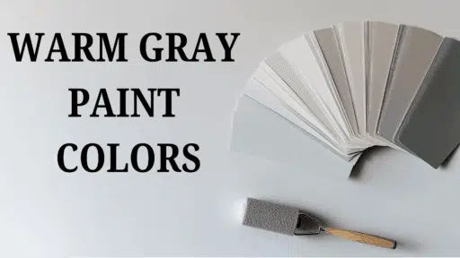

This review covers Alpaca’s undertones, room uses, durability, and best color pairings.
Sherwin-Williams Alpaca (SW 7022) might be your answer if you’re looking for a paint color that makes your home feel both warm and modern at the same time.
This special color sits right in the middle of gray and beige (that’s why people call it “greige”). With its light reflectance value of 57, Alpaca brightens rooms without being too stark like white paint.
The soft gray undertones mixed with hints of beige create a balanced color that works in sunny rooms and darker spaces. Alpaca hides dirt better than white paint, which is great for busy homes with kids or pets.
If you’re painting your living room, bedroom, kitchen, or even the outside of your house, this versatile color pairs well with many styles from farmhouse to modern designs.
Understanding Paint Color Basics
Color Terminology
| PROPERTY | Value |
|---|---|
| LRV – Light Reflectance Value: A measurement (from 0 to 100) of how much light a color reflects. Higher values reflect more light. | 57 |
| RGB – Red, Green, Blue: A set of three numbers showing how much red, green, and blue light combine to create a color. | 204 / 197 / 189 |
| Hex Value – A six-digit code used in digital formats (like websites) to represent a specific color. | #CCC5BD |
Undertones
- Alpaca has soft gray undertones with hints of beige
- It’s a light greige (gray + beige) that feels warm and neutral
- Not too gray or too beige, but a balanced blend of both
Psychology of Greige Colors
- Greige colors like Alpaca create a cozy, welcoming feeling
- Warm gray undertones: Add depth without feeling cold
- Neutral tones: Work well with many other colors
Benefits: Hides dirt better than white, enhances visual comfort in everyday areas, and is ideal for transitional spaces like entryways and living-dining combos where design flow and warmth are equally important
Why Choose Sherwin-Williams Alpaca?
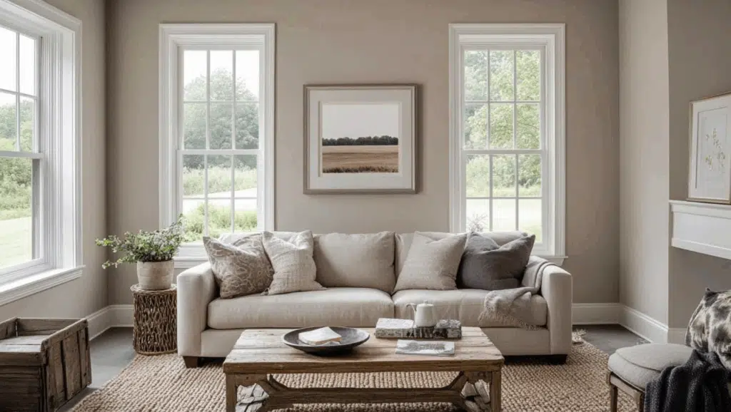
Sherwin-Williams Alpaca creates a warm, cozy feel in most rooms, maintaining a soft and welcoming presence in areas with little sunlight, and appearing balanced in bright rooms without being too dark or too light.
Its greige (gray-beige) tone serves as an excellent backdrop for a wide range of styles especially minimalist, rustic, Scandinavian, farmhouse, or modern—helping your home feel calm and put-together.
Alpaca is also a safe neutral if you’re painting for resale, offering broad appeal to different design preferences.
As a neutral greige paint for open floor plans, it provides visual consistency while allowing for subtle shifts in tone under different lighting conditions, making it both versatile and timeless.
1. Key Features
Sherwin Williams Alpaca works well with many colors and materials in your home, like wood floors, kitchen cabinets, and furniture. It gives you just enough color without being boring, white, or too dark, making it a safe choice that won’t go out of style quickly.
The soft greige tone helps rooms feel larger while adding more character than plain white. It fits well into an Alpaca coordinating paint palette that transitions smoothly between rooms.
2. Durability
Sherwin Williams Alpaca in good finishes like Duration or SuperPaint lasts a long time and handles everyday bumps and marks well.
This color is great for busy areas since it hides dirt and stains better than white paint does. When applied correctly and cleaned regularly, it stays true for years without fading or yellowing.
3. Texture Patterns
Sherwin-Williams Alpaca makes walls look smooth and clean while letting your furniture and decor shine. For a cohesive look, use flat or matte in bedrooms, eggshell in living areas, satin in high-traffic zones, and semi-gloss on trim.
These finishes enhance textures, resist wear, and help your home feel connected, no matter the lighting or function of each space.
Room-by-Room Color Recommendations
1. Living Spaces and Open Floor Plans
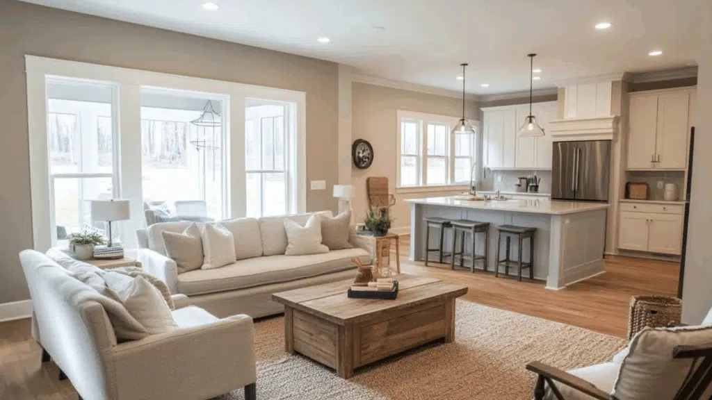
- Alpaca’s medium-light tone (57 LRV) brightens living spaces while providing more depth and character than white, creating a refined backdrop that works in both large and small rooms.
- This versatile greige color flows beautifully between connected spaces, helping your home feel cohesive while still offering more personality than basic neutrals.
- Alpaca pairs equally well with cool blues and greens or warm terracottas and golds, making it perfect for open concept areas where different design elements come together.
2. Bedrooms and Relaxation Areas
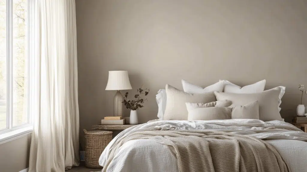
- The balanced gray-beige blend in Alpaca creates a soothing environment that promotes rest without feeling cold or sterile like cooler grays can in bedroom spaces.
- Morning light brings out Alpaca’s warmer undertones, while evening light emphasizes its refined gray base, creating a room that feels welcoming throughout the day.
- This color provides the perfect neutral foundation for layering bedding textures and accent colors, allowing you to easily update your bedroom’s look without repainting.
3. Kitchens and High-Traffic Zones
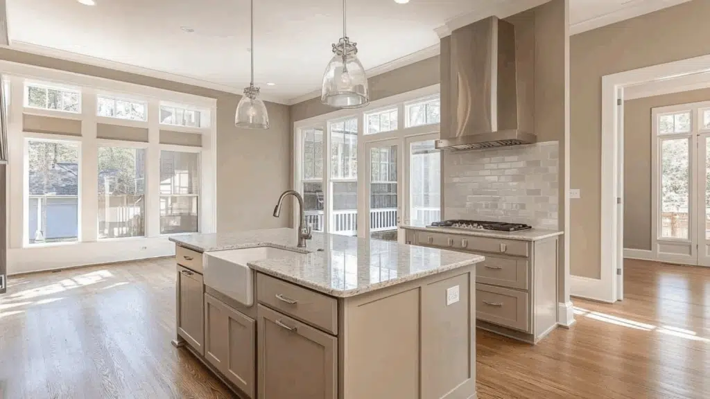
- Alpaca’s medium tone hides fingerprints, minor scuffs, and everyday kitchen splashes better than white paint, making it practical for busy family kitchens and hallways.
- This versatile gray complements both light and dark cabinet finishes, stainless steel appliances, and most countertop materials, including granite, quartz, and butcher block.
- In satin or semi-gloss finish, Alpaca stands up well to regular cleaning in high-use areas while maintaining its balanced, sophisticated appearance for years.
Color Pairings and Combinations for Sherwin Williams Alpaca (SW 7022)
Sherwin Williams Alpaca is a balanced greige (gray-beige) with soft, neutral undertones. Its medium Light Reflectance Value (LRV) of 57 makes it a versatile color that adds warmth to spaces without feeling too dark or too light.
Here are color pairings and combinations for this shade.
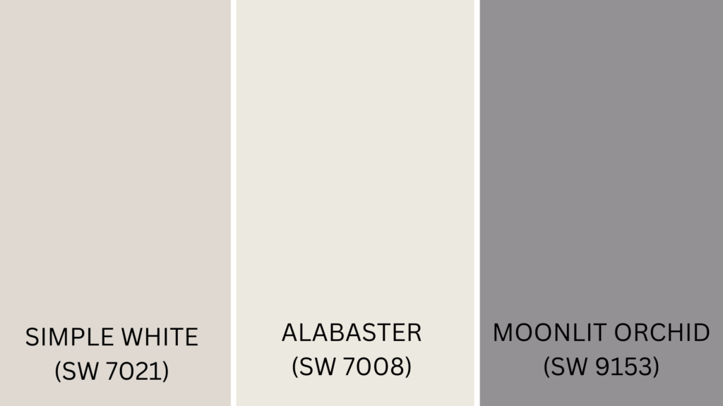
Complementary Trim Colors
- Simple White (SW 7021) – A clean, bright white that creates a crisp contrast against Alpaca’s warmer greige tone.
- Alabaster (SW 7008) – A soft, creamy off-white that pairs beautifully with Alpaca for a subtle, refined look.
- Moonlit Orchid (SW 9153) – A rich purple that adds a bold, unexpected accent when used with the neutral balance of Alpaca.
Creating Cohesive Color Schemes
1. Monochromatic Scheme
- Alpaca (SW 7022) for main walls
- Agreeable Gray (SW 7029) for accent walls
- Accessible Beige (SW 7036) for adjoining rooms
- Amazing Gray (SW 7044) for cabinetry or built-ins
- Simple White (SW 7021) for trim and ceilings
2. Warm Color Scheme
- Alpaca (SW 7022) for main living areas
- Kilim Beige (SW 6106) for dining room accent wall
- Concord Buff (SW 7684) for hallways
- Coral Island (SW 6332) for powder room
- Rustic Red (SW 7593) for small accent pieces
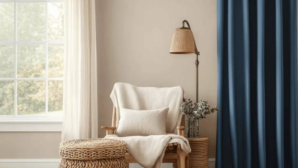
3. Cool Color Scheme
- Alpaca (SW 7022) for main walls
- Naval (SW 6244) for accent pieces or media room
- Sea Salt (SW 6204) for bedrooms
- Rainwashed (SW 6211) for bathrooms
- Distance (SW 6243) for home office
Coordinating with Furniture and Decor
1. Wood Tones
Alpaca pairs wonderfully with both light and dark woods. It brings out the richness in darker woods like cherry and walnut while softening the contrast with lighter woods like oak and maple.
- Enhances the natural grain patterns in medium-toned woods like hickory and ash
- Creates a refined backdrop for wooden furniture pieces with its balanced greige undertones
- Makes wood flooring appear warmer and more inviting in any room
2. Metals
Brushed nickel and chrome hardware look sleek and modern against Alpaca’s greige tone. For a warmer look, try bronze or brass fixtures, which create a cozy, inviting feeling with this versatile color.
- Provides a neutral canvas that makes metallic accents pop without overwhelming them
- Matte black hardware creates a dramatic contrast for a contemporary look
- The subtle warmth balances the coolness of silver and platinum fixtures beautifully
3. Fabrics
Navy blue, sage green, or rust-colored fabrics create a beautiful contrast with Alpaca’s neutral background. Patterned textiles with cream and charcoal also look stunning against this balanced greige.
- Serves as a versatile backdrop for seasonal fabric changes throughout the year
- Textured fabrics like linen and velvet gain depth and dimension when set against this soft neutral
- Helps unify diverse fabric patterns and colors in an open-concept living space
4. Decor
Natural elements like woven baskets, stone accessories, and ceramic pieces enhance Alpaca’s earthy quality. Green plants provide a fresh pop of color, while cream-colored candles and throws add softness to the space.
- Creates a gallery-like setting that allows artwork and photographs to stand out
- The balanced undertones make it ideal for highlighting both cool and warm decorative pieces.
- Provides a calm, neutral foundation that prevents decorative elements from competing with each other
Common Tip: When using neutral wall colors like Alpaca, introduce contrast through accessories such as pillows, rugs, or curtains in rich colors like navy, sage, or rust. These small changes make the space feel styled and intentional—without committing to bold wa
Similar Paint Colors: Perfect Alternatives to Alpaca (SW 7022)
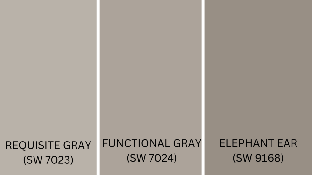
1. Requisite Gray (SW 7023)
- Slightly darker than Alpaca with the same greige balance and versatility.
- Cooler undertones make it perfect for rooms with lots of sunlight.
- Pairs beautifully with blue and green accent colors throughout your home.
2. Functional Gray (SW 7024)
- Medium-depth greige that adds noticeable color while staying neutral and versatile.
- Creates a cozier feeling in bedrooms and living spaces than lighter Alpaca.
- Adjusts well to different lighting conditions throughout the day.
3. Elephant Ear (SW 9168)
- Features subtle purple-gray undertones for a refined, unique neutral option.
- Works wonderfully with white trim and dark wood furniture.
- Perfect for dining rooms and offices where elegance matters.
Comparison Table: Alpaca vs Requisite Gray vs Functional Gray vs Elephant Ear
| Feature | Alpaca (SW 7022) | Requisite Gray | Functional Gray (SW 7024) | Elephant Ear (SW 9168) |
|---|---|---|---|---|
| Color Family | Greige | Greige | Greige | Gray with subtle purple undertones |
| Undertones | Soft gray with beige hints | Cooler gray-beige | Warm greige | Purple-gray |
| Ideal For | All-purpose use in any space | Sunlit rooms, open layouts | Cozy spaces like bedrooms | Formal spaces like dining rooms |
| Mood Created | Warm, neutral, balanced | Slightly cool, modern feel | Cozy, grounded, soft warmth | Elegant, muted sophistication |
| Best Trim Colors | Simple White, Alabaster | Extra White, Snowbound | Creamy, Dover White | Alabaster, Pure White |
| Stands Out For | Versatility, timelessness | Slightly more contrast | Warmth and depth | Distinctive undertone, drama |
Summing It Up
Sherwin Williams Alpaca (SW 7022) truly stands out as a paint color that doesn’t play favorites. It looks great with light or dark wood, works with almost any metal finish, and creates the perfect backdrop for your furniture and decorations.
The balanced greige tone stays looking fresh for years when used with quality paint like Duration or SuperPaint.
In kitchens and hallways, it hides fingerprints and marks better than lighter colors. For a cohesive look, pair Alpaca with Simple White or Alabaster trim.
It works wonderfully with cool colors like Sea Salt and Naval or warm tones like Kilim Beige. This timeless color won’t go out of style quickly, making it a smart investment for your home.
Improve your space with timeless greige—Sherwin Williams Alpaca is a reliable, stylish choice for any room.
Tried Alpaca in your home? Share your experience below! Or explore more warm neutral paint reviews.

Alex Guerrero, a graduate with a Fine Arts degree from the Rhode Island School of Design, has been a visionary in the world of color and design for over 15 years. His professional journey began in the heart of the fashion industry in Milan, where he developed an acute sense for color harmonies and trends. Alex joined our team in 2018, offering fresh and innovative perspectives on color utilization in various spaces. Renowned for his ability to blend contemporary trends with timeless elegance. Outside of work, Alex is an accomplished painter and a volunteer art therapist, his artistic talents further enriching his professional insights.