Sherwin Williams Creamy (SW 7012) stands out as one of the most popular warm whites for good reason – it brings warmth to any space without the commitment of bold color.
This warm off-white paint color offers the perfect balance between white and beige, with soft yellow undertones that create a cozy feeling in any room.
With its high Light Reflectance Value (LRV) of 81, Creamy brightens spaces while avoiding the harsh glare of pure white.
In this guide, you’ll learn about Creamy’s yellow undertones, see how it performs in different rooms and lighting conditions, plus find the best color pairings and similar alternatives to help you make the right choice for your home.
This versatile color works in all kinds of light – staying warm and bright in sunny rooms while remaining cozy and inviting in darker spaces.
If you prefer modern or traditional styles, Sherwin Williams Creamy provides a soft, welcoming background that enhances your home without overwhelming it.
Sherwin-Williams Creamy: Paint Color Basics
Before choosing any paint color, understanding its technical properties and undertones helps you make the right decision for your space.
Color Terminology
| Property | Value |
|---|---|
| LRV | 81 |
| RGB | 239 / 232 / 219 |
| Hex Value | #EFE8DB |
Undertones of Sherwin-Williams Creamy
- Sherwin Williams Creamy has soft yellow undertones
- It’s a warm off-white that isn’t too yellow or too white
- Not stark white or beige, but a gentle creamy color in between
Psychology of Warm White Colors
Warm whites like Sherwin Williams Creamy create a cozy and welcoming feeling.
- Cream tones: Feel soft and comfortable in any room
- Yellow-leaning whites: Make spaces feel sunny and bright, even on cloudy days
- Benefits: Brightens rooms without the harshness of pure white, hides minor wall imperfections, and works well in rooms with both natural and artificial light
Why Choose Sherwin-Williams Creamy(SW 7012)?
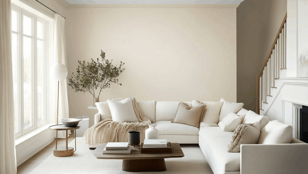
Sherwin Williams Creamy looks great in all kinds of light. In sunny rooms, it feels warm and bright without being too yellow. In darker spaces, it stays cozy and inviting without looking dull.
This timeless off-white creates a soft, welcoming background that works with both modern and traditional styles without taking over the room.
1. Key Features
Sherwin Williams Creamy works beautifully with many home materials, such as wood floors, stone countertops, and brick fireplaces. The warm undertones help these features look their best.
It gives walls just enough color to feel homey without being boring white, making it a smart choice that won’t go out of style quickly.
Takeaway: Choose Creamy when you want a versatile warm white that enhances natural materials and stays stylish year after year.
2. Durability
Sherwin Williams Creamy in good quality paints like Duration or Emerald lasts a long time and handles everyday bumps well. The gentle creamy color hides small marks better than bright white paint.
When applied correctly, this color stays true for years without turning yellow. It’s also easy to clean without losing its soft, warm glow.
Takeaway: Invest in quality paint formulas with Creamy to enjoy a beautiful, low-maintenance finish that looks fresh for years.
3. Texture Patterns
Sherwin Williams Creamy creates smooth, soft-looking walls that make your furniture and decorations stand out. The warm undertones create gentle shadows that make trim and textured walls look amazing.
Using different finishes, like flat ceilings and satin on walls, helps create a connected feeling throughout your home while adding subtle interest.
Takeaway: Mix paint finishes with Creamy to add depth and visual interest while maintaining a cohesive look throughout your home.
Room-by-Room SW Creamy Recommendations
Every room in your home has unique lighting and function – here’s how Sherwin-Williams Creamy performs in different spaces to help you decide where it works best.
1. Living Spaces and Open Floor Plans

Sherwin Williams Creamy (SW 7012) brightens living rooms and open spaces while feeling warmer and more welcoming than plain white.
Lighting Performance:
- North-facing rooms: Creamy’s yellow undertones counteract cool northern light, preventing the gray cast common with pure whites
- South-facing rooms: Abundant sunlight enhances the warm glow without making it look too yellow
- Evening artificial light: Looks cozy under warm LED bulbs (2700K-3000K) and maintains its creamy character
With a high LRV of 81, Creamy reflects lots of light, making rooms feel bigger and more open without the harsh glare of bright white.
Pair Creamy walls with darker trim in Amazing Gray (SW 7044) for a modern look, or keep it classic with white trim in Pure White (SW 7005).
2. Bedrooms and Relaxation Areas

Creamy creates a soft, peaceful feeling in bedrooms that helps you relax and feel comfortable.
Lighting Performance:
- Morning light: East-facing bedrooms show Creamy at its warmest, creating a gentle wake-up glow
- Afternoon light: West-facing rooms bring out golden tones perfect for evening relaxation
- Low light conditions: Maintains warmth without looking dingy, unlike cooler whites that can appear gray
The warm undertones look beautiful in both morning and evening light, making your bedroom feel cozy all day long.
Use Creamy on all walls for a calm bedroom, or pair it with a gentle accent wall in Accessible Beige (SW 7036) for a bit more interest.
3. Kitchens and High-Traffic Zones
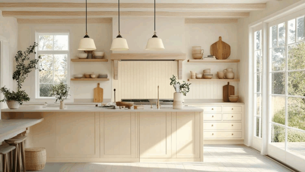
In satin or semi-gloss finish, Creamy stands up well to cleaning in busy areas like kitchens and hallways.
Lighting Performance:
- Under-cabinet lighting: Stays true to color under task lighting without looking washed out
- Mixed lighting sources: Balances well between natural window light and overhead fixtures
- Fluorescent lighting: Warm undertones help neutralize harsh cool-toned commercial lighting
This warm off-white makes kitchens feel clean and bright while looking great with any cabinet color, from dark wood to navy blue.
Creamy works perfectly for all kitchen cabinets, but for a trendy two-tone look, try it on upper cabinets with a darker color like Urbane Bronze (SW 7048) on lower cabinets.
Color Pairings and Combinations for Sherwin Williams Creamy (SW 7012)
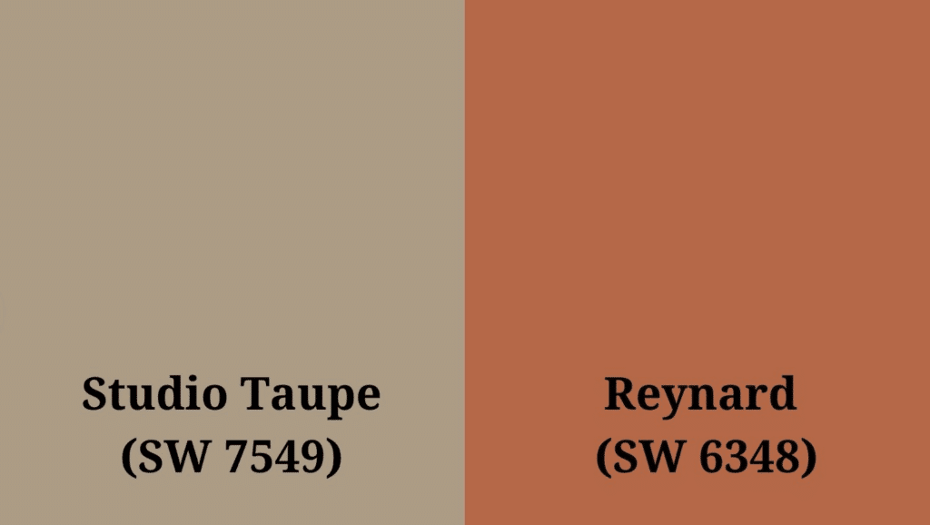
Sherwin Williams Creamy is a warm, soft off-white with gentle yellow undertones. Its high Light Reflectance Value (LRV) of 81 makes it a bright, welcoming color that adds warmth to any room while keeping spaces feeling open and airy.
Here are color pairings and combinations for this friendly shade.
Complementary Trim Colors
- Studio Taupe (SW 7549) – A balanced neutral taupe that adds depth and grounds Creamy’s lightness
- Reynard (SW 6348) – A rich, coppery brown that adds warm contrast and creates a cozy feel when used with Creamy
Creating Cohesive Color Schemes
1. Monochromatic Scheme
Perfect for: Open floor plans, minimalist homes, and spaces where you want a calm, flowing feeling
- Sherwin-Williams Creamy (SW 7012) for the main walls
- Alabaster (SW 7008) for accent walls
- Greek Villa (SW 7551) for adjoining rooms
- Ivory Lace (SW 7013) for cabinetry or built-ins
- Pure White (SW 7005) for trim and ceilings
Effect: This palette creates a serene, polished atmosphere where rooms flow together effortlessly, perfect for those who love understated style.
2. Warm Color Scheme
Perfect for: Traditional homes, cozy cottages, and families who want inviting, comfortable spaces
- Sherwin-Williams Creamy (SW 7012) for main living areas – establishes a welcoming base.
- Reynard (SW 6348) for dining room accent wall – adds rich warmth for intimate gatherings.
- Macadamia (SW 6142) for hallways – creates smooth transitions with golden tones.
- Butterscotch (SW 6377) for powder room – brings cheerful energy to small spaces.
- Bittersweet Stem (SW 7536) for home office – provides grounding earth tones for focus.
Effect: This combination wraps your home in warmth like a soft blanket, creating spaces that feel naturally inviting and lived-in.
3. Cool Color Scheme
Perfect for: Modern homes, coastal styles, and those seeking a fresh, balanced look
- Sherwin-Williams Creamy (SW 7012) for the main walls – softens cooler tones with warmth.
- Sea Serpent (SW 7615) for accent pieces or media room – adds refined drama.
- Misty (SW 6232) for bedrooms – creates tranquil, restful retreats.
- Aesthetic White (SW 7035) for trim throughout – provides clean, modern edges.
- Studio Taupe (SW 7549) for kitchen cabinetry – grounds the palette with neutral depth.
Effect: This palette balances warm and cool tones for a fresh, contemporary feel that’s neither too cold nor too cozy – just perfectly balanced
Coordinating Materials with Creamy (SW 7012)
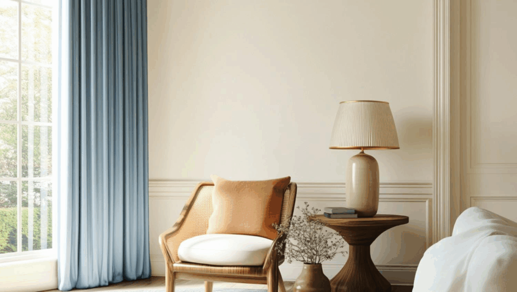
1. Wood Tones
Dark woods like walnuts create a rich contrast with Creamy. Medium woods blend smoothly with this warm white. Light woods pair with Creamy for a bright, fresh look.
- Creates a cozy, inviting atmosphere when paired with cherry or mahogany furniture
- Highlights the natural character of oak and pine without overwhelming their grain patterns
- Offers a timeless backdrop that works with both modern and traditional wood finishes
What not to pair: Avoid orange-toned woods like some older oak stains – they can clash with Creamy’s yellow undertones and create an outdated look.
2. Metals
Gold and brass hardware enhances Creamy’s warm glow. Silver and chrome fixtures create a clean, fresh look. Matte black creates a simple contrast against this soft white.
- Brings out the subtle warmth in copper accents and rose-gold details
- Provides a soft background that makes hammered metal textures more noticeable
- Complements mixed metal finishes without competing for attention
What not to pair: Avoid mixing too many metal finishes in one room – stick to two types maximum to keep the look cohesive with Creamy walls.
3. Decor
Blue and green accents pop against Creamy’s warm background. Soft fabrics add comfort to spaces painted in this gentle white, and plants bring life to rooms with this versatile neutral.
- Allows colorful artwork to stand out while maintaining a cohesive look
- Creates a perfect backdrop for displaying collections without visual distraction
- Makes small spaces feel larger while still maintaining a cozy, welcoming feel
What not to pair: Avoid cool purples or stark grays as main accent colors – they can make Creamy look dingy. Instead, choose warmer tones or add cool colors sparingly through small accessories.
Similar Paint Colors to Sherwin Williams Creamy (SW 7012)
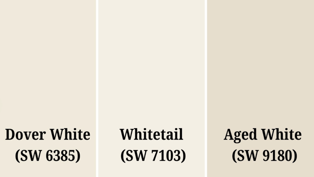
1. Dover White (SW 6385)
- Dover White offers a cooler appearance with subtle yellow undertones, creating a traditional feel while maintaining the warmth many homeowners desire.
- With its higher light reflectance value, Dover White brightens spaces more effectively than Creamy, making it perfect for smaller or darker rooms.
- This versatile alternative works especially well in kitchens and bathrooms where a cleaner white appearance is desired without feeling too stark or clinical.
2. Whitetail (SW 7103)
- Whitetail presents a more neutral variation of Creamy with balanced undertones that adapt beautifully to changing light conditions throughout the day.
- This adaptable color creates a pristine backdrop for both modern and traditional décor while still maintaining the cozy atmosphere that Creamy provides.
- Designers often choose Whitetail for open floor plans as it transitions smoothly between spaces and complements nearly all wood tones and metals.
3. Aged White (SW 9180)
- Aged White incorporates subtle beige undertones that evoke a sense of history and timelessness, perfect for creating depth in contemporary spaces.
- The slightly lower reflectance value of Aged White creates an enveloping warmth in living areas without the heaviness of more saturated neutral colors.
- This refined alternative pairs exceptionally well with natural materials like stone, wood, and linen for a cohesive, earthy aesthetic throughout the home.
Final Words
Sherwin-Williams Creamy (SW 7012) is a timeless choice for homeowners who want warmth without committing to a bolder color.
Its soft yellow undertones create welcoming spaces that feel clean yet cozy, making every room feel like home.
This versatile paint adapts to different lighting conditions, making it perfect for open floor plans and connecting spaces throughout your home.
Whether paired with contrasting trim colors like Studio Taupe or similar shades like Dover White for a cohesive look, Creamy offers endless possibilities for creating your dream home.
Ready to change your space with this perfect warm white?
Grab a sample of Sherwin Williams Creamy today and watch how it brings new life to your walls – one cozy room at a time.

