Have you ever wanted a color that makes your home feel like a peaceful morning walk through a gentle fog?
That’s what I get with Drift of Mist. This soft, magical gray has tiny hints of green and blue that you might not even notice at first.
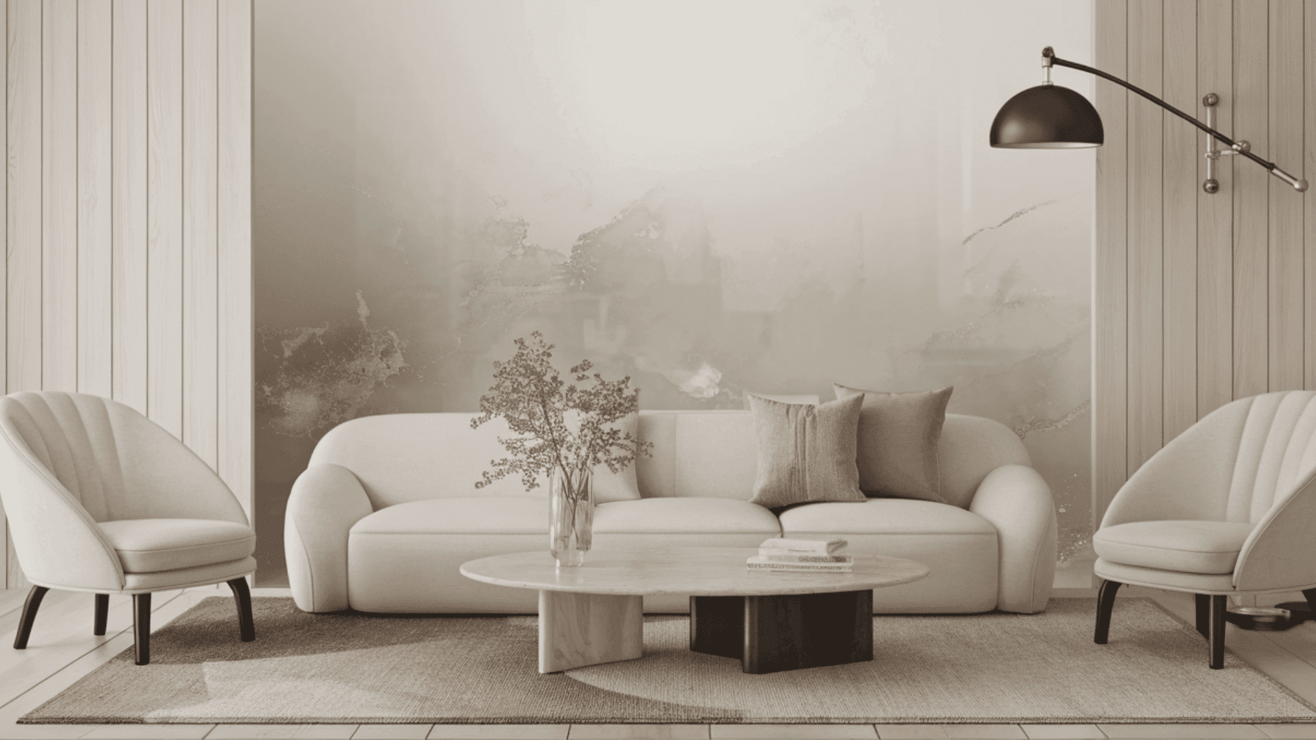
When I paint my walls with Drift of Mist, my rooms instantly feel calmer and more grown-up without being boring. It works great with everything – my wooden furniture, colorful pillows, and even my plant collection!
The best part? Drift of Mist changes throughout the day. In morning sunlight, it looks fresh and bright, but by evening, it becomes cozy and relaxing.
Want to create rooms that are stylish and comfortable? Try Drift of Mist—it’s like giving your home a big, gentle hug.
Understanding Paint Color Basics
Color Terminology
| PROPERTY | VALUE |
|---|---|
| LRV (Light Reflectance Value) | 69 |
| Color Category | Considered a light color (LRV above 50) |
| Comparison | Pure white: ~90 LRV, Black: ~0 LRV |
| RGB Value | Red: 220, Green: 216, Blue: 208 |
| Hex Code | #DCD8D0 |
Undertones:
- Drift of Mist is a soft, ethereal gray with soft, muted undertones of green and blue.
- It has a gentle, diffused quality that creates a calm, soothing atmosphere without appearing flat or lifeless.
- The subtle warmth is thoughtfully balanced, preventing it from feeling too cool while maintaining urbane neutrality.
- Drift of Mist provides a versatile, refined foundation that softens harsh light and creates a sense of tranquil grace.
- It’s exceptionally adaptable and harmonizes with both cool metallic finishes and warmer natural elements, making it a remarkably flexible neutral choice.
Psychology of Neutral Colors
- It enhances contemplation with a soft, misty backdrop. Light diffuses gently here.
- It conveys subtle intricacy. Muted undertones create depth without heaviness.
- It unifies space equally. Textural elements blend naturally against its subtle canvas.
- It promotes emotional balance. Tranquility and comfort permeate throughout any setting.
- It soothes through ambiance. Spaces feel cohesive; conversation flows more intimately.
Why Choose SW 9166 Drift of Mist?
Versatility
The drift of Mist transitions gracefully across lighting conditions, appearing as a soft, urbane gray in natural daylight while revealing its subtle green-blue undertones in artificial lighting.
Its balanced neutrality creates a versatile foundation that integrates effortlessly with contemporary, farmhouse, and traditional design elements.
Key Features
The drift of Mist functions as a refined space, visually softening room transitions and providing a refined backdrop that complements artwork and furnishings without competing for attention.
It delivers a serene, misty atmosphere that feels both current and enduring, avoiding the starkness of true grays or the heaviness of beige-toned neutrals.
Durability
Sherwin-Williams Drift of Mist in premium formulations like Emerald or Duration provides exceptional coverage and cleanability with minimal upkeep.
Just as Crown Fabric Protection safeguards your furnishings from stains and wear, this durable paint finish protects your walls from daily wear while maintaining their pristine appearance.
Its light-diffusing properties effectively balance brightness in spaces and maintain a refined appearance even in busy areas when properly applied.
Texture Patterns
Drift of Mist creates subtle intricacy through its ability to capture and softly diffuse light, adding dimension to walls while maintaining visual tranquility.
Its muted, supernatural undertones produce gentle dimensional effects that enhance structural details and create calm, welcoming environments.
Room-by-Room Color Recommendations for Drift of Mist
See how every space changes with the Drift of Mist’s versatile beauty. Find how this urbane gray-green chameleon adapts perfectly to each room’s unique personality and lighting needs.
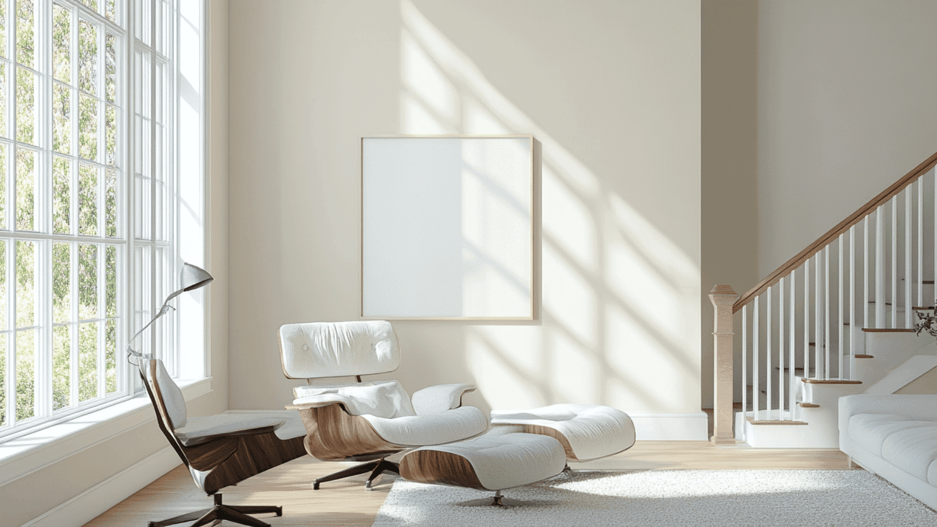
1. In Living Spaces and Open Floor Plans
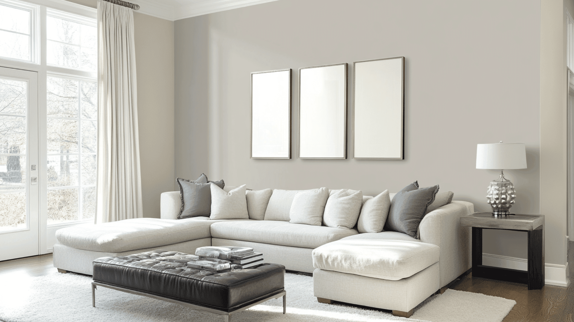
- Drift of Mist establishes gentle continuity in open concepts, as its light-diffusing quality blends varying lighting zones throughout the day.
- Drift of Mist’s moderate LRV enhances spatial flow while allowing textural elements and furniture pieces to integrate naturally into the space.
- For refined contrast, pair Drift of Mist walls with Extra White SW 7006 trim or create subtle layering with Rainwashed SW 6211 for adjacent areas.
2. In Bedrooms and Relaxation Areas
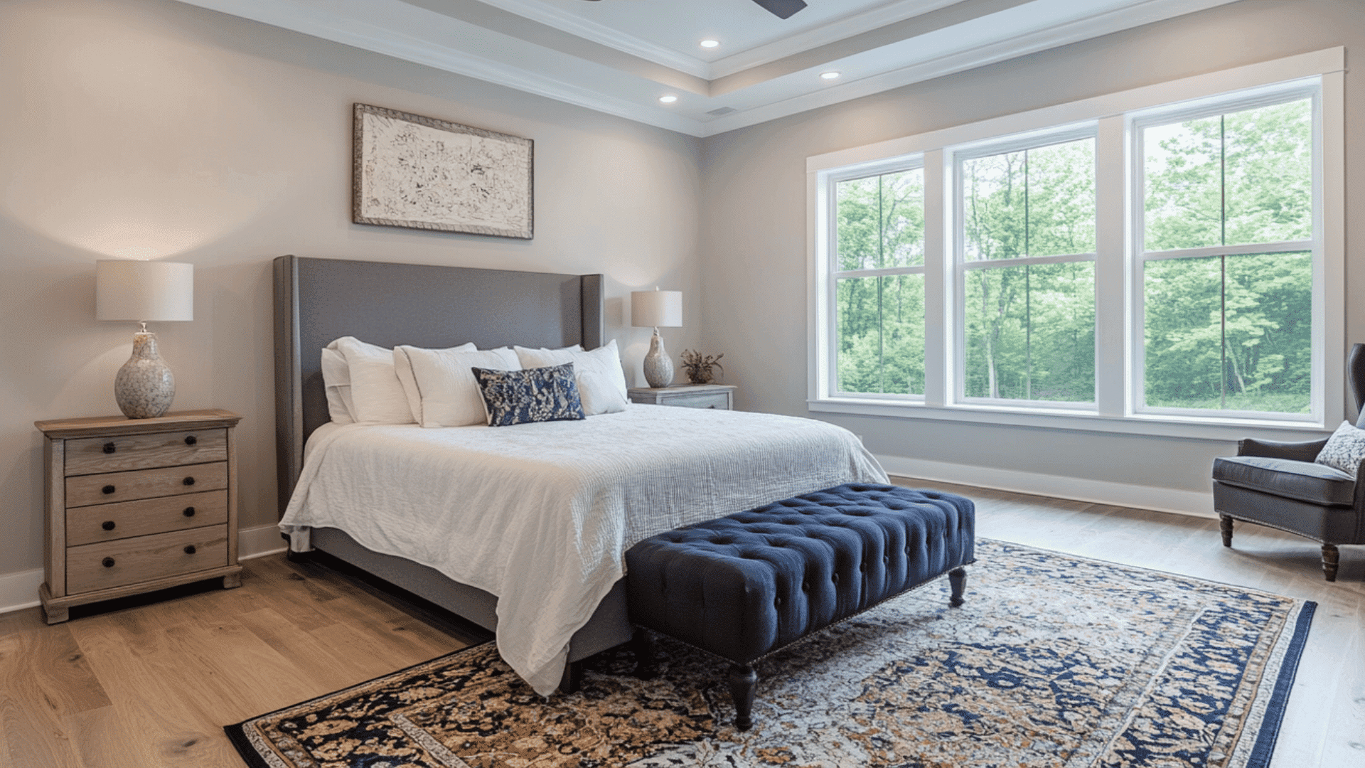
- Drift of Mist cultivates a tranquil, refined retreat in bedrooms. Its soft, muted tone promotes relaxation and serene simplicity.
- The airy green-blue undertones establish a peaceful environment while providing sufficient neutrality to accommodate various accent colors and textural elements.
- Consider Drift of Mist for all walls, enhanced by layered bedding and textiles in varying tones to create a restful sanctuary that feels both refined and inviting.
3. In Kitchen
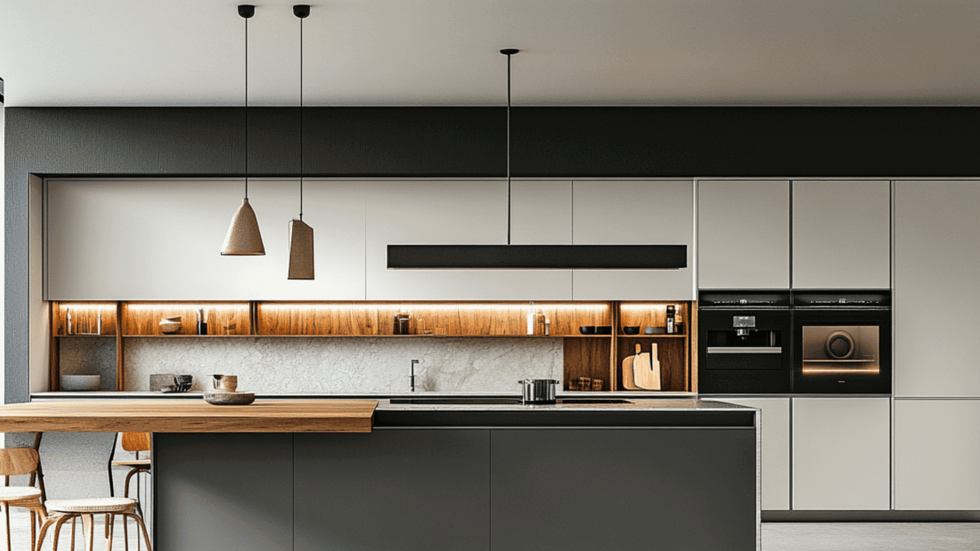
- Drift of Mist, in a satin finish, offers subtle grace on cabinets or walls. Its balanced tone moderates light and creates a clean, calm appearance.
- The adaptable neutrality harmonizes with both cool marble and warm wood surfaces, providing a flexible canvas for diverse material combinations.
- Drift of Mist creates a refined backdrop for metallic accents or statement fixtures, adding refined depth without appearing too cool or clinical.
4. In Bathrooms and Spa-Like Retreats
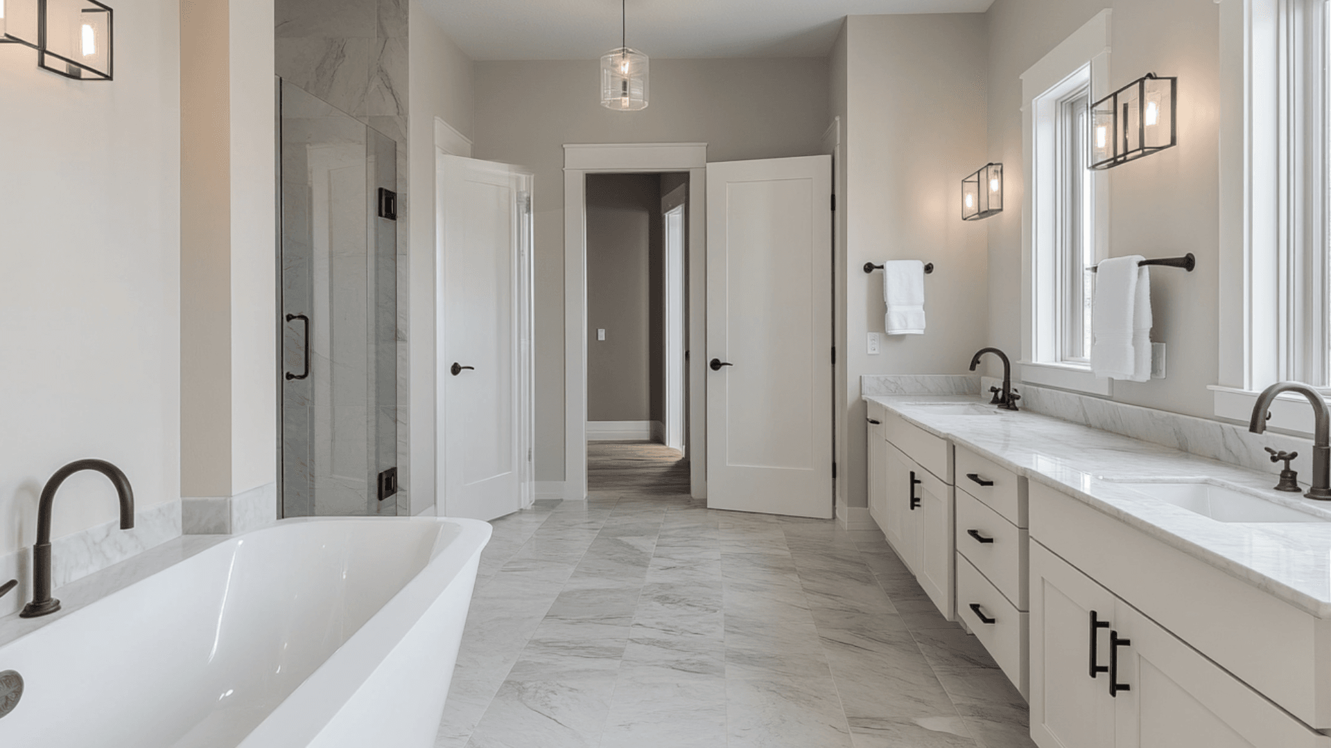
- Drift of Mist establishes calming, spa-like serenity in bathrooms. Its softness enhances atmospheric coherence while providing a refined backdrop for fixtures.
- This urbane neutral beautifully complements nickel, bronze, or brass fixtures, creating a coordinated, intentional aesthetic.
- Consider using it on all surfaces for a cohesive, tranquil feel, or pair it with subtle accent tile to create a balanced environment that promotes the entire space.
Combinations for Drift of Mist (SW 9166)
Drift of Mist changes transitional spaces like entryways and hallways into serene, cultivated areas, creating a calm, balanced atmosphere in often overlooked spaces.
When used on wall paneling or interior door frames, Drift of Mist establishes a subtle depth that creates a pleasant flow and enhances spatial continuity throughout the home with its muted green-blue undertones.
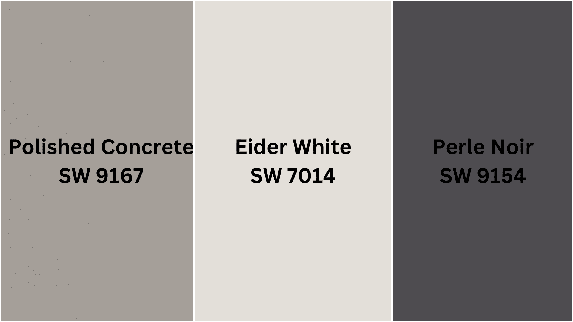
Complementary Accent Colors
- SW 7014 Eider White – A refined, light neutral that complements Drift of Mist’s subtle undertones while adding brightness and airiness to your space.
- SW 9167 Polished Concrete – A versatile mid-tone gray that deepens Drift of Mist’s quality, creating refined dimension.
- SW 9154 Perle Noir – A rich, dramatic black that provides a striking contrast against Drift of Mist’s soft canvas, creating a bold and contemporary color statement.
Creating Cohesive Color Schemes with Drift of Mist (SW 9166)
1. Monochromatic Scheme
- Drift of Mist for main walls and trim
- Eider White (SW 7014) for ceilings and connecting spaces
- Heron Plume (SW 6070) for structural details
- Gossamer Veil (SW 9165) for subtle contrast and depth
2. Cool Color Scheme
- Drift of Mist for main walls and millwork
- Sea Salt (SW 6204) for living areas and bedrooms
- Cucumber (SW 6722) for accent walls
- North Star (SW 6246) for subtle color in bathrooms
3. Warm-Cool Balance Scheme
- Drift of Mist for primary spaces and trim
- Agreeable Gray (SW 7029) for living and dining areas
- Balanced Beige (SW 7037) for accent walls
- Rosemary (SW 6187) for small spaces or accessories
4. Natural Elements Scheme
- Drift of Mist for main walls and built-ins
- Pure White (SW 7005) for trim and ceilings
- Polished Concrete (SW 9167) for connecting spaces
- Privilege Green (SW 6193) for focal points or furniture
Coordinating Drift of Mist with Furniture and Decor
Wood Tones
Drift of Mist creates a refined, balanced backdrop for light woods like ash, white oak, and maple, enhancing their natural grain and subtle character.
For a more balanced approach, medium-toned woods like walnut or mahogany provide graceful warmth against this soft, misty neutral.
Weathered or gray-washed woods create a contemporary, cohesive pairing that emphasizes the subtle depth of both elements.
Metals
Brushed nickel and chrome complement Drift of Mist’s cool undertones, creating a refined, contemporary palette.
Matte black hardware provides a refined contrast against Drift of Mist’s soft neutrality, offering structural interest that defines the space.
Pewter and silver-toned metals create a serene, modern feeling that enhances Drift of Mist’s quality while adding subtle illumination.
Decor
Textural elements like linen, velvet, and jute in varying cool and neutral tones add dimension and intricacy while enhancing Drift of Mist’s calming quality.
Concrete, marble, and frosted glass introduce refined material moments that pair beautifully with the neutral backdrop.
Abstract art with soft washes of color, sculptural plants with structural silhouettes, and gray-toned ceramic accessories enhance the serene, balanced atmosphere this color establishes.
Similar Paint Colors: Perfect Alternative to Drift of Mist (SW 9166)
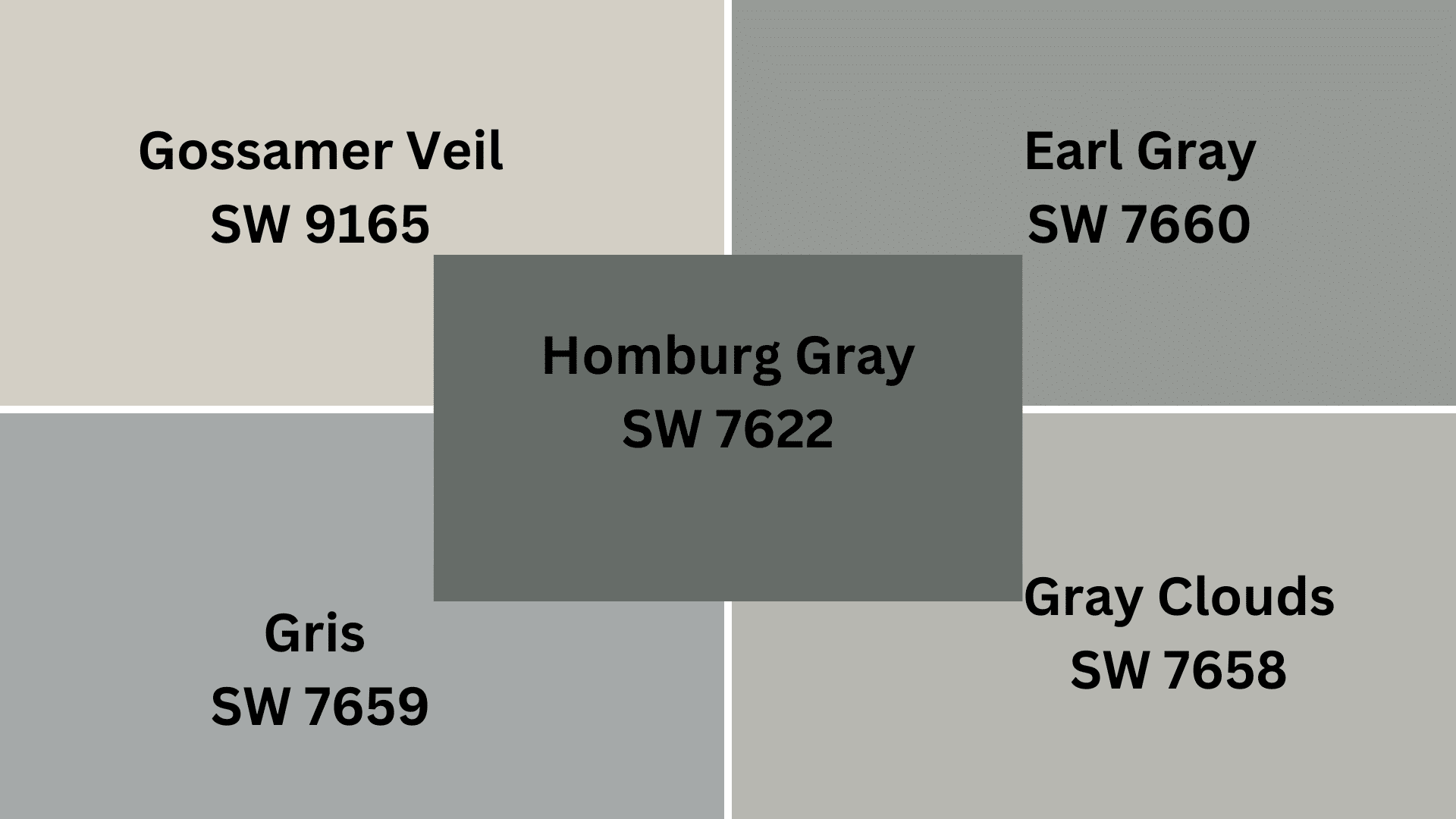
Drift of Mist is a soothing, light gray with subtle green-blue undertones.
Its balanced Light Reflectance Value creates serene, refined spaces while providing gentle depth and subtle character compared to plainer light grays.
- SW 9165 Gossamer Veil – A slightly warmer light gray that maintains Drift of Mist’s subtlety but with more beige undertones, creating a softer, more transitional aesthetic while still preserving an airy appearance.
- SW 7658 Gray Clouds – A refined light gray with airy blue undertones that echo Drift of Mist’s quality but with a cooler presence. It is ideal for creating tranquil, contemporary spaces.
- SW 7659 Gris – A versatile mid-tone gray that deepens Drift of Mist’s character toward a more substantial territory, adding definitive presence and structural weight for more grounded interiors.
- SW 7660 Earl Grey– A balanced medium gray with subtle taupe undertones that offers a more pronounced alternative to Drift of Mist for spaces where a stronger, more defined neutral presence is desired.
- SW 7622 Homburg Gray – A refined darker gray with complex undertones that captures Drift of Mist’s refinement while introducing a more dramatic, statement quality that works beautifully as an accent or for creating depth in well-lit areas.
Final Thoughts
When I look at my rooms painted in Drift of Mist, I can’t help but smile. This unique color has changed my home into a place that feels both fancy and super cozy.
What makes Drift of Mist special? It plays nice with everything – from my bright white kitchen cabinets to my dark wooden floors. It never fights for attention but makes everything else look better!
Have a small room? Drift of Mist makes it feel bigger! Dealing with weird lighting? This color stays pretty no matter what!
Ready to try it yourself? Grab a sample can of SW 9166 Drift of Mist this weekend!.
Paint a small section of your wall and watch how it changes throughout the day. I bet you’ll fall in love with it just like I did!

Alex Guerrero, a graduate with a Fine Arts degree from the Rhode Island School of Design, has been a visionary in the world of color and design for over 15 years. His professional journey began in the heart of the fashion industry in Milan, where he developed an acute sense for color harmonies and trends. Alex joined our team in 2018, offering fresh and innovative perspectives on color utilization in various spaces. Renowned for his ability to blend contemporary trends with timeless elegance. Outside of work, Alex is an accomplished painter and a volunteer art therapist, his artistic talents further enriching his professional insights.