Sherwin-Williams Outerspace (SW 6251) is a deep blue-gray color that adds strong style to any room. It’s rich and calm, perfect if you want a paint color that feels peaceful but still makes a strong statement.
Outerspace has cool undertones, so it works well with light neutrals, soft grays, or even warm metallics like brass or gold.
This color is popular in bedrooms, living rooms, and even home offices. It also looks great on exteriors, especially when paired with white trim. Because it’s dark, it looks best in rooms with good lighting, natural or artificial.
In this post, I’ll examine what makes Outerspace so useful, where to use it, and the best colors to pair with it.
If you’re thinking about going bold but still want something classic, Outerspace might be the perfect choice for your next project.
Understanding Outerspace (SW 625)

Sherwin-Williams Outerspace (SW 6251) is a cool, deep blue with strong gray undertones. It has a quiet confidence, bold without being too loud, calm yet full of character.
With a Light Reflectance Value (LRV) of 12, it’s a dark shade that absorbs light, so it looks best in rooms with good natural or artificial lighting.
In dim spaces, it leans closer to charcoal, but in brighter rooms, its blue tones shine through, creating a rich and welcoming feel.
The gray base makes it flexible and easy to pair with warm or cool colors, wood tones, and metal finishes. It looks great with white trim, soft neutrals, or bold accents like mustard yellow or burnt orange.
Whether on walls, cabinets, or a statement door, Outerspace adds depth and style without overwhelming the space.
Colors That Go with Outer Space Sherwin-Williams
Sherwin-Williams Outerspace is a deep, calm blue with gray undertones, which makes it quite adaptable when paired with other colors. Here are a few pairings that go well with it.
Neutral Pairings

Pure White (SW 7005) is one of the best trim colors to use with Outerspace. It’s a bright, clean white that creates a strong contrast, helping Outerspace stand out without feeling too dark.
It’s ideal for ceilings, baseboards, window frames, and doors.
Repose Gray (SW 7015) is a soft, warm gray that complements the cool tones in Outerspace.
This gray works well on nearby walls or in connecting spaces like hallways, adding a bit of softness to the room or breaking up the darkness.
Analogous Colors

If you prefer a more relaxed, tone-on-tone look, stick with colors close to Outerspace on the color wheel.
Slate Tile (SW 7624) and Storm Cloud (SW 6249) are great options.
These deeper gray-blues enhance Outer Space’s cool feel while adding depth and variation. This palette works especially well in modern, industrial, or simple spaces.
By mixing in the right supporting colors, whether bold, soft, or similar in tone, you can create a space that feels balanced, stylish, and unified.
Ideal Spaces for Using Outerspace by Sherwin-Williams
Outerspace by Sherwin-Williams works well in rooms where you want a moody, grounded feel. Its deep tone adds style without overwhelming the space.
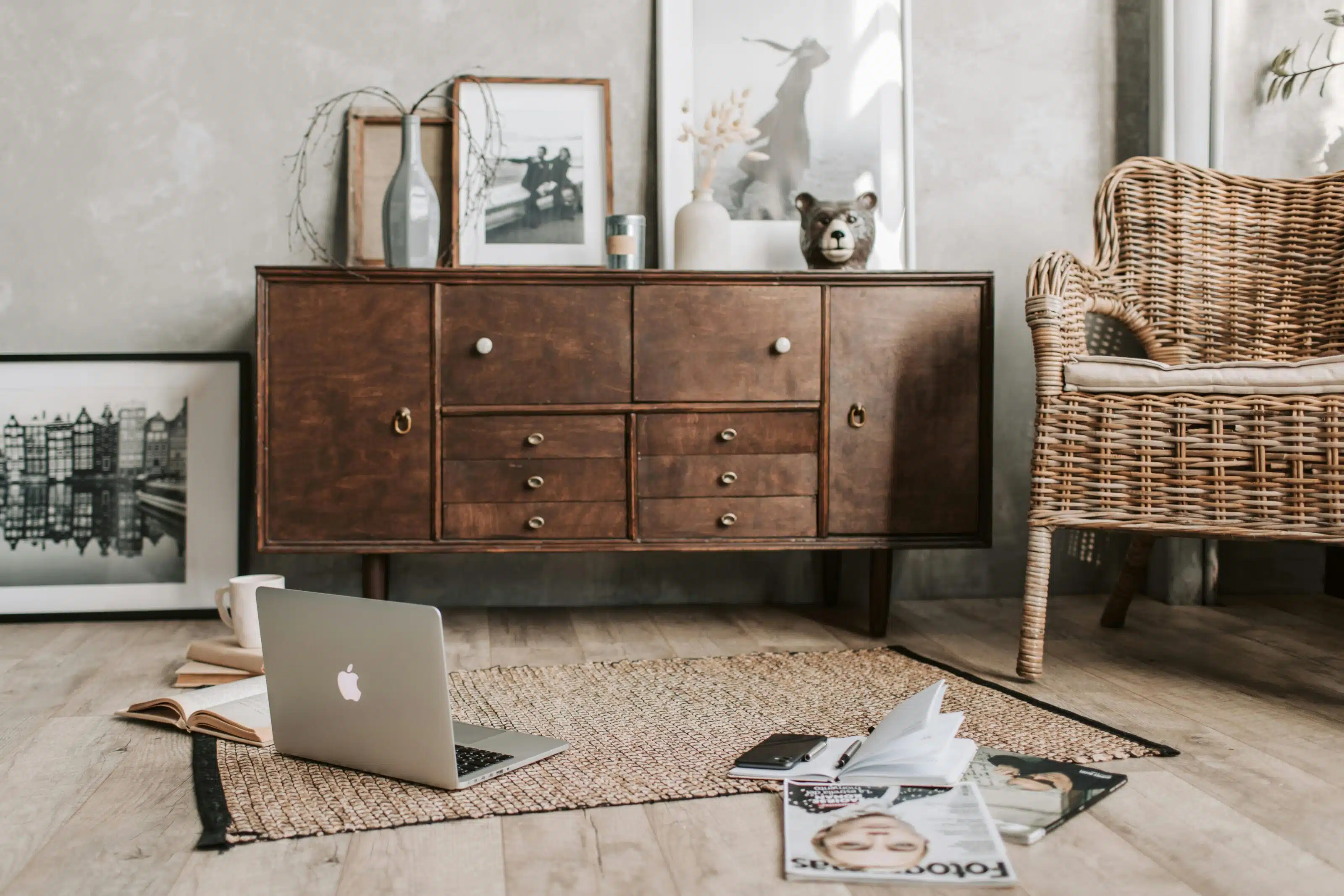
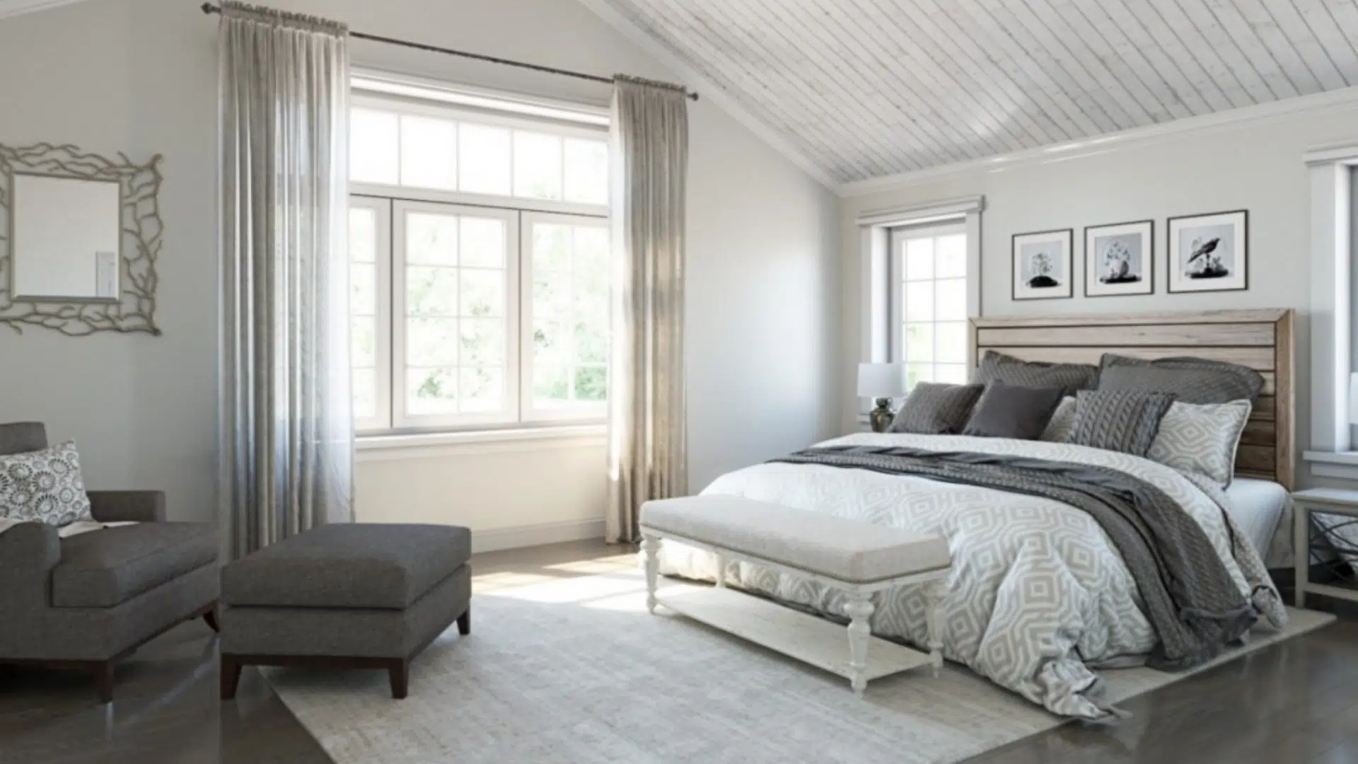
1. Bedrooms
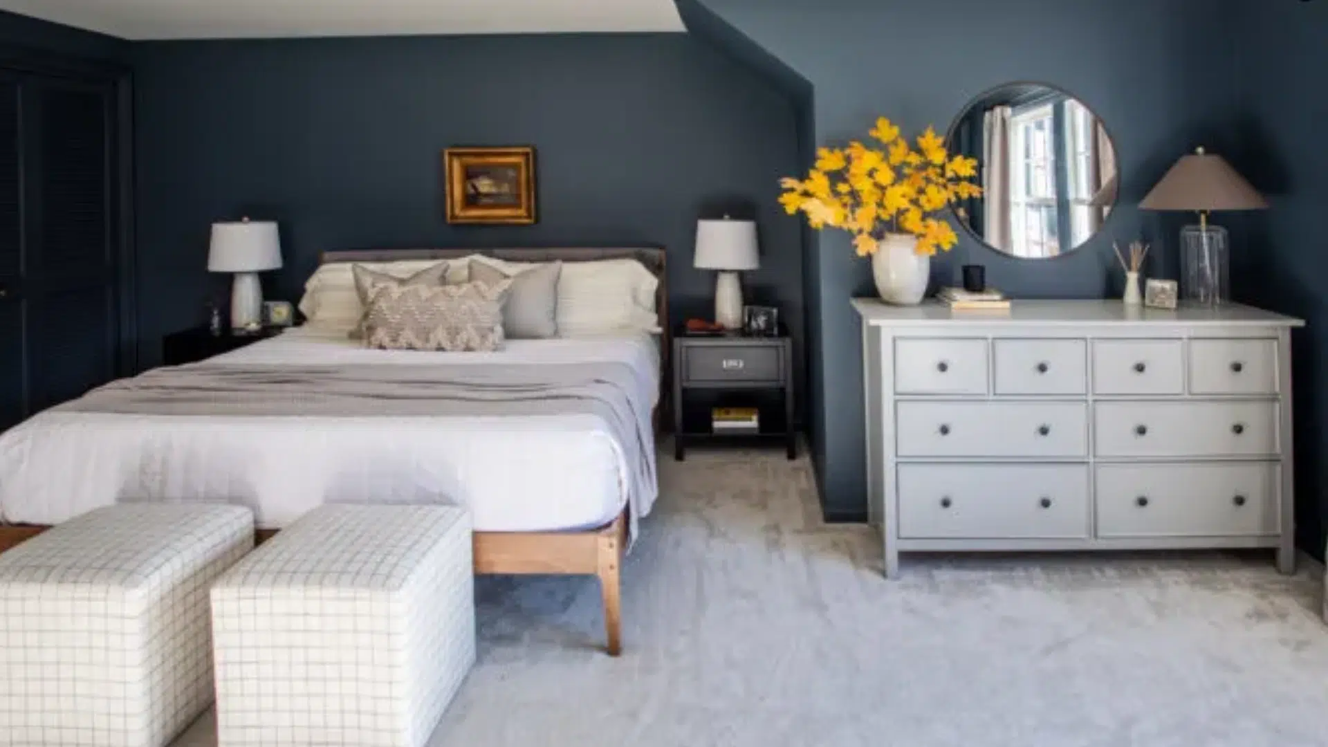
Outer space is a great choice for bedrooms because it feels cozy, peaceful, and a little dramatic. The darker tone makes the room feel more like a retreat, especially when soft bedding, neutral curtains, and warm lighting are used.
If you don’t want the whole room painted dark, try it as an accent wall behind the bed. It pairs beautifully with whites, creams, and soft textures like linen or velvet.
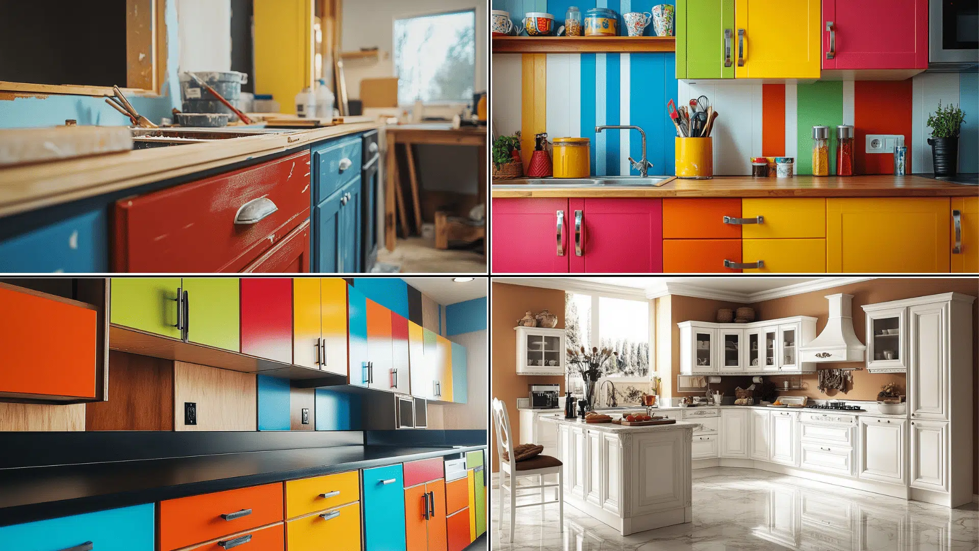
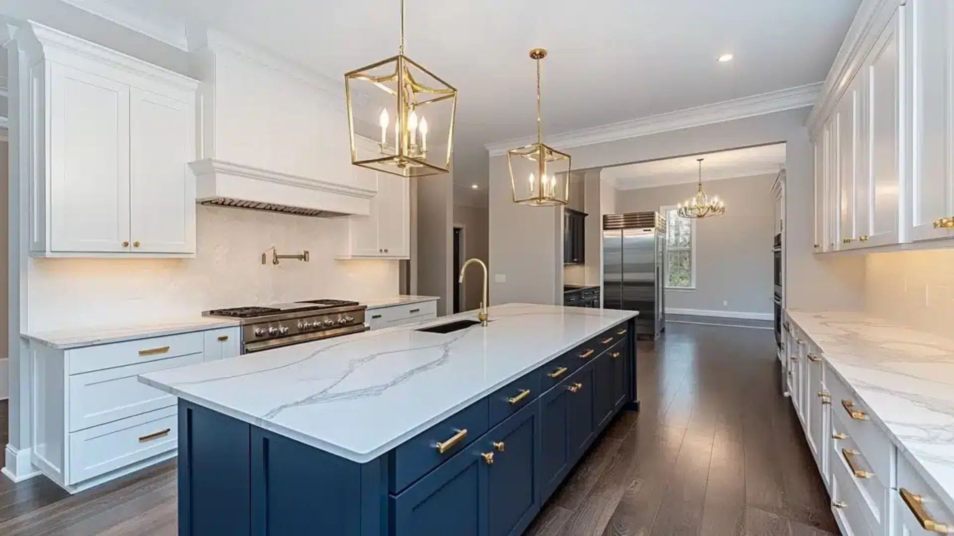
2. Living Rooms
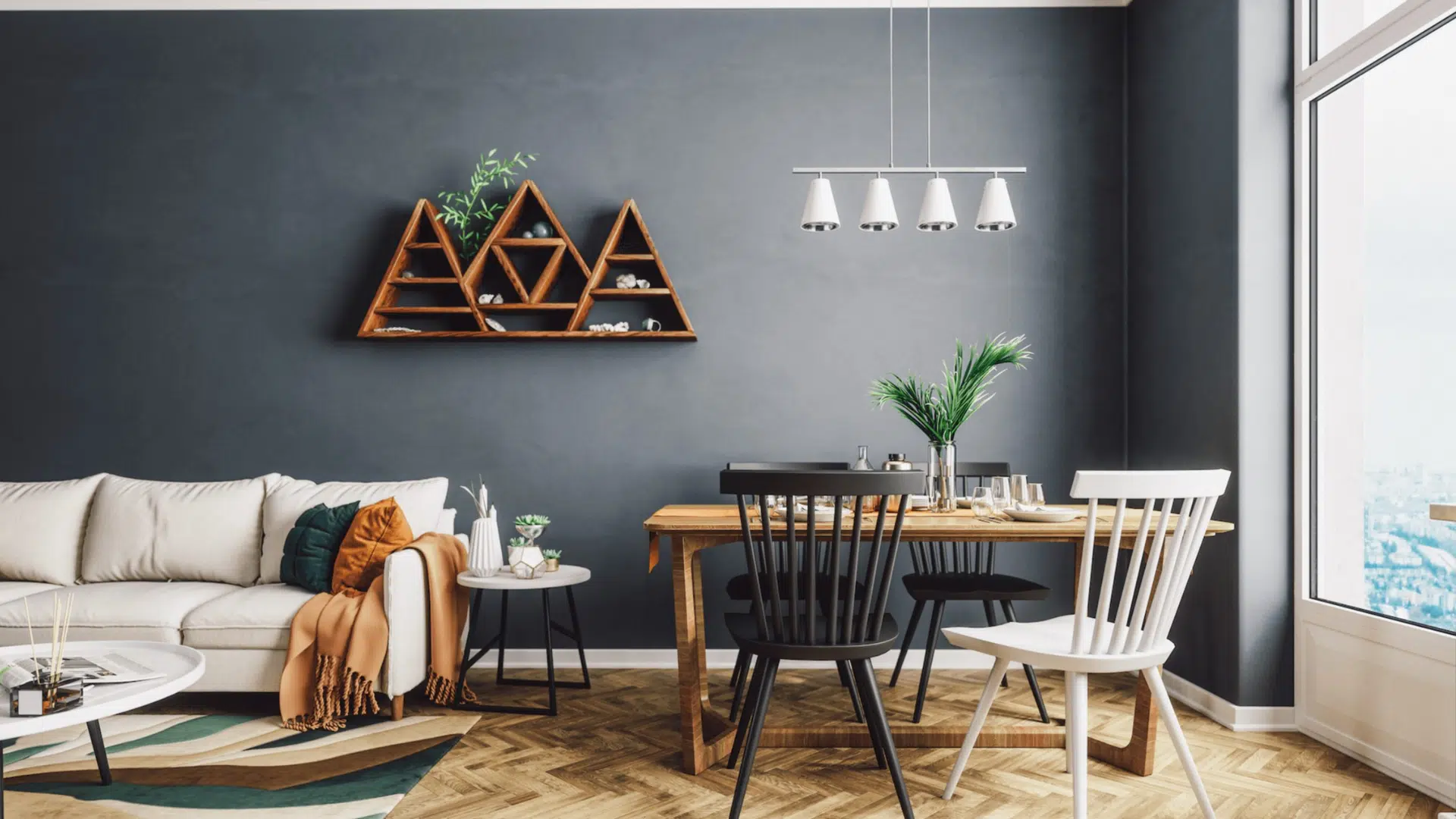
This color can add a rich, stylish feel to your living room. It works well with modern furniture and also fits right in with traditional or farmhouse decor.
Outerspace looks amazing with light wood tones, white trim, brass fixtures, or leather furniture. If the room has enough natural light, you can use it for one bold wall or go all in.
It helps anchor the space and adds depth without feeling too heavy.
3. Home Offices
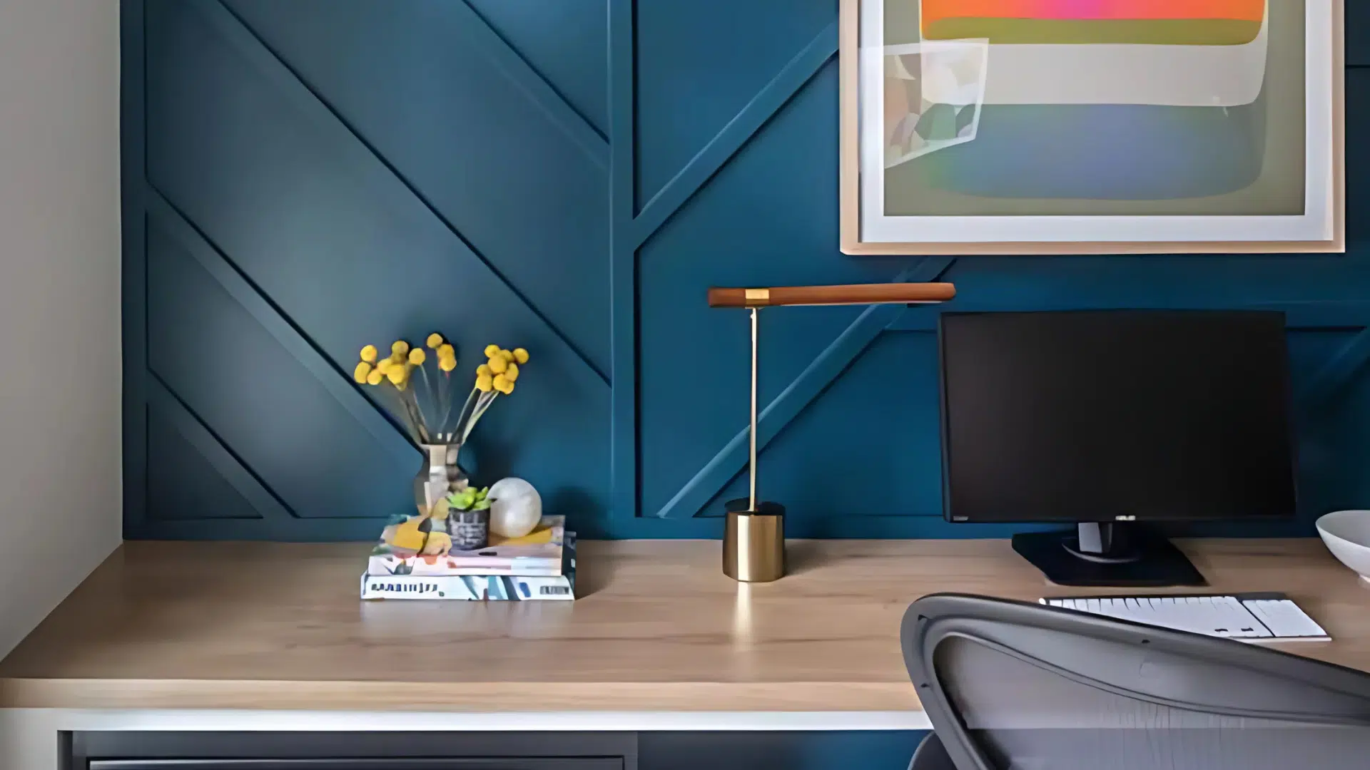
In a home office, Outerspace creates a calm, focused environment that still feels stylish. Its cool tones help block out distractions and set a serious, peaceful tone.
It pairs well with simple furniture, white shelves, or black and metal accents. If you’re going for a clean and minimal setup that’s still warm and welcoming, this color is a strong choice.
4. Exteriors
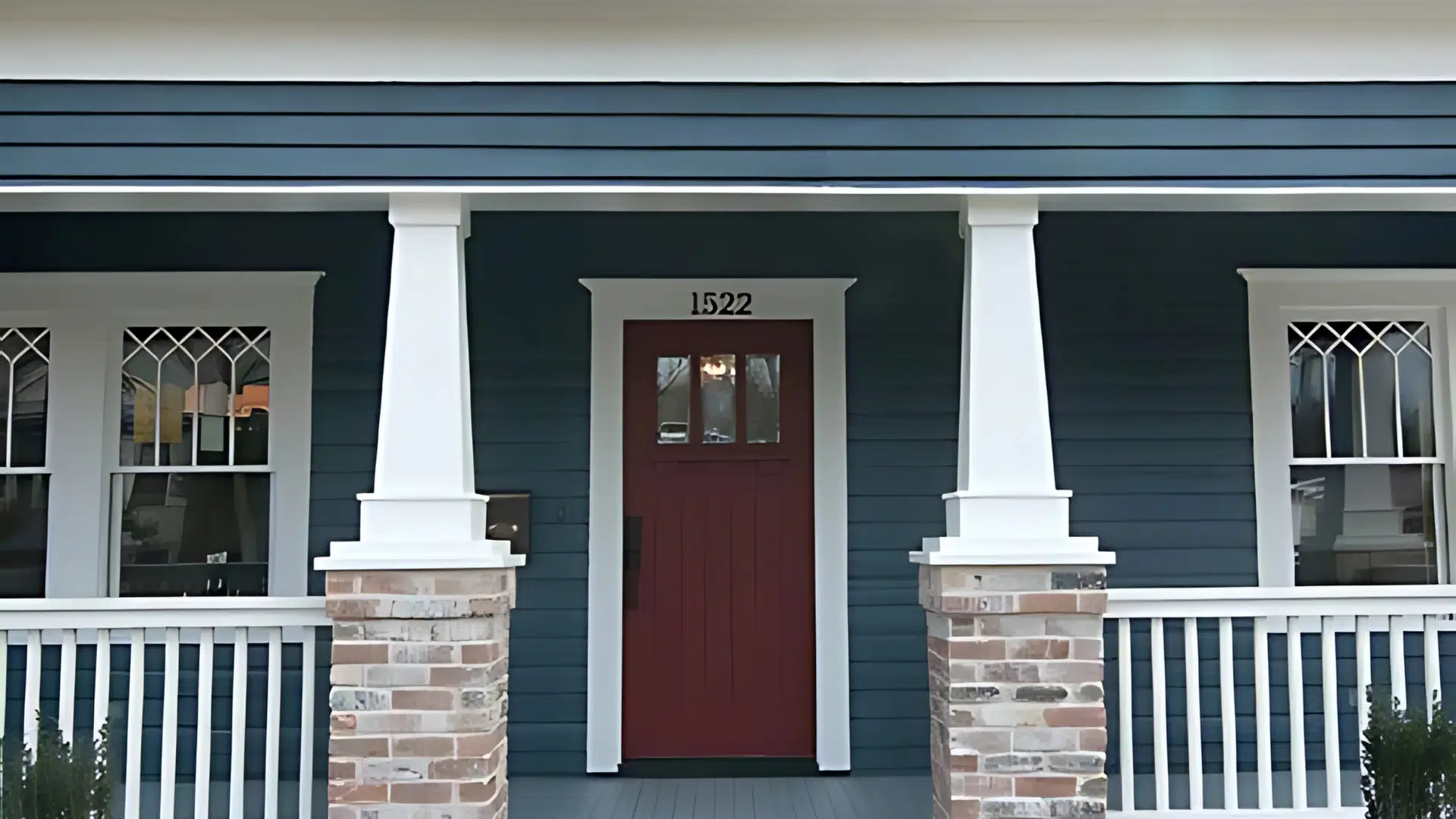
Outerspace can also make a big impact outside the home. It’s bold but not too loud, so it’s perfect for front doors, shutters, or garage doors.
It adds curb appeal and works well with lighter siding colors like off-white, cream, soft gray, or even natural stone. When paired with white or warm beige trim, it creates a crisp, fresh look that feels both classic and modern.
Outerspace Sherwin-Williams vs. Similar Color
Before choosing a deep blue like Sherwin-Williams Outerspace, it helps to compare it with similar paint colors. This way, you can be sure you’re picking the one that fits your style, lighting, and overall feel.
| Feature | Outerspace (SW 6251) | Grays Harbor (SW 6236) | Naval (SW 6244) |
|---|---|---|---|
| Tone | Deep blue with gray undertones | Dark gray with subtle blue hints | Classic navy with minimal gray |
| Vibe | Calm, modern, and a bit bold | Soft, neutral, and safe | Bold, rich, and traditional |
| Light Reflectance | LRV 12 – very dark | Slightly higher than Outerspace | Darker than Outerspace |
| Best For | Rooms with natural light; accent walls | Anyone wanting a moody but neutral look | Formal spaces or bold, timeless statements |
| Style Match | Contemporary, transitional | Neutral, versatile | Traditional, nautical, elegant |
| Pairs Well With | White trim, neutrals, mustard, burnt orange | Warm whites, soft woods | Crisp white, gold, deep wood tones |
Styling Tips for Outerspace SW 625
Outer space is a bold color, but with the right styling, it can feel calm, cozy, or even smooth and updated. Here are a few tips to help you get the most out of this deep blue-gray shade:
Lighting Considerations
- Because Outerspace is a dark color, it looks best in rooms with plenty of natural light. Sunlight helps bring out the blue tones and keeps the room from feeling too dark.
- If your space doesn’t get much sun, don’t worry, warm artificial lighting (like soft white bulbs) can also help highlight its gray side and make the room feel welcoming instead of heavy.
Material Pairings
- Try mixing in natural wood accents, like shelves, furniture, or flooring. Wood adds warmth and keeps the space from feeling too cool.
- Metal finishes like chrome, brushed nickel, or matte black can add a current touch that works really well with Outerspace, especially in kitchens or bathrooms.
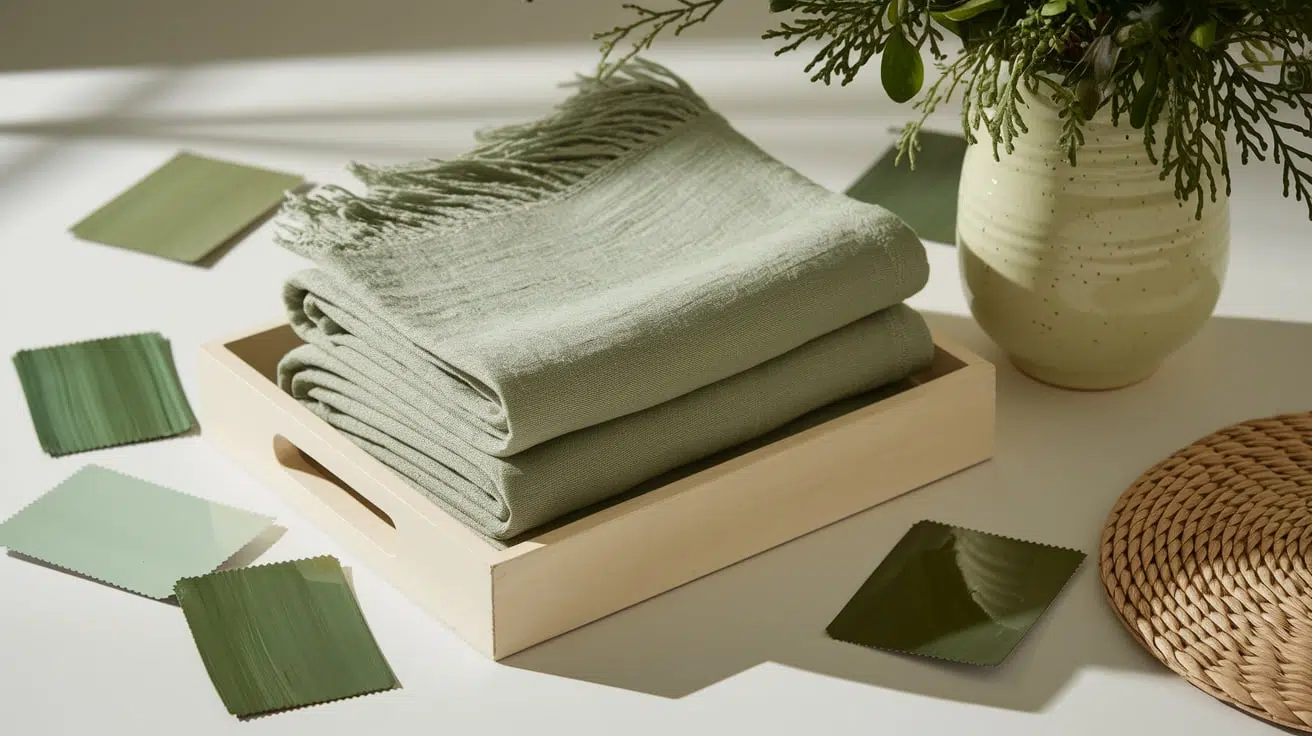
Texture Combinations
- To soften the overall look, add fabrics like linen, cotton, or chunky knits through curtains, pillows, or rugs. These textures help make the room feel cozy and balanced.
- If you want a more finished and bold look, leather furniture, especially in brown or tan, adds richness and pairs beautifully with this dark shade.
If you’re going for cozy, neat, or updated, these tips will help you style Outerspace so it fits your space and personal style just right.
Conclusion
Sherwin-Williams Outerspace is a bold, cool-toned color that adds depth and style to any space. Whether used in a bedroom, living room, home office, or exterior, it brings a calm and current feel.
With its mix of deep blue and soft gray, it’s easy to pair with whites, grays, natural wood, or strong accents like mustard or coral.
It looks best in rooms with good lighting, but it can create a cozy, moody tone even in darker spaces. Before painting a whole room, try a sample on your wall and see how it looks throughout the day.
Outerspace is a great choice if you want something different than the usual gray or navy, but still lasting. With the right styling, this rich color can make your space feel fresh, relaxed, and nicely put together.

With a Master in Architectural Studies from University of Pennysylvania, Marwa Haydar has pioneered living spaces since 2005. Her expertise, initially honed in a prestigious architectural firm, is evident in her approach to creating environments. Marwa became part of our team in 2019 and has since been a driving force in our home improvement section, known for her practical yet stylish solutions. She’s been spearheading our design workshops since then, infusing her passion for teaching into her work. In her leisure time, Marwa enjoys exploring historic architecture and is an enthusiastic pottery hobbyist, further enriching her understanding of form and texture.