Why do so many homeowners regret choosing Pure White without testing it first?
Let me help you understand Sherwin-Williams Pure White paint. I’ve used it in many homes and can tell you what makes it useful.
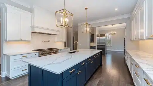
This paint has a slightly warm tone and is suitable for kitchen cabinets, walls, trim, doors, and outdoor spaces.
But before you buy it, you need to know how it will behave under different lighting and other materials in your home.
Let’s examine what I’ve learned from helping thousands of clients choose the right paint for their spaces.
What Makes Sherwin-Williams Pure White Unique?
It’s a soft white with a gentle touch of warmth. What’s special is that you won’t see strong yellow hints like in other warm whites.
Pure White has an LRV (Light Reflectance Value) of 84, making it one of the brightest whites in Sherwin-Williams’ collection. This high LRV means it reflects 84% of light, creating bright, airy spaces without feeling stark or clinical.
Think of it as sitting right in the middle – not too warm or stark. This balanced nature makes it versatile enough for modern and traditional homes alike.
Comparing Pure White to Other Whites
| Paint Color | Appearance Compared to Pure White |
|---|---|
| High Reflective White | Clean and bright, while Pure White appears softer with a subtle warmth. |
| Greek Villa | Greek Villa shows more pronounced yellow tones, while Pure White stays neutral with a hint of warmth. |
| White Snow | White SnowWhite Snow appears lighter and cleaner, whereas Pure White shows its gentle, warm side more clearly. |
How does Lighting Affect Pure White Paint?
Natural light
I’ve seen how Pure White changes in different spaces. It can look cooler than you’d expect in north-facing rooms or areas with little sunlight.
Some of my clients notice it looks flat or cold in these spots. This isn’t bad – just something to plan for.
Light Sources and Environmental Factors
Your light bulbs and surroundings directly impact Pure White’s appearance:
Bulb temperature: 5000K bulbs make it look cold with blue hints, while 3500K-4000K bulbs bring out its gentle warmth.
External influences: Red brick buildings cast pink tones, trees add green tints, and window tinting affects the color – blue tinting makes it cooler, green tinting adds green hints.
Real-life Application and Pairing Ideas for you!
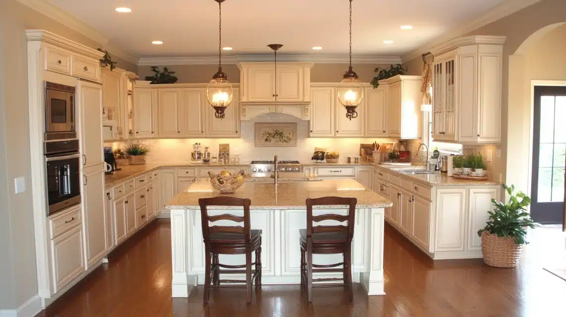
What to Avoid with Pure White?
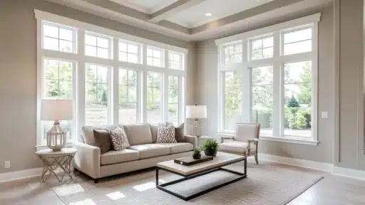
I often see issues when people use Pure White in living rooms with existing warm elements:
Common mistakes:
- With beige or tan furniture, Pure White walls can look too stark and cold
- Against honey oak floors or trim, it creates an uncomfortable mismatch
- Warm-toned wood furniture can conflict with Pure White’s cooler base
- Cream or ivory rugs and curtains make Pure White appear harsh
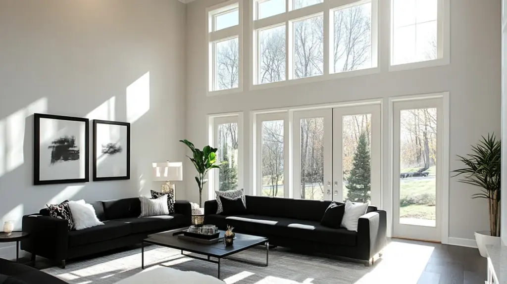
What to Pair with Pure White?
Modern living spaces:
- Pure White walls with charcoal gray sofas create visual interest
- Black or dark gray window frames and doors add definition
- Navy blue elements, through pillows or artwork,k provide depth
Peaceful, relaxing rooms:
- Soft blue-green throw pillows and artwork work well with Pure White walls
- Light gray furniture keeps the space feeling open and bright
- Natural linen textures in neutral tones add warmth without conflicting
How Does Sw Pure White Compare to Other White Paint Colors?
| Paint Color | Comparison to Pure White |
|---|---|
| High Reflective White | Bright and clean, Pure White looks more toned down with a tiny bit of warmth. |
| Greek Villa | Stronger yellow tints in the Greek Villa; Pure White stays more neutral and appears cooler. |
| White Snow | Brighter than Pure White, Pure White has more warmth and appears slightly deeper. |
| Alabaster | Alabaster is creamier with stronger yellow notes; Pure White stays more neutral. |
| White Dove | Softer and warmer, Pure White appears cleaner and less gray. |
What Colors Pair Well with Sw Pure White?
| Room Type | Recommended Colors to Pair with Pure White |
|---|---|
| Modern Spaces | Iron Ore (Sherwin-Williams) – Strong, clean contrast Tricorn Black – Bold statement Navy Blue – Classic, structured look |
| Calm, Quiet Rooms | Sea Salt (Sherwin-Williams) – Soft blue-green, peaceful Beach Glass (Benjamin Moore) – Gentle blue with gray hints Light French Gray – Subtle depth |
| Warm, Welcoming Areas | Cavern Clay – Adds warmth without being too bold Accessible Beige – Soft contrast Perfect Greige – Balanced warmth |
Tips for Using These Pairs
- Test colors at different times of the day.
- Look at them under your actual room lighting.
- Consider the fixed elements in your room (floors, counters, etc.).
- Start with small test areas before painting the entire room.
Summing Up
Success with Pure White depends on understanding your space’s lighting and existing materials.
Remember: LRV 84 means bright but not harsh, lighting changes everything, and warm materials may conflict.
Test the paint in your specific setting at different times of day. Sample it next to your floors and furniture before committing.
Next step: Get Pure White samples and test them in your actual space this week.
Frequently Asked Questions
Can SW Pure White Be Used for Trim and Ceilings?
Yes, Pure White works very well on trim and ceilings. It gives a clean look without being too stark and pairs nicely with many wall colors.
Does SW Pure White Look Yellow?
No, Pure White has only a tiny hint of warmth. Unlike warm whites, it won’t show obvious yellow tints unless compared directly to pure bright whites.
Is Sherwin Williams Pure White too bright?
No, Pure White is a muted white. It’s softer than true bright whites like High Reflective White, making it comfortable for daily living spaces.
How does SW Pure White look on exteriors?
Pure White performs well outside but can look different based on natural light and surrounding elements. Test it in your specific location before committing.

Alex Guerrero, a graduate with a Fine Arts degree from the Rhode Island School of Design, has been a visionary in the world of color and design for over 15 years. His professional journey began in the heart of the fashion industry in Milan, where he developed an acute sense for color harmonies and trends. Alex joined our team in 2018, offering fresh and innovative perspectives on color utilization in various spaces. Renowned for his ability to blend contemporary trends with timeless elegance. Outside of work, Alex is an accomplished painter and a volunteer art therapist, his artistic talents further enriching his professional insights.