

“White Snow—an effortlessly stylish off-white that shifts with the light, bringing warmth, serenity, and design possibilities to your space.”
This new, cloud-like shade changes any space into a canvas of possibility. White Snow, a luxurious color with the subtlest warm undertones, creates an atmosphere of serene refinement perfect for modern homes.
Pair it with rich, contrasting accents for dramatic impact, or layer with other neutrals for a calm, textured sanctuary.
The color’s remarkable versatility allows it to complement both cool and warm color palettes, adapting effortlessly to various decorating styles.
If You’re creating a minimalist retreat or a warm, inviting gathering space, White Snow offers the perfect balance between contemporary freshness and timeless grace, bringing a sense of pure serenity to your interior spaces.
Understanding Paint Color Basics: White Snow
Color Terminology
| PROPERTY | VALUE |
|---|---|
| LRV (Light Reflectance Value) | 90.00 |
| Color Category | Considered a light color (LRV above 80) |
| Comparison | Pure white: ~90 LRV, Black: ~0 LRV |
| RGB Value | Red: 245 Green: 244 Blue: 238 |
| Hex Code | #F5F4EE |
Undertones:
- White Snow has subtle, warm undertones
- It’s a refined off-white with very soft creamy notes
- Not a stark or clinical white, but a refined neutral white
Psychology of White/Off-White Colors
White spaces like those painted in White Snow create a sense of spaciousness and clarity.
- Off-white tones: Offer refinement and versatility
- High-reflectance colors: Evoke purity, simplicity, and boundless possibility
- Benefits: Maximizes natural light, creates visual expansion, and provides a perfect backdrop for various design elements
Why Choose This Color Sherwin Williams White Snow?
Sherwin-Williams White Snow’s versatility shines in varying lighting conditions, adapting beautifully to different room orientations and natural light patterns.
In north-facing rooms, which tend to receive cooler, dimmer light throughout the day, White Snow’s subtle warm undertones counteract the blue-gray cast that often plagues these spaces. The color’s warmth helps brighten what might otherwise feel cold or shadowy.
In south-facing rooms with abundant natural light, White Snow maintains its luminous quality without appearing washed out or overly bright. The color’s balanced undertones prevent it from becoming stark or clinical, even in direct sunlight.
In east and west-facing rooms, where light changes dramatically throughout the day, White Snow’s chameleon-like quality provides consistency. It appears crisp and fresh in morning light, then reveals its warmer undertones as the day progresses into golden afternoon sun.
In rooms with artificial lighting, White Snow works harmoniously with both warm LED bulbs (which enhance its creamy notes) and cool fluorescent lighting (where its warmth provides balance).
Its chameleon-like quality provides a refined, pristine backdrop that complements both traditional and contemporary design elements while creating a sense of spaciousness in any lighting scenario.
Key Features
Sherwin-Williams White Snow offers exceptional adaptability with fixed elements like wood furnishings and natural stone, creating cohesive transitions between spaces.
It provides enough subtle warmth to feel welcoming while maintaining a bright, timeless quality that won’t quickly date your interior design choices.
Durability
Sherwin-Williams White Snow, particularly in premium finishes like Emerald or Duration, offers outstanding durability with excellent coverage in all areas.
While its high LRV means it may show marks more readily than darker colors, proper preparation and quality application ensure a long-lasting, beautiful finish that maintains its appearance.
When properly applied, this paint resists yellowing and maintains color consistency even with regular cleaning.
Texture Patterns
Sherwin-Williams White Snow creates a subtle, luminous texture that adds dimension to walls without overwhelming the space.
Its warm undertones produce gentle shadow play that softens harsh lighting and adds visual interest to textured surfaces.
When applied to different finishes, it can improve constructive details while maintaining a consistent, refined appearance throughout connected rooms.
Room-by-Room Color Recommendations with White Snow
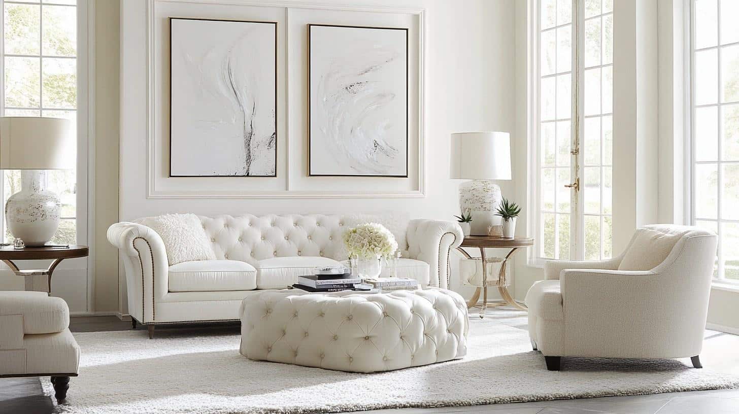
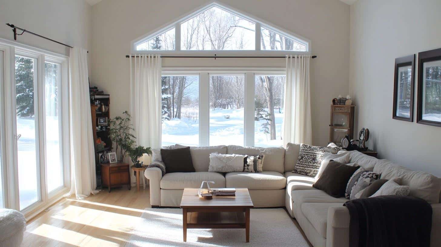
1. Living Spaces and Open Floor Plans
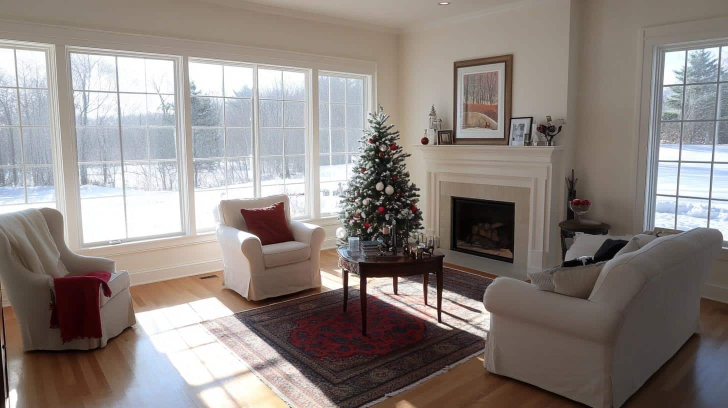
White Snow (SW) works exceptionally well in open floor plans due to its high reflectance value that creates a cohesive flow between connected spaces.
The 90.00 LRV of White Snow provides ample light reflection to make spaces feel expansive while offering a subtle warmth that stark whites lack.
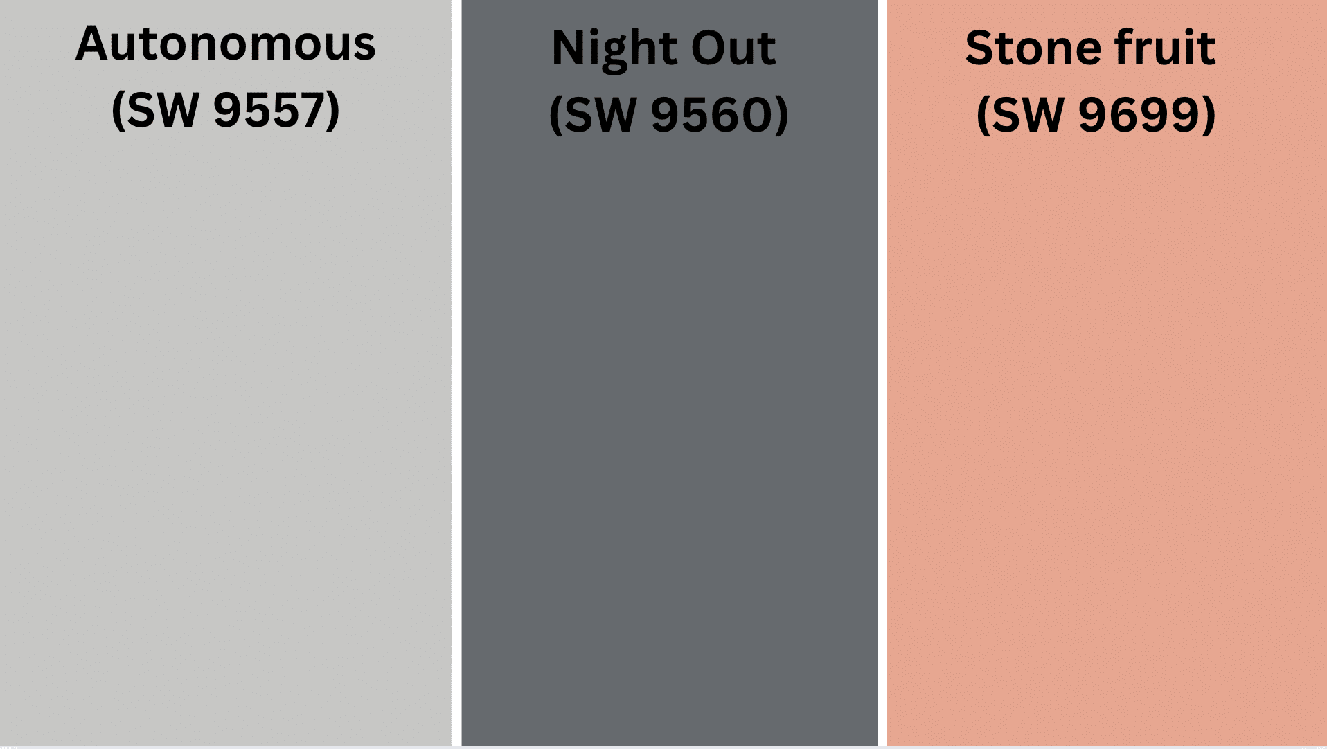
For dimension, pair White Snow walls with contrasting trim in Autonomous or create an accent wall with Night Out.
Pro Tip: Use White Snow on all walls and ceilings in connected spaces, then differentiate areas with varying trim colors or textures to maintain flow while defining distinct zones.
2. Bedrooms and Relaxation Areas
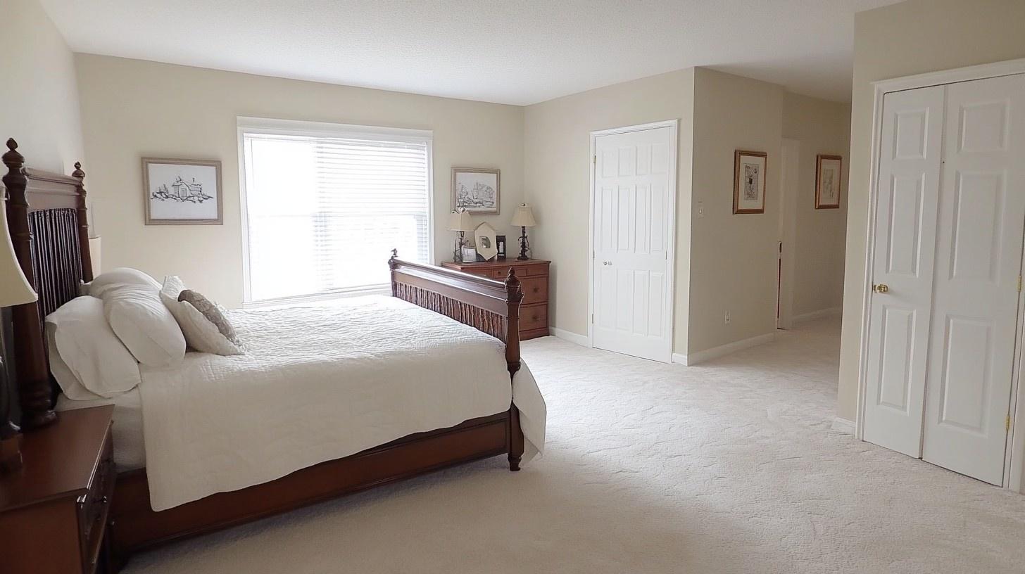
White Snow creates a peaceful, airy atmosphere in bedrooms without feeling sterile or cold. Its subtle, warm undertones promote relaxation while maintaining enough brightness to keep the space feeling fresh and open.
Consider White Snow as your primary color with Stone Fruit accents for a balanced bedroom that feels both serene and inviting.
Pro Tip: Paint the ceiling in White Snow as well to create a cocoon-like effect that makes the room feel taller and more serene, especially in rooms with slanted or low ceilings.
3. Kitchens
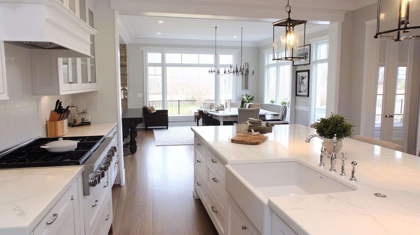
White Snow in satin or semi-gloss finish offers practicality in high-traffic areas, while its bright, clean appearance creates a sense of freshness in culinary spaces.
Its neutral warmth complements cool marble countertops and warm wood cabinetry without leaning too yellow.
White Snow works beautifully with stainless steel appliances and various cabinet colors, making it adaptable to kitchen updates and changes.
Pro Tip: Use White Snow on upper cabinets and a slightly deeper neutral on lower cabinets to create visual weight and prevent the kitchen from feeling too light or floating.
4. Bathrooms and Spa-like Retreats
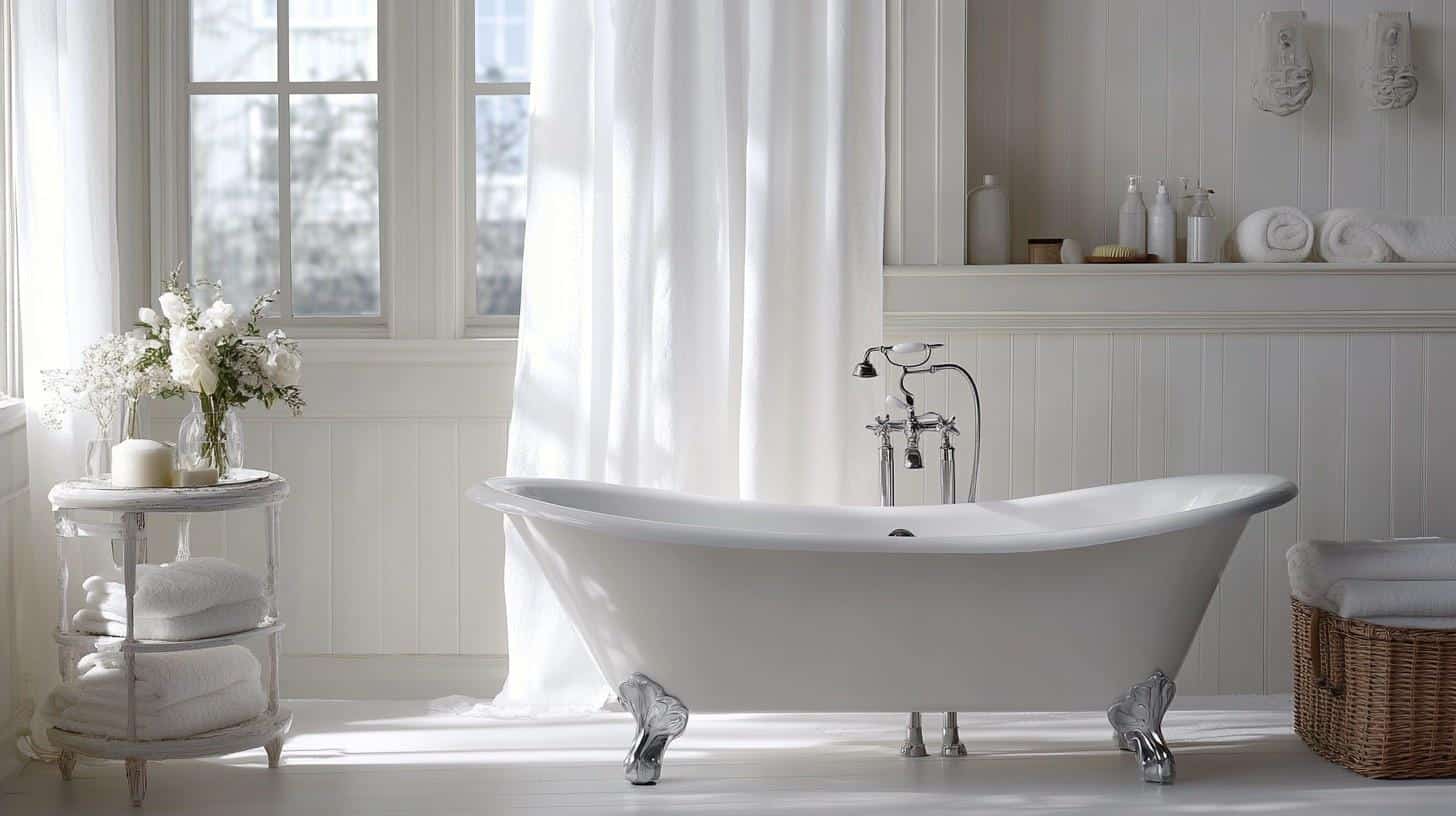
Sherwin-Williams White Snow creates a bright, spa-like atmosphere in bathrooms. Its subtle, warm undertones enhance the natural feel of fixtures while adding refinement to small spaces.
This versatile shade pairs beautifully with white porcelain, natural stone, and warm wood elements, creating a timeless, rejuvenating retreat. For smaller bathrooms, use White Snow throughout to maximize the perception of space and light.
Pro Tip: Apply White Snow in a satin finish on walls for easy cleaning, but use eggshell or flat on the ceiling to reduce glare from bathroom lighting and create a softer, more spa-like ambiance.
Color Pairings and Combinations for White Snow
White Snow is a refined, nuanced white that captures the essence of fresh, pristine simplicity.
This versatile shade blends the brightness of pure white with subtle warmth, creating a serene and adaptable color option for interior and exterior spaces.
Color Characteristics
- Undertones: Soft, warm undertones with subtle cream notes
- Mood: Bright, airy, and refined
- Best Used In: Living rooms, kitchens, bathrooms, exteriors
- Light Reflectance Value (LRV): 90, providing exceptional light reflection
Complementary Colors
- Autonomous (SW 9557) – A rich, grounding neutral that creates a dramatic contrast with White Snow
- Night Out (SW 9560) – A deep, refined shade that adds depth and definition against White Snow’s brightness
- Stone Fruit (SW 9699) – A warm, natural tone that enhances the subtle warmth in White Snow
Coordinating with Furniture and Decor
Recommended Wood Pairings
- Light Woods: Ash and light oak create a fresh, Scandinavian feel, highlighting the color’s brightness
- Medium Woods: Warm cedar and honey-toned maple complement the subtle warmth of White Snow.
- Dark Woods: Rich walnut and deep mahogany add dramatic contrast while maintaining the color’s refined mood
- Weathered Woods: Driftwood and reclaimed barn wood enhance the color’s versatile, timeless character.
Styling Recommendations
- Use darker wood furniture for dramatic, anchoring contrast
- Incorporate wood elements with varied textures to add dimension to the bright space
- Blend in natural wood tones to enhance White Snow’s subtle warmth
Metal Finishes
- Brass: Warm brass fixtures add a luxurious, refined touch
- Antique Bronze: Creates a rich, grounded feel with depth and character
- Brushed Nickel: Provides a modern, clean complement to the bright white tone
- Copper: Introduces warmth and a stylish, distinctive edge
- Matte Black: Offers a bold, contemporary statement against the crisp backdrop
Metal Mixing Techniques
- Experiment with multiple metal finishes for an eclectic, curated look
- Use metal accents to add definition against the bright white backdrop
- Consider metal elements in lighting, hardware, and decorative objects
Final Words
Imagine a color like freshly fallen snow kissed by a golden sunrise—that’s White Snow. This exceptional paint color is remarkably versatile because it changes depending on the light and surrounding colors.
Sometimes, it appears brilliantly white, and sometimes, it reveals its subtle warm undertones, which makes it incredibly versatile for designing refined spaces. It’s like a design foundation that can promote almost any interior vision.
Designers treasure White Snow because it creates spaces that feel both expansive and intimate.
It evokes the purity of new beginnings while maintaining enough warmth to feel welcoming rather than stark.
If you’re painting a bright kitchen, serene bedroom, or smart exterior, this color is the perfect choice. It’s luminous without being blinding—striking the perfect balance for creating truly remarkable spaces.
Ready to change your space? Whether you’re painting a bright kitchen, serene bedroom, or stylish exterior, White Snow offers the perfect balance of contemporary freshness and timeless grace.
Visit your local Sherwin-Williams store or consult with a color expert to see how White Snow can bring pure serenity to your home.

Alex Guerrero, a graduate with a Fine Arts degree from the Rhode Island School of Design, has been a visionary in the world of color and design for over 15 years. His professional journey began in the heart of the fashion industry in Milan, where he developed an acute sense for color harmonies and trends. Alex joined our team in 2018, offering fresh and innovative perspectives on color utilization in various spaces. Renowned for his ability to blend contemporary trends with timeless elegance. Outside of work, Alex is an accomplished painter and a volunteer art therapist, his artistic talents further enriching his professional insights.