

Imagine a color so quiet it almost whispers. That’s what Calm OC-22 is like. This special shade of white has just a tiny touch of lavender-gray mixed in. If you look quickly, you might think it’s just white, but there’s something more.
Calm OC-22 feels like early morning fog or the inside of a seashell. It’s the color of peace. When you paint a room this color, it feels bigger and more restful.
This gentle color works well with both warm and cool colors. It can make bright colors look less harsh or dark colors feel less heavy.
Calm OC-22 is perfect for bedrooms, bathrooms, or any space where you want to relax and feel at ease.
Why Choose Benjamin Moore’s Calm OC-22
This gentle color creates spaces that feel bigger and more peaceful. It works in any room you want to relax, from bedrooms to living areas. Calm OC-22 pairs beautifully with bold and subtle colors, making it a versatile choice for your home.
1. Fine Grace
- Calm OC-22 is a soft white with delicate lavender-gray undertones.
- It creates a peaceful backdrop that feels like a breath of fresh air.
- The color perfectly balances warm and cool, making spaces feel larger and more serene.
2. Ideal for Any Space
- Bedrooms transform into peaceful sanctuaries for better sleep
- Living areas become more spacious and inviting
- Bathrooms gain a clean, spa-like quality
- Home offices feel more focused and less distracting
3. Versatile Companion
- Dark wood furniture stands out beautifully
- Colorful accents appear more vibrant
- Stainless steel and chrome fixtures shine
- Natural fabrics and textures gain depth
4. Emotional Benefits
- Reduces visual noise and creates calm
- Helps rooms feel clean and organized
- Promotes a sense of peace and relaxation
- Makes smaller spaces feel open and airy
5. Lighting Effects
- Morning light brings out subtle lavender hints.
- The afternoon sun shows its cleaner white side.
- Evening lamps create a warm, cozy glow.
- This adaptability makes it perfect for rooms used throughout the day.
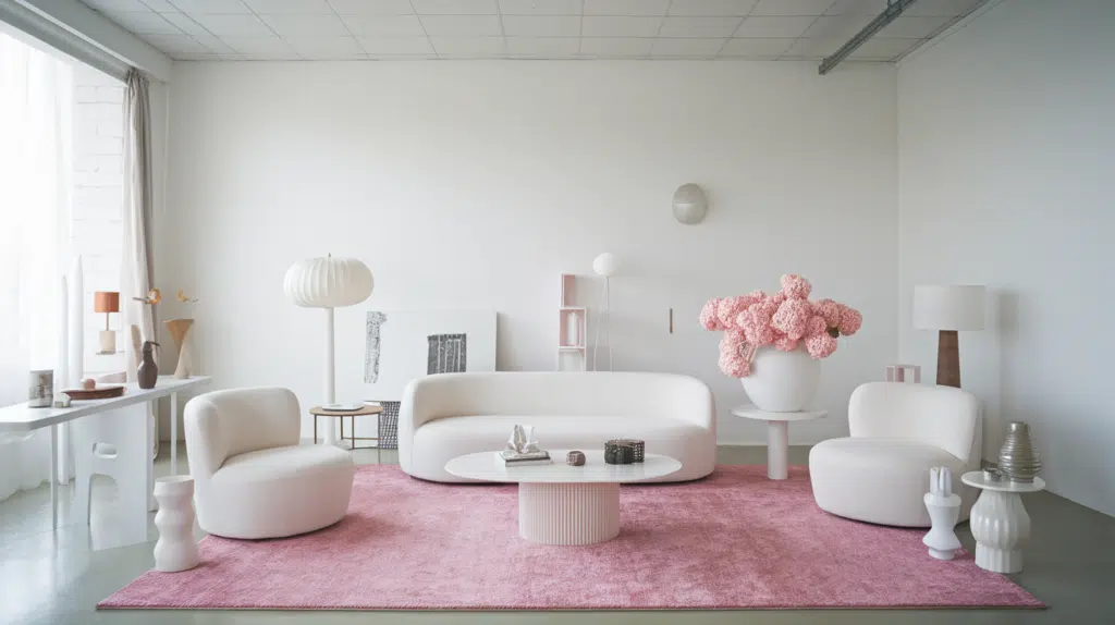
Benjamin Moore’s Calm OC-22 in Interior Design
Calm OC-22, a whisper-soft white with delicate lavender-gray undertones, brings serene simplicity and versatile culture to interior spaces while creating an expansive, peaceful atmosphere.
Color Pairings
| Color Name | Color Category | Benjamin Moore Code |
|---|---|---|
| Simply White | White/Trim | OC-117 |
| Gray Owl | Light Gray | OC-52 |
| Pale Oak | Neutral Beige | OC-20 |
| Hale Navy | Deep Blue | HC-154 |
| Revere Pewter | Greige | HC-172 |
| Wickham Gray | Light Blue-Gray | HC-171 |
| Classic Gray | Soft Gray | OC-23 |
| Stonington Gray | Medium Gray | HC-170 |
| Balboa Mist | Warm Gray | OC-27 |
| Naval | Navy Blue | SW 6244 |
| Kendall Charcoal | Dark Gray | HC-166 |
| Edgecomb Gray | Light Beige | HC-173 |
| White Dove | Warm White | OC-17 |
| Sea Salt | Light Green-Gray | CSP-95 |
| Chantilly Lace | Pure White | OC-65 |
Texture Partners
When looking for texture partners for Calm OC-22, I recommend complementary textures that enhance its properties while maintaining design harmony. Here are some texture pairing options:
- Natural wood finishes – The warmth of wood grain creates a beautiful contrast with the cool, calm tones of OC-22
- Linen or woven textiles – These add depth and tactile interest without competing with the subtle nature of Calm
- Smooth stone surfaces like marble or quartz – These provide graceful contrast while maintaining a refined palette
- Brushed metals (particularly in pewter, nickel, or champagne finishes) – These add a slight sheen without overwhelming the calm pr
- Natural sisal or jute – These textured materials bring organic warmth that balances the cooler undertones
The key is selecting textures that complement Calm’s gentle, refined presence without creating too much visual competition in your space. Materials with subtle variations rather than bold patterns tend to work particularly well.
Perfect Places for Use
- Bedrooms
- Living rooms
- Home offices
- Bathrooms
- Kitchens
- Dining rooms
- Hallways and transitional spaces
- Nurseries
- Meditation or yoga spaces
- North-facing rooms
Today’s Home Design
More people are choosing subtle neutrals for their homes. Calm OC-22 fits this trend by:
- Adding complexity to contemporary spaces
- Creating serenity in high-traffic areas
- Harmonizing with both warm woods and cool metals
- Enhancing spaces with various lighting conditions
- Providing versatility for changing seasonal decor
- Establishing a timeless foundation for evolving styles
- Complementing architectural features without overwhelming them
- Blending flawlessly with both traditional and modern elements
Why Does It Work?
- Maintains a soft, balanced appearance in different lighting
- Creates an atmosphere of graceful poise
- It provides a versatile backdrop for various design elements
- Expands visual space while adding subtle warmth
- Transitions smoothly between adjoining rooms
- Complements both modern and traditional architectural details
- Enhances natural materials like wood, stone, and textiles
- Allows statement pieces to stand out without competing
- Offers timeless appeal that won’t quickly date your space
- Adapts to seasonal decor changes without crashing
Calm Color Profile by Benjamin Moore

1. Color Values
RGB Value: 231, 228, 223
Red: 231
Green: 228
Blue:223
HEX Code: #E7E4DF
• Benjamin Moore’s Calm OC-22 is a soft, ethereal off-white with subtle gray undertones that creates a serene atmosphere in any space.
• This versatile neutral provides a peaceful backdrop that complements any design style while reflecting light beautifully throughout the day.
2. What These Numbers Mean
The RGB values show how Calm OC-22 gets its unique look:
- The nearly equal RGB values (231, 228, 223) create this color’s balanced, neutral appearance
- Slightly higher red and green values compared to blue give it a subtle warmth
- This careful balance produces the color’s serene, peaceful quality that works in any lighting
3. Digital Uses
- Minimalist website backgrounds
- Digital branding for wellness and spa businesses
- Virtual staging for real estate photography
- Background for e-commerce product photography
- App interfaces for mindfulness and meditation platforms
- Digital art and illustration with soft, neutral palettes
4. Quick Tips
- It pairs beautifully with soft blues and greens for a quiet space
- Use in north-facing rooms to brighten without feeling cold
- Apply in open floor plans to create visual continuity
- Perfect for “color drenching” walls, trim, and ceiling in the same shade
- Test samples at different times of day as it can shift subtly with lighting
- It complements both cool and warm accent colors due to its balanced undertones
Benjamin Moore Calm OC-22: Characteristics and Color Profile
Color Description
1. Light Reflectance Value (LRV)
- LRV: 78.2
- High brightness level
- Notably, light and airy
- Ideal for expanding visual space
- Reflects a significant amount of light in all conditions
2. Undertones
- Soft white base
- Subtle blue-gray hints
- Delicate cool notes
- Changes with lighting:
- Bluer in northern exposure
- Appears more neutral in warm lighting
- Crisper in daylight
- Softer and creamier at dusk
Calm OC-22 is a versatile off-white that lives up to its name with a serene, gentle quality that works beautifully in various settings.
Its high reflectance creates an open, breathable atmosphere while the subtle cool undertones prevent it from appearing stark or clinical.
Similar Benjamin Moore’s Colors
1. White Opulence (OC-69)
- High-brightness white with subtle pink undertones that soften its crisp appearance
- Smart reflective quality that brings gentle warmth to spaces while maintaining a fresh, clean look
2. Nightingale (AF-670)
- Refined medium gray with soft violet undertones that add depth and complexity
- Versatile neutral with a rich, grounding presence that shifts subtly from cool to warm depending on lighting conditions
Using Benjamin Moore’s Calm (OC-22) for Your Home
Living Room
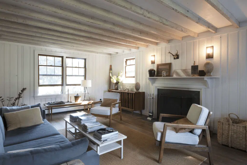
- Perfect for art display
- Great for family time
- It makes rooms feel open
- Works with any lighting
Bedroom
- Helps with sleep
- Morning light friendly
- Good for reading nooks
- It fits any size room
Dining Area
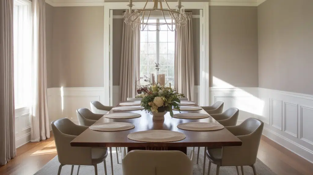
- A clean, fresh look
- Works with white items
- It makes spaces feel bigger
- Easy to keep fresh
Color Pairings for Benjamin Moore Calm OC-22
| Dark Colors | Light Colors |
|---|---|
| Hale Navy | Gray Owl |
| Kendall Charcoal | Pale Oak |
| Chelsea Gray | Classic Gray |
| Iron Mountain | Paper White |
| Temptation | Balboa Mist |
Decor Tips for Benjamin Moore Calm OC-22
| Room Type | Decor Tips |
|---|---|
| Living Room | Pair with natural wood furniture to add warmth. Incorporate navy blue or charcoal accent pillows•. Use brass or gold fixtures for a pretty contrast. Add texture with wool or linen throws. |
| Kitchen | Install matte black hardware for modern contrast. Choose marble or quartz countertops with subtle veining. Add warmth with light wood open shelving. Use brushed nickel appliances for a cohesive look. |
| Bedroom | Layer with soft textiles in green and light blue. Select natural fiber rugs for warmth and texture. Use blackout curtains in a complementary neutral. Add depth with dark wood nightstands. |
| Bathroom | Install chrome or brushed nickel fixtures. Choose white subway tile for a classic look. Add warmth with natural wood accents. Use glass shower doors to maintain airiness. |
| Home Office | Select dark wood or black furniture for contrast. Add a pop of color with emerald green accessories. Install floating shelves in light wood tones. Use task lighting with brass finishes. |
| Entryway | Make a statement with a dark console table. Add visual interest with a textured neutral rug. Install hooks or hardware in oil-rubbed bronze. Use mirrors to amplify the light-reflecting quality. |
Practical Tips for Painting with Calm OC-22
Preparing Your Space
- Clean all surfaces thoroughly with a mild detergent or wall cleaner.
- Repair any wall damage: Fill holes with spackling compound, fix cracks with caulk, and sand smooth.
- A white primer is ideal for Calm OC-22. Due to its high reflectance value, one coat is usually sufficient.
- Test Calm OC-22 by painting 2′ x 2′ samples on different walls.
- This off-white shade can appear more blue in northern exposures or neutral in warm lighting.
Application Tips
- For the best finish, use premium paint tools: high-quality synthetic brushes for trim and a ⅜” wall nap roller.
- Apply in “W” patterns when rolling to ensure even coverage.
- Two coats are typically required for full, consistent coverage.
- Allow proper drying time between coats (minimum 2-4 hours, depending on humidity).
- For a flawless finish, paint in natural daylight whenever possible.
Finishing Touches
- Inspect walls with a bright light held at an angle to catch missed spots.
- Touch up as needed after the paint has fully dried.
- Wait at least 2 weeks before washing newly painted surfaces.
- Store leftover paint in a sealed container for future touch-ups.
- Label the can with the room name for easy reference later.
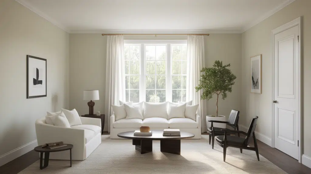
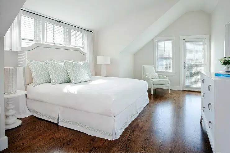
Room Inspirations with Benjamin Moore’s Calm (OC-22)
Hale Navy and Calm Blended in a Single Room
For a bolder contrast, navy blue brings depth and grace, grounding Calm OC-22 with a timeless, refined touch.
Whether used in furniture, cabinetry, or textiles, navy enhances Calm’s airy quality while adding striking visual interest.
Perfect for modern, minimalist, or classic interiors, Calm OC-22 is a beautifully balanced neutral that pairs effortlessly with soft pastels and rich, dramatic tones, creating a harmonious and stylish space.
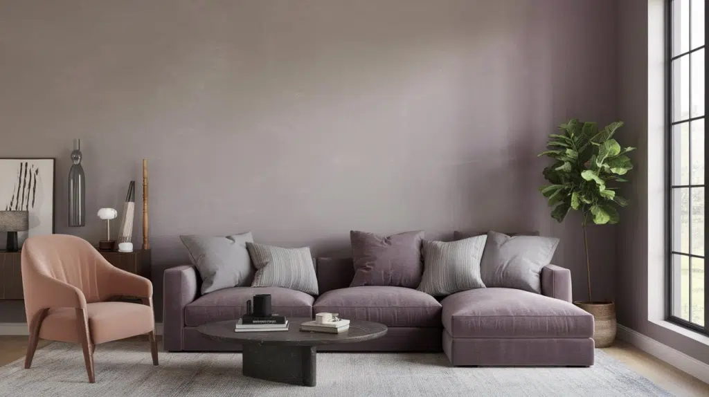
Mint Green and Calm Blended in a Single Room
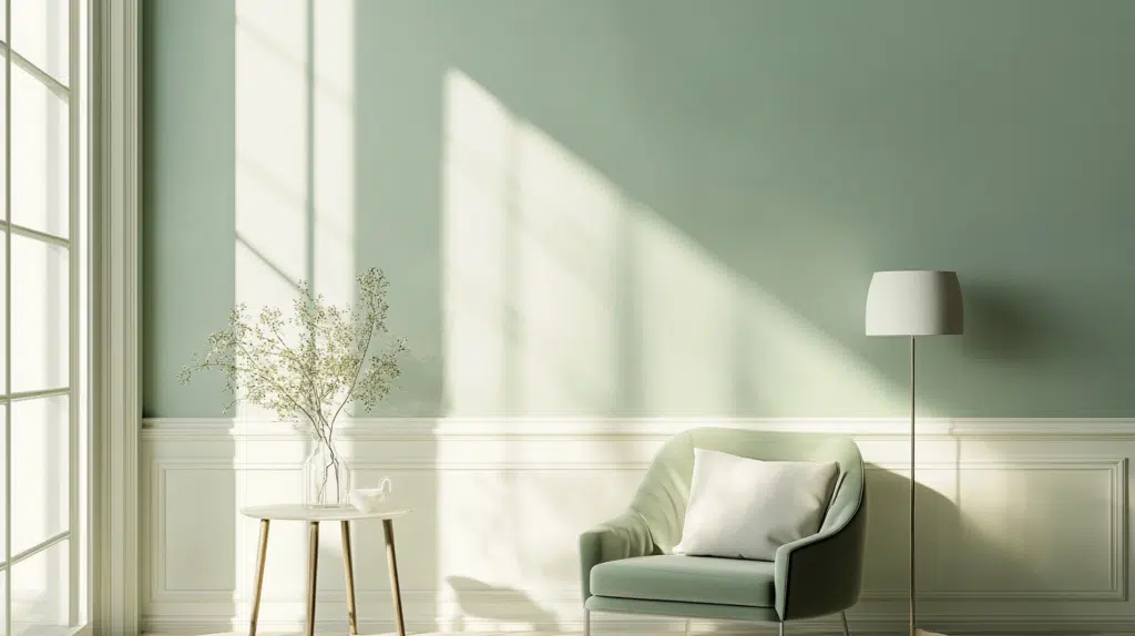
Benjamin Moore’s Calm OC-22 is a soft, warm off-white with subtle gray undertones. It offers a serene and refined feel. Its versatility makes it perfect for creating airy, inviting spaces while effortlessly pairing with various colors.
For a fresh, lively contrast, mint green adds a subtle pop of color without overwhelming the space, making it ideal for accent walls or decor. This combination evokes a soothing, nature-inspired ambiance.
Wrapping It Up
Calm OC-22 is a special white paint with tiny hints of lavender-gray. It makes rooms feel bigger and more peaceful. This color works great in any room you want to relax, like bedrooms, bathrooms, or living rooms.
One cool thing about Calm OC-22 is that it looks different as the light changes throughout the day. You might see more lavender hints in the morning, while evening lamps make it feel warm and cozy.
This color goes well with dark colors like navy blue and light colors like Gray Owl. It also looks great with wood furniture, marble countertops, and metal fixtures.
If you want a room that feels peaceful and not too bright or dark, Calm OC-22 is a superior choice!

Alex Guerrero, a graduate with a Fine Arts degree from the Rhode Island School of Design, has been a visionary in the world of color and design for over 15 years. His professional journey began in the heart of the fashion industry in Milan, where he developed an acute sense for color harmonies and trends. Alex joined our team in 2018, offering fresh and innovative perspectives on color utilization in various spaces. Renowned for his ability to blend contemporary trends with timeless elegance. Outside of work, Alex is an accomplished painter and a volunteer art therapist, his artistic talents further enriching his professional insights.