Looking for the perfect gray paint? Dorian Gray Sherwin Williams (SW 7017) might be just what you need. This medium-gray shade has just the right amount of warmth without being too dark or light.
It’s named after the famous character from Oscar Wilde’s novel and shares the same interesting mix of qualities—it feels both classic and fresh at the same time.
Unlike many trendy colors that go out of style quickly, Dorian Gray Sherwin Williams stays relevant year after year.
It changes slightly as the light shifts during the day but always keeps its balanced, calming feel.
Many homeowners choose this versatile gray because it works with almost any style and makes rooms feel put together without trying too hard. Find out how this popular paint color could change your space.
Understanding Paint Color Basics
Color Terminology
| Property | Value |
|---|---|
| LRV | 39 (Moderate reflectance, mid-tone) |
| RGB Values | 172, 167, 158 (A balanced neutral mix) |
| HEX Code | #ACA79E (A soft, warm gray tone) |
The Psychology of Dorian Gray SW 7017
- Refined and Polished – Adds Victorian-era luxury to any space.
- Contemplative – Shifting undertones mirror Wilde’s complex protagonist.
- Balanced – Works well across various design styles.
- Complex – Reveals different facets in changing light.
- Timeless – Blends period charm with a modern sensibility.
Why Choose Dorian Gray SW 7017
Sherwin Williams Dorian Gray delivers remarkable versatility with its balanced medium-gray tone, creating rich depth without feeling overwhelming.
This thoughtful shade is a calming, neutral, and character-filled wall color.
It establishes a refined foundation that complements furnishings and accessories while creating a sense of peace and comfort.
The color’s literary-inspired appeal ensures your space stays stylish for years, turning ordinary rooms into thoughtful personal style statements.
1. Key Features of Dorian Gray SW 7017
Dorian Gray SW 7017 offers a perfectly balanced gray with subtle warm undertones and exceptional coverage.
Unlike cooler grays that can feel sterile or warmer taupes that lean brown, this true gray creates a clean, adaptable canvas.
Its soft finish diffuses light beautifully, creating a gentle appearance that adds dimension to walls.
The color shows remarkable stability across different lighting conditions, maintaining its composed character from dawn to dusk while revealing subtle complexities as light changes.
2. Durability
Sherwin-Williams’ premium formulation ensures Dorian Gray maintains its unique character and resists fading even in sun-exposed areas.
This practical shade forgives minor wall imperfections and withstands daily wear, making it ideal for living spaces.
Easily clean without compromising its subtle depth, Dorian Gray’s lasting performance protects your investment while maintaining its timeless appeal for years.
3. Texture Patterns
Dorian Gray develops beautifully across different application techniques, creating impressive dimensional variations.
In standard applications, it produces a refined, smooth appearance. Applied in a limewash technique, it develops intriguing depth and movement.
The color improves structural details on textured surfaces, highlighting key elements with subtle precision.
When used with specialized finishes like Venetian plaster or concrete overlay, it delivers gentle variations that add remarkable character to spaces.
4. Why It Works
Dorian Gray succeeds because it creates an immediate atmosphere without dominating a space.
This versatile neutral complements diverse décor styles, from traditional to contemporary, while allowing other elements to shine.
The color’s depth directs the eye strategically, defining spaces and improving focal points with thoughtful restraint.
It works particularly well in rooms with varying light conditions, creating a perfect balance of character and restraint, much like its literary namesake.
Room-by-Room Color Recommendations with Dorian Gray
Bathrooms and Spa-Like Retreats
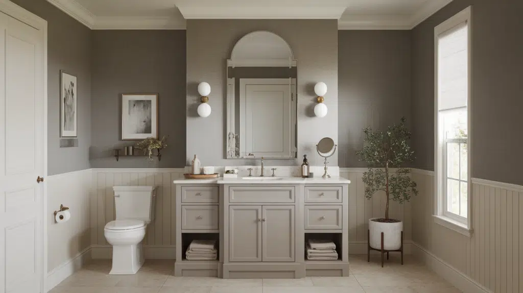
Dorian Gray bathrooms into peaceful sanctuaries, pairing beautifully with white fixtures and natural stone.
Its calming presence creates a spa-like atmosphere, especially when accented with soft textiles and wooden elements. Add brushed metals for a touch of understated luxury.
Dining Spaces

In dining rooms, Dorian Gray fosters intimate gatherings and thoughtful conversation. This versatile gray provides an ideal backdrop for casual family meals and formal entertaining.
It highlights wood furniture beautifully while allowing colorful tableware and centerpieces to stand out.
Home Offices and Focus Spaces
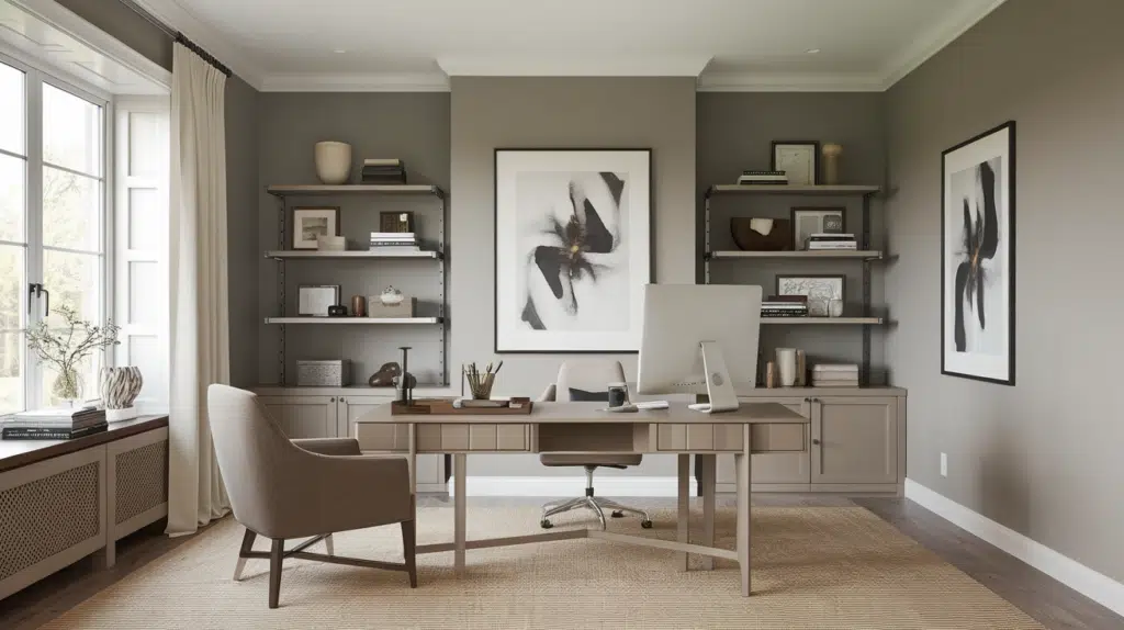
Dorian Gray creates productive workspaces with balanced energy—neither stimulating nor relaxing.
This adaptable gray reduces visual distractions while providing a professional backdrop for video calls. Pair with task lighting and natural elements for an inspiring yet focused environment.
Color Pairings and Combinations for Dorian Gray SW 7017

Dorian Gray pairs beautifully across the Sherwin-Williams palette. For contrast, choose whites and creams; for warmth, blush pinks and corals.
Cooler palettes benefit from soft blues and sage greens, while natural tones create balance with this versatile gray anchor.
Brushed nickel and matte gold finishes complement perfectly. Enhance with linen and light wood textures.
Clear glass or simple metal light fixtures maintain the balanced feel this medium gray naturally creates.
Complementary Trim Colors
- Pure White SW 7005 – Creates clean, fresh pairings ideal for timeless spaces.
- Repose Gray SW 7015 – Forms a subtle tone-on-tone effect for refined, layered looks.
- Sea Salt SW 6204 – Adds a hint of color that works with the gray’s understated warmth.
- Urbane Bronze SW 7048 – Creates depth and grounding for a rich, earthy palette.
Creating Cohesive Color Schemes
Dorian Gray is a versatile foundation for numerous color schemes, creating spaces with character and depth.
This balanced gray acts as a perfect anchor, allowing you to build varied looks ranging from serene and classic to rich and layered. Its adaptable tone provides the ideal starting point for any design vision.
Monochromatic Scheme
A monochromatic scheme uses various gray shades alongside Dorian Gray to create depth without complexity. This versatile gray makes spaces feel cohesive yet interesting.
The subtle variations between similar tones create polished layers while maintaining a clean, timeless look that feels intentional rather than flat.
My recommendations are:
- Dorian Gray on walls with Repose Gray SW 7015 trim creates a subtle, no-fuss contrast.
- Try Dorian Gray in a satin finish on woodwork with matte walls – it really makes a difference.
- Add Mindful Gray SW 7016 on a bookshelf or accent piece for a touch more dimension.
- Layer in textured grays like linen throws and matte ceramics to bring the whole look to life.
Warm Color Scheme
Dorian Gray’s subtle warm undertones complement warmer colors beautifully. This combination feels welcoming yet refined when natural light flows through the space.
The connection between the balanced gray and warm hues creates visual interest without overwhelming it. Terracotta, clay, and amber tones shine against this versatile gray backdrop.
My recommendations are:
- Use Creamy SW 7012 in dining spaces – it feels incredibly inviting for gatherings.
- Canyon Clay SW 6054 works wonders in hallways and ties everything together.
- Coral Clay SW 9005 makes bedrooms feel rich without trying too hard.
- Try Malabar SW 9110 for a subtle accent wall that doesn’t steal all the attention.
Cool Color Scheme
Though slightly warm, Dorian Gray pairs wonderfully with cooler colors, too. This balanced mix creates spaces that feel fresh yet grounded.
The interplay between the gray’s depth and cool tones like blue, teal, or sage produces a balanced, contemporary look that avoids feeling cold or stark while maintaining visual interest.
My recommendations are:
- Sea Salt SW 6204 in bathrooms alongside Dorian Gray living areas feels just right.
- North Star SW 6246 in bedrooms creates a peaceful vibe while keeping things grounded.
- Interesting Aqua SW 6220 makes home offices feel focused but not stark or boring.
- Misty SW 6232 accent wall adds enough contrast to catch your eye.
Coordinating with Furniture and Decor
Wood Tones

Dorian Gray beautifully improves both light and dark wood tones. It complements medium oak and walnut finishes, creating a balanced, timeless look.
The gray’s subtle warmth brings out natural wood grain patterns without competing for attention.
Metals

This versatile gray pairs effortlessly with brass, silver, and champagne finishes. Brushed or matte metals create a refined partnership with Dorian Gray, while polished accents add subtle contrast.
For contemporary spaces, try mixing metal finishes against this adaptable backdrop.
Fabrics

Linen, cotton, and wool textures thrive against Dorian Gray’s balanced tone. Velvet in jewel tones creates striking focal points, while natural-colored textiles maintain a serene atmosphere.
Consider patterns with gray undertones to create a cohesive, layered look.
Decor

Botanical elements and natural materials shine against Dorian Gray. Black and white photography, abstract art, and textural pieces create visual interest without clashing.
Glass and ceramic pieces in varied finishes add depth while maintaining the room’s balanced character.
Similar Paint Colors: Alternative to Dorian Gray SW 7017
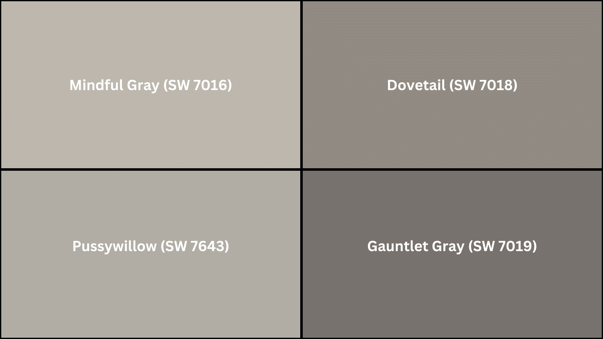
If you’re considering options similar to Dorian Gray, these alternatives offer subtle variations while maintaining their balanced appeal.
Each provides a slightly different undertone or depth, giving you the flexibility to find the perfect gray for your specific lighting conditions and design preferences.
- Mindful Gray (SW 7016) – Slightly darker with stronger warm undertones.
- Pussywillow (SW 7643) – Lighter with subtle green-gray undertones.
- Dovetail (SW 7018) – Deeper with taupe influences for added richness.
- Gauntlet Gray (SW 7019) – Bolder and more saturated for dramatic spaces.
Wrapping It Up
Dorian Gray Sherwin Williams (SW 7017) stands out as an easy-to-use gray that works well in any home. Its balanced warmth makes it great for walls, trim, cabinets, or even throughout your whole house.
This shade is special because it looks good in different rooms and lighting conditions while keeping its character. Just like in the book, there’s more to this color than you might notice at first glance.
Pair it with whites for a clean look, wood tones for warmth, or blues for a calm feeling – Dorian Gray Sherwin Williams gives you a timeless background for your space.
It’s more than just paint – it helps create rooms that feel both new and comfortable. Ready to try this balanced gray in your home? Go for it.


