
Looking for a color that makes a bold statement? Meet Benjamin Moore Salamander (2050-10). This deep green has a special magic that turns ordinary rooms into wonderful spaces.
Salamander isn’t your typical green. It’s rich and moody, like deep forests or stormy seas, yet it feels warm and welcoming in your home.
What makes Salamander stand out is its versatility. It works beautifully on kitchen cabinets, accent walls, or front doors and pairs perfectly with brass fixtures, warm woods, and crisp whites.
People love Salamander because it brings drama without feeling too dark. It changes throughout the day as light shifts, keeping your spaces interesting and alive.
Ready to try something beyond boring beige? Salamander might be the perfect color experience.
Why Choose Benjamin Moore Salamander?
Salamander delivers a dramatic blend of refined classiness and cozy intimacy, making it perfect for creating statement spaces with lasting impact.
1. Color’s Perfect Balance
- Salamander is a deep, rich green with luxurious blue-black undertones
- It evokes the mysterious depth of ancient forests and the refined luxury of classic design
- The color sits beautifully between bold and subtle, making rooms feel both dramatic and inviting
2. Versatile Room Applications
- Dining rooms transform into intimate, conversation-friendly settings
- Libraries and studies gain intellectual depth and character
- Kitchen cabinets become striking focal points against lighter countertops
- Powder rooms turn into jewel-box spaces with unexpected drama
3. Design Compatibility
- Crisp whites and creamy neutrals for a striking contrast
- Natural materials like marble, leather, and wood
- Metallic finishes, especially brass and gold
- Textural elements that catch and play with light
4. Atmospheric Advantages
- Creates spaces with unmistakable character and depth
- Brings refinement drama to interiors
- Establishes a confident, designer-inspired mood
- Makes rooms feel intentionally curated and complete
5. Light Interaction
- In bright spaces, the Salamander reveals its rich green character
- Under softer lighting, it becomes a moody, almost black backdrop
- This adaptability helps the color transition from day to evening, creating rooms that feel different yet cohesive throughout the changing light
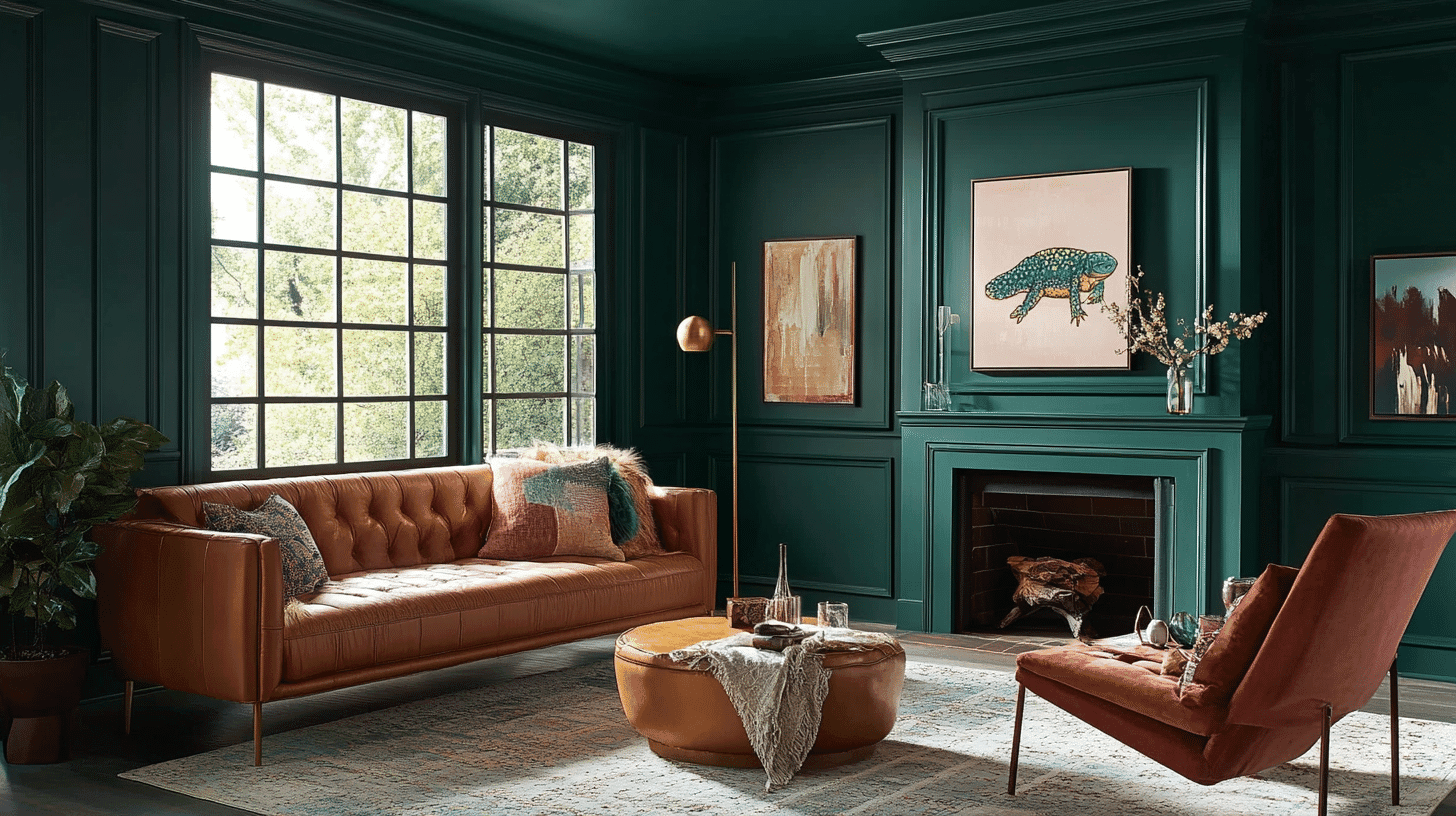
Salamander in Interior Design
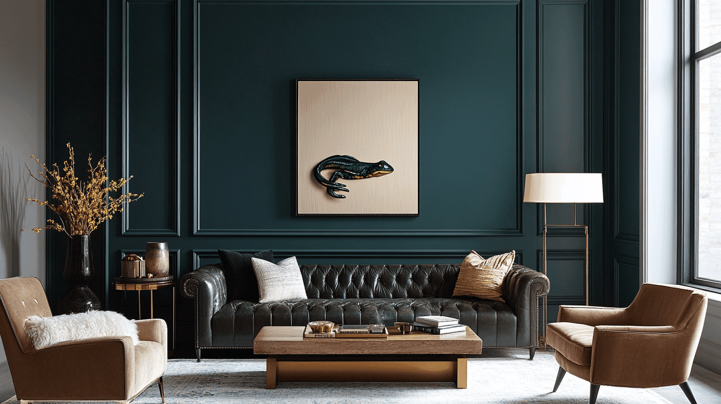
Salamander, rich, deep green with subtle blue undertones, exudes luxury and refinement while bringing nature’s restorative power indoors, creating bold and deeply grounded spaces.
1. Color Pairings
| Color Category | Color Name | Benjamin Moore Code |
|---|---|---|
| Soft Whites | Sebring White | OC-137 |
| Muted Greens | Silver Marlin | 2139-50 |
| Soft Whites | White Dove | OC-17 |
| Warm Grays | Edgecomb Gray | HC-173 |
2. Texture Partners
Salamander thrives alongside plush velvet upholstery, creating a layered sensory experience that amplifies its luxurious qualities.
Polished marble surfaces reflect and enhance its depth, while natural rattan lightens the mood. Brushed brass hardware adds warmth against its cool undertones, and leather furniture develops a beautiful patina alongside this rich shade.
Glazed ceramics in complementary shades create subtle connections throughout a space.
3. Perfect Places for Use
Dining rooms dressed in Salamander create intimate, conversation-friendly atmospheres that transition beautifully from day to evening entertaining.
Powder rooms gain instant drama without overwhelming small spaces, while kitchen islands make striking statements when finished in this rich shade.
Home libraries enveloped in this shade create scholarly retreats that encourage contemplation, and bedroom accent walls behind headboards frame sleeping areas with enlightenment.
4. Why does It Work?
Salamander demonstrates remarkable versatility throughout changing light conditions, deepening at dusk for evening aura while maintaining its character in the morning light.
The shade’s complex undertones reveal different facets, creating layered, refined interiors when paired with various materials.
Its depth recedes visually, making it surprisingly effective in smaller spaces despite its boldness.
Salamander Color Profile By Benjamin Moore
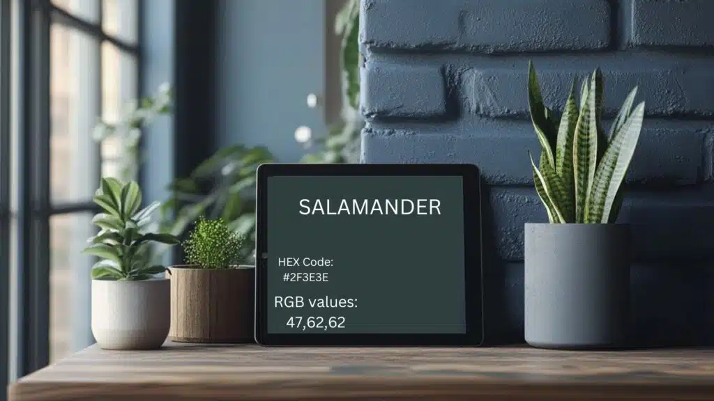
1. Color Values
RGB Value: 47, 62, 62
- Red: 47
- Green: 62
- Blue: 62
HEX Code: #2F3E3E
- Essential code for digital color implementation
- Ensures precise color reproduction across digital platforms
2. What These Numbers Mean
The RGB values show how Salamander gets its unique look:
- The prominent red value (47) contributes to the color’s warm, earthy undertones
- The balanced green (62) and blue (62) values add subtle complexity and depth
- This specific combination creates Salamander’s distinctive, cultivated yet approachable character
3. Digital Uses
- Contemporary website and graphic design applications
- Virtual inspiration and planning boards
- Interactive room visualization tools
- Mobile applications for paint selection
- Professional interior design programs
- Online paint preview environments
Characteristics and Color Profile
1. Light Reflectance Value (LRV)
Light Reflectance Value (LRV) is a measurement that indicates how much light a color reflects, with higher numbers reflecting more light and appearing brighter. In comparison, lower numbers absorb more light and appear darker.
- LRV: 5.72
- Very low brightness level
- Significantly dark and rich
- Absorbs most light in a space
- Creates a dramatic, intimate atmosphere
- Best balanced with lighter elements
2. Undertones
Undertones are the subtle, secondary colors within a main paint color and can shift how the color appears under different lighting conditions.
Changes with lighting:
- More red-brown in bright light
- Deeper and more muted in dim settings
- Warmer and more vibrant at sunset
- Cooler and more somber in the morning light
Similar Benjamin Moore colors
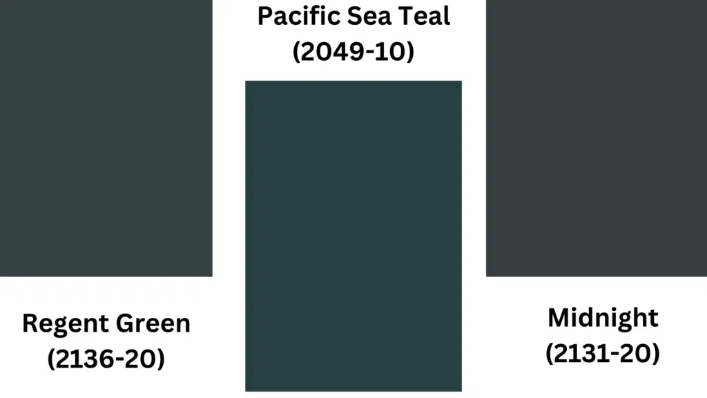
Regent Green (2136-20)
Regent Green offers a rich, graceful depth that refines traditional and modern spaces. Its deep emerald quality creates a sense of luxury while maintaining a connection to nature.
Pacific Sea Teal (2049-10)
Pacific Sea Teal’s rich blue-green hue captures the mysterious depths of ocean waters. This color dramatically impacts any room while evoking a sense of serene tranquility.
Midnight (2131-20)
Midnight wraps spaces in a velvety darkness that feels both protective and refined. Its deep blue-black tone creates dramatic contrast against lighter elements while adding timeless classiness to any design scheme.
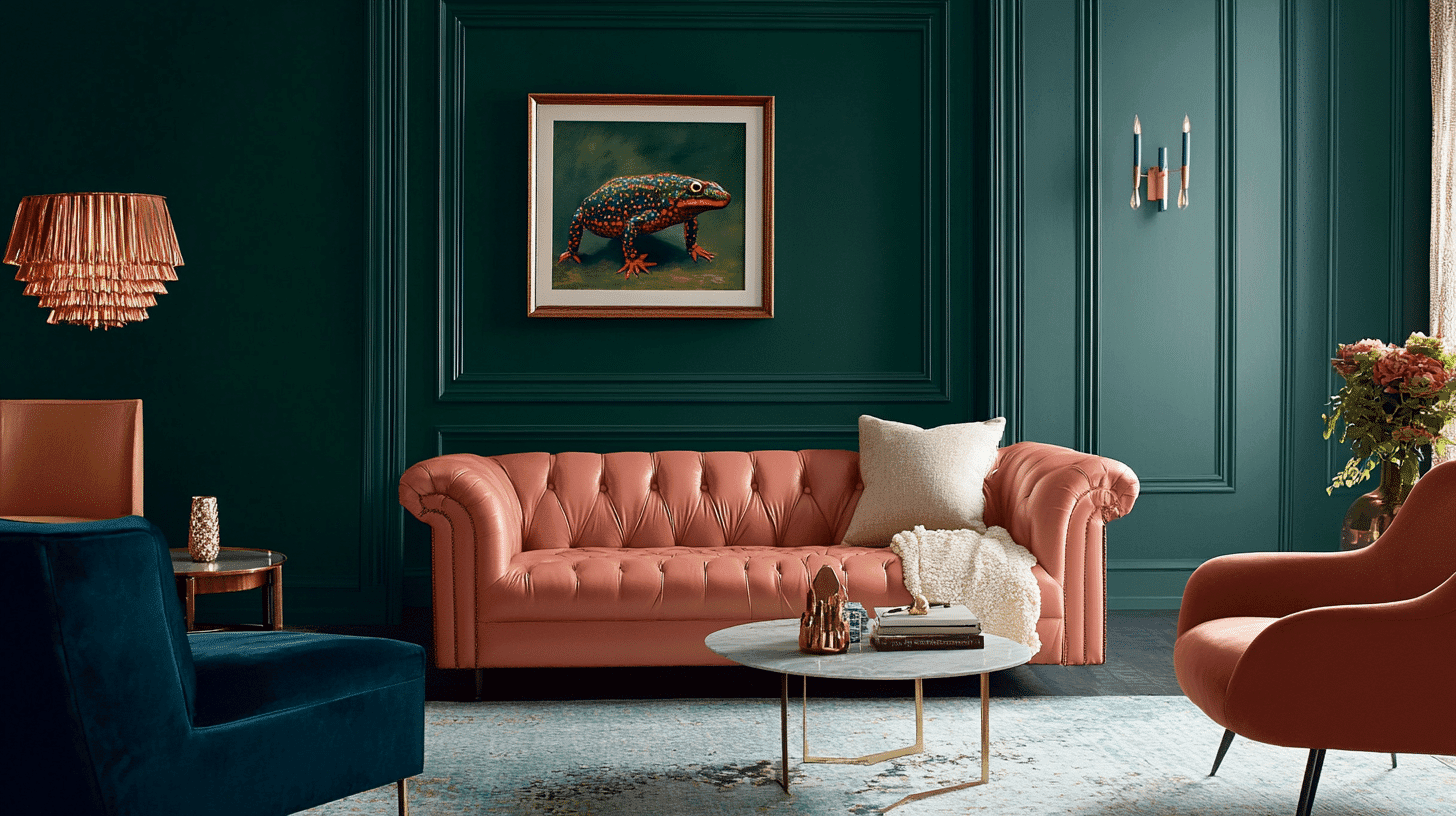
Using Salamander (2050-10) for Your Home
Benjamin Moore’s Salamander is a rich, cultured shade that adds depth and warmth to interior spaces. This deep terracotta-brown creates a dramatic impact while maintaining an earthy, grounded feel.
1. For Living Room
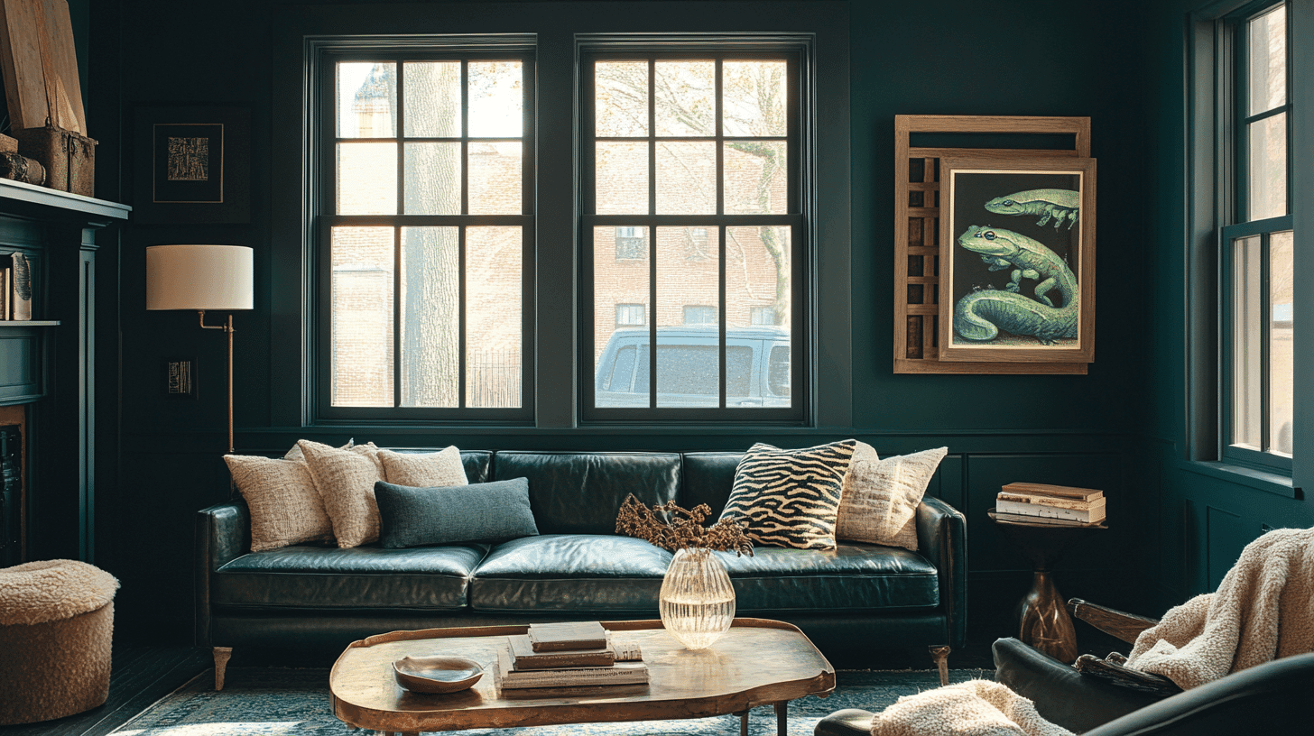
- Perfect for An Accent Wall Behind a Fireplace or Bookshelf to Create a Focal Point
- Pairs Beautifully with Cream or Ivory Furniture for Striking Contrast
- Complements Natural Materials Like Wood, Leather, and Brass Accents
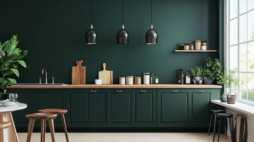
2. In the Kitchen
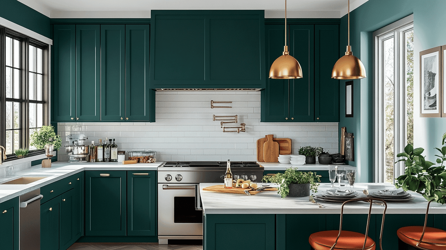
- Creates a Bold Statement on Kitchen Cabinets, Especially when Paired with Marble Countertops
- Works Well on A Kitchen Island to Anchor the Space with Visual Significance
- Combines Effectively with Brushed Gold or Bronze Hardware for A Luxurious Touch
3. In Bedroom
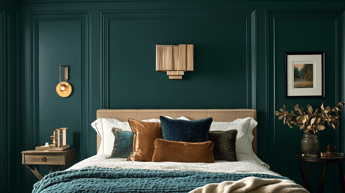
- Provides a Cocooning Effect that Promotes rest when Used on All Walls
- Makes a Striking Backdrop for Neutral Bedding and Metallic Accents
- Coordinates well with natural textures like linen, wool, and rattan for a balanced look
Practical Tips for Painting with Salamander
Benjamin Moore’s Salamander is a rich, deep color that requires careful preparation and application for best results.
The following sections provide step-by-step guidance for achieving a flawless finish with this cultivated hue.
1. Preparing Your Space
- Clean all surfaces thoroughly with TSP or a degreasing cleaner to ensure proper paint adhesion.
- Repair any wall damage by filling holes with spackling compounds, fixing cracks with caulk, and sanding smooth.
- To reduce the number of topcoats needed, apply a dark gray or tinted primer specifically designed for deep colors like Salamander.
- Test Salamander by painting 2′ x 2′ samples on different walls to observe how this rich color appears in various lighting conditions throughout the day.
2. Application Techniques
- Use high-quality tools such as a 3/8-inch nap microfiber roller for walls and a 2-inch angled synthetic brush for cutting in around trim and corners.
- Apply the paint using the “W” technique—roll in a W pattern, then fill in without lifting the roller. Due to Salamander’s deeper pigmentation, work in smaller 3-foot sections.
- For even coverage, plan for two to three thin coats rather than one thick coat, as dark colors like Salamander require multiple applications for depth and richness.
- Maintain a wet edge by cutting in only one wall at a time, then immediately rolling that same wall before the cut-in sections dry.
3. Maintenance and Durability
- Use window treatments or a UV-protective clear coat to prevent the Salamander’s rich color from fading in rooms with strong sunlight.
- Clean walls painted with Salamander using a soft cloth with mild soap solution, avoiding abrasive cleaners that could damage the finish or alter the color’s depth.
- Choose your finish strategically—matte or eggshell for living areas to minimize imperfections, satin for hallways, and semi-gloss for kitchens and bathrooms.
- Touch up scuffs or marks promptly using a small foam brush with the original paint, keeping a labeled container of your Salamander paint for future touch-ups.
Color Combinations and Inspiration
Room Inspirations with Salamander
Salamander (2050-10) by Benjamin Moore is a rich, deep green with blue undertones that creates dramatic and refined spaces.
It delivers a luxurious vibe in contemporary dining rooms when paired with gold accents and cream-colored furniture.
Many homeowners have welcomed Salamander in living rooms, where its jewel-tone depth creates an intimate, cozy atmosphere while maintaining an air of grace.
The 2024 design trends emphasize bold statement colors balanced with neutrals, making Salamander particularly impactful.
It complements beautifully with this year’s popular warm metallics and organic textures.
Designers pair it with walnut bookshelves and antique brass fixtures in libraries and studies for a timeless, distinguished look.
The color converts bedrooms into luxurious retreats when combined with trending ivory linens and burnished gold lighting fixtures.
Color Pairing Suggestions
Salamander’s deep, complex undertones make it a powerful foundation for various color combinations:
For a Classic Look, Pair It With:
- Crisp white trim (Benjamin Moore Chantilly Lace) for a striking contrast
- Warm gold (Golden Retriever) for luxurious accents
- Soft cream (Cloud White) for lightness and balance
- Rich caramel (Alexandria Beige) for warming complementary notes
As an Accent Wall, Salamander Creates Impact Against:
- Light gray walls for a refined contemporary contrast
- Warm beige surroundings for an earthy, grounded palette
- Pale blue companion walls for a nature-inspired color story
- Soft whites for dramatic dimension in formal spaces
The color’s versatility allows it to excel in various design styles, from traditional library settings to bold modern statements.
It is an excellent choice for spaces meant to impress or rooms designed for evening relaxation and entertainment.
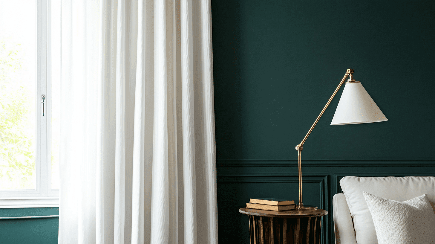
Decor Tips with Benjamin Moore Salamander
- Create a dramatic focal point by using Salamander on a single accent wall, particularly behind beds, fireplaces, or in dining rooms.
- Highlight architectural features such as built-in bookshelves, wainscoting, or ceiling medallions with this rich green to showcase your home’s character.
- Balance with neutral furniture in cream, ivory, or light gray to prevent the space from feeling overwhelming.
- Incorporate metallic accents in warm tones like brass, gold, or copper to add reflective elements that complement Salamander’s depth.
- Ensure proper lighting as this dark color absorbs light – use a mix of task and accent lighting.
- Add natural elements with wood furniture, stone accents, and abundant greenery to enhance the organic quality of the color.
- Use large mirrors strategically to reflect light and visually expand spaces painted in this deep hue.
- Accessorize with complementary colors like blush pink, terracotta, or mustard yellow for visual interest and depth.
Summing It Up
Benjamin Moore Salamander (2050-10) is a deep green that can make your home feel special. This rich color works in many rooms and with many styles.
It looks great with gold, cream, and wood tones. You can use it on all walls for a cozy feel or just one wall to make a statement.
If you’re not sure about painting a whole room, try using this color on smaller things like furniture or doors. Since Salamander is a dark color, make sure you have good lighting.
This green brings nature indoors and creates spaces that feel both calm and exciting. With the right decor choices, Salamander turns ordinary rooms into something to remember.
Go bold with Salamander – where walls become conversation starters.

Alex Guerrero, a graduate with a Fine Arts degree from the Rhode Island School of Design, has been a visionary in the world of color and design for over 15 years. His professional journey began in the heart of the fashion industry in Milan, where he developed an acute sense for color harmonies and trends. Alex joined our team in 2018, offering fresh and innovative perspectives on color utilization in various spaces. Renowned for his ability to blend contemporary trends with timeless elegance. Outside of work, Alex is an accomplished painter and a volunteer art therapist, his artistic talents further enriching his professional insights.