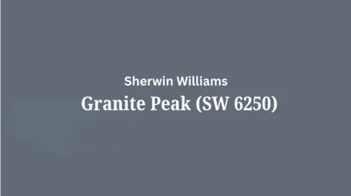
Granite Peak (SW 6250) by Sherwin Williams is a testament to refined depth in interior design.
This rich, medium-dark gray carries subtle blue undertones, creating a grounded, graceful foundation that brings both character and versatility to any space.
Like its namesake—commanding and enduring—Granite Peak offers a sense of stability and depth that anchors rooms while providing a perfect dramatic backdrop for both traditional and contemporary design elements.
Neither too dark nor too light, this thoughtfully balanced gray strikes the ideal middle ground for those seeking a substantial, atmospheric presence without the heaviness of charcoal or the lightness of pale gray tones.
Understanding Sherwin Williams’ Granite Peak (SW 6250)
Color Terminology
| PROPERTY | VALUE |
|---|---|
| LRV (Light Reflectance Value) | 14 |
| RGB Value | Red: 96 Green: 107 Blue: 117 |
| Hex Code | #606B75 |
Undertones:
- Granite Peak has subtle blue undertones
- It’s a rich gray with a slight blue/navy influence
- Not a flat or one-dimensional gray, but a refined, complex neutral with noticeable depth
Psychology of Medium-Dark Gray Colors
Medium-dark grays like Granite Peak create a sense of complexity and contemporary urbane.
- Deep tones: Offer coziness and visual grounding of spaces
- Blue-tinted grays: Extract peace, stability, and modern luxury
- Benefits: More dramatic than lighter grays, adds substantial presence to spaces, and creates a rich backdrop for both light-colored furniture and metallic accents.
Why Choose this Color?
The balanced depth of Granite Peak gives a sense of stability and culture that promotes urbane in any environment.
This enduring color carries complex undertones that shift subtly with changing light, ensuring your space feels both current and timelessly tasteful.
Key Features
Sherwin Williams Granite Peak offers exceptional richness and versatility across different lighting conditions. It maintains its subtle blue undertones in bright spaces while creating a cozy, intimate atmosphere in rooms with varied natural light.
Its timeless, neutral quality provides a refined backdrop that complements both bright white elements and metallic accents without appearing overly dark or heavy.
Adaptability
Sherwin Williams Granite Peak demonstrates remarkable adaptability with existing elements like light-colored furniture and metallic fixtures, creating striking contrasts between spaces.
It provides enough depth to feel substantial and grounding while maintaining a refined, enduring quality that won’t quickly date your interior design choices.
This versatile gray works equally well as an accent wall to create focal points or as an all-over color to create intimate, atmospheric environments.
Durability
Sherwin Williams Granite Peak, particularly in premium finishes like Duration or Emerald, delivers outstanding durability with excellent coverage in both new and repainted areas.
Its medium-dark tone and subtle blue undertones maintain a refined appearance throughout your home while providing a forgiving surface for everyday living.
This paint resists fading and maintains color consistency even with regular cleaning when properly applied.
Texture Patterns
Sherwin Williams Granite Peak creates a rich, velvety texture that adds substantial dimension to walls and other features. Its complex undertones produce a beautiful light play that improves moldings and adds visual interest to even simple walls.
When applied to different finishes, it can dramatically highlight details while maintaining a consistent, refined appearance throughout connected spaces..
Room-by-Room Color Recommendations with Granite Peak
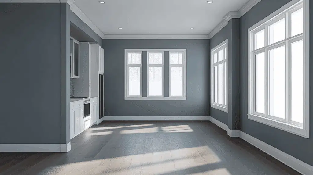
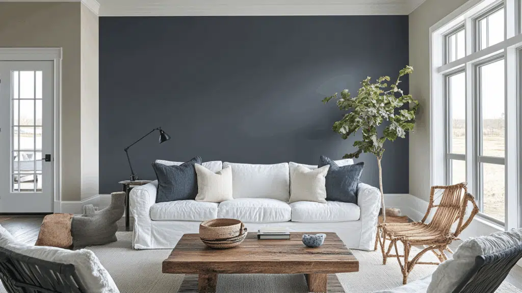
1. Living Spaces and Open Floor Plans
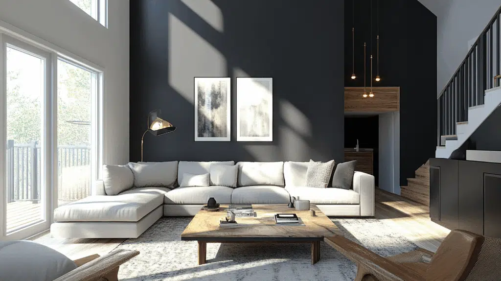
- Granite Peak works exceptionally well as an accent wall in open floor plans. It creates a dramatic focal point while maintaining a refined, contemporary palette.
- The LRV of Granite Peak provides a substantial, grounding feel that makes spaces appear more intimate and refined without feeling gloomy.
- Use Granite Peak to define conversation areas in larger spaces while allowing lighter walls and furnishings to maintain overall brightness.
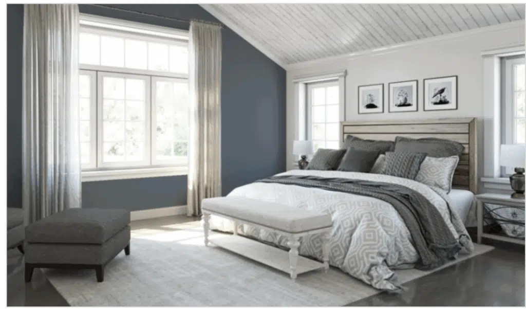
2. Bedrooms and Relaxation Areas
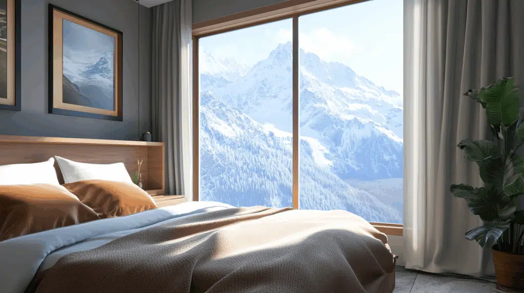
- Granite Peak creates a cocooning, intimate atmosphere in bedrooms that promotes relaxation.
- The subtle blue undertones in Granite Peak evoke a sense of tranquility while creating a refined backdrop for lighter bedding and furniture of any style.
- Consider Granite Peak as an accent wall behind the headboard to create a dramatic focal point without sacrificing the brightness of the rest of the room.
3. Kitchens
- Granite Peak in satin or semi-gloss finish on kitchen islands creates a striking, anchoring element that contrasts beautifully with white or light-colored perimeter cabinets.
- The rich depth of Granite Peak enhances both light countertop materials and metallic fixtures, making it adaptable to various kitchen styles, from contemporary to transitional.
- Granite Peak lower cabinets paired with white upper cabinets create an appealing contrast that grounds the kitchen while maintaining an open, airy feel above.
4. Bathrooms and Spa-like Retreats
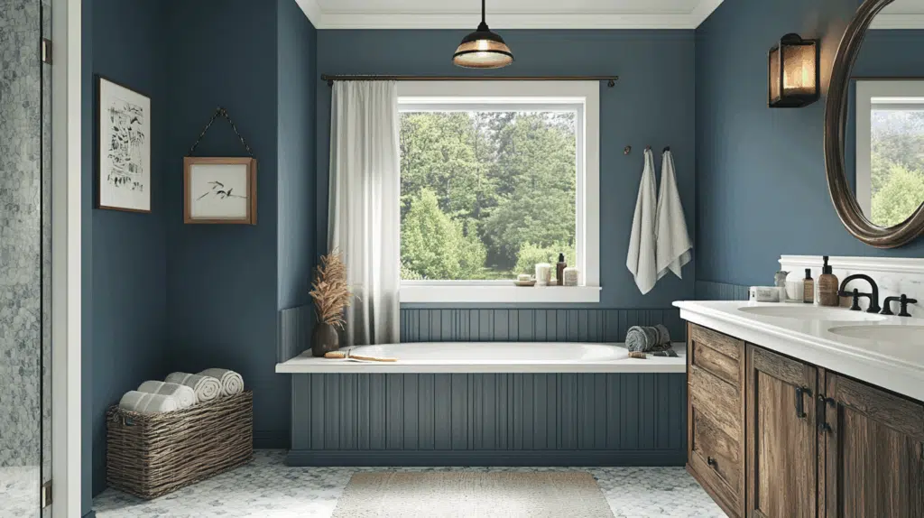
- Sherwin Williams Granite Peak creates a dramatic, refined atmosphere in bathrooms. Its subtle blue undertones establish a sense of luxury while complementing white fixtures.
- This versatile shade pairs beautifully with both chrome and brass fixtures, marble, and natural wood, creating a timeless, refined retreat that feels both grand and inviting.
- Use Granite Peak on an accent wall in larger bathrooms or as a vanity color to create visual interest without overwhelming smaller spaces
Granite Peak Color Combinations
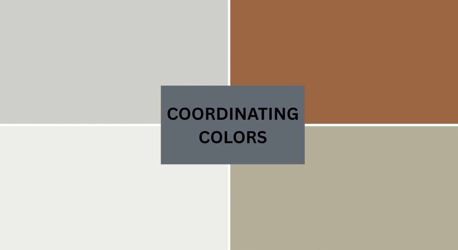
Granite Peak is a rich, refined gray with subtle blue undertones. Its low Light Reflectance Value (LRV) of 14 makes it a substantial, grounding foundation that adds depth and versatility to spaces while maintaining a refined coolness.
Let me help you with color pairings and combinations for this shade.
Complementary Trim Colors
- Extra White (SW 7006) – A bright, clean white that creates a striking contrast with Granite Peak.
- Mineral Deposit (SW 7652) – A subtle gray with blue-green undertones that complements Granite Peak’s cool refinement.
- Waterloo (SW 9141) – A rich, muted blue that deepens Granite Peak’s moody grace while maintaining balance.
- Alabaster (SW 7008) – A versatile off-white that softens Granite Peak’s dramatic quality.
Coordinating Wall Colors
- Repose Gray (SW 7015) – A light, warm gray that lightens spaces while complementing Granite Peak.
- Agreeable Gray (SW 7029) – A versatile greige that creates a balanced, cohesive palette.
- Network Gray (SW 7073) – A medium gray that bridges between Granite Peak and lighter elements.
- On the Rocks (SW 7671) – A light blue-gray that echoes Granite Peak’s undertones in a brighter tone.
Accent Colors
- Naval (SW 6244) – A deep navy that enhances Granite Peak’s blue undertones
- Marshmallow (SW 7001) – A crisp, soft white that creates a dramatic contrast
- Copper Mountain (SW 6356) – A muted terra cotta that provides a warm complement to Granite Peak’s coolness
- Dark Night (SW 6237) – A deep blue-black that intensifies the drama in a compatible palette
Coordinating with Furniture and Decor
Wood Tones
Granite Peak pairs beautifully with a wide range of wood tones, offering different aesthetic effects. Light oak, maple, and birch create a striking contrast against Granite Peak’s rich backdrop.
Medium wood tones like walnut provide complementary depth that balances Granite Peak’s cool undertones. For a more cohesive look, gray-washed or charcoal-toned woods extend Granite Peak’s refined quality and create a balanced, modern style.
White-painted wood creates a dramatic, clean contrast that highlights Granite Peak’s depth and richness.
Metals
Chrome, stainless steel, and polished nickel hardware enhance Granite Peak’s cool undertones and create a fresh, contemporary look.
Matte black fixtures create a subtle contrast that emphasizes Granite Peak’s refined nature. While Granite Peak works beautifully with cool metals, brass and gold accents create a dynamic tension between warm and cool elements—opt for antiqued or brushed finishes for a more refined pairing.
Silver and pewter finishes provide an elegant, timeless combination that complements Granite Peak’s distinguished character.
Decor
Natural fibers like linen, cotton, and wool in light neutral tones create textural interest against Granite Peak walls while providing necessary brightness.
Colorful accents in muted pastels like blush, sage, and pale blue offer a gentle contrast against the deep backdrop. Glass, acrylic, and mirrored elements reflect light and prevent Granite Peak from feeling too heavy in spaces with limited natural light and introduce natural elements with cool undertones—like marble, concrete, or slate.
Reinforces the suave coolness inherent in this versatile gray while adding organic texture.
Similar Paint Colors: Perfect Alternative to Granite Peak
Granite Peak (Sherwin Williams SW 6250)
- A medium-dark gray with subtle blue undertones
- Low LRV (Light Reflectance Value) that creates rich, intimate spaces
- Works well in contemporary, transitional, or dramatic interiors
- Best for spaces where you want a substantial, refined feel
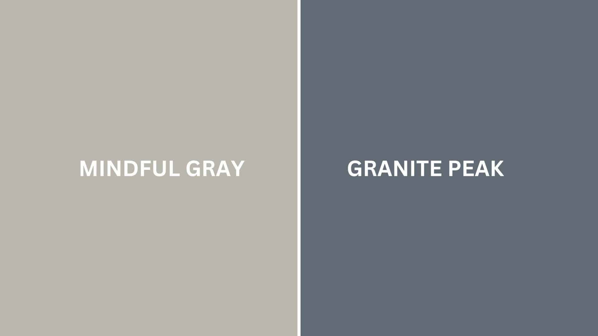
Mindful Gray (Sherwin Williams SW 7016)
- A versatile medium gray with warm undertones
- Medium LRV (48) that creates a balanced, adaptable backdrop
- Contains warm undertones that create a more approachable atmosphere
- Popular for creating neutral, calming environments that work with many design styles
Key Differences:
- Granite Peak is significantly darker than Mindful Gray
- Granite Peak has cool blue undertones, while Mindful Gray has warm undertones
- Granite Peak creates more drama and intimacy, while Mindful Gray is more versatile and light
- They serve different roles in design – one as a dramatic anchor and one as a versatile neutral
Final Thoughts
Granite Peak (SW 6250) surpasses trends, embodying the perfect balance between depth and complexity that makes it a perennial favorite among designers and homeowners seeking dramatic, refined spaces.
Its subtle complexity allows it to adapt effortlessly to changing styles and seasonal accents, ensuring longevity in your design choices.
Whether anchoring your walls in afternoon light or creating a canvas for contrasting elements, Granite Peak delivers a timeless quality that both grounds and upgrades a space.
In choosing this exceptional shade, you’re not simply selecting a color—you’re adopting a design philosophy that values depth, refinement, and enduring beauty in the spaces we call home.
If you’re interested in more color ideas, feel free to click here and explore our collection of stylish palette combinations and inspiring home decor inspiration.

Alex Guerrero, a graduate with a Fine Arts degree from the Rhode Island School of Design, has been a visionary in the world of color and design for over 15 years. His professional journey began in the heart of the fashion industry in Milan, where he developed an acute sense for color harmonies and trends. Alex joined our team in 2018, offering fresh and innovative perspectives on color utilization in various spaces. Renowned for his ability to blend contemporary trends with timeless elegance. Outside of work, Alex is an accomplished painter and a volunteer art therapist, his artistic talents further enriching his professional insights.