Have you ever walked into a room and felt instantly calm without knowing why?
Sea Salt by Sherwin-Williams has become one of the most liked paint colors for many homeowners. This soft greenish-blue shade brings a calm feeling to any room without trying too hard.
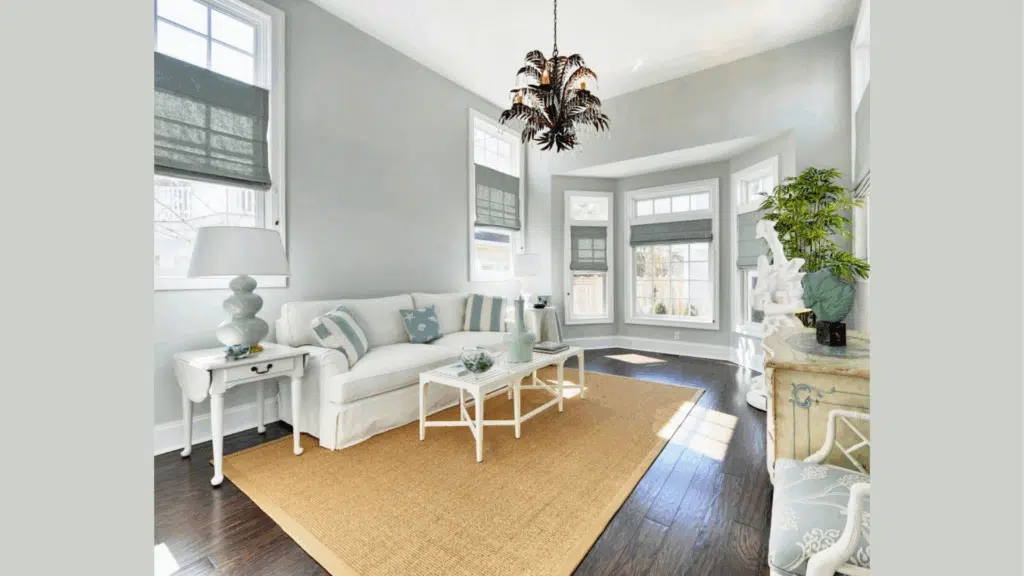
Last month, I visited my friend’s coastal-style kitchen painted in Sea Salt. The color changed throughout the day—more green in the morning, more blue by afternoon—making the space feel fresh and airy.
After working with this color in dozens of homes, I can tell you exactly why it works so well and when it might not be right for your space.
In this blog, I’ll help you see if Sea Salt is right for your home. You’ll learn:
- What makes Sea Salt work in different rooms
- When to use (and when to skip) this color
- Which lighting brings out its best qualities
- How to pair it with other colors
With my background in home design and seeing this color in dozens of real homes, I can guide you to make the best choice for your walls.
The Deep Undertones that Make Sea Salt Stand Out
Sea Salt isn’t just one color. It’s a mix of green, gray, and blue that works together to create something special. This blend is what makes it stand out from other paint choices.
Sea Salt is a blend of green, gray, and blue that shifts with the light, making it a versatile choice for any room.
Morning (Green Tones): In bright natural light, the green hues take over, creating a fresh, energizing atmosphere. Perfect for kitchens, offices, or bathrooms, it brings vitality to start your day.
Afternoon and Evening (Blue Tones): As the light softens, the blue and gray undertones become more prominent, adding tranquility and calm. Ideal for living rooms or bedrooms, it helps create a soothing, relaxing environment.
I’ve noticed that Sea Salt shows its green side in bright natural light. But when the sun goes down, the blue and gray notes take over under lamps and overhead lights. This shifting quality helps rooms feel different as the day goes on.
Sea Salt (SW 6204) – Complete Color Overview
| Color Detail | Value | What This Means |
|---|---|---|
| Paint Name | Sea Salt | Sherwin-Williams signature color |
| Color Code | SW 6204 | Official Sherwin-Williams number |
| LRV (Light Reflectance Value) | 63 | Reflects 63% of light – perfect middle range |
| RGB Values | 205 / 210 / 202 | Digital color match for screens |
| Hex Code | #CDD2CA | Web design color code |
You might wonder why so many people pick this color. The answer is in its calm nature. Unlike bolder colors that grab attention, Sea Salt sits back. It creates a background that feels good without trying hard.
When you see it on walls, you’ll notice how it changes as you move through a room. One wall might look greener, while another pulls blue. This subtle shift is what gives rooms depth without being obvious about it.
How Does Sea Salt Affect the Feel of A Room?
Sea Salt brings a calm, spa-like feel to any space it touches. I’ve seen it turn plain rooms into peaceful spots where people naturally want to slow down and take a breath.
You’ll notice right away how this color makes the walls seem to step back. This creates a feeling of more space and air in the room. Even smaller areas feel less cramped when painted in this shade.
What I find most helpful about Sea Salt is its ability to cool down a room without making it cold. Think of how you feel near water—that’s what this color can do for your space.
In the morning hours, the green notes make rooms feel fresh and clean. As the day moves on, the blue tones take over, bringing a quieter evening mood. This natural shift works with your daily rhythm.
The way Sea Salt changes with light means your room never feels stuck in one mood. This color breathes with your home. When friends visit my Sea Salt living room, they often say, “I feel like I can relax here.” That’s exactly what makes this color worth thinking about for your own walls—it creates a place where both body and mind can rest.
What Makes Sea Salt a Great Choice for Any Space?
Sea Salt works well in almost any room you can think of. I’ve seen it used in kitchens, living rooms, bedrooms, and offices—all with great results. This color sits in a sweet spot: it has character without forcing itself into the spotlight.
You might wonder if it fits your style. The good news is that Sea Salt plays well with many looks. In coastal homes, it feels like a natural extension of beach views. For farmhouse styles, it brings a clean backdrop for wooden beams and vintage items. Even in modern spaces, its subtle depth adds warmth to sleek lines.
I painted my guest bathroom Sea Salt three years ago, and it still feels fresh. Visitors often ask about the color because it feels both new and timeless at once.
What makes it stand out from other neutrals? It has life without being loud. Unlike plain white or beige, which can feel flat, Sea Salt has movement and depth. The color changes slightly as you move through the day, which keeps rooms feeling alive and interesting.
For bedrooms, this shade helps create a peaceful sleep space. In busy family rooms, it forms a calm background that doesn’t compete with your life happening in front of it.
How Sea Salt Works with Specific Décor Elements
1. Furniture and Upholstery: White furniture gains depth, dark wood pieces look rich without harsh contrast, navy sofas create coastal vibes, and both brown and black leather work well with Sea Salt’s cool undertones.
2. Window Treatments: White curtains provide fresh contrast, natural linen in cream or gray adds relaxed comfort, while navy or charcoal options bring drama for dining rooms and offices.
3. Artwork and Wall Décor: Black and white photos look crisp, colorful paintings get a soft backdrop, natural wood frames feel organic, gold/brass frames add warmth, and both white and dark metal shelving work well.
4. Lighting Fixtures: Warm white LED bulbs (2700K-3000K) bring out green tones, brass/copper pendants add kitchen warmth, and white/cream lampshades show true wall color without competition.
5. Accent Colors and Accessories: Warm accents like coral pink and soft yellow add cheerful energy, cool accents like navy and charcoal create spa-like moods, while natural elements like wicker and plants feel intentional.
6. Metallic Touches: Brushed nickel and chrome create modern freshness in bathrooms and kitchens, brass and gold add living room warmth, while black metal fixtures suit dramatic modern farmhouse styles.
Top Spots to Use Sea Salt Around Your Home
Sea Salt is a light, fresh color that brings a peaceful feeling to any room. This soft, bluish-green shade works well in many areas of your home. These are the best places to use this gentle paint color:
1. Bathrooms
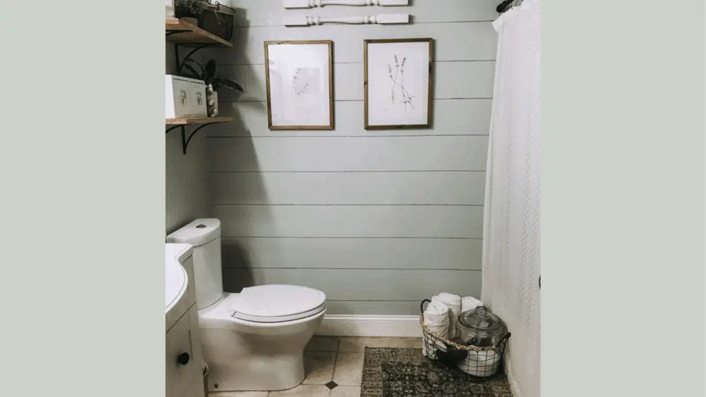
Bathrooms and Sea Salt are a perfect match. I’ve used this color in three different bathroom projects, and each time it created a clean, fresh feeling. The color’s hint of green brings life to a space that might otherwise feel cold and plain.
You can pair it with white trim and natural wood for a look that stays current year after year. In smaller bathrooms, this shade makes the walls seem to pull back, helping tight spaces feel more open.
2. Bedrooms

Your bedroom should feel like a place to unwind, and Sea Salt helps create that mood. The soft blue-green tones work like a gentle backdrop for sleep.
I painted my master bedroom with Sea Salt last year, and the walls seem to change with the day – more green in morning light, more blue in the evening. This subtle shift feels natural and helps the room stay interesting without being too busy for rest.
3. Kitchen Cabinets
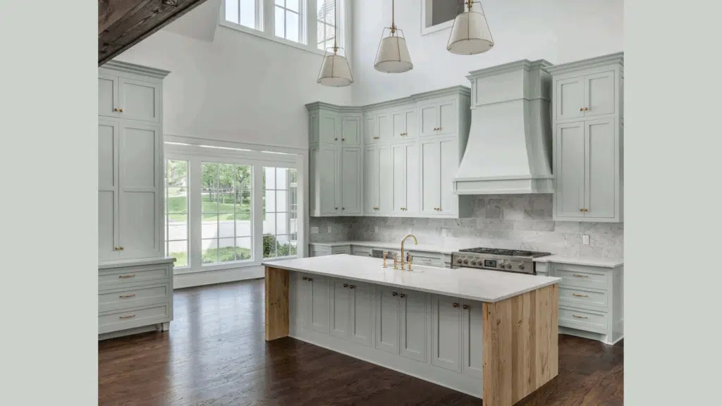
While most people think about walls, Sea Salt makes for beautiful kitchen cabinets. This unexpected choice brings color without overwhelming the heart of your home.
You might try it on lower cabinets with white uppers, or go bold with all cabinets in this shade. I’ve seen both approaches work well, especially when paired with simple white countertops and walls.
4. Living Areas
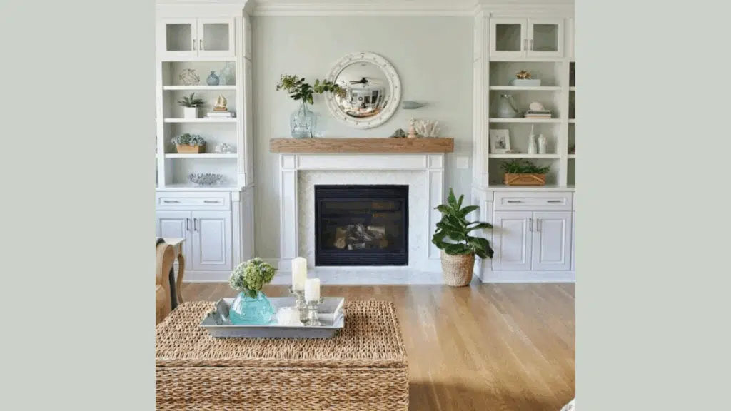
For spaces where family gathers, you need a color that stays in the background while still adding character. Sea Salt does exactly this in living rooms.
It forms a gentle canvas for your furniture, art, and everyday life. The subtle mix of tones means it works with many different wood finishes and fabric colors without clashing.
Flooring Styles that Work Best with Sherwin-Williams’ Sea Salt
Sea Salt is a light, soft blue-green color that pairs well with many flooring options. Finding the right floor to match this popular paint color can help complete your room’s look. These are some flooring styles that work particularly well with Sea Salt walls:
1. Light Hardwoods
Light oak and maple floors create a perfect foundation for Sea Salt walls. I’ve seen this combo in dozens of homes, and it always feels clean and open. The natural wood tones bring warmth while Sea Salt adds just enough color to keep the space from feeling too plain.
You’ll notice how the warm undertones in light woods balance the cool hints in Sea Salt. This creates a room that feels both fresh and cozy at the same time.
2. Whitewashed and Bleached Woods
If you want a beach-house feel, try Sea Salt with whitewashed or bleached wood floors. This pairing feels like summer all year round.
The light floors bounce sunlight around the room, making the walls shift between their blue and green sides throughout the day. I used this combo in my sunroom, and guests always comment on how bright yet calm the space feels.
3. Neutral Carpets
Beige, greige, or light gray carpets work well with Sea Salt walls. The soft wall color makes the carpet feel more current and less dated.
You can go with plush or flat weaves – both styles match this wall color well. I recommend staying with carpet colors that have no strong yellow undertones for the best match.
4. Gray Tile Floors
In bathrooms and kitchens, light to medium gray tiles provide a modern base for Sea Salt. The gray tones pull out the subtle gray hints hidden in the paint color.
This match works in both small powder rooms and large kitchen spaces. The cool tones play well together without making the room feel cold.
5. Flooring to Avoid
Dark walnut or cherry floors can make Sea Salt look washed out by comparison. The strong contrast between dark floors and light walls can feel jarring rather than balanced.
Floors with red or orange undertones might clash with the cool tones in Sea Salt. I once saw this combination in a client’s home before we repainted, and the walls looked oddly green against the reddish floor.
Sea Salt vs. Other Sherwin-Williams Colors
Paint small boards with each color and move them around your room at different times of day. The way these colors shift in your specific lighting can surprise you!
| Color | Main Difference | Best For | My Personal Take |
|---|---|---|---|
| Sea Salt (SW 6204) | Perfect balance of blue, green, and gray | All-around spaces, especially bathrooms and bedrooms | The most flexible of the bunch – changes beautifully with light |
| Rainwashed (SW 6211) | More blue than Sea Salt | Rooms where you want a clearer blue feel | I find this reads as “more color” than Sea Salt – less neutral |
| Comfort Gray (SW 6205) | Greener than Sea Salt with more gray | Spaces needing an earthy, muted feel | Feels more tied to nature, like sage leaves on a cloudy day |
| Silver Strand (SW 7057) | More gray with less color | Modern spaces that need subtle color | Works well when you need something between gray and color |
Conclusion
Sea Salt deserves its place as a favorite paint choice for so many homes. Its gentle mix of blue, green, and gray creates a backdrop that works with many styles and moods.
I hope this review has helped you see why this color stands the test of time. It’s not just another pretty shade—it’s a color that truly makes spaces feel good.
Test if Sea Salt suits your home by sampling it on a wall section. Observe how it changes during the day.
You might be surprised at how this simple paint choice can change how your whole room feels. No stress, just a fresh new look.
Ready to try Sea Salt in your home? Pick up a sample this weekend and see the magic for yourself!
Want to see another beautiful Sherwin-Williams shade? Check out my review of Sherwin-Williams Swiss Coffee for another flexible option that works in almost any space.

Alex Guerrero, a graduate with a Fine Arts degree from the Rhode Island School of Design, has been a visionary in the world of color and design for over 15 years. His professional journey began in the heart of the fashion industry in Milan, where he developed an acute sense for color harmonies and trends. Alex joined our team in 2018, offering fresh and innovative perspectives on color utilization in various spaces. Renowned for his ability to blend contemporary trends with timeless elegance. Outside of work, Alex is an accomplished painter and a volunteer art therapist, his artistic talents further enriching his professional insights.