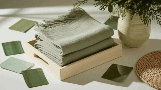
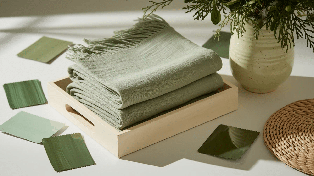
Cream and green are a nice color mix that feels calm, fresh, and natural. This soft combo works well in many places, from cozy living rooms to nice weddings.
Cream adds warmth and brightness, while green brings in a clean, peaceful feel. When used together, they make spaces feel relaxing and welcoming.
If you’re decorating a room, planning a party, or working on a design project, cream and green can give you lots of good options.
In this blog, I’ll share my favourite cream and green color sets that are easy to use and nice to look at. Each one includes a different shade of green, from soft sage to bold emerald, paired with cream or off-white tones.
You’ll also find simple tips for using these sets in your home or event. Get ready to feel inspired by these calm and pretty color ideas!
What Is a Cream and Green Color Palette?
A cream and green color palette mixes soft cream shades with fresh green tones. Cream is a warm, light color that feels calm, cozy, and clean.
Green brings a natural, peaceful feel that reminds us of trees, grass, and the outdoors.
When you put cream and green together, they create a balanced look that feels both warm and fresh.
This color combo is very flexible. It can be used in modern homes for a clean look or mixed with wood and plants for a cozy, cottage feel.
It also works great for weddings, office spaces, or even websites and logos. Lighter greens like mint or sage feel soft and relaxing, while darker greens like forest or emerald add strong style.
Cream helps soften the green, making everything look smooth and pulled together. It’s a go-to favorite for a reason!
Cream and Green Color Palette Combinations
Looking for soft, fresh color ideas? Cream and green are a perfect match. This mix brings warmth, calm, and nature into any space.
1. Sage and Ivory Serenity
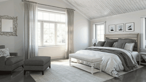
Sage and Ivory Serenity is a soft and nice combo that works well in many settings. Soft sage green paired with warm ivory creates a peaceful and inviting space.
It gives off a calm, easygoing feel that’s perfect for spaces where you want to relax and feel comfortable. Ideal for bedrooms and living rooms to help with rest.
This pairing combines a touch of color with a light base, making it easy to decorate around. Add plants, wood, or soft fabrics to finish the look.
2. Mint and Cream Freshness
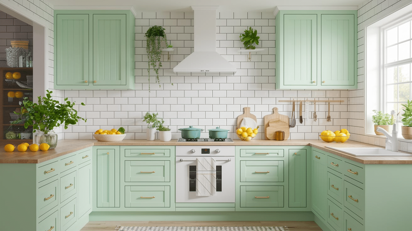
Mint and Cream Freshness is light, clean, and cheerful. Light mint green with creamy white offers a crisp and fresh look.
This combo feels cool and welcoming without being too bright. It is perfect for kitchens and bathrooms, where a fresh feel is desired.
The soft colors make a room feel bigger and more open. Try using this palette with white tile, light wood, and simple decor for a calm and neat look that still has personality.
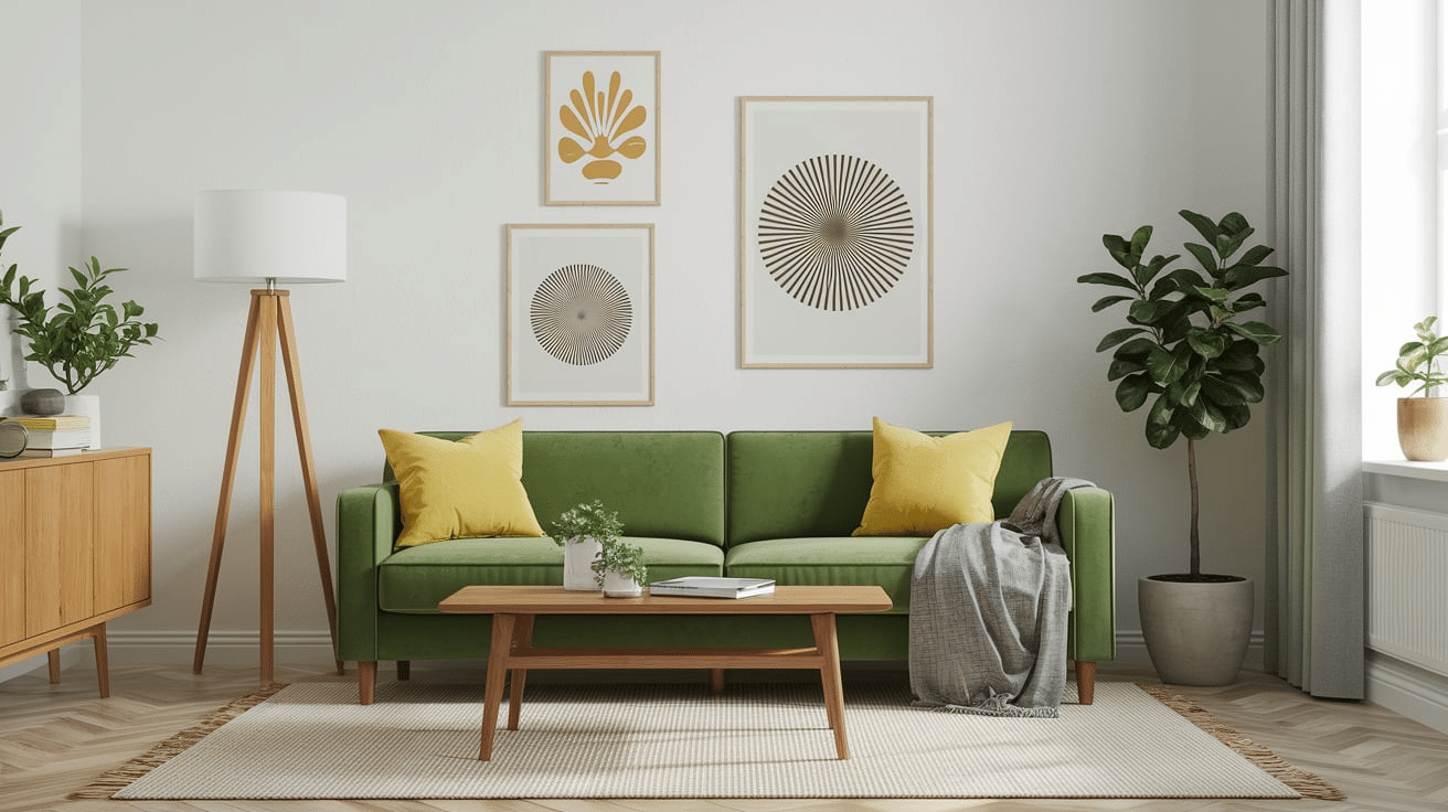
3. Olive and Beige Elegance
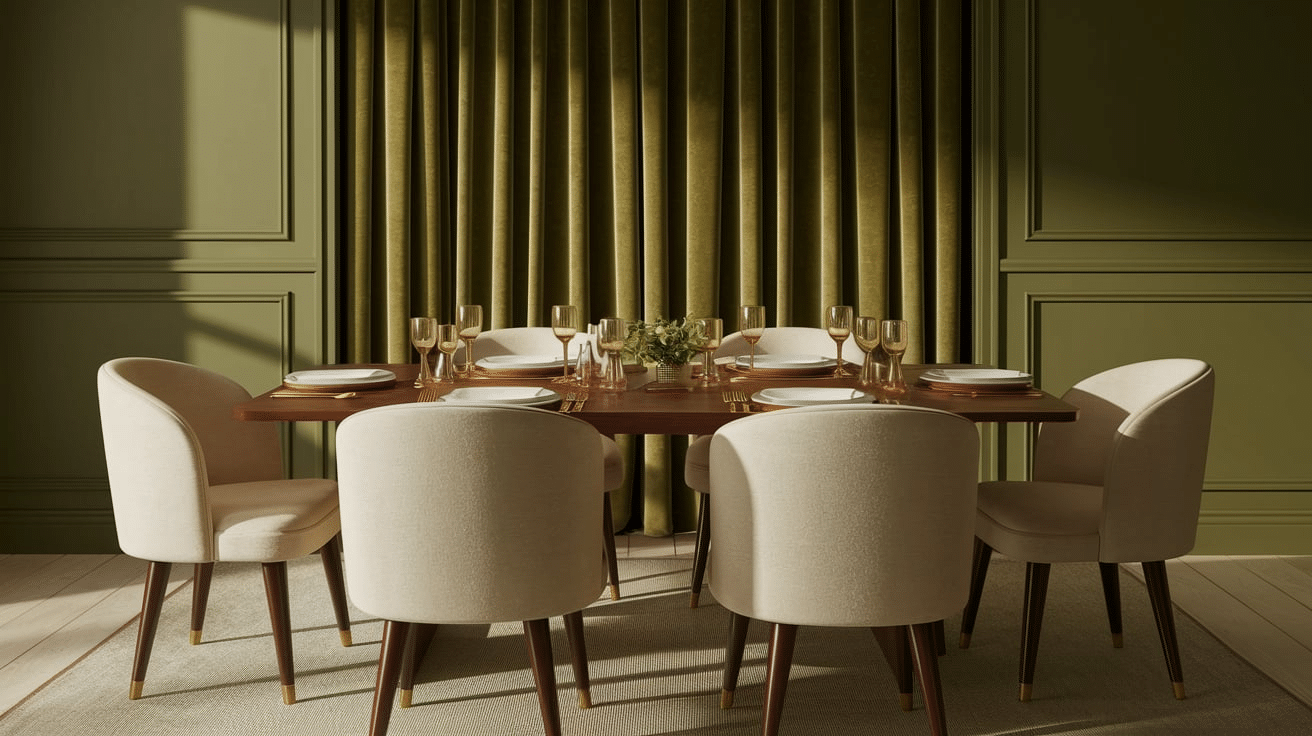
Olive and Beige Elegance is rich and natural. Deep olive green combined with beige adds a touch of style. It has a grounded, earthy feel that’s perfect for grown-up spaces.
Great for formal dining areas or home offices. Pair with gold accents, dark wood, or textured fabrics like linen or velvet.
This palette brings a sense of calm confidence and never feels too strong.
4. Emerald and Off-White Style
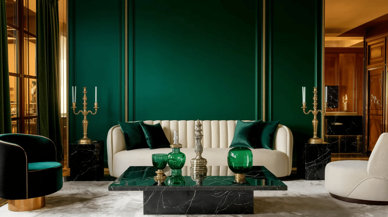
Emerald and Off-White Style is bold and classic. Rich emerald green with off-white accents gives a feeling of style and richness.
It’s a great choice when you want a pop of color but still want to keep things looking clean. Suitable for bold walls or fancy event decor.
This palette works well with shiny items, stone, or black accents for a cleaner look.
5. Pistachio and Vanilla Delight
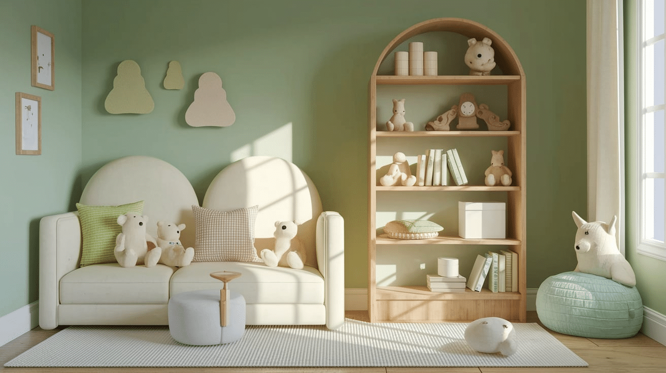
Pistachio and Vanilla Delight feels light, airy, and sweet. Light pistachio green with vanilla cream creates a soft and quiet palette.
It’s perfect for gentle, peaceful spaces like nurseries or spring-themed events. The colors bring warmth and comfort while still feeling fresh.
Add light wood or white furniture for a cozy, simple feel.
6. Forest Green and Cream Contrast

Forest Green and Cream Contrast is bold yet balanced. Dark forest green matched with soft cream gives a room strength without being too heavy.
Works well in libraries or cozy dens where you want a calm, deep space to read or rest. Add leather chairs, bookshelves, or soft rugs to complete the look. It feels classic and warm.
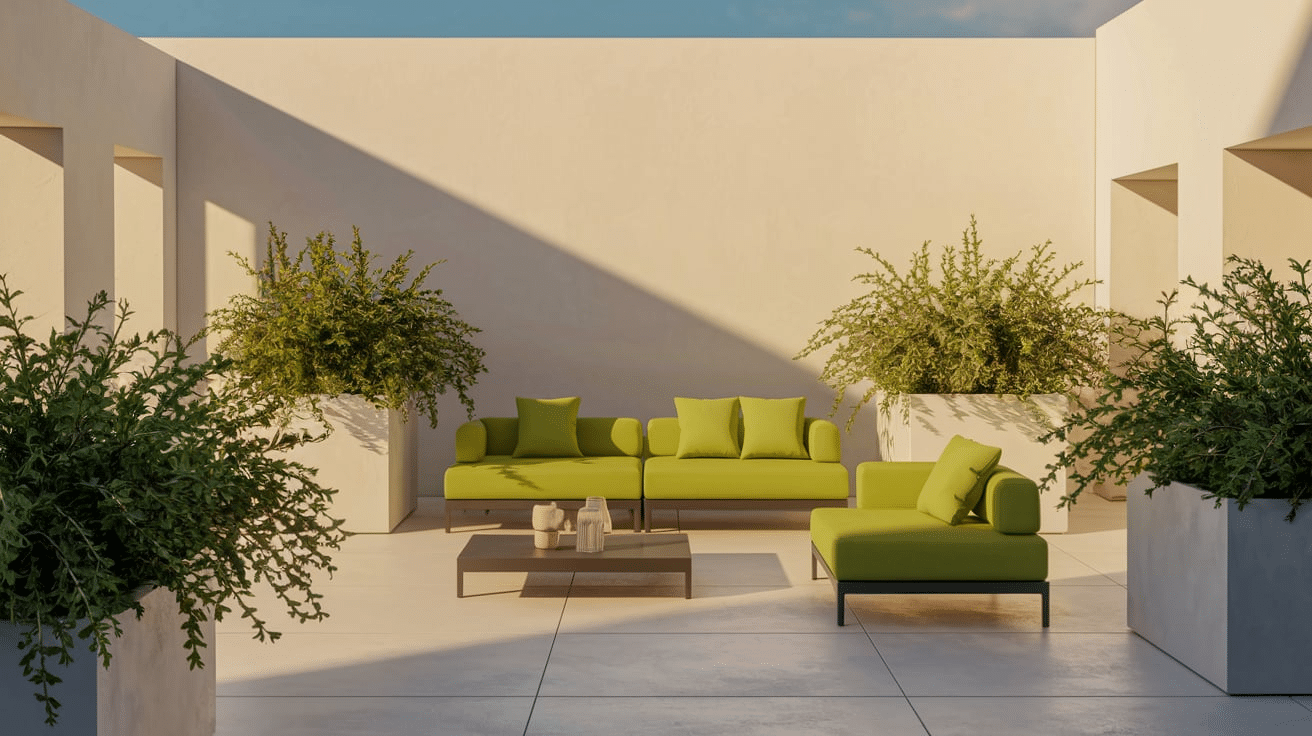
7. Lime and Light Cream Zest
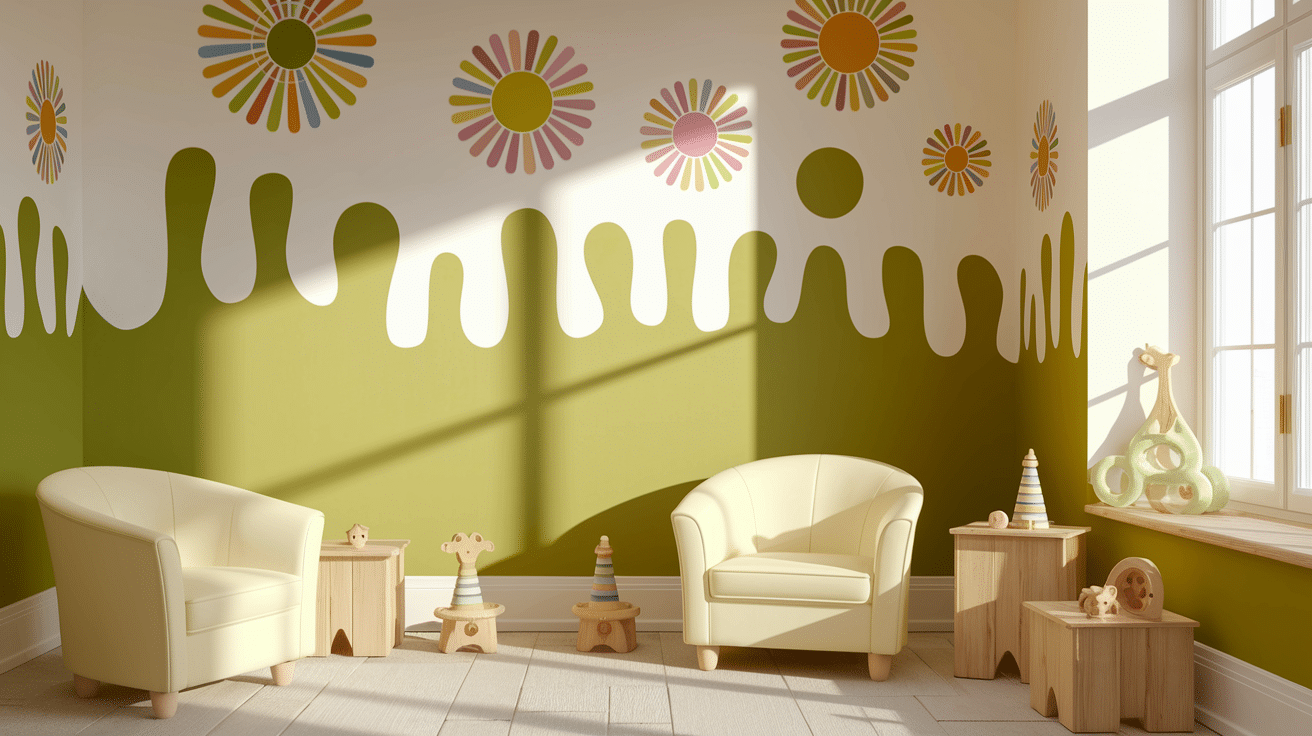
Lime and Light Cream Zest is bright and playful. Bright lime green paired with light cream brings lots of energy. It is ideal for creative spaces or children’s playrooms.
The colors feel fun and happy without being too wild. Add colorful art or simple wooden furniture to make the room cheerful and full of life.
8. Seafoam and Pearl Calm
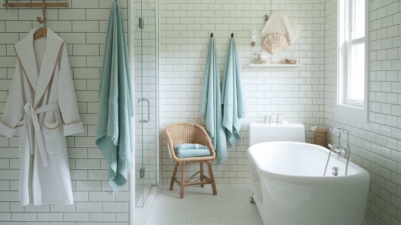
Seafoam and Pearl Calm bring in a calm, beachy feel. Gentle seafoam green with pearl cream is soft and peaceful. It is perfect for bathrooms or beach house spaces.
This mix makes small spaces feel bigger and brighter. Pair with white towels, shell decor, or pale wood accents for a spa-like feel.
9. Chartreuse and Antique White Retro
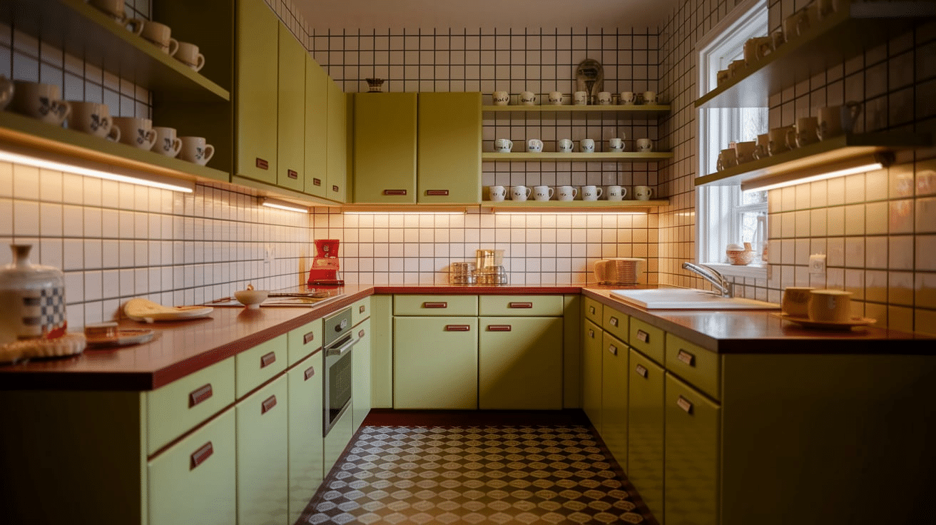
Chartreuse and Antique White Retro have a fun, older feel. Bright chartreuse green with antique white gives off a vintage feel that’s great for creative people.
It’s great for older-style kitchens or cafes. To bring out the throwback charm, add checkered floors, pastel dishes, or fun shapes.
10. Hunter Green and Buttercream Warmth
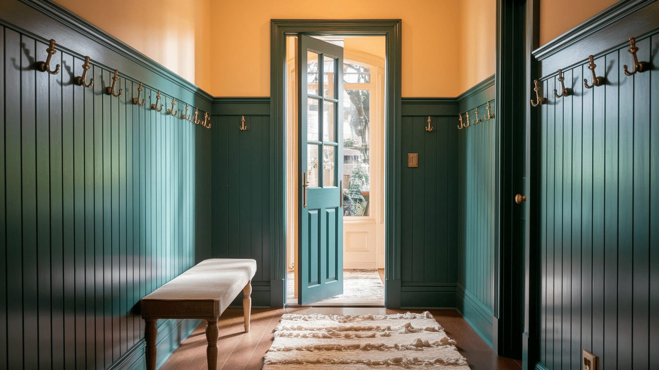
Hunter Green and Buttercream Warmth feel cozy and welcoming. Deep hunter green with buttery cream adds warmth and depth to a space.
It is suitable for traditional living rooms or entryways. It pairs well with dark woods, brass accents, and soft layers like pillows or curtains, creating a look that feels both rich and homey.
11. Kelly Green and Snow White Crispness
Kelly Green and Snow White Crispness are clean and bold. Bright Kelly green with snow white creates a fresh, modern look. Ideal for new kitchens or outdoor spaces.
Use with bold prints or black trim for a high-contrast style. This cheerful palette feels fresh and neat.
12. Moss Green and Almond Softness
Moss Green and Almond Softness is peaceful and natural. Earthy moss green with almond cream gives off a quiet, comfy feel.
It works well in bedrooms or reading corners. Pair it with natural fabrics like cotton or wool and soft lighting to create a cozy, restful space.
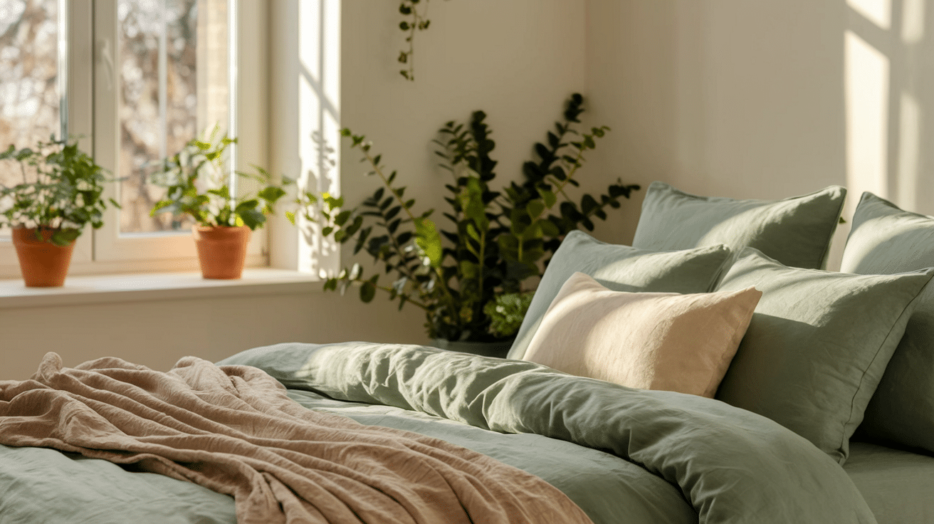
13. Jade Green and Linen Peace
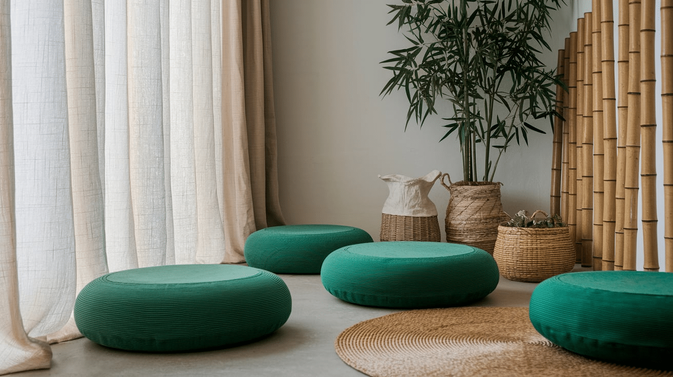
Jade Green and Linen Peace feel peaceful and steady. Soothing jade green with linen cream creates a soft, relaxing space.
This palette is perfect for quiet rooms or calm spots. Add light wood, plants, and soft lighting for a peaceful setup. This palette helps with calm thoughts and a sense of peace.
14. Avocado Green and Ecru Look
Avocado Green and Ecru Look brings a bit of the past into today. Older avocado green with ecru cream has a fun mid-century feel.
This style is great for homes with a simple, old-style feel. For a full look, add wood furniture with plain shapes, old prints, and bits of orange or yellow.
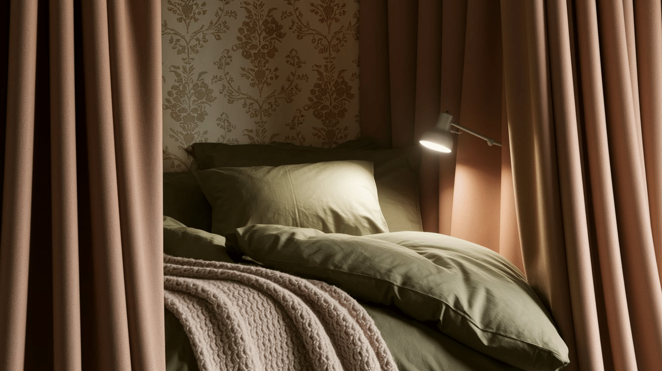
15. Teal Green and Champagne Glow
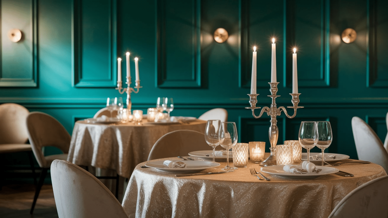
Teal Green and Champagne Glow are rich and soft at the same time. Together, teal green and champagne cream give a fancy, warm feel.
Suitable for pretty dining rooms or wedding themes. It pairs nicely with soft lighting, candles, and shiny items. It’s a lovely choice when you want a bit of shine without going too far.
16. Basil Green and Custard Comfort

Basil Green and Custard Comfort is simple and warm. Fresh basil green with custard cream brings warmth and a sense of peace.
It is ideal for kitchens or family rooms. It feels friendly and easygoing, like a space where people gather. Add open shelves, wood counters, or soft cushions for a cozy feel.
17. Fern Green and Coconut Cream Nature
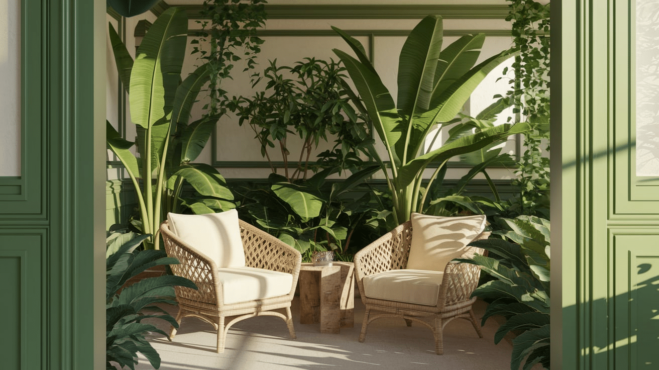
Fern Green and Coconut Cream Nature brings the outdoors in. Full fern green with coconut cream feels fresh, clean, and natural.
Perfect for sunny rooms or garden-style spaces. Add wicker, potted plants, and natural textures to get the most out of this nature-filled pair.
Tips for Using Cream and Green Palettes
Using cream and green together can make any space feel calm, fresh, and inviting. Below I’ve shared some easy tips to that always help me get the right look:
- Balance the Shades: Pair dark greens with light creams to keep the space bright and calm. Try cream walls with green accents or switch them for variety.
- Add Natural Elements: Use wood, stone, or plants to make the room feel earthy and relaxing.
- Use Textures: Mix soft items like pillows with rougher surfaces like wood or tile for added depth.
- Think About Lighting: Let in natural light or use warm lamps to highlight cream and green tones.
- Add Simple Accessories: Use matching pillows, rugs, or décor in soft shades to tie the room together without overwhelming it.
Conclusion
Cream and green are a great color pair if you want something calm, natural, and easy to work with.
They bring a soft, fresh feel to any room, whether you’re decorating a living space, planning an event, or updating a small corner of your home.
With so many shades to choose from, you can go light and airy or bold and cozy. These colors also work well with natural materials like wood, plants, and stone, making your space feel warm and welcoming.
The best part? Cream and green are simple to use but always look good together. Just remember to balance the colors, think about lighting, and add textures or extras to bring everything together.
If you’re going for a relaxed look or something more dressed up, this color combo can help make your space feel comfortable and well-matched.

With a Master in Architectural Studies from University of Pennysylvania, Marwa Haydar has pioneered living spaces since 2005. Her expertise, initially honed in a prestigious architectural firm, is evident in her approach to creating environments. Marwa became part of our team in 2019 and has since been a driving force in our home improvement section, known for her practical yet stylish solutions. She’s been spearheading our design workshops since then, infusing her passion for teaching into her work. In her leisure time, Marwa enjoys exploring historic architecture and is an enthusiastic pottery hobbyist, further enriching her understanding of form and texture.