Color has a bigger impact on a room than most people realize. A monochromatic color scheme is one of the easiest ways to pull a space together without overthinking it.
These colors work well in almost any room, from bedrooms to kitchens to living areas. And because everything ties back to one base color, the whole space feels calm and cohesive.
If you’re looking for ideas, this blog will help you find your best monochromatic example. Let’s begin!
What is a Monochromatic Color Scheme?
A monochromatic color scheme uses one base color and builds around it with variations of that same color. Those variations include lighter tones, darker shades, and subtle shifts in intensity.
Rather than combining many colors, the focus stays on one color family. This keeps things visually consistent and gives the room a sense of order.
It also makes decorating decisions much easier once you pick your base color; everything else falls into place naturally.
Key Parts of Monochromatic Colors
| Element | Description | Example |
|---|---|---|
| Base Color | The main color used throughout the room. | Navy blue walls as the starting point |
| Tints | Lighter versions of the color are created by adding white. | Soft sky blue on the ceiling |
| Tones | Softer versions of the color are created by adding gray. | Dusty blue on upholstery or curtains |
| Shades | Darker versions of the color are created by adding black. | Deep midnight blue on accent furniture |
| Textures | Different materials, such as fabric, wood, or stone, keep the design interesting. | Velvet cushions, linen drapes, matte walls |
A monochromatic color scheme is more than just one color repeated everywhere. It works because of the different elements that add depth and variety within that single color family.
Monochromatic Examples and Design Ideas
These monochromatic examples show how one color family can shape the mood of a room. From soft neutrals to bold darks, each idea proves that working with a single color doesn’t mean settling for a boring space.
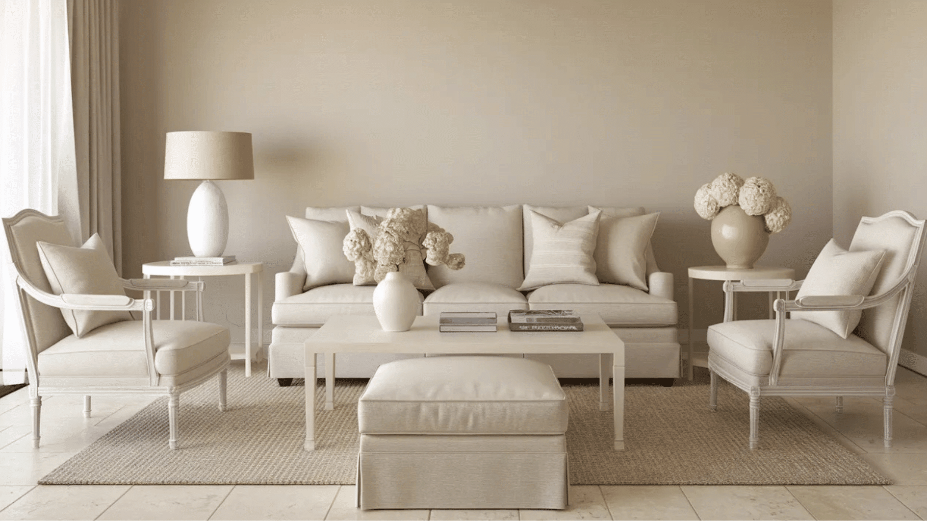
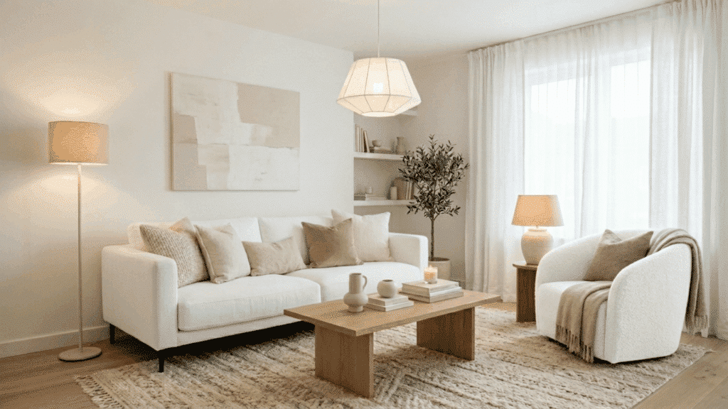
1. Light, Medium, and Dark Shades
Layering shades is the foundation of any strong monochromatic color scheme. Start with a medium base color on the walls, then bring in lighter tones through bedding or curtains and darker shades through furniture or rugs.
This creates depth without introducing new colors. The result looks intentional and well thought out.
If you’re unsure where to start, pick three shades of the same color and assign each one to a different part of the room. This simple structure makes the whole process much easier to manage.
2. Monochromatic Walls and Furniture
Matching the wall color to furniture in the same color family is a bold yet effective approach. It creates a strong visual impact and makes the room feel cohesive from floor to ceiling.
The key is to vary the finish of the walls against a glossy or textured furniture piece to keep things interesting. This works especially well in modern, minimalist spaces.
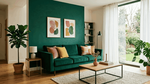
3. Sage Green Living Room
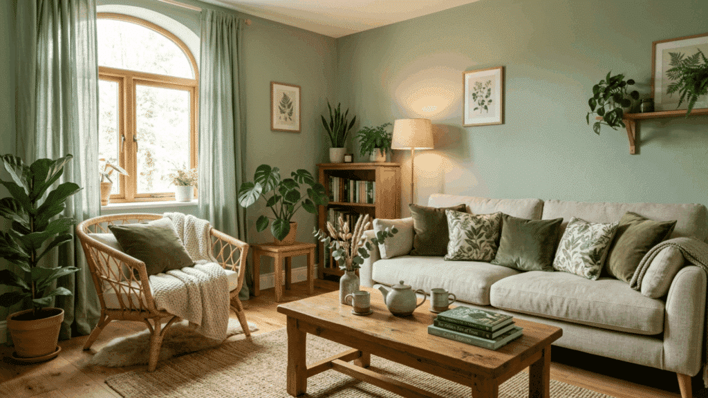
A sage green living room feels calm, grounded, and connected to nature. Use sage on the walls as your base, then bring in olive and muted green tones through cushions, throws, and curtains.
Natural materials like rattan and wood complement this palette well. Sage green also photographs well, which makes it a great option if you plan to list your home or share your space online. It’s one of those colors that look just as good in person as they do in pictures.
4. All-White Minimalist Bedroom
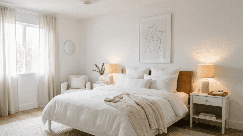
An all-white bedroom is one of the most classic monochromatic examples in home design. White walls, bedding, and furniture create a clean, open atmosphere.
To keep it from feeling too cold, layer different textures like cotton, linen, and wool. Soft off-white and cream tones add warmth without breaking the palette.
This approach is also very practical, as white bedding and accessories are easy to replace and update over time. A few well-chosen decor pieces in warm white or ivory keep the room feeling personal rather than clinical.
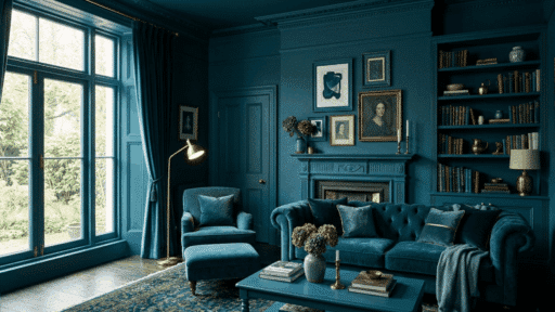
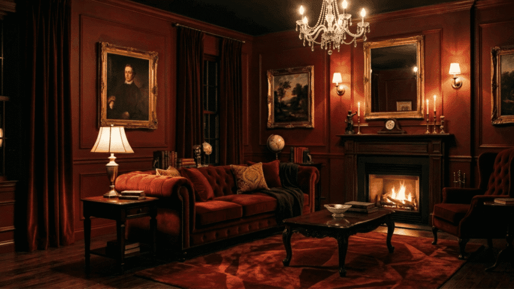
5. Navy Blue Living Room
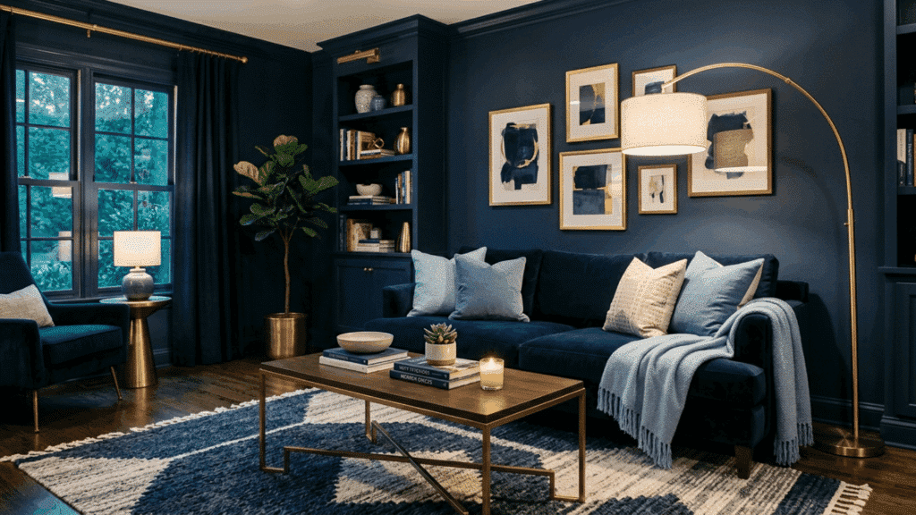
Navy blue makes a strong statement in a living room when used across walls, sofas, and accents. Pair deep navy walls with medium blue cushions and lighter blue curtains to add dimension.
Brass or gold hardware works well as a finishing touch without pulling in a completely new color. This palette feels rich and well put-together.
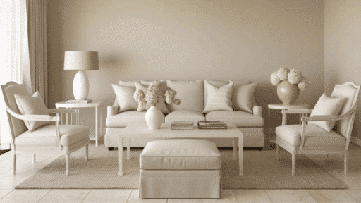
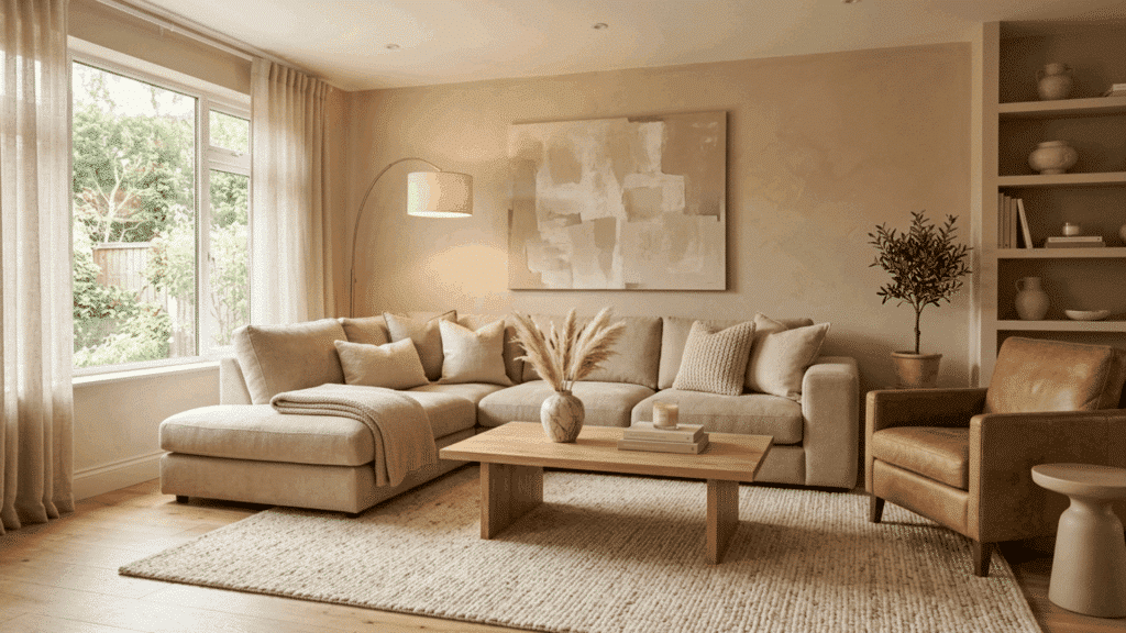
6. Warm Beige Neutral Interior
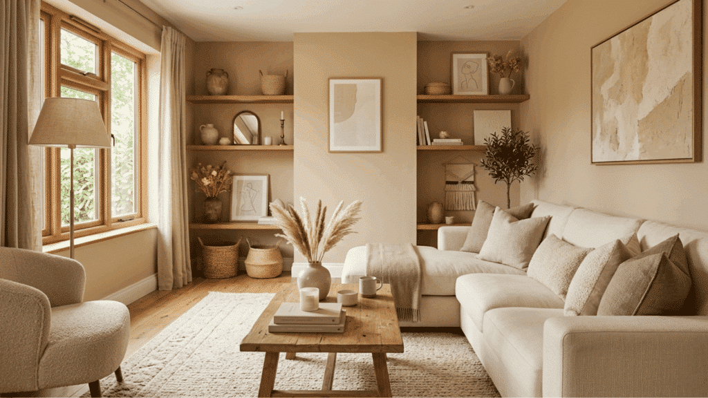
A warm beige interior is one of the most approachable monochromatic color schemes for any home. Use sandy beige on the walls, cream on the trim, and warm brown tones in the furniture and flooring.
Textured materials, such as wool rugs and wooden shelves, add visual interest. This palette suits both traditional and contemporary spaces equally well. It’s a great starting point for anyone new to working with monochromatic colors.
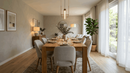
7. Terracotta Dining Room
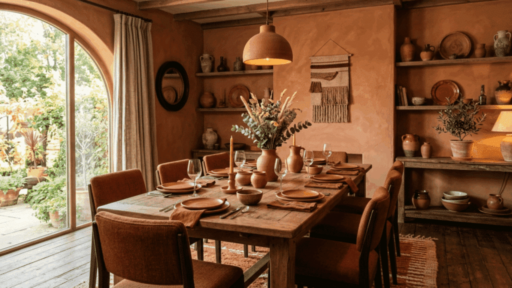
Use a mid-tone terracotta on the walls and bring in deeper clay tones through upholstered chairs or a statement rug. Lighter rust tones on table linens or ceramics keep the palette balanced. The overall effect feels warm, inviting, and full of personality.
Terracotta also pairs well with candlelight, which makes it a particularly good choice for a dining space used in the evenings. The warm undertones in the color respond beautifully to soft, ambient lighting.
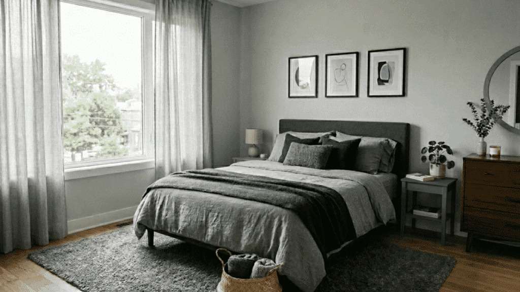
8. Dusty Blue Bedroom
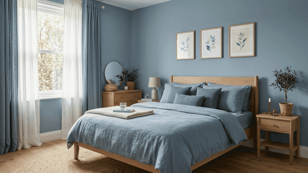
A dusty blue bedroom is one of the most requested monochromatic examples in residential design right now.
Layer powder blue bedding with deeper slate blue accents on pillows or a throw blanket. White or light wood furniture keeps the space feeling fresh.
Dusty blue also has the added benefit of working well in both north and south-facing rooms, making it a reliable choice regardless of how much natural light the space gets. It’s a color that adapts well to different conditions.
9. Charcoal Gray Modern Living Room
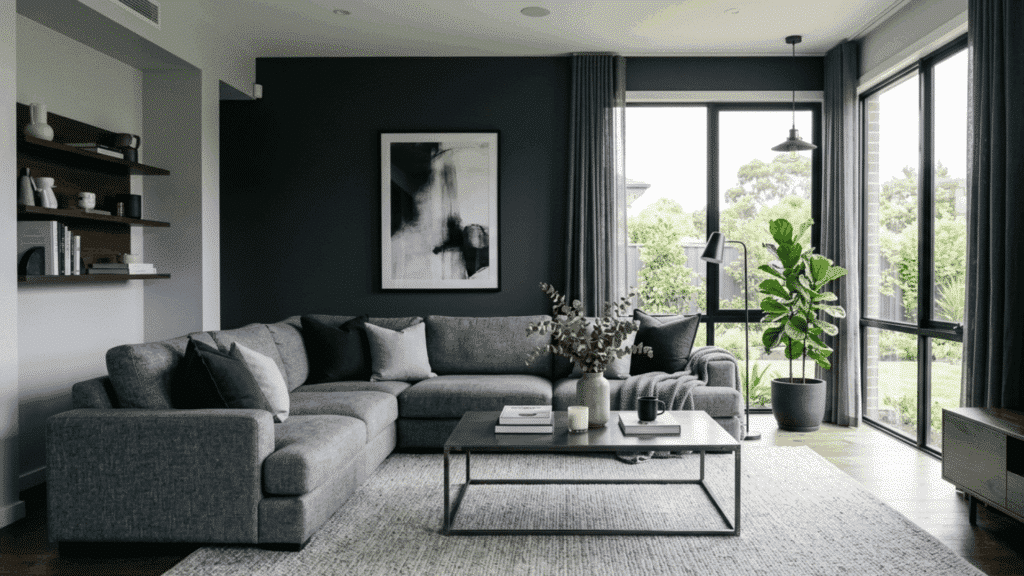
Charcoal gray is a strong choice for a modern living room that needs a clean, structured look. Use dark charcoal on a feature wall, balancing it with medium-gray sofas and light-gray flooring.
Concrete or steel accents fit naturally into this palette. Plenty of natural light is important here to stop the room from feeling too closed in.
Adding a large mirror or reflective surface helps bounce light around the space and keeps the dark tones from feeling heavy. This small addition can make a noticeable difference in how open the room feels.
10. Teal Bedroom
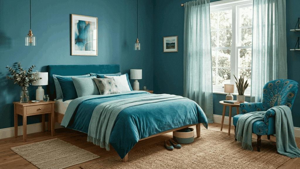
Teal sits comfortably between blue and green. Start with a mid-tone teal on the walls and layer in icy seafoam tones through curtains and bedding, then anchor the space with deep peacock accents in cushions or a statement chair.
The range within this one color family is wide enough to create real depth and contrast. Teal also responds beautifully to both natural and artificial light, shifting in character throughout the day.
11. Butter Yellow Kitchen or Dining Room
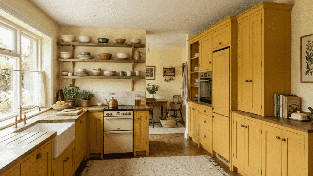
Start with a pale cream on the walls and build toward richer custard and honey tones through cabinetry, upholstered dining chairs, or pendant lighting.
The range within this yellow family is wider than most people expect, giving you plenty of room to layer without the space feeling overwhelming.
Matte finishes work particularly well here, keeping the palette feeling soft and warm rather than sharp or overly bright.
12. Mushroom Taupe Entryway
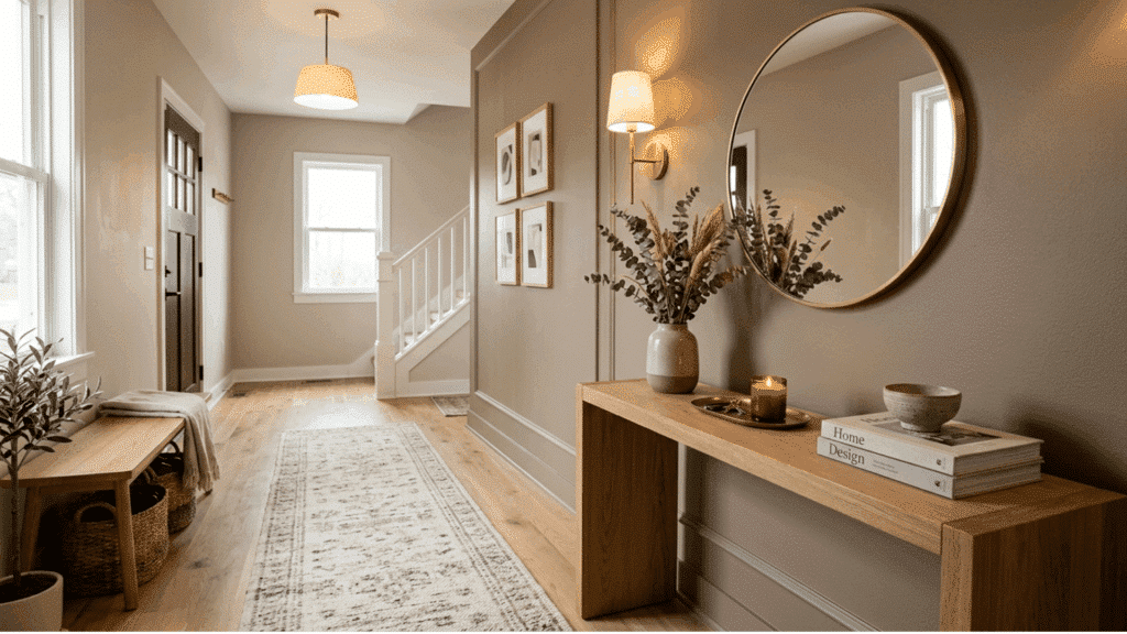
Mushroom taupe is an organic color that sits between warm brown and cool gray, making it an ideal choice for an entryway.
It sets a warm, grounded tone the moment you walk through the door without feeling too bold or unwelcoming. Layer different depths of this brownish-gray through the walls, a console table, and soft furnishings like a runner rug or cushioned bench.
Natural textures like stone flooring, raw linen, and unfinished wood hooks or shelving sit perfectly within this color family.
13. Plum Noir Kids Room
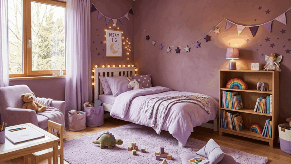
Plum noir might seem like an unexpected choice for a kids’ room, but in its lighter variations, it creates a space that feels creative, cozy, and genuinely fun.
Use a mid-tone dusty plum on the walls rather than the darkest version of the color, and layer in lighter lavender-purple tones through bedding, curtains, and storage accessories.
Broader burgundy-purple accents in small decor pieces like bookends, lamp shades, or wall art add depth without making the room feel heavy.
14. Olive Grove Living Room
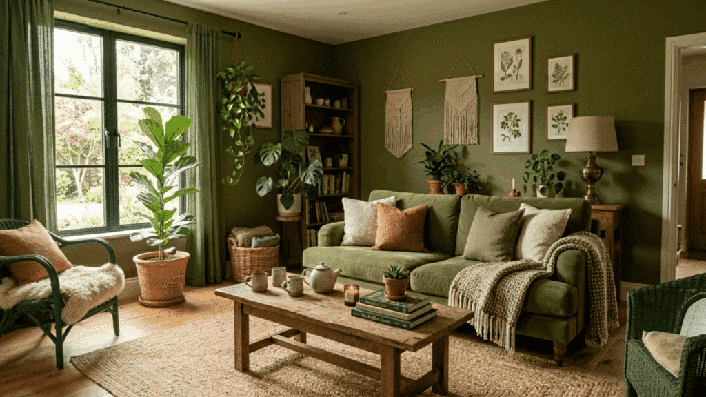
Olive grove is a muted, swampy green that functions almost like a biophilic neutral in a living room. It sits deeper and warmer than sage, giving the space a more grounded and earthy quality.
Use olive on the walls as your base and layer in darker moss tones through a sofa or armchairs, with lighter muted greens in cushions and throws.
Natural materials like jute, clay, and reclaimed wood sit comfortably within this palette. It’s a color that feels connected to the outdoors without being overly bold.
15. Forest Green Reading Corner
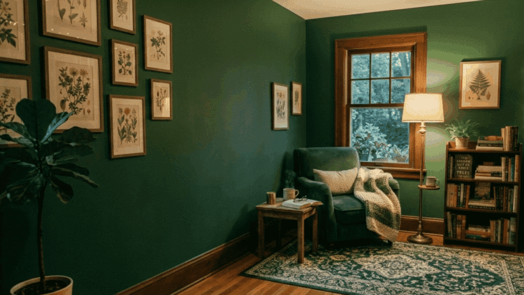
A forest green reading corner feels tucked away and cozy in the best way. Paint the walls in a deep forest green and layer in medium and light green tones through a chair, cushions, and a small side table.
A built-in bookshelf painted in the same color adds to the enclosed, comfortable feel. This is a great monochromatic example for smaller spaces within a larger room.
The deep green also works well with warm lighting, which makes the corner feel even more inviting during evening hours.
16. Matching Lighting and Decor
Carrying your chosen color through lighting fixtures and decor pieces is what pulls a monochromatic room together.
A pendant light, a lamp shade, or even a candle holder in the same color family reinforces the palette. It shows attention to detail, making the design feel complete.
Even small items like a colored light bulb or a tinted glass vase can contribute to the overall palette without requiring a big investment.
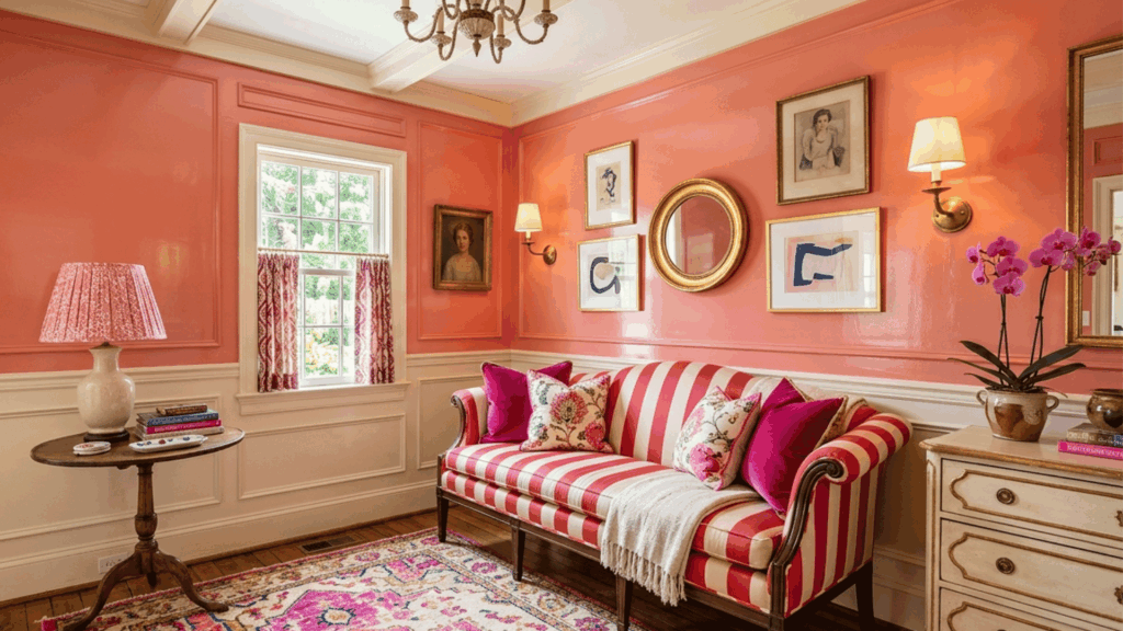
17. Peach Living Room
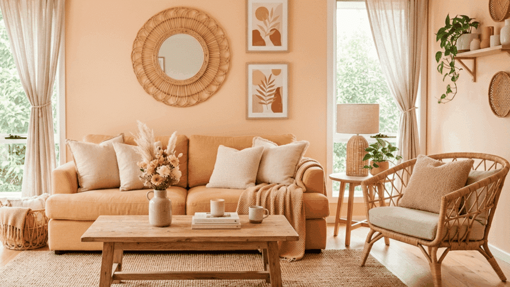
Peach is a warm and underrated color for a monochromatic living room. Start with a soft peach on the walls and build out with deeper apricot tones in the upholstery and lighter blush tones in the curtains.
Natural linen and rattan accessories sit well within this palette. Peach also responds well to natural light, shifting slightly warmer in the morning and cooler in the afternoon, which gives the room a different character throughout the day.
18. Pale Pink and Cream kitchen
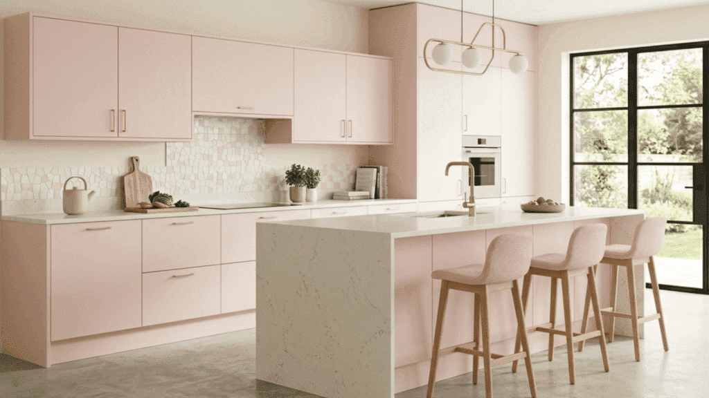
A pale pink and cream kitchen is a soft, unexpected take on monochromatic design that feels warm and genuinely inviting. Start with a creamy off-white on the walls and pair it with pale blush pink cabinetry to keep the palette light and cohesive.
Deeper dusty rose tones in small accessories like ceramics, a tea towel, or a pendant light shade add subtle depth without pulling the room in a different direction.
Cream countertops and light wood open shelving sit naturally within this palette, keeping the space feeling grounded.
19. Brown Layered Living Room
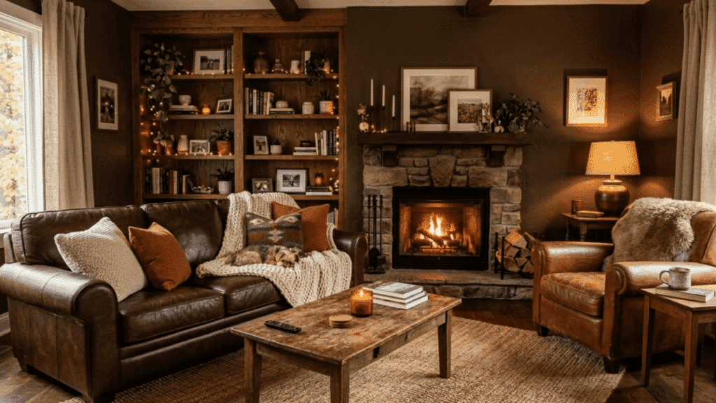
Start with warm caramel tones on the walls, then work in chocolate brown through a sofa or armchairs and lighter tan tones through rugs and cushions.
Leather, suede, and wood all sit naturally within this palette. The result is a space that feels rich and lived-in. Brown is also a very forgiving color to maintain, as it doesn’t show everyday dust or wear as quickly as lighter tones.
20. Black and White Spectrum
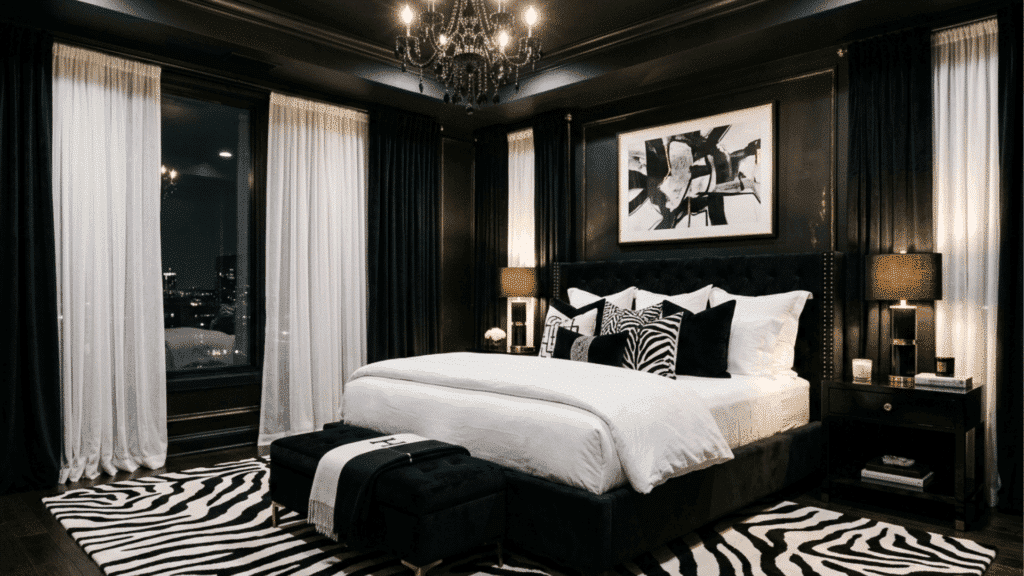
A black-and-white monochromatic room is one of the most graphic and controlled color schemes you can create in a home.
Use true white on the walls and ceiling, then bring in varying depths of black through furniture, textiles, and flooring before anchoring the space with frames, fixtures, or a statement furniture piece.
The full spectrum from white to black gives you more range to work with than most people expect. Matte finishes keep the palette feeling chic rather than harsh.
21. Steel Slate Home Office
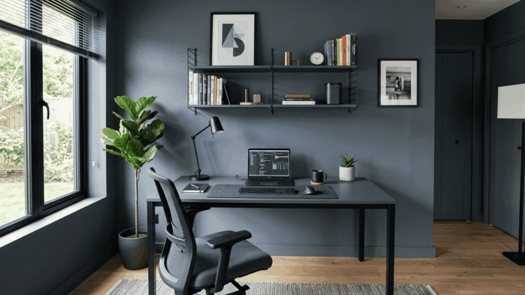
Steel slate is a cool, blue-toned gray that brings a clean, industrial quality to a home office. Use a mid-tone slate on the walls and layer in deeper charcoal-blue tones through a desk, shelving, or a statement chair.
Lighter, cooler grays in soft furnishings balance the overall look and prevent the space from feeling too heavy. Metal and glass accessories fit naturally within this palette and reinforce the sleek, focused atmosphere.
22. Mint Green Bathroom
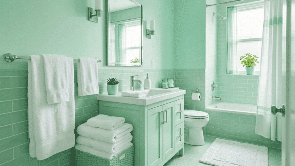
Green works beautifully in a bathroom where a light, fresh atmosphere is the goal. Use mint on the walls and bring in slightly deeper sage tones through towels, a bath mat, or small accessories.
White fixtures and chrome hardware complement the palette without pulling attention away from the color. This is a cool-toned alternative to the more common blue bathroom palette.
Mint also works particularly well with subway tiles or simple geometric tile patterns, where the clean lines suit the freshness of the color.
23. Jade Energy Bathroom
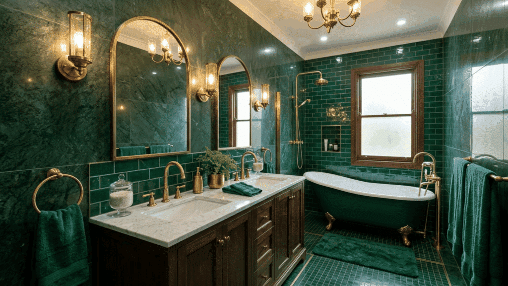
Jade is a vibrant, balanced green that sits right between mint and emerald, giving it an energy that few other colors match. Use a mid-tone jade on the walls and bring in deeper emerald tones through tiles, towels, or a statement piece of furniture.
Lighter mint accents in smaller accessories keep the palette from feeling too saturated. Brass or brushed gold fixtures complement jade beautifully without competing with its color.
24. Oxblood Red Living Room
Oxblood red is a rich, moody color that brings real depth to a living room. Use a deep maroon on the walls as your base and layer in crimson tones through velvet upholstery or a statement rug.
Pale blush accents in cushions or lampshades soften the intensity and keep the palette from feeling too closed in. The warmth of oxblood red makes it particularly well-suited to evening spaces where a cozy, intimate atmosphere matters.
25. Dusty Rose Monochromatic Living Room
Dusty rose is a mature, refined take on pink that avoids feeling overly sweet or on-trend. The key is to lean into the fleshy, muted undertones of the color rather than the brighter, more saturated versions.
Use a mid-tone dusty rose on the walls and layer in deeper mauve tones through bedding and curtains, with lighter blush accents in smaller decor pieces. Linen, brushed cotton, and soft velvet all sit naturally within this palette.
This monochromatic color scheme feels grown-up and genuinely restful, making it an excellent choice for a bedroom.
Trending Monochromatic Color Schemes in Interior Design
Some color families have become especially popular in recent interior design trends. These palettes stand out because they are versatile, easy to work with, and they suit a wide range of home styles.
| Color Scheme | Key Colors | Best Used In | Best Pairings | Overall Vibe |
|---|---|---|---|---|
| Warm Neutral Palettes | Beige, sand, warm brown, cream | Living rooms, bedrooms, hallways | Linen, jute, natural wood | Cozy, grounded, inviting |
| Sage Green Interiors | Sage, olive green, muted green | Kitchens, bathrooms, and reading nooks | Rattan, clay, unfinished wood | Calm, fresh, nature-inspired |
| Dusty Blue Palettes | Soft blue, muted blue, powder blue | Bedrooms, bathrooms, nurseries | White trim, light wood floors, linen | Peaceful, airy, restful |
| Terracotta and Clay Colors | Terracotta, clay, rust, warm orange | Dining rooms, entryways, and accent walls | Matte plaster, glazed ceramics, brass | Warm, bold, earthy |
| Charcoal and Gray Interiors | Charcoal, slate, light gray, cool gray | Modern living areas, open-plan spaces, and home offices | Concrete, glass, steel, white accents | Sleek, modern, understated |
Common Mistakes to Avoid with Monochromatic Colors
While monochromatic designs look simple, a few mistakes can make the space look flat or unfinished. Here’s what to watch out for:
- Using Only One Shade of Color: Sticking to a single shade throughout the entire room removes all depth from the space.
- Ignoring Texture and Patterns: Without varied textures like velvet, linen, or wood, even a well-chosen palette will look one-dimensional and lifeless.
- Forgetting About Natural Light: Always test paint samples in your actual space before committing, as natural light changes how a color appears at different times of day.
- Overlooking the Floor and Ceiling: Leaving these out of the equation can break the cohesion of the whole room.
- Going Too Matchy-Matchy: Slight variations in shade and finish are what make the design feel curated rather than rigid.
- Not Adding Contrast Through Materials: Without contrast in material finishes, such as combining matte, gloss, and natural surfaces, the room loses visual energy.
Final Thoughts
Monochromatic examples dont have to be complicated. Working with one color family gives you plenty of room to get creative through shades, textures, and materials.
The key is to think beyond a single flat tone and build a palette that has real depth and character. Monochromatic colors work in every room, every style, and every budget.
If you’re starting from scratch or refreshing an existing space, this approach makes decorating feel far more manageable.
Pick a monochromatic example that genuinely appeals to you, start small, and build from there.

Alex Guerrero, a graduate with a Fine Arts degree from the Rhode Island School of Design, has been a visionary in the world of color and design for over 15 years. His professional journey began in the heart of the fashion industry in Milan, where he developed an acute sense for color harmonies and trends. Alex joined our team in 2018, offering fresh and innovative perspectives on color utilization in various spaces. Renowned for his ability to blend contemporary trends with timeless elegance. Outside of work, Alex is an accomplished painter and a volunteer art therapist, his artistic talents further enriching his professional insights.