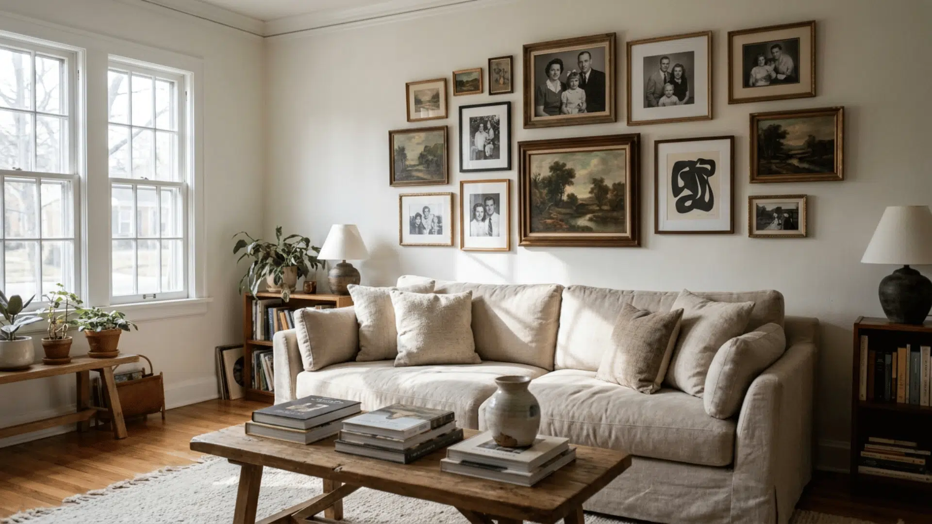

As an interior designer with several years of experience, I keep seeing one pattern: people spend thousands on furniture but leave their walls completely bare!
That blank wall above your sofa? It is not just space. It is the most personal real estate in your home, and a gallery wall is the best way to use it.
A gallery wall is a grouped arrangement of framed art, photos, and objects hung together on one wall so they read as a single composition instead of scattered pieces.
The frames can match or deliberately clash; the layout can be a strict grid or a loose cluster. What makes it a gallery wall rather than a few random frames is that the pieces are planned to relate to each other through color, subject, frame finish, or spacing.
No, you do not need a designer budget or a perfectly coordinated art collection to pull one off. You just need the right layout, a little planning, and this guide.
Inside, I will cover a few layout ideas and style options that will make your gallery wall look like it was done by someone who actually knows what they are doing.
Why Gallery Walls Remain a Popular Home Decor Trend
Gallery walls have been a fixture in interior design for decades, and they are not going anywhere. Part of their appeal is how personal they are. No two gallery walls look the same because no two people have the same collection of memories, art, and objects.
In my professional years, I have seen gallery walls do things that no single piece of furniture or art ever could. They fill a room with personality, tell a story, and make a space feel truly lived in.
That is why clients keep asking for them, and why they keep showing up in every kind of home, from studio apartments to large family houses.
How to Choose the Perfect Gallery Wall for Your Space
Before you start buying frames or searching for art, I always tell my clients to take a few minutes to think about the specific wall and room they are working with.
The right gallery wall for a narrow hallway looks very different from the right one for a wide living room or a small bedroom nook.
Getting this right from the beginning saves you time, money, and a lot of unnecessary holes in your wall. Three things guide every decision I make at this stage.
- Consider Your Room Size and Wall Shape: I start every gallery wall project by measuring the wall first. Note the width, height, and any interruptions, such as outlets, light switches, or architectural features.
- Match the Gallery Wall to Your Interior Style: In my experience, the biggest mistake people make is choosing a gallery wall style that does not match the surrounding room.
- Decide on a Theme or Story: It can be as simple as a color that repeats across several pieces, a consistent mood, or a subject that appears in different forms throughout the arrangement.
I always ask clients to lay everything they already own out on the floor before buying a single new piece.
Products You Would Need
Before any installation begins, I make sure my clients have the right supplies on hand.
Over the years, I have narrowed it down to a core set of products that cover almost every gallery wall situation, if working with a rental apartment, a large statement wall, or a tight budget.
| Category | Product |
|---|---|
| Frames and Displays | Picture frames set (matching multipack) |
| Floating/shadow box frames | |
| Gallery ledge/picture rail shelves | |
| Wooden dowel with clips | |
| Hanging Hardware | 3M Command Strips (damage-free) |
| Picture hanging kit with hooks and nails | |
| Heavy-duty drywall anchors | |
| Planning and Layout Tools | Self-leveling laser level |
| Measuring tape | |
| Painter’s tape | |
| Gallery wall template kit | |
| Art and Prints | Printable wall art packs |
| Photo print packs |
Gallery Wall Ideas
The idea you pick depends on your wall size, how many pieces you have, and how much structure you prefer. Some layouts are clean and measured; others are loose and free-form.
The good news is that there is something here for every kind of space and every kind of person.
Go through the options below, see which one fits your wall, and use the details under each to guide your planning.
1. The Classic/Organic Gallery
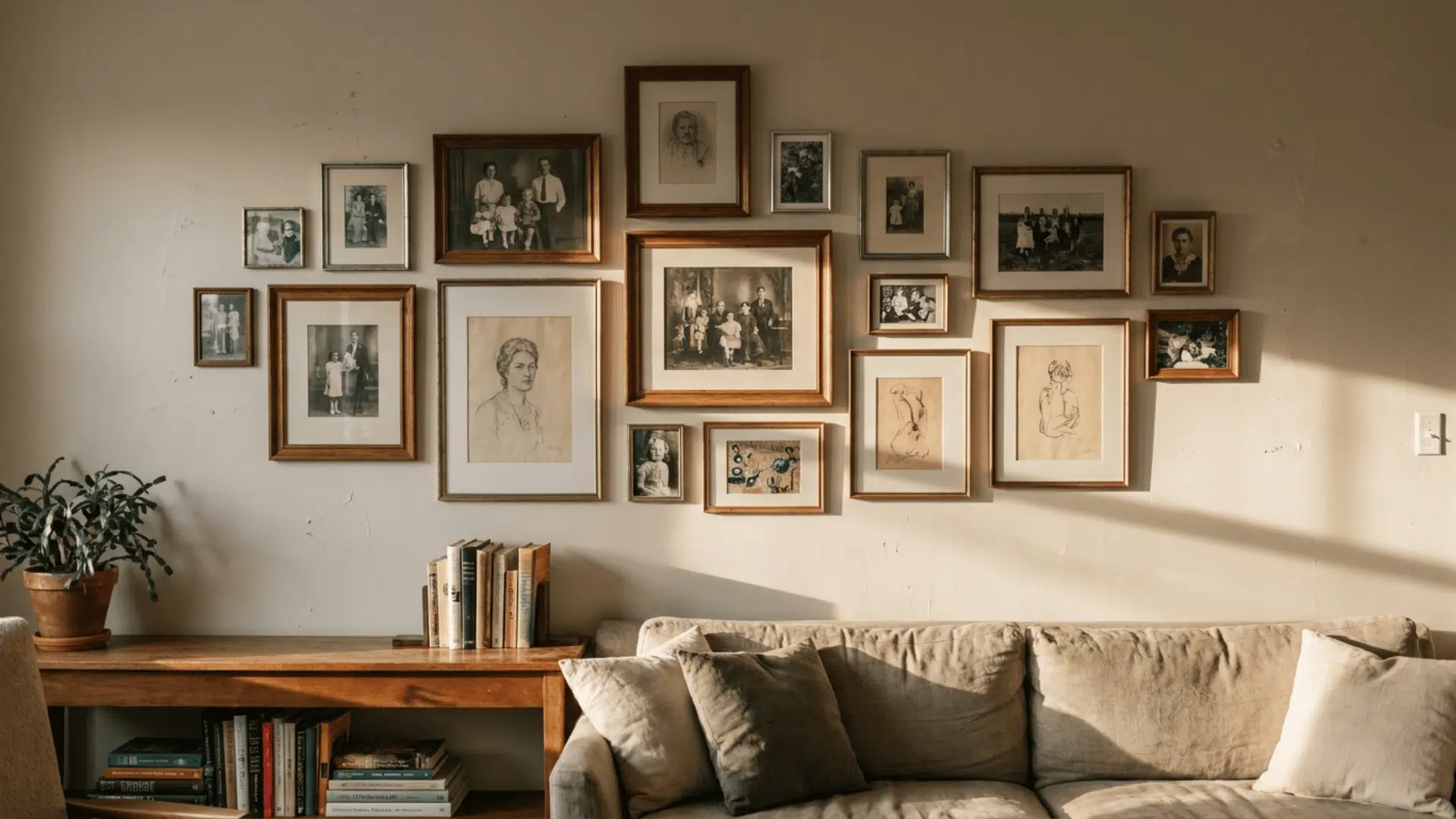
This is the most popular starting point for a reason. You group a mix of frames, photos, and art pieces in a loose arrangement with no strict rules about spacing or sizing.
What holds it all together is a shared element, like a common color palette, a consistent subject, or a similar mood across all the pieces.
It works well in living rooms and hallways where you want something that feels personal and collected over time rather than bought all at once.
2. The Grid
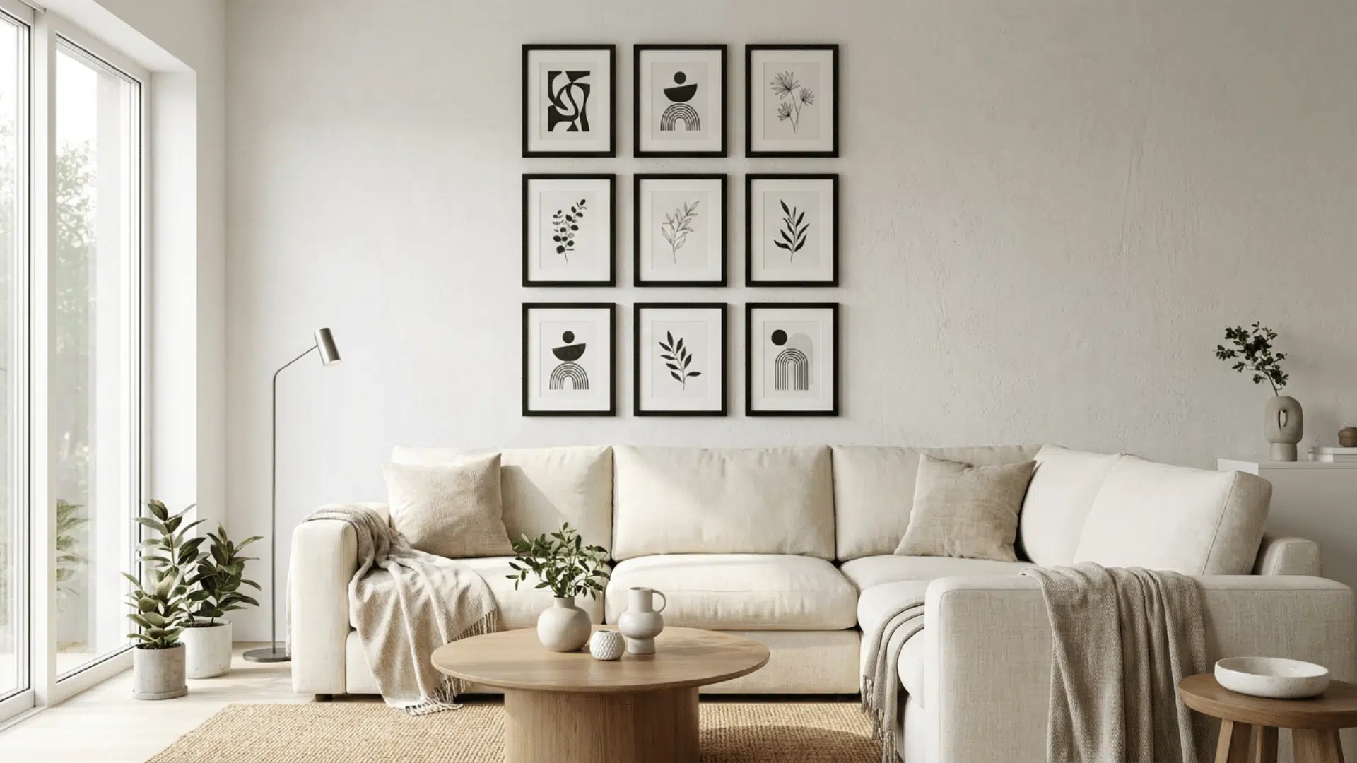
If you like things neat and structured, the grid layout is a great fit. You hang frames of the same size in even rows, keeping a consistent gap of about 2 to 3 inches between each piece.
The result looks sharp and works especially well above a sofa, bed, or desk. The key to getting this right is measuring before you hang anything.
Tape out the grid on your floor first, then transfer the spacing to your wall using a level and measuring tape. It takes a bit more prep than other layouts, but the finished result looks incredibly clean and considered.
3. The Salon Style
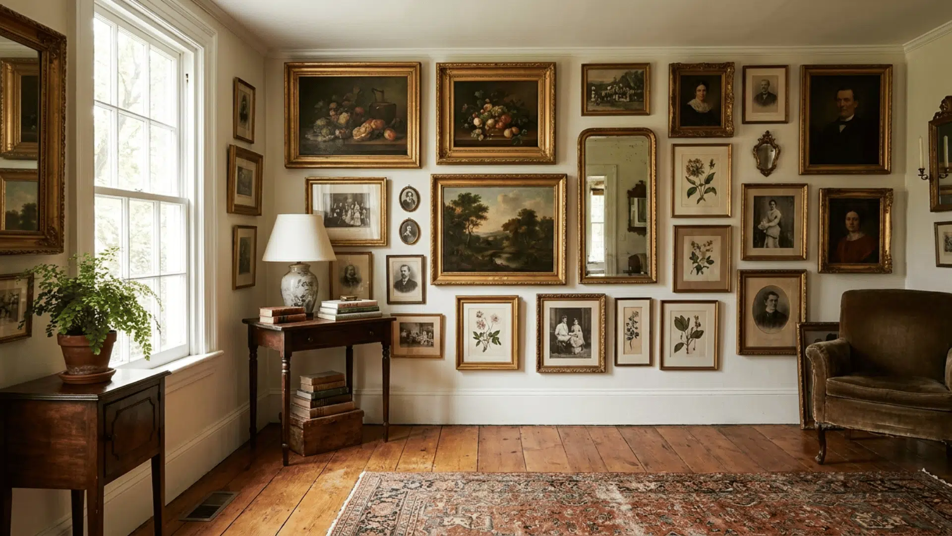
This layout makes a big statement. The salon style covers an entire wall from floor to ceiling with frames arranged closely together, leaving very little empty wall space.
It is the best option when you have a large collection of photos or art and are not sure how to display everything at once. There are no strict spacing rules here. The more varied the frames, the better.
Just keep some visual consistency through color, subject matter, or frame finish to stop it from feeling scattered.
4. The Triptych
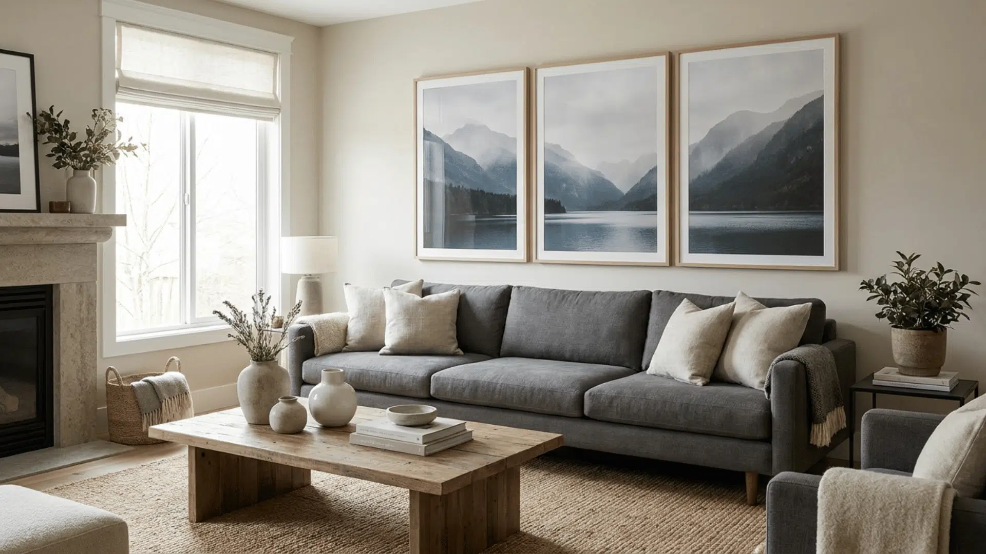
A triptych takes one single image and splits it across two, three, or more frames placed side by side. When hung together, the pieces form one complete picture. It is a great way to create a strong visual moment without needing a large art collection.
This layout works particularly well with landscape or panoramic photos, travel shots, or any image with a lot of horizontal detail.
Floating frames work especially well here since they give the image room to breathe and feel finished.
If you have collected pieces over the years and want to display them all together, the next layout gives you the most room to work with.
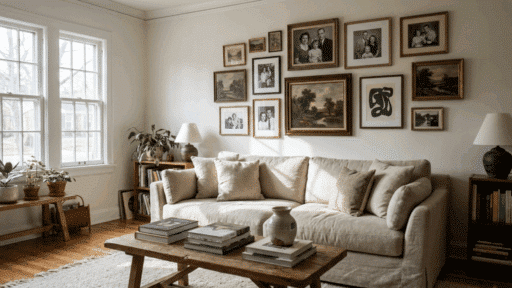
5. The Mismatched Set
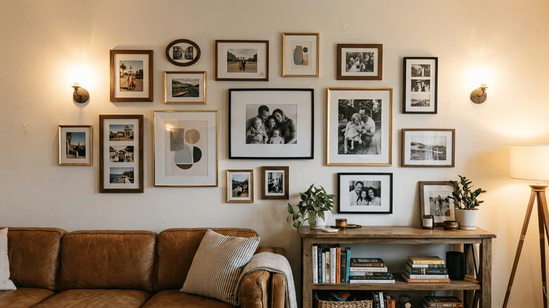
The mismatched layout is one of the most personal options on this list. You combine different frame materials like walnut wood, brass, and black metal, mix up the sizes, and pair photos of people with places or abstract art.
The variety is entirely the point. What keeps it from feeling chaotic is a loose connecting thread, like warm-toned photos across all the frames or a subject that appears throughout the collection.
This layout is a great fit for anyone who has gathered pieces from different places and wants to bring them all together on one wall without forcing them to match.
6. The Closed/Touching Set
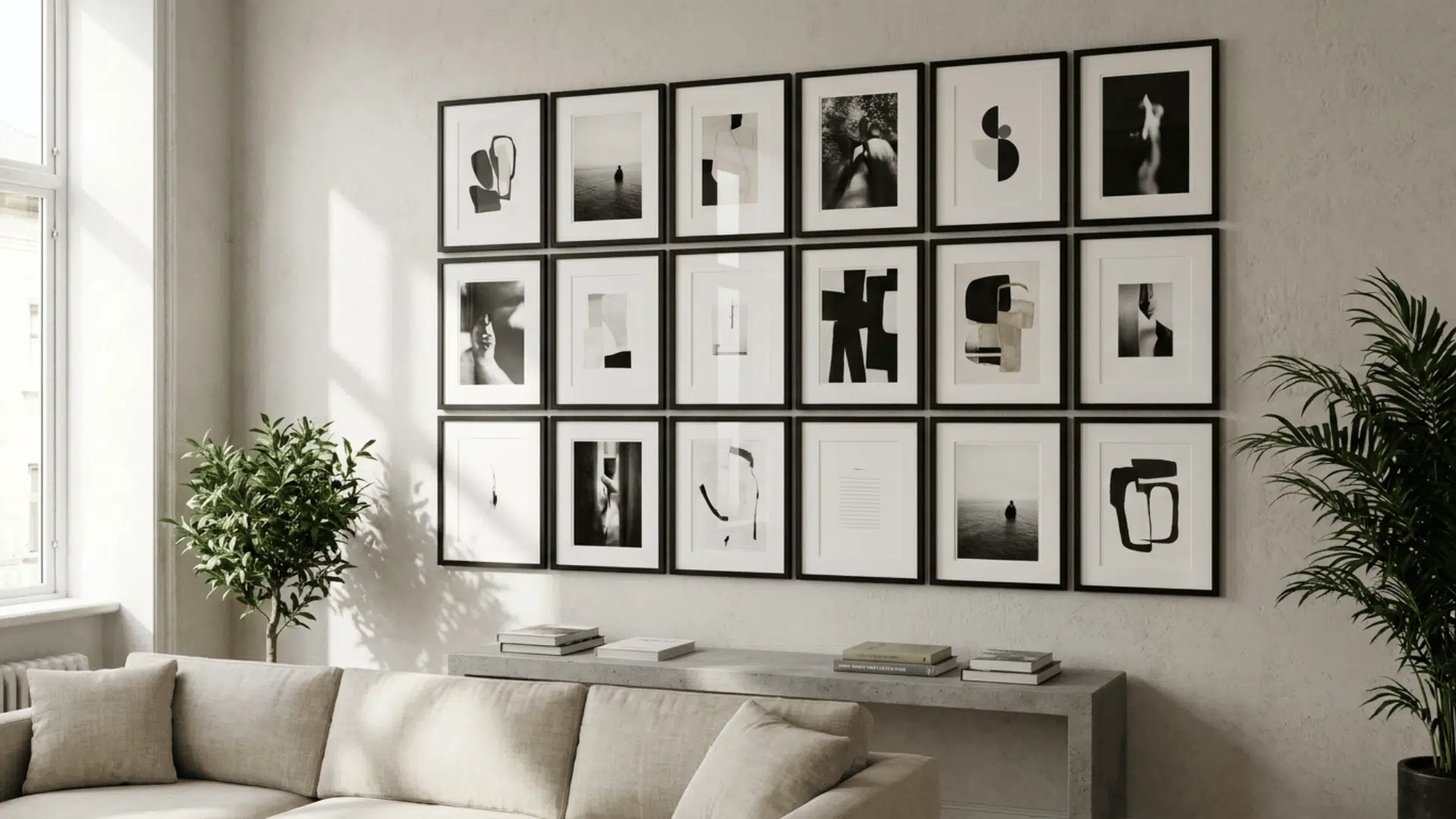
The Closed/Touching Set flips the usual rule of leaving space between frames. Instead, you push frames right up against each other so the edges are touching or nearly touching.
The white mat inside each frame then becomes the breathing room between photos.
It creates a very clean, gallery-like look and suits smaller spaces where you want strong visual impact on a limited wall area. For this to look right, keep all frames in the same finish and choose frames with a wide mat.
7. The Asymmetrical
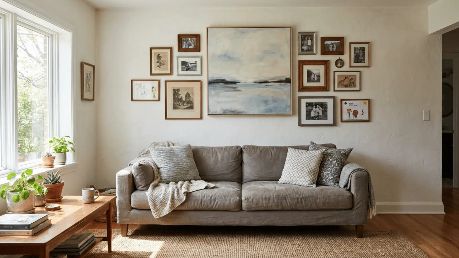
This is the layout for anyone who does not want to measure everything precisely. It is built around one anchor piece, usually your largest or most eye-catching frame, placed slightly off-center on the wall.
Everything else is arranged freely around it with no fixed grid or pattern to follow. This gives you the most creative freedom of any layout on this list.
You can add pieces over time, swap things out, and let the wall grow naturally.
8. Shelf/Ledge Alignment
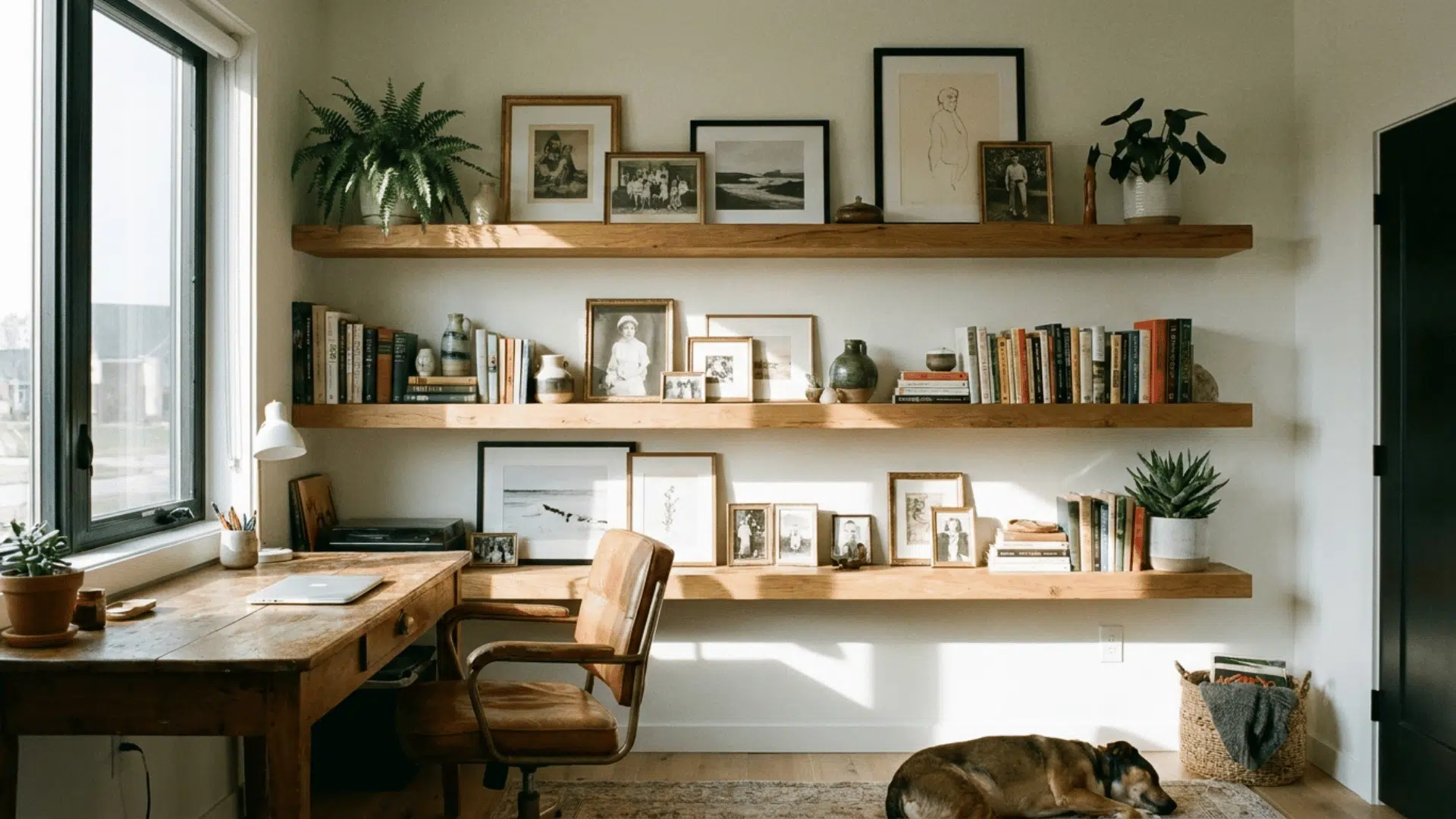
Not every gallery wall needs nails in the wall. With this layout, you install one or more floating shelves and layer frames, prints, and small objects along them.
Because nothing is fixed directly to the wall, you can rearrange, swap out photos, and refresh the look whenever you like without making new holes. This fits spaces where you want flexibility, like a home office, nursery, or bedroom.
It also lets you bring in small plants, books, or decorative objects alongside your frames for a more layered look. Use shelves at different heights to add visual depth and keep things from looking flat.
9. The Suspended/Hanging Look
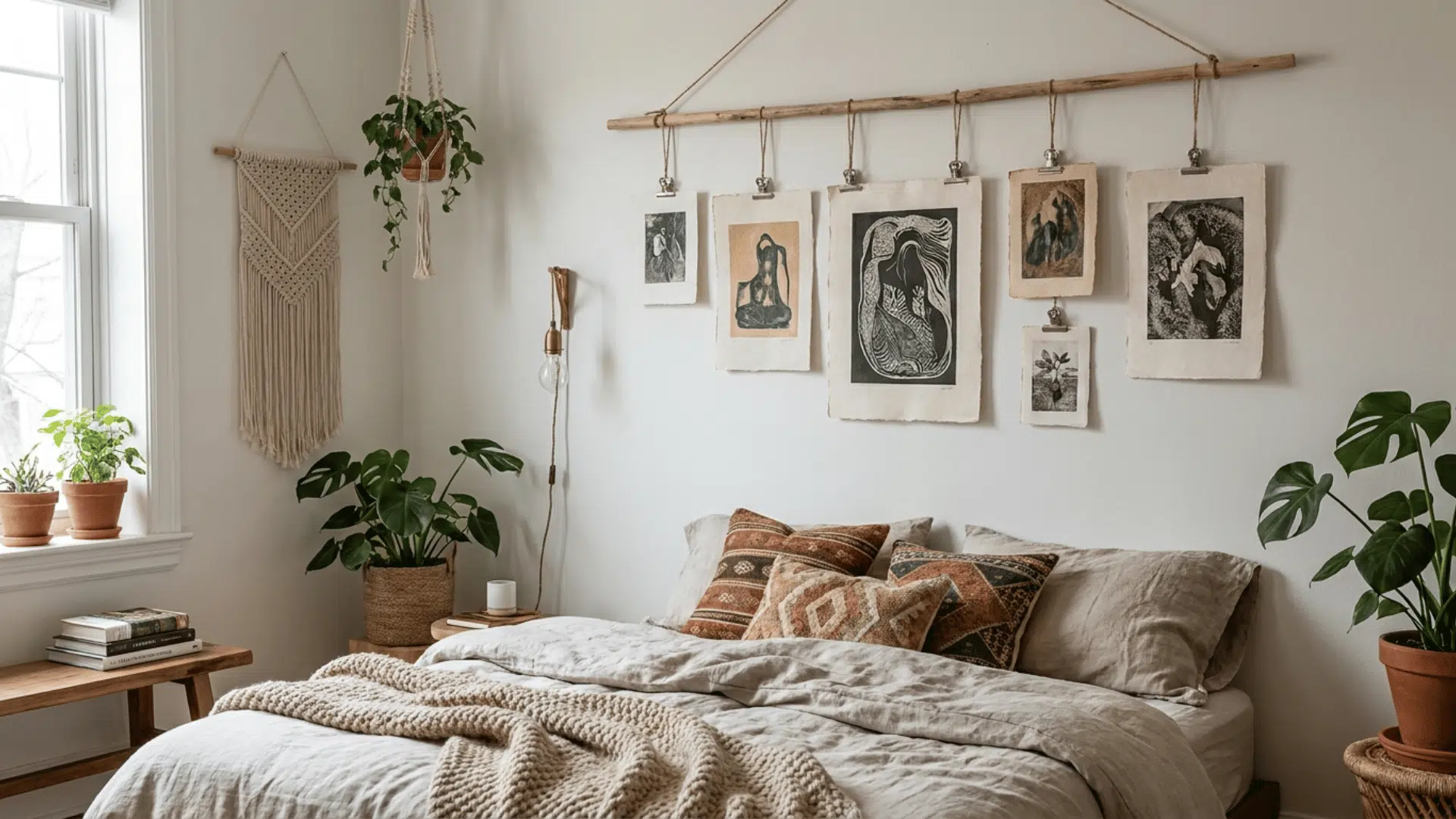
Suspended look skips traditional frames on nails entirely. Instead, you hang prints from a horizontal string, wooden dowel, ladder rungs, or even a string of lights using small clips or clothespins.
The result feels informal, warm, and very easy to update. It works well in bedrooms, kids’ rooms, or any space where you want something personal and low-commitment.
10. The Alternating Symmetrical
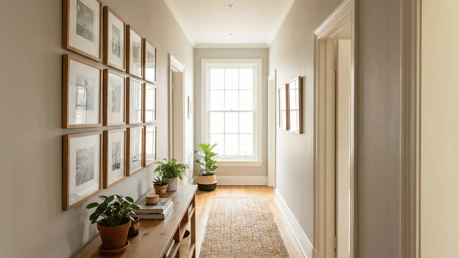
It sits right between structured and relaxed. You arrange frames in two or more columns, alternating between a horizontal frame and a vertical frame as you move down each column.
The tops and bottoms of the columns line up evenly, giving the arrangement a sense of order, while the alternating orientations stop it from feeling too rigid or predictable. It is a good fit for longer walls or in narrow hallways where a straight grid might feel too uniform.
Gallery Wall Styles to Match Your Space
Picking a layout is only half the decision. The style you choose shapes how the finished wall feels inside the room. A grid of black frames reads very differently from a floor-to-ceiling collection of vintage art, even if the basic arrangement is the same.
Each of the five styles below suits a different kind of room and person, so take a moment to find the one that truly fits before you start buying frames.
11. Minimalist
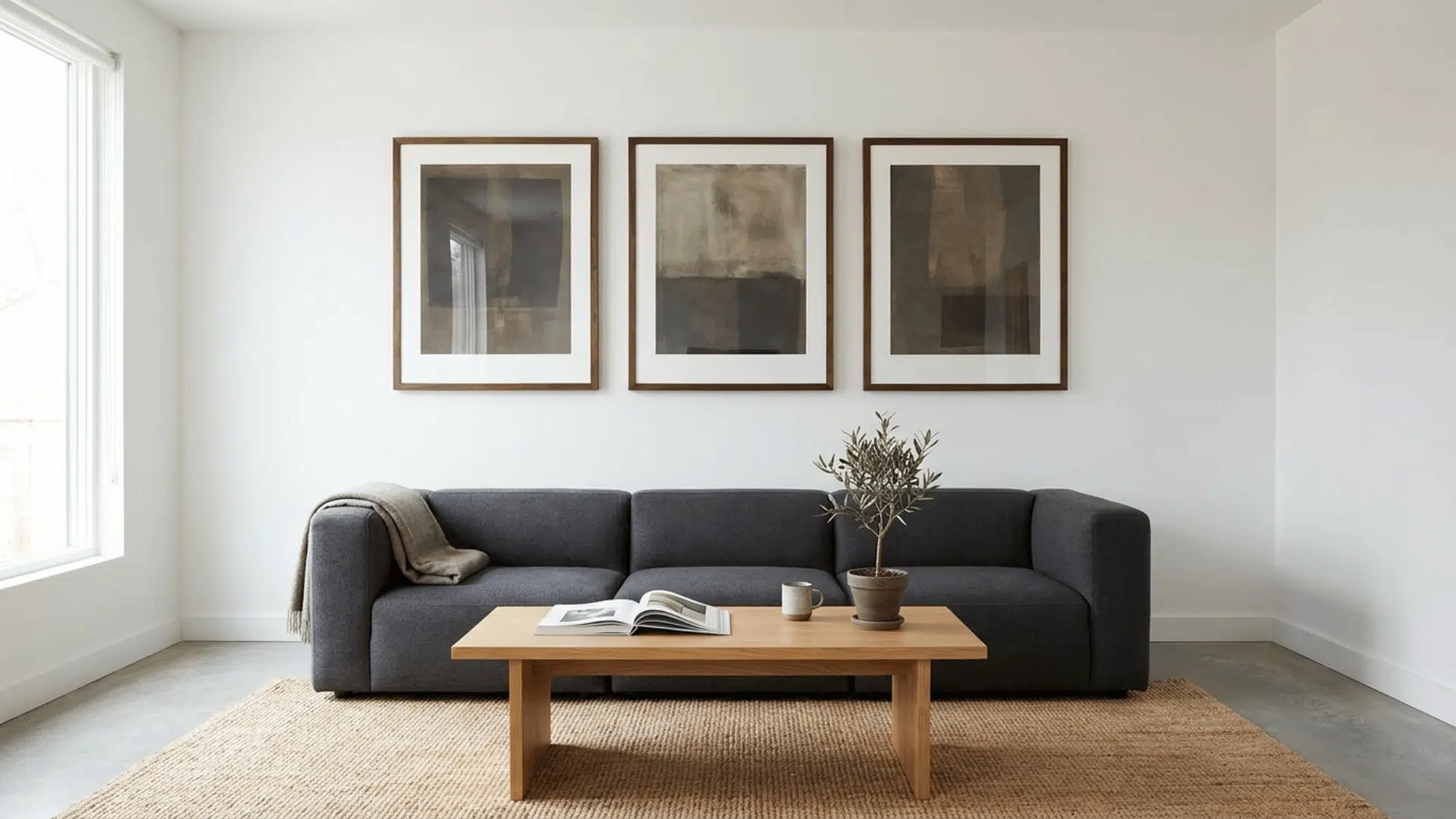
Less is more with this style. Instead of filling an entire wall, you pick one wall as the focal point and keep the arrangement simple: a few well-chosen frames with plenty of open space around them.
This can make just as strong a statement as a wall packed with art, sometimes even more so. It suits rooms that already have a lot going on, bold furniture, strong colors, or heavy textures.
12. Black and White
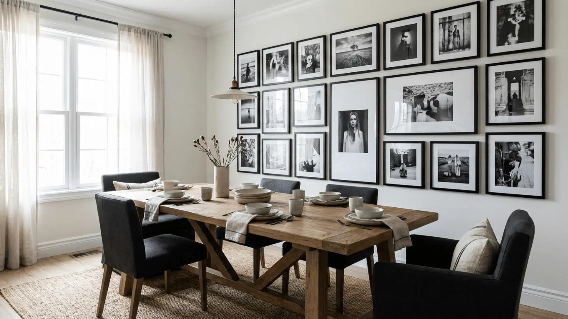
There is a reason black-and-white photography never falls out of favor. This style uses black-and-white photos or art paired with simple frames in black, white, or brass.
The result is clean and considered, and it works in almost any room, regardless of the existing color palette. It is a particularly smart choice for rooms with bold furniture, colorful rugs, or heavy patterns.
The absence of color in the art stops the wall from competing with everything else in the space.
13. The Classic Setting
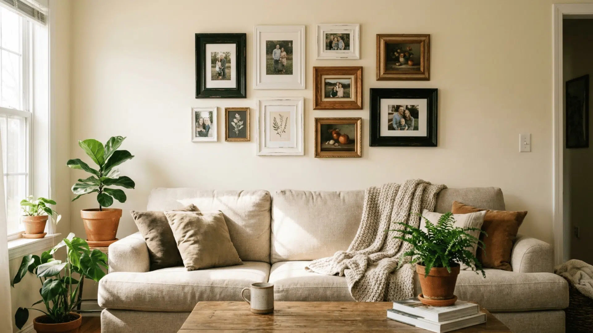
This style is straightforward and reliable. Matching frames, same finish, same size, arranged in a clean symmetrical grid. It is predictable in the best possible way and fits almost any room.
The uniformity makes it easy to plan and hang, and the consistent look lets the photos or art inside the frames do all the talking.
Keep the frame color simple, go with black, white, or a natural wood, and let the content carry the wall.
14. Playful and Eclectic
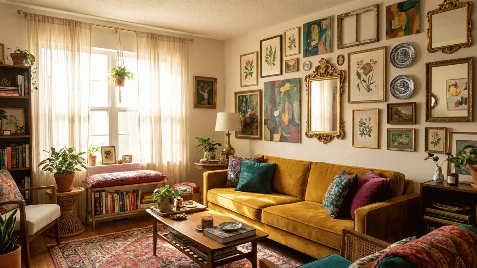
This style has very few rules. You mix framed and unframed prints, add decorative objects like ceramic plates or small mirrors, combine different frame finishes, and let the wall grow and shift over time.
It is the most personal of all five styles and tends to reflect a collection built up naturally over many years rather than purchased all at once.
The key to making it work is finding one loose thread that ties everything together, a color that repeats across several pieces, a general subject like travel or nature, or simply a consistent mood.
Without that thread, eclectic tips quickly turn into clutter.
15. Artistic
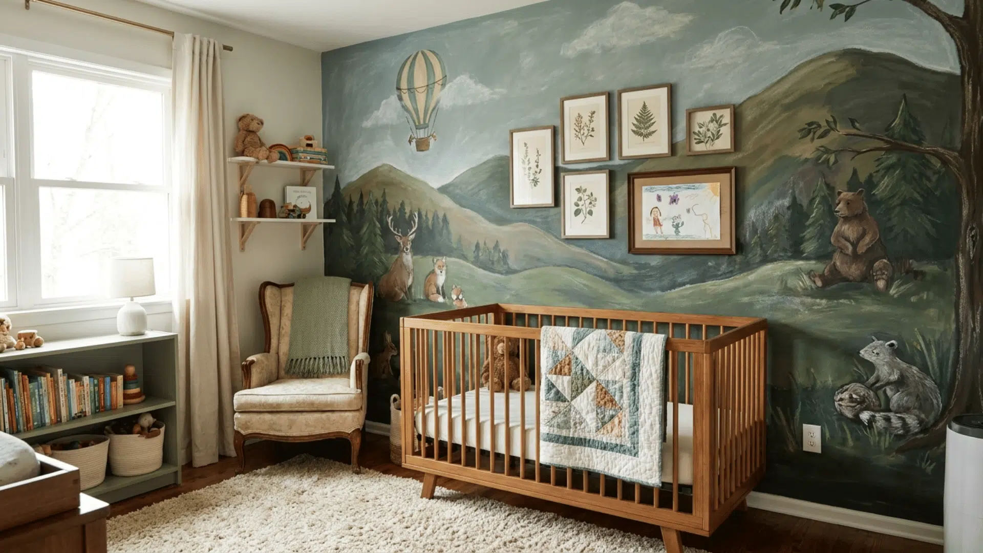
This style goes beyond frames and prints. The idea is to paint or stencil a mural directly onto the wall and use it as a backdrop for a smaller, focused collection of frames.
The wall itself becomes part of the overall composition rather than just a surface to hang things on. It works especially well in nurseries, kids’ rooms, or any space where you want something that feels truly one-of-a-kind.
If freehand painting feels like too much, stencils make the process very manageable. Keep the framed pieces simple so they do not compete with the mural.
Gallery Wall Ideas for Renters
A gallery wall is absolutely possible in a rented home. The assumption that you need to drill holes and leave marks on the walls stops many renters from doing anything with their walls at all, but several approaches work well without causing any damage.
Most of them are just as effective as the traditional nail-and-hammer method, and some are even more flexible because they let you rearrange or update the wall without starting from scratch.
16. Use Adhesive Hanging Strips
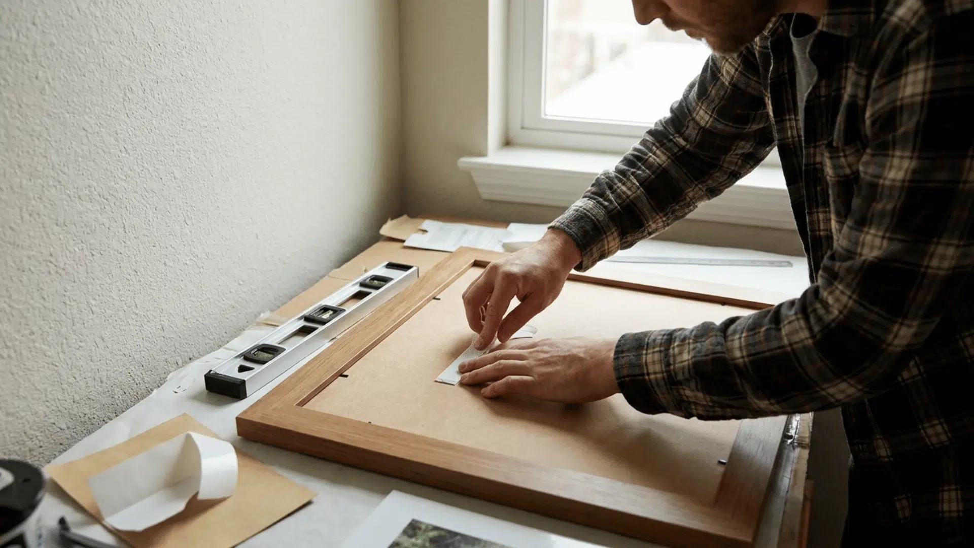
Adhesive picture hanging strips are the most straightforward option for renters. Brands like 3M Command make strips that hold frames securely against the wall and remove cleanly without leaving marks or peeling paint.
They work well for frames up to a certain weight, so check the packaging for the weight limit before using them on heavier pieces. For lighter prints and smaller frames, they are a reliable and damage-free solution.
17. Try Floating Shelves
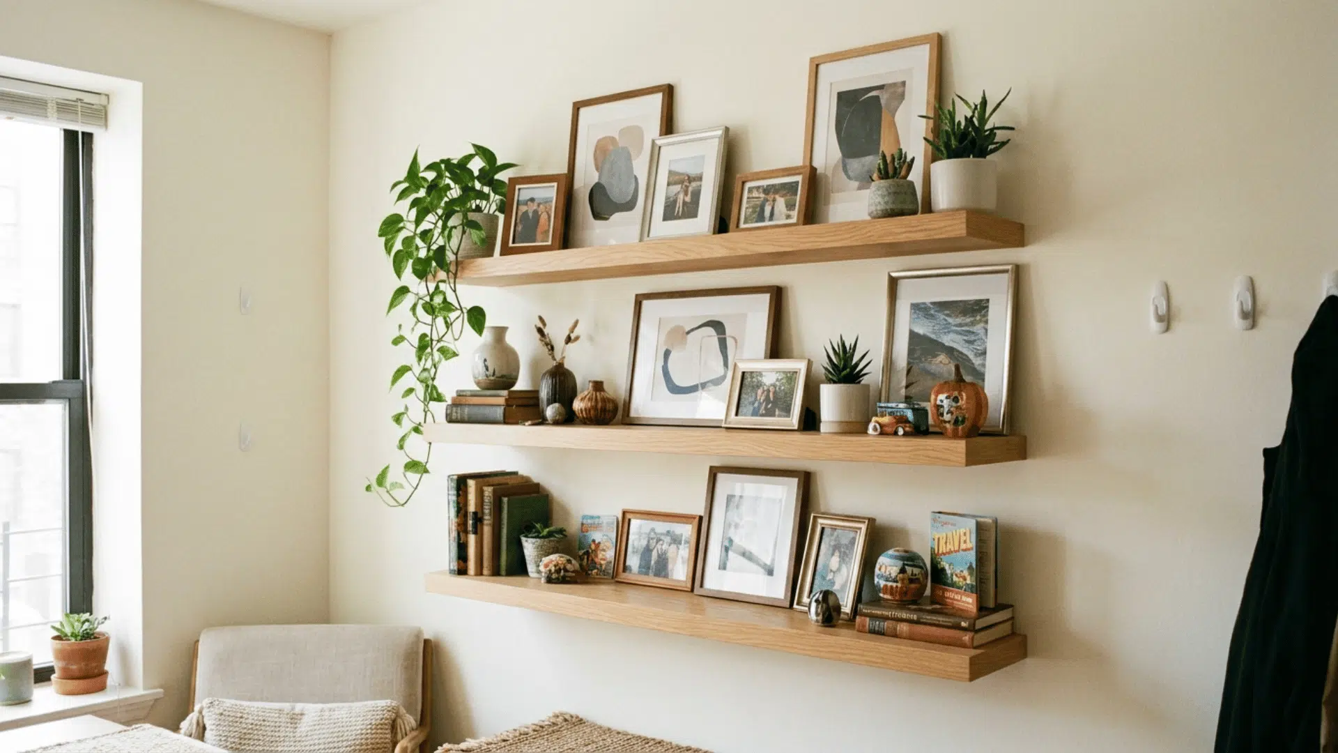
Floating shelves are among the most renter-friendly gallery wall options because they require only a few screws to install and give you complete flexibility in what sits on them.
You can rearrange frames, swap out prints, add small plants or objects, and update the look completely without touching the wall again.
18. The Suspended Look Needs Only Two Hooks
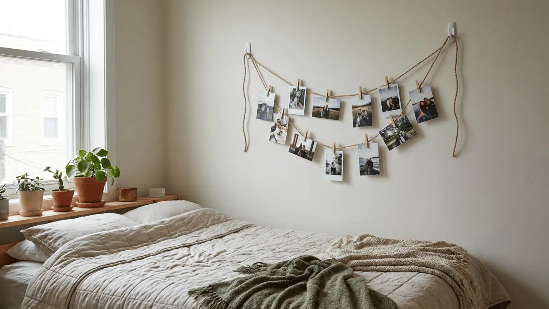
The suspended layout, where prints hang from a string or dowel with clips, requires only two small hooks or nails in the wall. That is far less wall impact than a traditional gallery wall with a dozen or more individual nail points.
It is also one of the easiest arrangements to update. Swapping out prints takes seconds, and the overall look can change completely just by swapping out the photos, without touching the wall at all.
This layout works especially well in bedrooms and kids’ rooms, where the relaxed, informal feel suits the space and where the ability to change things out regularly is useful.
19. Floor-Leaning Arrangements
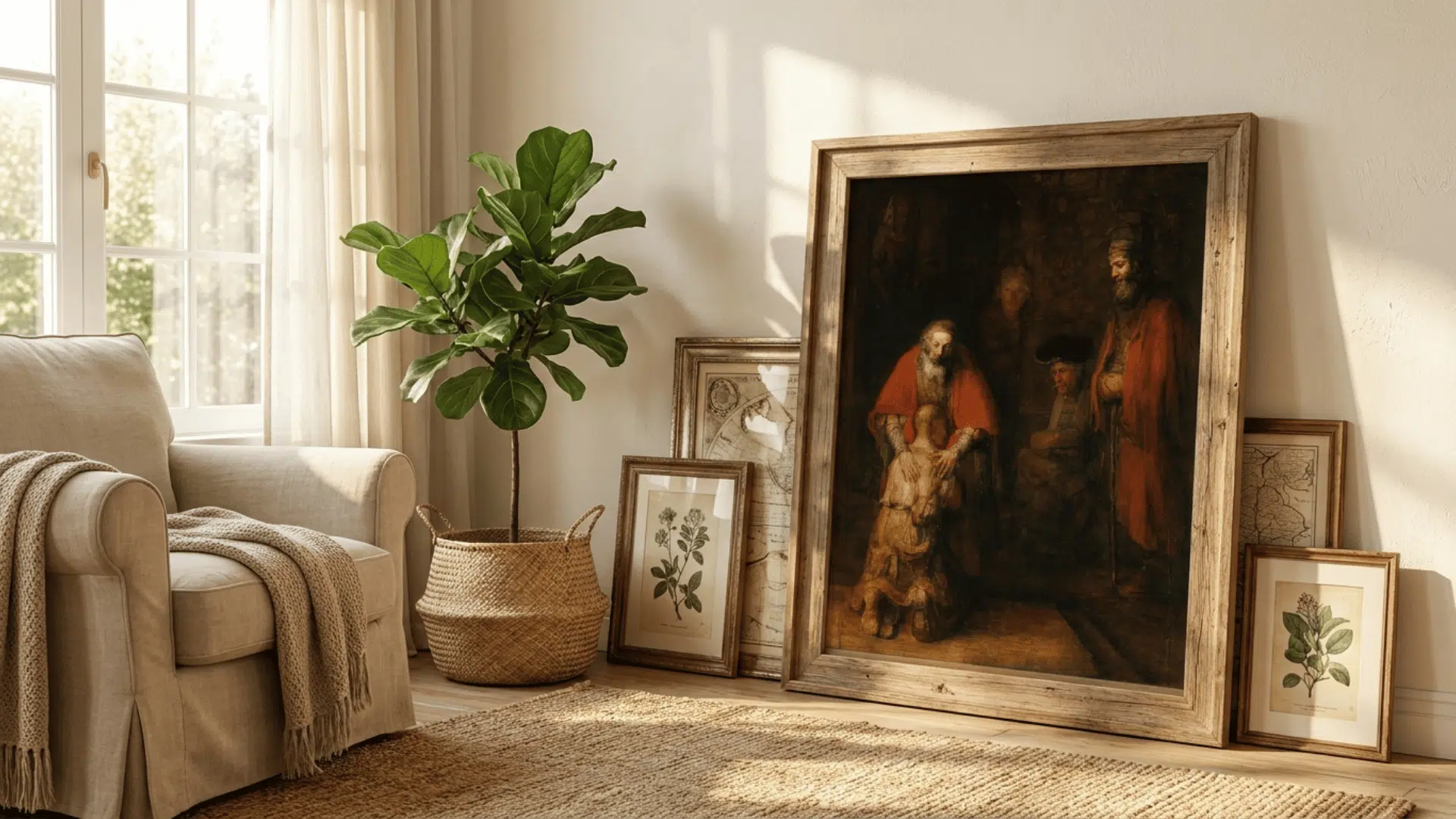
For renters who want zero wall impact, leaning large frames against the wall is a legitimate and widely used approach. A few large frames, leaning against a wall and slightly layered in front of each other, can create a strong visual moment without a single nail.
This works best with larger frames since small frames leaned against a wall tend to look accidental rather than intentional.
Mix a leaning frame or two with a floating shelf above it and a few smaller pieces hung with adhesive strips, and you have a full gallery wall arrangement that causes minimal wall damage and can be packed up and moved with no repairs needed.
To Wrap Up
By now, you have everything you need to get started. You know the layouts, you know the styles, and you have a clear process to follow from the first piece you pull off the shelf to the last nail in the wall.
The most important thing to remember is this: there is no single right way to build a gallery wall. A three-frame grid above a desk is just as valid as a floor-to-ceiling salon arrangement in a living room.
What matters is that the wall reflects your space and feels like it belongs there.
Start small if you need to. Pick one layout, gather what you already own, and go from there. Most people are surprised by how much they already have to work with.
Now it is your turn. Pick your layout and start planning your wall today.
Frequently Asked Questions
How Many Frames do I Need for a Gallery Wall?
There is no fixed number. A small wall works well with 5-7 pieces. A larger wall can comfortably hold 10 to 20 pieces.
How High Should I Hang a Gallery Wall?
Center your arrangement at eye level, around 57 to 60 inches from the floor. This is the standard used in most professional gallery spaces.
How do I Hang a Gallery Wall Without Damaging Walls?
Use adhesive hanging strips for lighter frames, floating shelves for flexibility, or a suspended string layout that only needs two small hooks.
How do I Make My Gallery Wall Look Cohesive?
Stick to a consistent color palette across your art and limit your frame styles to three. A shared tone or subject also helps tie varied pieces together.

With a Master in Architectural Studies from University of Pennysylvania, Marwa Haydar has pioneered living spaces since 2005. Her expertise, initially honed in a prestigious architectural firm, is evident in her approach to creating environments. Marwa became part of our team in 2019 and has since been a driving force in our home improvement section, known for her practical yet stylish solutions. She’s been spearheading our design workshops since then, infusing her passion for teaching into her work. In her leisure time, Marwa enjoys exploring historic architecture and is an enthusiastic pottery hobbyist, further enriching her understanding of form and texture.