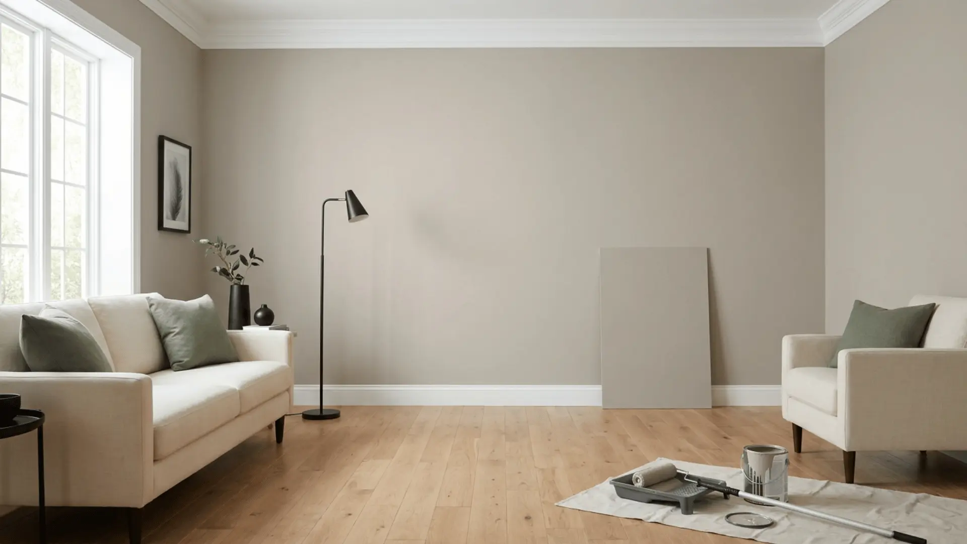

A paint chip can look balanced in a store, then appear much warmer once it reaches a wall. That matters with Popular Gray Sherwin-Williams, since the name may suggest a cleaner gray than the color often shows at home.
Popular Gray SW 6071 is a light warm greige with an official clay undertone and an LRV of 61. It can appear beige, taupe, pink, or slightly violet depending on lighting and nearby finishes.
I reviewed the official Sherwin-Williams color details, listed pairings, sample options, and the room conditions that can affect a warm neutral. The goal is to help you judge SW 6071 before buying paint or hiring someone to apply it.
This review covers the color values, greige character, undertones, lighting changes, LRV, indoor and outdoor uses, coordinating shades, close alternatives, homeowner feedback, and sample choices.
You will also learn how to test the color against the permanent finishes in your home.
Popular Gray SW 6071 Color Details
Official color values offer a useful starting point, but they cannot show exactly how the paint will look in a specific room. Sherwin-Williams recommends checking a physical sample because screens may display colors differently.
| Color Detail | Popular Gray SW 6071 |
|---|---|
| Brand | Sherwin-Williams |
| Official name | Popular Gray |
| Color number | SW 6071 |
| Color family | Neutral |
| General appearance | Light warm greige |
| Official undertone | Clay |
| Possible shifts | Taupe, pink, or muted violet |
| LRV | 61 |
| RGB | 212, 204, 195 |
| Hex code | #D4CCC3 |
| Suitable uses | Interior and exterior |
| Official pairings | Heron Plume, Spalding Gray, and Exclusive Plum |
| Sample formats | Color chip, peel-and-stick sample, and tinted sample paint |
Sherwin-Williams describes Popular Gray as a light gray warmed by a clay undertone. Its official values place it in the lighter neutral range, though the warm base gives it more color than a basic off-white.
Is Popular Gray Actually Gray or Greige?
Popular Gray usually reads as a warm greige rather than a plain gray. Its gray base is softened by clay and beige, which can make the finished surface appear closer to light taupe.
Cool light may bring forward more gray, while warm light can make the shade seem softer and more beige. Nearby flooring, wood, stone, carpet, and trim can also affect the result.
SW 6071 is a better fit for someone seeking a light warm neutral than someone seeking a crisp cool gray.
The name “Popular Gray” describes the product line, not the finished wall. Paint names are marketing labels. They do not account for window direction, bulb temperature, or nearby materials, so treat the name as a starting point rather than a guarantee.
What Undertones does Popular Gray Have?
Sherwin-Williams identifies clay as the main undertone in Popular Gray. Other subtle tones may become visible based on lighting and surrounding finishes.
The points below explain the main color influences:
- Clay undertone: Clay gives SW 6071 its soft warmth and keeps it from looking icy or blue.
- Taupe influence: Beige carpet, brown flooring, cream furniture, and warm stone may make the paint appear more taupe.
- Soft pink shift: Cool white trim, red-toned wood, blue-gray flooring, or pink-beige counters may bring out a faint pink cast.
- Muted violet shift: Cool daylight or cool bulbs may reveal a quiet violet tone, mainly in shaded areas.
- Reflected color: Large rugs, curtains, cabinets, and furniture can reflect color onto the wall and change how the paint is seen.
- Paint finish: Satin and semi-gloss reflect more light than flat paint, which can make subtle undertones easier to notice.
These shifts will not appear at the same strength in every home. The complete room setting controls which part of the color becomes most visible.
How Popular Gray SW 6071 Looks in Different Lighting
Light direction changes the balance between gray, beige, clay, and violet. The descriptions below explain the most likely result in each setting.
1. North-Facing Rooms
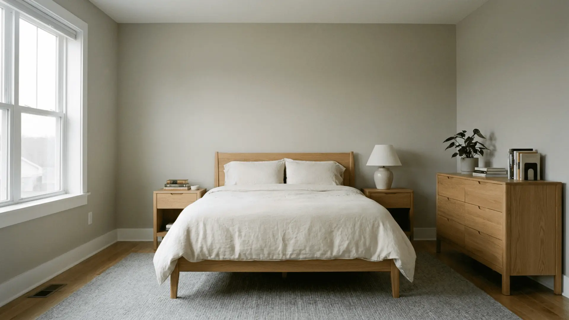
North-facing rooms usually receive cool, indirect daylight. Popular Gray may look grayer, slightly deeper, or more violet in these spaces.
Cream textiles, warm flooring, and light wood may balance the cooler exposure. Blue-gray carpet or sharp white trim may make the cooler side easier to see.
This setting may work for homeowners who do not mind a softer taupe-gray result. In rooms with heavy shade, the color may feel less warm than expected.
2. South-Facing Rooms
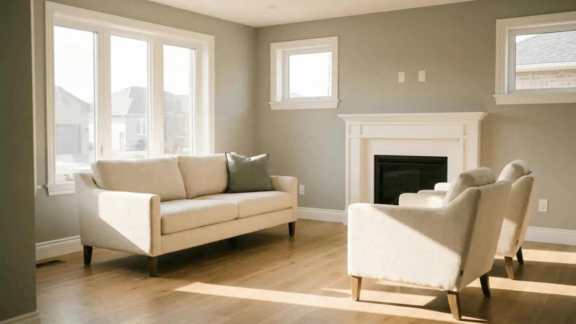
South-facing rooms receive warm and often strong natural light. SW 6071 may appear lighter, softer, and more beige in this exposure.
Direct sun can reduce some of the color’s visible depth near windows, while interior walls may retain more clay and taupe character. Warm wood, cream upholstery, and natural stone often support the result.
Strong yellow finishes may make the full space feel too warm, so the surrounding palette still matters.
3. East-Facing Rooms
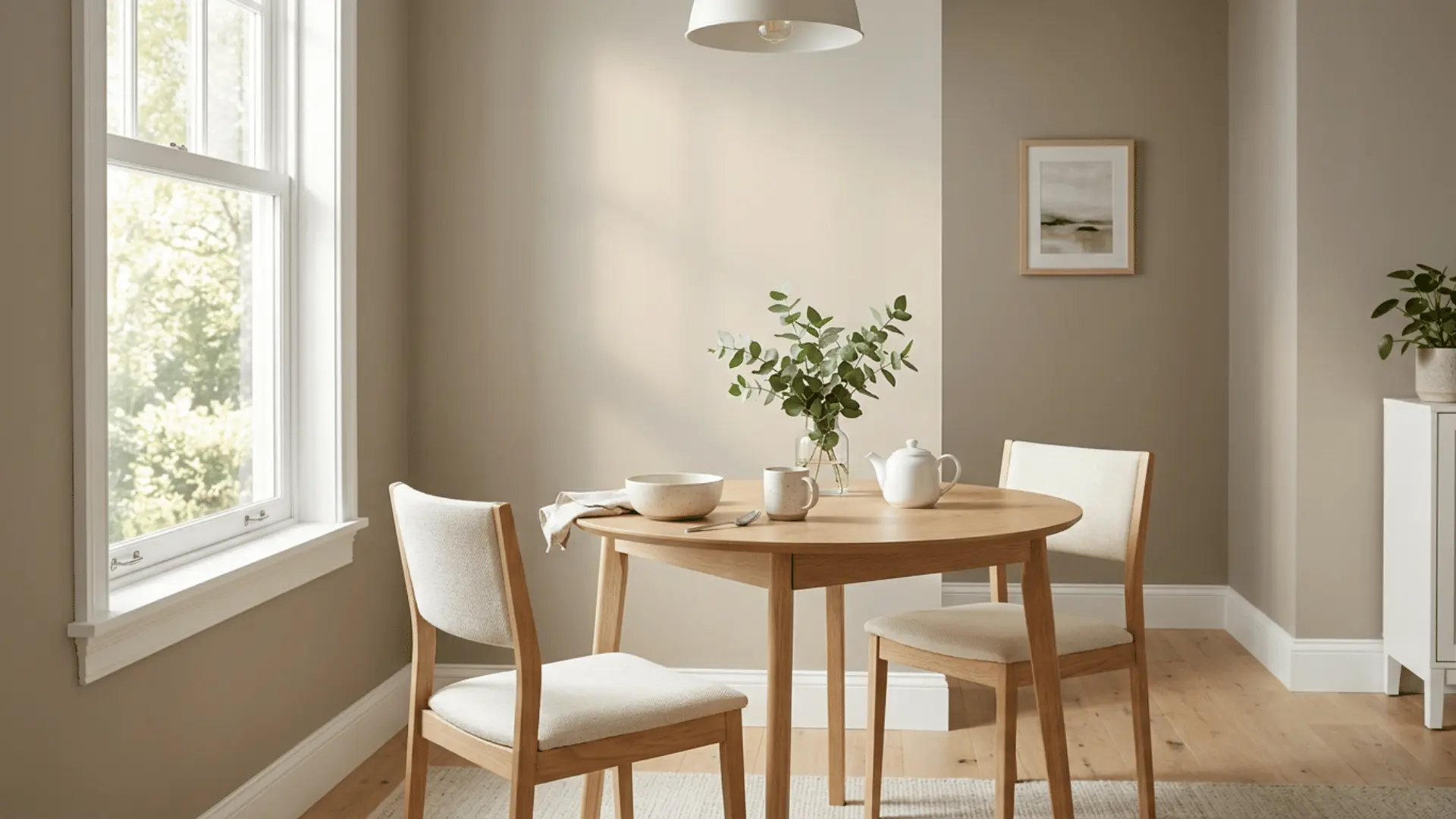
East-facing rooms receive warm morning light and cooler light later in the day. Popular Gray may appear beige or clay-based early, then shift toward gray or taupe after noon.
This daily change matters in kitchens, bedrooms, and offices used across several hours. The shade may feel soft during the morning and more reserved by late afternoon.
A suitable result should remain comfortable through both parts of the day, even though the exact tone changes.
4. West-Facing Rooms
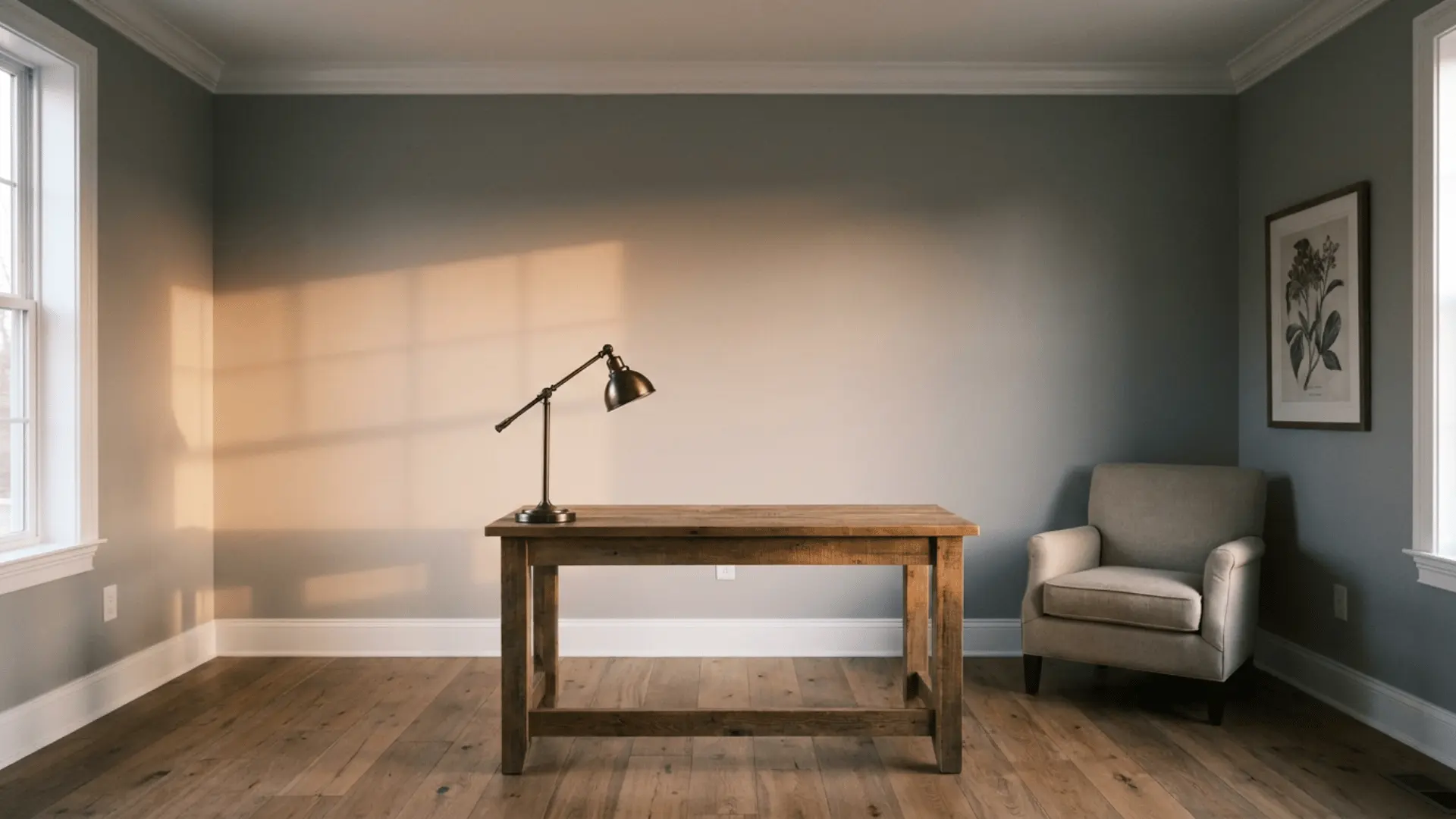
West-facing rooms often begin with cooler light and become much warmer later in the day. Late-afternoon sun may strengthen the beige, clay, or pink side of Popular Gray.
This effect can work well with bronze hardware, brown flooring, warm wood, and cream fabrics. Cool gray tile or blue-based counters may create a stronger contrast.
The warmest color shift is likely to appear during the late afternoon, especially on walls that receive direct sun.
5. Rooms With Limited Daylight
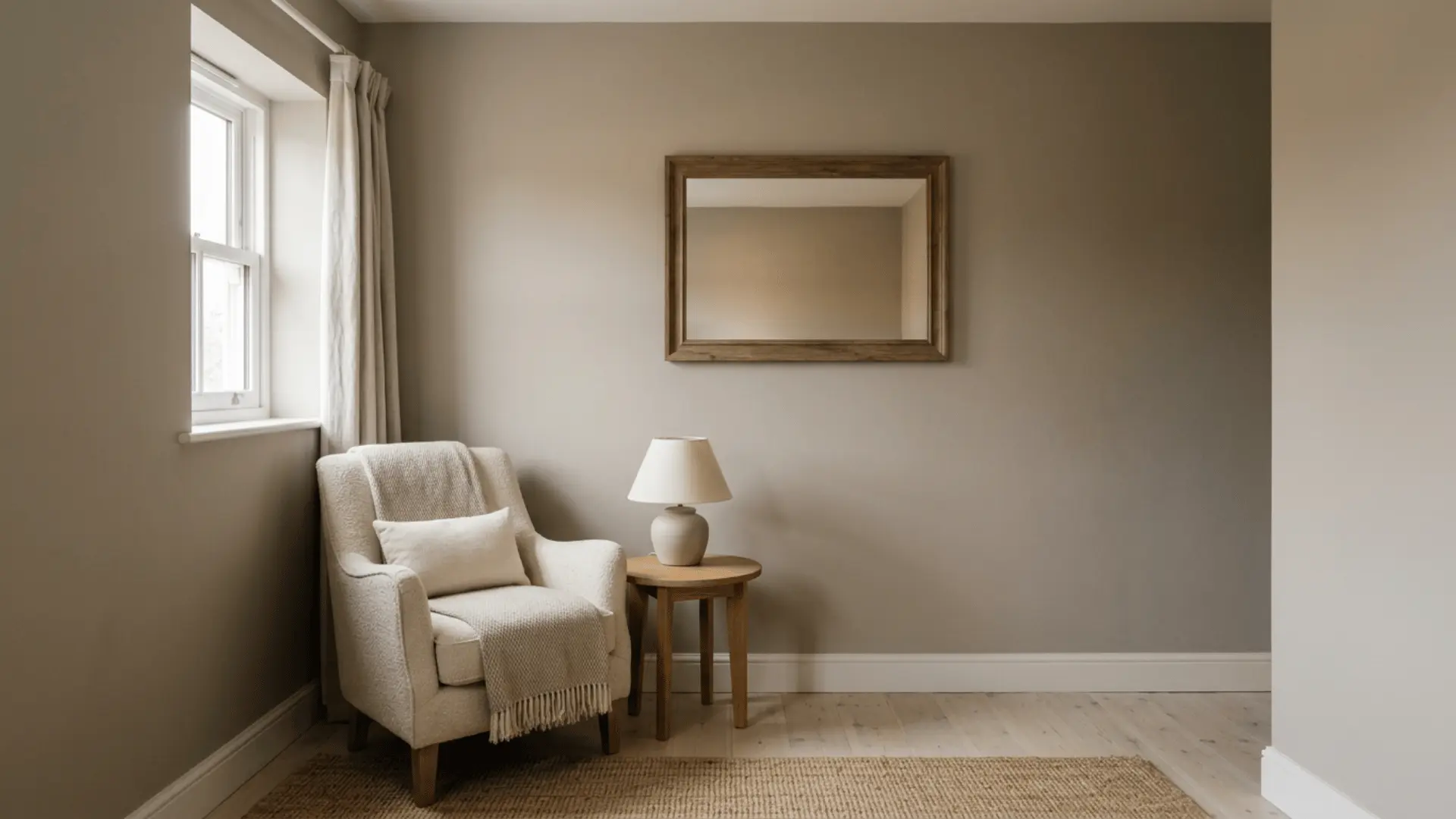
In rooms with small windows or heavy outdoor shade, Popular Gray may look deeper and more taupe. It may also feel flatter because less natural light moves across the walls.
Dark floors and large furniture can make the room feel heavier. Light fabrics, pale flooring, mirrors, and balanced lamps may help the space feel more open.
A lighter neutral may be a safer choice when the room is already dark, and the goal is maximum brightness.
6. Artificial Lighting
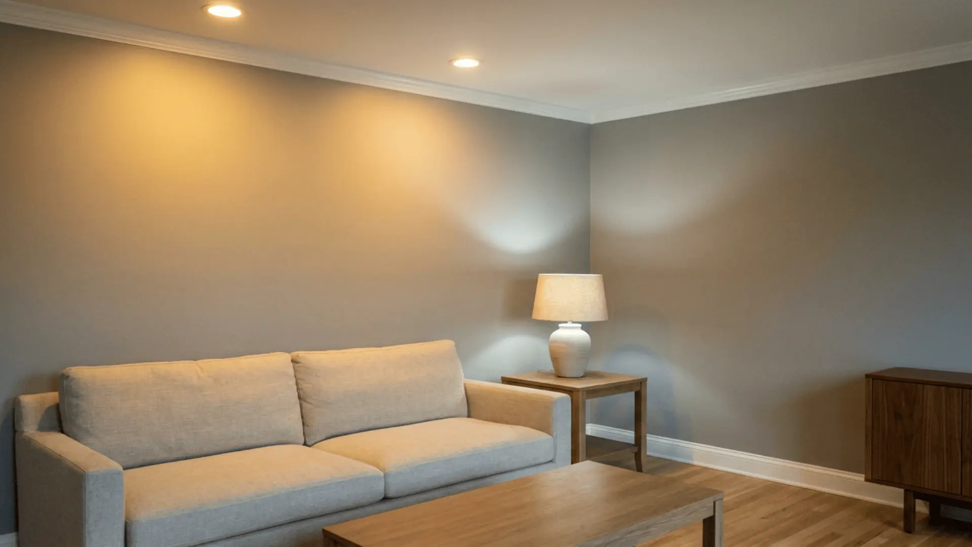
Bulb temperature changes how SW 6071 appears after sunset. Warm-white bulbs may strengthen beige and clay tones, while cool-white bulbs may bring forward gray or muted violet.
Neutral-white bulbs often show a more balanced result. Fixture type also matters because ceiling lights, wall lights, and shaded lamps spread light differently.
Bulbs with weak color rendering may make paint and furnishings look dull, so the final room lighting should be considered before the color is approved.
When to Avoid Popular Gray Sherwin-Williams
Popular Gray is not the right choice in every room. Skip it if any of the following apply to your space.
- You Want a True Cool Gray: The clay undertone will pull the color toward warm territory no matter the lighting.
- Your Room Faces West with Strong Afternoon Sun: That light pulls the pink and violet undertones forward more than any other exposure.
- You Already Have Cream Trim or Cream Cabinets Nearby: The yellow in cream can make Popular Gray look dull or slightly dirty by comparison.
- You are Pairing it with Green Accents: Green tends to clash with the clay base rather than complement it.
- You Dislike Any Hint of Pink or Purple in a Wall Color: in cool, shaded rooms, Popular Gray can show a faint violet cast that will not disappear with a different bulb.
None of these rule out Popular Gray outright. They are the conditions where a large sample matters most before you commit to a full room.
Popular Gray LRV and What it Means
Light Reflectance Value, or LRV, shows how much visible light a paint color reflects. The scale runs from 0 to 100, with lower numbers appearing darker and higher numbers reflecting more light.
Popular Gray has an LRV of 61, placing it in the light neutral range.
| Factor | What it Means for Popular Gray |
|---|---|
| Overall depth | It looks lighter than many greiges but has more color than an off-white. |
| White trim | Most whites create visible contrast, though the undertone of the white affects the result. |
| Bright spaces | Strong daylight may make the paint look paler and less saturated. |
| Dark spaces | Low light may make it appear deeper and more taupe. |
| Large walls | Full walls may seem lighter than a small paint chip. |
| Main limit | LRV measures brightness only and does not identify undertones. |
An LRV of 61 makes SW 6071 suitable for many well-lit rooms, but the number alone cannot predict how bright or warm the finished space will feel.
Popular Gray Sherwin-Williams Interior and Exterior Review
Popular Gray can be used on interior walls, cabinets, built-ins, and siding. Each surface changes how the color reads because of shadows, texture, sheen, and scale.
1. Popular Gray on Interior Walls
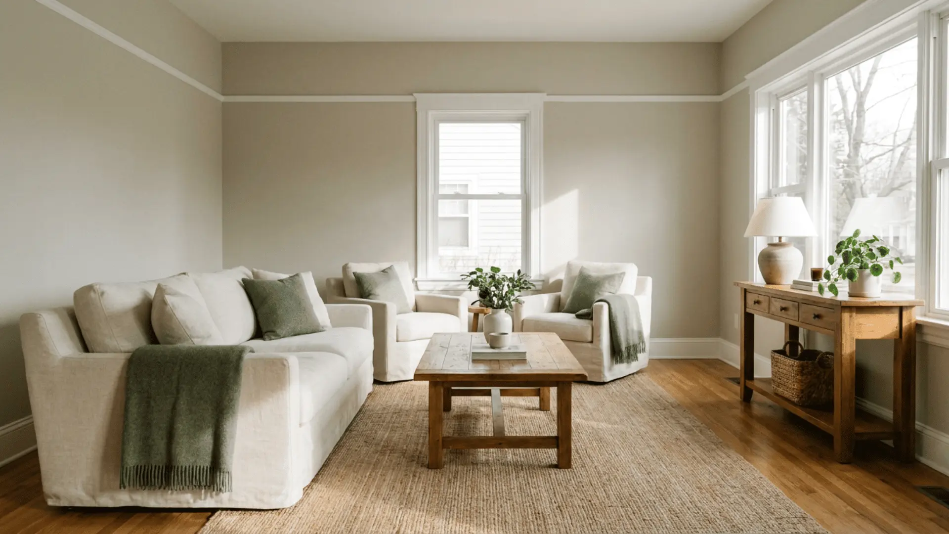
SW 6071 works best in rooms that already contain warm or mixed-neutral finishes. Its light depth helps it stand apart from white trim without making a well-lit room feel dark.
The following uses show where it may fit:
- Living rooms: Warm wood, cream seating, charcoal accents, muted green fabrics, and natural fibers often relate well to its clay base.
- Bedrooms: The color adds more warmth than a basic gray while staying lighter than many taupes.
- Kitchens: It can work on walls when the cabinets, counters, backsplash, flooring, and appliances share compatible undertones.
- Bathrooms: Cool tile, white fixtures, and strong LED light may make the color feel cooler than it does elsewhere.
2. Popular Gray on Cabinets and Built-Ins
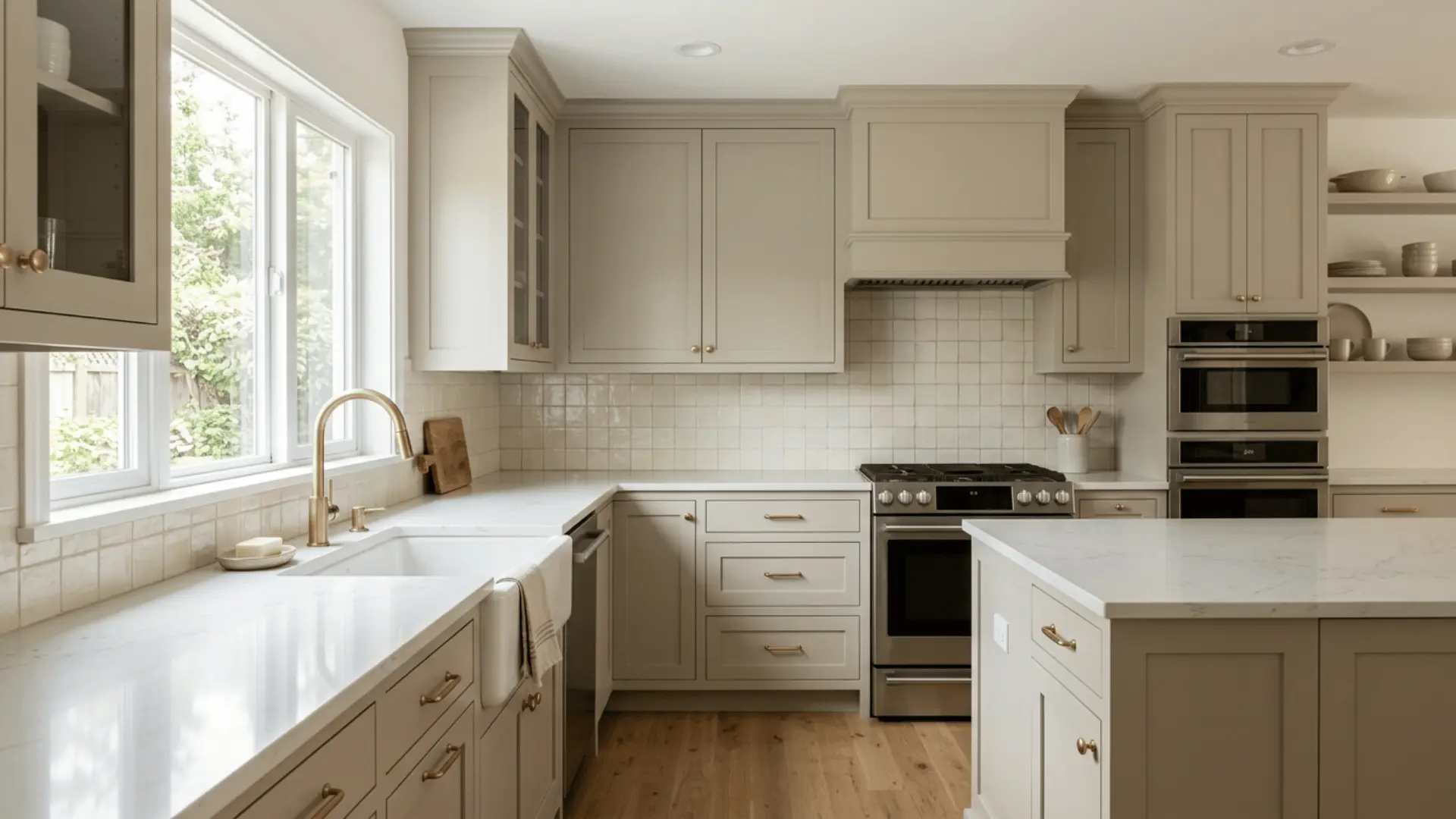
Cabinet doors include panels, corners, and shadows so that Popular Gray may look deeper on cabinets than on flat walls.
These details are especially important:
- Paint sheen: Satin and semi-gloss may make the shade look cleaner and slightly brighter.
- Countertops: Quartz, granite, and marble should share a compatible base tone and veining color.
- Backsplash tile: Cool white, cream, blue-gray, and pink-beige tiles may each affect the cabinet color differently.
- Hardware: Brass, bronze, and black often support the warm base, while chrome and nickel create a cooler contrast.
- Wall color: A cool wall white may make the cabinets look warmer by comparison.
3. Popular Gray on Exterior Siding
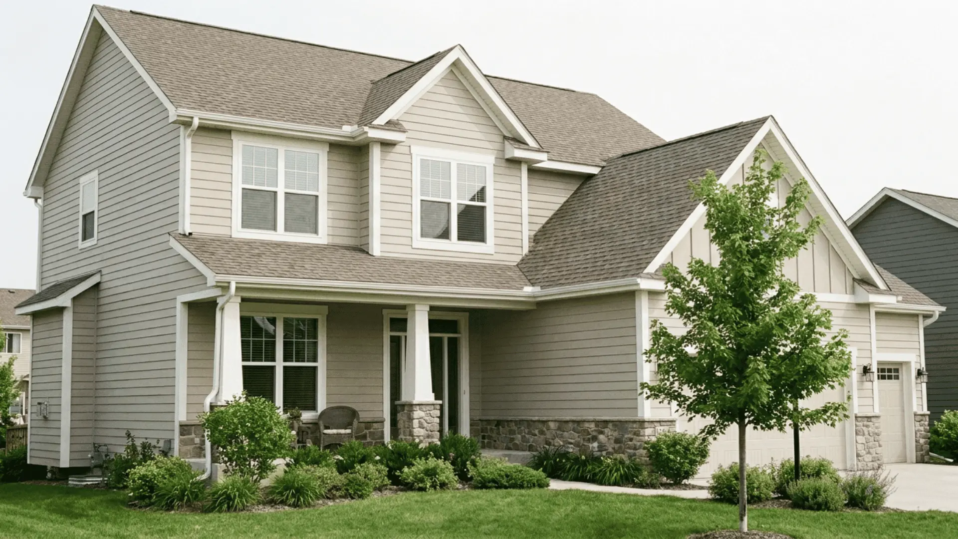
Outdoor daylight usually makes SW 6071 appear lighter than it does indoors. Siding texture, roof color, trees, masonry, and home direction all affect the result.
Key exterior factors include:
- Siding material: Lap siding, stucco, fiber cement, shakes, and painted brick create different shadow patterns.
- Roof color: Brown, charcoal, red, and black roofing may each change how warm the body paint appears.
- Brick and stone: Warm brown and taupe masonry may relate well to the clay base, while cool gray stone needs closer comparison.
- Home direction: North-facing walls may stay cooler, while south- and west-facing walls may appear warmer.
- Landscaping: Trees can add shade and reflect green onto the siding.
What Colors Coordinate With Popular Gray?
Popular Gray works best with shades that relate to its clay and taupe base. Sherwin-Williams lists Heron Plume SW 6070, Spalding Gray SW 6074, and Exclusive Plum SW 6263 as official coordinating colors.
Heron Plume provides a lighter related neutral, while Spalding Gray adds deeper contrast. Exclusive Plum connects with the subtle violet quality that may appear in SW 6071.
Pure White SW 7005 can provide a clean trim border without feeling extremely sharp. Alabaster SW 7008 creates a creamier effect, while a brighter white may make Popular Gray’s warm side more obvious.
Muted green, navy, charcoal, warm brown, dusty blue, terracotta, and soft plum can also work. Cool blue-gray, yellow cream, and pink-beige finishes require more care because they may compete with the base color.
Popular Gray Compared with Similar Sherwin-Williams Colors
Close paint colors may seem almost identical on small cards. A side-by-side comparison makes differences in depth, warmth, and undertone easier to judge.
| Paint Color | Difference From Popular Gray |
|---|---|
| Agreeable Gray SW 7029 | Often reads as a more balanced mix of beige and gray |
| Repose Gray SW 7015 | Usually appears cooler and closer to a standard gray |
| Worldly Gray SW 7043 | Has a more earthy greige character |
| Versatile Gray SW 6072 | Sits deeper and shows more taupe |
| Perfect Greige SW 6073 | Has much more depth and stronger brown-gray character |
| Alpaca SW 7022 | May show a clearer violet-taupe cast |
| Heron Plume SW 6070 | Offers a lighter related neutral |
Homeowners who want a neutral with a more noticeable green influence may also consider Escape Gray. It has a calmer green-gray appearance, while Popular Gray leans warmer because of its clay and taupe qualities.
Popular Gray Reviews: What Homeowners Commonly Notice

A Reddit discussion about Popular Gray SW 6071 shows how strongly room conditions can affect the finished result. The homeowner felt the shade might be too light, but several users focused more on the room’s low natural light and the mix of fixed finishes.
One commenter advised against moving to a darker gray because the space appeared to receive limited daylight. Another user felt the paint looked purple and cool rather than like a warm gray.
Other users suggested choosing a shade that connects the vanity, floor tile, shower tile, countertop, and dark wood instead of adding another unrelated tone.
The discussion shows that Popular Gray may not match the name in every room. In a dim space with several competing materials, it can look cooler and less balanced than expected.
How to Sample Popular Gray Before Buying
Physical sampling gives a more reliable result than online images or store lighting. Sherwin-Williams offers small chips, larger peel-and-stick samples, and tinted sample paint, though availability and pricing may change.
Use this process before buying the full amount:
- Start with a Small Chip: Hold it beside flooring, counters, cabinets, tile, stone, brick, and trim to rule out clear conflicts.
- Use a Larger Sample: Move a peel-and-stick sheet between walls with different exposures.
- Paint a Sample Board in The Planned Sheen: Apply the planned primer and two finish coats to a large white board using the same finish intended for the final surface.
- Keep a White Edge: A plain border helps separate the sample from the current wall color.
- Check Several Locations and Times: Move the board near windows, corners, doorways, cabinets, and major furniture. Review it in the morning, midday, evening, and after sunset.
- Use the Final Bulbs: Turn on the fixtures that will remain in the room.
- Treat Interiors and Exteriors Separately: A successful indoor sample does not predict the outdoor result.
Popular Gray samples may be ordered through Sherwin-Williams or purchased from participating stores, though formats, pricing, and availability may vary by location.
Popular Gray SW 6071 Pros and Cons
Popular Gray offers a light, warm greige look, but its clay undertone may shift depending on the room. Review these advantages and drawbacks before choosing it for your home.
| Pros | Cons |
|---|---|
| Light enough for many living spaces | May show pink or violet undertones |
| Works well with warm wood and cream finishes | Can appear taupe in rooms with limited light |
| Adds more warmth than a standard gray | May conflict with cool tile or blue-gray flooring |
| Suitable for interior and exterior surfaces | The name may create the expectation of a cooler gray |
Popular Gray is a practical choice for warm, neutral spaces, but a large sample should be tested before buying the full amount.
Final Verdict: Is Popular Gray a Good Choice?
Popular Gray can work well in a home that needs a light, warm neutral with more depth than off-white. It often suits natural wood, cream textiles, warm stone, brown finishes, and soft earth tones.
It is less suitable for someone seeking a crisp cool gray. The clay base may appear more taupe, pink, or violet depending on the room, so the final result should be judged in the actual space.
SW 6071 is most useful when its warm greige character connects with the permanent materials already in the home. A large physical sample is the safest way to confirm that match before buying paint.
Have you used Popular Gray at home? Share the room, lighting conditions, and final result in the comments below.
Frequently Asked Questions
Is Popular Gray Too Dark for a Small Room?
Popular Gray is fairly light at an LRV of 61, but it may look deeper in a small room with weak daylight, dark flooring, or large furniture.
Does Popular Gray Work With Warm Wood Floors?
Yes. Oak, walnut, cedar, and medium brown floors often support the clay and taupe side of SW 6071. Strong red or orange wood should still be checked beside a sample.
Can Popular Gray be Used in an Open Floor Plan?
It can work in an open layout, but connected spaces may receive different light. Test the color in each major exposure before using it across the full floor.
Does Popular Gray Need a Tinted Primer?
A tinted primer is not always needed. The right primer depends on the old wall color, surface condition, stains, and paint product. Follow the label directions for the selected coating.
Does Popular Gray Look Purple?
Popular Gray can show a muted violet or purple cast in cool daylight, shaded rooms, or beside blue-gray flooring and cool white trim. Sampling helps confirm the result.

Alex Guerrero, a graduate with a Fine Arts degree from the Rhode Island School of Design, has been a visionary in the world of color and design for over 15 years. His professional journey began in the heart of the fashion industry in Milan, where he developed an acute sense for color harmonies and trends. Alex joined our team in 2018, offering fresh and innovative perspectives on color utilization in various spaces. Renowned for his ability to blend contemporary trends with timeless elegance. Outside of work, Alex is an accomplished painter and a volunteer art therapist, his artistic talents further enriching his professional insights.