The conversation of “agreeable gray vs. repose gray” has become a critical topic in interior design.
These Sherwin-Williams neutrals are more than just paint colors—they’re powerful design elements that can completely reshape a space.
Agreeable Gray brings warmth and versatility, while Repose Gray offers a crisp, contemporary feel. Each color tells a unique story, adapting to different styles, lighting, and room configurations.
From living rooms to kitchens, bedrooms to exteriors, these grays have proven their worth as go-to neutrals for homeowners and designers alike.
Understanding the subtle differences between these two grays can unlock the secret to creating spaces that are both timeless and personal, reflecting individual style with remarkable precision.
Understanding Paint Color Basics
Color Terminology
| Aspect | Agreeable Gray | Repose Gray |
|---|---|---|
| LRV | 60 | 58 |
| RGB | 209 / 203 / 193 | 204 / 201 / 192 |
| Hex Value | #D1CBC1 | #CCC9C0 |
Key Differences Between Agreeable Gray (SW 7029) vs. Repose Gray (SW 7015)
Agreeable Gray has warm beige undertones that create a versatile, welcoming feel, making it one of Sherwin-Williams’ most popular “greige” colors that bridge the gap between gray and beige.
Repose Gray leans cooler with subtle blue-green undertones, offering a more contemporary gray appearance while still maintaining warmth that prevents it from feeling industrial.
In bright natural light, Agreeable Gray appears more beige, while Repose Gray maintains its true gray character with minimal color shifting.
Agreeable Gray has a slightly higher LRV (60) compared to Repose Gray (58), making it marginally brighter and more reflective in darker spaces.
Room-by-Room Comparison
When used throughout the home, Agreeable Gray creates a warmer, more inviting flow between spaces, while Repose Gray delivers a more distinct gray presence.
Agreeable Gray adapts beautifully to different lighting conditions, appearing more beige in south-facing rooms and maintaining balance in north-facing spaces.
Repose Gray tends to show its cooler undertones more prominently in rooms with limited natural light but remains crisp and clear in bright spaces.
In Spaces and Open Floor Plans
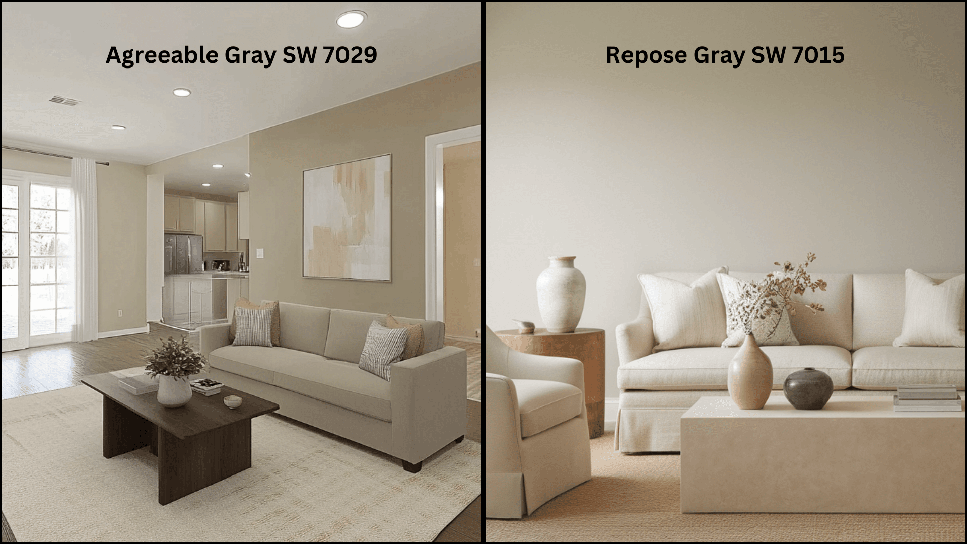
Agreeable Gray: Its balanced warmth creates a flowing backdrop that connects different spaces. The subtle beige undertones complement both traditional and modern furnishings, making it particularly effective for homes with mixed décor styles.
Repose Gray: Its cleaner gray appearance creates a more contemporary atmosphere. It provides a refined neutral backdrop that allows statement furniture and accessories to stand out, particularly those in bold jewel tones or black-and-white palettes.
In Bedrooms and Relaxation Areas
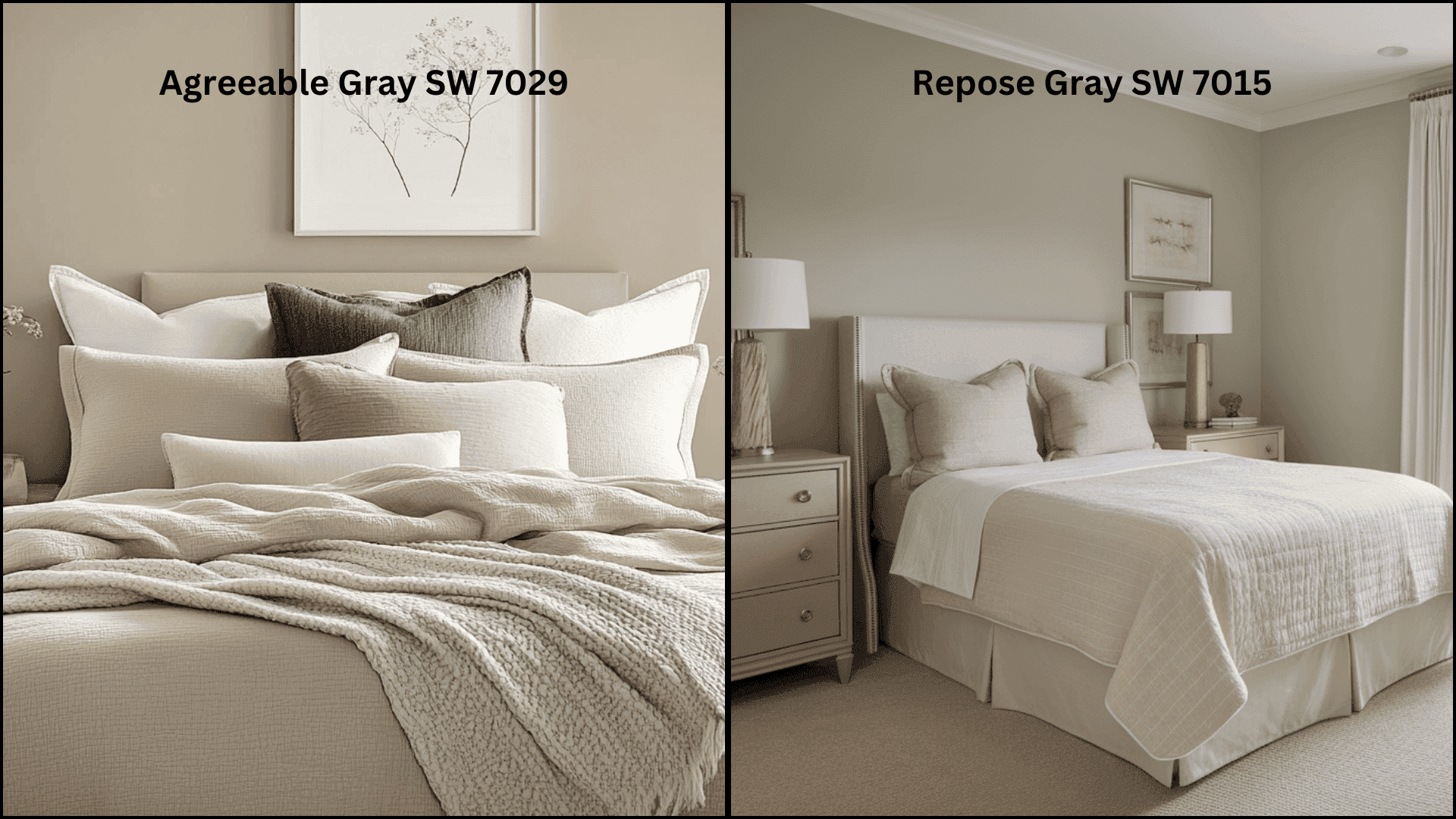
Agreeable Gray: This color delivers a cozy, nurturing feeling that promotes rest. Its warm undertones create a soothing environment that pairs exceptionally well with natural textiles, cream-colored bedding, and wood furniture.
Repose Gray: Offers a serene, slightly cooler atmosphere that feels polished and calm. It creates an excellent foundation for layering textures and works beautifully with blues, grays, and purples in bedding and accessories.
Kitchen
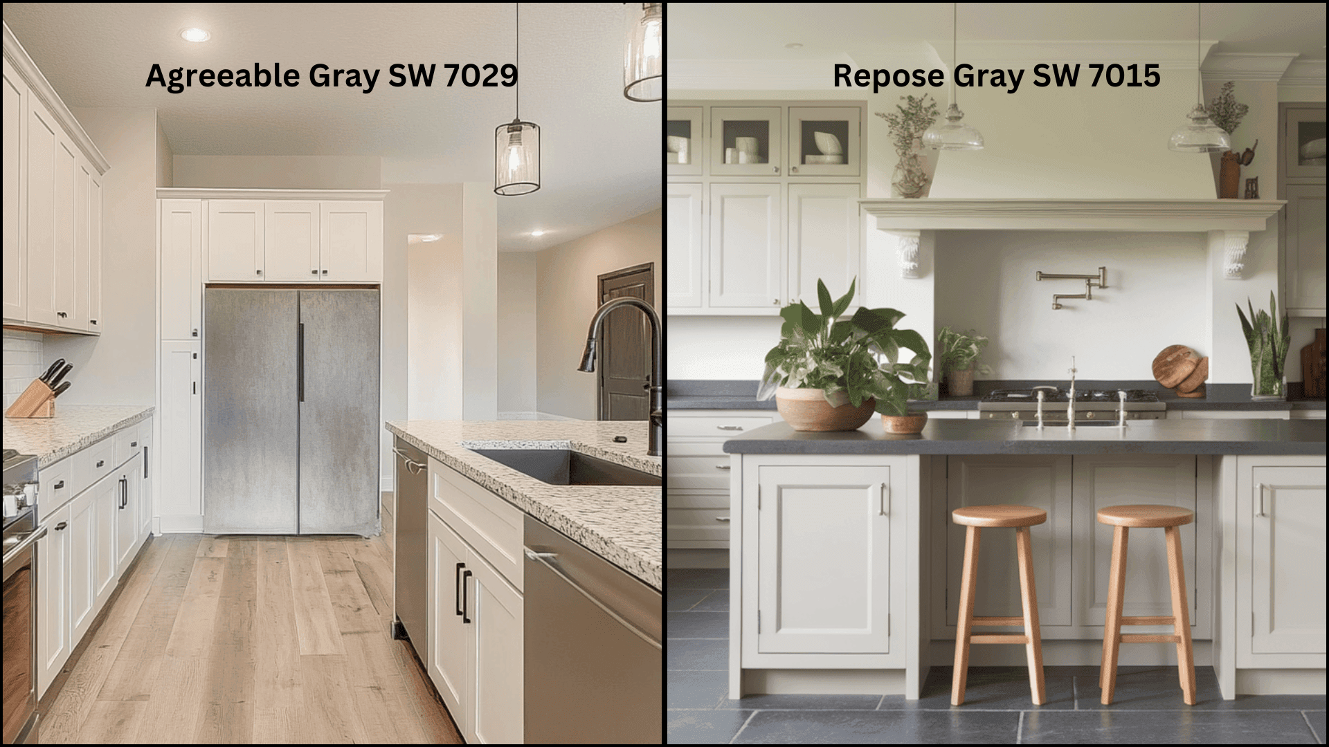
Agreeable Gray: Its versatile warm undertones complement both cool quartz and warm butcher block countertops. It provides a balanced backdrop for kitchens with mixed materials, particularly those featuring wood cabinets or islands.
Repose Gray: This creates a more modern kitchen look that pairs exceptionally well with white cabinets, marble countertops, and brushed nickel hardware. Its cooler undertones can make stainless steel appliances appear more integrated into the space.
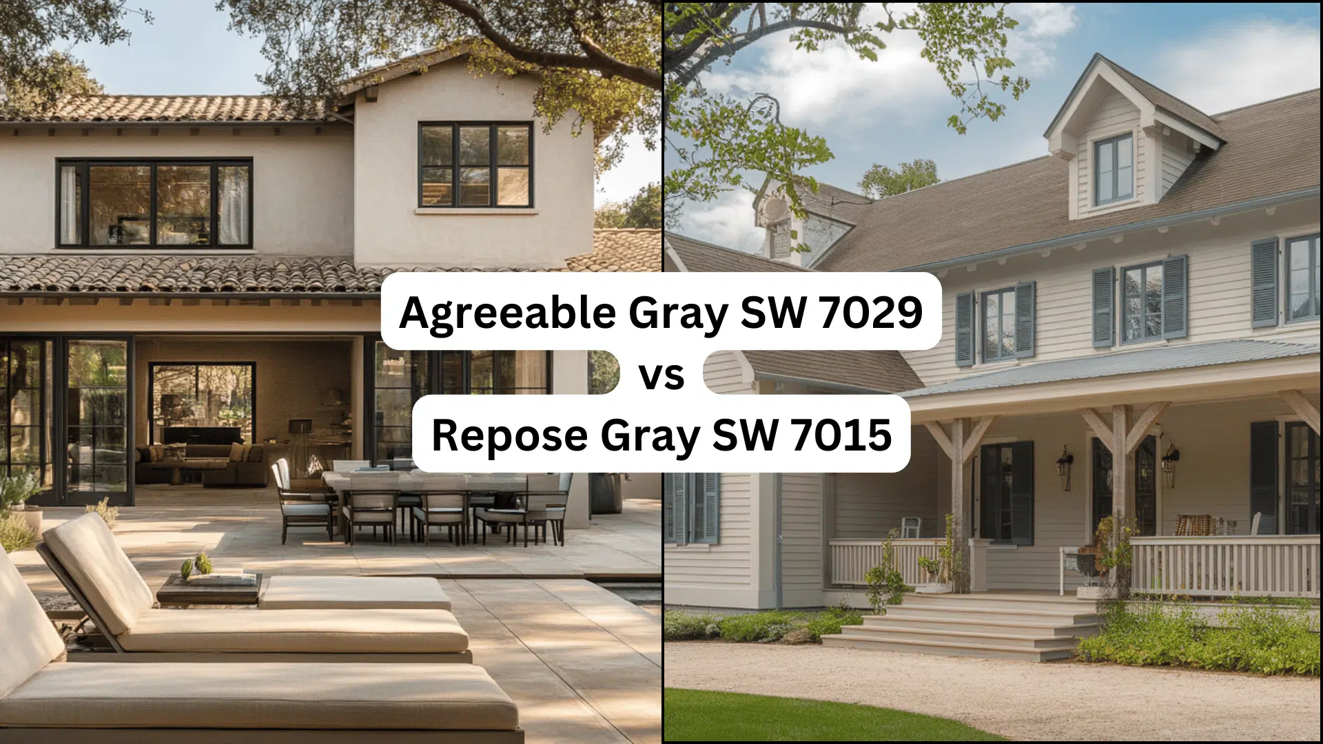
Agreeable Gray vs. Repose Gray for Exterior Use
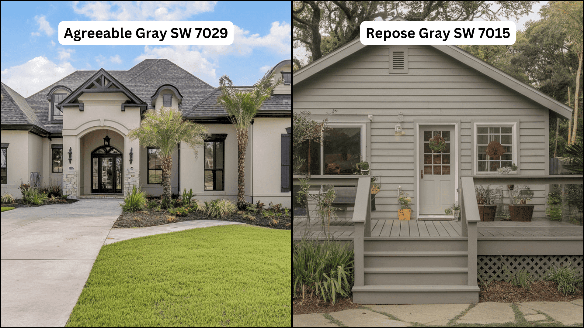
Agreeable Gray (SW 7029) presents as a versatile warm gray (greige) on exteriors that softens harsh sunlight while maintaining depth in shadowed areas. Its beige undertones become more pronounced in the afternoon light, giving the home a welcoming, grounded appearance.
It shines on craftsmen, farmhouses, and modern homes, providing a subtle contrast with white trim (Extra White or Pure White) that highlights design details without stark opposition.
Agreeable Gray pairs beautifully with natural stone accents, brick with warm undertones, and wooden elements like cedar shutters or front doors.
Repose Gray (SW 7015) delivers a cleaner, more definitive gray exterior that reads as a true neutral in most lighting conditions. Its subtle blue-green undertones become visible in overcast weather, adding interesting dimension without dominating.
It excels in a contemporary, modern farmhouse and colonial exteriors, creating a polished look.
Repose Gray creates striking combinations with crisp white trim, black accents (Tricorn Black windows or doors), and cool-toned stone or slate elements.
Both colors should be sampled on different sides of the home as Agreeable Gray may appear almost tan on sun-drenched southern exposures, while Repose Gray can take on a cooler, almost bluish cast on north-facing walls in certain light conditions.
Which color is More Classic?
Both Sherwin-Williams grays have established themselves as core neutrals in interior design, representing distinct color philosophies.
Current Color Trends & Long-Term Appeal: Agreeable Gray captures the ongoing preference for warm, livable neutrals that bridge multiple design eras, while Repose Gray speaks to the contemporary desire for crisp, clean-lined spaces.
Their sustained popularity across renovation cycles and design magazines indicates a deeper connection beyond fleeting style trends.
Each color tells a different story of design evolution—Agreeable Gray represents the comfort of traditional rooms, and Repose Gray embodies the simplicity of modern living.
Versatility Across Changing Decor: Agreeable Gray provides a warm foundation that gracefully adapts to style shifts from traditional to ultra-modern interiors. Repose Gray offers a neutral backdrop that remains consistent across diverse design approaches.
Their strength lies not in uniformity, but in their ability to become chameleons within different design stories—Agreeable Gray softening modern lines, Repose Gray adding depth to classic spaces.
Real-World Applications: These grays appear frequently in design publications, designer portfolios, and home renovation projects, successfully translating across residential, commercial, and hospitality environments.
Their enduring presence suggests that classic status emerges from a color’s capacity to enhance spatial stories rather than fitting a single design concept.
The Longevity of Agreeable Gray and Repose Gray
Agreeable Gray and Repose Gray have defied the typical lifespan of color trends. Their versatility allows them to adapt to different design styles and home environments.
These colors continue to appear in design portfolios, renovations, and new construction projects. Their enduring popularity suggests a timeless quality that exceeds temporary design movements.
Agreeable Gray (SW 7029)
Agreeable Gray beats typical color trends through its remarkable flexibility. Its warm, greige undertones create a timeless foundation that effortlessly bridges traditional and modern design styles.
Interior designers consistently choose this color for its ability to adapt to changing decor, making it less a trend and more a reliable neutral.
The color’s subtle warmth ensures it remains relevant across design cycles, appealing to homeowners seeking a versatile wall color that feels both current and classic.
Repose Gray (SW 7015)
Repose Gray represents a contemporary approach to timeless design. Its cool, crisp undertones reflect the minimalist design movements that continue to influence modern interiors. Unlike short-lived color trends, Repose Gray offers a clean, refined neutral that adapts to various design contexts.
Its understated presence allows it to remain a go-to choice for spaces seeking a current look that doesn’t feel outdated. The color’s ability to provide a neutral backdrop while maintaining its own unique character speaks to its lasting impact.
Common Misconceptions About Agreeable Gray and Repose Gray
- Agreeable Gray is not a true gray but rather a “greige” with significant beige undertones.
- Repose Gray is not a cold, sterile gray – it maintains warmth despite its cooler undertones.
- Neither color appears the same in all lighting conditions or on all surfaces.
- Agreeable Gray won’t look beige in every space – northern exposure can enhance its gray qualities.
- Repose Gray doesn’t always show blue undertones – in the warm afternoon light, it reads as a true gray.
- Both colors aren’t automatically “safe” choices – they still need to be tested in your specific space.
- Despite being popular neutrals, neither color pairs equally well with all accent colors.
- These grays aren’t interchangeable – their different undertones create distinctly different moods.
Wrapping It Up
The “agreeable gray vs. repose gray” debate isn’t about finding a universal winner but understanding how each color can uniquely reshape your space.
Both colors offer remarkable versatility, speaking to different design approaches while providing a neutral foundation for personal expression.
Agreeable Gray’s warm tones and Repose Gray’s cool undertones each tell a compelling design story.
The perfect color choice goes beyond trends, focusing instead on creating environments that reflect your personal comfort and emotional connection to a space.
Understanding the subtle differences between these two grays helps homeowners make thoughtful decisions that bring out the best in their living areas.
The right gray is the one that truly feels like home, turning your living space into a place that speaks to you.

Alex Guerrero, a graduate with a Fine Arts degree from the Rhode Island School of Design, has been a visionary in the world of color and design for over 15 years. His professional journey began in the heart of the fashion industry in Milan, where he developed an acute sense for color harmonies and trends. Alex joined our team in 2018, offering fresh and innovative perspectives on color utilization in various spaces. Renowned for his ability to blend contemporary trends with timeless elegance. Outside of work, Alex is an accomplished painter and a volunteer art therapist, his artistic talents further enriching his professional insights.