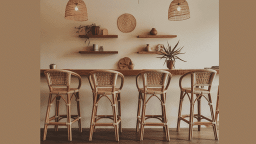

I’m always drawn to the simple beauty of country living, and that’s what made me fall in love with the cottagecore style.
As someone who values comfort and nature-inspired spaces, I’ve learned that picking the right paint colors can make a huge difference.
In my experience, the perfect paint shade can turn any room into a cozy retreat.
I’ve spent time testing different colors in my own home, and I want to share what I’ve found about creating that perfect countryside feeling through paint choices.
Essential Cottagecore Paint Colors for your Home
Soft Pastels
I find that light, gentle colors work best to create a peaceful feeling in any room. These shades remind me of spring flowers and morning light.
1. Super White
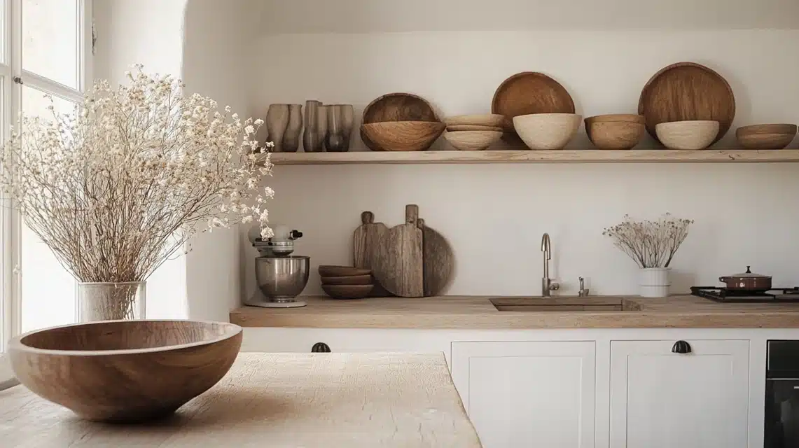
I chose this shade for my kitchen, and it made such a big change.
It’s a pure, bright white that makes every room feel fresh and open.
When I painted my walls with Super White, I noticed how it made my antique pieces stand out beautifully.
I like to add wooden bowls and dried flowers to warm up the space.
From my experience, it works really well in rooms that get natural light.
2. Cloud Cover
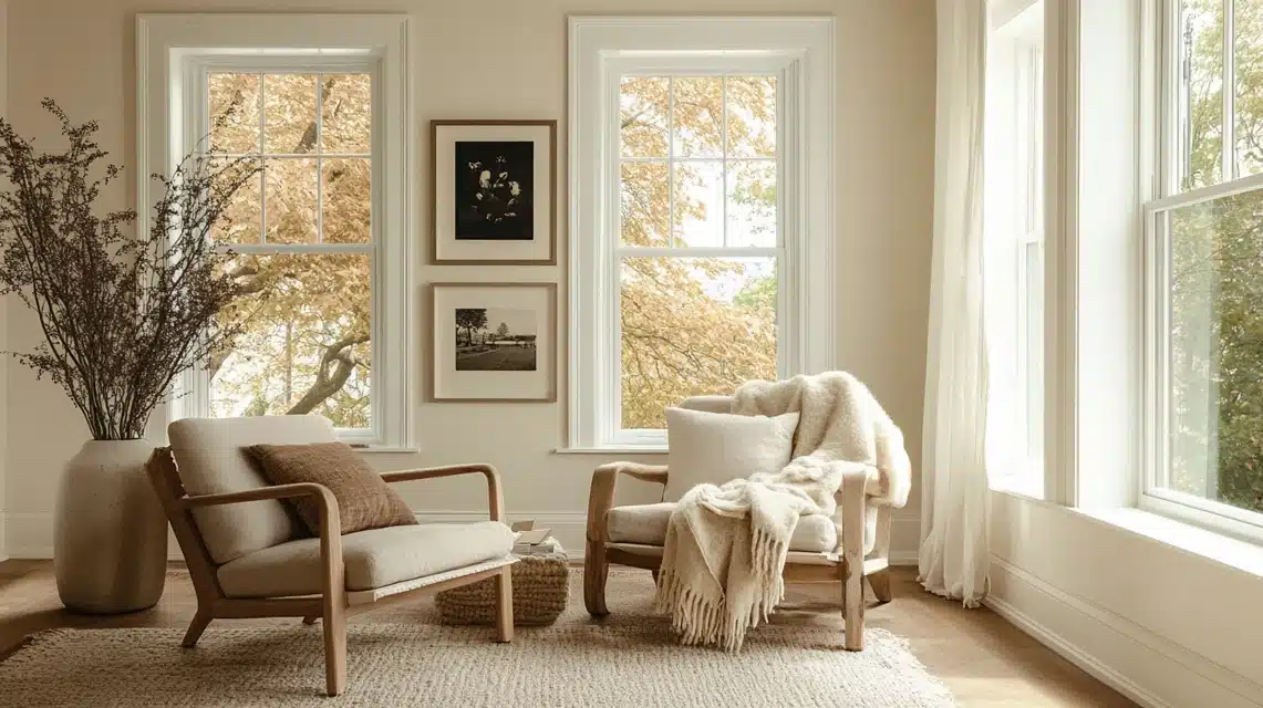
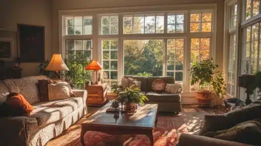
I painted my living room with Cloud Cover, and it feels like being wrapped in a warm blanket.
It’s not stark white – instead, it has a gentle warmth that makes everything feel cozy.
I’ve noticed it changes throughout the day, looking slightly different but always welcoming.
My vintage photographs look perfect against these walls.
3. Angelica
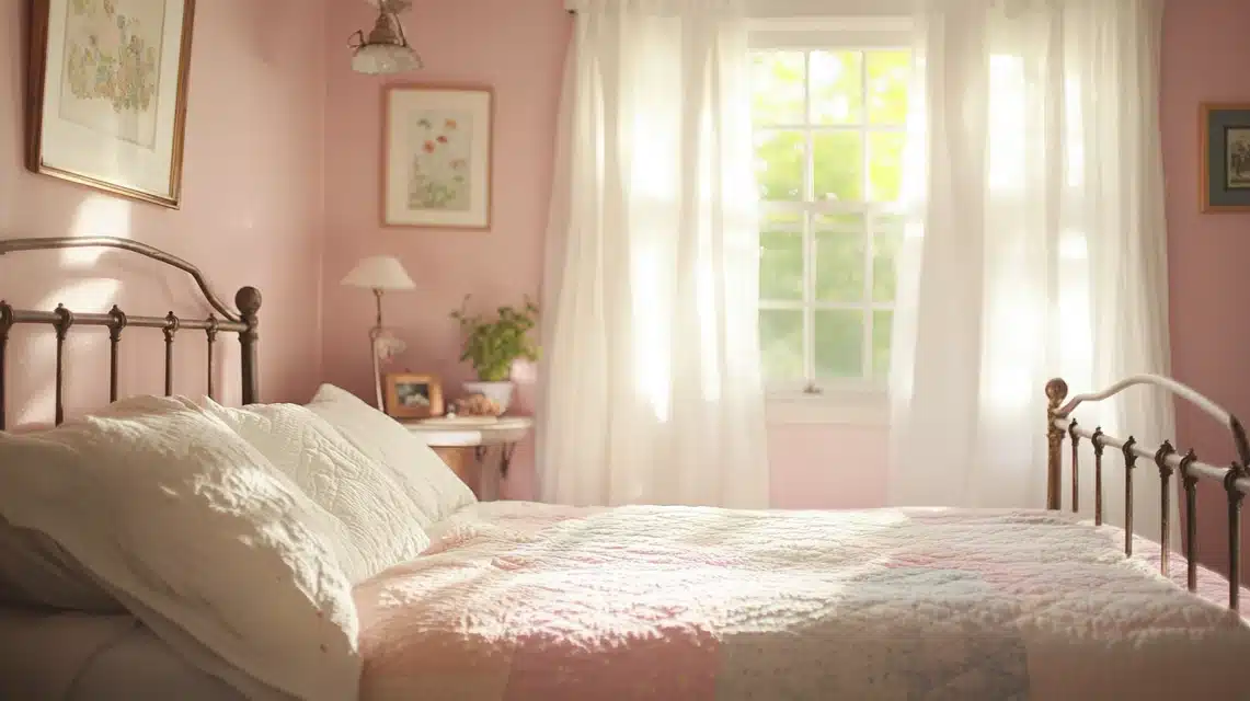
When I decided to paint my guest bedroom, Angelica, it transformed into the sweetest space.
This soft color makes the room feel like a gentle hug.
I love how it looks with my grandmother’s quilts and the white curtains I put up.
Every morning, the room glows with a gentle light that makes my guests feel right at home.
Earthy Neutrals
I love using these natural shades because they remind me of walking through fields and forests. They bring the outdoors inside my home.
4. Majestic Mauve
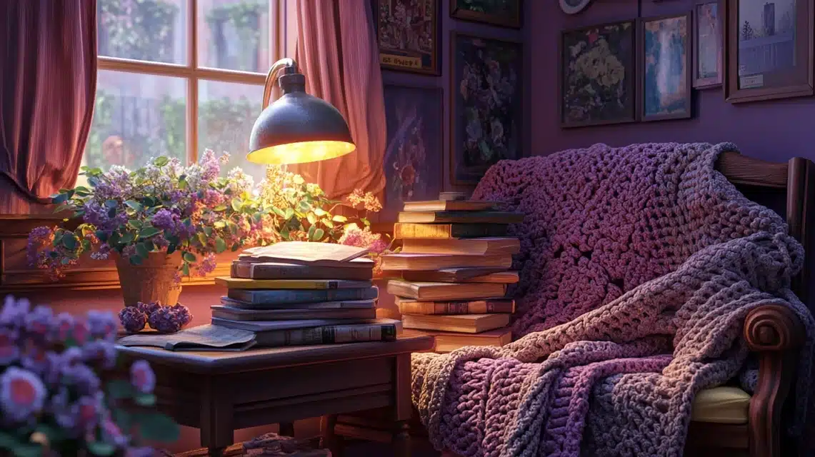
I painted my reading nook with this color, and it’s become my favorite spot in the house.
The soft mauve creates such a peaceful feeling, especially in the evening light.
I added my collection of old books and a vintage reading lamp – they look perfect against this background.
When friends visit, they always comment on how cozy it feels.
I find it works beautifully with my grandmother’s crocheted throws and wooden picture frames.
5. Creme Caramel
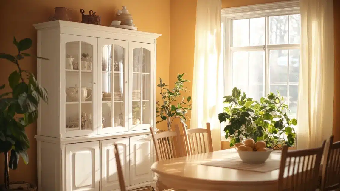
This is the color I chose for my dining room, and it makes every meal feel special.
It reminds me of warm honey and fresh bread.
I noticed how it changes throughout the day – in the morning, it’s bright and cheerful, and by evening, it feels warm and intimate.
My white china cabinet stands out beautifully against it, and my plants seem to thrive in this space.
6. Paper Mache
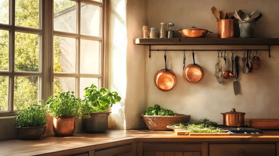
When I painted my kitchen with Paper Mache, it changed the whole feel of our family gatherings.
It has this gentle warmth that makes everyone want to linger over coffee.
My copper pots look stunning against it, and it makes my herb collection on the windowsill pop with color.
I love how it brightens up even the cloudiest days.
Rich Jewel Tones
These deeper colors give my home personality and depth. I use them to create special spots that feel like hidden treasures.
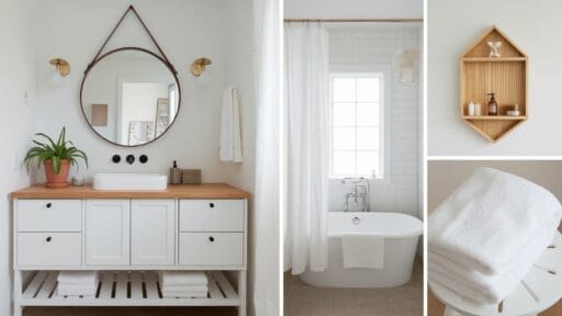
7. Coastal Path
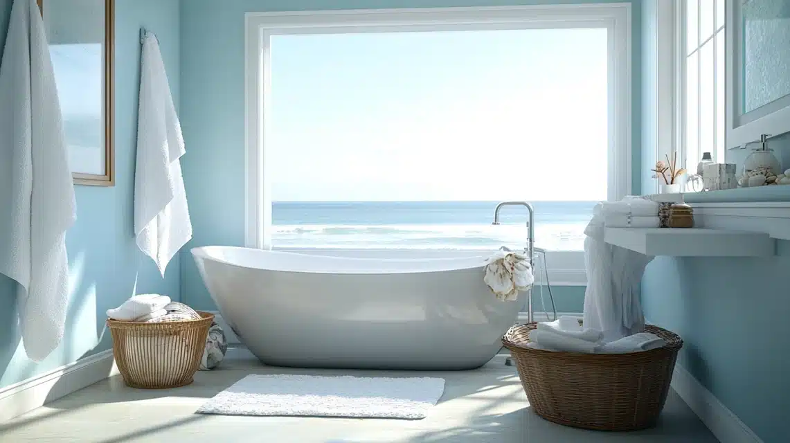
I used this color in my bathroom, and now it feels like a peaceful retreat.
The color reminds me of the beach glass I collected as a child.
It pairs perfectly with my white towels and the seashells I’ve displayed on the window sill.
When the morning light hits it, the whole room feels fresh and clean.
8. French Violet
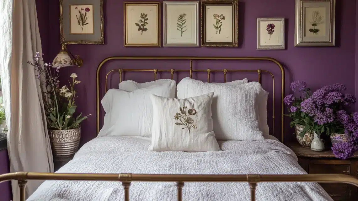
This became the star of my guest bedroom makeover.
I was nervous about using purple, but this shade is so subtle and dreamy. My vintage brass bed frame looks like it was made for this color.
I added white linens and my collection of pressed flowers in silver frames – the combination is simply magical.
9. Misty Blue
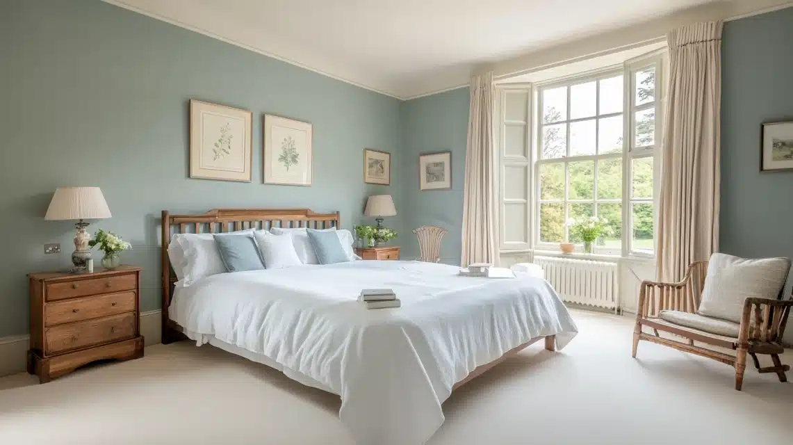
I painted my main bedroom this color, and it’s like sleeping in a cloud.
Every morning, I wake up feeling calm and refreshed.
It works perfectly with my white bedding and the natural wood furniture.
I’ve noticed that even on gray days, this color keeps the room feeling bright and hopeful.
Color Palette Inspiration
I’ve spent hours looking at different color combinations in my home, and I want to share what really works.
From my living room to my cozy reading nook, I’ve tried various paint colors to create that perfect cottagecore feel.
Based on my experience, these colors work together beautifully: soft whites with gentle mauves, warm beiges with touches of violet, and peaceful blues with creamy whites.
I find that mixing three to four colors creates the most balanced look.
Let me show you my favorite combinations that have transformed my spaces.
Interactive Tools and Resources
I remember feeling overwhelmed when choosing paint colors for my home.
That’s why I tried several online tools that made the process much easier.
The Sherwin-Williams ColorSnap app helped me visualize colors in my space before painting.
I also used Benjamin Moore’s Personal Color Viewer to test different color combinations.
These tools saved me time and money by helping me avoid color mistakes.
I suggest taking photos of your room at different times of the day to see how the light affects your chosen colors.
Conclusion
After trying various colors in my own home, I’ve learned that choosing paint isn’t just about picking pretty shades – it’s about creating feelings and memories.
Start with one room, test your colors in different lights, and trust your instincts.
Remember, there’s no wrong choice if it makes you feel at home.
I hope my experience helps you find the perfect colors for your space.
The right shade can turn any house into a cozy cottage retreat, and I’m excited for you to start your painting adventure.
Just take it one wall at a time and create a space that feels just right.
Frequently Asked Questions
What are the classic cottage colors?
Soft whites, pale blues, gentle pinks, warm creams, and muted greens are typical cottage colors. These light shades create a calm, welcoming home environment.
What color makes a house more valuable?
White, greige (gray-beige), and light gray paint colors tend to increase home value since they appeal to most buyers and make spaces feel larger.

With a Master in Architectural Studies from University of Pennysylvania, Marwa Haydar has pioneered living spaces since 2005. Her expertise, initially honed in a prestigious architectural firm, is evident in her approach to creating environments. Marwa became part of our team in 2019 and has since been a driving force in our home improvement section, known for her practical yet stylish solutions. She’s been spearheading our design workshops since then, infusing her passion for teaching into her work. In her leisure time, Marwa enjoys exploring historic architecture and is an enthusiastic pottery hobbyist, further enriching her understanding of form and texture.