

Tired of white paints that feel too sterile or leave your space looking flat? Dover White by Sherwin-Williams (SW 6385) might be just what you need. This warm white paint offers a creamy, inviting look ideal for creating cozy, welcoming interiors.
This warm, creamy off-white has soft yellow undertones that make rooms feel cozy. Its Light Reflection Value of 83 brightens spaces without feeling harsh.
Dover White works well in many light conditions, staying warm in north-facing rooms and soft in bright spaces.
It’s a timeless choice that won’t go out of style soon. This blog will show you how to pair Dover White with colors like Dakota Wheat and Waterloo.
You’ll learn how to create color schemes for your whole home and see how they work with different furniture and decor.
Understanding Paint Color Basics
Color terminology
| Property | Value |
|---|---|
| LRV | 83 |
| RGB | 240 / 234 / 220 |
| Hex Code | #F0EADC |
Undertones
- Dover White has soft, creamy undertones with a hint of yellow
- It’s a warm off-white that avoids looking too yellow or beige
- Not a stark or pure white, but a versatile neutral with warmth
Psychology of Off-White/Neutral Colors
- Warm off-whites like Dover White: Create a welcoming atmosphere and sense of comfort.
- Creamy tones: Offer approachability and a classic, timeless appeal
- Warm neutrals: Evoke coziness, relaxation, and subtle refinement
- Benefits: Less stark than pure white, it provides visual warmth and creates a soft backdrop that complements most decor styles and colors.
Why Choose Sherwin Williams Dover White (SW 6385)?

Sherwin Williams Dover White’s versatility shines in various lighting conditions. It maintains its warm, creamy character in north-facing rooms while softening without yellowing in bright spaces.
Its timeless off-white quality creates a welcoming neutral backdrop that improves traditional and modern design elements without competing for attention.
1. Key Features
Sherwin Williams Dover White is excellently compatible with existing elements like wood floors and cabinetry, creating smooth transitions between rooms.
It provides the right warmth to feel inviting and cozy while preserving a clean, timeless quality that won’t quickly date your interior design investments.
2. Durability
Sherwin Williams Dover White, especially in premium finishes like Duration or Emerald, delivers superior durability with good resistance to marks in busy household areas.
Its subtle warmth and creamy undertones help disguise minor smudges and imperfections better than pure whites while maintaining its graceful appearance.
This paint holds its color well and cleans easily without dulling when properly applied and maintained.
3. Texture Patterns
Sherwin Williams Dover White creates a soft, gentle texture that adds subtle depth to walls without overwhelming the space.
Its warm undertones produce a light shadow play that softens harsh lighting and enhances constructive details.
When used across different finishes, it highlights trim and moldings while maintaining a consistent, classy appearance throughout connected spaces.
4. Why It Works
Sherwin Williams Dover White works because it strikes an ideal balance between warmth and neutrality, offering enough color to feel comfortable without dominating a room.
Its creamy undertones complement warm wood tones and cooler stone elements, while its high LRV (83.00) ensures spaces feel bright yet grounded.
This adaptable off-white adjusts beautifully to changing daylight, maintaining its welcoming character from morning to evening.
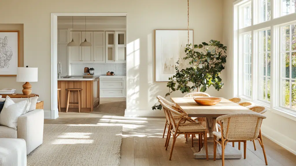
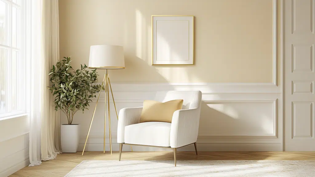
Where to Use Dover White: Room-by-Room Guide
Living Spaces and Open Floor Plans
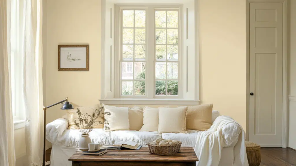
- Dover White (SW 6385) excels in open floor plans thanks to its soft, creamy undertones, which create an ideal flow between connected areas.
- The 83.00 LRV of Dover White maximizes light reflection, making spaces feel expansive while offering a warmth that stark whites can’t provide.
- For added interest, pair Dover White walls with crisp white trim like Pure White (SW 7005) or complementary neutral trim like Accessible Beige (SW 7036).
Bedrooms and Relaxation Areas
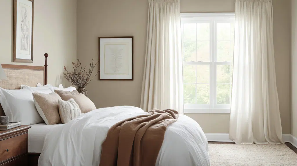
- Dover White creates a gentle, soothing atmosphere in bedrooms that feels welcoming rather than cold or sterile.
- The warm creamy undertones in Dover White improve relaxation while maintaining brightness that keeps the space feeling open.
- Consider Dover White for bedroom walls and ceilings to soften lighting and create a cozy, restful environment that still feels airy.
Kitchens and High-Traffic Zones
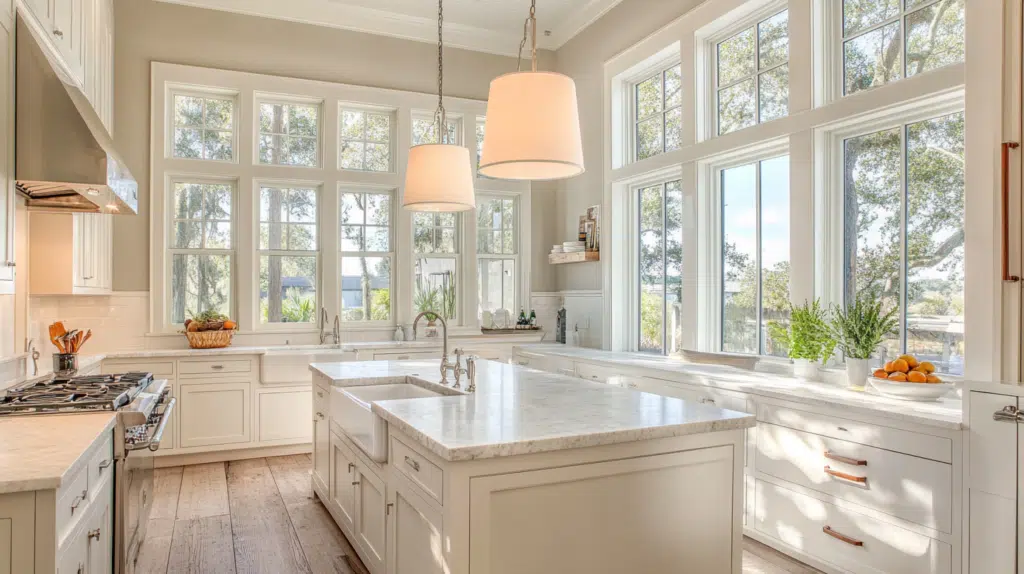
- Dover White in satin or semi-gloss finish provides practicality in busy areas, while its subtle warmth hides smudges better than brighter whites.
- The versatile warmth of Dover White complements both dark granite countertops and light wood cabinetry without appearing too yellow.
- Dover White complements all metal finishes, from stainless steel to brass, making it adaptable as kitchen hardware trends change.
Exterior Usage and Weather Protection

- Dover White offers a soft, welcoming exterior that avoids brighter whites’ harsh, blinding quality in direct sunlight.
- This versatile cream works beautifully on traditional, farmhouse, and coastal home styles, providing timeless curb appeal with its balanced warmth.
- Pair Dover White siding with darker shutters in Tricorn Black (SW 6258) or Naval (SW 6244) for a classic contrast that can withstand changing design trends.
- Its warm undertones help disguise dirt and weathering better than pure whites while still reflecting heat effectively for energy efficiency.
Color Pairings and Combinations for Dover White (SW 6385)

Dover White is a warm, creamy off-white with subtle yellow undertones. It creates a soft, inviting atmosphere in any space.
It pairs beautifully with Dakota Wheat and Waterloo, offering versatile options for creating a similar, warm palette or a deep contrast with depth.
Dakota Wheat (SW 9023)
- Creates a warm, inviting atmosphere
- Works beautifully in living rooms and kitchens
- Provides a subtle contrast that feels cohesive
- Enhances Dover White’s creamy undertones
Waterloo (SW 9141)
- Creates a refined contrast
- Adds drama while maintaining balance
- Works well for accent walls or cabinetry
- Highlights Dover White’s brightness and warmth
Creating Cohesive Color Schemes
Monochromatic Scheme:
- Dover White (SW 6385) for main walls
- Pure White (SW 7005) for trim
- Alabaster (SW 7008) for ceilings
- Shoji White (SW 7042) for accent pieces or adjoining rooms
Warm Color Scheme:
- Dover White (SW 6385) for main living areas
- Useful Gray (SW 7050) for the dining room
- Dakota Wheat (SW 9023) for hallways
- Aesthetic White (SW 7035) for bedrooms
Cool Color Scheme:
- Dover White (SW 6385) for main walls
- Sea Salt (SW 6204) for bathrooms
- Agreeable Gray (SW 7029) for bedrooms
- Waterloo (SW 9141) for home office
Coordinating with Furniture and Decor
1. Wood Tones
Dover White improves honey-toned woods like oak and pine, contrasting with walnut and mahogany. It also pairs beautifully with white-washed or bleached woods for a fresh, coastal aesthetic.
2. Metals
Warm metallics like brass, gold, and copper naturally complement Dover White’s yellow undertones for a cohesive look. Oil-rubbed bronze and brushed nickel fixtures add depth and refinement against the creamy backdrop.
3. Decor

Natural textiles in neutral tones enhance Dover White’s soft, welcoming quality throughout the space. Incorporate woven textures like rattan and jute to bring organic warmth that balances Dover White’s creamy undertones.
Paint Colors: Perfect Alternative to Dover White (SW 6385)

Similar Paint Colors: Comparison Chart
| Paint Color | Undertones / Tone | Best Use Case | Key Characteristics |
|---|---|---|---|
| Creamy (SW 7012) | Warm with pronounced yellow undertones | North-facing rooms, cozy spaces | Slightly deeper than Dover White; adds warmth and comfort |
| Aged White (SW 9180) | Soft with subtle gray undertones | Traditional, vintage, or farmhouse-style spaces | Creates a muted, timeless aesthetic |
| Neutral Ground (SW 7568) | Warm greige with added depth | Transitional areas, open floor plans | Offers subtle contrast while maintaining versatility |
See our full 23 Best White Paint Colors for your Home to keep more alternatives side by side.
Wrapping It Up
Dover White Sherwin Williams (SW 6385) is a great choice for almost any room in your home. Its warm white paint look creates spaces that feel both bright and cozy.
If you’re looking for a creamy white paint with yellow undertones that blends easily with wood and metal, this is your go-to.
Dover White isn’t just a color it’s where your home’s story begins with the best off-white paint for interiors.
Dover White is a perfect blank canvas that won’t clash with your decor if you’re painting your living room, bedroom, or kitchen. It works well with warm colors like Dakota Wheat and cool ones like Waterloo.
If you want something similar, try Creamy, Aged White, or Neutral Ground for small changes. Pick the right white paint and your whole home can feel new again.
Dover White isn’t just a color—it’s where your home’s story begins.
Thinking of trying Dover White in your home? Share your plans, questions, or favorite pairings in the comments below we’d love to hear how you’re bringing this timeless shade to life!

Alex Guerrero, a graduate with a Fine Arts degree from the Rhode Island School of Design, has been a visionary in the world of color and design for over 15 years. His professional journey began in the heart of the fashion industry in Milan, where he developed an acute sense for color harmonies and trends. Alex joined our team in 2018, offering fresh and innovative perspectives on color utilization in various spaces. Renowned for his ability to blend contemporary trends with timeless elegance. Outside of work, Alex is an accomplished painter and a volunteer art therapist, his artistic talents further enriching his professional insights.