Looking for a paint color that makes a bold statement without feeling too harsh? Iron Ore Sherwin Williams (SW 7069) might be your perfect match.
This rich, near-black charcoal brings dramatic depth to any space while maintaining just enough warmth to feel inviting rather than stark.
With its low LRV of 4, Iron Ore creates a striking contrast that makes other elements in your home pop.
It’s versatile enough for modern or traditional spaces, working as both an accent and a main color depending on how dramatic you want to be.
This blog covers everything you need to know about Iron Ore – from its basic properties to room-specific recommendations, complementary colors, and decor pairings that will help you use this powerful neutral to its full potential.
Understanding Paint Color Basics
Color Terminology
| Property | Value |
|---|---|
| LRV | 4 |
| RGB | 55 / 58 / 58 |
| Hex Code | #373A3A |
Undertones
- Iron Ore has soft, warm undertones
- It’s a very dark gray that’s almost black
- Not a pure black, but a rich, dark, neutral
Psychology of Dark Colors
- Dark colors like Iron Ore: Create a cozy, dramatic feeling.
- Charcoal tones: Feel modern and refined.
- Near-black colors: Add depth and contrast to spaces.
- Benefits: Makes other colors pop, hides dirt well, and creates a strong backdrop for artwork and furniture.
Why Choose Sherwin Williams Iron Ore?
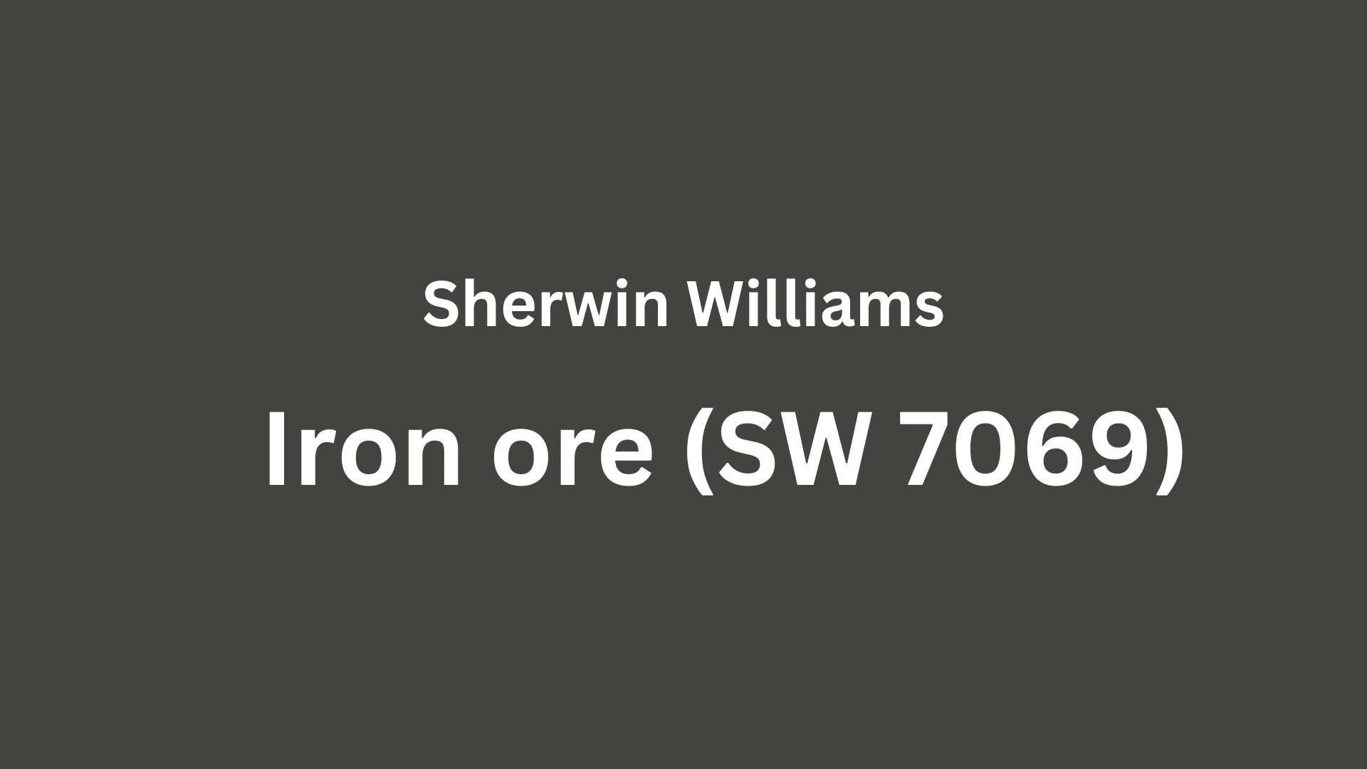
Sherwin Williams’s Iron Ore’s dramatic depth creates a powerful impact in diverse lighting. It maintains its rich character in bright spaces while creating cozy intimacy in dimmer areas.
Its near-black quality offers a bold, neutral backdrop that enhances both traditional and modern design elements by creating a striking contrast.
1. Key features
Sherwin Williams Iron Ore delivers powerful versatility with existing elements like light fixtures and furniture, creating dramatic focal points between spaces.
It provides enough depth to feel grounding while maintaining a cultured, timeless quality that won’t quickly date your design choices.
2. Durability
Sherwin Williams Iron Ore, especially in premium finishes like Duration or Emerald, delivers exceptional durability with superior hide in high-traffic areas.
Its deep tone and subtle warmth help disguise scuffs and fingerprints better than lighter colors while preserving its rich appearance.
This paint resists fading and maintains color consistency even with regular cleaning when properly applied.
3. Texture patterns
Sherwin Williams Iron Ore creates a rich, velvety texture that adds a dramatic dimension to walls without requiring additional elements.
Its dark undertones produce striking shadow play that enhances constructive features and adds visual significance to smooth surfaces.
When applied to different finishes, it can highlight structural details while maintaining a bold, refined appearance throughout connected spaces.
Room-by-Room Color Recommendations with Iron Ore
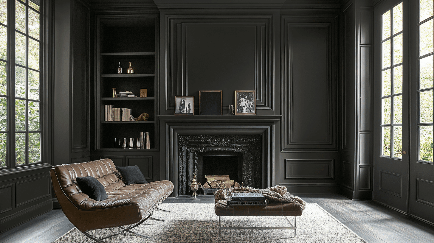
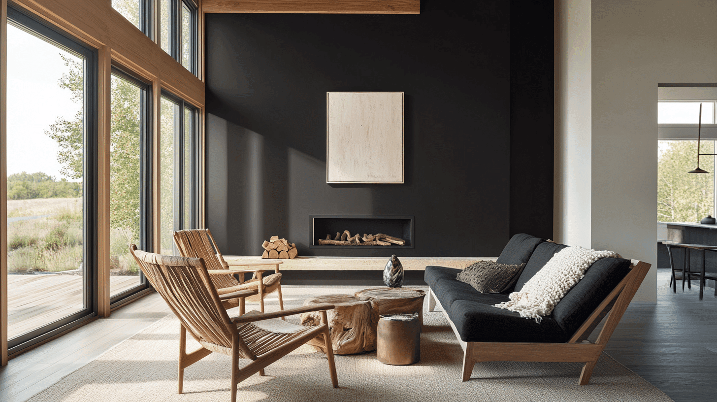
1. Living Spaces and Open Floor Plans
- Iron Ore (SW 7069) creates dramatic focus areas in open floor plans due to its deep charcoal undertones that define and separate connected spaces.
- The 4 LRV of Iron Ore provides strong contrast and depth while offering a warmth that pure black lacks.
- For dimension, pair Iron Ore accent walls with lighter neutrals like Repose Gray SW 7015 or create a striking contrast with white trim in Pure White SW 7005.
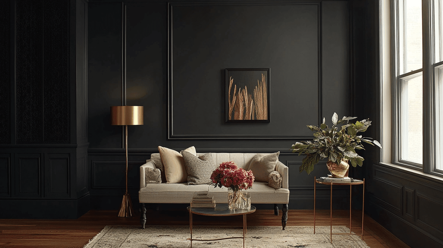
2. Bedrooms and Relaxation Areas
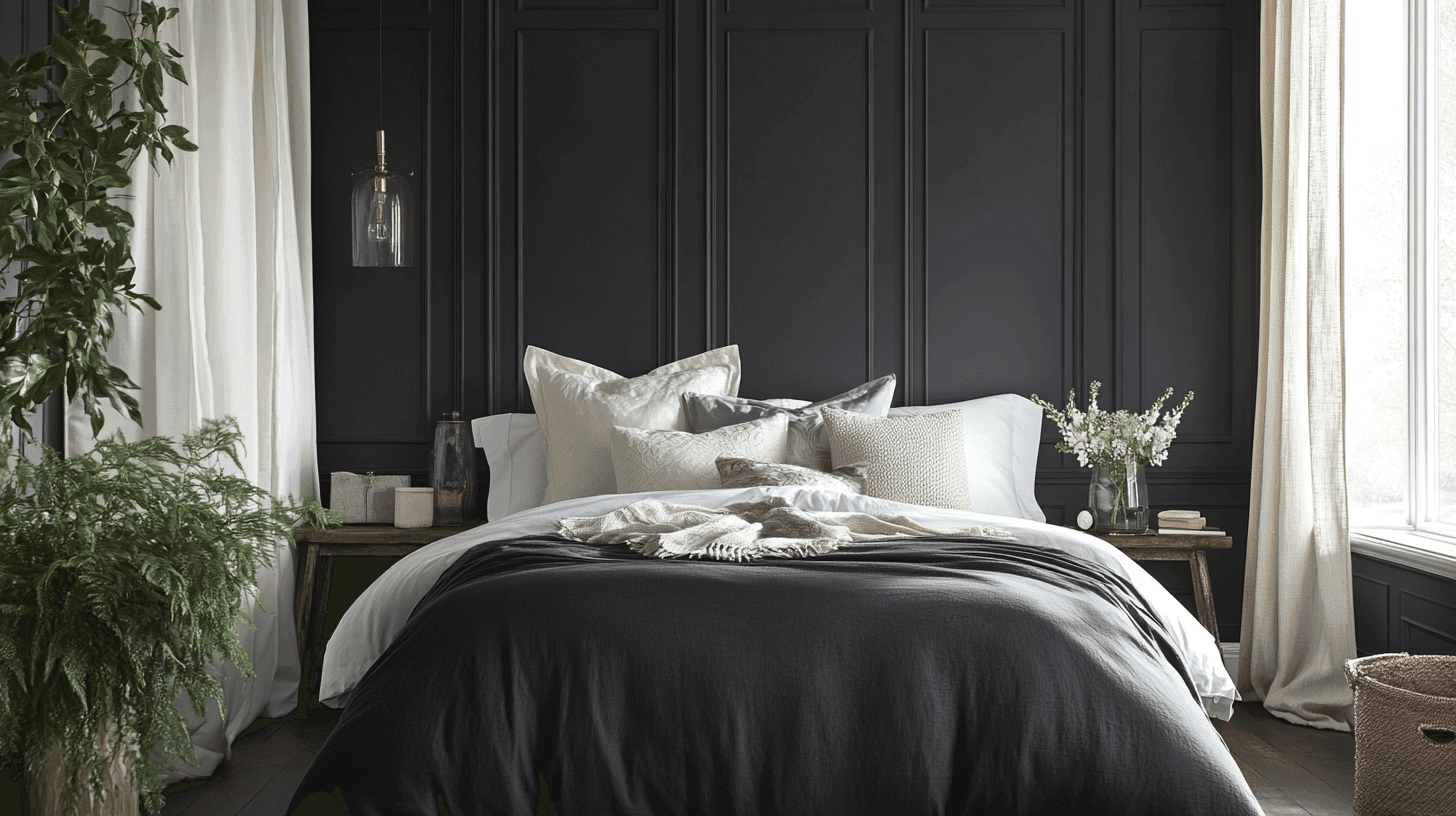
- Iron Ore creates a cozy, enveloping atmosphere in bedrooms when used as an accent wall behind the headboard or on a feature wall.
- The subtle, warm undertones in Iron Ore promote intimacy while creating enough drama to keep the space interesting and cultured.
- Consider Iron Ore for bedroom doors or trim to create definition against lighter walls and add constructive interest without darkening the entire space.
3. Kitchens and High-Traffic Zones
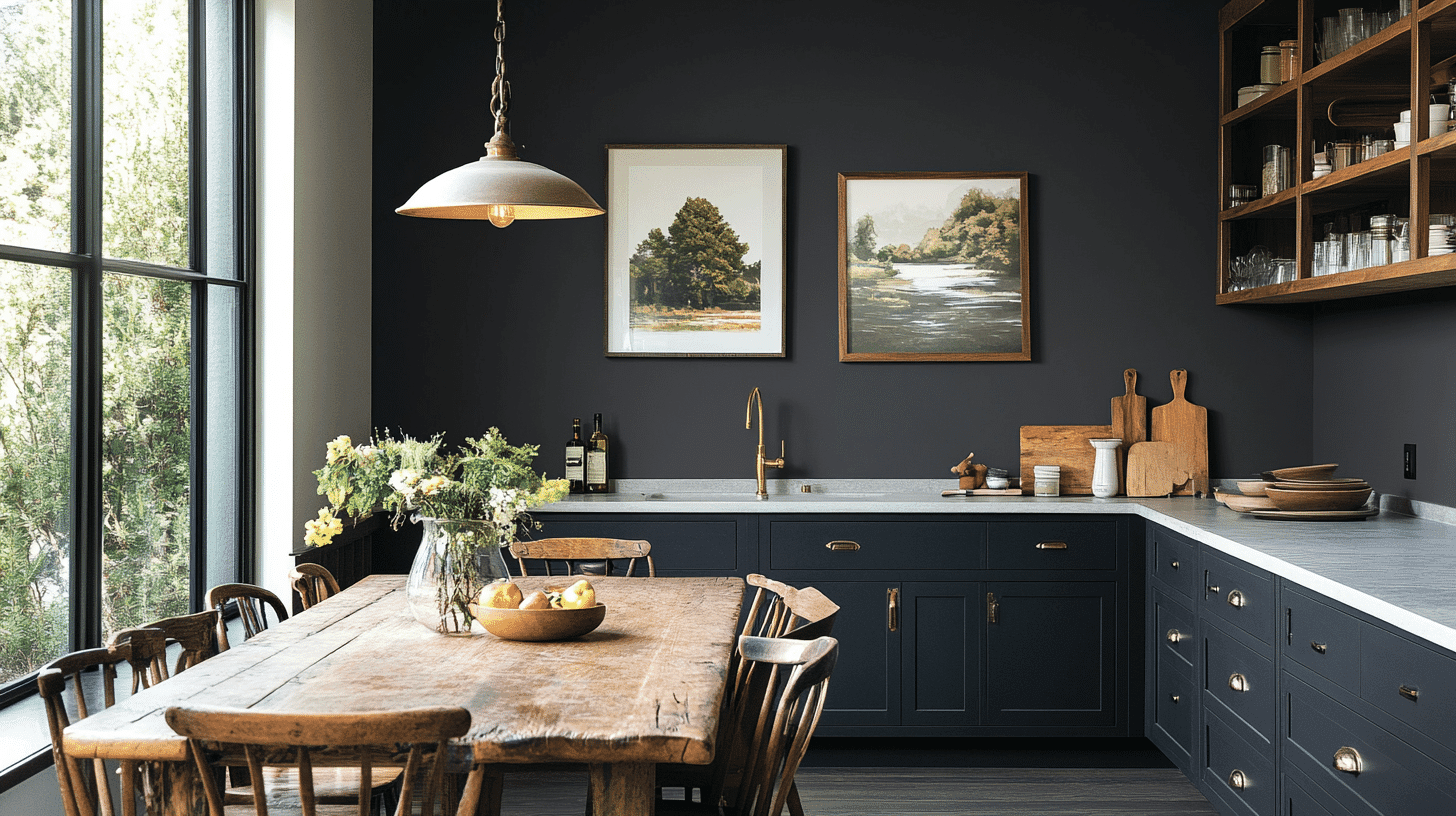
- Iron Ore in satin or semi-gloss finish is practical on kitchen islands or lower cabinets, and its deep tone masks fingerprints better than lighter colors.
- The neutral darkness of Iron Ore complements both bright white countertops and warm wood elements without competing with them.
- Iron Ore works beautifully with brass hardware and stainless appliances, making it adaptable to kitchen updates and changes.
4. Bathrooms and spa-like retreats
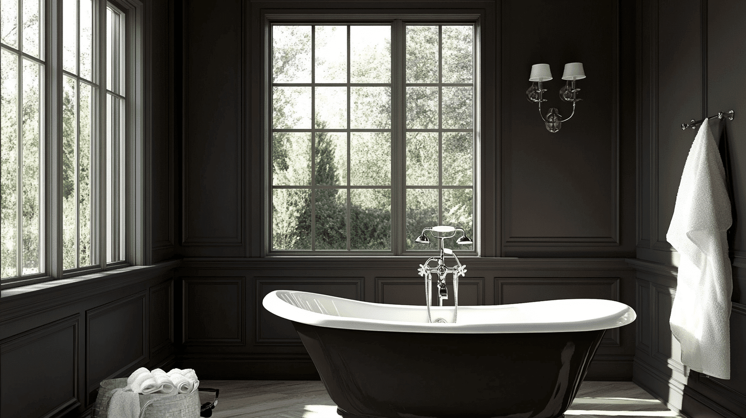
- Sherwin Williams Iron Ore creates a luxurious, spa-like atmosphere in bathrooms with its rich depth that adds enlightenment to white fixtures.
- Its dark charcoal tone makes white tiles and porcelain stand out dramatically while creating a sense of defined space in even small bathrooms.
- Iron Ore pairs exceptionally well with brushed metals, marble surfaces, and natural wood accents for a timeless, high-end retreat feel.
Color Pairings and Combinations
Iron Ore is a dramatic near-black charcoal with subtle warm undertones. Its low Light Reflectance Value (LRV) of 4 makes it a bold neutral that can add depth to spaces while providing more warmth than a stark black. Here are color pairings and combinations for this shade.
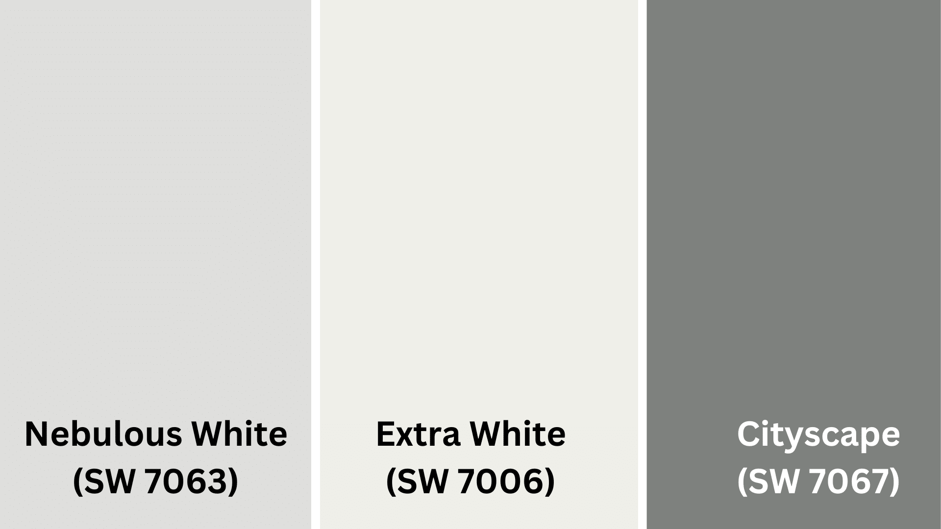
Complementary Trim Colors
- Nebulous White (SW 7063) – A soft, airy white with subtle gray undertones that creates a striking contrast
- Extra White (SW 7006) – A bright, clean white that provides dramatic definition against Iron Ore’s depth
- Cityscape (SW 7067) – A medium gray that creates a refined tonal progression when used with Iron Ore
Creating Cohesive Color Schemes
1. Monochromatic Scheme
- Iron Ore for accent walls or feature areas
- Cityscape (SW 7067) for connecting spaces
- Nebulous White (SW 7063) for main walls
- Extra White (SW 7006) for trim and ceilings
2. Warm Color Scheme
- Iron Ore for accent walls or cabinetry
- Urbane Bronze (SW 7048) for adjoining rooms
- Mega Greige (SW 7031) for transitional spaces
- Accessible Beige (SW 7036) for main living areas
3. Cool Color Scheme
- Iron Ore for feature walls or doors
- Grayish (SW 6001) for bedrooms
- Morning Fog (SW 6255) for bathrooms
- Repose Gray (SW 7015) for main walls
Coordinating with Furniture and Decor
1. Wood Tones
Iron Ore works dramatically with light wood tones like ash, birch, and maple. Blonde or natural oak creates a striking contrast when paired with this bold charcoal.
For a more classy look, walnut or cherry provides rich complementary warmth while maintaining a grounded atmosphere.
2. Metals
Brass, gold, and copper hardware pop beautifully against Iron Ore’s dark backdrop. Matte black fixtures create flawless integration for a monochromatic effect.
The neutral depth allows for successfully showcasing statement metallic pieces throughout a space.
3. Decor
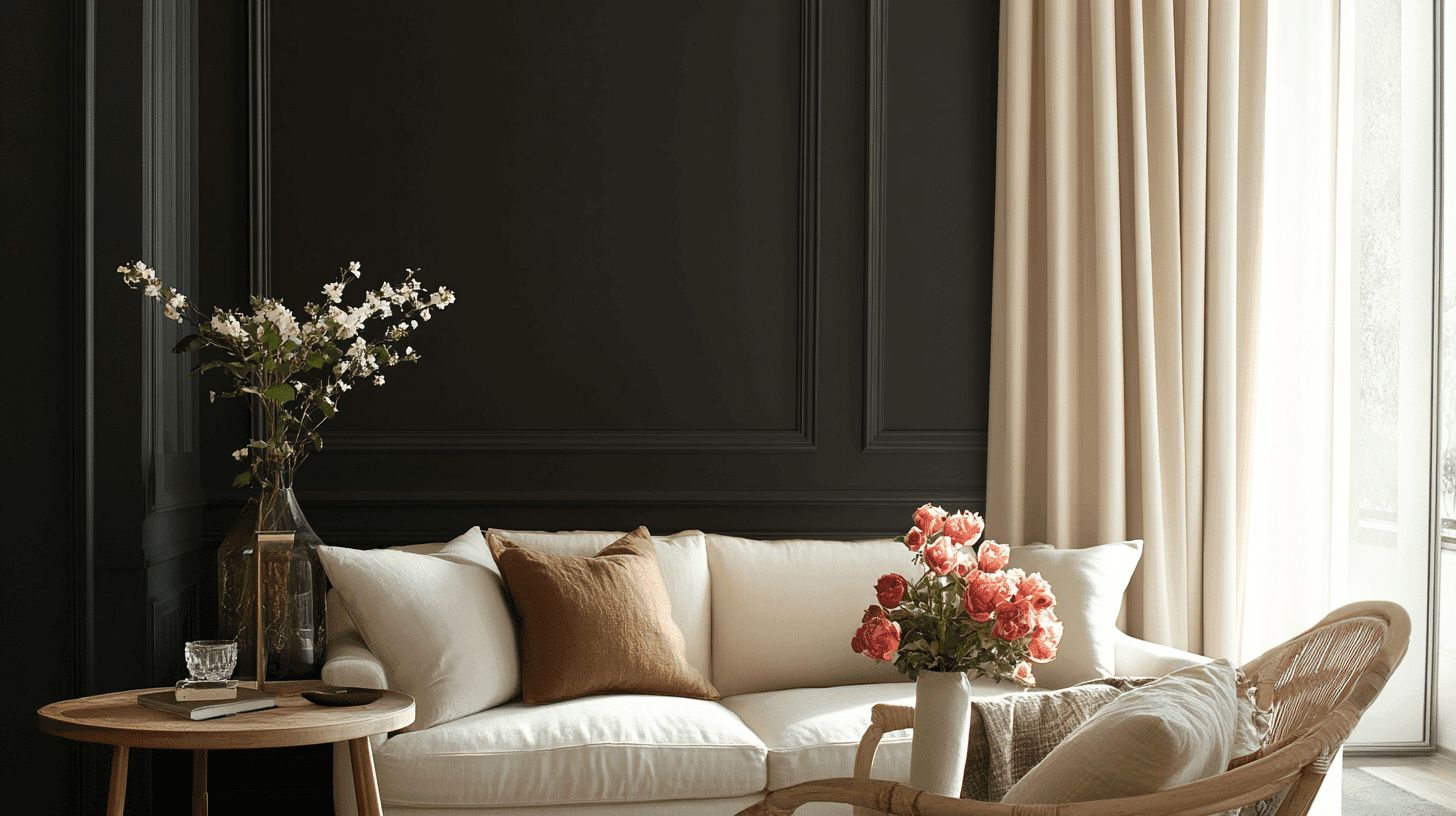
Bright textiles like ivory, cream, and light gray enhance Iron Ore’s dramatic depth and create the necessary contrast.
Glass and acrylic pieces reflect light against the dark backdrop while adding visual space. Concrete planters, geometric shapes, and crisp white linens complete the bold yet balanced aesthetic.
Similar Paint Colors: Perfect Alternative to Iron Ore (SW 7069)
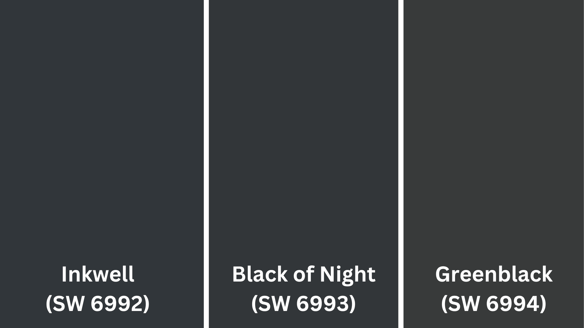
1. Inkwell (SW 6992)
- Slightly darker than Iron Ore with an LRV of 4 compared to Iron Ore’s 4
- It contains subtle blue undertones, giving spaces a cooler, more mysterious feel
- Works exceptionally well in dramatic dining rooms and powder rooms
2. Black of Night (SW 6993)
- True black alternative with the lowest LRV of 4 for maximum depth
- Neutral undertones make it a versatile choice for modern interiors
- Creates striking contrast when used on exterior accents or interior doors
3. Greenblack (SW 6994)
- Features subtle green undertones that emerge in natural lighting
- Similar depth to Iron Ore with a LRV of 4
- It pairs beautifully with natural elements and creates a classy atmosphere in libraries and offices
Final Thoughts
Iron Ore Sherwin Williams (SW 7069) is a versatile dark neutral that brings enlightenment to any space.
Its warm charcoal depth creates drama without the harshness of pure black, making it perfect for accent walls, cabinetry, doors, or even full rooms if you’re feeling bold.
The paint’s durability in premium finishes means it beautifully handles high-traffic areas, while its dark tone hides imperfections better than lighter colors.
If paired with bright whites for contrast or similar tones for a moody, monochromatic look, Iron Ore adapts to your design vision.
It complements both modern and traditional spaces, working equally well with light woods, metallic accents, and bright textiles.
Ready to make a dramatic change in your home? Take the plunge with Iron Ore and convert your space from ordinary to extraordinary!

Alex Guerrero, a graduate with a Fine Arts degree from the Rhode Island School of Design, has been a visionary in the world of color and design for over 15 years. His professional journey began in the heart of the fashion industry in Milan, where he developed an acute sense for color harmonies and trends. Alex joined our team in 2018, offering fresh and innovative perspectives on color utilization in various spaces. Renowned for his ability to blend contemporary trends with timeless elegance. Outside of work, Alex is an accomplished painter and a volunteer art therapist, his artistic talents further enriching his professional insights.