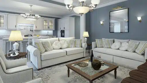
Subway tiles might look simple at first, but the way you arrange them can completely change the feel of a room.
From classic layouts to more creative twists, different subway tile patterns can add movement, depth, and personality without needing bold colors or expensive materials.
That’s why choosing the right subway tile layout patterns matters more than most people think.
Some patterns keep things clean and traditional, while others bring a modern or eye-catching look. The best part? You can mix style with function and still stay within budget.
In this guide, you’ll find some surprising subway tile patterns that can refresh your space and make it feel more put-together without a full renovation.
Understanding Subway Tile Layout Patterns Before You Choose
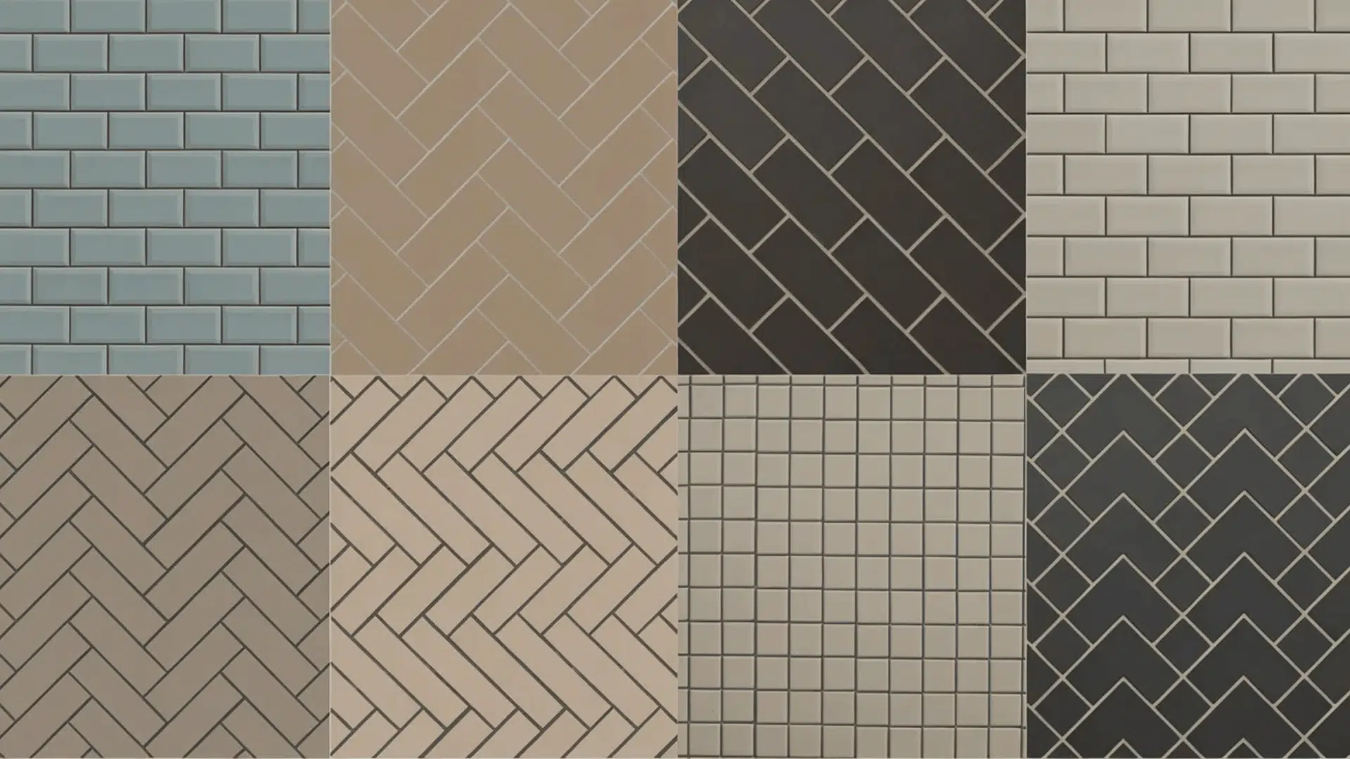
There is a lot more variety in subway tiles than most people realize. Before jumping into your project, it helps to understand what each layout brings to the table visually and practically.
- Tile orientation: Horizontal, vertical, or diagonal placement completely changes the visual weight of a wall
- Grout contrast: High-contrast grout makes the pattern pop; matching grout creates a subtle, quieter look
- Room size: Certain layouts, such as vertical stacking, can make low ceilings appear taller
- Tile size: Classic 3×6 tiles behave differently than larger subway formats in the same pattern
- Complexity: Some patterns, like herringbone, take more time and skill to install correctly
Classic Subway Tile Patterns That Always Work
Some subway tile patterns have stood the test of time for good reason. They are valid, widely loved, and fit in with almost every design style, from farmhouse to modern minimalist.
1. Running Bond (Horizontal Brick)

The running bond is the most recognized subway tile layout pattern out there. Each tile is offset by half from the one above and below it, mimicking the look of traditional brickwork.
It is simple, balanced, and works in virtually any room. If you are unsure where to start, this one is hard to get wrong.
- Best For: Kitchens, bathrooms, laundry rooms
- Pros: Easy to install, timeless look, suits any decor style, widely available in tutorials
- Cons: Can feel predictable if not paired with interesting grout or tile color
2. Running Bond (Vertical Brick)

The vertical brick layout is similar to the classic running bond, but with tiles stacked vertically rather than horizontally. This pattern makes the walls appear taller and more dynamic.
The vertical orientation also offers a fresh take on the timeless running bond pattern, giving it a modern twist without losing the traditional charm.
- Best For: Bathrooms, narrow rooms, powder rooms
- Pros: Makes spaces feel taller, clean and modern, visually striking
- Cons: Requires precise alignment; minor errors are noticeable
3. Vertical Stack Bond

Instead of laying tiles horizontally, the vertical stack bond turns them on their sides. This small change makes a big difference. The eye naturally follows the vertical lines upward, giving lower ceilings a taller feel.
The grout lines run straight up and down, giving it a modern, structured look.
- Best For: Bathrooms, powder rooms, small spaces, kitchens
- Pros: Makes rooms feel taller, clean and contemporary, easy installation
- Cons: Requires very precise alignment; even small errors are visible
4. Horizontal Stack Bond

The horizontal stack bond lines every tile up perfectly, both across and down. There is no offset at all. This gives the wall a very grid-like, orderly appearance.
The clean lines can feel almost architectural. Grout color plays a big role here since the rigid grid pattern is heavily defined by where the lines fall.
- Best For: Modern kitchens, industrial-style bathrooms
- Pros: Very structured and modern, easy to install, versatile with grout colors
- Cons: Can look stark in warmer, cozier spaces
5. One-Third Offset

The one-third offset is a slight twist on the classic running bond. Instead of shifting each tile by half, you shift it by one-third.
The result is a less symmetrical, more relaxed look that still feels organized. Some tile manufacturers actually recommend this offset to reduce the risk of lippage.
- Best For: Scandinavian interiors, contemporary homes, large-format tiles
- Pros: Reduces lippage risk, fresh take on the classic look, works with large tiles
- Cons: Less recognizable pattern; may not suit traditional spaces
6. Herringbone

Herringbone is one of the most visually striking subway tile patterns you can choose. Tiles are placed at 45-degree angles in a V-shape, alternating direction to create that signature zigzag.
It draws attention and feels high-end without being over the top. It does take more precision to install, but the payoff is a wall that genuinely stands out.
- Best For: Feature walls, kitchen backsplashes, master bathrooms
- Pros: Sophisticated and eye-catching, works with both matte and glossy tiles
- Cons: More complex to install, higher labor cost, more tile waste
7. Chevron

Chevron is often confused with herringbone, but they are different. In chevron, tiles are cut at an angle so the points meet precisely, creating a continuous zigzag with no gaps.
This gives it a sharper, more refined look compared to herringbone. It requires specialty cut tiles and more skill to install, but the finished result is genuinely striking. It suits bold, modern spaces beautifully.
- Best For: Accent walls, modern bathrooms, statement backsplashes
- Pros: Very polished and modern, strong visual impact
- Cons: Expensive due to specialty cuts, difficult installation, and more waste
8. Diagonal (45-Degree)

Laying subway tiles at a 45-degree angle creates a diamond-like effect that feels lively and bold. The diagonal orientation draws the eye across the surface in a way that standard horizontal layouts simply do not.
It works especially well on floors and as a full-wall feature in bathrooms. The pattern increases tile waste, since you will need more cuts at the edges, so budget accordingly.
- Best For: Bathroom floors, feature walls, entryways
- Pros: Bold visual effect, adds movement and energy to a space
- Cons: More tile waste, higher labor cost, not ideal for very small tiles
9. Pinwheel

The pinwheel pattern pairs larger square tiles with smaller accent tiles placed at the corners. This creates a rotating, windmill-like look that is genuinely distinctive. It works best when you mix two complementary tile colors or finishes.
The pattern is a great way to introduce a secondary tile without committing to a fully mixed design. It suits bathroom floors and decorative backsplash areas well.
- Best For: Bathroom floors, decorative backsplashes, feature areas
- Pros: Unique and creative, easy to introduce a second color or material
- Cons: Requires precise cutting and planning, can look busy with bold colors
10. Basketweave

The basketweave pattern groups rectangular tiles together in alternating horizontal and vertical pairs. The result looks almost woven, like fabric.
It is a classic pattern with rich texture and depth. It can also be done with contrasting tiles to make the woven effect more visible.
- Best For: Vintage bathrooms, traditional kitchens, decorative features
- Pros: Rich texture, suits many styles, works well in smaller spaces
- Cons: More complex to install, grout lines can be harder to clean
11. Double Herringbone

Double herringbone takes the classic herringbone layout and doubles up the tiles side by side before alternating direction. It creates a bolder, thicker zigzag with greater visual weight.
This version suits larger walls and spaces where a single row of herringbone might look too delicate.
- Best For: Large bathroom walls, modern kitchens, open-plan spaces
- Pros: Bold and modern, great for large walls, high visual impact
- Cons: More tiles needed, complex installation, higher cost
12. Box or Frame Pattern

The box pattern creates rectangular frames by laying tiles in a bordered arrangement. The tiles on the edges run horizontally while the ones inside run vertically, or vice versa.
This gives the wall a structured, almost panelled look. It suits areas where you want a refined feel without going too bold. It works especially well with contrasting grout or two-toned tile sets.
- Best For: Powder rooms, formal dining rooms, feature wall sections
- Pros: Refined and structured, suits formal and transitional spaces
- Cons: Requires precise planning and cutting for clean borders
13. Mixed Orientation Layout

The mixed orientation layout combines horizontal and vertical sections of subway tile within the same space. For example, you might run tiles diagonally behind the stove and horizontally on the adjacent walls.
It is a clever approach for open-plan kitchens where you want to break up large expanses of tile without a full pattern change.
- Best For: kitchens, large bathrooms, rooms with distinct zones
- Pros: Adds variety, creates visual zones, uses one tile type
- Cons: Requires careful planning to ensure transitions look intentional
14. Checker Pattern (Horizontal Stacked)

The checker pattern uses two contrasting tile colors, typically black and white, laid in a horizontal stack so the colors alternate in a checkerboard arrangement.
Each tile lines up directly above and below its neighbor, and the alternating colors create the bold, graphic effect. This high-contrast look suits retro, maximalist, and bold modern spaces equally well.
- Best For: Bathrooms, retro kitchens, bar areas, powder rooms
- Pros: Striking visual contrast, suits many interior styles, timeless black and white palette
- Cons: Can feel overwhelming on large walls; works best in smaller doses or defined feature areas
15. Grid Stack (Basketweave Rotation)

The grid stack pattern groups tiles into alternating horizontal and vertical blocks, forming a repeating square grid across the wall.
Each block contains several tiles running in one direction, and the next block rotates 90 degrees. The result is a structured, almost textile-like surface that reads as both organized and detailed.
- Best For: Modern kitchens, bathroom feature walls, open-plan spaces
- Pros: Highly textured look using a single tile, clean and architectural feel
- Cons: Requires precise block planning before installation; any misalignment is very visible
16. Diagonal Picket Tile
![]()
The diagonal picket layout uses pointed, arrow-shaped tiles set at an angle to create a continuous zigzag or arrow-like pattern across the wall.
Unlike standard subway tiles, picket tiles have tapered ends that lock together visually when installed diagonally. The look is modern and geometric, with a sense of movement and flow built into the tile’s shape.
- Best For: Bathroom feature walls, behind vanities, powder rooms, accent walls
- Pros: Distinctive shape adds built-in pattern, works beautifully in bold colors like Sage green, forest green, or other muted tones
- Cons: Specialty tile shape increases cost; cutting at edges requires precision
17. Square Grid Tile

The square grid layout uses square subway tiles, or standard rectangular tiles turned to face both directions, to create a clean, perfectly even surface.
Every tile and every grout line lines up both horizontally and vertically with no offset at all. The result is incredibly ordered and calm.
- Best For: Minimalist interiors, industrial kitchens, contemporary bathrooms
- Pros: Clean and ordered, very easy to install, suits modern and industrial decor
- Cons: Requires perfectly level walls; any surface imperfection is more visible without offsets to break the eye
18. Combined Vertical and Horizontal Stack

The combined vertical and horizontal stack pattern deliberately mixes tile orientations within the same wall installation.
As seen in modern kitchen backsplashes, you can run tiles horizontally across most of the wall, then switch to vertical stacking in one defined section, such as directly behind the stove or above the sink.
- Best For: Kitchen backsplashes, open-plan kitchens, large bathroom walls
- Pros: Creates visual zones, adds depth using one tile, and works with glossy and matte finishes
- Cons: Transitions between orientations need careful planning to look intentional rather than accidental
19. Ladder Pattern

The ladder pattern places horizontal tiles with small vertical tiles connecting them at intervals, creating a step-like or ladder appearance. It adds a playful detail without overwhelming the space.
- Best For: Backsplashes, accent strips, small walls.
- Pros: Unique and creative, adds visual interest, works well in compact spaces, helps break up plain tile layouts, and pairs nicely with both neutral and bold tile colors
- Cons: Requires planning and extra cuts, alignment needs to be precise, not ideal for large surfaces, as the pattern can feel repetitive or too busy
20. Stepped Brick Pattern

This pattern builds on the classic running bond but shifts tiles in a staggered “step” formation instead of a smooth offset.
It creates a more dynamic flow compared to traditional brick layouts. The stepped layout draws the eye across the wall, making even simple tiles feel more interesting and less repetitive.
- Best For: Feature walls, modern kitchens, bathrooms
- Pros: Fresh twist on a classic, adds movement, easy to customize
- Cons: Can look uneven if spacing isn’t precise, requires careful planning to keep the stepped pattern consistent
Final Thoughts
Subway tile layout patterns are among the easiest ways to add real personality to a tiled space.
If you go for the valid running bond or something bolder like herringbone or chevron, the pattern you choose shapes how the whole room feels.
There are some surprising ideas to help you find something that truly fits your space. Start with the room size, consider your style, and don’t be afraid to try something a little different.
The right subway tile pattern can completely shift the look of a room. Go ahead and pick yours.

Alex Guerrero, a graduate with a Fine Arts degree from the Rhode Island School of Design, has been a visionary in the world of color and design for over 15 years. His professional journey began in the heart of the fashion industry in Milan, where he developed an acute sense for color harmonies and trends. Alex joined our team in 2018, offering fresh and innovative perspectives on color utilization in various spaces. Renowned for his ability to blend contemporary trends with timeless elegance. Outside of work, Alex is an accomplished painter and a volunteer art therapist, his artistic talents further enriching his professional insights.