Choosing the right wedding color schemes can feel confusing at the start, especially with so many options around.
Colors play a big role in setting the mood for your big day, from décor and flowers to outfits and photos. Some people lean toward soft, airy spring wedding colors, while others prefer deeper or more classic tones.
The good part is that there is no single “right” choice. It all comes down to what feels right for your style and setting.
This list keeps things simple and easy to scan. You’ll find a mix of fresh, modern, and eternal ideas that can help you build a color palette that works well for your wedding theme and season.
Why Wedding Color Schemes Matter
Wedding color schemes set the tone for the entire celebration and tie every detail together. A well-chosen palette helps create a cohesive and memorable experience for you and your guests.
- Creates a Unified Look: Brings decor, outfits, and venue elements together in a consistent style
- Sets the Mood: Colors influence the overall vibe, from soft and romantic to bold and lively
- Enhances Photos: A balanced palette makes wedding photos look polished and visually appealing
- Reflects Personal Style: Helps showcase your personality and theme through color choices
- Guides Planning Decisions: Makes it easier to choose flowers, decor, and accessories consistently
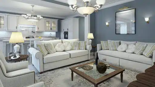
Wedding Color Schemes for Your Big Day
Choosing the right wedding color scheme can shape the entire look and feel of your celebration. Here are some beautiful ideas to help you find a palette that matches your style and season.
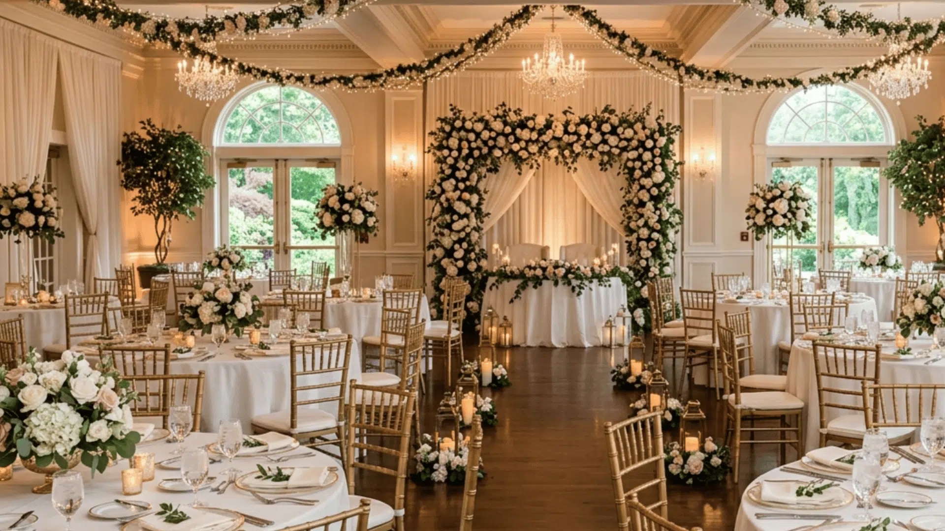
1. Blush Pink & Champagne

A soft and romantic choice that never goes out of style. Blush pink brings a gentle warmth, while champagne adds a light glow without feeling too bold.
This palette works well for both indoor and outdoor weddings. It pairs nicely with gold accents, soft lighting, and white flowers. If you want something calm and pretty without being too bright, this is a safe and beautiful option.
2. Sage Green & Dusty Rose

This color mix feels calm and natural. Sage green gives a fresh, earthy base, while dusty rose adds a soft touch of color. Together, they create a relaxed, romantic look that pairs well with greenery and simple décor.
It’s a great choice for outdoor settings or venues with wood and natural textures. The balance between soft and earthy tones makes it easy to style.
3. Lavender & White

Lavender and white create a light and peaceful look. Lavender adds a soft hint of color, while white keeps everything clean and fresh.
This palette works well for daytime weddings and open spaces. It feels simple but still special. You can pair it with silver accents or soft greenery for extra detail without making things look too busy.
4. Navy Blue & Gold

A strong and classic combination that feels rich and well-balanced. Navy blue adds depth, while gold brings warmth and shine.
This pairing works well for evening weddings or formal venues. It looks great in table settings, invitations, and outfits. If you want something bold yet eternal, this color scheme is a perfect choice.
5. Terracotta & Rust

Warm and earthy, this palette feels grounded and cozy. Terracotta and rust tones bring a natural warmth that complements outdoor or rustic settings.
These colors look great during sunset and pair nicely with dried flowers, wood décor, and soft lighting. It’s a great option if you want something different from traditional soft pastels.
6. Emerald Green & Gold

This palette feels rich and eye-catching. Emerald green adds a deep, bold tone, while gold brings brightness and contrast.
Together, they create a polished and balanced look. It works well in venues with greenery, dark furniture, or candlelight. This is a strong choice for couples who want a color scheme that stands out without feeling too loud.
7. Dusty Blue & Ivory

A soft and calming palette that feels easy on the eyes. Dusty blue adds a cool tone without being too dark, while ivory keeps things light and neutral.
This combination works well for both modern and traditional weddings. It pairs well with simple décor and soft fabrics, creating a clean, relaxed overall look.
8. Peach & Coral

This palette feels bright and cheerful without being too strong. Peach adds a soft warmth, while coral brings a bit of energy.
Together, they create a lively but balanced look. These colors work well with greenery and natural light. If you want something fresh and happy, this is a great option.
9. Burgundy & Blush

A mix of deep and soft tones that creates a nice contrast. Burgundy brings richness, while blush softens the overall look.
This combination feels romantic and slightly bold at the same time. It works well for evening settings or cooler seasons. You can pair it with gold or greenery for added depth.
10. Mint Green & Gold

Mint green gives a light and fresh feel, while gold adds a touch of shine. This palette feels clean, soft, and slightly modern.
It works well for outdoor weddings or daytime events. The combination is simple but still looks put together, especially when paired with white flowers and light décor.
11. Gold, Turquoise & White

A bright and refreshing palette that feels clean and eye-catching. Turquoise adds a pop of color, while gold brings warmth and a slight shine.
White helps balance the look and keeps everything feeling light. This combination works well for outdoor or destination weddings. It pairs nicely with simple décor, glass elements, and fresh florals for a neat and lively setup.
12. Champagne & Mauve

A soft and muted palette that feels calm and balanced. Champagne brings a warm neutral base, while mauve adds a gentle hint of color.
This combination works well in intimate settings with soft lighting. It pairs nicely with simple décor, candles, and natural textures. If you want a subtle and cozy feel, this is a lovely option.
13. Dusty Pink & Grey

A modern and simple color scheme that feels clean and balanced. Dusty pink adds softness, while grey keeps everything grounded.
This palette works well for city venues or minimal setups. It’s easy to style and doesn’t feel overwhelming. You can add metallic accents for a bit of shine without changing the overall mood.
14. Lavender & Yellow

A fresh and cheerful color mix that feels bright yet balanced. Lavender brings a soft, calming tone, while yellow adds a pop of energy and warmth.
Gold ties everything together with a subtle shine. This palette works well for outdoor weddings or daytime events. It pairs well with floral setups, soft fabrics, and simple décor to create a lively yet polished look.
15. Deep Plum & Copper

A rich and warm combination that feels bold and cozy. Deep plum adds depth, while copper brings a soft metallic glow. Together, they create a strong yet balanced look.
This palette works well in evening settings and pairs nicely with warm lighting and textured décor. It also looks great with candlelight and darker backdrops.
16. White & Green

A clean and natural palette that feels fresh and simple. White keeps everything light, while greenery adds life and texture.
This combination works well in almost any setting, from outdoor spaces to modern venues. It’s easy to style and looks great in photos without feeling too busy. It’s also budget-friendly since greenery can fill space easily.
17. Sky Blue & Sand

A light and relaxed palette inspired by coastal settings. Sky blue brings a soft color, while sand tones keep things neutral.
This combination works well for outdoor weddings and open spaces. It feels calm and easy, making it a great choice for a laid-back celebration. It pairs well with simple fabrics and breezy décor.
18. Lilac & Silver

A soft and dreamy pairing that feels light and gentle. Lilac adds a subtle color, while silver brings a cool shine. This palette works well for evening or indoor weddings with soft lighting.
It creates a calm and slightly magical feel without being too bold. Adding fairy lights can make this look even more special.
19. Rust & Mustard

A warm and earthy palette that feels rich and inviting. Rust and mustard tones bring depth and a natural look. This combination works well with wood décor, dried flowers, and outdoor settings.
It’s a great choice if you want something warm and different from soft pastels. These tones also photograph beautifully in natural light.
20. Blush & Eucalyptus

A soft and natural combination that feels fresh and balanced. Blush adds a gentle pink tone, while eucalyptus brings a cool green touch.
This palette works well with simple floral arrangements and greenery. It creates a relaxed and romantic look that’s easy to style. It’s also popular for both indoor and outdoor venues.
21. Midnight Blue & Ivory

A deep and calm palette that feels refined and simple. Midnight blue adds richness, while ivory keeps things soft and easy on the eyes.
This combination works well for evening weddings and formal venues. It looks great with candlelight and simple décor. You can also add gold or silver accents to give it a slightly richer finish without making it feel too heavy.
22. Caramel & Cream

A warm and cozy palette that feels soft and inviting. Caramel tones bring depth, while cream keeps the overall look light and balanced.
This combination works well for rustic or simple setups. It pairs nicely with natural materials like wood, linen, and soft fabrics. It’s a great option for couples who want a relaxed and comfortable setting that still feels well put together.
23. Hot Pink & Orange

A bold and playful combination that stands out easily. Hot pink adds energy, while orange brings warmth and brightness.
This palette works well for outdoor weddings and lively celebrations. It’s perfect if you want something fun and colorful. Bright florals and simple décor can help tie everything together without making the setup feel too busy.
24. Forest Green & Burgundy

A deep and rich palette that feels strong and grounded. Forest green adds a natural tone, while burgundy brings depth and warmth.
This combination works well in outdoor or rustic venues. It creates a cozy and romantic feel that works especially well in cooler settings. Adding wood elements or soft lighting can make this palette feel even more welcoming.
25. Powder Blue & Butter Yellow

A light and cheerful pairing that feels soft and fresh. Powder blue keeps things calm, while butter yellow adds a gentle brightness.
This palette works well for daytime weddings and open spaces. It creates a relaxed and happy mood without feeling too bright. Light fabrics and simple floral arrangements can help keep the overall look balanced.
26. Rose Gold & Nude

A soft and warm palette that feels calm and polished. Rose gold adds a gentle shine, while nude tones keep everything neutral and easy to match.
This combination works well with soft lighting and simple décor. It creates a cozy, balanced look that feels modern yet not too bold. It’s also easy to pair with white or blush accents.
27. Cobalt Blue & White

A crisp and clean palette that feels bold and fresh. Cobalt blue stands out against a white base, creating a strong contrast.
This combination works well for outdoor settings and simple décor. It looks sharp and clear in photos, especially in natural light. Adding small hints of greenery can help soften the overall look.
28. Olive Green & Burnt Orange

A natural and warm palette that feels grounded and easy. Olive green adds a soft base, while burnt orange brings warmth and depth.
This combination works well for outdoor and rustic weddings. It pairs nicely with wood, dried flowers, and natural textures. This palette feels simple but still has enough color to stand out.
29. Soft Apricot & Sage

A gentle and balanced palette that feels fresh and light. Apricot adds a soft warmth, while sage keeps things calm and natural.
This combination works well with simple floral setups and greenery. It creates a relaxed, easygoing look that works well in both indoor and outdoor spaces. Neutral décor can help tie everything together nicely.
30. Ice Blue & Platinum

A cool and clean palette that feels calm and polished. Ice blue adds a light, soft tone, while platinum adds a subtle shine.
This combination works well for indoor venues and modern setups. It creates a neat and refined look without feeling too heavy. Soft lighting and simple décor can make this palette feel even more special.
How to Choose the Right Color Scheme for Your Venue
Your venue is the first place to consider when choosing wedding color schemes. The lighting, space, and surroundings should match your colors, not clash with them.
| Step | What to Consider | Why It Matters | Example Idea |
|---|---|---|---|
| Understand the Venue | Look at walls, flooring, and existing decor | Helps avoid clashing with fixed elements | Match tones with wood or stone |
| Consider Lighting | Natural and artificial light conditions | Affects how colors appear | Soft pastels for bright spaces |
| Match the Theme | Align colors with wedding style | Keeps everything consistent | Rustic theme with earthy tones |
| Keep It Balanced | Use 2–3 main colors with accents | Prevents the space from looking busy | Neutral base with one bold color |
| Test Before Finalizing | Check samples at the venue | Ensures colors look right in a real setting | Fabric swatches or sample decor |
Conclusion
Picking the right wedding color schemes doesn’t have to feel stressful. Start with a mood like soft, bold, or natural and build your wedding colors around that idea.
Spring wedding colors are perfect for light and fresh vibes, while deeper tones work well for evening or fall weddings.
The best color schemes are the ones that feel personal and easy to match across your décor, outfits, and overall theme.
Take inspiration from this list and mix different colors until everything feels just right for your big day.

Alex Guerrero, a graduate with a Fine Arts degree from the Rhode Island School of Design, has been a visionary in the world of color and design for over 15 years. His professional journey began in the heart of the fashion industry in Milan, where he developed an acute sense for color harmonies and trends. Alex joined our team in 2018, offering fresh and innovative perspectives on color utilization in various spaces. Renowned for his ability to blend contemporary trends with timeless elegance. Outside of work, Alex is an accomplished painter and a volunteer art therapist, his artistic talents further enriching his professional insights.