Thinking About Paper White for Your Home?
Benjamin Moore Paper White (OC-55) or 1590 might be the color you’ve been searching for. This gentle shade sits between pure white and light gray, with soft blue-gray undertones that shift with changing light.
With an LRV of 74.41, it reflects plenty of light to keep spaces feeling open and airy.
Our blog covers everything you need: how Paper White changes in different lighting conditions, which colors pair well with it, and how it performs in various rooms.
We also share maintenance tips for keeping your walls looking fresh, common mistakes to avoid, and similar colors to consider if you’re still deciding.
Read on to learn why Paper White might be the perfect choice for your home.
Understanding Paper White’s Undertones
Paper White is not simply white. It has subtle color hints that change how it looks in different settings. The main undertone is gray-blue, making it cooler than pure white.
Light affects how people see this color. In north-facing rooms with less sun, the blue tones become stronger. In sunny south-facing spaces, it appears more neutral.
The time of day matters, too. Morning light brings out Paper White’s blue qualities, while evening light can make it seem grayer.
The colors nearby also change how Paper White looks. Next to true white, its blue-gray shows more clearly. When used with warm browns or creams, it creates a calm contrast.
For those wanting a clean but not stark white, Paper White offers a gentle option with its soft blue-gray base.
How Does Paper White Appear in Different Lighting Conditions?
Paper White by Benjamin Moore changes its look based on the light it gets. Here’s how this paint color shows up at different times of day:
- Morning Light: In early daylight, Paper White looks clean and bright. The soft morning sun brings out its cool tones, making walls feel fresh and open.
- Afternoon Sun: This paint gets warmer during midday. The strong light shows more gray hints in Paper White, giving rooms more depth and warmth than in the morning.
- Nighttime: When darkness falls, Paper White turns more gray. Its true color changes without natural light, and the walls can look more flat.
- Artificial Light: Under lamps and bulbs, Paper White’s appearance depends on the bulb type. Warm lights make it seem more cream-colored, while cool white bulbs bring out its blue-gray side.
Color Details
| Attribute | Value |
| Color Code | OC-55 or 1590 |
| Hex Code | #E0E2DC |
| Light Reflective Value (LRV) | 74.41 |
| RGB Value | (224,226,220) |
What Does These Numbers Show?
- Color Code OC-55 or 1590 tells people the exact shade in Benjamin Moore’s catalog.
- Hex Code #E0E2DC is the computer code for this color, which is useful for websites and digital projects.
- The Light Reflective Value (LRV) of 74.41 shows how much light the color reflects—higher numbers mean brighter rooms.
- RGB Values tell how much red (224), green (226), and blue (220) mix to make Paper White.
Paper White is a soft, light color with slightly more green than other shades. The high LRV number means it will make spaces feel bigger and brighter.
The small difference between the red, green, and blue numbers creates its gentle, balanced look.
Digital Uses of Paper White
Benjamin Moore’s Paper White color works well in many online and computer settings. This light, clean shade helps make digital spaces look clear and simple.
- It is good for website backgrounds to make text easy to read.
- Works as a base color for social media posts.
- Useful for digital presentations to keep slides clean.
- It helps photo backgrounds look nice without paying extra attention.
- Fits well with most other colors in digital designs.
- It makes email newsletters look clean and professional.
- Works well on both computers and phones.
The color gives digital work a clean, simple look without being boring. It has just enough warmth to feel friendly but stays basic enough to work with many styles.
Why Choose This Paint Color?
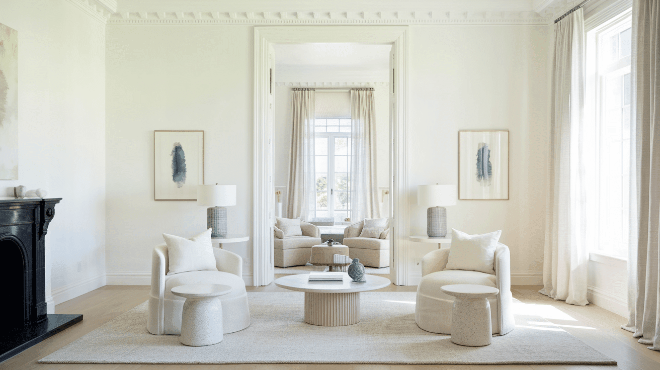
Paper White is a top pick for people who want a clean, bright look in their homes. This color gives rooms a fresh feel without being too cold.
It works well in living rooms, kitchens, and bathrooms because it makes spaces look bigger and more open.
The soft gray undertones in Paper White help it stay neutral while adding more depth than plain white paint. This makes it a good match for many different styles of furniture and decorations.
It looks nice in both sunny rooms and spaces with less natural light.
Many homeowners pick this color because it doesn’t show dirt easily and keeps walls looking clean longer than brighter whites. It’s also very easy to touch up if needed.
Durability & Maintenance
The right care helps Benjamin Moore Paper White paint stay clean and fresh for many years. Here are tips for keeping this paint looking good:
- Clean walls with mild soap and water using a soft cloth
- Wipe spills right away to stop stains
- Use a damp cloth for dust removal every few months
- Keep paint cans for touch-ups when needed
- Avoid harsh cleaners that can damage the finish
- Check walls twice a year for damage needing fixes
- Use low-tack tape for hanging items to protect paint
These simple steps will help Paper White walls stay in good shape for a long time.
Texture Partners
| Material Type | Best Texture Partners | Effect on Paper White |
|---|---|---|
| Wood | Light oak, whitewashed wood, walnut | Adds warmth and contrast to the cool undertones |
| Metal | Brushed nickel, matte black, antique brass | Enhances the modern or industrial style |
| Stone | White marble, light gray quartz, limestone | It complements the neutral, airy feel |
| Fabric | Linen, cotton, soft wool | Adds texture and softness to the space |
| Tile | White subway tile, textured ceramic, herringbone patterns | Creates a clean and timeless look |
| Glass | Clear, frosted, or lightly tinted glass | Reflects light and enhances brightness |
| Brick | Painted white brick, exposed light gray brick | Adds depth and constructive interest |
How Paper White Color Works in Different Rooms?
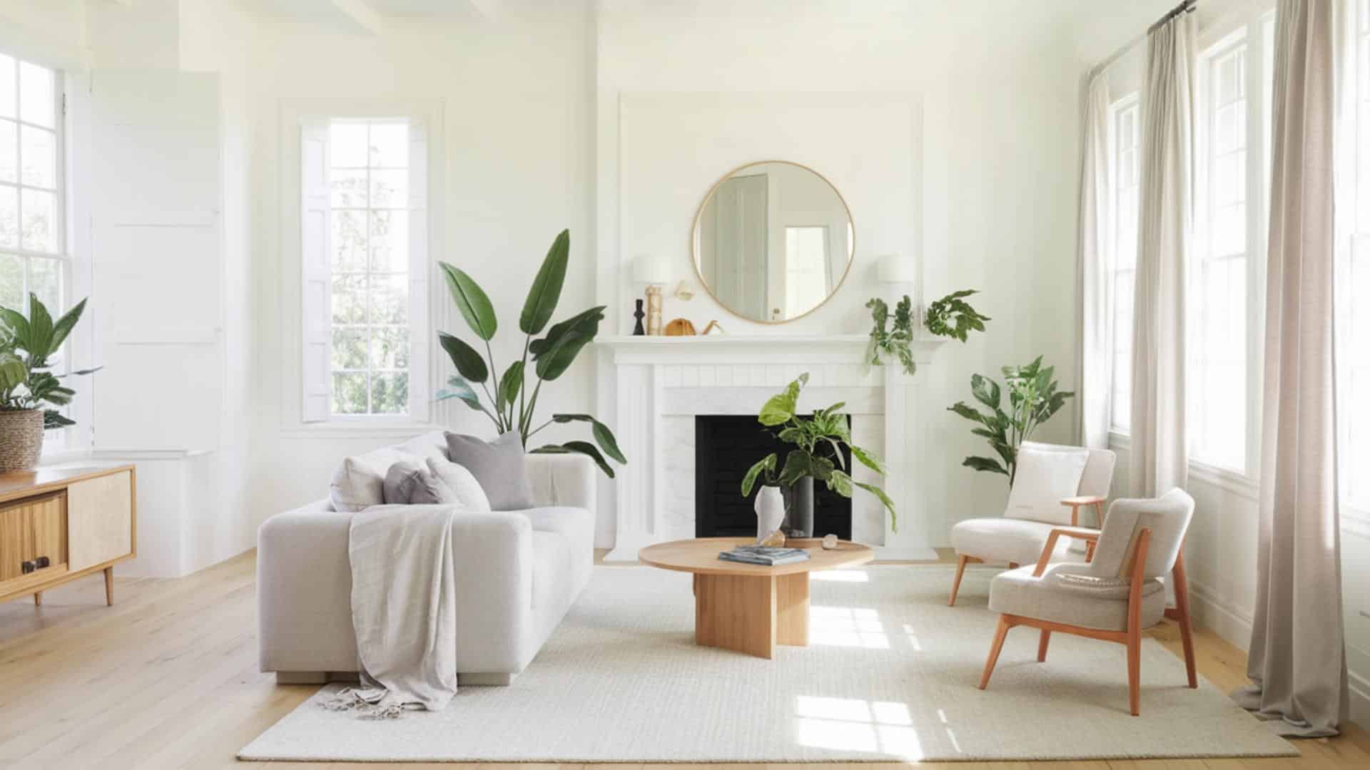
Living Room
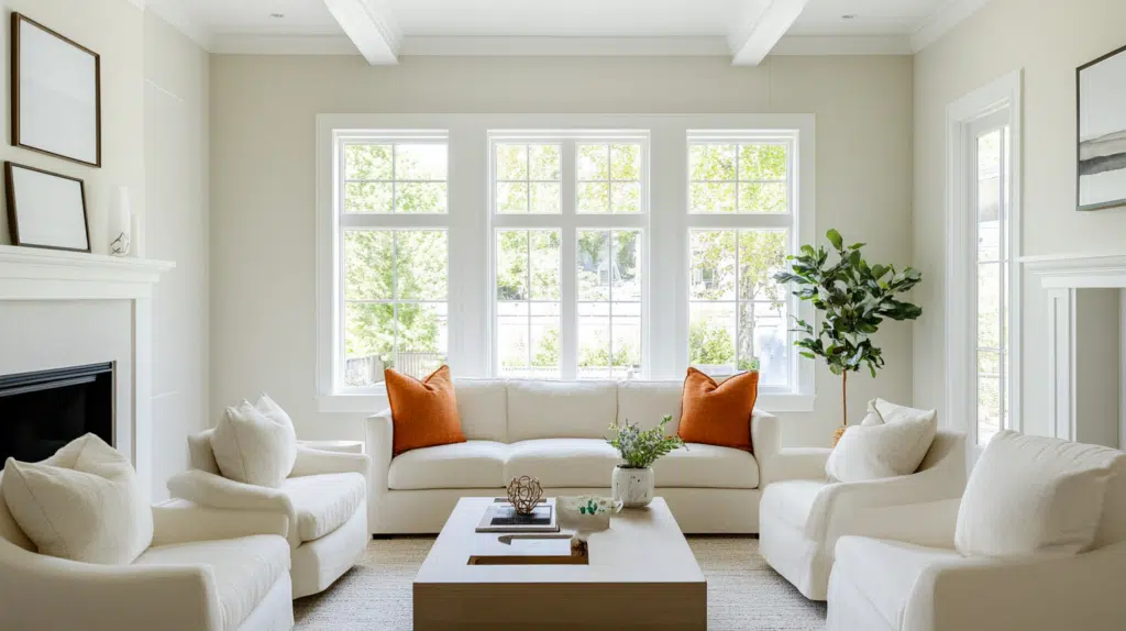
Paper White creates a calm base in living rooms. The color stays neutral day and night, helping the artwork stand out. The furniture looks clean against these walls.
- Pair with natural wood furniture for a warm contrast.
- Add navy blue accents for depth without overwhelming the space.
Kitchen
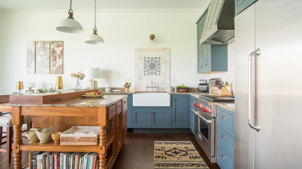
Paper White makes kitchens look clean and fresh. This color works with many cabinet colors and doesn’t clash with food tones. The soft shade feels welcoming.
- Mix with stainless steel for a modern look.
- Use light wood cutting boards and tools as accents.
Bedroom
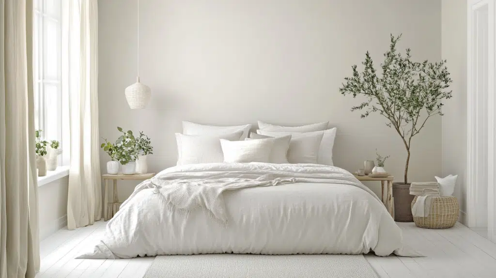
This gentle shade helps bedrooms feel peaceful. Paper White doesn’t clash with bedding colors or patterns, and its soft tone promotes rest.
- Combine with soft green plants for a natural feel.
- Add gray or tan bedding for a simple, restful space.
Bathroom
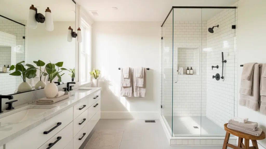
Paper White helps bathrooms feel clean and bright. The color works well with both natural and artificial light. It makes small bathrooms seem bigger.
- Match with white fixtures for a clean look.
- Use dark towels or rugs for a simple contrast.
Dining Room
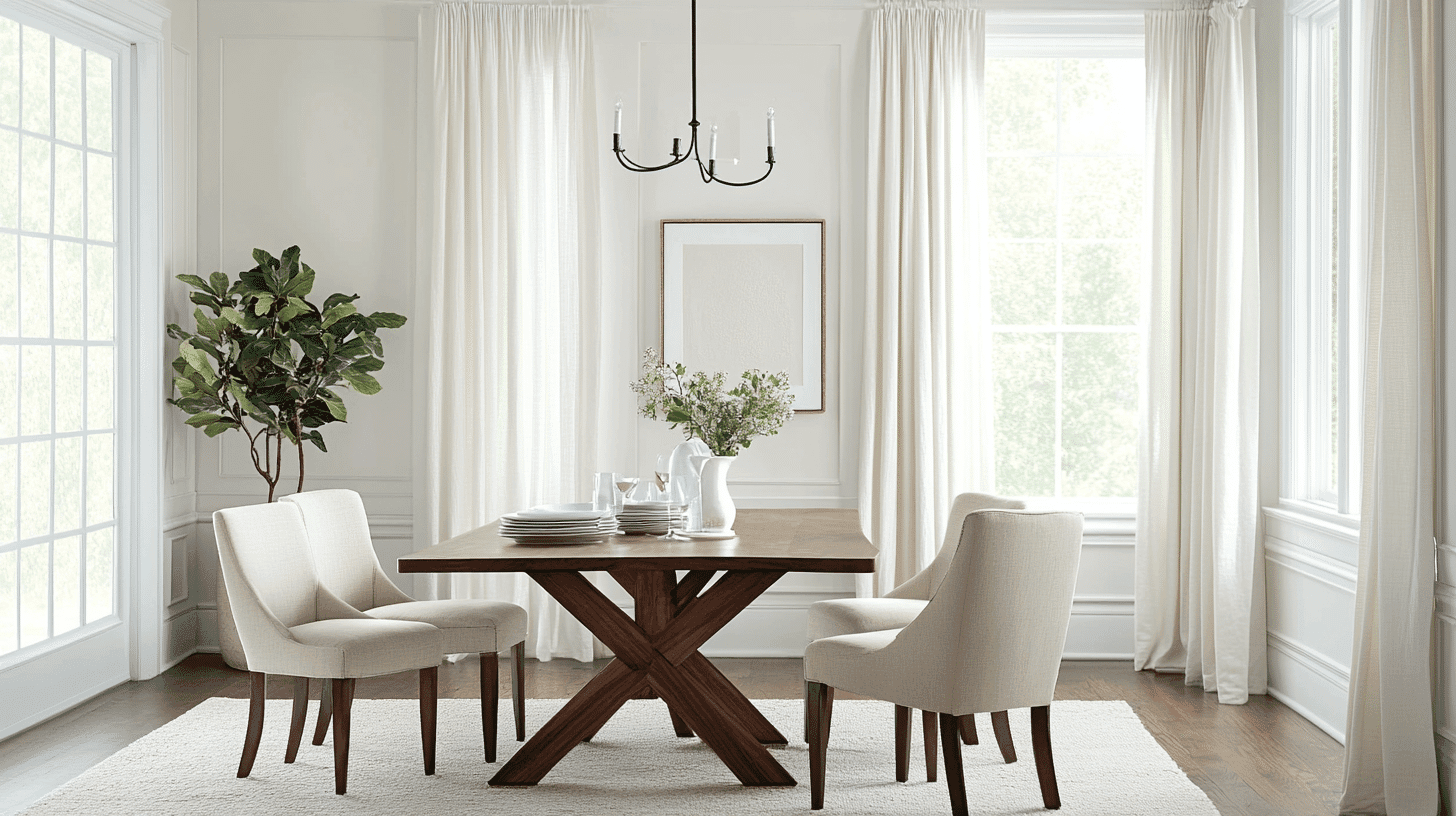
This color creates a good background for meals and talks. Paper White doesn’t compete with food colors or table settings. It stays pleasant in all lighting.
- Blend with wood tables for a classic feel.
- Include black picture frames for a simple style.
Home Office
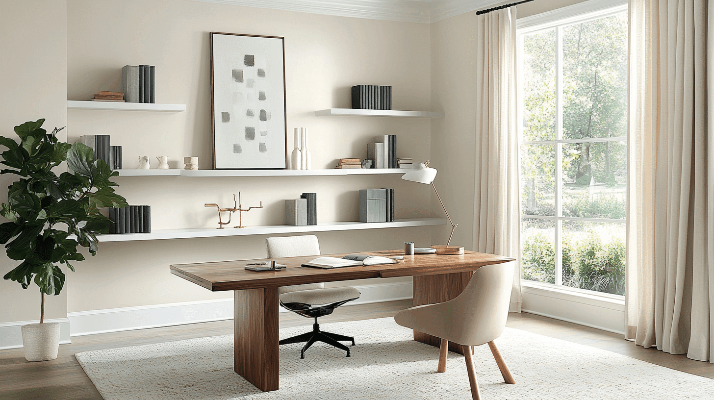
Paper White helps focus and reduces eye strain. This color won’t distract you during work hours, keeping the space feeling open and clear.
- Team with dark desk furniture for good balance
- Use green plants to add life to the workspace.
Colors That Complement This Shade!
1. White Heron (OC-57)
White Heron is a soft, clean white that works well with Paper White. Its hint of warmth makes rooms feel calm and open. This color helps make spaces look bigger and brings more light into a room.
2. Sweet Bluette (813)

Sweet Bluette adds a soft touch of color when used with Paper White. This gentle blue tone creates a calm feeling in bedrooms or bathrooms without being too bold.
3. Mountain Peak White (OC-121)
Mountain Peak White has warm hints that balance the cooler tones of Paper White. This pairing works well in living areas where a subtle contrast between whites adds depth without being obvious.
4. Manchester Tan (HC-81)
Manchester Tan brings a neutral warmth that makes Paper White look crisper. This tan shade helps ground the lighter color, making it a good match for halls and dining rooms.
Similar Paint Colors to Consider
1. White Wisp (OC-54)

White Wisp is a light gray with soft undertones that closely matches Paper White. It gives walls a clean look while adding a bit more depth. This color works well in living rooms and halls where a subtle backdrop is needed.
2. Horizon (1478)
Horizon is a pale gray-blue that shares the cool feel of Paper White. Its hint of blue shows more in certain lights. This color makes rooms feel open and airy while maintaining a calm mood.
3. Silver Satin (856)
Silver Satin has a pearly finish with gray notes that are close to Paper White. It catches light nicely and changes slightly throughout the day. This color fits well in kitchens and bathrooms where a bit of shine helps the space.
4. Winter White (2140-70)
Winter White is a crisp, cool white with just a little gray. It looks almost like Paper White but with a slightly cooler tone. This color creates clean lines and works well on trim or in rooms that need a fresh look.
Tips Before Choosing This Paint Color
Selecting the right paint color needs careful planning. Testing samples in different lighting conditions helps avoid mistakes.
- Test paint samples on different walls.
- Look at the color during morning, afternoon, and evening.
- Compare it with existing furniture and fixtures.
- Consider the room’s natural light sources.
- Check how it looks with the floor color.
Taking time to test colors properly will save money and disappointment in the long run.
Wrapping It Up
Benjamin Moore Paper White is a solid choice for those seeking a light, clean wall color with a hint of character.
This soft white with gray-blue undertones offers balance in most rooms, making spaces feel open without the stark feel of pure white.
Paper White works well in modern and traditional homes, letting other items in rooms take center stage. The color pairs well with many materials, from wood to stone, making it a good base for different design styles.
For those wanting a calm, fresh look without too much boldness, Paper White delivers a pleasant middle ground between pure white and more noticeable colors.
With proper testing and careful placement, this paint shade can transform ordinary walls into clean, quiet backgrounds that add subtle interest to any home.
What do you think about the color? Please share with us in the comment section below.

Alex Guerrero, a graduate with a Fine Arts degree from the Rhode Island School of Design, has been a visionary in the world of color and design for over 15 years. His professional journey began in the heart of the fashion industry in Milan, where he developed an acute sense for color harmonies and trends. Alex joined our team in 2018, offering fresh and innovative perspectives on color utilization in various spaces. Renowned for his ability to blend contemporary trends with timeless elegance. Outside of work, Alex is an accomplished painter and a volunteer art therapist, his artistic talents further enriching his professional insights.