
Like a perfectly balanced cup of chamomile tea, Benjamin Moore’s Manchester Tan wraps your space in understated dignity and timeless warmth.
This refined neutral transcends ordinary beiges, carrying just the right balance of warm and cool undertones that adapt beautifully to changing light throughout the day.
Manchester Tan creates a foundation of refined comfort—a versatile, inviting atmosphere that complements traditional and contemporary design sensibilities.
Its remarkable adaptability allows it to shift subtly from room to room, creating a compatible flow while responding uniquely to each space’s lighting and purpose.
More than just another neutral, Manchester Tan is an experience—one that brings the refined comfort of nature’s most adaptable shades into your everyday environment.
It’s the perfect backdrop for everything from historic renovations to modern minimalist designs seeking subtle depth and character.
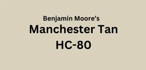
Understanding Benjamin Moore’s Manchester Tan
Color Terminology
| PROPERTY | VALUE |
|---|---|
| LRV (Light Reflectance Value) | 63.24 |
| Color Category | Considered a medium-light neutral (LRV between 60-70) |
| Comparison | Pure white: ~90 LRV, Black: ~0 LRV |
| RGB Value | Red: 219, Green: 209, Blue: 187 |
| Hex Code | #DBD2BC |
Undertones:
- Manchester Tan has balanced warm undertones with subtle green influences
- It’s a versatile neutral that avoids appearing too yellow or pink
- Not a flat or one-dimensional beige but a refined, complex neutral with remarkable adaptability
Psychology of Versatile Neutral Colors
Balanced neutrals like Manchester Tan create a sense of experience and timeless serenity.
- Chameleon-like tones: Offer adaptability and visual harmony across spaces
- Balanced neutrals: Evoke comfort, experience, and design flexibility
- Benefits: More nuanced than stark whites or heavy beiges, adds substantial presence to spaces, create a warm backdrop for both colorful furniture and constructive elements
Manchester Tan provides the perfect balance for those seeking a significant neutral that isn’t too overwhelming or underwhelming.
Its balanced undertones make it particularly versatile in various lighting conditions. Under these conditions, it maintains its character while subtly shifting to complement each space’s unique qualities.
Why Choose this Color?
Manchester Tan’s exceptional versatility creates a sense of refined comfort that adapts to virtually any design direction or lighting condition.
This enduring color carries complex undertones that respond beautifully to changing light, ensuring your space feels both contemporary and timelessly smart.
Key Features
Benjamin Moore Manchester Tan offers remarkable adaptability across different lighting conditions. It reveals warmer aspects in morning light while showcasing more refined gray undertones in evening illumination.
Its balanced neutral quality provides a refined backdrop that complements both vibrant accent colors and natural materials without appearing too warm or too cool.
Adaptability
Benjamin Moore Manchester Tan demonstrates exceptional versatility with existing elements like various wood tones and metal finishes, creating harmonious transitions between spaces.
It provides enough warmth to feel inviting and substantial while maintaining a refined, enduring quality that bridges traditional and contemporary design approaches.
This chameleon-like neutral works equally well as an all-over color for creating compatible, refined environments or as a complementary element to more dramatic accent walls.
Durability
Benjamin Moore Manchester Tan, particularly in premium finishes like Aura or Regal Select, delivers outstanding durability with excellent coverage in both new and repainted areas.
Its medium-light tone and balanced undertones maintain a refined appearance throughout your home while providing a forgiving surface that hides minor imperfections.
This paint resists wear and maintains color consistency even with regular cleaning when properly applied.
Texture Patterns
Benjamin Moore Manchester Tan creates a soft, refined texture that adds subtle dimension to walls and constructive features.
Its complex undertones produce a stunning light play that increases moldings and brings warmth and interest to even simple walls.
When applied to different finishes, it can elegantly highlight constructive details while maintaining a consistent, refined appearance throughout connected spaces.
Room-by-Room Color Recommendations with Manchester Tan
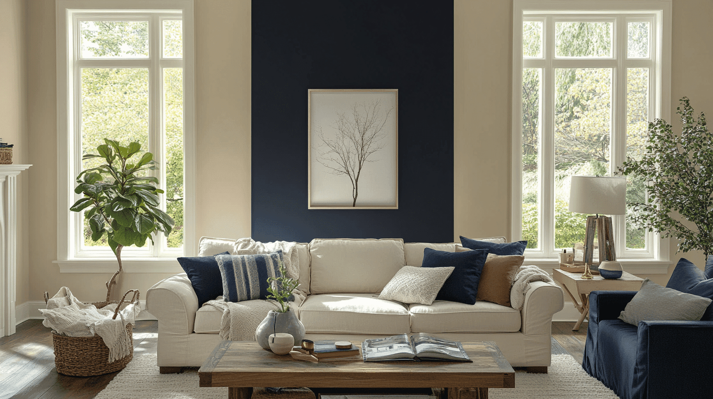
Living Spaces and Open Floor Plans
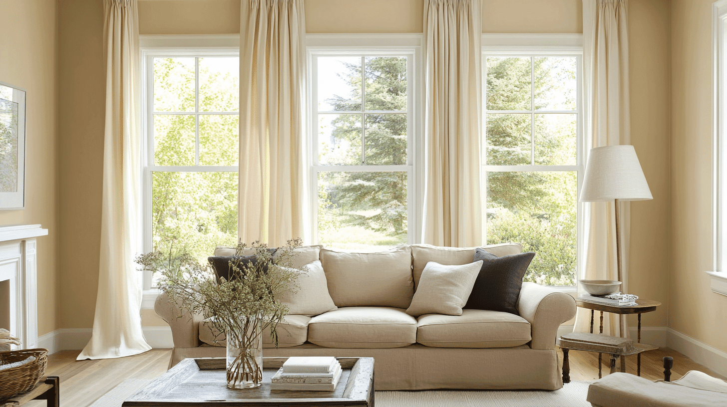
- Manchester Tan works exceptionally well as an all-over color in open floor plans, creating a compatible space while maintaining background and adaptability across different lighting zones.
- The 63.24 LRV of Manchester Tan provides a substantial, grounding feel that makes spaces appear refined and welcoming without feeling heavy.
- Use Manchester Tan to unify different areas in larger spaces while allowing constructive details and artwork to stand out against its adaptable backdrop.
Bedrooms and Relaxation Areas
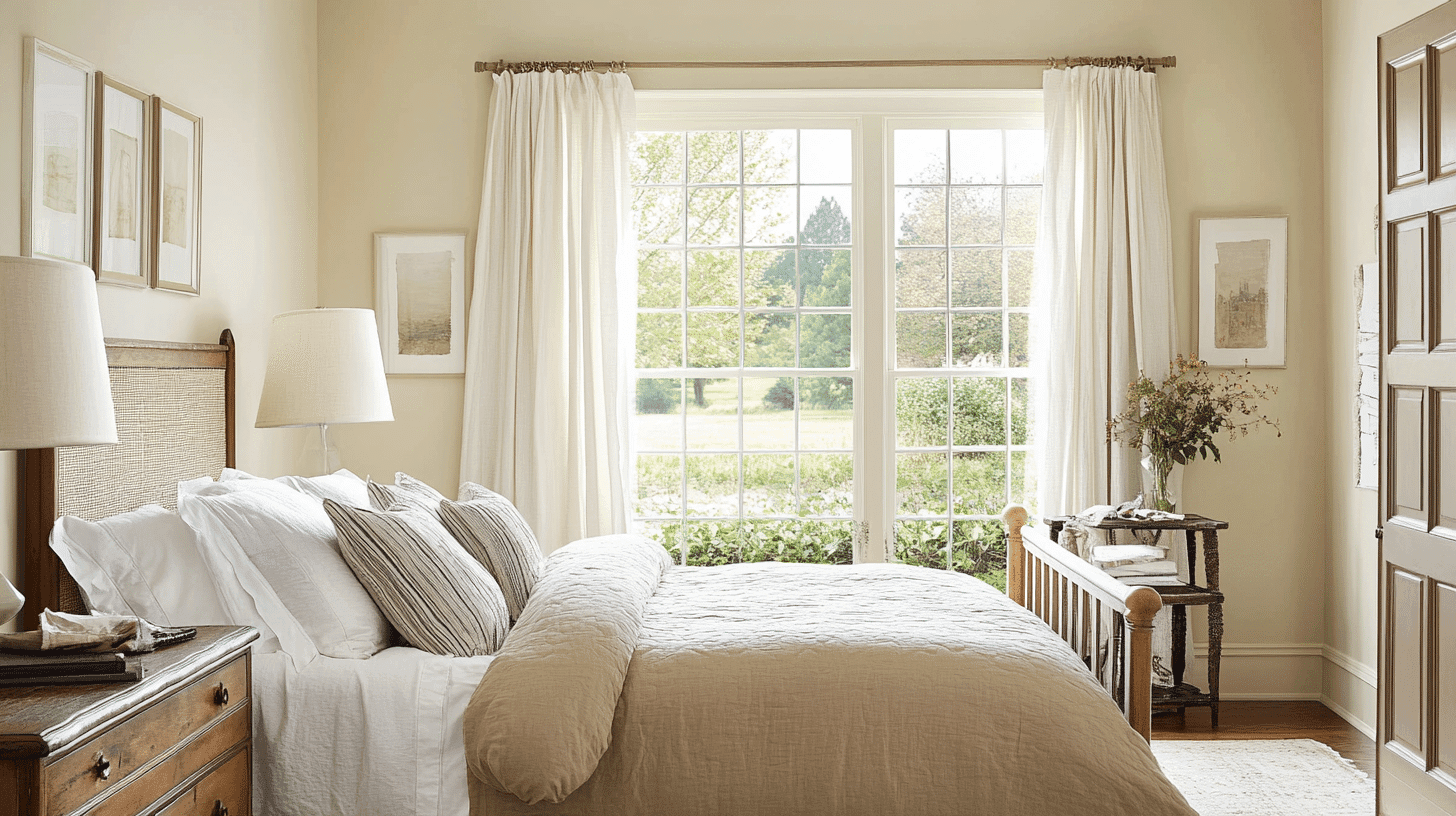
- Manchester Tan creates a balanced, refined atmosphere in bedrooms that promotes relaxation without feeling too warm or cool.
- The subtle balance in Manchester Tan provides a refined backdrop for both cool and warm bedding colors and furniture styles.
- Consider Manchester Tan for all walls to create a serene sanctuary that feels both timeless and contemporary without sacrificing character.
Kitchens
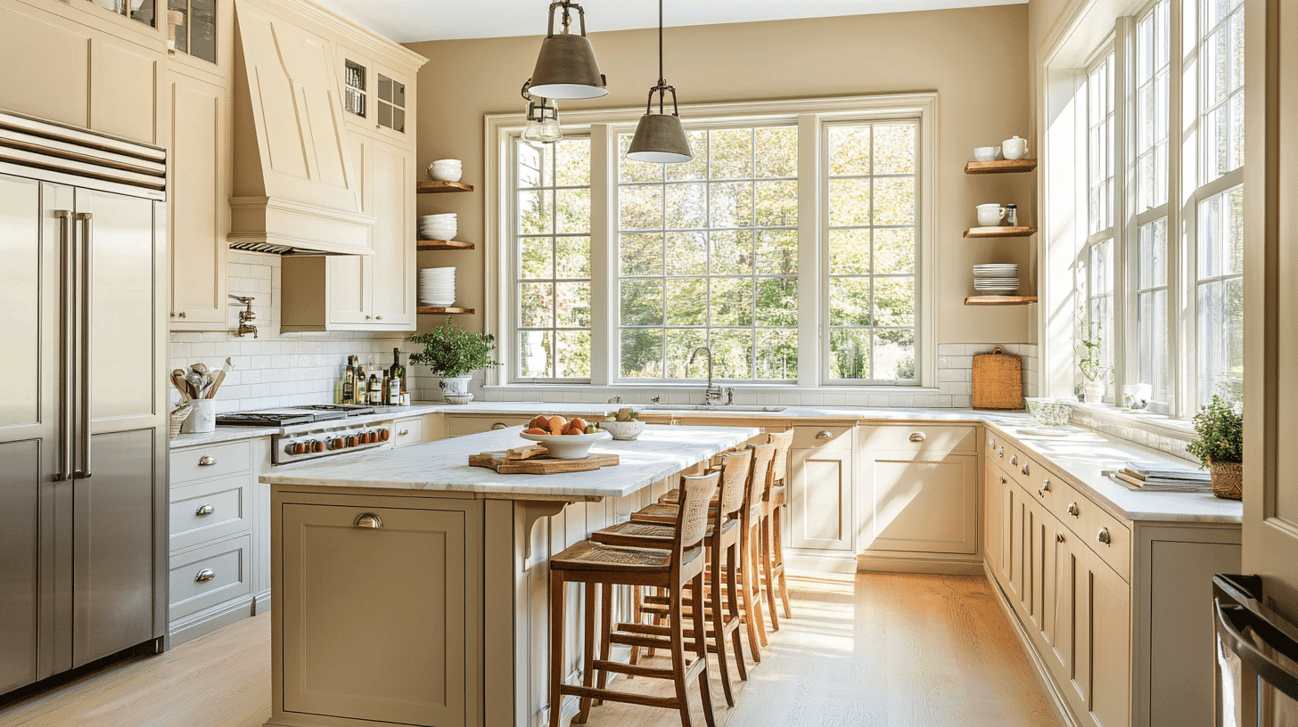
- Manchester Tan in eggshell or satin finish on walls creates a warm, refined element that pairs beautifully with both white cabinets and darker wood tones.
- The balanced depth of Manchester Tan increases both light and dark countertop materials and various metal fixtures, making it adaptable to kitchen styles from traditional to transitional.
- Manchester Tan walls paired with white cabinets create appealing harmony that warms the kitchen while maintaining a refined, timeless feel.
Bathrooms and Spa-like Retreats
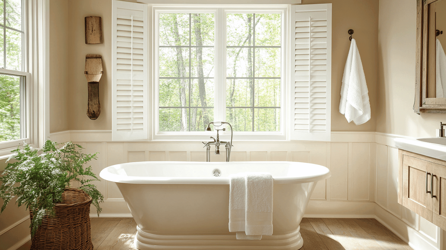
- Benjamin Moore Manchester Tan creates a balanced, refined atmosphere in bathrooms. Its adaptable undertones establish a sense of experience while complementing various fixtures.
- This versatile shade pairs beautifully with chrome, nickel, brass, and bronze fixtures, as well as marble, limestone, and natural wood, creating a timeless retreat that feels both elegant and inviting.
- Use Manchester Tan on all walls in smaller bathrooms to create a sense of spaciousness without sacrificing character.
Manchester Tan Color Combinations
Manchester Tan is a versatile, balanced neutral with subtle warm undertones. Its medium-light Light Reflectance Value (LRV) of 63.24 makes it a substantial, adaptable foundation that adds knowledge and versatility to spaces while maintaining a refined character.
Let me help you with color pairings and combinations for this shade.
Complementary Trim Colors
- Simply White (BM OC-117) – A bright, clean white that creates a crisp distinction with Manchester Tan
- White Dove (BM OC-17) – A soft white that harmonizes with Manchester Tan’s subtle warmth
- Cloud White (BM OC-130) – A versatile soft white that complements Manchester Tan’s balanced quality
- Decorator’s White (BM OC-149) – A slightly cooler white that creates an elegant contrast with Manchester Tan
Coordinating Wall Colors
- Revere Pewter (HC-172) – A light, warm gray that creates seamless transitions with Manchester Tan
- Edgecomb Gray (HC-173) – A versatile greige that pairs perfectly with Manchester Tan
- Alexandria Beige (HC-77) – A deeper version in the same color family for monochromatic depth
- Pale Oak (BM OC-20) – A light taupe that creates serene harmony with Manchester Tan
Accent Colors
- Hale Navy (BM HC-154) – A deep navy that creates a dramatic, classic contrast with Manchester Tan
- Soft Fern (2144-40) – A muted green that provides a natural complement to Manchester Tan’s warmth
- Revere Pewter (BM HC-172) – A light gray that creates a subtle experience with Manchester Tan
- Hasbrouck Brown (HC-71) – A deep brown that grounds Manchester Tan’s airy quality
Coordinating with Furniture and Decor
Wood Tones
Manchester Tan pairs beautifully with a wide range of wood tones, offering different refined effects. Medium oak, walnut, and maple create a harmonious balance against Manchester Tan’s adaptable backdrop.
Light wood tones like ash or light oak provide complementary brightness that increases Manchester Tan’s subtle warmth.
For a more contrasting look, dark walnut or ebony woods create striking depth that highlights Manchester Tan’s refined quality and makes a cultivated classic.
Natural, unstained wood creates organic harmony that increases Manchester Tan’s depth and versatility.
Metals
Brass, gold, and bronze hardware enhance Manchester Tan’s warm aspects and create a rich, timeless look.
Matte black fixtures create a modern contrast that emphasizes Manchester Tan’s refined character. While Manchester Tan works beautifully with warm metals, chrome and nickel accents create an elegant tension between cool and warm elements—opt for brushed or satin finishes for a more refined pairing.
Mixed metals work exceptionally well with Manchester Tan, allowing its chameleon-like quality to bridge different finishes with remarkable elegance.
Decor
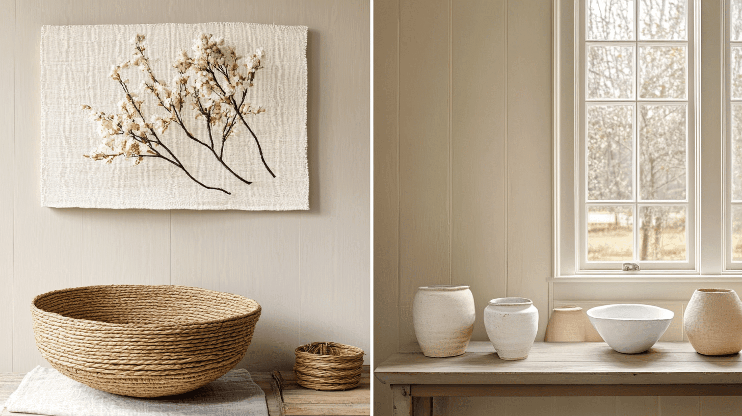
Natural fibers like linen, cotton, and wool in various tones create textural interest against Manchester Tan walls while providing necessary depth.
Colorful accents in navy, emerald, coral, or mustard offer a striking contrast against the neutral backdrop.
Glass, ceramic, and stone elements add weight and prevent Manchester Tan from feeling too neutral in spaces with abundant natural light.
Introducing natural elements with varied textures—like sisal, jute, or leather—reinforces the refined balance inherent in this versatile neutral while adding tactile interest.
Similar Paint Colors: Perfect Alternatives to Manchester Tan
Manchester Tan vs. Jute
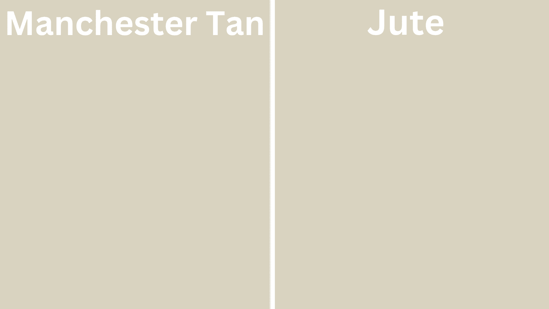
Manchester Tan (Benjamin Moore HC-81)
- A versatile neutral with balanced warm undertones
- Medium-light LRV (63.24) that creates refined, adaptable spaces
- Works well in traditional, transitional, or contemporary interiors
- Best for spaces where you want refined versatility
Jute (Benjamin Moore AF-80)
- A refined neutral with earthy, organic undertones
- Medium LRV that creates a grounded, adaptable backdrop
- It contains warm undertones that create a natural, organic atmosphere
- Popular for creating warm, welcoming environments with subtle depth
Key Differences:
- Manchester Tan has more balanced undertones, while Jute has more pronounced earthy undertones
- Manchester Tan appears slightly lighter in most lighting conditions
- Manchester Tan creates a more versatile experience, while Jute is more organic and grounded
- They serve similar roles in design – both as versatile neutrals with slightly different character and undertones
Final Thoughts
By selecting Manchester Tan, you’re assuming a design philosophy that values adaptability, civilization, and lasting beauty in every space.
Its remarkable versatility allows it to complement evolving styles and seasonal accents, ensuring a timeless appeal.
Whether creating cohesion across rooms or providing the perfect backdrop for both traditional and contemporary elements, Manchester Tan promotes and coordinates any interior.
More than just a color, it represents an enduring commitment to refined design, making it a perennial favorite among homeowners and designers seeking balance, warmth, and effortless classiness in the spaces we call home.

Alex Guerrero, a graduate with a Fine Arts degree from the Rhode Island School of Design, has been a visionary in the world of color and design for over 15 years. His professional journey began in the heart of the fashion industry in Milan, where he developed an acute sense for color harmonies and trends. Alex joined our team in 2018, offering fresh and innovative perspectives on color utilization in various spaces. Renowned for his ability to blend contemporary trends with timeless elegance. Outside of work, Alex is an accomplished painter and a volunteer art therapist, his artistic talents further enriching his professional insights.