Like the gentle touch of morning light on weathered stone paths, Sherwin-Williams’ Accessible Beige (SW 7036) wraps your space in refined versatility.
This refined neutral top ordinary beige carries subtle taupe-gray undertones that add depth and character to your walls without overwhelming them. Accessible Beige creates an adaptable sanctuary—a balanced, pleasant atmosphere that allows both design elements and inhabitants to flourish naturally.
Its fine complexity invites changing light to reveal different facets throughout the day, maintaining its composed, grounded character in any setting.
More than just another beige, Accessible Beige is an experience—one that brings the serene balance of nature’s most versatile landscapes into your everyday environment.
It’s the perfect foundation for both contemporary designs and transitional spaces seeking quiet culture.
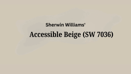
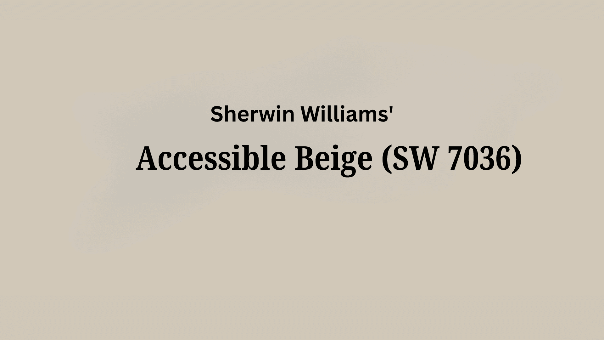
Understanding Sherwin-Williams’s Accessible Beige (SW 7036)
Color Terminology
| PROPERTY | VALUE |
|---|---|
| LRV (Light Reflectance Value) | 58 |
| Color Category | Considered a light-medium neutral (LRV between 55-65) |
| Comparison | Pure white: ~90 LRV, Black: ~0 LRV |
| RGB Value | Red: 209 Green: 199 Blue: 184 |
| Hex Code | #D1C7B8 |
Undertones:
- Accessible Beige has subtle taupe-gray undertones
- It’s a balanced neutral with a slight earthy influence
- Not a flat or one-dimensional beige, but a refined, complex neutral with noticeable versatility
Psychology of Balanced Neutral Colors
Balanced neutrals like Accessible Beige create a sense of peace and contemporary serenity.
- Grounded tones: These offer subtle warmth and visual stability to spaces
- Taupe-Influenced Neutrals: Produce balance, versatility, and modern style
- Benefits: More adaptable than stark whites or heavy beiges, adds refined presence to spaces, creates a versatile backdrop for both contemporary furniture and natural elements.
Accessible Beige provides the perfect balance for those seeking a substantial neutral that isn’t too cool or overly warm.
Its subtle taupe-gray undertones make it particularly versatile in spaces with varied exposures, where it helps maintain balance while contributing a sense of refined comfort.
Why Choose this Color?
The balanced neutrality of Accessible Beige evokes a sense of connection and culture that promotes adaptability in any environment.
This enduring color carries complex undertones that shift subtly with changing light, ensuring your space feels both contemporary and timelessly graceful.
Key Features
Sherwin-Williams Accessible Beige offers exceptional versatility across different lighting conditions. It maintains its subtle taupe-gray undertones in bright spaces while creating a warm, inviting atmosphere in rooms with limited natural light.
Its timeless, neutral quality provides a refined backdrop that complements both bold design elements and subtle textures without appearing bland or dated.
Adaptability
Sherwin-Williams Accessible Beige demonstrates remarkable adaptability with existing elements like contemporary furniture and natural wood finishes, creating balanced transitions between spaces.
It provides enough depth to feel substantial and grounding while maintaining a refined, enduring quality that won’t quickly date your interior design choices.
This versatile neutral works equally well as an all-over color for creating cohesive, flowing environments or as a complementary element to more dramatic accent walls.
Durability
Sherwin-Williams Accessible Beige, particularly in premium finishes like Duration or Emerald, delivers outstanding durability with excellent coverage in both new construction and repainting projects.
Its balanced tone and subtle taupe-gray undertones maintain a refined appearance throughout your home while providing a forgiving surface for everyday living.
This paint resists fading and maintains color consistency even with regular cleaning when properly applied.
Texture Patterns
Sherwin-Williams Accessible Beige creates a smooth, refined texture that adds subtle dimension to walls and features. Its complex undertones produce a subtle light play that enhances trim work and adds visual interest to even simple walls.
Room-by-Room Color Recommendations with Accessible Beige
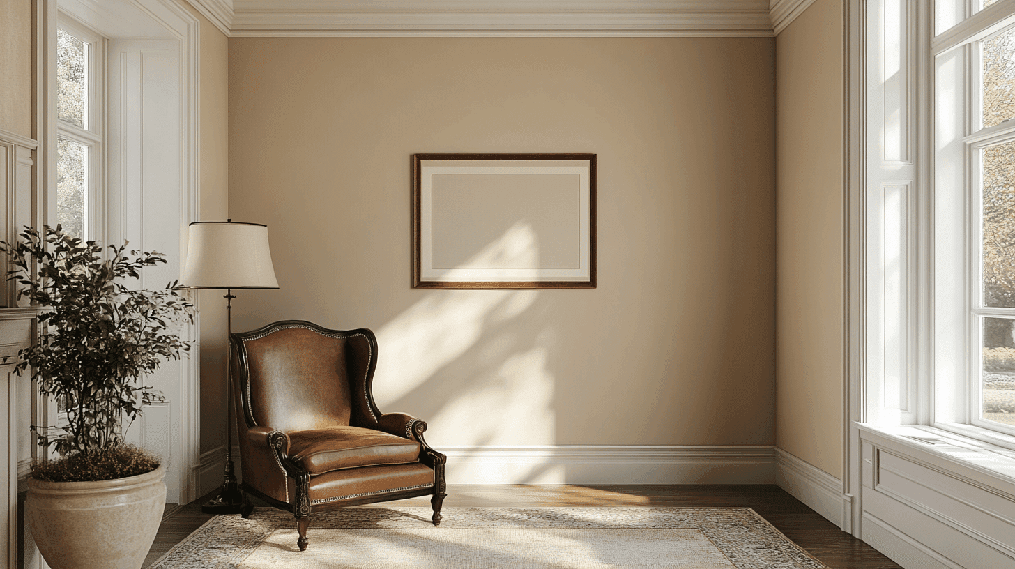
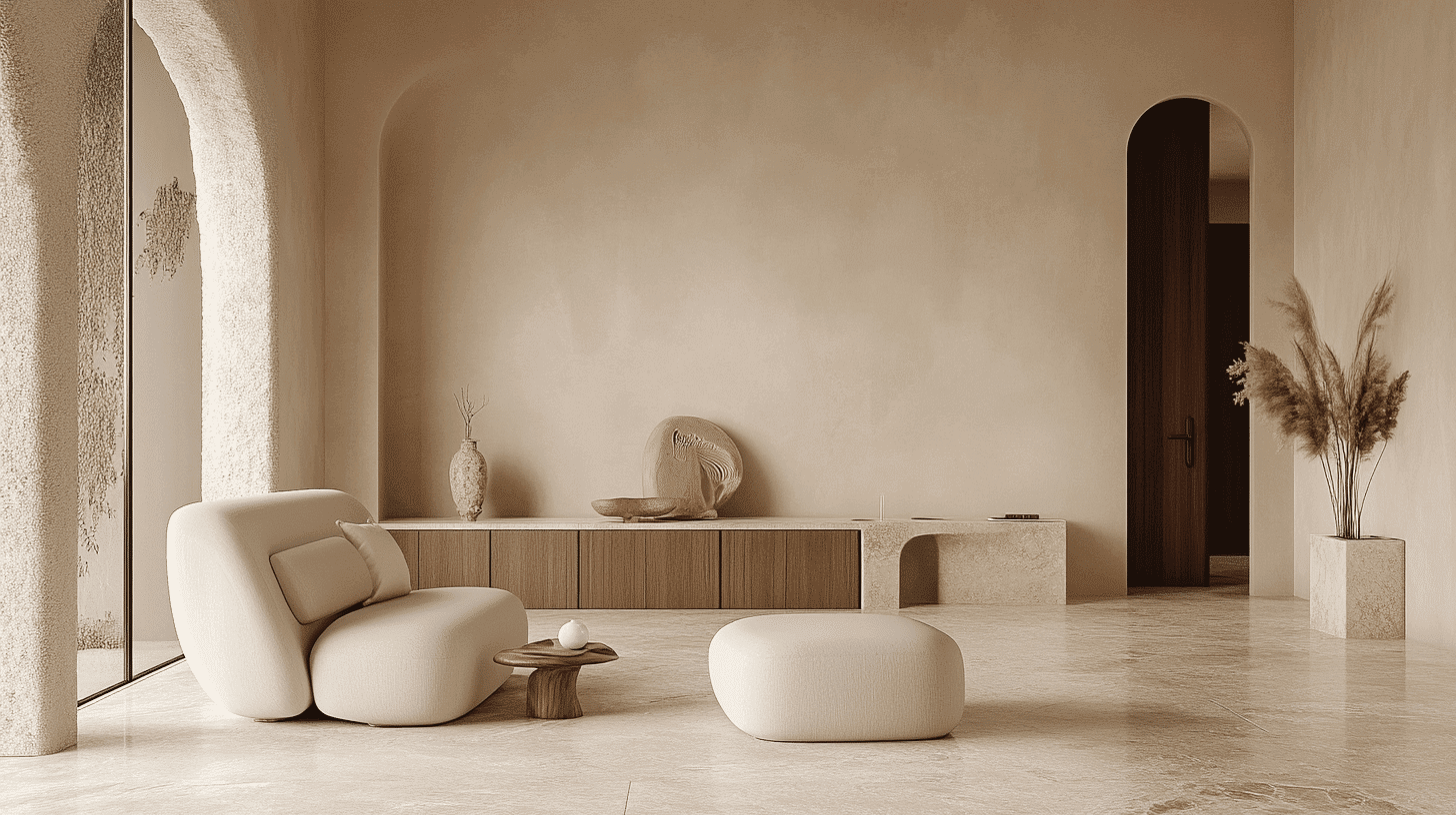
1. Living Spaces and Open Floor Plans
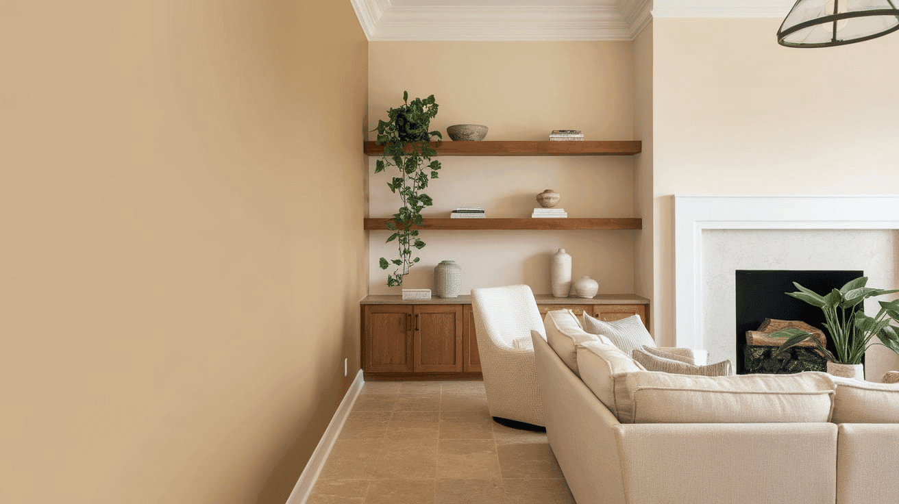
- Accessible Beige works exceptionally well as an all-over color in open floor plans, creating a cohesive, balanced space while maintaining a refined, contemporary palette.
- The 58 LRV of Accessible Beige provides a substantial, grounding feel that makes spaces appear more balanced and refined without feeling heavy.
- Use Accessible Beige to unify different areas in larger spaces while allowing design elements and artwork to stand out against its versatile backdrop.
2. Bedrooms and Relaxation Areas
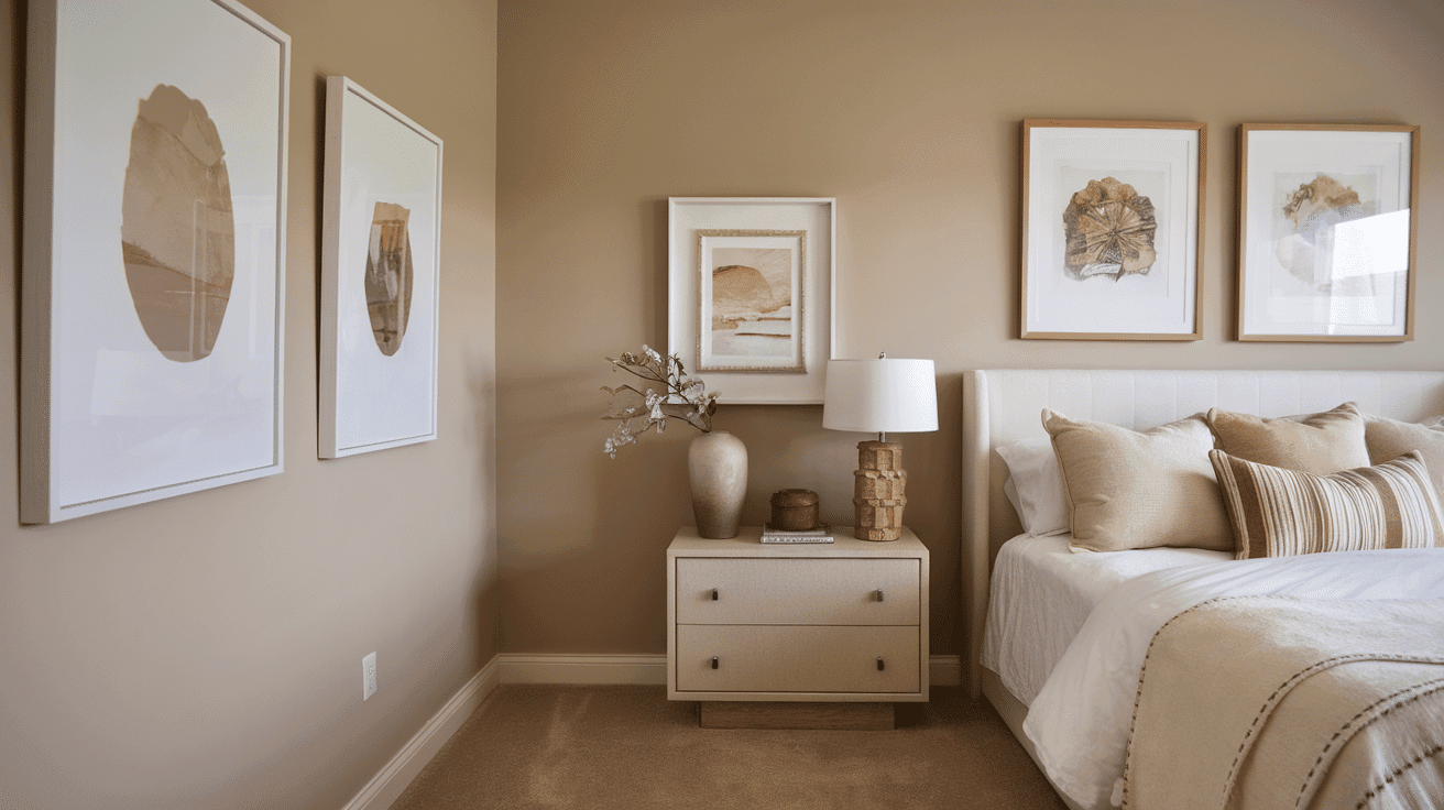
- Accessible Beige creates a balanced, peaceful atmosphere in bedrooms that promotes relaxation and peace.
- The subtle taupe-gray undertones in Accessible Beige evoke a sense of culture while creating a versatile backdrop for bedding and furniture of varying styles.
- Consider Accessible Beige for all walls to create a serene sanctuary that feels both spacious and intimate without sacrificing character.
3. Kitchens
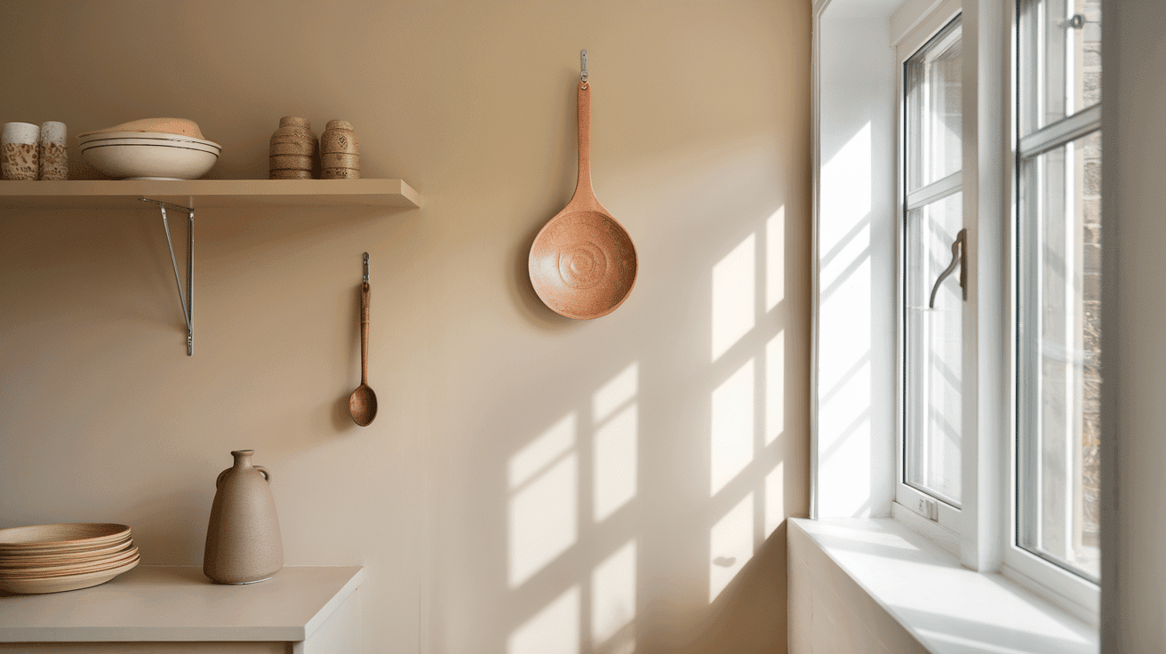
- Accessible Beige in eggshell or satin finish on walls creates a refined, timeless element that pairs beautifully with white cabinets or wood elements.
- The balanced depth of Accessible Beige enhances both light countertop materials and matte black fixtures, making it adaptable to various kitchen styles, from modern to transitional.
- Accessible Beige walls paired with contrasting cabinet colors create an appealing connection that grounds the kitchen while maintaining a refined, cohesive feel.
4. Bathrooms and Spa-like Retreats
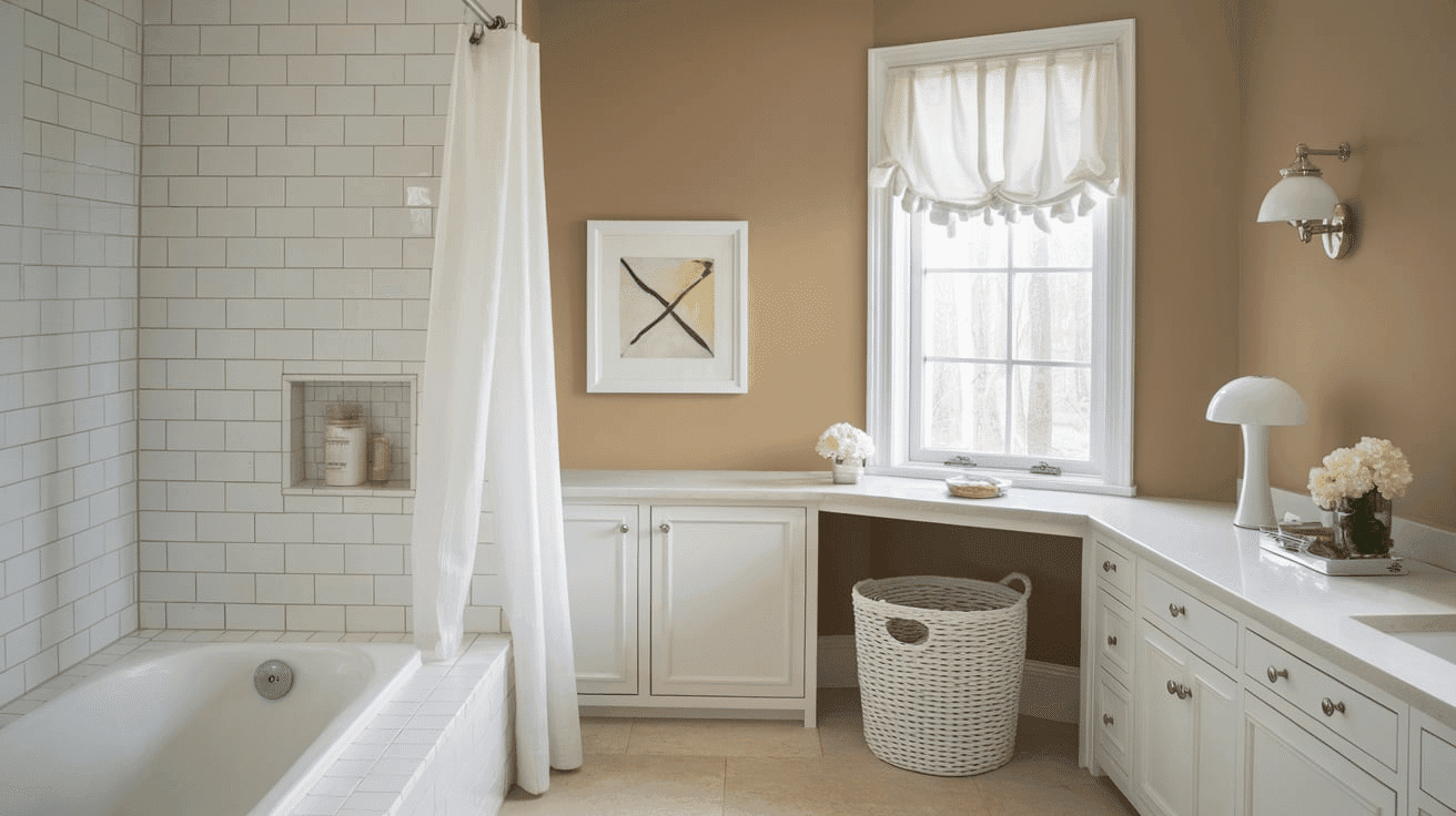
- Sherwin-Williams Accessible Beige creates a balanced, refined atmosphere in bathrooms. Its subtle taupe-gray undertones establish a sense of peace while complementing various fixture finishes.
- This versatile shade pairs beautifully with both chrome and matte black fixtures, marble, and natural wood, creating a timeless, refined retreat that feels both grand and inviting.
- Use Accessible Beige on all walls in smaller bathrooms to create a sense of spaciousness without sacrificing character.
Accessible Beige Color Combinations
Accessible Beige is a balanced, refined neutral with subtle taupe-gray undertones. Its medium Light Reflectance Value (LRV) of 58 makes it a substantial, grounding foundation that adds versatility and refinement to spaces while maintaining a refined balance.
Let me help you with color pairings and combinations for this shade.
1. Complementary Trim Colors
- Extra White (SW 7006) – A bright, clean white that creates a crisp distinction with Accessible Beige
- Pure White (SW 7005) – A soft white that balances Accessible Beige’s depth with subtle brightness
- Alabaster (SW 7008) – A versatile off-white that softens Accessible Beige’s neutral quality
- Snowbound (SW 7004) – A warm white that blends with Accessible Beige’s undertones
2. Coordinating Wall Colors
- Agreeable Gray (SW 7029) – A light, versatile gray that adds depth while complementing Accessible Beige
- Repose Gray (SW 7015) – A popular light gray that creates a balanced, cohesive palette
- Intellectual Gray (SW 7045) – A medium warm gray that balances Accessible Beige’s neutral qualities
- Mega Greige (SW 7031) – A deeper greige that creates serene peace with Accessible Beige
3. Accent Colors
- Naval (SW 6244) – A deep navy that creates a refined contrast with Accessible Beige’s balance
- Evergreen Fog (SW 9130) – A muted sage green that provides a natural complement to Accessible Beige
- Urbane Bronze (SW 7048) – A deep, warm brown that intensifies the style in a compatible palette
- Iron Ore (SW 7069) – A soft black that grounds Accessible Beige’s versatile quality
Coordinating with Furniture and Decor
1. Wood Tones
Accessible Beige pairs beautifully with a wide range of wood tones, offering different aesthetic effects. Medium wood tones like oak provide complementary warmth that enhances Accessible Beige’s versatility.
White-washed or gray-toned woods create an organic, modern contrast that highlights Accessible Beige’s depth and sophistication.
2. Metals
Matte black, brushed nickel, and chrome hardware improve Accessible Beige’s contemporary undertones and create a clean, modern look. Brass and gold accents create a warm contrast that emphasizes Accessible Beige’s versatility.
Mixed metal finishes provide an elegant, layered combination that complements Accessible Beige’s adaptable character with depth.
4. Decor
Natural fibers like linen, cotton, and wool in neutral, layered tones create textural interest against Accessible Beige walls while providing necessary depth. Bold accents in navy, emerald, or burgundy offer a striking contrast against the balanced backdrop.
Concrete, stone, and leather elements add weight and prevent Accessible Beige from feeling too flat in spaces with abundant natural light.
Introducing natural elements with varied textures—like sisal, jute, or bouclé—reinforces the organic balance inherent in this versatile neutral while adding tactile interest.
Similar Paint Colors: Perfect Alternative to Accessible Beige
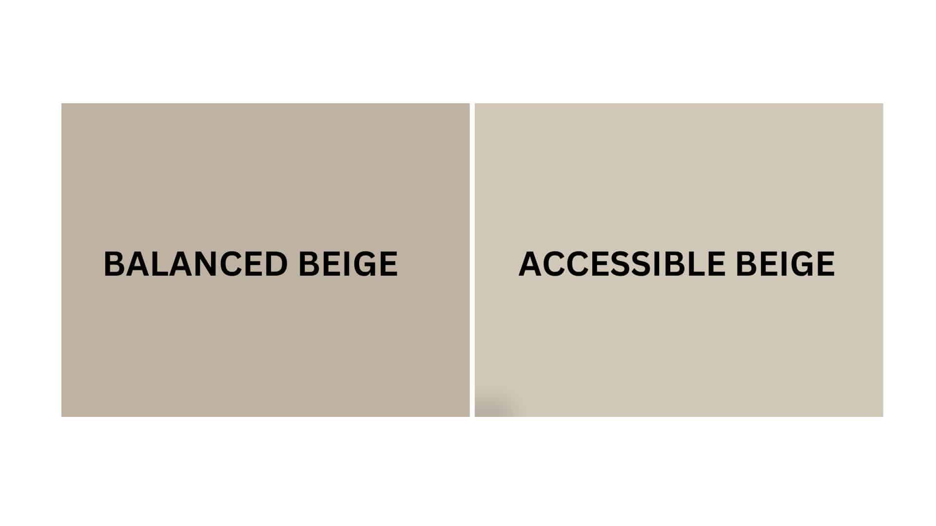
Accessible Beige vs. Balanced Beige
Accessible Beige (Sherwin-Williams SW 7036)
- A balanced neutral with subtle taupe-gray undertones
- Medium LRV (Light Reflectance Value) that creates bright, refined spaces
- Works well in contemporary, transitional, or modern farmhouse interiors
- Best for spaces where you want a versatile, refined balance
Balanced Beige (Sherwin-Williams SW 7037)
- A deeper neutral with stronger taupe undertones
- Lower LRV (46) that creates a more substantial, grounded backdrop
- It contains warm undertones that create a more traditional atmosphere
- Popular for creating cozy, inviting environments that work with many design styles
Key Differences:
- Accessible Beige has more gray influence, while Balanced Beige has stronger taupe undertones
- Accessible Beige appears noticeably lighter in most lighting conditions
- Accessible Beige creates more versatility and adaptability, while Balanced Beige is more substantial and grounded
- They serve similar roles in design – both as refined neutrals with slightly different character and depth
Final Thoughts
Accessible Beige (SW 7036) surpasses trends, embodying the perfect balance between versatility and culture that makes it a perennial favorite among designers and homeowners seeking adaptable, refined spaces.
Its subtle complexity allows it to transition effortlessly between design styles and seasonal accents, ensuring longevity in your design choices.
Whether grounding your walls in morning light or creating a canvas for contrasting elements, Accessible Beige delivers a timeless quality that both anchors and upgrades a space.
In choosing this exceptional shade, you’re not simply selecting a color—you’re adopting a design philosophy that values balance, versatility, and enduring style in the spaces we call home.
If you’re interested in more color ideas, feel free to click here and explore our collection of stylish palette combinations and inspiring home decor inspiration.

Alex Guerrero, a graduate with a Fine Arts degree from the Rhode Island School of Design, has been a visionary in the world of color and design for over 15 years. His professional journey began in the heart of the fashion industry in Milan, where he developed an acute sense for color harmonies and trends. Alex joined our team in 2018, offering fresh and innovative perspectives on color utilization in various spaces. Renowned for his ability to blend contemporary trends with timeless elegance. Outside of work, Alex is an accomplished painter and a volunteer art therapist, his artistic talents further enriching his professional insights.