
After working with dozens of paint finishes and color palettes, one thing remains consistent: sage green is the most forgiving base color. It’s calm, grounded, and fits on your walls, in your wardrobe, or in a full color palette.
But pairing it with the wrong color can throw the whole look off.
Knowing what colors go with sage green makes all the difference.
From warm neutrals to bold contrasts, sage green pairs surprisingly well with a range of hues.
Why Sage Green Works so Well in Home Design
Sage green isn’t just a trend; it’s genuinely easy to live with.
It pulls from nature, so it feels familiar the moment it hits a wall or a piece of furniture.
Darker shades add depth to a room without feeling heavy. Lighter colors open space without a full clinical look.
It works in a bedroom, a kitchen, a hallway. Pretty much anywhere, really.
Sage green adapts. That’s the reason why designers keep reaching for it.
How to Choose the Right Colors for Sage Green
Picking the right colors for sage green isn’t complicated. You just need to know a few basics to start with.
Understand the Undertone of Your Sage
Sage green falls somewhere between grey and green, and sometimes blue.
Some shades lean warmer with yellow or brown undertones.
Others pull a cooler with grey or blue beneath them. That undertone decides everything that neutrals feel right, which accents pop, and which combinations fall flat.
Hold a white card next to your sage swatch. If the green looks yellowish, it has warm undertones; if it appears grey or blue, it’s cool. This simple check prevents costly repainting.
Use the 60-30-10 Rule with Sage Green
Get this balance right, and the room feels intentional without looking overdone.
Sage green sits comfortably in any of these three roles, depending on how bold you want to go.
- 60% is your dominant color: usually sage green or a neutral, it pairs with
- 30% is your secondary color: warm whites, terracotta, or dusty rose
- 10% is your accent: navy, brass, burnt orange, or deep plum work beautifully
One thing worth knowing: Sage green (60%) works best with north- or south-facing windows. In darker rooms, reduce to 30% and let a warmer neutral be dominant.
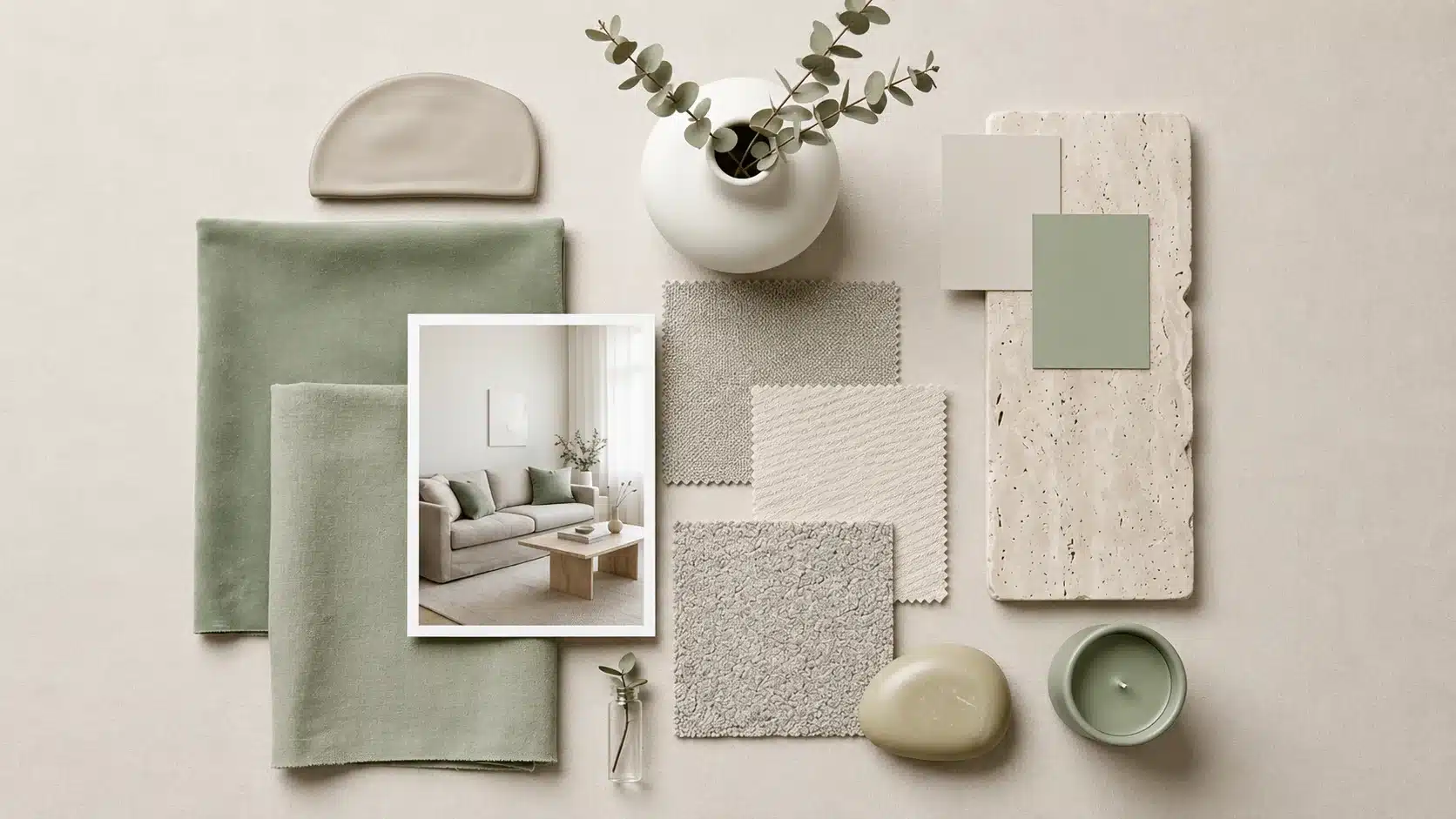
Best Neutral: What Colors Go with Sage Green
Neutrals are the safest starting point without competing, and the right one depends entirely on the undertone of your sage.
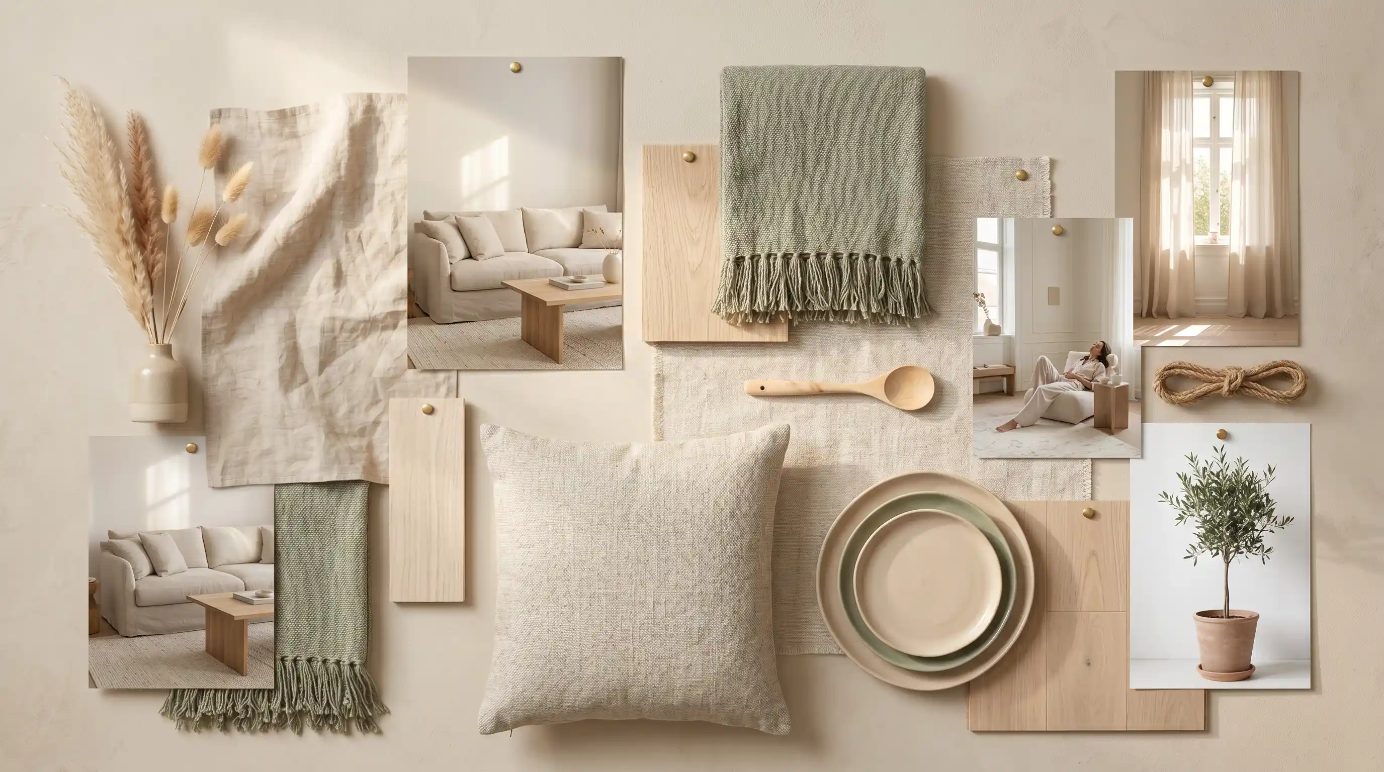
1. Soft White Base
Soft white and sage green are a pairing that never fails.
White lifts the room without overpowering the green. This combination is a staple in Modern Farmhouse interiors, clean, airy, and unpretentious. Stick to off-white rather than stark white for the most natural result.
The difference is subtle, but the heat it adds is noticeable.
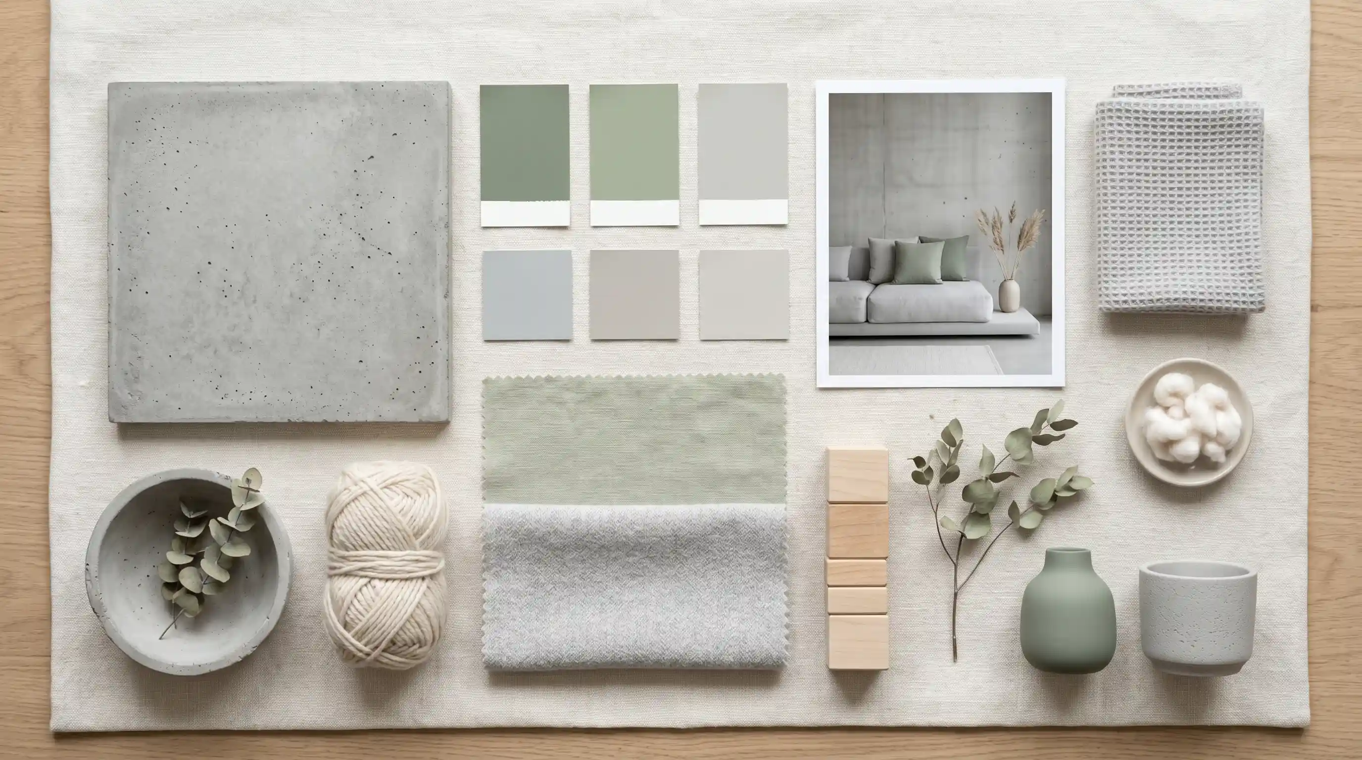
2. Creamy Tone for a Lived-In Feel
Cream brings heat that pure white simply can’t. It softens sage and makes a space feel genuinely comfortable.
Linen curtains in cream, alongside sage walls, create an unhurried, lived-in atmosphere that feels more like a home than a showroom.
3. Balanced Greige for a Modern Touch
Greige sits between gray and beige, neutral enough not to clash, warm enough to add depth. It works particularly well on trim and woodwork alongside sage green walls.
Scandinavian interiors favor greige, functional, and refined designs that avoid feeling cold or overly minimal.
4. Light Gray Shade
Light gray pulls out the cooler undertones in sage without making a space feel cold.
Designer Ilse Crawford leans on gray-and-green combinations for rooms that feel grounded and modern.
Works especially well in spaces with plenty of natural light where both colors can settle properly without one overpowering the other.
5. Muted Taupe for Added Depth
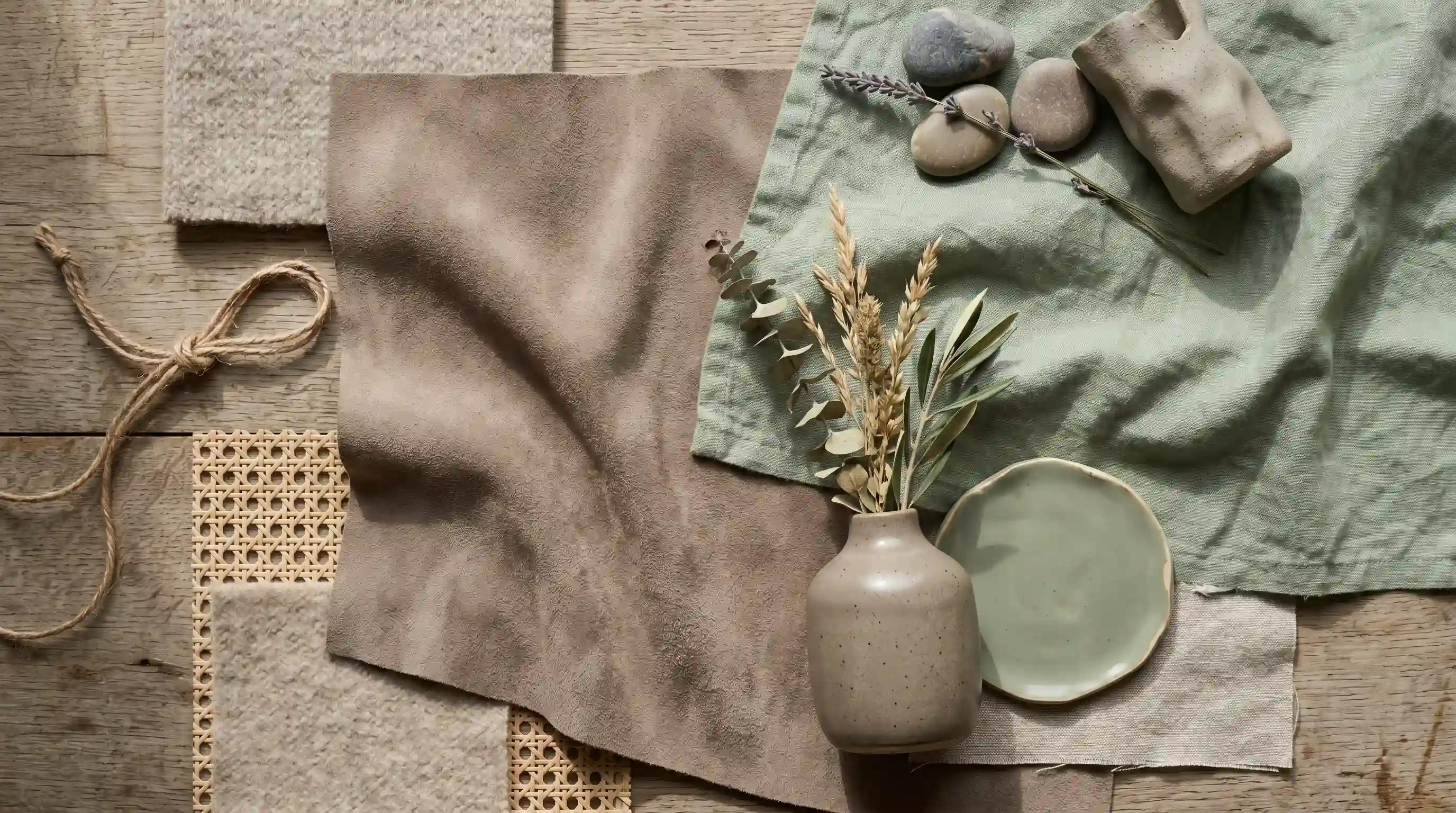
Taupe sits warmer than gray but quieter than beige.
Alongside sage, it adds subtle depth without shifting the mood dramatically. This pairing is common in Japanese Wabi-Sabi interiors: imperfect, textured, and deeply calm.
Works best when texture linen, wool, or raw wood is doing some of the heavy lifting alongside it.
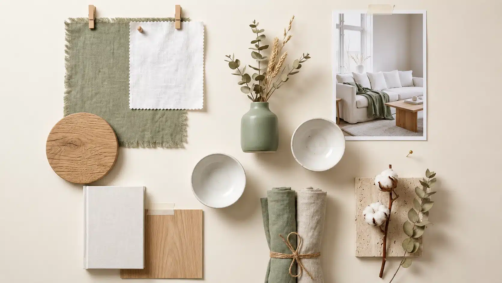
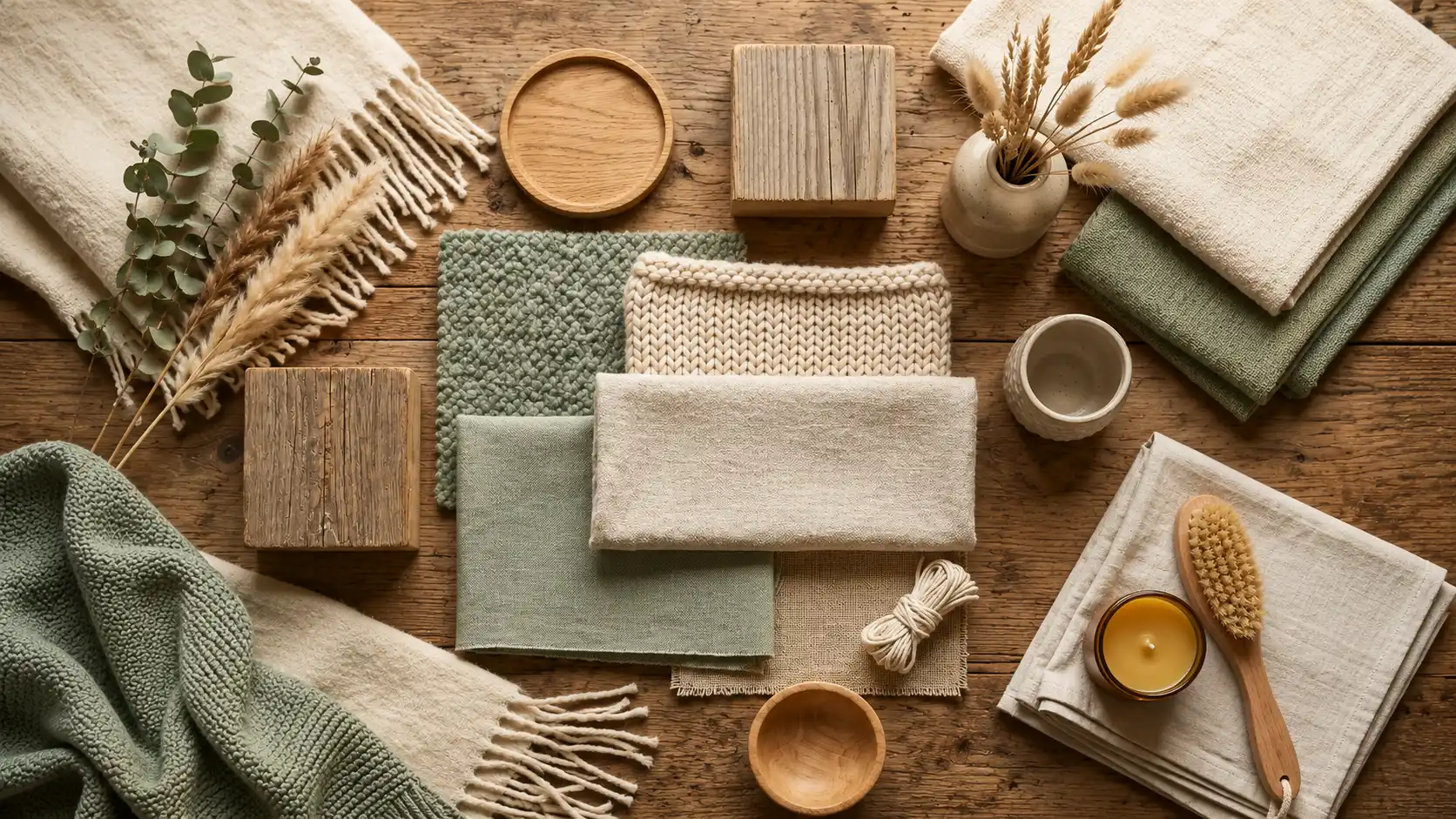
Earthy Colors that Compliment Sage Green naturally
Sage green already belongs to the earth. These colors simply remind it of where it came from, and the combinations feel natural.
6. Warm Clay Tone for a Natural Contrast
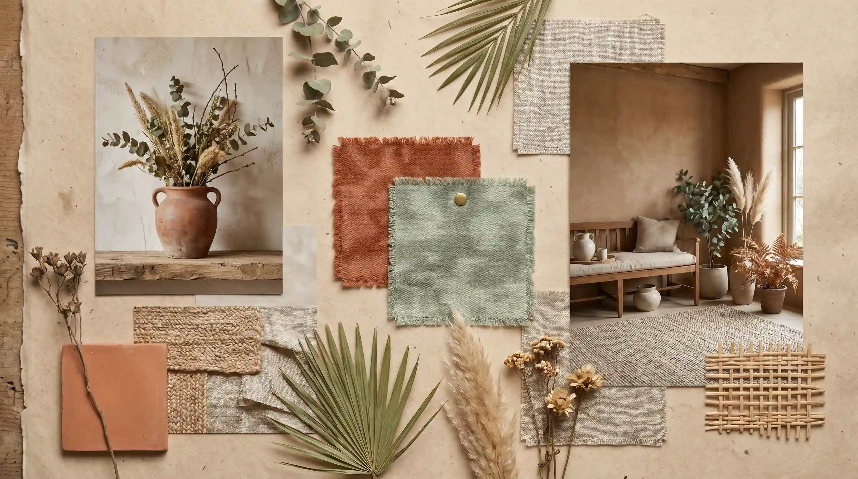
Clay and sage green share the same earthy colors.
Clay brings heat and contrast without jarring against the sage’s muted quality.
Southwestern and Adobe-inspired interiors use this combination extensively, with terracotta pots, clay-rendered walls, and sage-painted woodwork sitting together effortlessly.
7. Deep Rust Shade for a Rich Layered Look
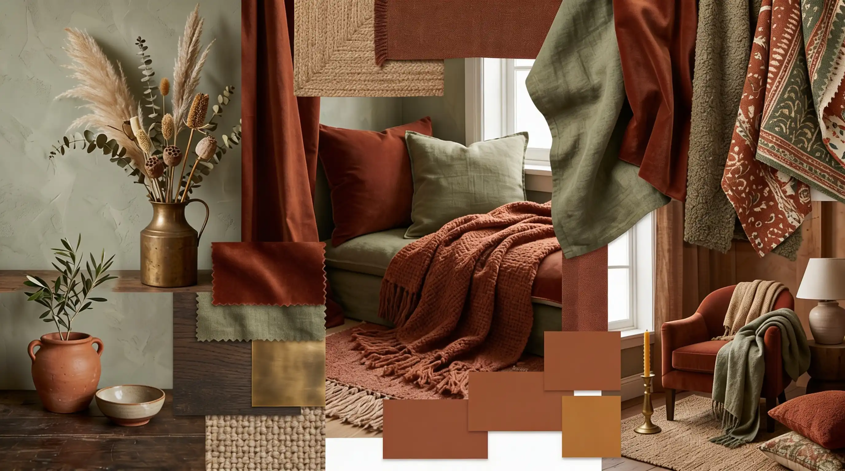
Rust deepens a sage green palette considerably. It adds richness without going full dramatic.
This pairing appears frequently in Bohemian interiors, layered textiles, worn leather, and aged wood, pulling everything together naturally.
8. Light Sand Hue for An Airy Earthy Feel
Sand keeps things light while staying grounded.
It works where cream might feel too warm or white too stark. Coastal interiors lean on sand-and-sage regularly, natural fibers, rattan furniture, and open windows.
The combination stays airy without losing the earthy quality that makes sage green so appealing in the first place.
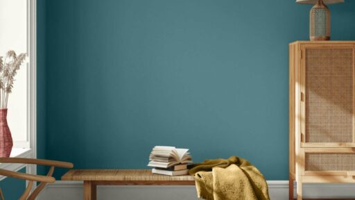
9. Dark Wood Finish
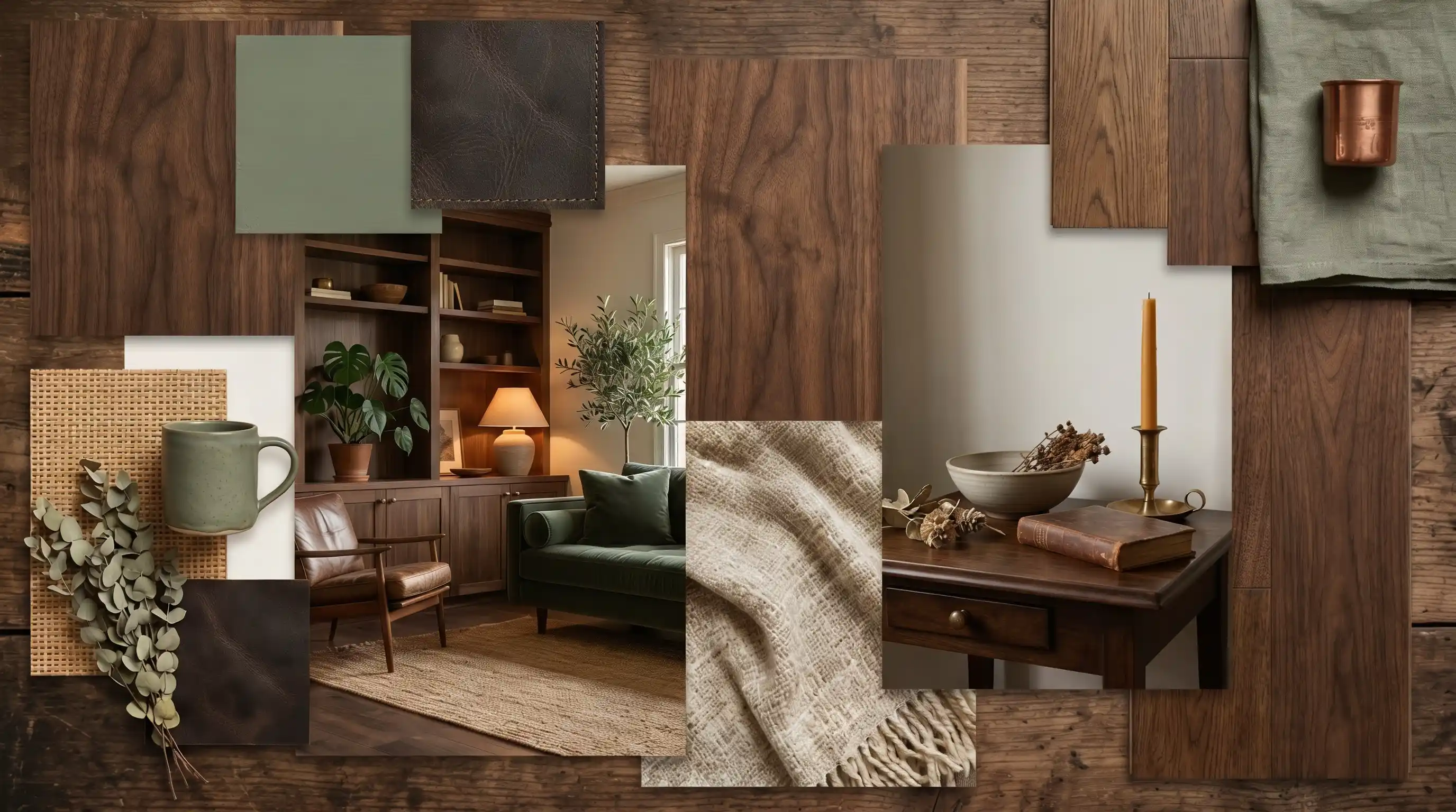
Dark wood grounds sage green immediately stops the palette from feeling too light or decorative.
Mid-Century Modern design uses this pairing extensively, with walnut furniture against sage walls, which is a signature of the style. The contrast between warm dark timber and cool sage creates a balanced, mature feel.
Soft Pastels that Create a Calm, Airy Palette
Pastels and sage green share a low-saturation quality. They sit together without fighting, and the result is always quiet and considered.
10. Powdery Blue Shade for a Balance
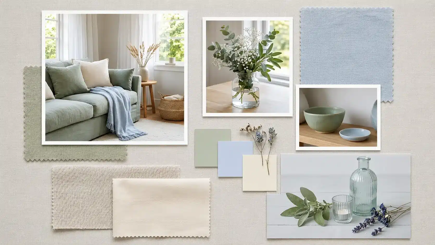
Powdery blue and sage green pull from the same cool, natural family.
Together they create a palette that feels calm without being flat. Designer Nina Campbell has long favored soft blue and green combinations in drawing room settings, delicate, considered, and quietly layered.
Layer through cushions and ceramics rather than committing both colors to large wall surfaces.
11. Faint Peach Tint for Subtle Heat
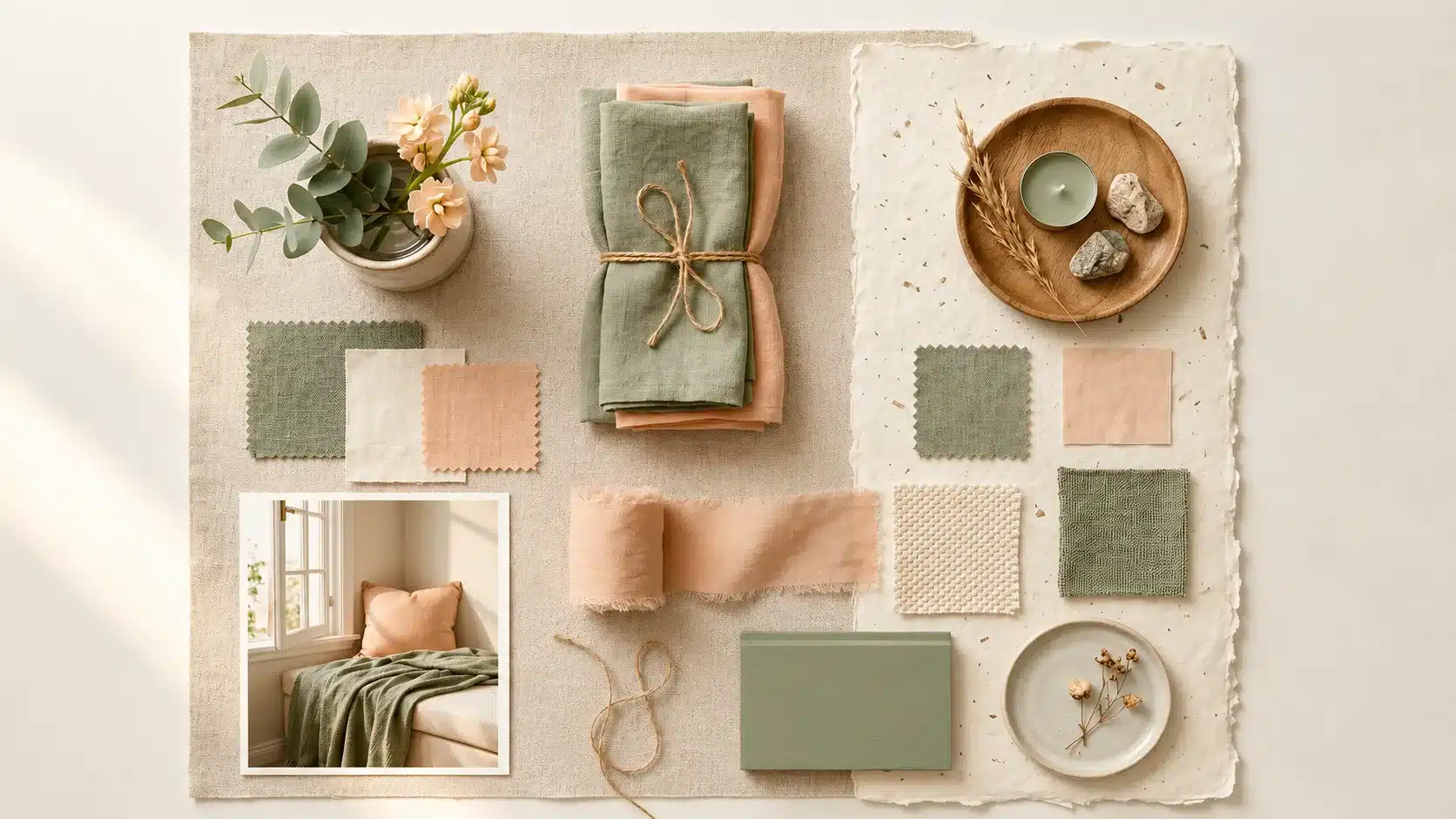
Peach introduces the gentlest calm into a sage palette, stopping the combination from leaning too cool.
Romantic and Soft Feminine interiors use delicate textiles, blush ceramics, and warm-toned furnishings. Ideal for bedrooms aiming for heat and calm, it encourages comfortable sitting without either taking over.
Bold Colors that Pair Surprisingly Well with Sage Green
Sage green holds its own against stronger colors more than people expect.
These pairings add drama, depth, and real personality when used in the right proportion; none of them overpower.
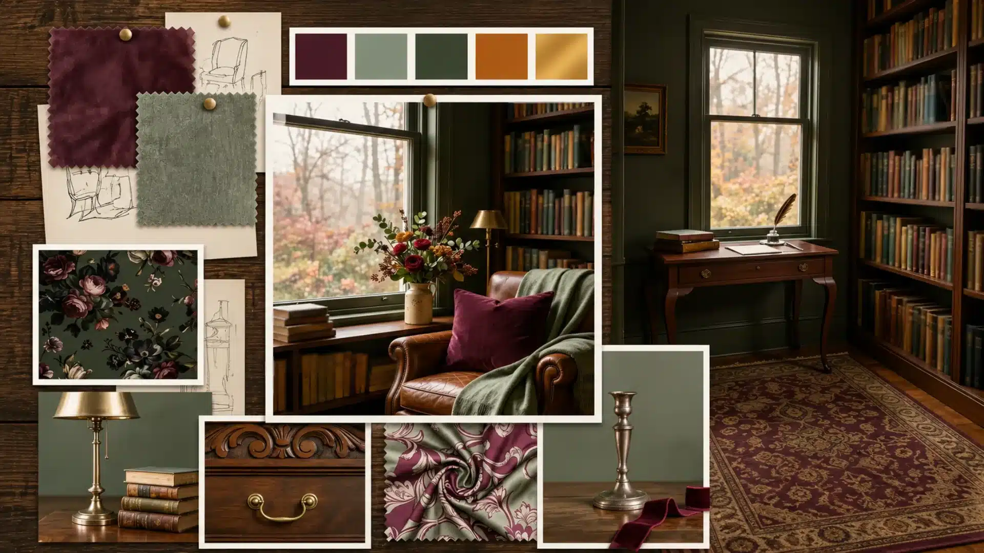
12. Rich Burgundy Shade for a Statement Look
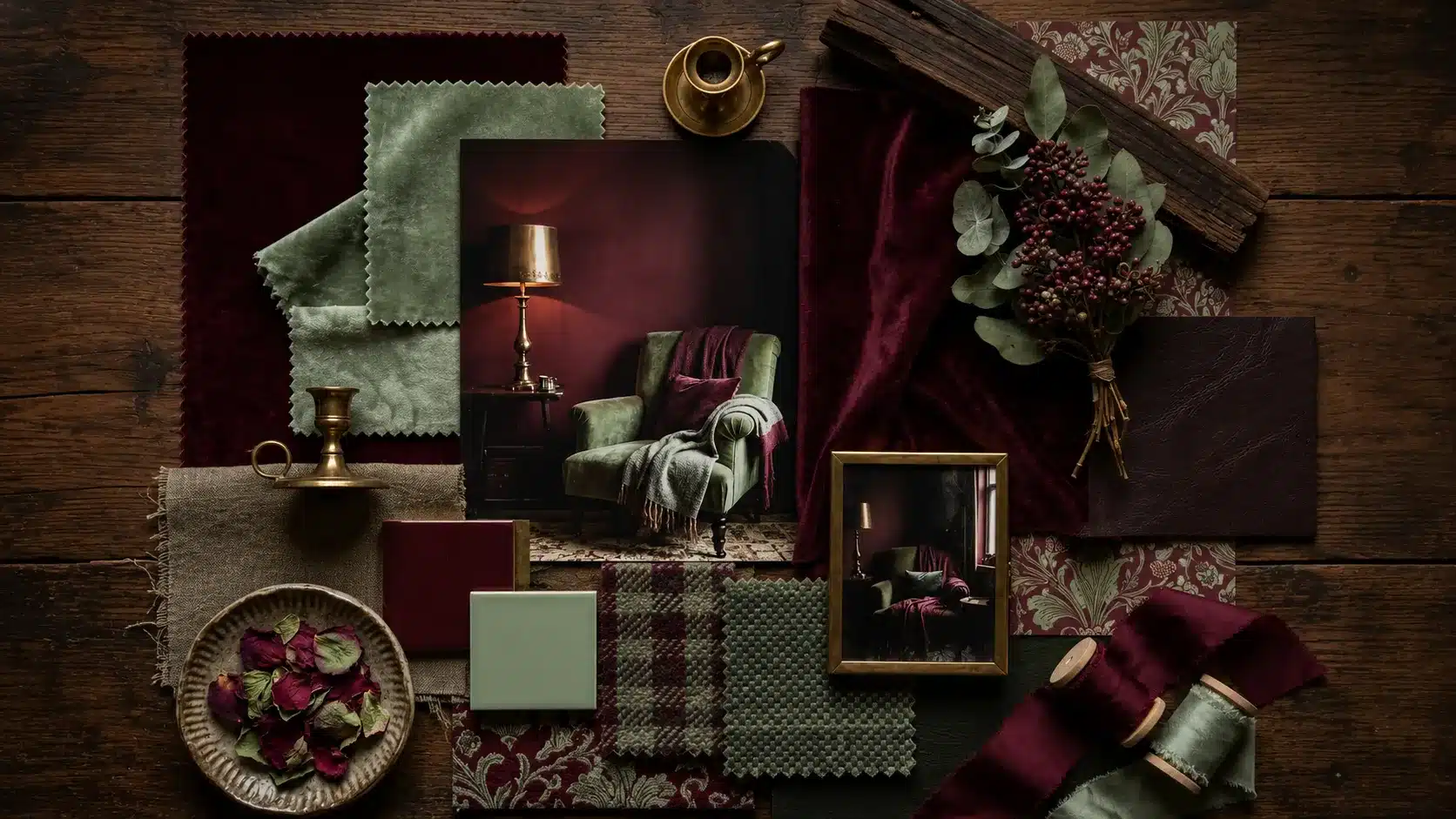
Burgundy and sage green create a pairing rooted in nature, winter berries against muted foliage.
Arts and Crafts interiors frequently combine deep reds and greens with natural materials for exactly this effect.
Keep burgundy as an accent, a single armchair, a set of cushions, or a throw, and let sage hold the room together.
13. Mustard-Inspired Hue
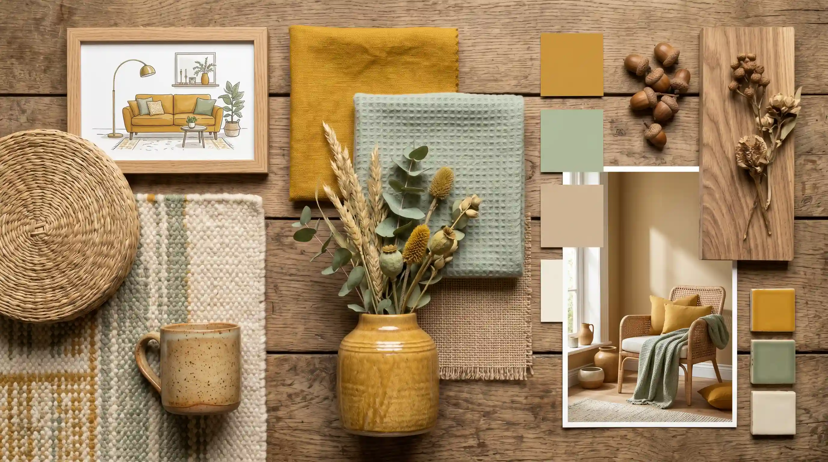
Mustard brings energy into a sage green space without clashing.
The yellow heat in mustard picks up any golden undertones sitting beneath sage, a mustard pendant light, or a cushion, shifting the entire mood of the room.
14. Dark Teal Tone for A Bold Tonal Mix
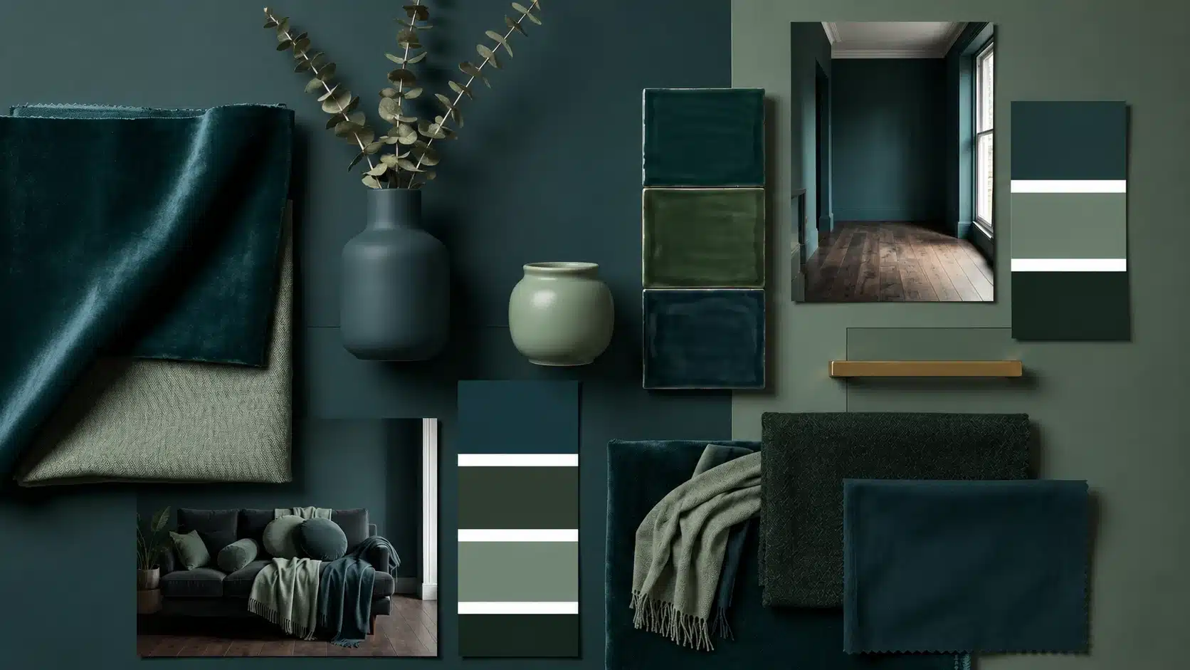
Dark teal and sage green are tonal relatives, both rooted in green, but teal brings considerably more depth.
Use teal on a feature wall or large upholstered pieces. The contrast with light sage is striking yet soft. More immersive and layered than sticking to one green tone.
15. Matte Black Accent for Sharp Definition
Matte black sharpens a sage green palette more than any other color. Industrial Modern interiors use black and sage together for a clean, bold, contemporary look.
Small doses go a long way. Door frames, light fittings, and cabinet handles are enough.
Designer Sophie Robinson says, dark green accents add definition, blocking the palette from feeling too soft.
16. Deep Plum Tone
Plum and sage green are an unconventional pairing that works beautifully in the right setting.
Maximalist interiors, jewel tones, layered patterns, rich texture use this combination to create spaces with real depth and drama. Keep plums in soft furnishings rather than on walls for the most balanced result.
The richness of plum contrasts against sage’s quietness without ever overpowering it.
17. Burnt Orange Accent
Burnt orange and sage green sit on opposite sides of the color wheel, creating a striking contrast. Eclectic, global-inspired interiors use this pairing with handmade ceramics, woven textiles, and vintage rugs.
A single burnt orange vase or cushion against sage walls is genuinely all it takes.
No designer needed, this one speaks for itself.
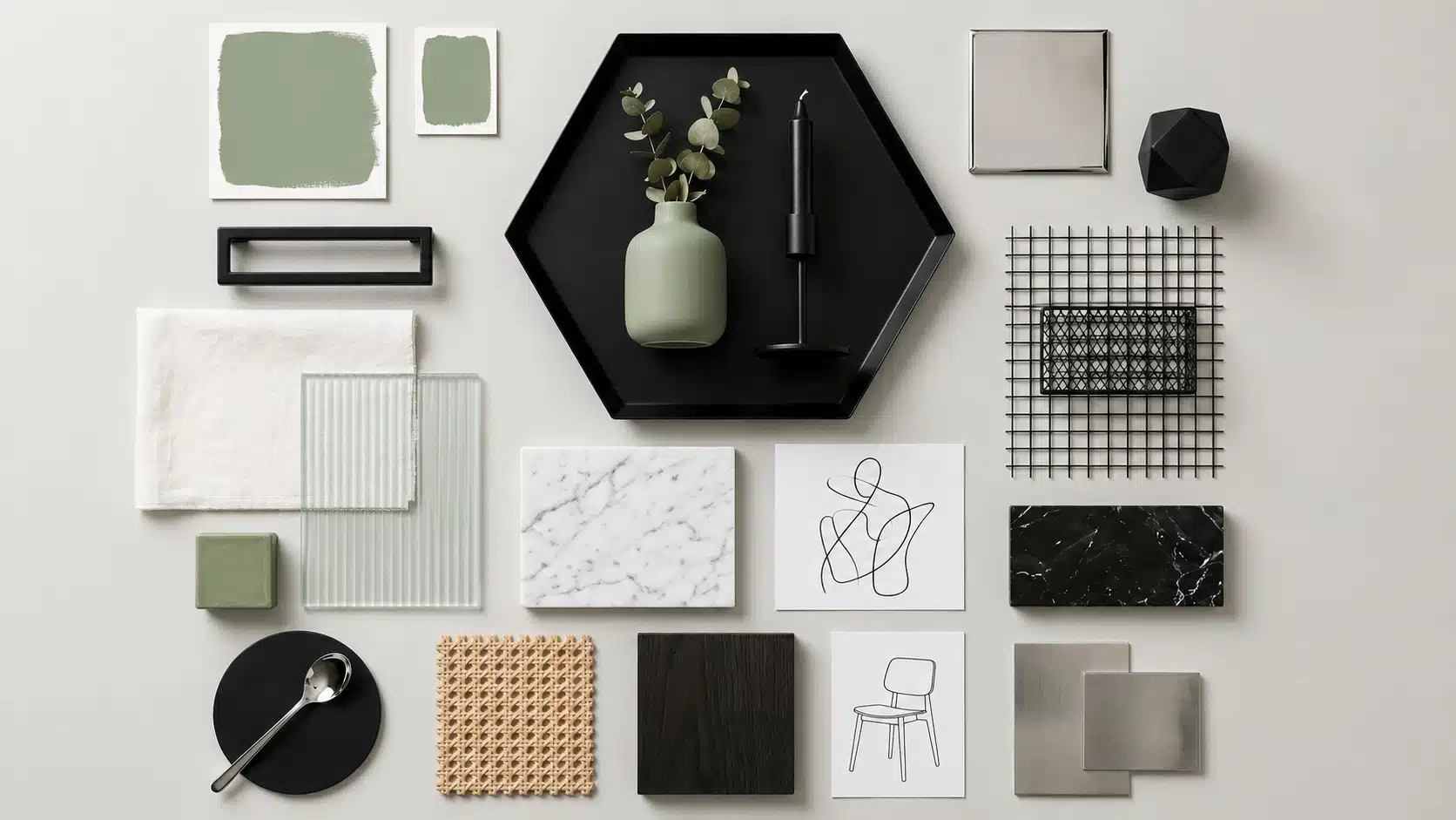
Metal Finishes that Uplifts Sage Green Instantly
Warm finishes like brass and copper lean into sage’s earthy side.
Cooler finishes like chrome and nickel keep things clean and modern. Matte black works across both its that universal. The right metal finish can take sage green from nice to really polished.
Here’s a quick breakdown:
| Metal Finish | Vibe it Creates | Best Used On |
|---|---|---|
| Brass | Warm, vintage, rich | Handles, light fixtures, frames |
| Matte Black | Bold, modern, sharp | Faucets, curtain rods, cabinet pulls |
| Brushed Nickel | Cool, clean, subtle | Door hardware, bathroom fixtures |
| Copper | Warm, earthy, rustic | Pendant lights, decorative accents |
| Gold | Luxe, elegant, bright | Mirrors, drawer knobs, chandeliers |
| Chrome | Sleek, minimal, crisp | Kitchen fixtures, shelving brackets |
Brushed finishes hide fingerprints and watermarks far better than polished ones worth considering in kitchens and bathrooms where sage green cabinetry sees daily contact.
Room-By-Room Manual: What Colors Go with Sage Green
Every room has a different job. Here’s how sage green shows up in each one.
Living Room: Cream, Walnut, and Matte Black for a Balanced Look
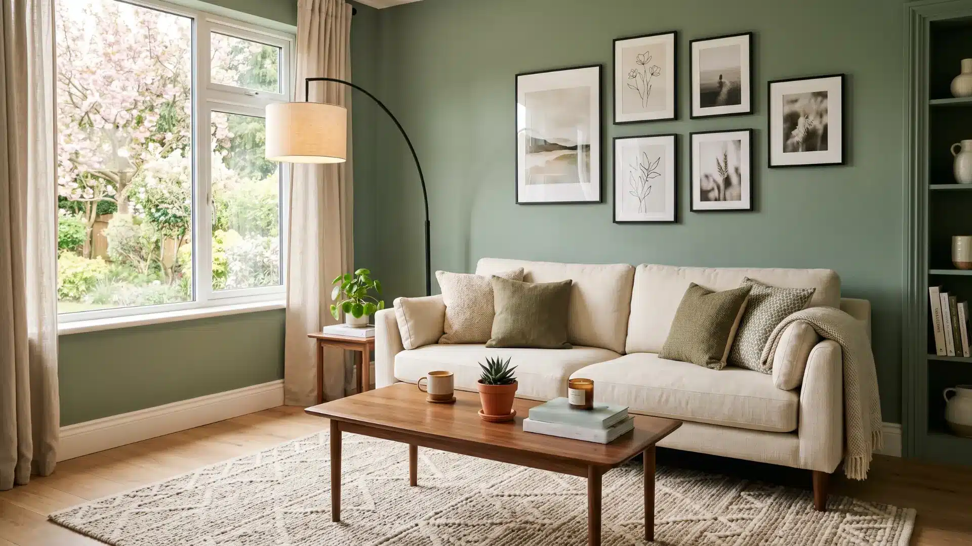
Cream softens sage without washing it out.
Walnut furniture adds heat and weight. Matte black sharpens everything up, keeps it from going too soft.
- A cream sofa or armchair grounds the seating area.
- A walnut coffee table or shelving adds natural heat.
- Matte black through frames, light fixtures, or cabinet pulls.
- Layer a textured cream rug to tie the furniture together.
This combination feels collected, not overdone. Every element earns its place.
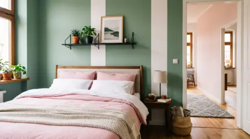
Bedroom: Blush, Beige, and Soft Gold for a Calm Retreat
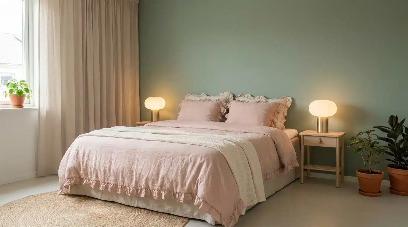
Beige bedding linen especially feels the most natural against it.
Blush adds quiet heat without tipping into overly romantic. Soft gold shows up best in the details: lamp bases, mirror frames, drawer handles. Avoid bright whites here; they break the calm.
Keep everything in the same muted family, and the room practically decorates itself.
Kitchen: Warm White, Brass, and Light Wood for a Clean Finish
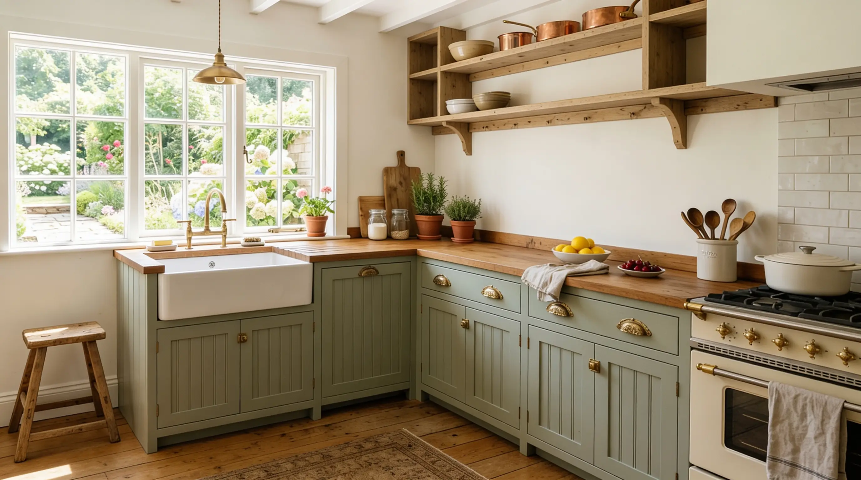
Three things are doing all the work here and doing it well.
Sage cabinets + warm white walls: fresh without feeling cold.
Light wood shelving or flooring: stops the palette from cooling off too much
Brass hardware throughout: handles, taps, fixtures, pulls, adds calm to every corner.
Keep countertops simple. A cluttered surface fights against this combination. Let the three core elements lead, and the kitchen looks intentional without trying too hard.
Bathroom: White, Light Gray, and Silver for a Fresh Feel
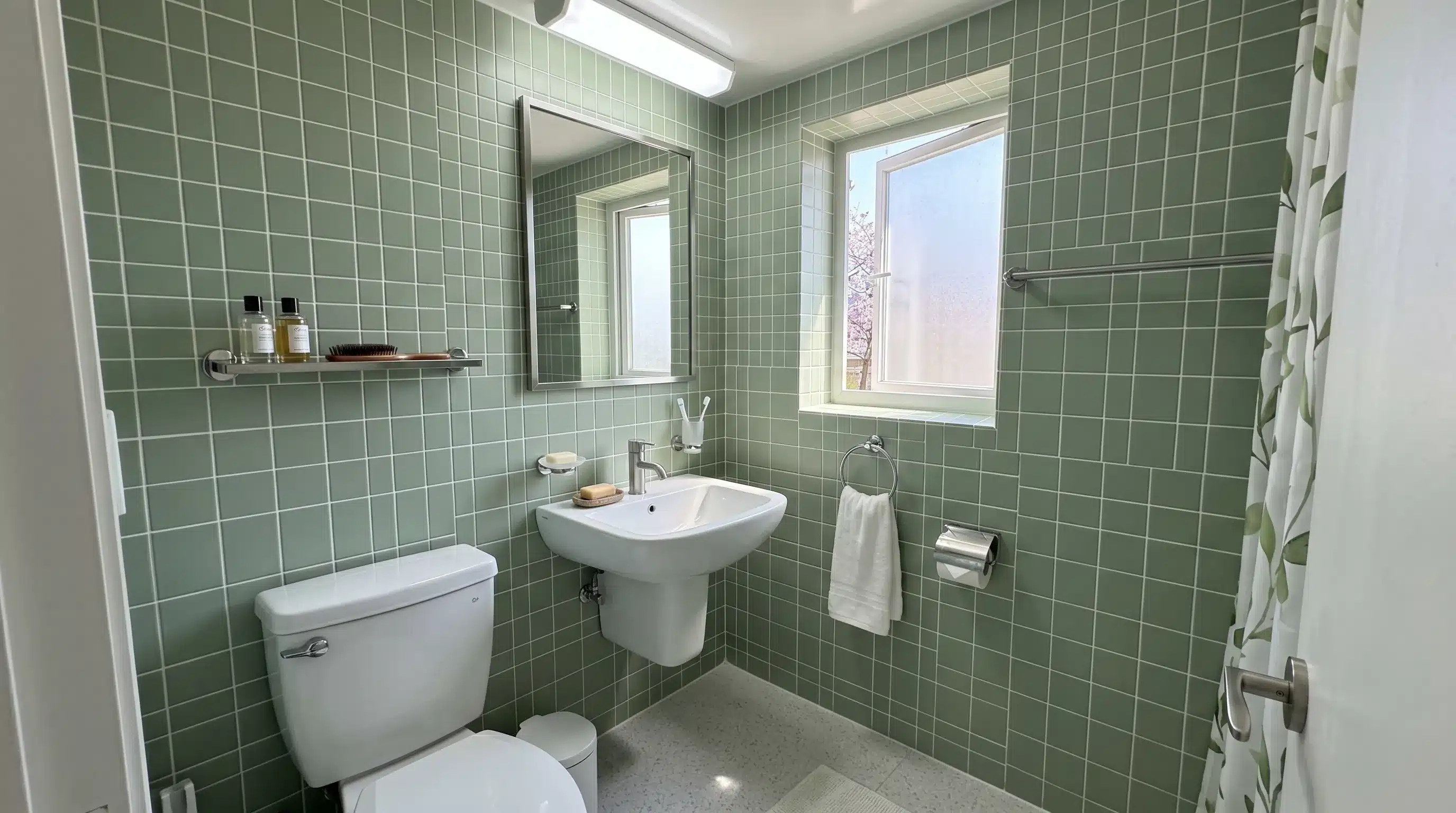
White subway tiles sit cleanly against sage walls. Light gray on the floor adds contrast without visual noise.
Silver fixtures, towel rails, taps, and shower fittings stay cohesive and crisp.
Frosted glass adds texture without breaking the palette. A white basin keeps the vanity open and bright.
Dining Room: Terracotta, Cream, and Dark Wood
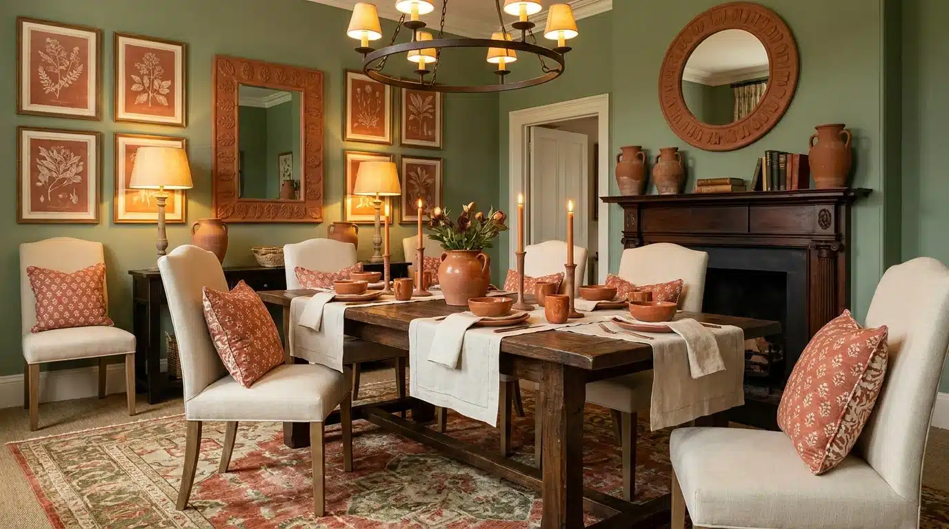
Sage green walls. Dark wood table. That’s already most of the work done.
- Dark wood dining chairs ground the space naturally.
- Terracotta ceramic tableware brings earthy calm to the table.
- Cream linen napkins soften without lightening too much.
- A terracotta centerpiece bowl acts as a quiet focal point.
- Cream seat cushions on dark chairs balance the weight perfectly.
Light a few candles in the evening; this palette comes alive under warm light. Comfortable, warm, and genuinely good to sit in for hours.
Home Office: Soft Gray, Navy, and Black for Focus and Contrast
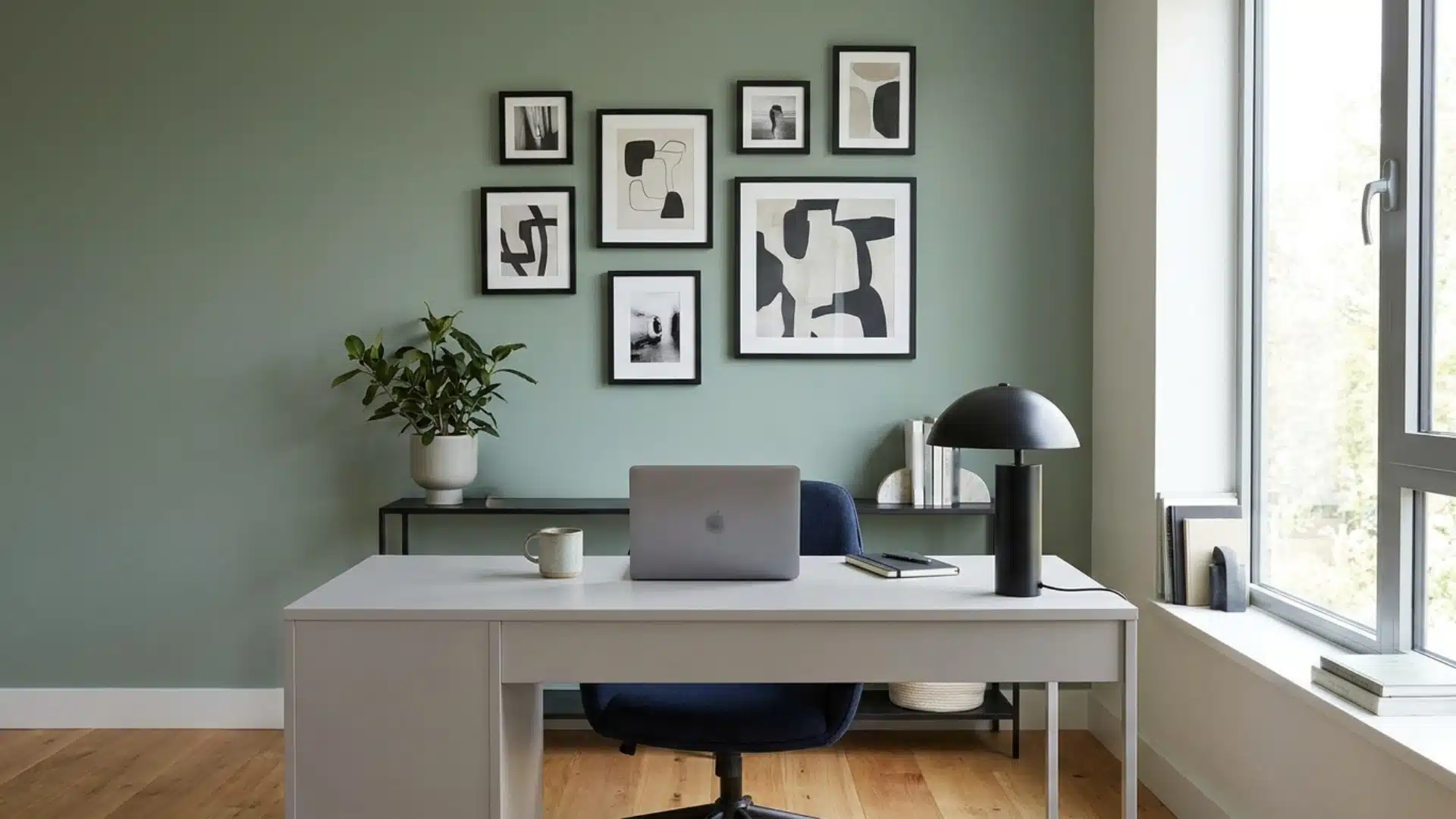
Sage green reduces visual fatigue without making the room feel sleepy. Pair it right, and the space feels sharp.
Navy, whether in a desk chair or rug, adds depth and anchors the room. Black desk legs, lamp bases, or thin-framed shelving sharpen the look. Keep the desk surface clear. Open space around sage improves breathing.
This combination is productive without feeling corporate or cold.
Entryway: Beige, Black, and Natural Wood for a Strong First Impression
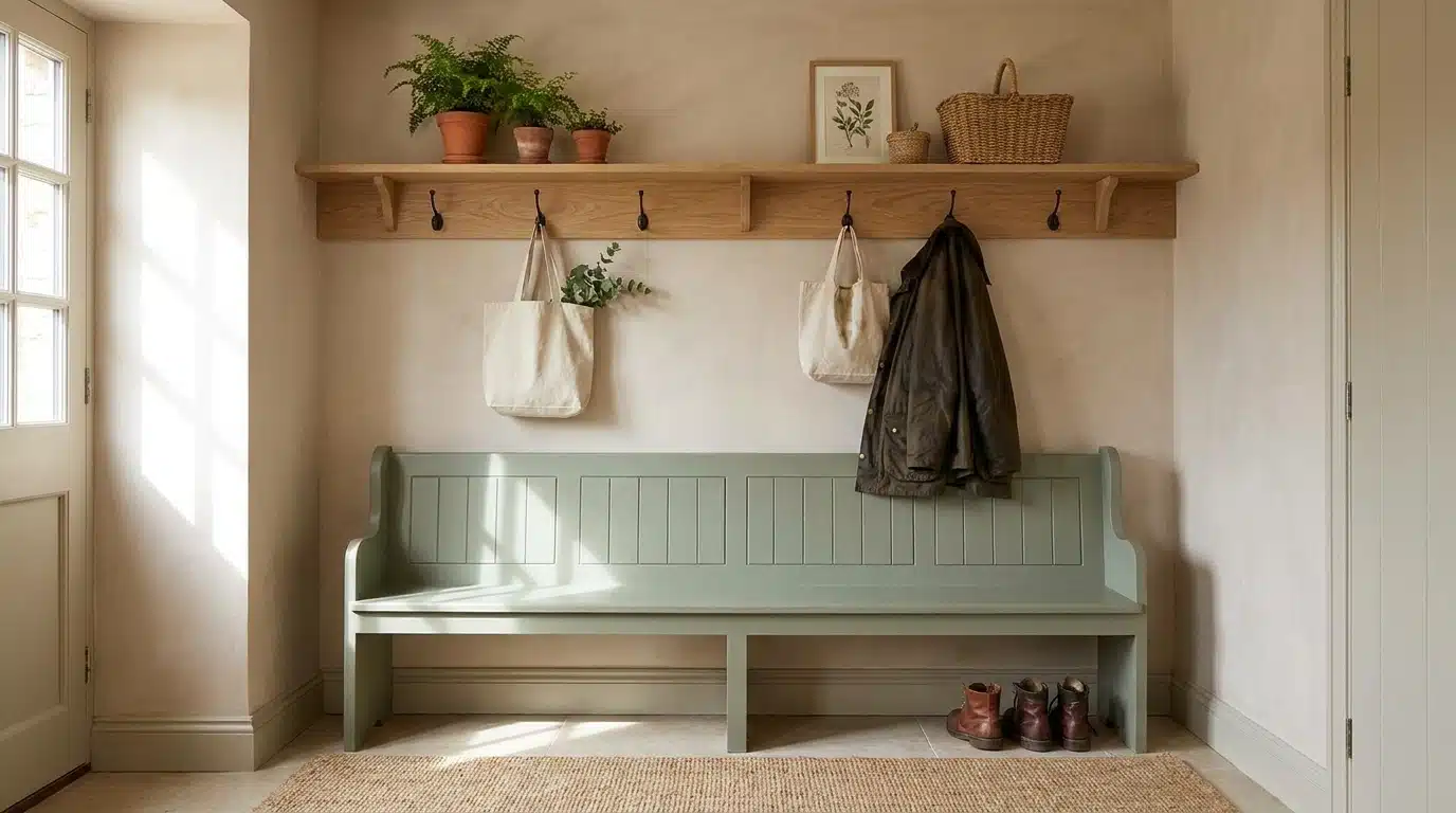
Natural wood console table brings heat right at the door. Beige runner or floor tiles keep the floor feeling open and light. Matte black light fixture adds definition overhead without heaviness.
One good coat hook, one clean rug, one strong light. That’s all this space needs.
Sage green combos with natural materials appear more resolved than those with only paint and fabric.
How to Test Sage Green Color Combinations Before Committing
Painting an entire room only to hate the combination is an expensive mistake. Test first; it takes very little effort and saves a lot of regret.
Step 1: Get Physical Swatches Before Anything Else
Grab actual paint swatches from the store. Pin them directly on the wall.
Phone screens and computer monitors don’t show accurate color; natural light on a physical swatch does.
Step 2: Test at Different Times of the Day
Morning light and evening light hit sage green completely differently. Check your swatch at dawn, midday, and under artificial evening light before making any decisions.
Step 3: Place Swatches Next to Existing Furniture
Hold combinations against your sofa, flooring, or curtains. See how they interact in real life.
A pairing that looks great in isolation can fall flat next to existing pieces.
Step 4: Paint a Large Sample Patch on the Wall
A small swatch only tells part of the story.
Paint at least a 12×12-inch section. Larger patches show how the color behaves across a bigger surface area.
Step 5: Live with it for 48 Hours
Don’t decide on day one. Give it two full days. Moods, lighting changes, and fresh eyes reveal things an immediate reaction misses completely.
Step 6: Test Your Accent Colors Alongside Sage
Pin terracotta, navy, blush, whatever you’re considering right next to the sage patch. See the full combination together before committing to a single tin of paint.
Step 7: Use a Peel-and-Stick Sample if Repainting Feels Like Too Much
Several brands now offer removable paint-like wall samples.
Low commitment, accurate color representation, and easy to swap out until the right combination lands.
End Note!
Sage green rarely fails, but knowing which colors go with it makes it truly shine.
If you’re leaning into warm neutrals, earthy tones, or something bolder, the combinations covered here give you a clear direction without the guesswork.
One thing worth remembering is to always include at least one natural material in the mix.
Wood, linen, stone, or ceramic. It grounds sage green in a way that paint and fabric alone simply can’t replicate.
Get that right, and the color stops being just a wall and starts feeling like a considered, complete space.
Frequently Asked Questions
What Colors Don’t Go with Sage Green?
Bright neon shades, cool purples, and cool grays clash with sage green, fighting its muted, earthy quality.
Is Sage Green Still in Style?
Yes, sage green is now a classic, as its muted, natural quality adapts across styles and spaces without quickly dating.
What Color is Replacing Sage Green?
Warm olive and moss tones are rising, with deeper, richer greens maintaining a natural feel.
Which Color Never Goes out of Style?
Warm white pairs with all colors and styles, seamlessly blending without competing for attention.
What One Color Best Suits Sage Green?
Warm cream softens sage’s subtle tones, suits all rooms, and complements its earthy tones.

Alex Guerrero, a graduate with a Fine Arts degree from the Rhode Island School of Design, has been a visionary in the world of color and design for over 15 years. His professional journey began in the heart of the fashion industry in Milan, where he developed an acute sense for color harmonies and trends. Alex joined our team in 2018, offering fresh and innovative perspectives on color utilization in various spaces. Renowned for his ability to blend contemporary trends with timeless elegance. Outside of work, Alex is an accomplished painter and a volunteer art therapist, his artistic talents further enriching his professional insights.