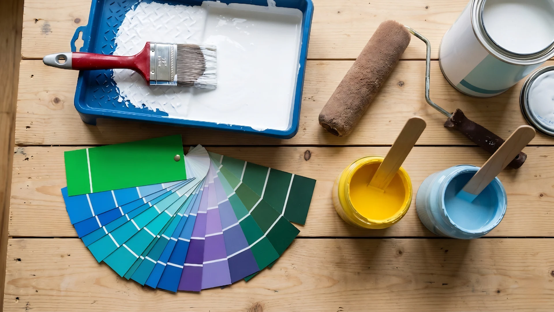

You finally figured out how to choose a paint color, spent an hour at the store, grabbed the swatch, and bought a full gallon. You rolled it on the wall, and it looked nothing like what you expected.
That greenish-gray you loved? Now it looks straight-up green. The warm beige? Suddenly pink.
It’s not your eye. Its undertones and almost no paint manual talk about this honestly.
This blog explains exactly why colors shift under your home’s lighting, how to read your room before touching a single swatch, and how to make a final decision you won’t regret two coats in.
No color theory lectures. Just a clear, room-by-room framework that actually works.
Start with the Parts of the Room You Cannot Easily Change
Before you even glance at a paint chip, look at what’s already fixed in your room.
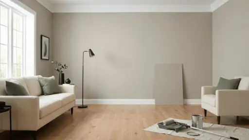
Your flooring, countertops, cabinetry, tile, and brick aren’t going anywhere. Every one of them carries an undertone, whether warm, cool, or neutral. Your paint color needs to work with those undertones, not fight them.
Pull a sample of each fixed finish into natural light and look closely.
That’s your real starting point. Everything else flows from there.
Understand Undertones Before Looking at Paint Swatches
Every paint color has a hidden undertone, and it will show up whether you planned for it or not.
- Warm undertones lean yellow, red, or orange.
- Cool undertones pull toward blue, green, or violet.
- Spot hidden undertones by holding the paint card next to a pure white surface.
- Never judge a swatch on its own; compare two or three cards side by side.
Beige reads pink in some rooms. Gray turns lavender. White goes yellow. It happens because surrounding colors and lighting shift your perception completely.
That contrast reveals what your eye misses when looking at a single chip.
Check How Natural Light Changes Paint Throughout the Day
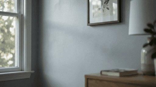
The same paint color can look like three different shades depending on the time of day.
| Time of Day | Light Quality | North-Facing | South-Facing | East-Facing | West-Facing |
|---|---|---|---|---|---|
| Morning | Soft, cool blue | Flat, dull | Bright, warm | Direct warm glow | Still dim |
| Midday | Bright, neutral | Cool, shadowy | Truest color | Slightly cool | Warming up |
| Afternoon | Warm golden | Blue-toned | Intense, warm | Losing light | Direct warm glow |
| Evening | Dim, artificial | Darkest reading | Warm, rich | Quite dark | Brightest moment |
North-facing rooms rarely receive consistent direct sunlight and are perceived as cooler and darker.
South-facing rooms receive the most balanced light throughout the day. East and west rooms swing dramatically, so testing at multiple times matters most there.
Learn the 60-30-10 Rule that Designers Actually Use
Designers don’t just pick colors they like; they distribute them intentionally.
60% of the room gets your dominant color, usually the walls. 30% goes to secondary elements like furniture, rugs, or curtains. The remaining 10% is divided among accents, throw pillows, artwork, and small decor pieces.
This ratio creates visual balance without making a room feel flat or chaotic.
It works in any style, any room size. Get this proportion right, and even bold color choices feel grounded.
How to Test Paint Samples the Right Way

Buying a full gallon before properly testing is one of the costliest mistakes you can make. Here’s how to do it right.
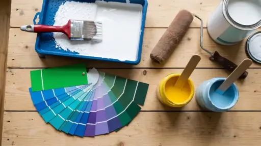
Step 1: Buy Sample Pots First
Never commit to a full gallon without testing. Sample pots are cheap insurance.
One small pot gives you enough to test properly without wasting money on a color that won’t work.
Step 2: Paint Large Boards, Not Small Patches
Use cardboard or poster board at least 12×12 inches.
Small patches distort perception. Larger surfaces show how the color behaves across a larger area.
Step 3: Move the Board Around the Room
Place it near fixed finishes, against different walls, beside your furniture. A color that works near the window might look completely wrong in a darker corner.
Step 4: View it at Every Lighting Window
Morning, midday, afternoon, and evening, check the board each time. Don’t make a final call after seeing it only once under a single lighting condition.
Step 5: Narrow Down to Two Finalists
Testing too many colors creates confusion. Get down to two strong contenders and compare them directly.
Once you have a clear winner that looks right in all conditions, then buy the full quantity.
How to Build a Whole-House Paint Color Palette
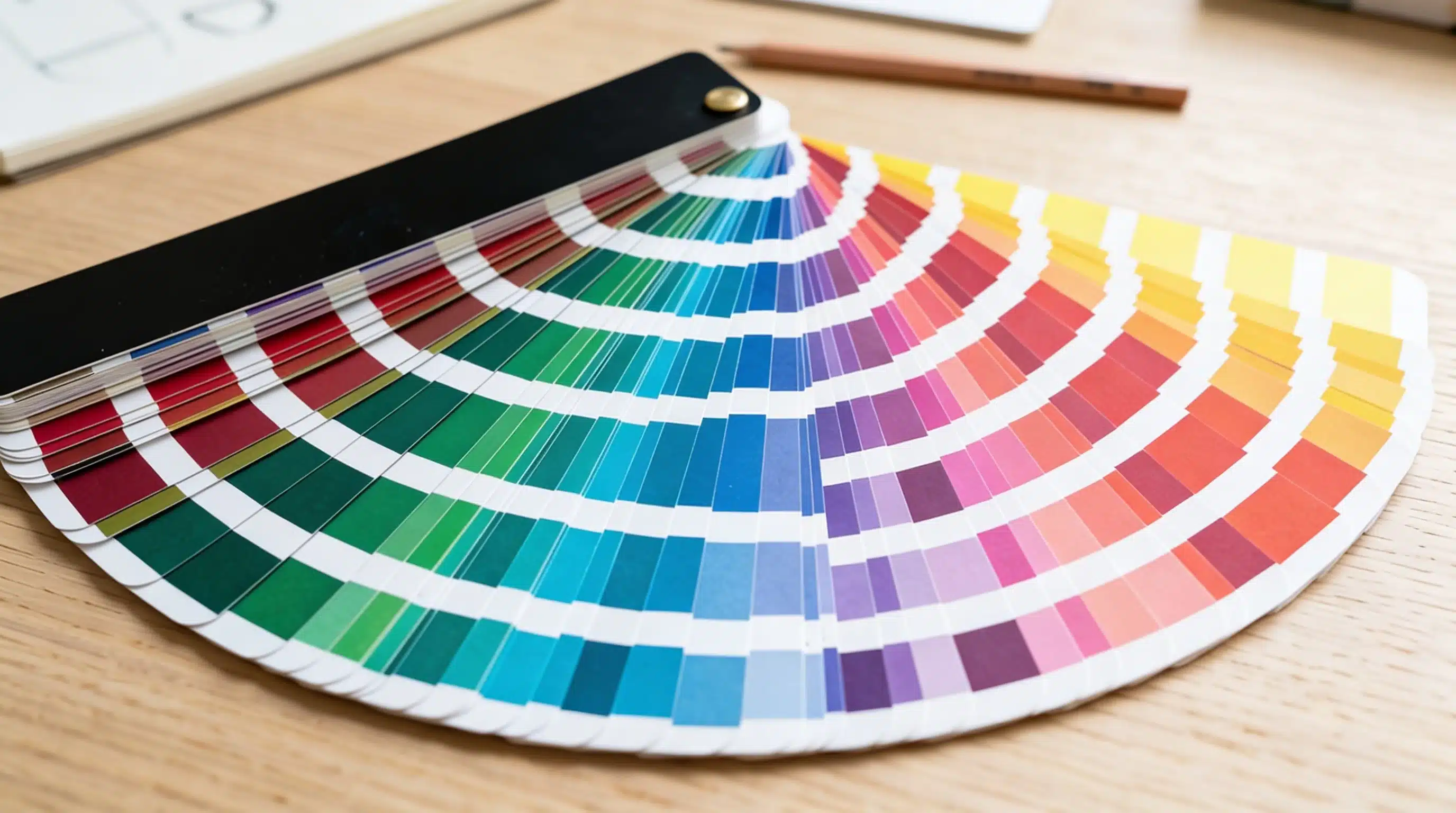
A cohesive whole-house palette doesn’t happen by accident; it takes a simple system.
And when it comes to choosing paint colors, starting with one anchor color makes everything else fall into place. This becomes your most-used neutral, appearing in connected spaces like hallways and living areas.
From there, build outward.
- Pick colors from the same undertone family so rooms flow naturally into each other.
- Limit your palette to three or four colors across the entire home.
- Use deeper or lighter versions of your anchor color in smaller rooms.
- Save bold, saturated choices for enclosed rooms like dining areas or home offices.
Transition between rooms gradually to prevent clashes when viewed from doorways.
Room-by-Room Paint Color: What Works in a Bedroom Won’t Work in a Kitchen
Knowing how to choose paint colors for your home interior is never clear. Every room has a different function, and your paint color needs to match that function, not just look good in isolation.
Bedroom
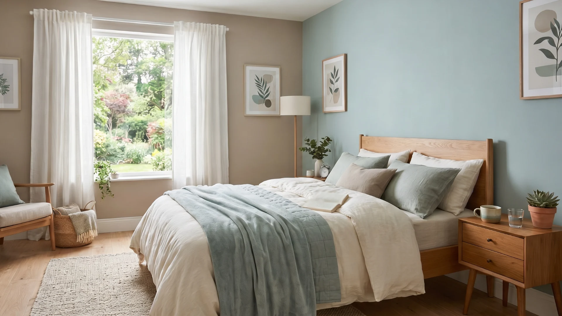
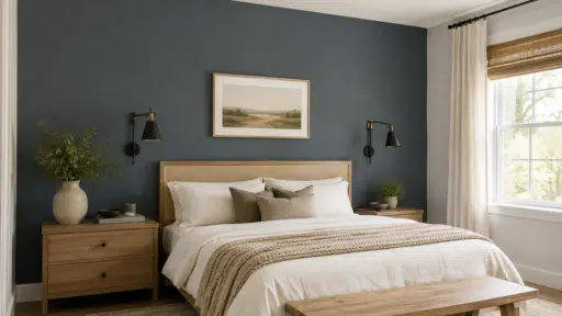
Sleep science supports cooler, low-saturation colors here.
Soft blues, muted greens, and warm taupes support rest. Avoid anything too bright or high-contrast; stimulating colors work against winding down at night.
- Quiet Moments: It’s a soft, airy blue-green that stays calm in any light.
- SW Rainwashed: Muted coastal tone that reads serene without feeling cold.
- Farrow & Ball Mizzle: A warm, earthy green that feels grounded and restful.
Living Room
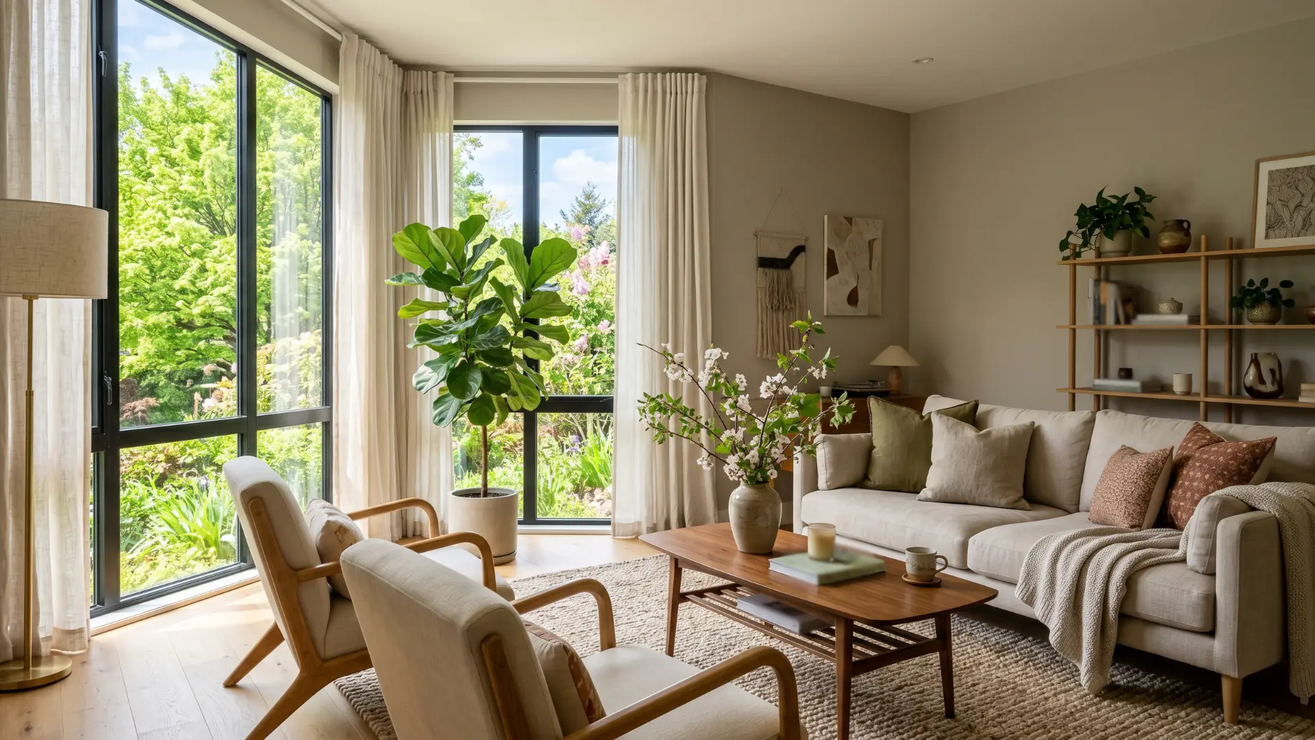
This space handles everything from relaxing to entertaining to everyday family life.
Mid-tone colors perform best here. They are universal enough to shift mood with lighting changes without feeling too stark or too heavy.
Farrow & Ball Elephant’s Breath: A refined warm gray that anchors a room beautifully.
Kitchen
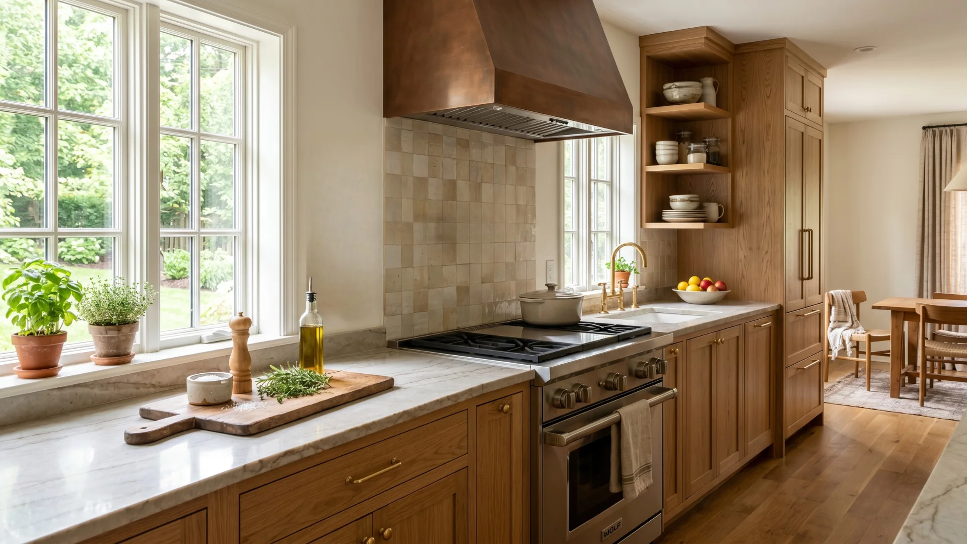
Steam, grease, and strong task lighting change everything. Lighter, wipeable finishes work harder here.
Warm whites, soft yellows, and earthy tones complement food naturally without competing with cabinetry.
- Benjamin Moore White Dove: A clean, slightly warm white that never reads stark.
- Sherwin-Williams Alabaster: Creamy and soft, pairs well with both wood and painted cabinets.
- Farrow & Ball Wimborne White: A warm, timeless white with subtle depth.
- Accessible Beige: Bridges white and warm neutral beautifully in larger kitchens.
- Benjamin Moore Hawthorne Yellow: A soft, muted yellow that adds heat without crowding.
Bathroom
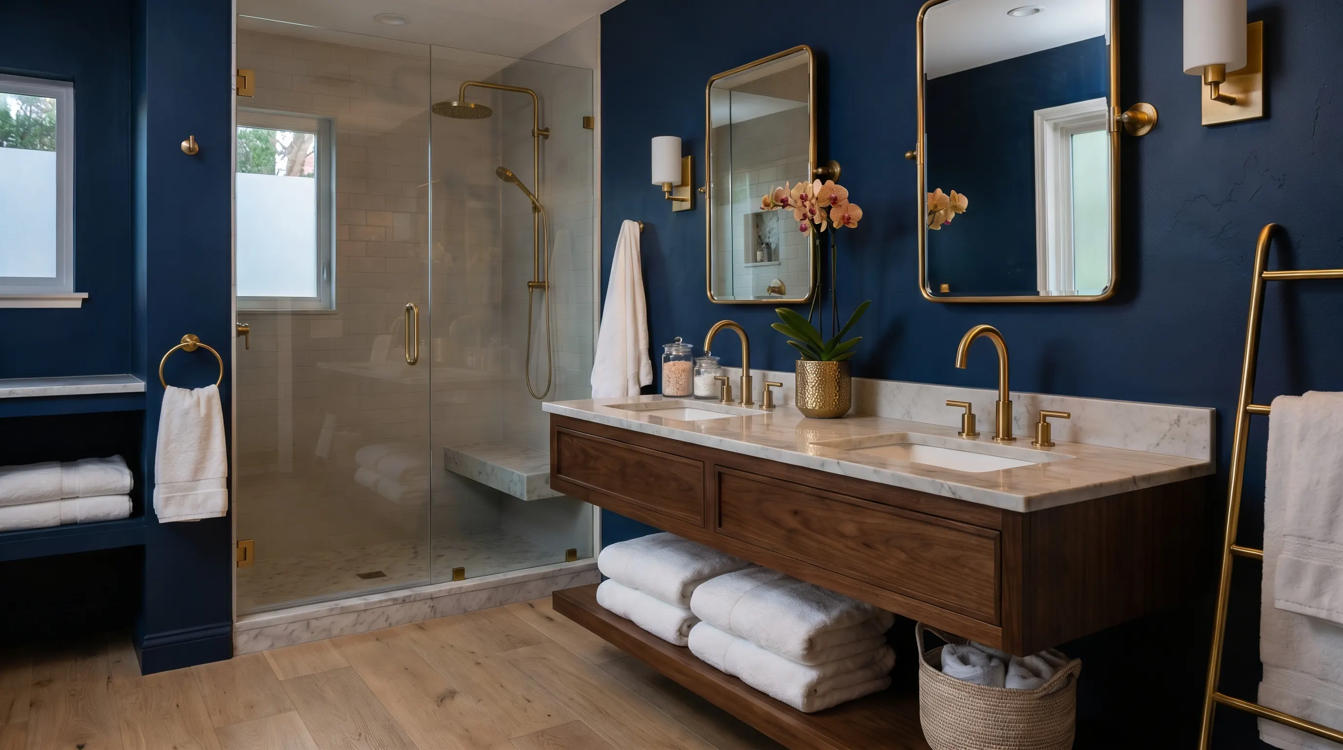
Small bathrooms don’t need white to feel bigger.
A deep, saturated color used consistently across all four walls creates an intentional, spa-like feel. Contrast comes from fixtures and towels, not paint.
- Farrow & Ball Hague Blue: A dramatic, inky blue that changes a small space instantly.
- Benjamin Moore Newburyport Blue: A refined coastal blue that works in both bright and dim bathrooms.
Home Office
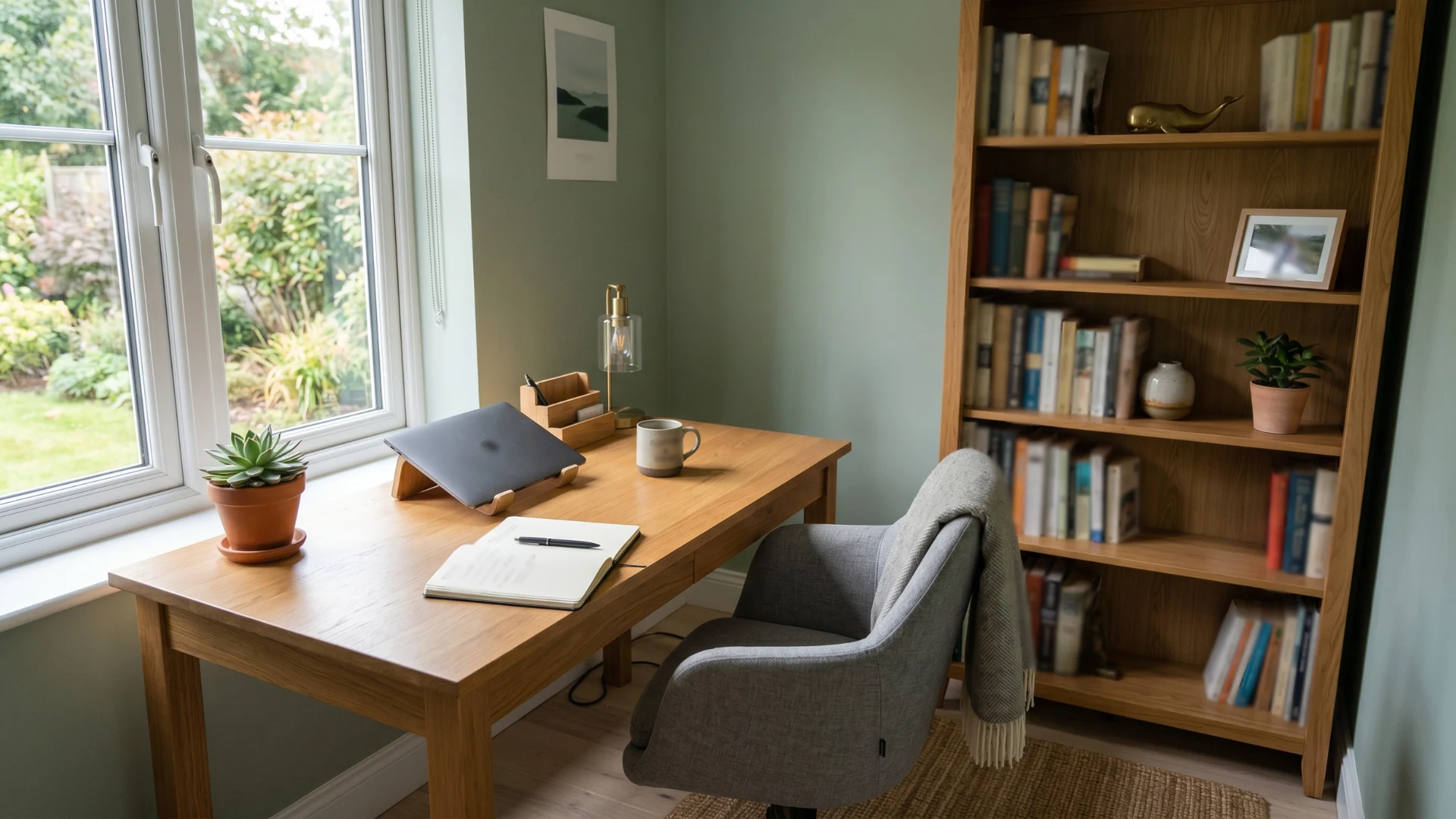
Productivity needs focus. Muted greens and soft blues reduce eye fatigue during long hours.
Avoid overly warm or stimulating tones; they create restlessness rather than concentration.
- SW Sea Salt: A soft blue-green that stays energizing without being distracting.
- Benjamin Moore Pale Avocado: A muted, earthy green that feels grounded and easy to work with.
- Farrow & Ball Mole’s Breath: A warm gray-taupe that adds quiet complexity to a workspace.
Dining Room
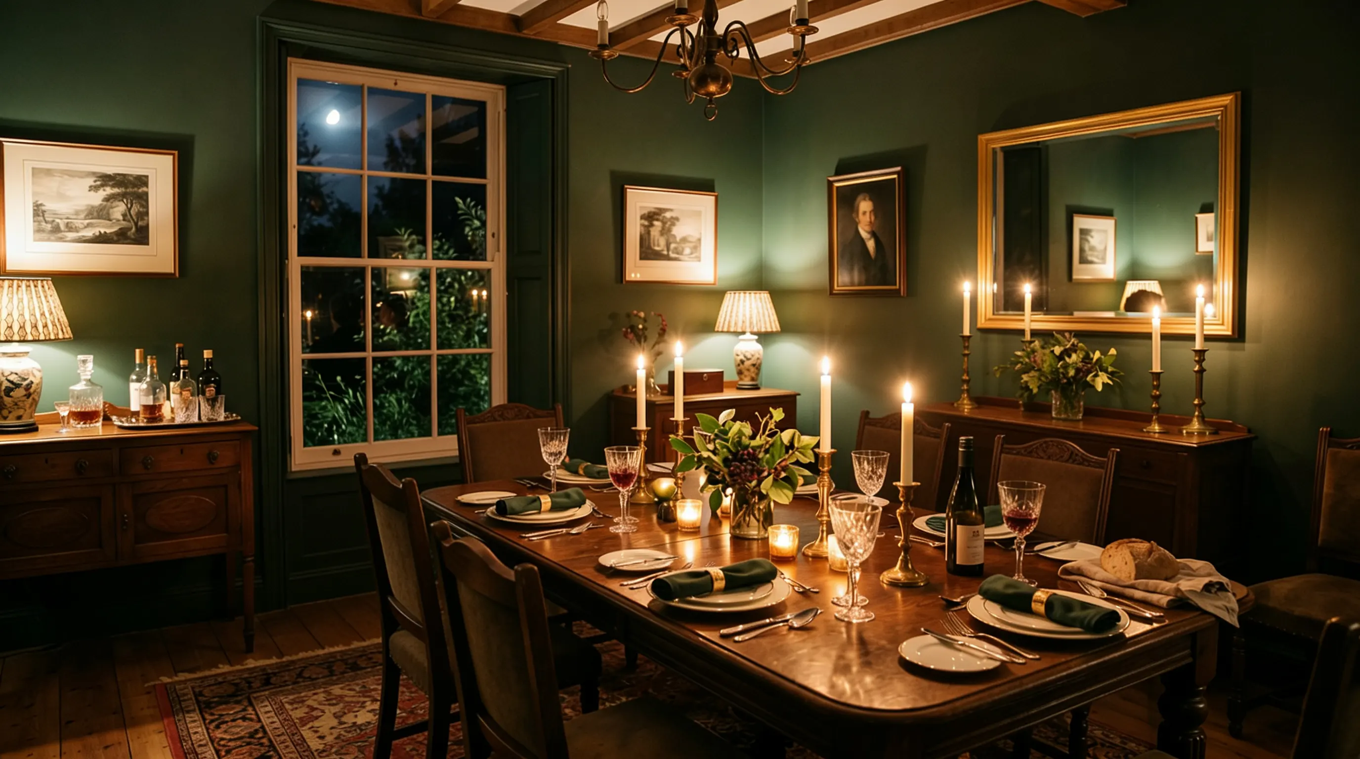
This is where bold colors earn their place.
Deep greens, and moody navies create an intimate atmosphere that makes meals feel more intentional and memorable. Darker tones also make candlelight and evening lighting look exceptionally warm.
- Farrow & Ball Dining Room Blue: A rich, historic blue that feels formal yet inviting.
- Black Forest Green: A deep, moody green that adds drama without heaviness.
- SW Cordovan: A warm, earthy red-brown that makes a dining room feel genuinely cozy.
- Farrow & Ball Preference Red: A refined, muted red that works beautifully by candlelight.
Children’s Room
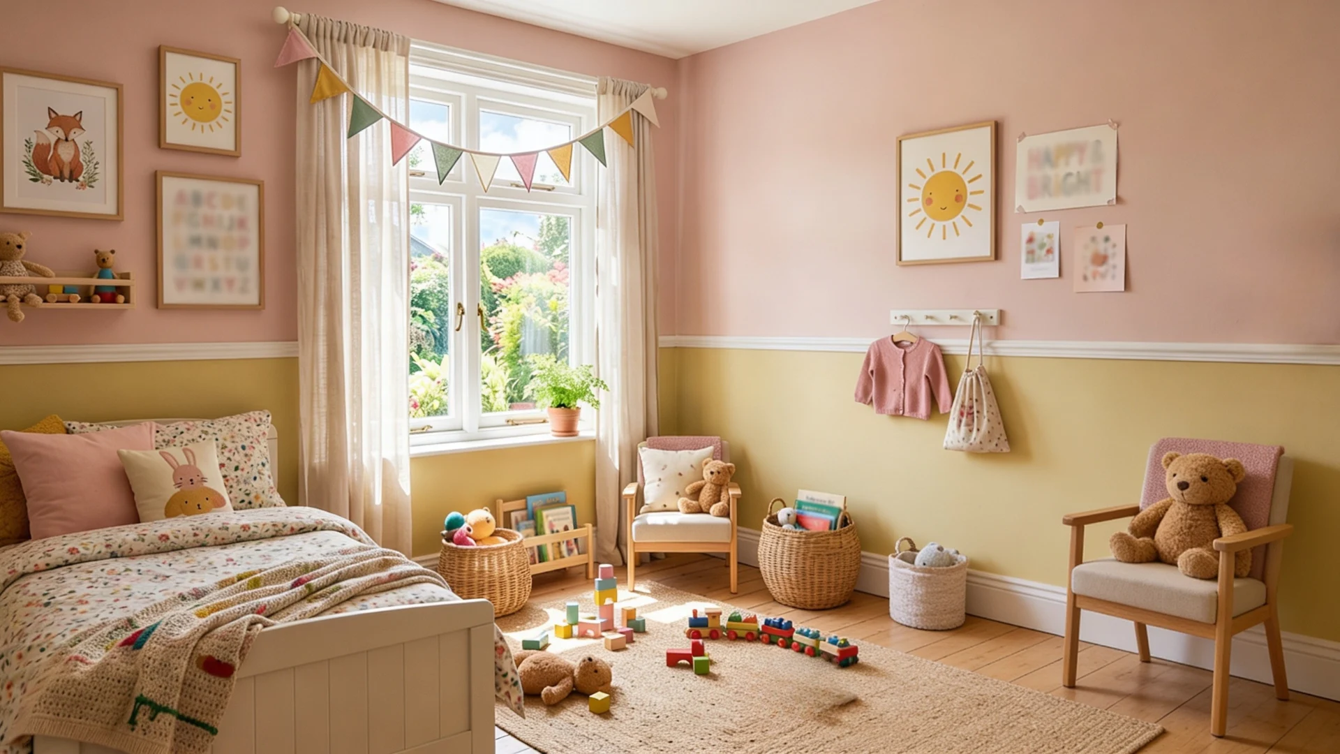
Softer, muted versions of bright colors work better than their full-saturation counterparts.
They’re still playful but far less dominating and easier to live with as children grow older.
- Bosc Pear: A gentle, warm yellow-green that feels cheerful without being loud.
- SW Demure: A soft, dusty pink that works for any age without feeling babyish.
Finish Matters as Much as Color: How to Choose a Paint Color
The can’s color is just part of the decision; the finish affects how the color looks, feels, and performs on walls.
| Finish | Sheen Level | Best For | Avoid Using On |
|---|---|---|---|
| Flat/Matte | None | Ceilings, low-traffic walls | High-moisture areas, kids’ rooms |
| Eggshell | Very low | Bedrooms, living rooms | Areas needing frequent scrubbing |
| Satin | Soft glow | Hallways, family rooms | Walls with heavy imperfections |
| Semi-Gloss | Medium shine | Trim, doors, bathrooms | Large open wall surfaces |
| Gloss | High shine | Cabinetry, furniture, accents | Any standard wall surface |
One practical note: Higher sheen levels highlight wall imperfections more than flat finishes do. If your walls aren’t perfectly smooth, a matte or eggshell finish will be far more forgiving than a satin or semi-gloss finish.
How to Use Color Psychology without Falling
Color psychology is a useful starting point, but treat it as a directory, not a rulebook. Context, lighting, and personal association always override any universal color rule.
Warm colors energize, cool colors calm, but saturation changes everything
A muted terracotta feels cozy. A neon red feels aggressive.
Hue alone doesn’t determine mood; how saturated or muted a color is matters just as much.
Your personal associations carry more weight than any color chart
If blue reminds you of a place you love, it’ll feel right regardless of what psychology says. Design for how you actually respond, not how you’re supposed to.
Bold colors work best in rooms with a single purpose
A dining room, a reading nook, and a home office contain spaces that handle strong color confidently.
Open, multi-use spaces need more neutral, adaptable choices.
Color affects perceived temperature, not just mood
Warm-toned rooms genuinely feel a few degrees warmer.
Cool-toned rooms feel airier and fresher. Factor this in for rooms that run hot or feel stuffy year-round
Checklist to Finalize Your Color Choice with Confidence
Run through this checklist before committing to any color. It takes ten minutes and saves you from a decision you’ll regret after the first coat dries.
- Identify fixed finishes and note whether they run warm, cool, or neutral.
- Define the room’s function and the mood you want it to support.
- Narrow choices to two or three colors from the same undertone family.
- Paint large sample boards, not full gallons yet.
- Observe boards across morning, midday, and evening light.
- Select a finish based on room traffic and wall condition.
- Buy the full quantity only after the color passes all the conditions above.
Wrap Up!
Knowing how to choose a paint color comes down to one thing: know your room before trusting your instincts.
Light, fixed finishes, undertones, and level all shape the final result more than the color chip ever will.
Take your time with the sample stage. Move boards around.
Check them at night. Get the finish right.
These aren’t extra steps; they’re the difference between a color you love for years and one you repaint six months later. Your room already has a personality. The right paint color simply brings it out.
Frequently Asked Questions
How Many Paint Colors Should I Test Before Making a Final Decision?
Testing two to three finalists anymore creates confusion and delays decisions.
Does Paint Color Look Different Once it Dries?
Yes, most colors dry slightly darker and more saturated than they appear wet.
How Long Should I Wait Before Judging a Paint Sample?
Always wait at least 24 hours after applying before evaluating any paint sample.
Can Dark Paint Colors Make a Small Room Feel Bigger?
Yes, used consistently on all four walls, dark colors create intentional depth.
What is the Safest Neutral Paint Color for Any Room?
Warm whites and soft greiges with balanced undertones work reliably across most spaces.

Alex Guerrero, a graduate with a Fine Arts degree from the Rhode Island School of Design, has been a visionary in the world of color and design for over 15 years. His professional journey began in the heart of the fashion industry in Milan, where he developed an acute sense for color harmonies and trends. Alex joined our team in 2018, offering fresh and innovative perspectives on color utilization in various spaces. Renowned for his ability to blend contemporary trends with timeless elegance. Outside of work, Alex is an accomplished painter and a volunteer art therapist, his artistic talents further enriching his professional insights.