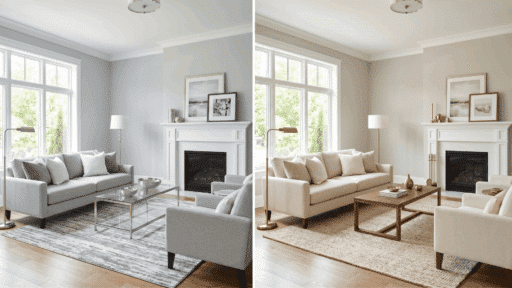
Neutral color schemes never go out of style because they create a calm, clean, and easy-to-live-with environment.
This blog highlights popular neutral color palettes along with simple combinations that are easy to use.
It will help you choose the right mix of tones to match your space, mood, and personal style, without making the process confusing or overwhelming.
What is a Neutral Color Scheme?
A neutral color scheme uses soft, muted shades to create a calm, balanced look in any space. These colors do not stand out too strongly, which makes them easy to mix and match with other tones and materials.
They work well as a base, allowing furniture, textures, and small accents to stand out naturally. Neutral palettes are often used to make rooms feel open, light, and comfortable without adding visual clutter.
Before choosing your palette, it helps to understand how these tones behave in different lighting and how they can shape the overall mood of your space.
Key Features of Neutral Colors
- Soft and Muted Tones: Neutral colors are known for their gentle and subtle appearance. They avoid bright or overpowering shades, which helps create a relaxed and easy-on-the-eyes environment.
- Easy to Mix and Match: One of the biggest advantages is how well these colors work together. You can pair different neutral shades or combine them with accent colors without worrying about clashing.
- Work Well In Any Room: Neutral tones are flexible and fit into every space in the home. From bedrooms to kitchens, they adapt easily to different styles and layouts.
- Create a Calm and Balanced Feel: These colors help set a peaceful mood in any space. They reduce visual noise, making the room feel more organized and comfortable.
Common Neutral Shades
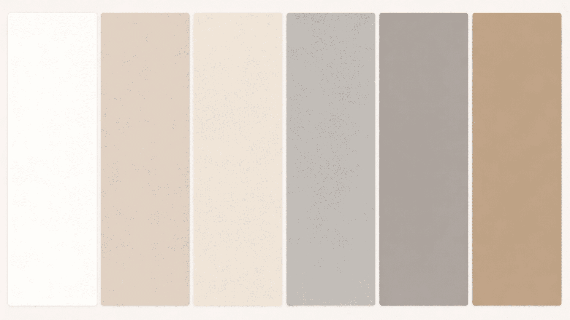
Neutral shades form the foundation of any calm, balanced color scheme. These tones are simple, flexible, and easy to use across different rooms and styles.
| Neutral Shade | Description |
|---|---|
| White | Bright and clean, it helps make spaces feel open and airy |
| Beige | Warm and soft, it adds a cozy and welcoming touch |
| Cream | Slightly warmer than white, it gives a smooth and gentle look |
| Gray | Cool and modern, it works well in simple and minimal spaces |
| Taupe | A mix of gray and brown adds depth without feeling too dark |
| Soft Brown | Earthy and natural, it brings warmth and comfort to a room |
Top Neutral Color Scheme Ideas to Try
Looking for simple and stylish combinations? These neutral color scheme ideas can help create a calm, balanced space that feels easy to live in and works with different styles.
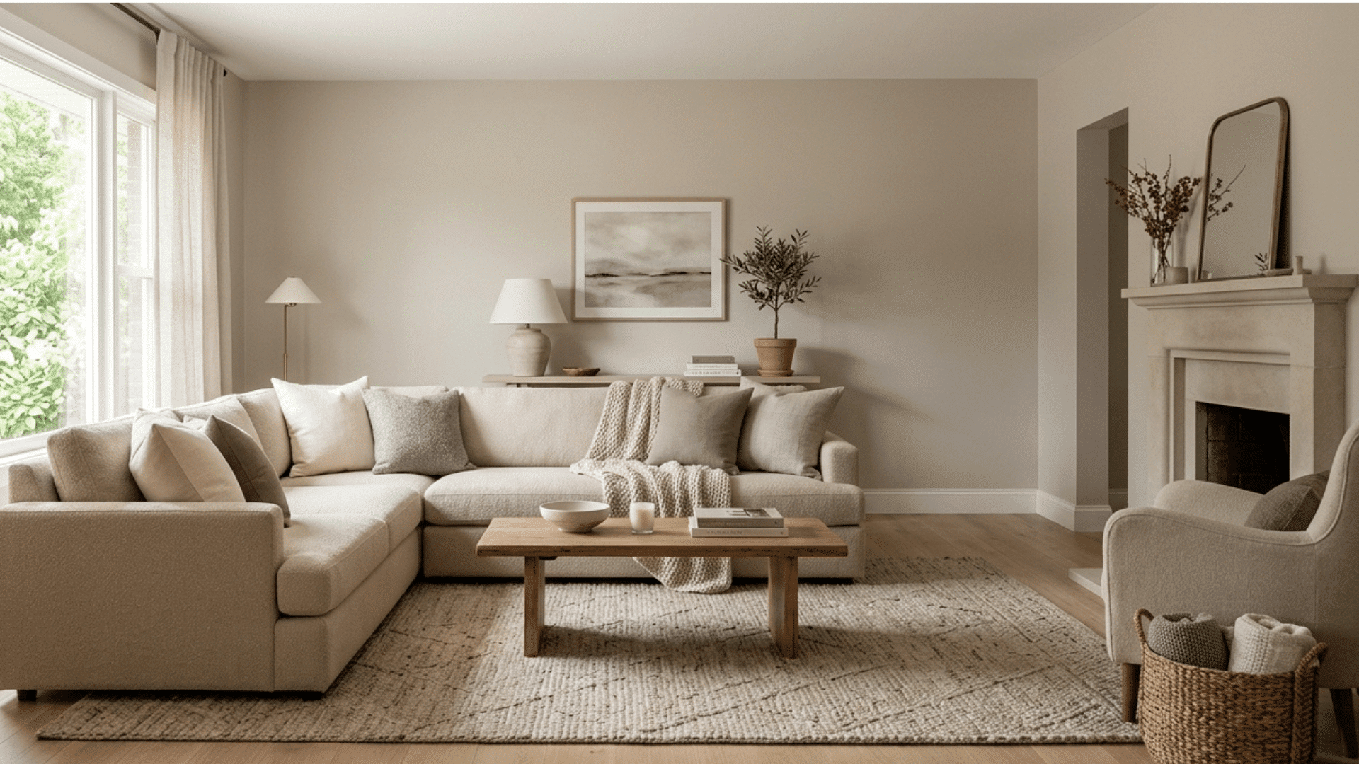
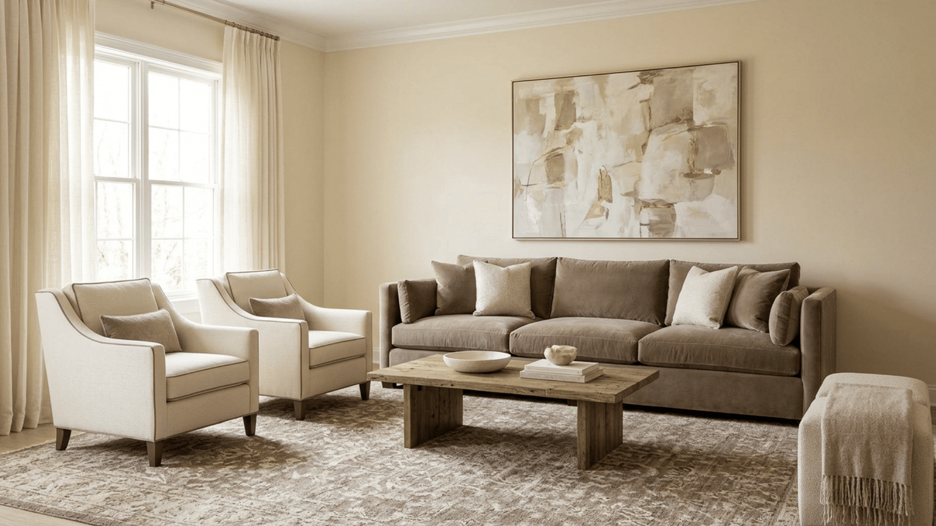
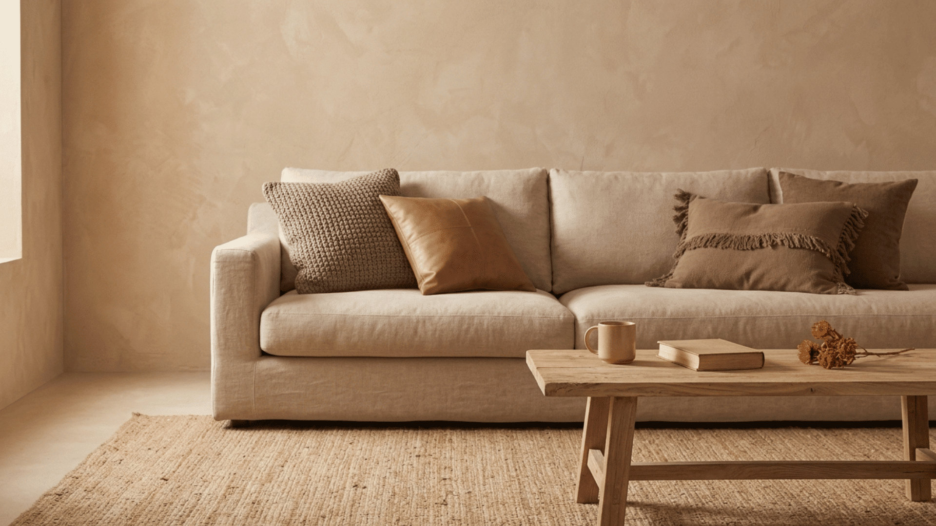
1. Warm Beige and Cream Palette
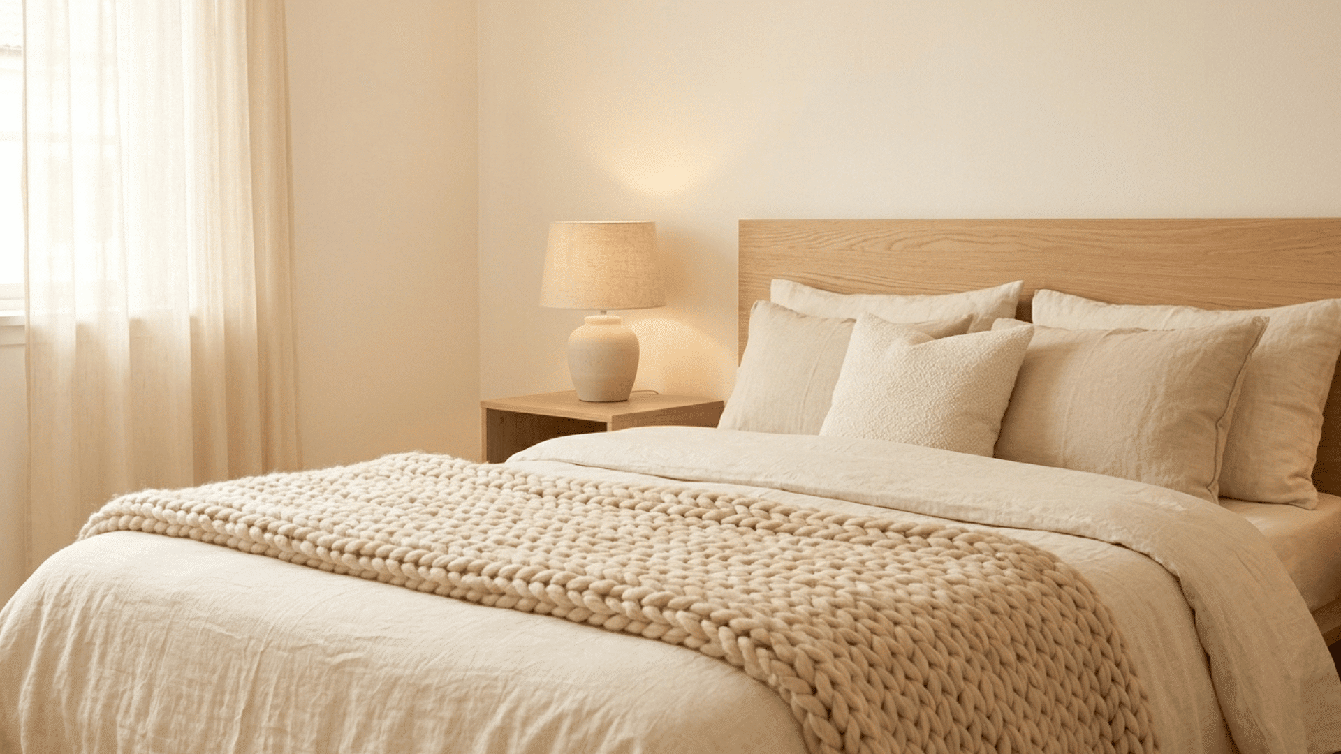
A warm beige-and-cream palette creates a soft, cozy look that feels inviting and comfortable. These shades work well together to add gentle warmth without making the space feel heavy.
This combination is ideal for living rooms and bedrooms where a relaxed atmosphere matters most. It pairs nicely with wooden furniture, soft fabrics, and warm lighting.
The overall effect is simple yet comforting, making it a great choice for spaces meant for rest and everyday living.
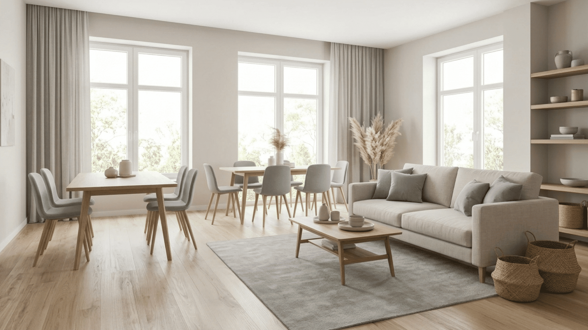
2. Gray and White Minimal Combo

The gray-and-white combination offers a clean, simple look that feels fresh and uncluttered. It is a popular choice for modern interiors because it keeps the space looking neat and balanced.
White helps brighten the room, while gray adds a soft contrast without being too bold. This palette works well in kitchens, living areas, and even workspaces.
Adding metal or glass elements can increase the overall feel without making the space look busy.
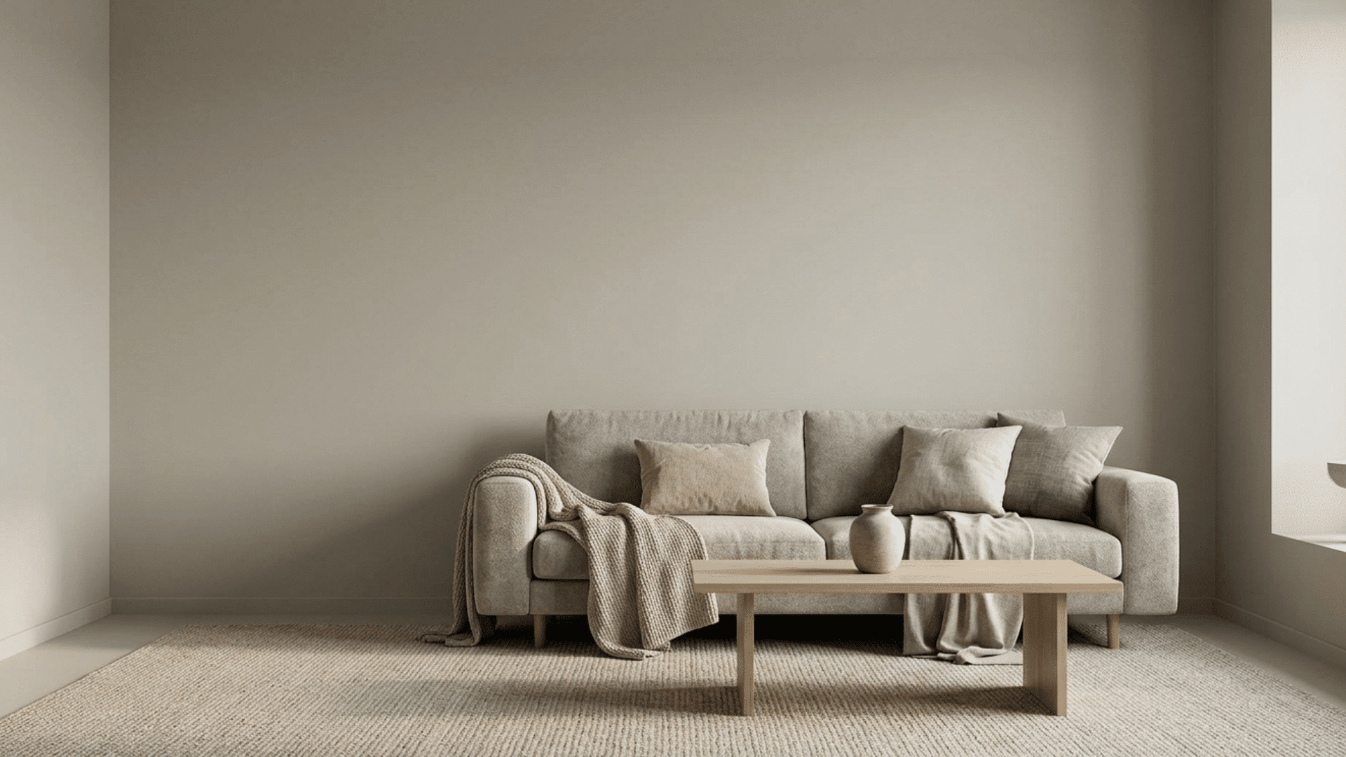
3. Taupe and Soft Brown Blend
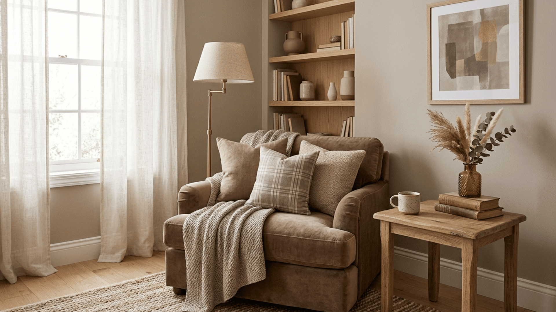
Taupe and soft brown together create a warm and grounded look with added depth. This palette brings richness to a space without feeling too dark or heavy.
It is perfect for cozy spaces like bedrooms or reading corners where comfort is important.
These tones pair well with natural materials like wood and fabric, adding a relaxed and welcoming feel. The blend of gray and brown undertones helps maintain balance while still adding character to the room.
4. Black, White, and Gray Contrast
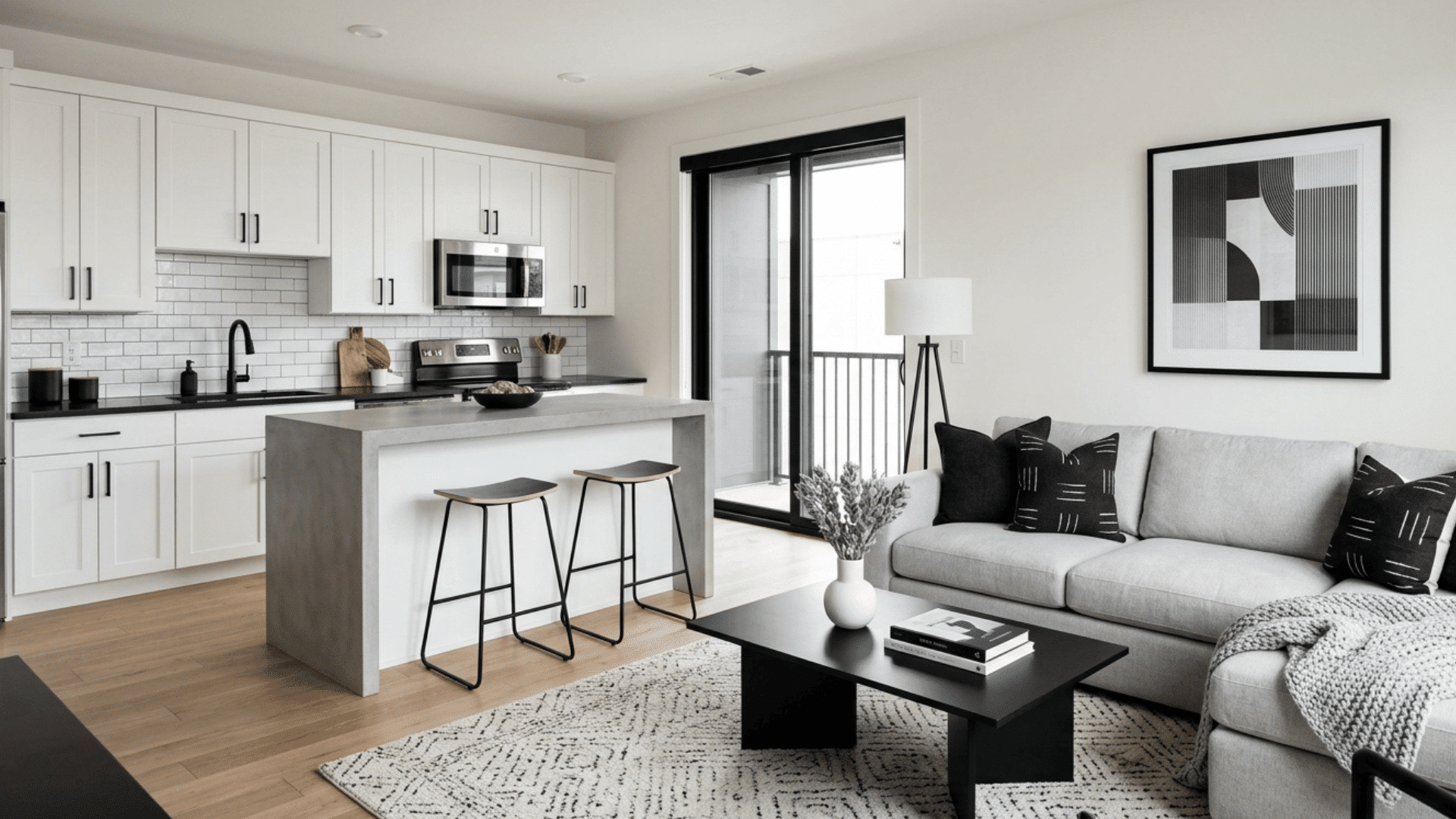
This combination uses contrast in a balanced way while staying within a neutral range. Black adds depth, white keeps the space bright, and gray helps connect the two smoothly.
The result is a clean and structured look that works well in kitchens, offices, and modern living spaces.
This palette is great for creating visual interest without using bold colors. Adding simple patterns or textures can make the space feel more complete and less flat.
5. Off-White and Natural Wood Tones
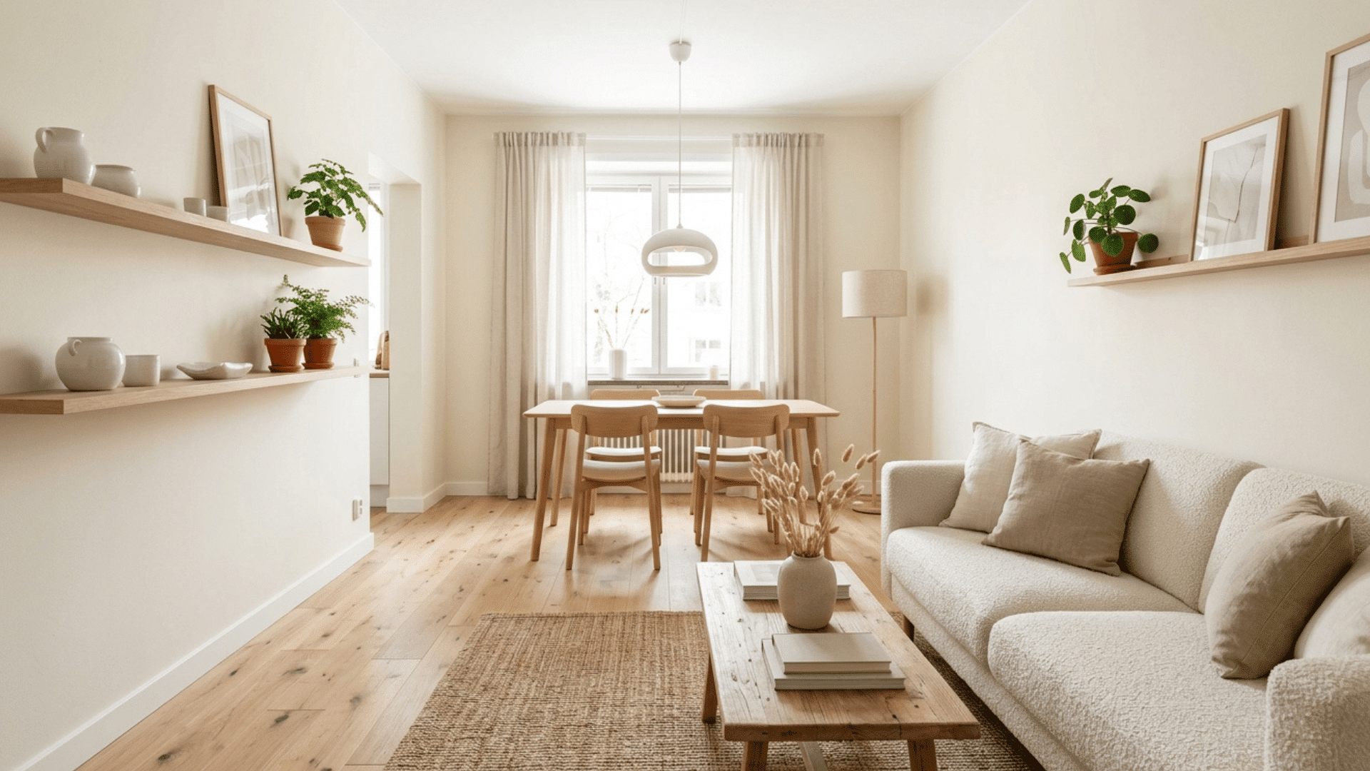
Off-white paired with natural wood creates a light and fresh look that feels warm and inviting. This combination works especially well in small spaces as it helps reflect light and make the area feel more open.
The softness of off-white balances the warmth of wood, creating a comfortable, easygoing environment. It is a great choice for living rooms, kitchens, and even small apartments.
Simple decor and natural textures help increase the overall feel.
6. Greige (Gray + Beige) Palette
Greige combines the best of gray and beige, offering a balanced mix of warm and cool tones. This makes it one of the most versatile neutral palettes for any room.
It adapts easily to different lighting conditions and works well with a wide range of furniture styles.
Greige creates a calm and steady look without feeling too cold or too warm. It is a practical option for anyone looking for a neutral base that fits almost every space.
7. Soft White and Light Gray Palette
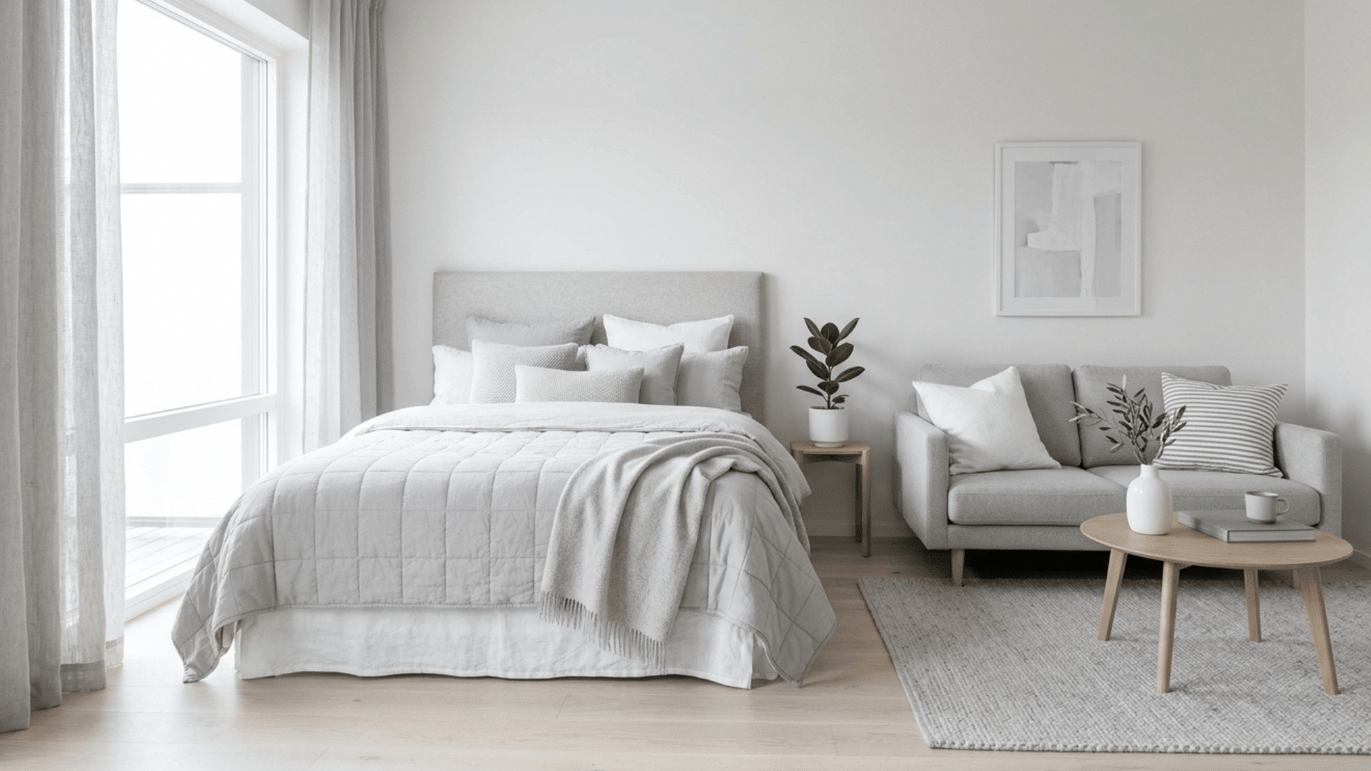
Soft white and light gray create a clean and airy look that feels calm and open. This palette works well in small spaces because it reflects light, making the room feel bigger.
The combination is simple yet effective, especially in bedrooms and living areas. It pairs well with minimal decor and soft textures, such as linen and cotton. The overall feel is light, fresh, and easy to maintain, making it a great everyday choice.
8. Cream and Taupe Combination
Cream and taupe together create a warm and balanced look that feels soft and grounded. This palette adds depth without making the space feel dark.
It works well in living rooms and dining areas where comfort and style both matter. The mix of light and mid-tones helps create a smooth flow in the space.
Adding wooden elements or soft fabrics can increase the overall warmth and make the room feel more inviting.
9. Beige and Soft Gray Blend
Beige and soft gray offer a mix of warm and cool tones that feels balanced and easy to style. This combination works well in modern and transitional spaces.
Beige adds warmth, while gray keeps the look clean and subtle. It is a great choice for open layouts that you want to maintain a consistent, calm feel.
This palette also pairs well with simple decor and natural materials for a relaxed finish.
10. Off-White and Charcoal Contrast
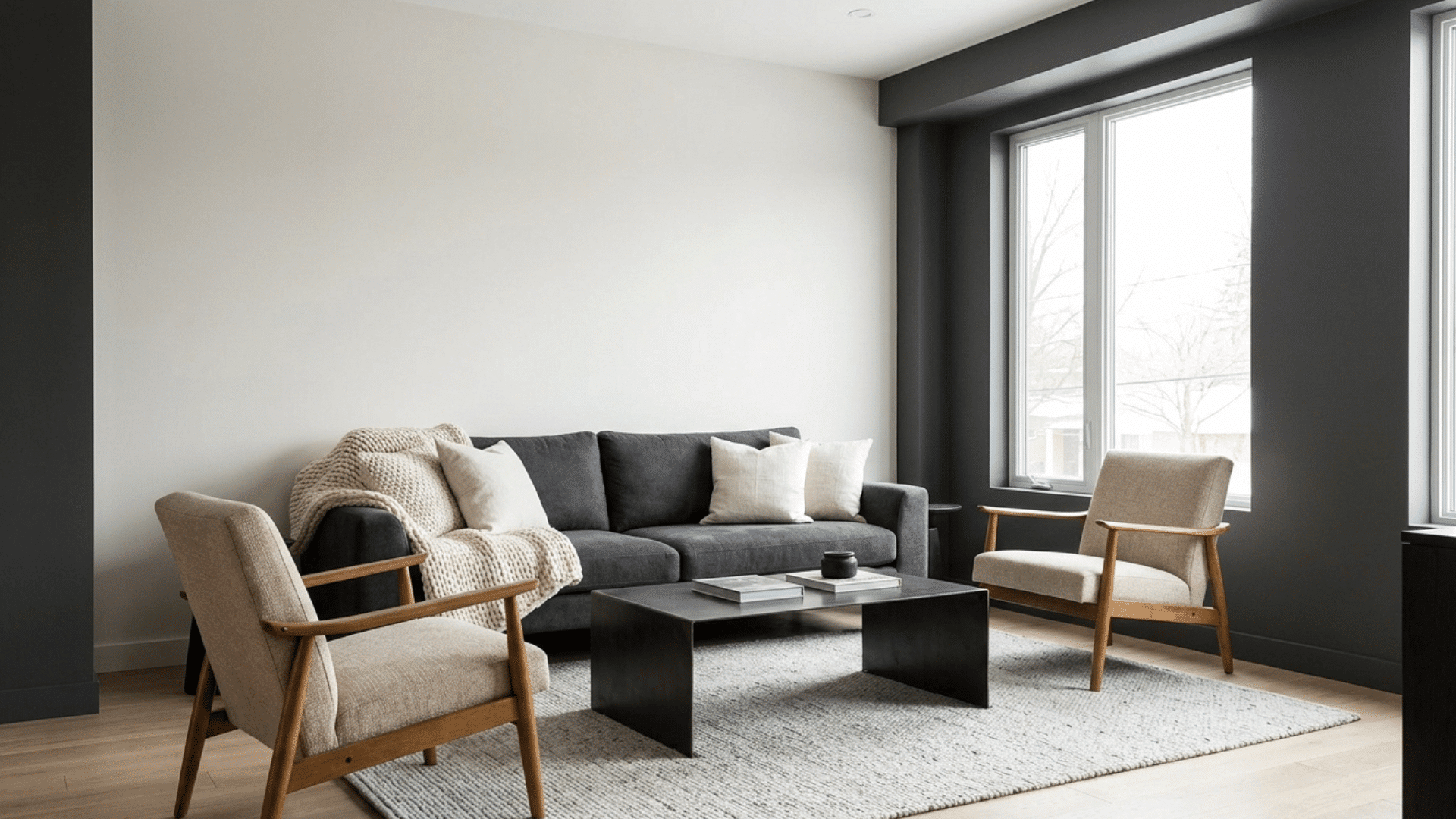
Off-white and charcoal create a soft contrast that adds depth without feeling too bold. Off-white keeps the space light, while charcoal adds a touch of structure.
This palette works well in living rooms, offices, and bedrooms where a bit of contrast is needed. It pairs nicely with modern furniture and clean lines.
Adding soft textures can help balance the darker tone and keep the space comfortable.
11. Warm Sand and Soft Brown Tones
Warm sand and soft brown tones create a natural and earthy look that feels cozy and grounded. This palette works well in spaces where comfort is the focus, like bedrooms and lounges.
The tones blend smoothly, creating a relaxed environment without sharp contrast. It pairs well with wood, woven textures, and simple decor. The overall look feels warm, steady, and easy to live with every day.
Best Ways to Style Neutral Color Schemes
Styling a neutral space is all about small details. With the right mix of shades, textures, and accents, a simple palette can feel warm, balanced, and full of life.
- Layer Different Shades of the Same Color: Using multiple shades of the same neutral color helps add depth to a space. Instead of sticking to one tone, combine lighter and darker tones to create a more balanced, visually interesting look.
- Mix Textures Like Wood, Fabric, and Metal: Texture plays a big role in making neutral spaces feel rich and complete. Combining materials such as wood, soft fabrics, and metal finishes adds contrast without resorting to bold colors.
- Add Plants for a Fresh Touch: Bringing in greenery is an easy way to break up neutral tones. Plants add a natural and refreshing element while keeping the overall look calm and grounded.
- Use Accent Pieces In Soft Colors: Small accents can make a big impact in a neutral space. Soft-colored cushions, rugs, or decor items add personality without detracting from the neutral base.
- Play With Lighting for Better Mood: Lighting can change how neutral colors look in a room. Using a mix of natural light, warm bulbs, and soft lamps helps highlight tones and creates a cozy and inviting feel.
- Add Simple Patterns for Visual Interest: Patterns can make a neutral space feel less plain without adding strong colors. Subtle designs on rugs, cushions, or curtains help create movement while keeping the overall look calm.
Final Thoughts
Neutral color schemes are simple, flexible, and easy to use in almost any space. They help create a calm, comfortable environment that feels easy to live in every day.
These tones work well with different styles, making it easier to update your space without major changes. By mixing the right shades and adding a few textures, even a basic neutral palette can feel fresh and well-put-together.
Small details like lighting, materials, and accents can make a big difference.
Start with a few combinations from this blog and adjust them to fit your space, needs, and personal style, creating a look that feels balanced and inviting.

Alex Guerrero, a graduate with a Fine Arts degree from the Rhode Island School of Design, has been a visionary in the world of color and design for over 15 years. His professional journey began in the heart of the fashion industry in Milan, where he developed an acute sense for color harmonies and trends. Alex joined our team in 2018, offering fresh and innovative perspectives on color utilization in various spaces. Renowned for his ability to blend contemporary trends with timeless elegance. Outside of work, Alex is an accomplished painter and a volunteer art therapist, his artistic talents further enriching his professional insights.