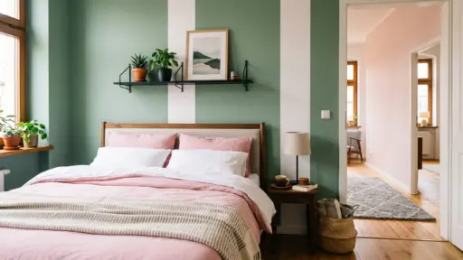
That paint chip looked perfect in the store. But on your wall, under your lighting, next to your floors, it tells a completely different story.
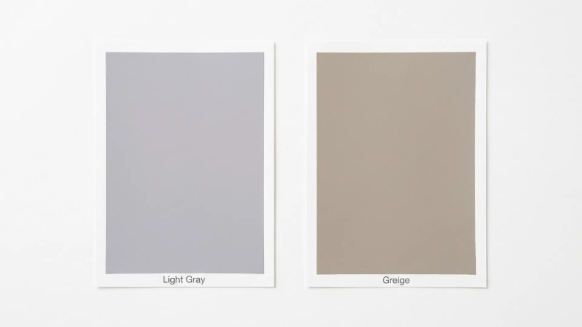
This is exactly the problem most people face when choosing between light gray vs greige. Both read as soft, neutral, and safe on a swatch. Both seem interchangeable at first glance.
But put them side by side in a real room, and the difference becomes impossible to ignore. This blog breaks down exactly what sets them apart so you can pick the right color with confidence.
What is Light Gray Paint?
Light gray is a true neutral paint color defined by its cool undertones, most commonly blue, purple, or green. On a wall, it reads crisp, clean, and modern, making it a go-to choice for contemporary and minimalist interiors.
It performs best in north-facing rooms and spaces that receive strong natural light, where those cool undertones come alive rather than fall flat.
When shopping for light gray paint, pay attention to the Light Reflectance Value. Light gray typically falls between 55 and 80. The higher the LRV, the more light the color reflects, keeping the room feeling open and airy.
Pros and Cons of Light Gray Paint
Light gray is a strong contender for modern interiors, but it comes with conditions. Here is a clear breakdown of where it works and where it can let you down:
| Category | Pros | Cons |
|---|---|---|
| Lighting | grows in bright, natural light | Feels cold and flat in low-light rooms |
| Undertones | Clean, crisp look in the right conditions | Can pull blue, purple, or green unexpectedly |
| Pairing | Works well with white trim and cool metals | Does not pair well with warm wood tones |
| Space | Higher LRV keeps small rooms feeling open | Less forgiving in open-concept spaces |
| Style | Perfect for contemporary and minimalist interiors | Too stark for traditional or cozy spaces |
What is Greige Paint?
Greige is a paint color that blends gray and beige into one warm neutral. Unlike light gray, greige sits on the warmer side of the color spectrum, pulling from beige and brown bases rather than cool blues or purples.
On a wall, it reads soft, warm, and inviting, making it a natural fit for traditional, transitional, and farmhouse interiors.
It performs best in south-facing rooms and spaces with warm wood tones, where its beige base can shine.
When shopping for greige paints, look for an LRV between 55 and 75, enough depth to add warmth without making a room feel heavy.
Pros and Cons of Greige Paint
Greige is one of the most popular neutral paint colors for a reason, but it isn’t the right choice for every space. Here is a clear breakdown of where it works and where it can let you down:
| Category | Pros | Cons |
|---|---|---|
| Lighting | grows in south and west-facing rooms | Can look muddy and dull in low-light spaces |
| Undertones | Warm, inviting feel in the right conditions | Can pull yellow or brown unexpectedly |
| Pairing | Works beautifully with wood tones and warm metals | Can clash with cool-toned furniture and finishes |
| Space | Great for open-concept spaces with mixed light | Harder to pull off in strictly modern interiors |
| Style | Perfect for traditional, transitional, and farmhouse styles | Too warm for minimalist or contemporary spaces |
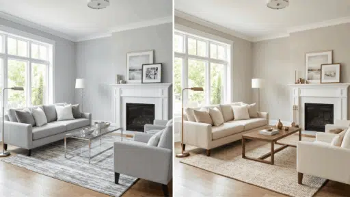
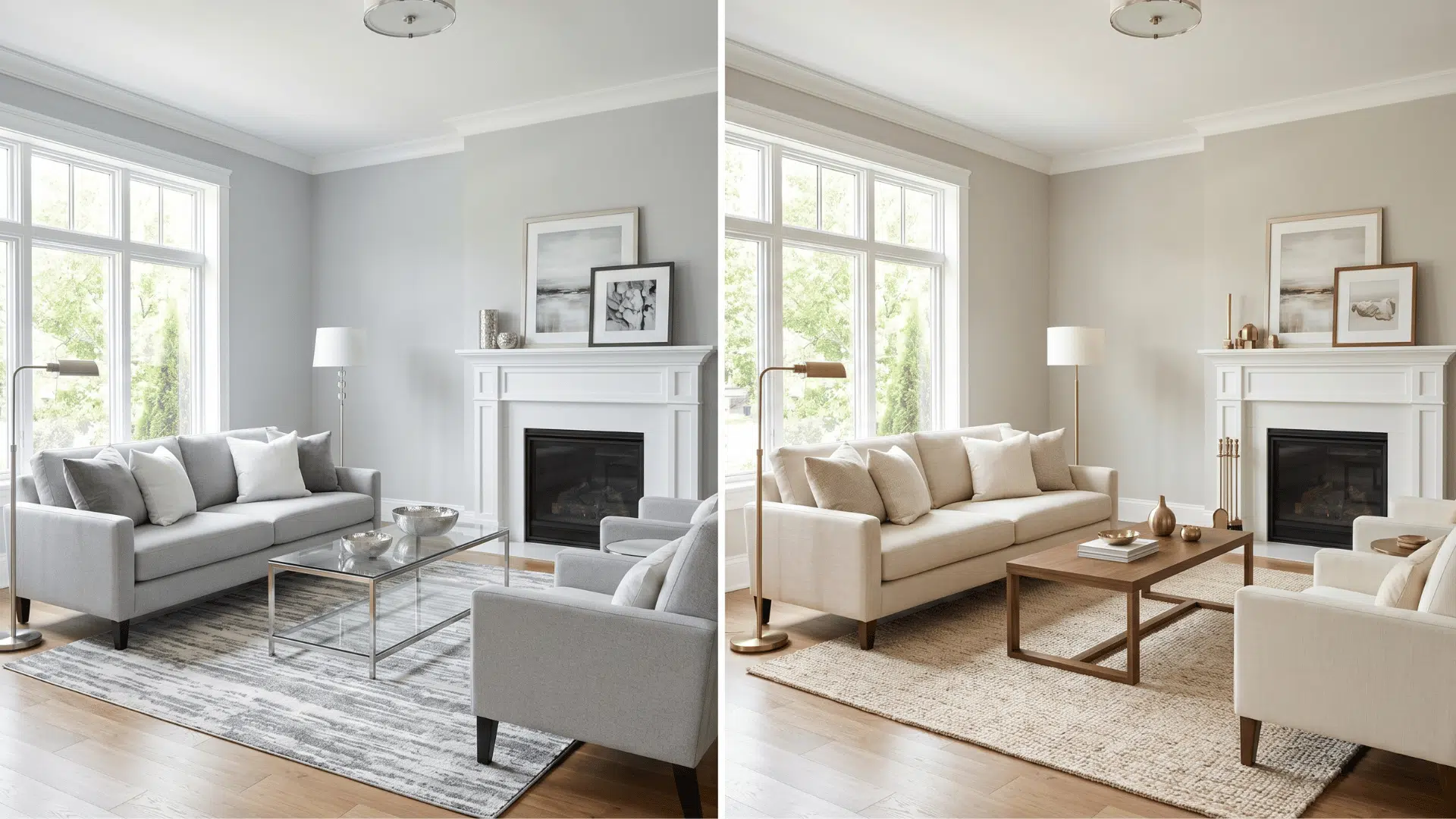
Light Gray vs Greige: Key Differences
When it comes to light gray vs greige, the differences go deeper than what a swatch can show. Here are some key points that will help you understand exactly what sets these two neutrals apart before you commit to a color.
1. Undertone Differences
Undertones are where light gray and greige split completely. Light gray carries cool undertones, most commonly blue, purple, or green. These are what give it that crisp, clean look on a well-lit wall.
Greige, on the other hand, draws on a warm palette of beige, brown, and taupe.
This is the single most important difference between the two colors, and it is the one most people miss when choosing from a small paint chip.
Getting the undertone right from the start is what separates a color that works from one that feels off constantly.
2. Mood Contrast
Light gray reads modern, airy, and clean. It brings a sense of order to a space without feeling cold, as long as the lighting supports it. Greige reads warm, grounded, and inviting.
It makes a space feel lived-in and comfortable without going as heavy as a full beige. The mood each color creates is noticeably different once you see it on a full wall.
3. Room Direction
Room orientation determines how much natural light a space receives and the color temperature of that light.
Light gray performs best in north and east-facing rooms, where cooler light complements its undertones rather than fighting them.
Greige performs best in south and west-facing rooms, where warmer afternoon light brings out its beige base and keeps it from looking flat.
4. Pairing Differences
Light gray pairs naturally with white trim, cool-toned metals like chrome and nickel, and contemporary furniture in white, black, and gray.
Greige works best alongside warm wood tones, brass and bronze hardware, natural materials like linen and rattan, and furnishings in cream, tan, and terracotta.
Pairing the wrong color with the wrong finishes is one of the most common reasons a neutral paint ends up looking off.
5. Style Fit
Light gray belongs in contemporary, minimalist, and Scandinavian interiors where clean lines and cool tones are part of the design language.
Greige belongs in traditional, transitional, and farmhouse interiors where warmth and layering are central to the overall look.
Popular Light Gray Paint Colors that Work Well
Light gray paints vary widely in undertone and depth. Here are three tried-and-tested picks that will help you narrow down the right shade for your space:
1. Sherwin-Williams Repose Gray
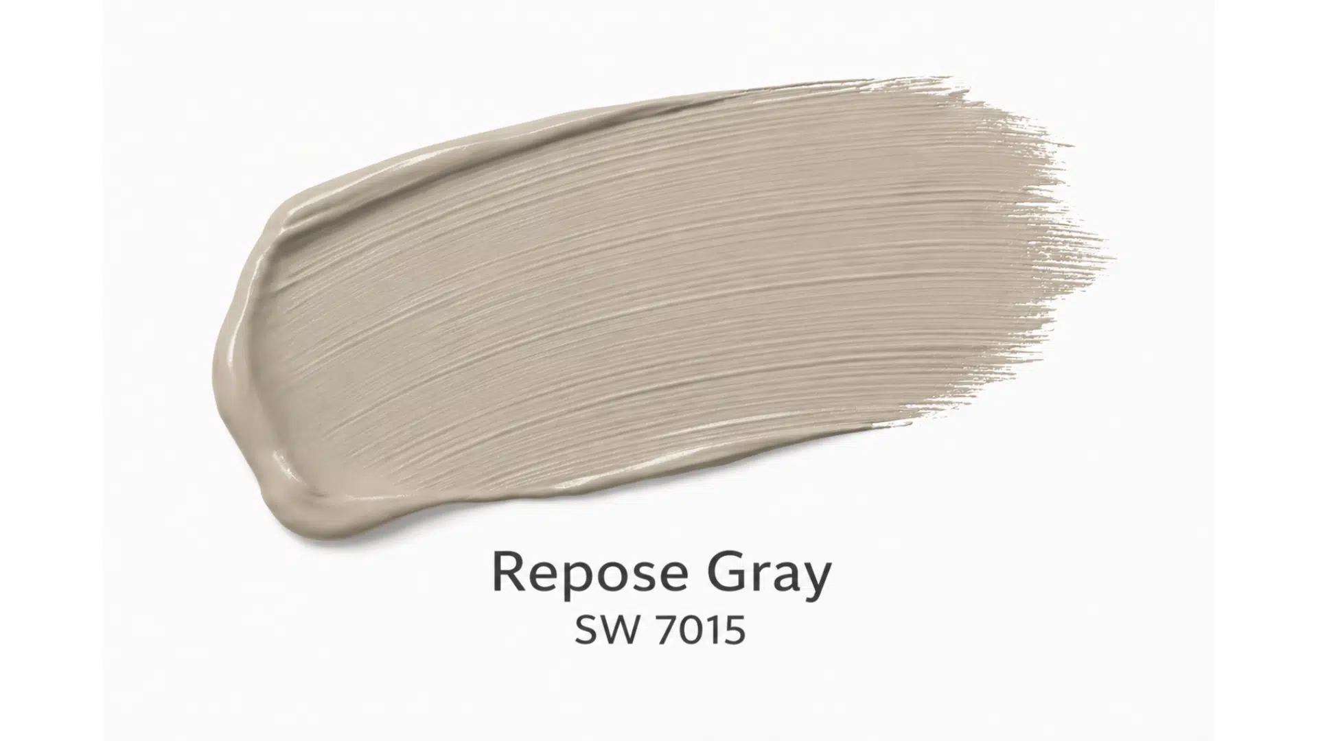
Repose Gray is one of Sherwin-Williams’ best-selling neutrals, and for good reason. It sits right in the middle of the light-gray spectrum, giving it enough depth to feel intentional without weighing down a room.
2. Sherwin-Williams Mindful Gray
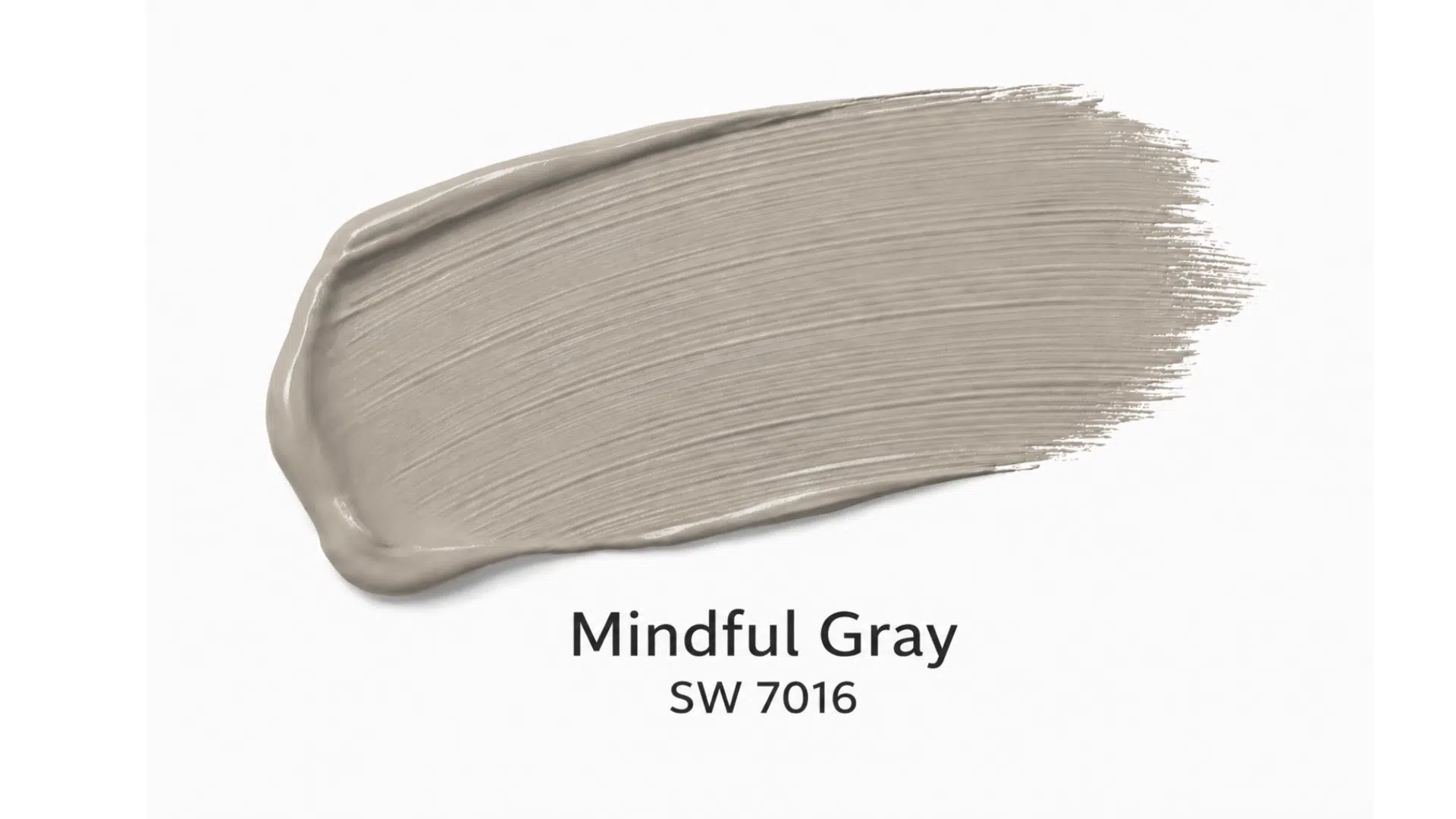
Mindful Gray sits slightly deeper on the LRV scale, giving it a more grounded, confident feel compared to lighter grays. It carries subtle warm-neutral undertones that stop it from reading too cold on the wall.
3. Benjamin Moore Classic Gray
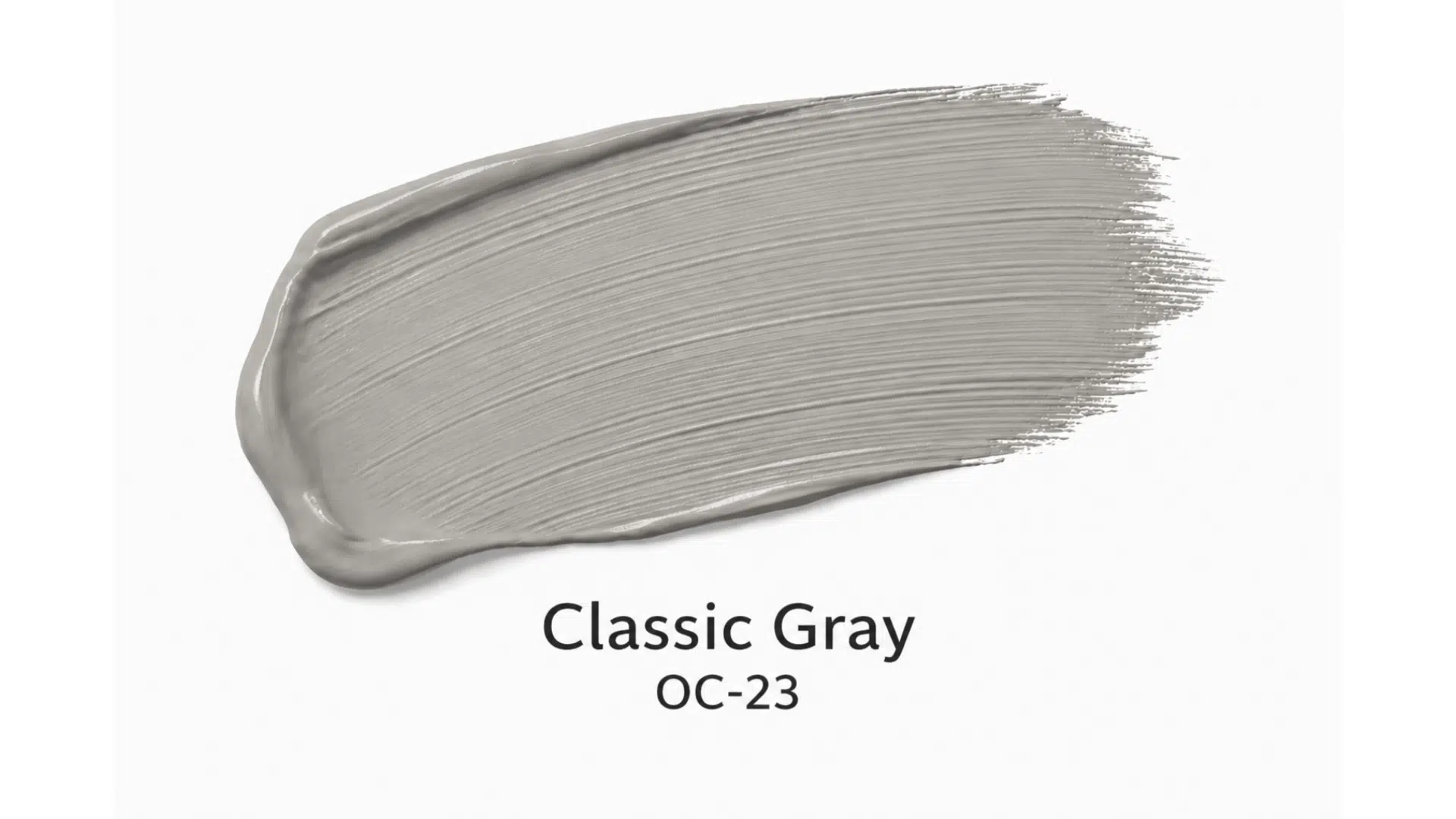
Classic Gray is the lightest pick on this list, placing it right on the border between a true light gray and an off-white. It carries a soft, warm undertone that can shift between gray and creamy depending on the light in the room.
Have a Look at Some Greige Paint Colors
When comparinglight gray vs greige, the greige side of the spectrum offers far more variety than most people expect. Here are three picks that will help you find the right fit for your space.
1. Sherwin-Williams Agreeable Gray

Agreeable Gray is the most popular greige on the market, and it earns that title for good reason. It sits in a comfortable middle ground, warm enough to feel inviting, neutral enough to work in almost any space.
2. Benjamin Moore Edgecomb Gray
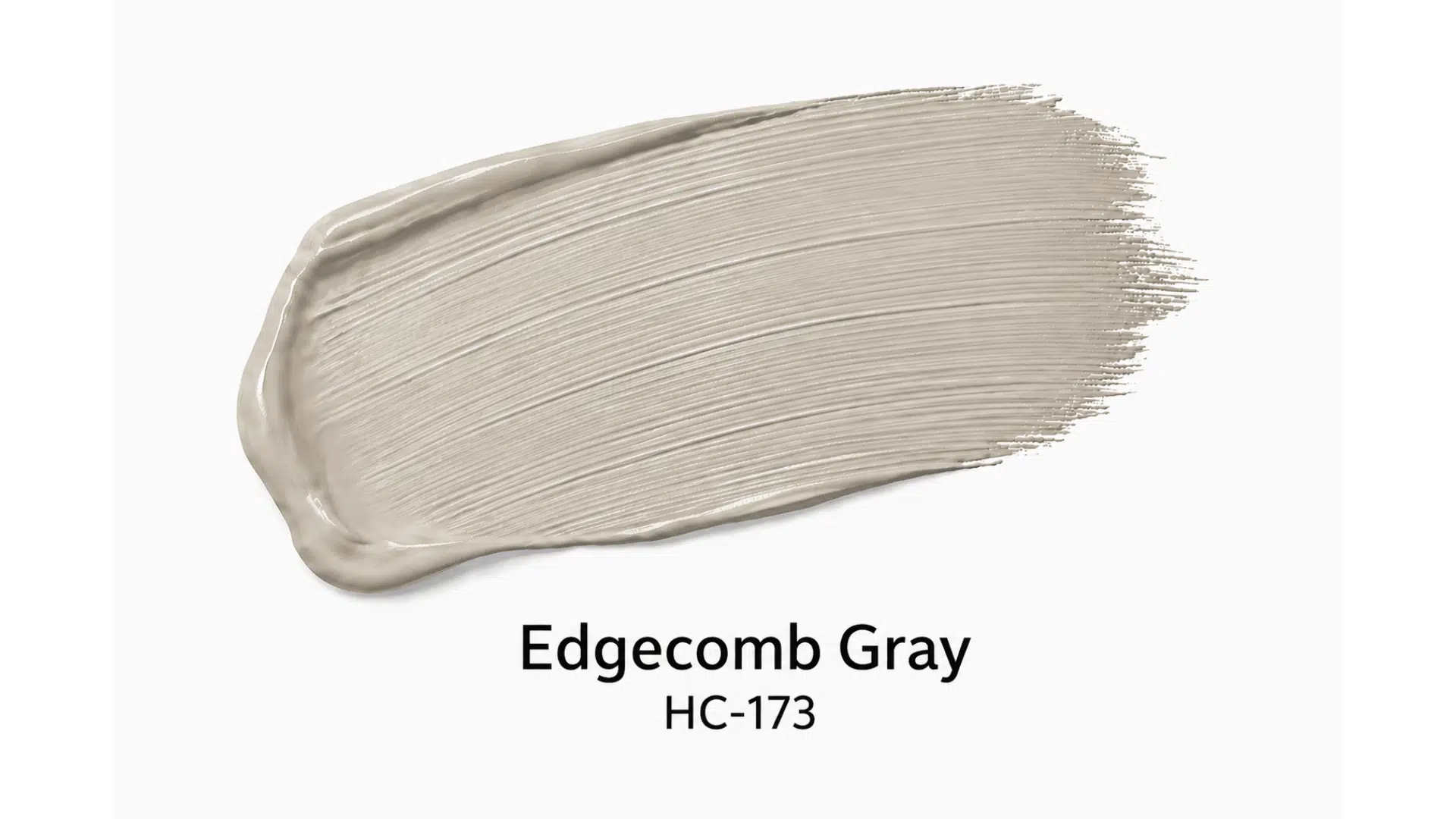
Edgecomb Gray leans noticeably warmer than Agreeable Gray, sitting closer to the beige end of the greige spectrum. It is earthy, grounded, and reads as a true warm neutral in most lighting conditions.
3. Benjamin Moore Balboa Mist
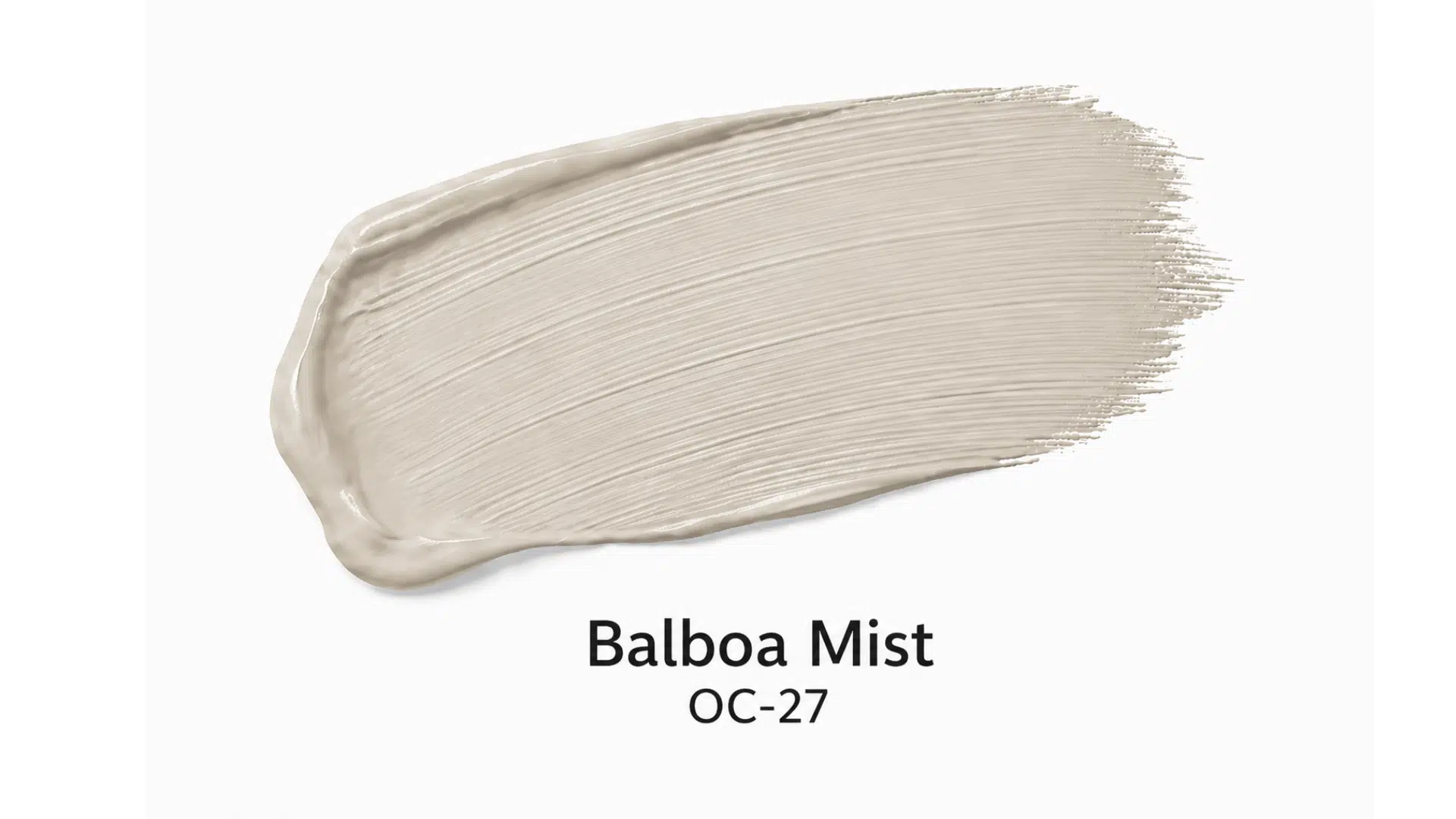
Balboa Mist sits slightly cooler and lighter than Edgecomb Gray, making it one of the more gray-leaning options in the greige family. It carries a subtle red-violet undertone that gives it a warm cast without going full beige.
How Does Lighting Affect These Two Shades?
Lighting plays a major role in how neutral colors appear in a space. The same shade can look very different depending on many factors, including the paint finish, which affects how light reflects off the surface.
Here’s how lighting changes the way light gray and greige show up in your home:
- North-Facing Rooms: Cooler light makes light gray appear more blue or cold, while greige can feel slightly muted
- South-Facing Rooms: Warm natural light enhances greige, making it look balanced and inviting compared to light gray
- Artificial Lighting: Yellow or warm bulbs can make greige look more beige or brown, while light gray may lose its crispness
- Time of Day: Morning vs evening light shifts undertones, changing how both colors are perceived
- Number of Windows: More natural light softens both shades, while low light can make them look dull or heavy
Final Thoughts
At the end of the day, neither light gray nor greige is the better color; the better color is the one that works with your specific lighting, your fixed elements, and your overall vision.
Gray brings a clean, cool edge that modern spaces grow on. Greige brings warmth and depth that traditional and transitional interiors need.
The decision gets easier once you stop choosing by name and start choosing by undertone. That one step saves you more paint regret than any guide ever could.

Alex Guerrero, a graduate with a Fine Arts degree from the Rhode Island School of Design, has been a visionary in the world of color and design for over 15 years. His professional journey began in the heart of the fashion industry in Milan, where he developed an acute sense for color harmonies and trends. Alex joined our team in 2018, offering fresh and innovative perspectives on color utilization in various spaces. Renowned for his ability to blend contemporary trends with timeless elegance. Outside of work, Alex is an accomplished painter and a volunteer art therapist, his artistic talents further enriching his professional insights.