
Your living room works harder than any other room in the house. It hosts movie nights, holiday gatherings, awkward first meetings with your kid’s new partner, and the occasional Sunday nap that turns into a three hour commitment. With that much life happening in one space, the walls around it deserve more than a coat of beige paint and a hopeful shrug.
And yet so many of us freeze the moment we look at a blank wall. Call it “blank wall paralysis.” You know the feeling: you’ve bought the sofa, arranged the cushions just so, and then you stand there staring at four bare walls like they’re a pop quiz you didn’t study for.
Here’s the good news. That blank wall isn’t a problem to solve. It’s an invitation.
Living room wall decor ideas don’t need a design degree or a bottomless budget. They need a plan, a bit of courage, and permission to let your personality show. Whether you gravitate toward gallery walls stacked with black and white photo prints or you’d rather lean a single oversized mirror against the plaster, your walls can carry warmth, texture, and a little bit of your family’s story.
This guide walks through the math behind hanging art well, the textures and materials worth exploring beyond a flat canvas, how light and reflection change a room’s mood, and what to do when your walls are anything but a perfect square.
We’ll also cover renter friendly wall decor for anyone who can’t look at a nail gun without a call to the landlord. By the end, that blank wall won’t feel like a chore. It’ll feel like the best decorating opportunity in the house.
Get the Spacing and Hanging Math Right
Good wall decor looks effortless. It rarely is. Behind every well-balanced living room sits a bit of picture hanging math that most people never learn, mostly because nobody teaches it in school.
Start with what design pros call the 75% sofa sizing rule, sometimes called the 75% couch rule. Any artwork or mirror hung above your sofa should span roughly 60 to 75 percent of the furniture’s total width. A 100 inch sofa, for example, calls for a piece, or a grouped arrangement, somewhere between 60 and 75 inches wide. Go smaller and the art looks like an afterthought floating in a sea of empty wall. Go bigger and it can overwhelm the room. This one rule alone solves half the “why does my living room feel off” complaints designers hear.
Next, consider numbers. Specifically, odd ones. The Rule of Three exists because the human eye is drawn to odd groupings such as three, five, or seven pieces, or a single oversized statement piece that skips the math altogether.
Even numbers tend to read as too formal, almost like a matching furniture set from a showroom floor. Odd numbers feel curated without looking forced, which is exactly the vibe most living rooms are after.
Then there’s height. The industry standard Eye-Level Rule places the physical center of your artwork between 57 and 60 inches from the floor, which lines up with the average adult eye line.
If you’re hanging above the sofa, leave 6 to 8 inches between the top of the sofa back and the bottom of the frame. Too high and the piece floats awkwardly near the ceiling. Too low and it looks like it’s hiding behind the couch cushions. Households with especially tall or short members can nudge that number a few inches in either direction. The 57 to 60 inch figure is an average, not a court order.
Before a single nail touches the wall, measure each frame carefully, then trace the shapes onto craft paper and cut them out. Tape the paper templates up in your planned arrangement and live with them for a day or two. Walk past them at different times, in different light, and see how the layout feels once it’s more than a mental picture. It costs a roll of tape and a little patience, and it turns a wall full of potential mistakes into one confident round of drilling.
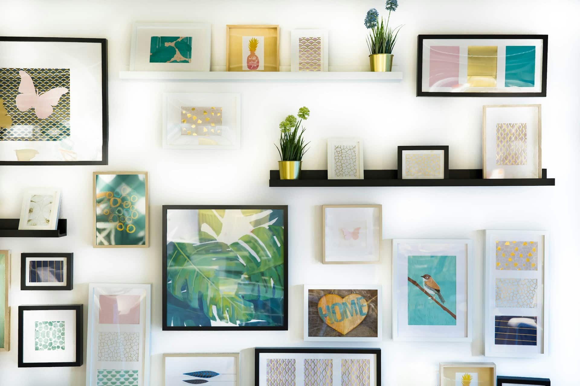
Finally, if you’re working out how to hang a gallery wall, the Frame Gap Rule keeps things tidy. Space your frames 2 to 3 inches apart, whether you’re building a full gallery cluster or a simple triptych. Tighter gaps read as cluttered. Wider gaps make the grouping feel disconnected, like three strangers waiting for a bus rather than a cohesive display.
None of these rules are strict laws. Think of them as guardrails, not handcuffs. But when a wall arrangement feels slightly off and you can’t put your finger on why, it usually traces back to one of these four numbers.
Creative 3D Alternatives to Framed Art
Framed art is wonderful. It is also not the only option, and treating it like the sole rule of decorating is a bit like assuming pasta is the only thing you can cook for dinner.
Organic Living Art
A vertical garden living wall brings the outdoors in without asking you to become a full time gardener. Living wall panels, moss art, and clusters of hanging potted plants soften hard edges and quiet a room in a way that’s hard to fake with anything else.
Moss panels in particular need zero watering, so if your track record with houseplants is spotty at best, start there. Woven or terracotta planters add another layer of texture without asking you to learn a new skill. The goal isn’t a jungle. A few well-placed plants against a plain wall can carry as much visual weight as a large painting, minus the frame, and they tend to make a room smell better too.
Hobby-Led and Functional Displays
Not every wall needs to whisper “curated gallery.” Some walls should just tell the truth about who lives there. A guitar mounted on a simple wall hook becomes sculpture the moment it’s off the floor.
Vinyl records lined up on floating wall shelves double as a rotating art display and a genuinely useful storage solution. A statement clock built from raw wood or stone gives a wall a functional focal point that still earns its keep as decor.
Sports memorabilia, a shelf of well-loved board games, or a small collection of vintage cameras all work the same way, and collectors of vintage plates can hang them in a loose cluster for the same effect. None of this requires matching frames or a design consultant. It requires paying attention to what you already own and enjoy, and a willingness to treat your hobbies as decor rather than clutter to hide before guests arrive.
Architectural Moldings and Wood Paneling
For walls that need more permanent texture, wood paneling wainscoting adds instant character and, frankly, resale value (here’s a full breakdown of styles and installation). Board and batten brings crisp vertical lines to an otherwise flat wall.
Shiplap has earned an eye roll or two after a decade of renovation shows, but used with restraint, say on a single accent wall, it still works. Crown molding and custom trim, painted to match or deliberately contrast the wall color, dress up a room the way a good blazer dresses up a plain outfit.
If your walls feel flat no matter what you hang on them, the problem might not be what’s on the wall. It might be the wall itself. The good news is that most of these projects can be done a section at a time over a few weekends, so the cost and the mess spread out rather than hitting all at once.
Textiles and Wall Sculptures
Soft surfaces deserve a place here too. Vintage tapestry decor warms up a large, echoey wall in a way that framed prints simply can’t. Woven baskets and macrame add organic wall textures without a single nail hole beyond the one holding them up. Sculptural pieces in metal wall sculptures, carved wood, or ceramic add real dimension.
A folded quilt or a fragment of vintage fabric, stretched over a simple frame, works just as well as a formal tapestry if you’re starting small. Run your hand across a textured plaster wall or a raised sculptural piece sometime. It reads differently than a flat print, and that difference is the whole point of decorating in three dimensions instead of two.
Mix a few of these ideas with your existing black and white photo prints or framed pieces, and the wall stops looking like a single flat surface. It starts looking like a room with depth, story, and a bit of texture you can actually feel.
Lighting and Reflections: Styling Sconces and Mirrors
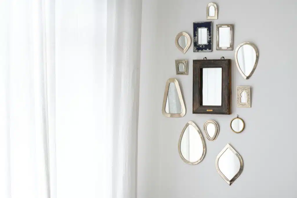
Light does half the work that color and furniture get all the credit for.
Start with mirrors, because nothing reshapes a room faster. A statement mantel mirror, oversized and Parisian in spirit, turns overmantel art placement into an instant focal point above a fireplace. Don’t want just one? Three matching mirrors hung in a row above the sofa create rhythm without the commitment of a full gallery wall.
Leaning a large mirror against the wall instead of hanging it is the decorating equivalent of a shrug: low effort, high payoff. A plain builder-grade mirror gets there fast with a simple DIY frame instead of a full replacement. All three approaches bounce natural light around the room, make a tight space feel roomier, and soften a wall full of hard angles with a bit of rounded geometry.
Sconces do quieter, steadier work. Flanking a fireplace or a large art piece with sculptural wall sconces gives the eye something to rest on beyond the centerpiece itself (ideal mounting height is covered here).
Museum-style picture lights, mounted directly above a favorite frame, do exactly what museums use them for: they make the art the obvious star the moment someone walks into the room. Neither option needs an electrician if you go with plug-in, battery, or LED versions, which is good news for renters and homeowners alike.
Designers call the combination of ceiling, sconce, and picture light “layered lighting,” and it’s the reason some living rooms feel rich and dimensional while others feel flat under a single overhead bulb.
Then there’s the trend that’s quietly taken over half the lighting aisle in the last few years: dimmable smart lighting. A room that’s bright and energetic for a Saturday game night and warm and low for a Tuesday movie marathon isn’t two different rooms. It’s the same room with the lights doing the heavy lifting. A single app or remote can shift the entire mood of a living room in seconds, no repainting required.
Here’s the part people skip. Light and reflection aren’t decoration you add after the art goes up. They’re part of the art. A gorgeous statement piece under flat, dull overhead lighting looks tired.
That same piece with a picture light angled just right, or a mirror nearby catching the glow, suddenly looks like it belongs in a design magazine. Before you buy one more frame, ask whether your current lighting is doing your walls any favors. Often, it isn’t, and that’s a much cheaper fix than you’d think.
Overcoming Architectural Obstacles and Awkward Walls
Not every wall plays fair. Attic conversions, converted lofts, and older homes hand you angles that no furniture catalog ever photographs.
Sloped ceiling wall art is the fix for attic-style rooms that feel like they’re closing in on you. A single large-scale piece, positioned to follow the angle rather than fight it, pulls the eye up and along the slope instead of letting it snag on the awkward geometry. Small frames scattered across a slanted wall tend to get lost or, worse, look like they’re sliding off. Go bigger than feels comfortable.
It almost always works better than a cluster of small pieces would. If the slope is especially steep, look for lightweight canvas prints rather than heavy framed glass, since the mounting hardware has to fight gravity at an angle rather than straight down. Many of these low ceiling design tricks work just as well on an angled ceiling as a flat, low one.
Then there’s the television, the least romantic object in the living room and somehow the one everyone has to design around. A hidden TV bookshelf, complete with sliding doors or panels, lets you conceal the screen entirely when it’s off, turning “the wall with the TV on it” back into just a nice wall (more TV stand decor ideas here if you’re starting from scratch).
If concealment isn’t practical, integrate the screen into a poster or art collage instead, so the TV reads as one more frame rather than the obvious centerpiece. Art-display screens, which show rotating digital artwork when the TV isn’t in use, split the difference nicely for anyone who isn’t ready to build a bookshelf wall from scratch.
Even something as simple as flanking the TV with two matching shelves, styled with books and a few small objects, stops the screen from looking like the only thing anyone thought about on that wall.
Awkward wall breaks, half walls, and boxed-in nooks respond well to symmetrical framing. Use wall paneling to build individual boxes or molding frames, then place one art piece cleanly inside each section. The structure does the organizing for you, so even a chopped-up wall with three different angles can look intentional instead of accidental.
The theme across all three problems is the same: don’t decorate against your walls’ quirks. Decorate with them. An attic slope, a mounted TV, and a boxy alcove aren’t flaws to hide. They’re just different shapes that need a slightly different plan than a flat rectangular wall would. Once you stop fighting the architecture, the room usually tells you exactly what it needs.
The Renter’s Damage-Free Decor Guide
Renting shouldn’t mean staring at bare walls for two years out of fear of your bond. Renter friendly wall decor has come a long way, and most of it requires nothing sharper than a level.
Floating picture ledges are the single best trick in this whole guide. Install two or three ledges with a small handful of anchor points, then lean your art against them instead of hanging each piece individually.
Swap frames seasonally, layer smaller pieces in front of larger ones, and rearrange on a whim, all without adding a single new hole to the wall (our picture ledge styling guide covers more layout ideas).
If you’re wondering how to style floating shelves for maximum impact, keep the arrangement loose and overlapping rather than perfectly lined up. A little imperfection reads as intentional here.
Adhesive felt art solves a problem most renters don’t expect: noise. Geometric felt tiles double as acoustic wall panels, softening echo in a room full of hard floors and bare walls, and they stick on with temporary adhesive tabs that come off clean. Handy renters can also build their own sound-absorbing panels covered in the same felt for a bit more depth.
Arrange them into a mural pattern and you’ve got texture, sound dampening, and zero drilling in one move. They come in enough shapes and colors to build anything from a subtle honeycomb pattern to a bold, graphic accent wall, so the acoustic benefit never has to look like an afterthought.
Leaning artwork and mirrors skip the wall entirely. Rest an oversized sketch frame or a full-length floor mirror directly against the baseboard, and you get scale and presence without a single tool. Lean two or three pieces together at slightly different depths and the arrangement reads as deliberate rather than unfinished. It’s the decorating version of a good shortcut: less effort, similar payoff.
For anyone craving a bolder change, a removable wallpaper accent wall delivers serious impact for a weekend project and zero long-term commitment. Self-adhesive wallpaper and fabric murals apply and remove cleanly, which means that bold botanical print or moody color you’ve been eyeing doesn’t have to stay a Pinterest board fantasy just because you don’t own the walls. A few wallpaper installation tips go a long way toward a smooth, bubble-free finish.
None of these options ask you to choose between a beautiful home and getting your bond back. They just ask you to be a little more strategic about how you decorate.
What to Skip: Modern Decor Restraint
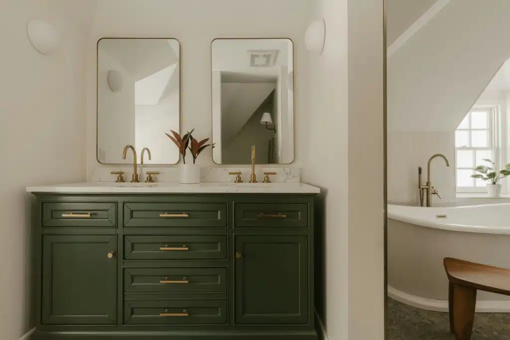
Knowing what to leave off the wall matters just as much as knowing what to put on it.
A few habits are worth retiring. Literal word art, the kind that spells out “Live Laugh Love” in cursive script, has run its course. Cheap, mass-produced canvases printed by the thousand rarely age well either, and once you notice the same print in three friends’ living rooms, it’s hard to unsee.
Overly matched decor sets, where every frame, cushion, and vase comes from the same collection, can flatten a room instead of elevating it. A little variation is what makes a space feel lived in rather than staged.
High-gloss wallpaper belongs on this list too. It photographs well for about a week and then spends the next few years reflecting glare from every lamp in the room. If you’re buying new pieces, look into sustainable frame sourcing from a smaller maker instead of the cheapest bulk option. It usually costs a little more and looks like it.
Giant, performative family portraits belong in intimate spaces, not the main room where guests gather. An oversized formal portrait over the sofa can feel like a lot for casual company, however lovely the photo is. Save that piece for a hallway, a staircase wall, or a bedroom, where it reads as personal rather than performative.
Finally, give your walls room to breathe. Negative design space, meaning the parts of the wall you deliberately leave bare, is what lets everything else on that wall actually register. A living room where every inch is covered in frames, shelves, and sconces stops reading as curated and starts reading as busy. Pick one wall to be the star and let the others stay quieter. Restraint isn’t the absence of style. It’s often the clearest sign of it.
Frequently Asked Questions
How high should I hang artwork in a living room?
Center your art between 57 and 60 inches from the floor, which lines up with average eye level. Hanging above a sofa? Leave 6 to 8 inches between the top of the sofa back and the bottom of the frame so the whole arrangement feels connected rather than floating.
What is the Rule of Three in wall decor?
It’s the idea that the eye finds odd numbered groupings, three, five, or seven pieces, more balanced than even ones. Cluster your art in odd numbered groups, or skip the math entirely and let one oversized statement piece do the job alone.
How do I choose the right size art for above my couch?
Follow the 75% sofa sizing rule. Your art or mirror should span roughly 60 to 75 percent of the sofa’s width. A 100 inch sofa calls for a piece, or a grouped arrangement, somewhere between 60 and 75 inches wide.
Can I mix different art styles and frames in the same room?
Absolutely, and it usually looks better than an overly matched set. Keep a shared color palette, stick to one or two frame finishes, and spread pieces evenly around the room so no single wall ends up overloaded while another sits empty.
What wall decor trends are popular right now?
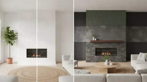
Texture is having a moment. Sculptural plaster, textured plaster walls, stone overlays, and wood paneling are replacing flat statement walls with finishes that soften sound, catch light differently throughout the day, and age gracefully instead of looking dated in five years.
What wall decor items are considered outdated?
Literal word art, mass-produced canvases, high-gloss finishes, and overly matched sets top the list. Oversized, formal family portraits are better suited to a hallway or bedroom than the main space where guests gather.
How can renters decorate their walls without damaging them?
Floating picture ledges, adhesive felt tiles, leaning mirrors, and removable wallpaper all deliver a finished look without a single permanent hole. Most of these options come down or swap out just as easily as they went up.
How do I decorate the wall behind my TV?
Frame it into a poster or art collage so the screen reads as one more piece rather than the focal point, or build a hidden TV bookshelf with sliding doors to conceal it when it’s off. Either approach turns the TV wall into an actual design feature.

With a Master in Architectural Studies from University of Pennysylvania, Marwa Haydar has pioneered living spaces since 2005. Her expertise, initially honed in a prestigious architectural firm, is evident in her approach to creating environments. Marwa became part of our team in 2019 and has since been a driving force in our home improvement section, known for her practical yet stylish solutions. She’s been spearheading our design workshops since then, infusing her passion for teaching into her work. In her leisure time, Marwa enjoys exploring historic architecture and is an enthusiastic pottery hobbyist, further enriching her understanding of form and texture.