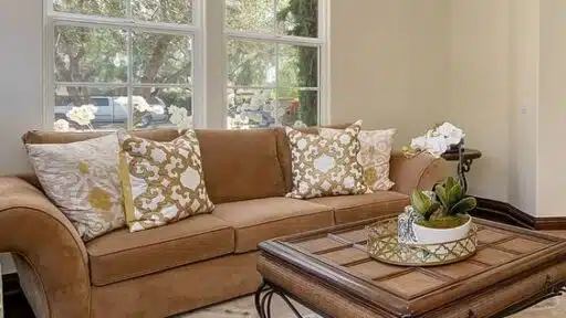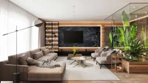
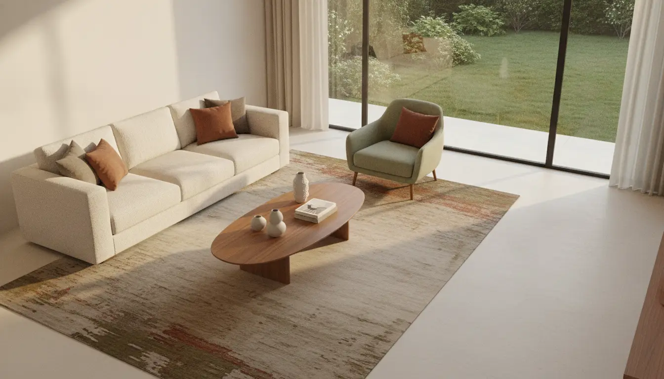

We’ve all been there. You spot the perfect sofa, fall in love with a rug, and before you know it, you’ve filled a room with beautiful pieces that somehow don’t work together. The couch blocks a doorway, the coffee table sits too far from the seating, and that gorgeous armchair? It’s crammed into a corner where no one will ever sit.
The problem isn’t your taste. It’s that most of us skip the one step that separates a room that flows from one that fights itself: planning the layout first. I’ve redesigned enough rooms — and made enough mistakes — to know that a little forethought goes a long way. Here’s how I approach room layout planning before a single piece of furniture comes through the door.
Start With Accurate Measurements Using a Floor Plan Creator
Everything begins with the numbers. Grab a tape measure and record the key dimensions of your room. Here’s what I always measure before starting any layout:
- Room length and width (measure twice — corners aren’t always square)
- Ceiling height (especially important for tall furniture and light fixtures)
- Door positions, widths, and swing directions
- Window locations and heights from the floor
- Permanent features: radiators, built-ins, columns, outlets
- Any alcoves, recesses, or awkward angles
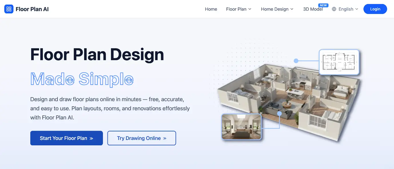
I can’t tell you how many times I’ve skipped this step, convinced I “remembered” the dimensions, only to discover mid-project that my mental picture was off by a foot. Write everything down. Better yet, sketch it. This is also where a digital floor plan creator can save you from costly guesswork — instead of redrawing your room every time an idea changes, you can drag and drop walls, doors, and furniture to scale and see instantly whether that king-size bed actually fits.
Identify the Room’s Focal Point
Every well-designed room has something that draws the eye the moment you walk in. Once you know what that focal point is, everything else should support it — not compete with it. Common focal points include:
- A fireplace or mantel
- A large window with a scenic view
- A statement piece of art or a gallery wall
- A media wall or built-in entertainment center
- An architectural feature like exposed brick or a bay window
In my living room, the focal point is a wide window overlooking the backyard. I arranged the seating to face it, kept the opposite wall free of clutter, and chose low-profile furniture so nothing blocks the sightline. The result is a room that feels intentional the second you enter it. If your room doesn’t have an obvious focal point, you can create one — a bold accent color or a striking light fixture can do the job just as well.
Map Out Traffic Flow
This is the step most people overlook, and it’s the one that makes the difference between a room that feels comfortable and one that feels cramped. Think about how people will move through the space. A few rules I always follow:
- Main walkways need at least 36 inches of clearance — enough for two people to pass
- Secondary paths between furniture pieces should have 24 inches minimum
- Never block a door’s full swing arc with furniture
- Leave 18 inches between a coffee table and the sofa for legroom
- Keep the path from entrance to focal point direct and unobstructed
In open-concept spaces, traffic flow matters even more. You’re not just designing one room; you’re designing how several zones connect. A poorly placed dining table can turn a kitchen-living room combo into an obstacle course. Before committing to any arrangement, walk the path yourself and see if it feels natural.
Choose a Layout Strategy With Floor Plan AI
Not every room calls for the same approach. Here are three layout strategies I use depending on the space:
The Conversation Cluster
Best for living rooms and family rooms. Group seating around a central point — usually a coffee table — with pieces facing each other at a comfortable distance (about 8 feet between seats). This encourages interaction and makes the room feel intimate without being cramped.
The Functional Zone
Best for multipurpose rooms. Divide the space into distinct areas: a desk nook in one corner, a reading chair by the window, storage along one wall. Each zone should have its own lighting and enough breathing room to feel separate without being isolated.
The Symmetrical Approach
Best for formal spaces like dining rooms or entryways. Matching pairs — two sofas, twin nightstands, identical lamps — create a sense of order and balance. It’s classic for a reason: symmetry reads as deliberate and polished.
Test Your Floor Plan Creator Layout Before You Commit
Here’s the mistake I see most often: people push heavy furniture around a room, get frustrated, and settle for “good enough.” There’s a better way. Before you move anything, run through this testing checklist:
- Use painter’s tape on the floor to mark where each piece will go
- Live with the taped layout for a day or two — walk through it, sit in the zones
- Check that walkways have at least 36 inches of clearance
- Verify the focal point is visible from every main seating position
- Confirm that door swings don’t conflict with furniture placement
- Compare your taped layout against a digital version for scale accuracy
Digital tools make this even easier. When you can visualize the room to scale before lifting a finger, you catch problems that tape on the floor won’t reveal — like whether a tall bookshelf will block light from a window, or whether your chosen rug is actually proportional to the seating area.
Don’t Forget Vertical Space in Your Floor Plan AI Design
When we plan layouts, most of us think in two dimensions: where does the sofa go, where does the table go. But rooms are three-dimensional, and what happens at eye level and above matters just as much. Here are the vertical elements that can make or break a layout:
- Tall furniture proportion relative to ceiling height (bookshelves, wardrobes)
- Pendant and ceiling light placement — height and spread
- Window height and how it affects natural light on lower furniture
- Wall art positioning — centered at eye level (about 57 inches from the floor)
- Crown molding, beams, or other overhead architectural details
Consider wall height when choosing tall furniture. Think about how light fixtures will interact with the layout — a pendant light over a dining table needs to hang at the right height, and a floor lamp needs to sit where it actually reaches the seating. Art placement should be planned as part of the layout, not added as an afterthought.
Final Thoughts: Why Floor Plan AI Simplifies Room Design
A beautiful room starts long before the decorating begins. It starts with a plan — measurements taken, traffic flow mapped, focal points identified, and layouts tested. When you get the bones right, everything else falls into place more easily. The furniture fits, the flow feels natural, and the space works as hard as it looks good.
So before you buy that sofa or hang that gallery wall, take a step back and plan the layout first. Trust me — your future self will thank you.

Ava Taylor, holding a Bachelor’s degree in Interior Design from the Pratt Institute, has made her mark in creating engaging and functional living spaces for over 14 years. She began her career with a New York-based design studio, where she gained a reputation for her innovative and user-centric designs. Ava joined our team in 2019, bringing a blend of artistic flair and practicality to our home improvement section. Since the she has been the lead contributor to our room transformation series, inspiring readers with her unique approach to maximizing space utility and aesthetic appeal. Beyond her professional work, Ava is a passionate collector of vintage furniture, a hobby that enriches her design perspective.