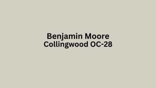
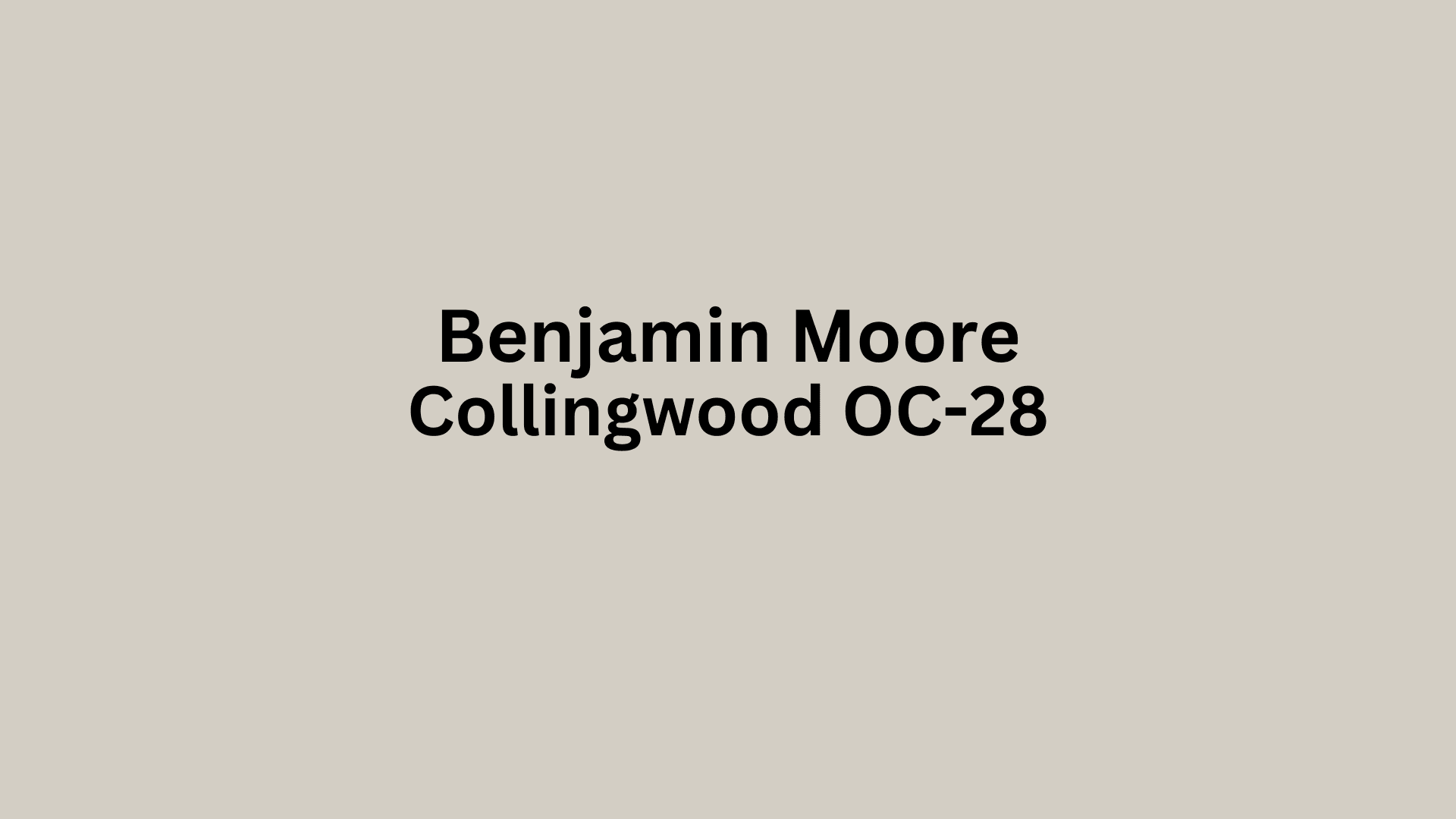
Looking for the perfect neutral paint color? Collingwood Benjamin Moore might be your answer. This balanced gray has become a designer favorite for a simple reason—it works everywhere.
Not too warm, not too cool, not too light, not too dark—Collingwood hits that sweet spot that’s hard to find in neutrals.
This chameleon-like color shifts beautifully with changing light throughout the day while keeping its warm gray character. It creates spaces that feel both fresh and cozy.
Perfect for living rooms, bedrooms, or hallways, Collingwood OC-28 gives you a flexible foundation that makes decorating easy. It’s the reliable neutral that lets your furniture, art, and accessories truly shine.
Understanding Paint Color Basics
Color Terminology
| Property | Value |
|---|---|
| LRV | 61.52 (Moderate reflectance) |
| RGB Values | 227, 223, 213 (A soft neutral mix of red, green, and blue) |
| HEX Code | #E3DFD5 (A light warm gray-beige color) |
The Psychology of Benjamin Moore Collingwood OC-28
- Calm and Soothing – Collingwood creates a peaceful atmosphere that calms the mind.
- Versatile and Balanced – This neutral gray with warm undertones complements virtually any design style.
- Refined and Understated – Adds polish without overwhelming the space.
- Warm and Welcoming – Its soft gray tone creates an inviting environment that feels like home.
- Timeless and Enduring – Provides a classic backdrop that won’t feel dated as trends change.
Why Choose Benjamin Moore Collingwood OC-28?
Collingwood OC-28 offers exceptional versatility for almost any space. This soft gray with warm undertones creates a neutral foundation that adapts to different lighting conditions and design styles.
Its balanced nature provides the perfect backdrop without competing with your décor elements, making it an ideal choice for homeowners seeking a timeless color that will remain relevant through changing trends.
1. Key Features of Collingwood OC-28
This premium paint delivers a smooth, even finish with excellent coverage. Collingwood reads as a soft gray, subtle greige, or warm neutral, depending on lighting and surrounding colors.
Its balanced undertones avoid appearing too purple, green, or blue, unlike many gray paints. The color’s depth creates visual interest without overwhelming a space.
2. Durability
Benjamin Moore’s advanced formula ensures Collingwood OC-28 maintains its integrity for years. The paint resists fading, scuffing, and daily wear while remaining washable for easy maintenance.
Its quality formulation bonds well to prepared surfaces, reducing the need for frequent touch-ups. This longevity makes it a smart investment for both residential and commercial spaces.
3. Texture Patterns
Collingwood OC-28 performs beautifully across various texture applications. From smooth modern walls to textured surfaces, this versatile shade improves surface details without overpowering them.
It’s particularly effective for highlighting texture in techniques like Venetian plaster or sponging. The color’s subtle depth adds dimension to walls with minimal effort.
4. Why It Works
Collingwood succeeds by achieving perfect balance—not too warm or cool, not too light or dark.
This adaptable shade creates visual balance while offering subtle character that stands confidently on its own. Its restrained presence allows other design elements to take center stage when desired.
The neutral foundation pairs effortlessly with virtually any accent color, from bold primaries to soft pastels and natural tones.
Room-by-Room Color Recommendations with Collingwood
In Bathrooms and Spa-Like Retreats
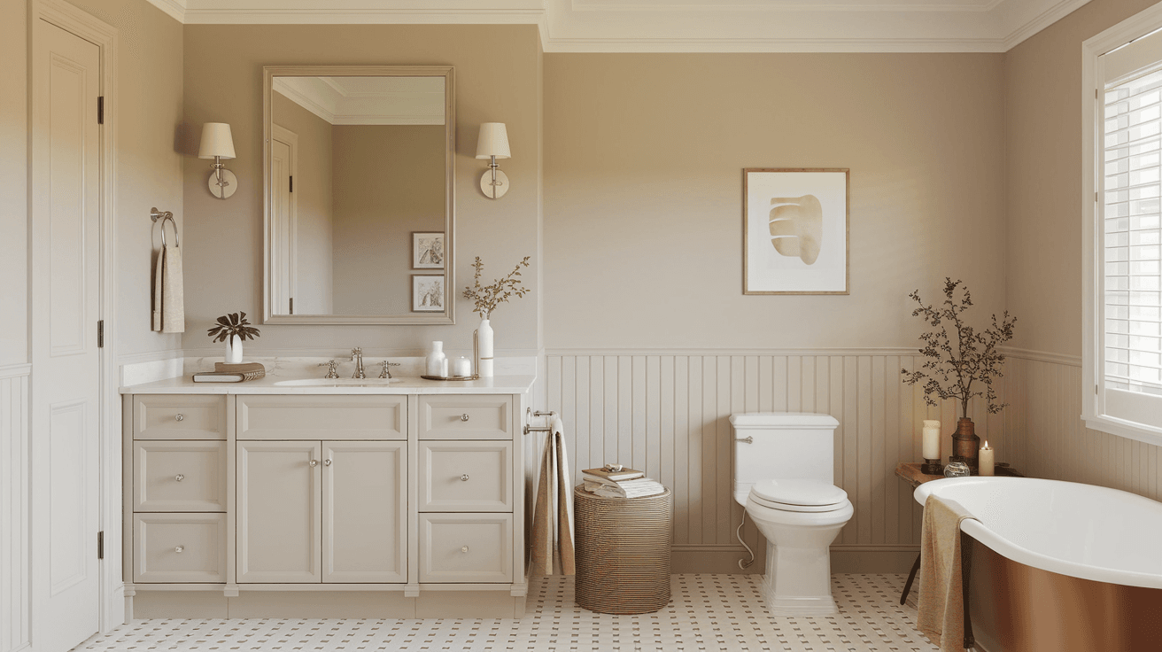
Collingwood OC-28 creates a serene bathroom sanctuary when paired with white fixtures and natural stone.
The gray’s warm undertones prevent the space from feeling cold while maintaining a clean look that enhances the sense of calm and relaxation.
In Dining Spaces
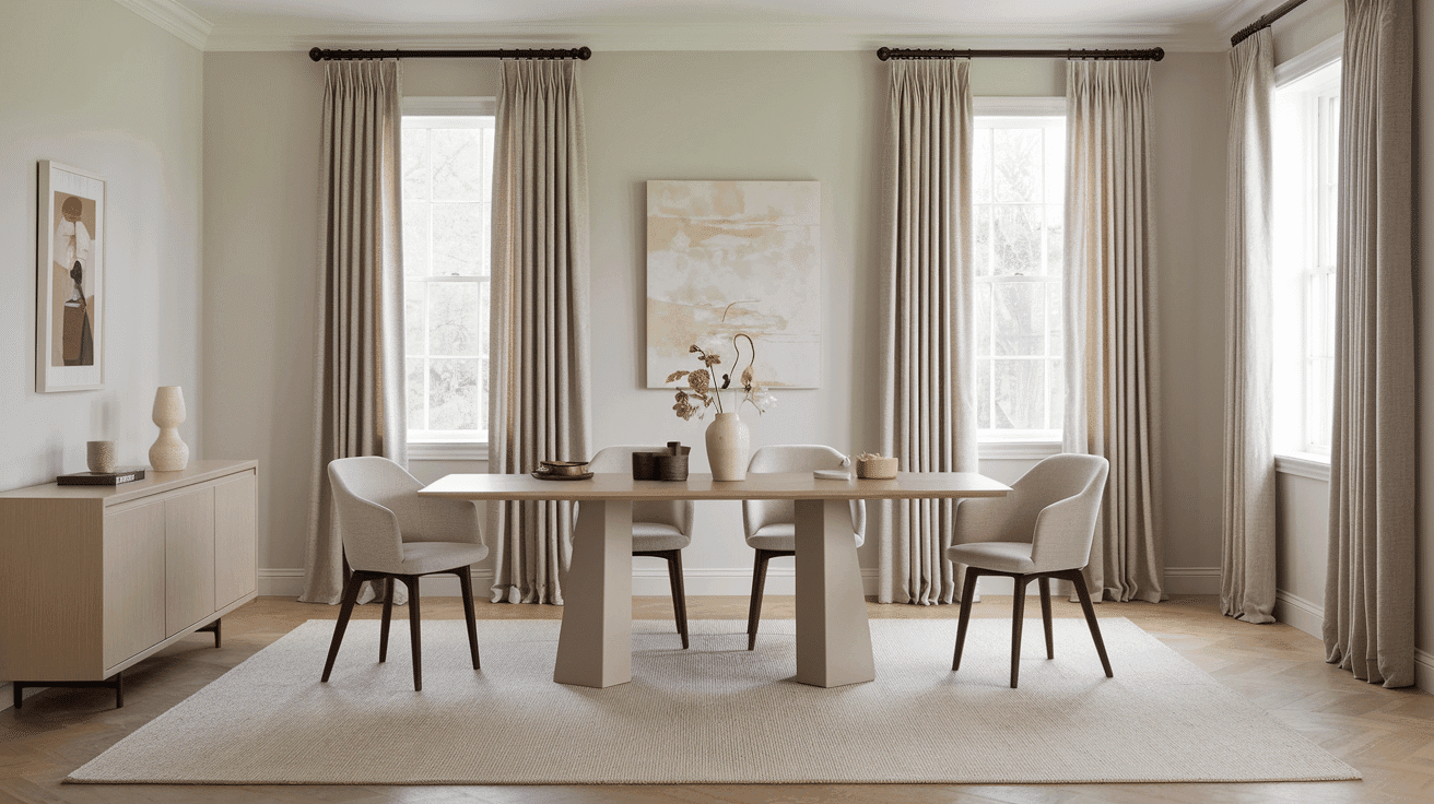
In dining rooms, Collingwood OC-28 provides an inviting backdrop that flatters skin tones in the evening light.
The neutral tone creates a comfortable atmosphere for gatherings while allowing your table settings, flowers, and food to take center stage during meals.
In Home Offices and Focus Spaces
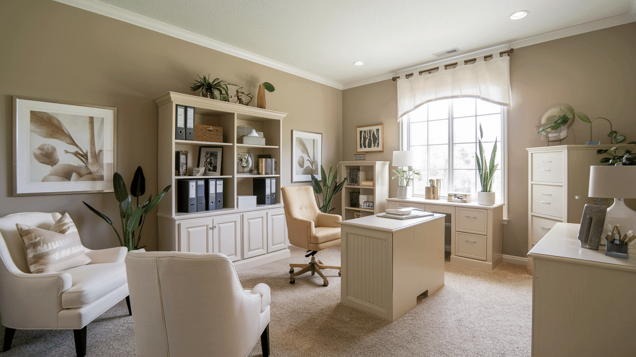
Collingwood OC-28 reduces visual distractions in work areas without feeling stark. The balanced gray promotes concentration while its warm undertones keep the space feeling welcoming during long work sessions, helping to maintain focus without causing eye strain.
Color Pairings and Combinations for Collingwood OC-28
Benjamin Moore Collingwood OC-28 works best when paired with complementary colors that enhance its warm gray undertones.
This versatile neutral creates effective combinations with both contrasting and balanced shades.
For a cohesive look, consider pairing it with deeper accents for drama or lighter tones for an airy feel. Its chameleon-like quality allows it to shift subtly depending on surrounding colors.
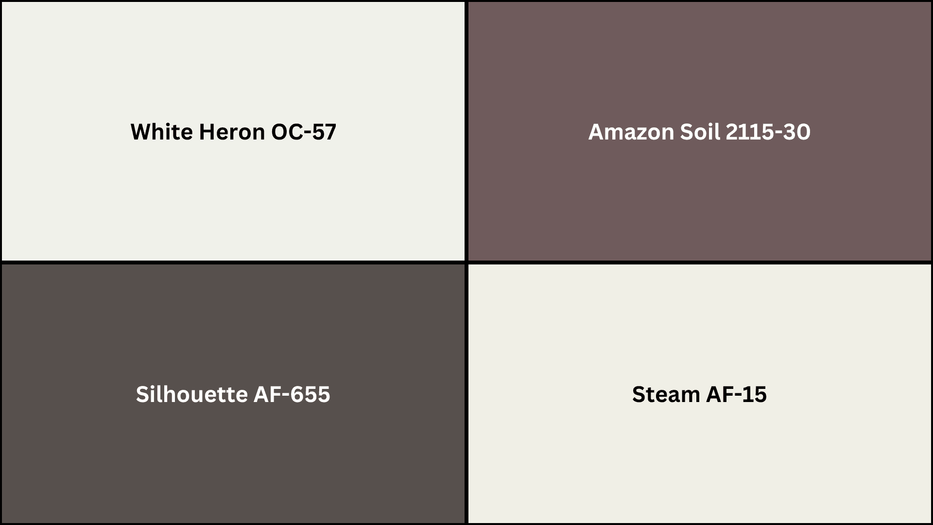
Complementary Trim Colors
- White Heron OC-57 – A crisp, clean white that creates a sharp contrast.
- Amazon Soil 2115-30 – Rich brown that grounds and warms the palette.
- Steam AF-15 – Soft off-white that blends smoothly with the main color.
- Silhouette AF-655 – Deep charcoal that adds bold drama.
Creating Cohesive Color Schemes
Collingwood OC-28 serves as a versatile foundation for numerous color schemes, creating spaces with character and depth.
This balanced gray acts as a perfect middle ground, allowing you to build varied looks ranging from bold and dramatic to subtle and refined.
Its warm undertones provide the ideal starting point for any design vision.
Monochromatic Scheme
A monochromatic scheme uses various gray shades alongside Collingwood OC-28 to create depth without complexity. This versatile gray makes spaces feel cohesive yet interesting.
The subtle variations between similar tones create polished layers while maintaining a clean, minimalist look that feels intentional rather than flat.
My recommendations are:
- Collingwood OC-28 on walls with Edgecomb Gray HC-173 trim creates a subtle, no-fuss contrast.
- Try a shinier finish of Collingwood OC-28 on crown moldings – it really makes a difference.
- Add Revere Pewter HC-172 on a bookshelf or accent piece for a touch more dimension.
- Layer in textured grays like linen upholstery and matte ceramics to bring the whole look to life.
Warm Color Scheme
Collingwood OC-28’s warm undertones complement other warm colors beautifully. This combination feels cozy yet balanced when natural light flows through the space.
The balance between the soft gray and warm hues creates visual interest without overwhelming contrast. Terracotta, rust, and amber tones shine against this neutral gray backdrop.
My recommendations are:
- Use Alexandria Beige HC-77 in dining spaces – it feels incredibly inviting for gatherings.
- Kingsport Gray HC-86 works wonders in hallways and ties everything together.
- Hazy Skies OC-48 makes bedrooms feel rich without trying too hard.
- Try Lancaster Whitewash HC-174 for a subtle accent wall that doesn’t steal all the attention.
Cool Color Scheme
Though inherently warm-toned, Collingwood OC-28 pairs wonderfully with cooler colors, too. This adaptable mix creates spaces that feel fresh yet grounded.
The balance between the gray’s warmth and cool tones like blue, teal, or sage produces a pleasant, contemporary look that avoids feeling cold or stark while maintaining visual interest.
My recommendations are:
- Van Deusen Blue HC-156 in bathrooms alongside Collingwood OC-28 living areas feels just right.
- Gray Owl OC-52 in bedrooms creates a peaceful vibe while keeping things grounded.
- Hale Navy HC-154 makes home offices feel focused but not stark or boring.
- Wickham Gray HC-171 accent wall adds enough contrast to catch your eye.
Coordinating with Furniture and Decor
Wood Tones
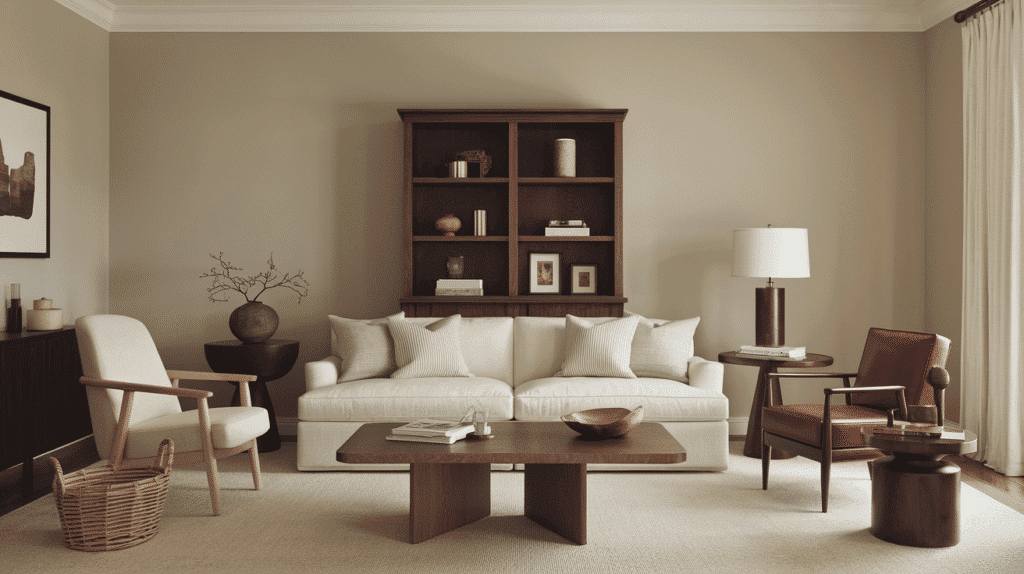
Collingwood OC-28 blends beautifully with dark woods like walnut and mahogany, creating rich depth.
Medium woods such as oak and cherry offer natural warmth that complements the gray’s subtle undertones.
Light woods, including maple and ash, provide gentle contrast while maintaining the room’s airy feel.
Metals
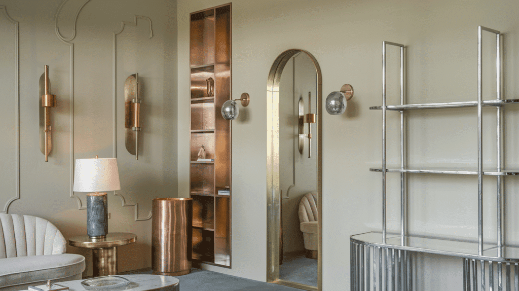
Brushed brass and gold fixtures add warmth and polish against Collingwood’s neutral backdrop.
Silver and chrome create a clean, contemporary look that feels balanced and intentional. Bronze and copper accents introduce rich dimensions while enhancing the paint’s warmth.
Fabrics
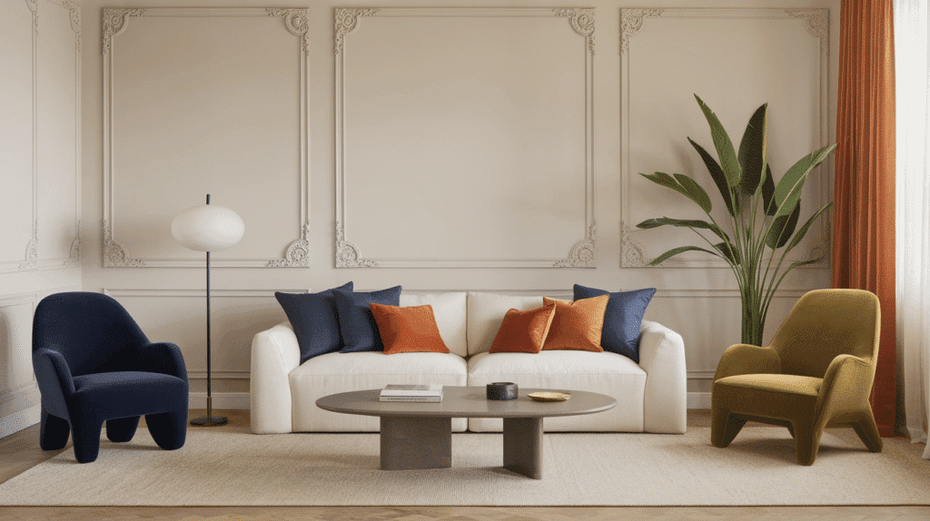
Navy blue, rust orange, and olive green textiles create striking focal points against Collingwood’s subtle gray.
Cream and oatmeal fabrics blend effortlessly for a cohesive, calming atmosphere. Textured materials like bouclé, linen, and wool add depth and interest to the neutral foundation.
Decor
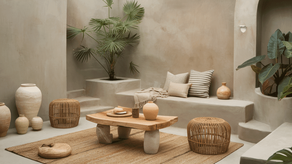
Natural elements like jute, rattan, and simple pottery enhance Collingwood’s organic quality. Black and white photography gains a refined presence against this balanced gray.
Colorful art pieces and accessories pop without competing, thanks to the even-toned neutral background.
Similar Paint Colors: Alternative to Collingwood OC-28
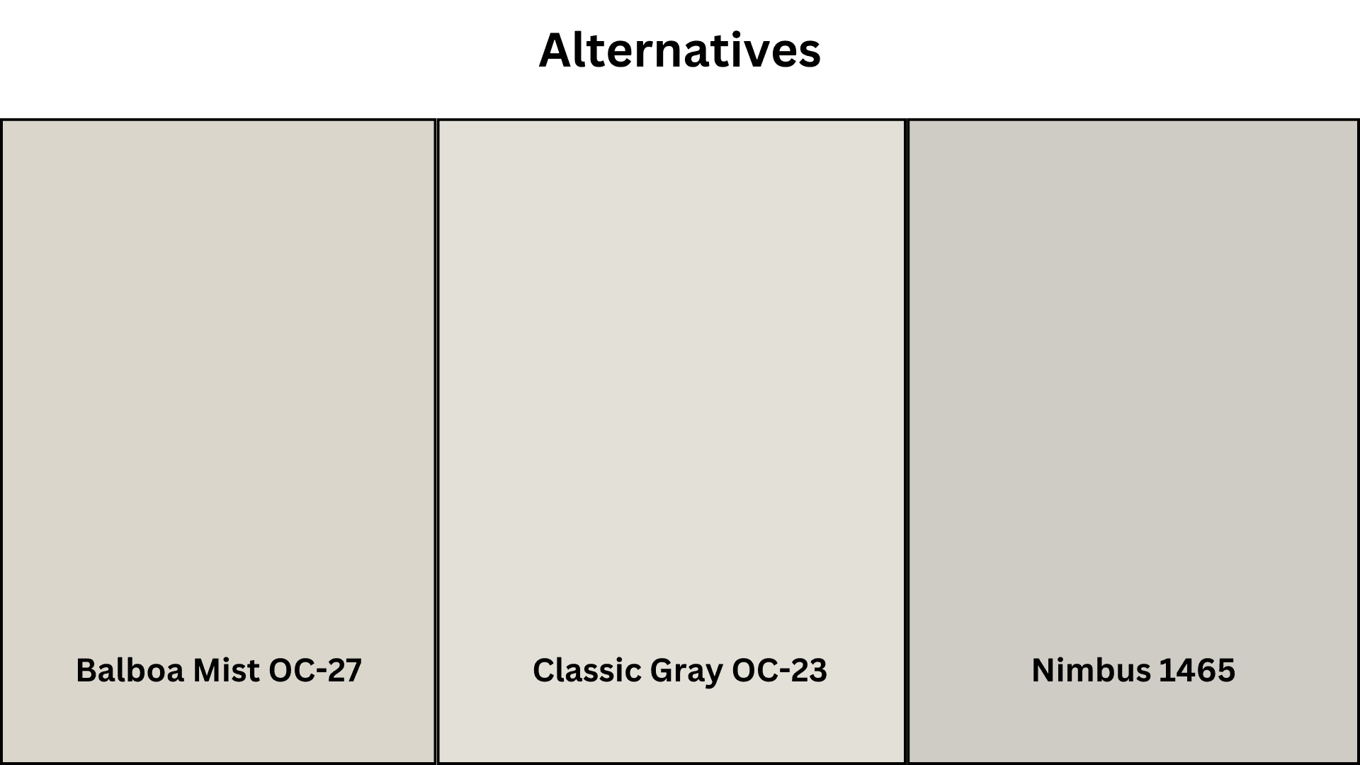
If you’re considering alternatives to Collingwood OC-28, these Benjamin Moore colors offer similar qualities while providing subtle variations in undertone and depth.
Each maintains the versatile, balanced nature that makes Collingwood popular but with unique characteristics that might better suit specific lighting conditions or design preferences.
1. Balboa Mist OC-27
- It is slightly lighter and airier than Collingwood, with similar warm undertones.
- Reads more silvery in north-facing rooms.
- Creates a softer, more fine appearance in bright spaces.
- It pairs beautifully with crisp whites and natural wood tones.
2. Classic Gray OC-23
- The lightest option of the three alternatives.
- It has subtle warm undertones that prevent it from feeling cold.
- Works exceptionally well in spaces with limited natural light.
- Creates an open, breathable feeling in smaller rooms.
3. Nimbus 1465
- It’s slightly deeper and more saturated than Collingwood.
- It contains subtle blue-green undertones that add complexity.
- Creates a more dramatic contrast against white trim.
- It holds its color well in bright, south-facing rooms.
Summing It Up
Now that we’ve looked at all the qualities that make Collingwood OC-28 special, it’s easy to see why this balanced gray has become such a popular neutral.
Collingwood Benjamin Moore works well in so many rooms, adjusts to different lighting, and fits with almost any decor style.
What really makes Collingwood stand out is how it sits right in the middle – warm enough to feel cozy, light enough to keep spaces feeling open, and neutral enough to match whatever furniture and accessories you choose now or later.
If you want a paint color that looks good year after year and makes your daily life at home more pleasant, give Collingwood OC-28 a try.
This flexible Benjamin Moore color shows that sometimes the best colors aren’t the boldest – they’re the ones that help everything else in your home shine.

Alex Guerrero, a graduate with a Fine Arts degree from the Rhode Island School of Design, has been a visionary in the world of color and design for over 15 years. His professional journey began in the heart of the fashion industry in Milan, where he developed an acute sense for color harmonies and trends. Alex joined our team in 2018, offering fresh and innovative perspectives on color utilization in various spaces. Renowned for his ability to blend contemporary trends with timeless elegance. Outside of work, Alex is an accomplished painter and a volunteer art therapist, his artistic talents further enriching his professional insights.