Small rooms often feel more cramped than they actually are, but the right design choices can completely change that. Understanding what colors make a room look bigger plays a key role in how a space looks and feels.
With the right approach, even the smallest room can appear brighter, more open, and visually balanced. A simple color change can make a noticeable difference without any major effort.
This blog walks you through the best ways to choose and use colors effectively. It focuses on practical ideas that help transform small spaces into more comfortable, inviting spaces.
How Colors Affect Room Size Perception
Before choosing a shade, it helps to know how color changes how a room feels. Light, reflection, and contrast all play a role in making a space feel bigger or smaller.
- Light Colors Open Up Space: Soft shades reflect more light, making the room feel brighter and wider.
- Dark Colors Add Depth: Deeper tones absorb light, which can make a room feel cozy but slightly smaller.
- Balanced Contrast Matters: Mixing light and dark shades adds depth without making the space feel tight.
- Lighting Affects Everything: Natural and artificial light can change how a color looks throughout the day.
Best Colors that Make a Room Look Bigger
Choosing the right shade matters more than people think. Light-reflecting tones, soft neutrals, and cool shades can visually open up a space.
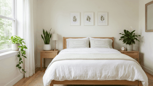
1. Soft White
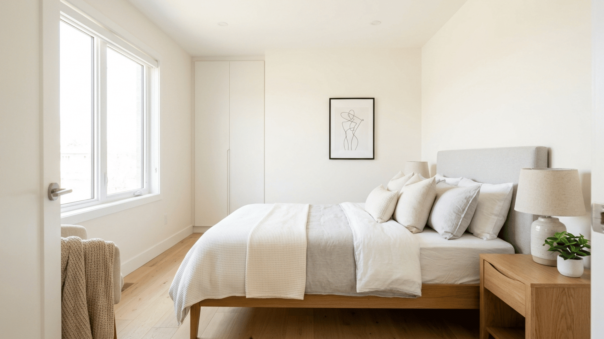
Soft white is one of the best choices for making a room look bigger. It reflects the most light of any shade, helping brighten even the smallest spaces.
This added brightness makes walls feel farther apart, creating a more open and airy look. Soft white also keeps the room feeling clean and simple without looking too plain. Another reason it works so well is its flexibility.
It pairs easily with almost any furniture, decor, or flooring style, making it a safe and practical option for living rooms, bedrooms, kitchens, and even bathrooms.
2. Light Gray
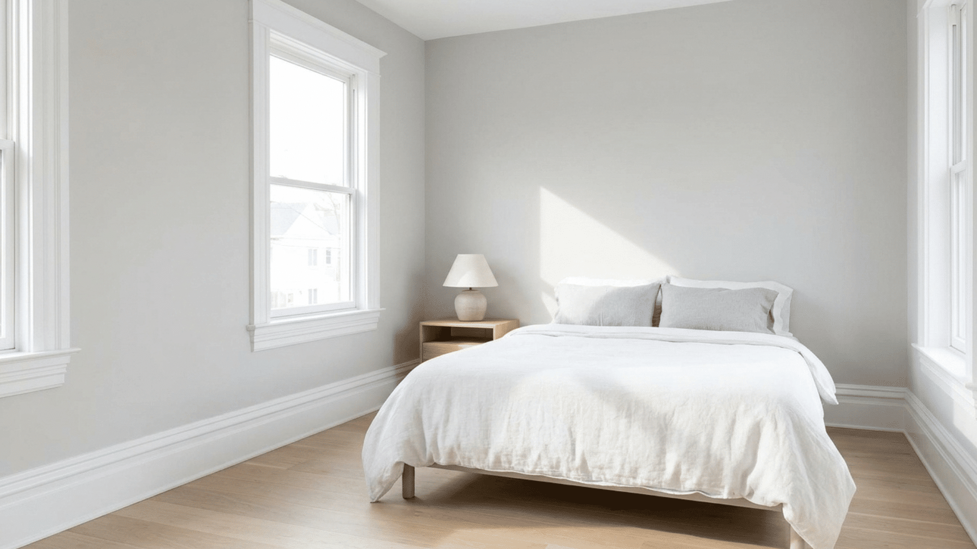
Light gray is a smart choice for adding depth without making a room feel dark or closed in. It has a soft, modern look that works well in many homes.
Unlike darker grays, this shade keeps the space feeling open while still adding a bit of character. It’s especially popular in modern, minimalist spaces because it feels clean and balanced.
Light gray also pairs very well with white trim, which helps outline the room and makes walls appear more defined and spacious.
3. Pale Blue
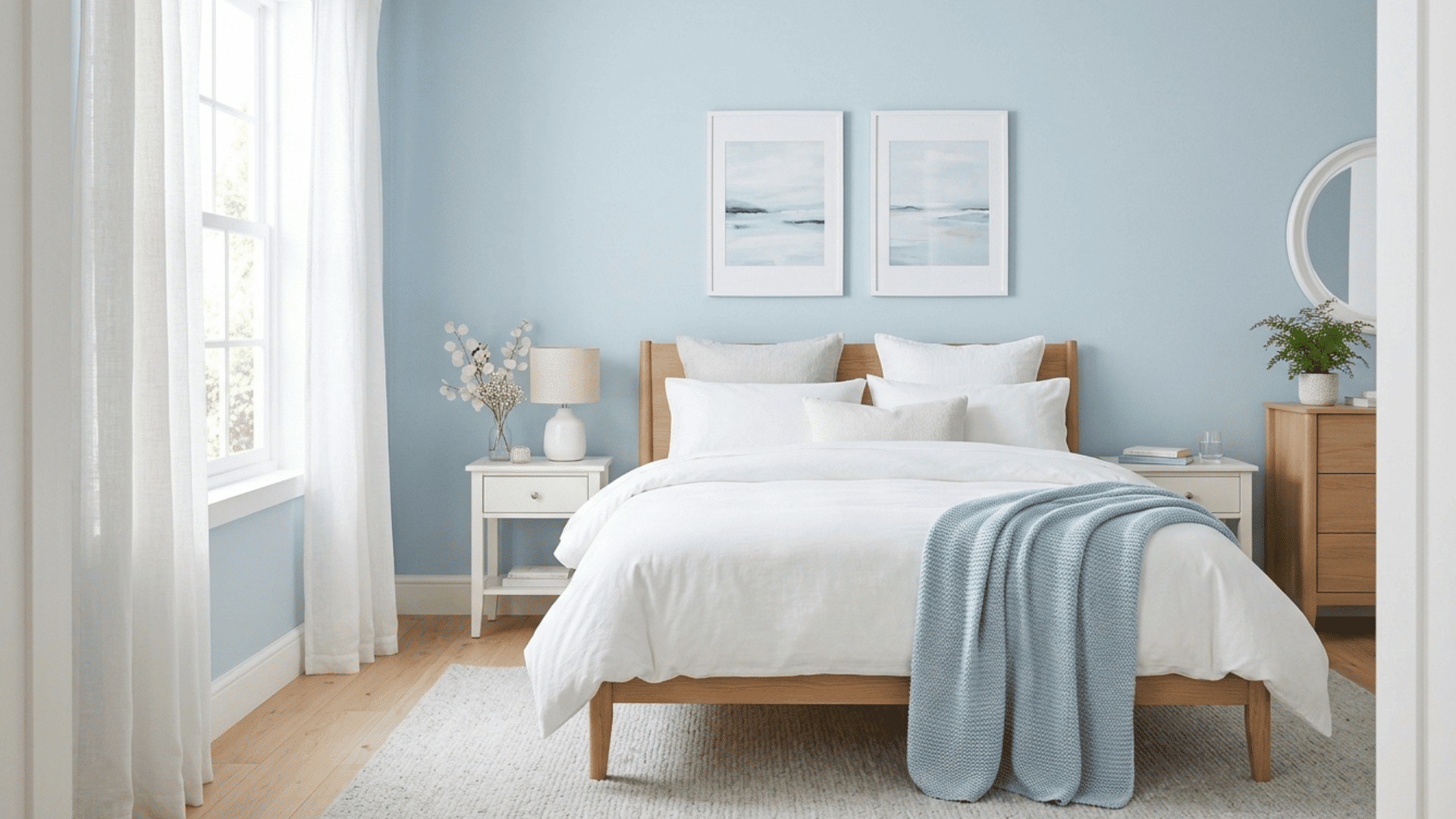
Pale blue brings a soft, airy feel that can instantly make a room seem more open. It reminds people of the sky, which naturally creates a sense of space and calmness.
This color works well in rooms where relaxation matters, like bedrooms and bathrooms.
It reflects light gently, helping the room feel brighter without being too bold. Pale blue also pairs well with white or light-colored decor, adding to the open, peaceful look.
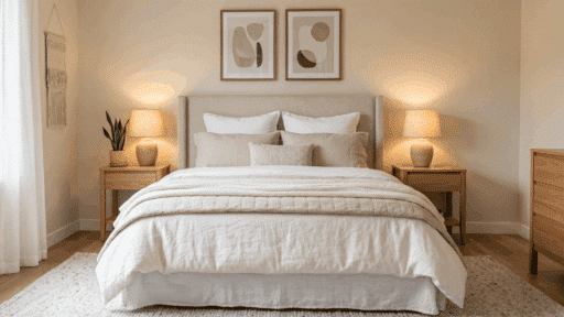
4. Soft Beige
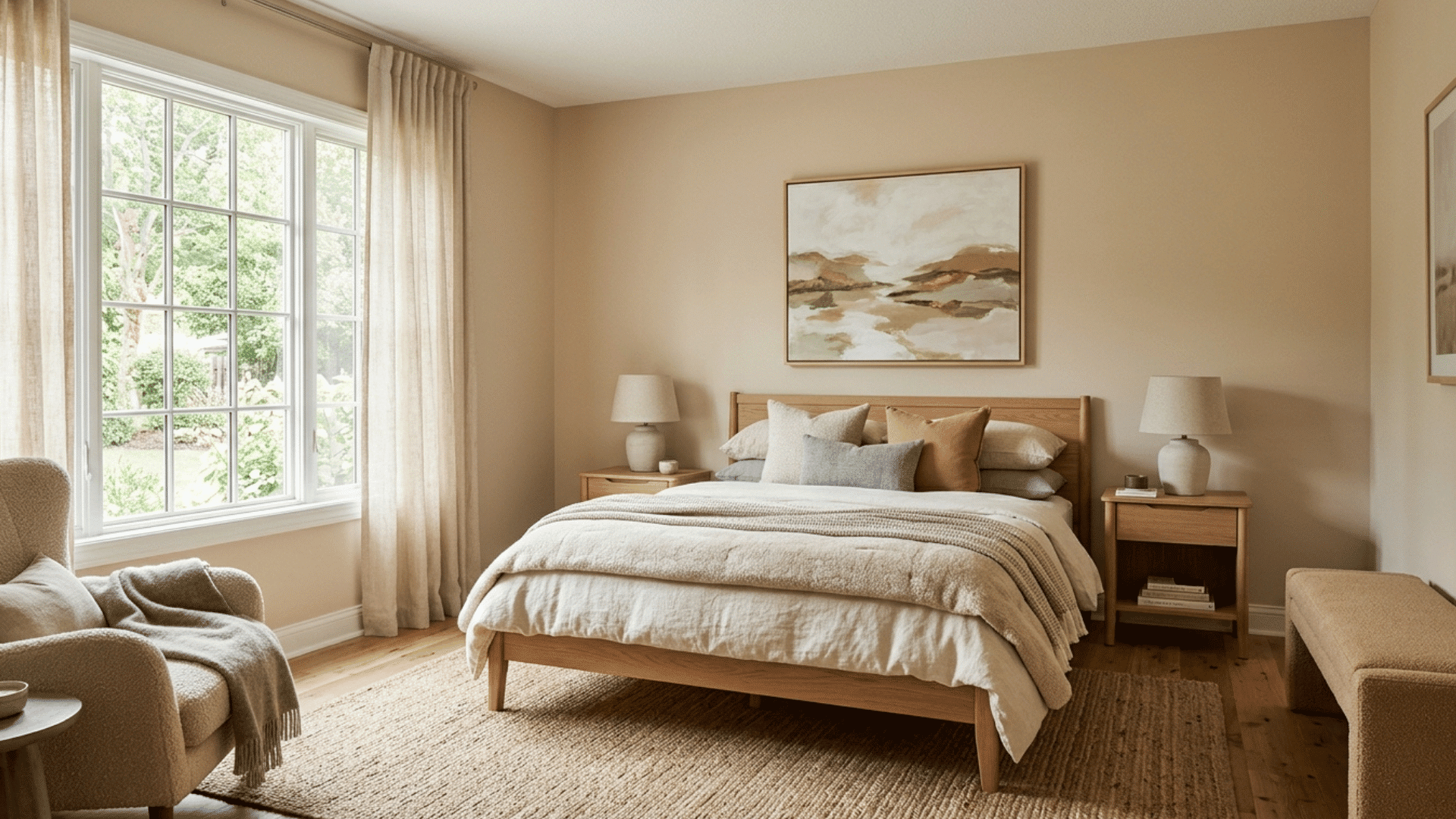
Soft beige is a warm and inviting option that still keeps a room feeling light and open. It adds more warmth than white, which makes the space feel comfortable without making it look smaller.
This color works well in living rooms where a cozy feel is important, but the space still needs to look bigger.
Soft beige blends easily with different styles and furniture, making it a reliable choice for many homes while keeping the overall look balanced.
5. Light Greige
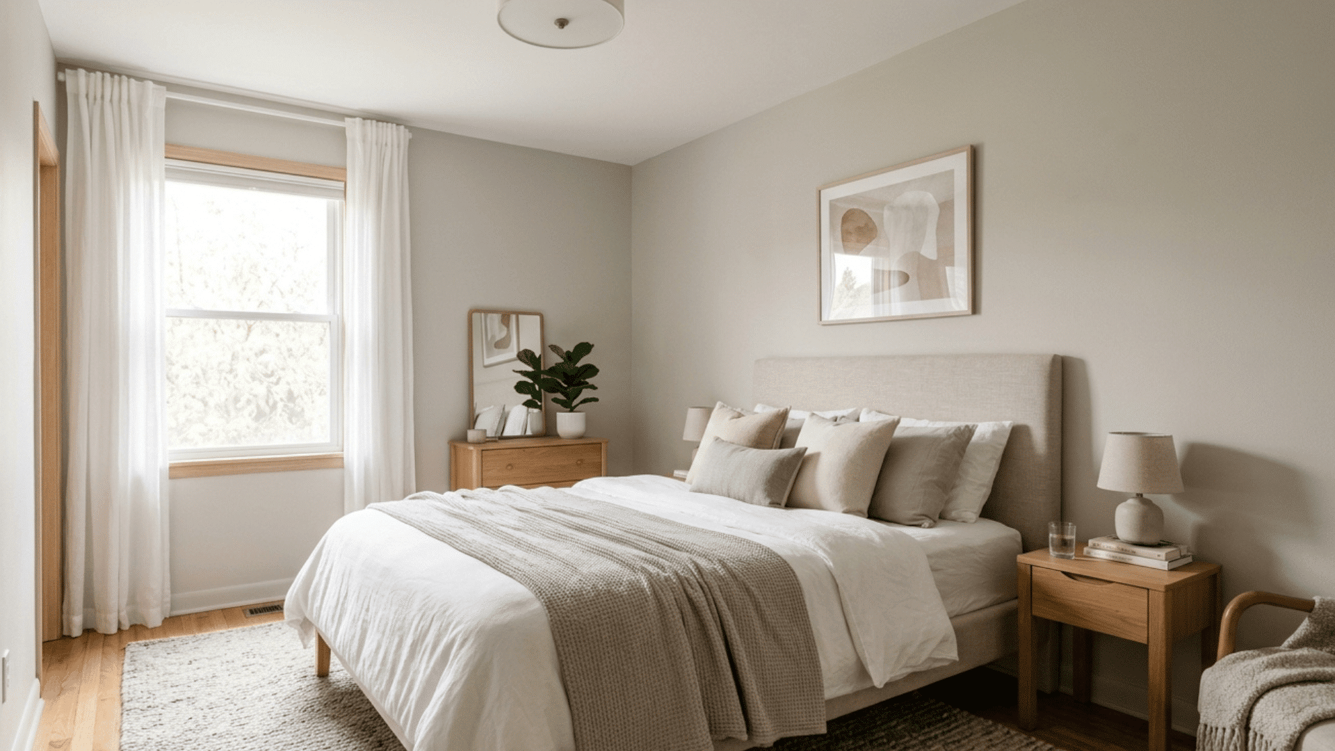
Light greige, a mix of gray and beige, offers the best of both tones in one color. It feels balanced and smooth, which helps prevent walls from looking too plain or flat.
This shade works well in small rooms because it blends softly with the surroundings instead of creating harsh contrasts.
The subtle tone helps walls flow together, making the space feel larger. Light greige is also easy to match with different decor styles, which adds to its appeal.
6. Pastel Green
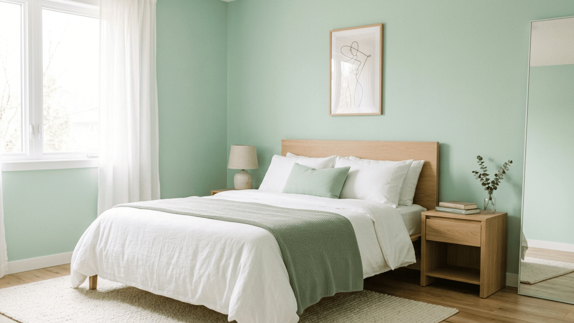
Pastel green adds a fresh and light feel without making the room look busy or heavy. It brings a gentle touch of color that still keeps the space open and bright.
This shade works especially well in smaller kitchens or bedrooms where a bit of color is needed without shrinking the room.
Pastel green reflects light softly and pairs nicely with white or light wood tones, helping the space feel calm, clean, and more spacious overall.
7. Off-White Cream
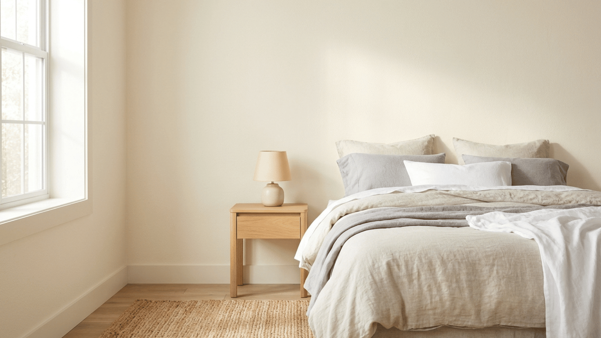
Off-white cream is a warmer alternative to pure white that still keeps a room bright and open. It softens the look of a space while maintaining good light reflection.
This makes it a great option for rooms that need a cozy touch without losing that airy feel.
Off-white cream works especially well with wood furniture, as it highlights natural tones while keeping the room from feeling too heavy or closed in.
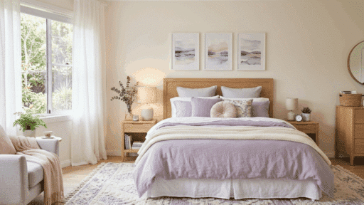
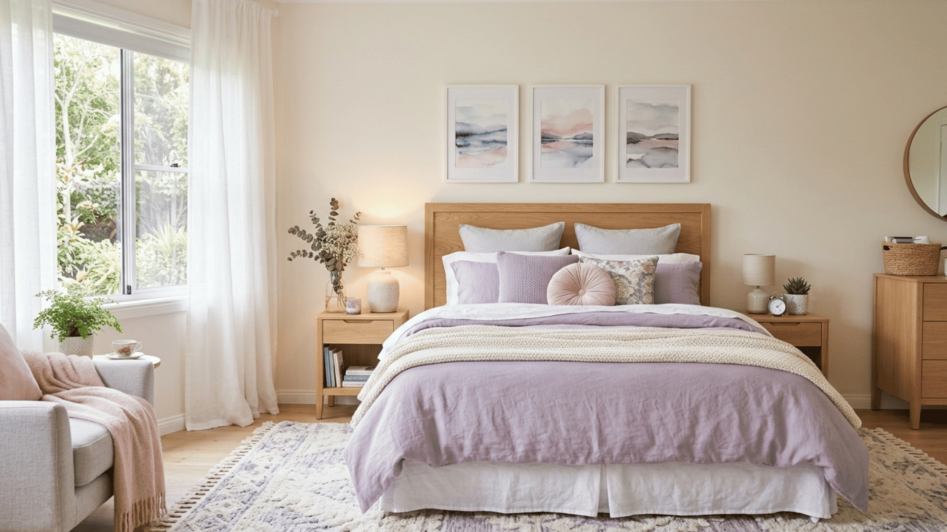
8. Soft Lavender
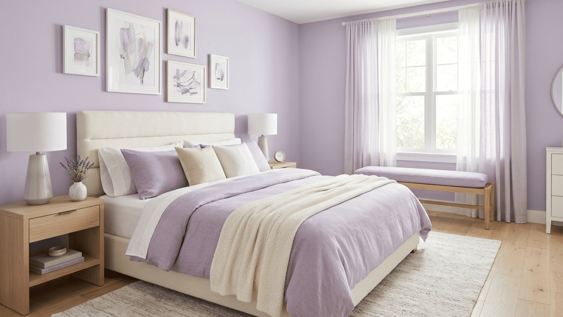
Soft lavender is a light purple shade that adds a calm and gentle feel to a room. It introduces a bit of color without making the space feel smaller or crowded.
This shade works best in bedrooms where a peaceful mood is important. Soft lavender reflects light well and blends easily with neutral decor, helping maintain an open look while still adding personality to the space.
9. Pale Yellow
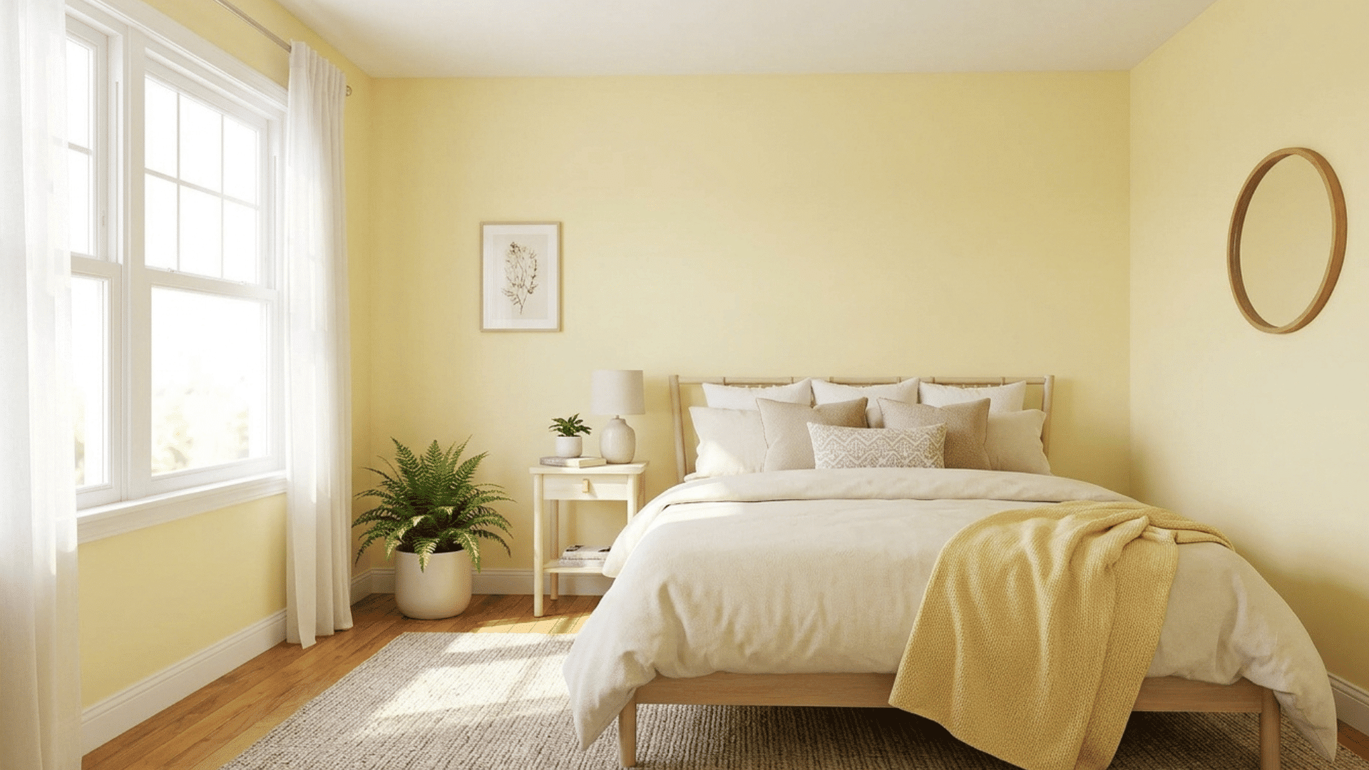
Pale yellow is a cheerful color that brightens any space. It reflects natural light well, making the room feel more open and welcoming.
This shade works best in rooms that get sunlight, as it enhances the brightness even more. Pale yellow can make a small room feel lively and less confined while still keeping the overall look soft and light.
10. Light Taupe
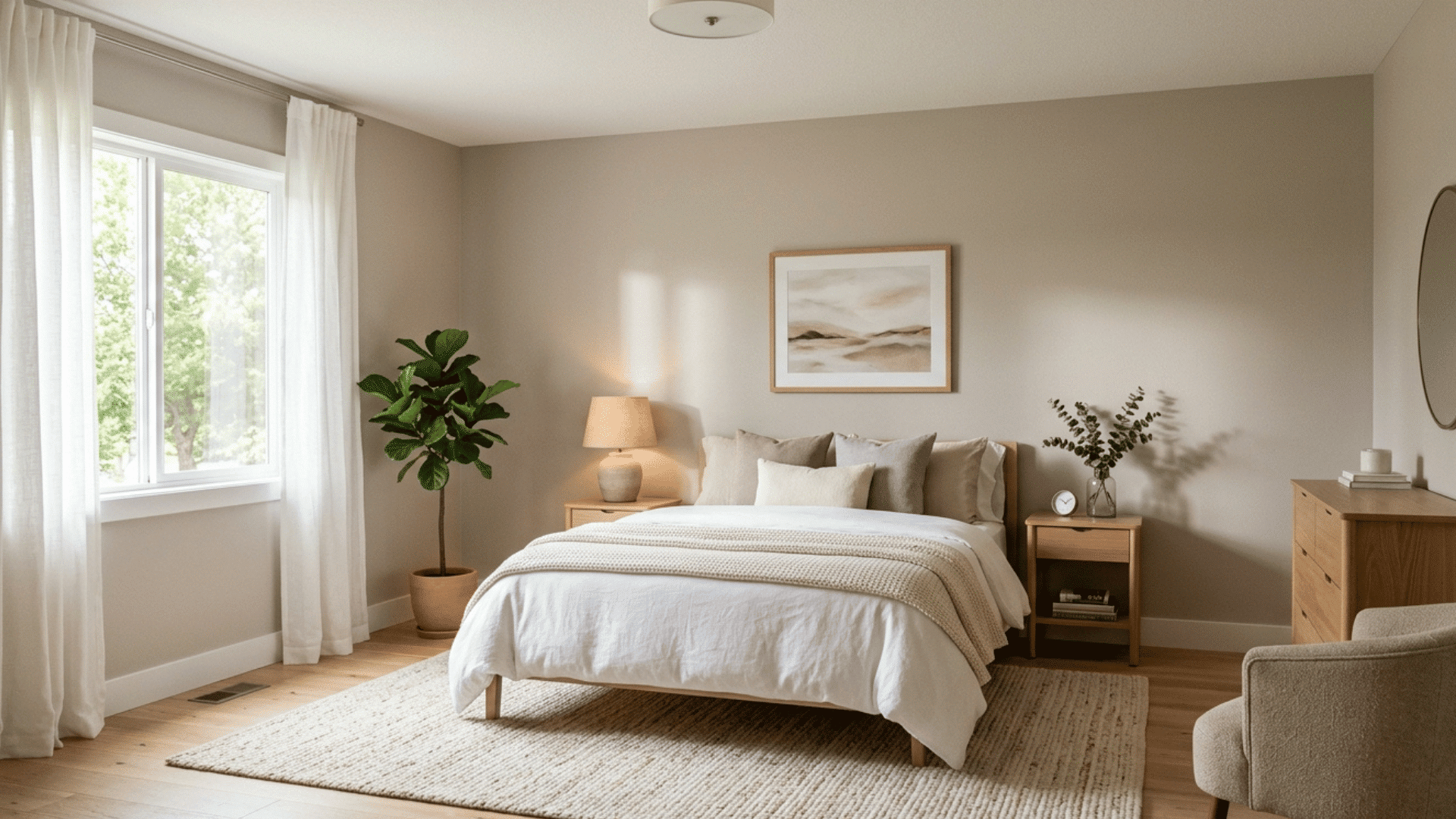
Light taupe is a soft neutral that adds a bit of depth without making the room feel closed in. It falls between gray and brown, giving it a balanced, natural look.
This shade helps reduce the boxed-in feeling that small rooms can have. Light taupe works well in living rooms and hallways, creating a smooth, open flow without feeling too plain or too dark.
11. Cool Mint
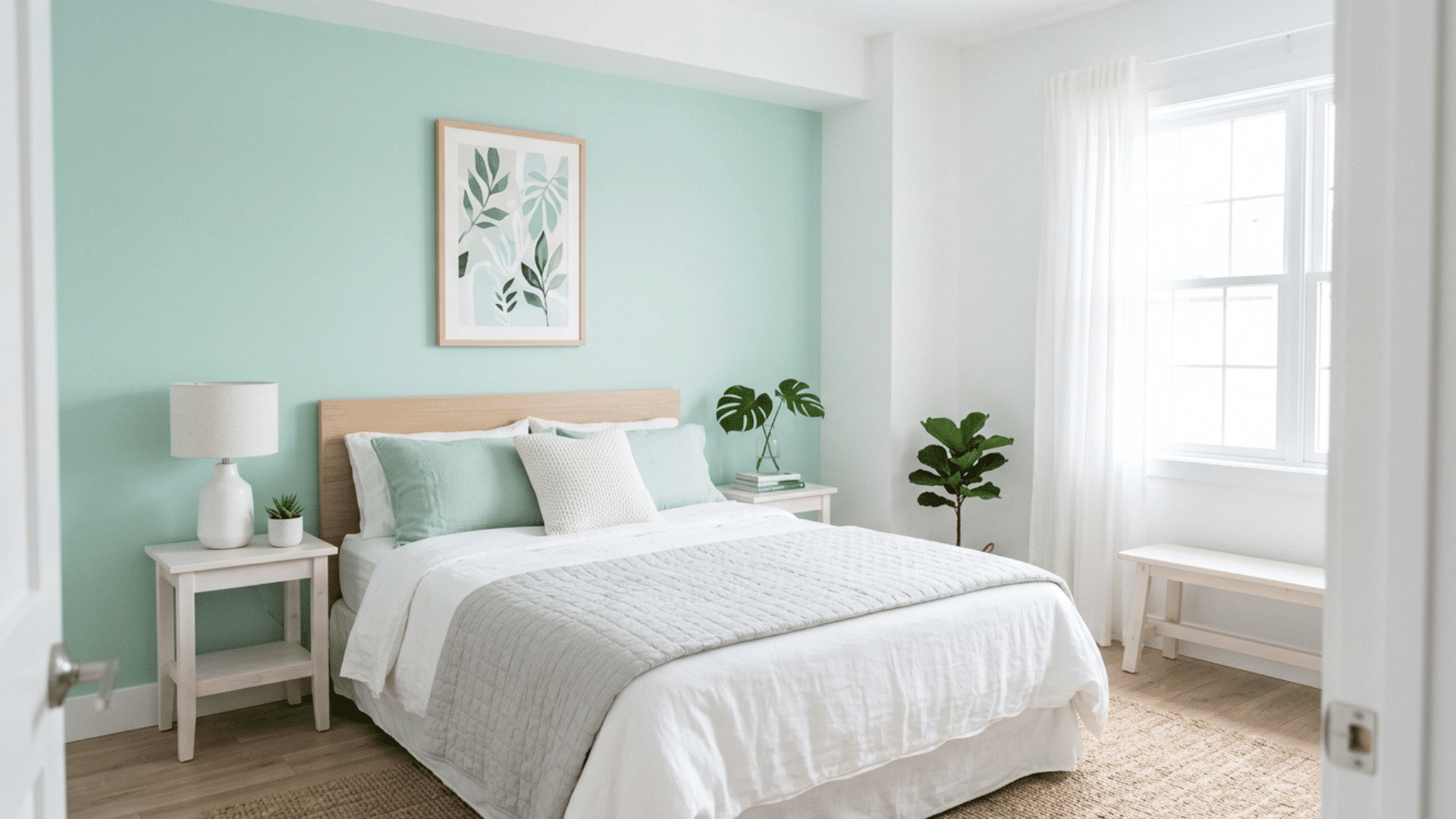
Cool mint is a light and refreshing color that can make a room feel clean and open. It has a crisp look that brightens small spaces without overwhelming them.
This shade works especially well in bathrooms, where a fresh feel is important. Cool mint reflects light gently and pairs well with white accents, helping the room appear more spacious and inviting.
How to Use These Colors for a Bigger Look
Using the right color is only one part of the process. The way you apply that color can make a room feel bigger or smaller. These simple tips can help you get the best results.
- Paint the walls and ceiling the same shade: Keeping the walls and ceiling in the same color helps reduce visual breaks. This makes the room feel taller and more open because the eye moves smoothly across the space.
- Use glossy or satin finishes: The finish of your paint matters as much as the color. Glossy or satin finishes reflect more light, which helps brighten the room and create a more spacious look.
- Keep trim lighter than walls: Using a lighter shade on trims and moldings helps define the edges without making the space feel closed. It adds subtle contrast while still keeping the room open.
- Avoid strong color contrasts: Sharp color changes can break up the space and make it feel smaller. Sticking to soft, similar tones helps create a smooth and continuous look.
Conclusion
A small room doesn’t have to feel cramped or uncomfortable. The right paint color can completely change how a space looks and feels without requiring a big budget or major changes.
Light and soft shades help reflect more light, making the room feel brighter and more open. Keeping the color palette simple also helps avoid a crowded look.
Small choices, like picking the right tone or finish, can have a noticeable impact on the overall space.
With the right approach, even the smallest room can feel more spacious, airy, and comfortable without adding extra furniture or changing the layout.

Ava Taylor, holding a Bachelor’s degree in Interior Design from the Pratt Institute, has made her mark in creating engaging and functional living spaces for over 14 years. She began her career with a New York-based design studio, where she gained a reputation for her innovative and user-centric designs. Ava joined our team in 2019, bringing a blend of artistic flair and practicality to our home improvement section. Since the she has been the lead contributor to our room transformation series, inspiring readers with her unique approach to maximizing space utility and aesthetic appeal. Beyond her professional work, Ava is a passionate collector of vintage furniture, a hobby that enriches her design perspective.