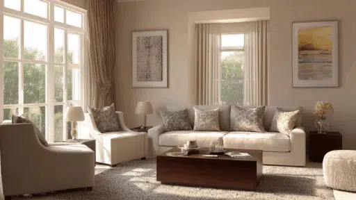
Have you ever repainted a wall and suddenly the whole room just clicked? That’s the power of color. It’s one of those things that’s easy to overlook but makes an enormous difference once you get it right.
The wrong shade can make a bright room feel gloomy, and the right one can make a tiny space feel open and airy.
That’s exactly why room color schemes are worth thinking about carefully. They’re not just about picking a pretty shade off a paint chip.
A well-planned interior design color scheme pulls a whole room together, from the furniture to the floor. This blog walks you through some amazing ideas to help you find what works for your space. Let’s get into it.
How Color Theory Actually Works in Real Interiors
Before jumping into specific color schemes, it helps to know a few basic color rules. You don’t need a design degree for this. These are simple ideas that, once you understand them, you’ll start noticing everywhere.
| Color Scheme Type | Description | Best For |
|---|---|---|
| Monochromatic Schemes | Uses different tones and shades of one color for a simple, cohesive look | Easy, clean designs with minimal contrast |
| Complementary Schemes | Pairs opposite colors on the wheel for strong contrast | Bold spaces that need visual impact |
| Analogous Schemes | Uses colors next to each other for a smooth and layered look | Calm, cohesive rooms with natural flow |
| Triadic & Split-Complementary | Uses three colors from different points on the wheel for variety | Creative spaces with more personality |
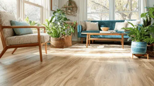
Room Color Scheme Ideas to Inspire Every Space
Looking for fresh interior design color schemes? These room color scheme ideas can help shape every space with the right mood and style.
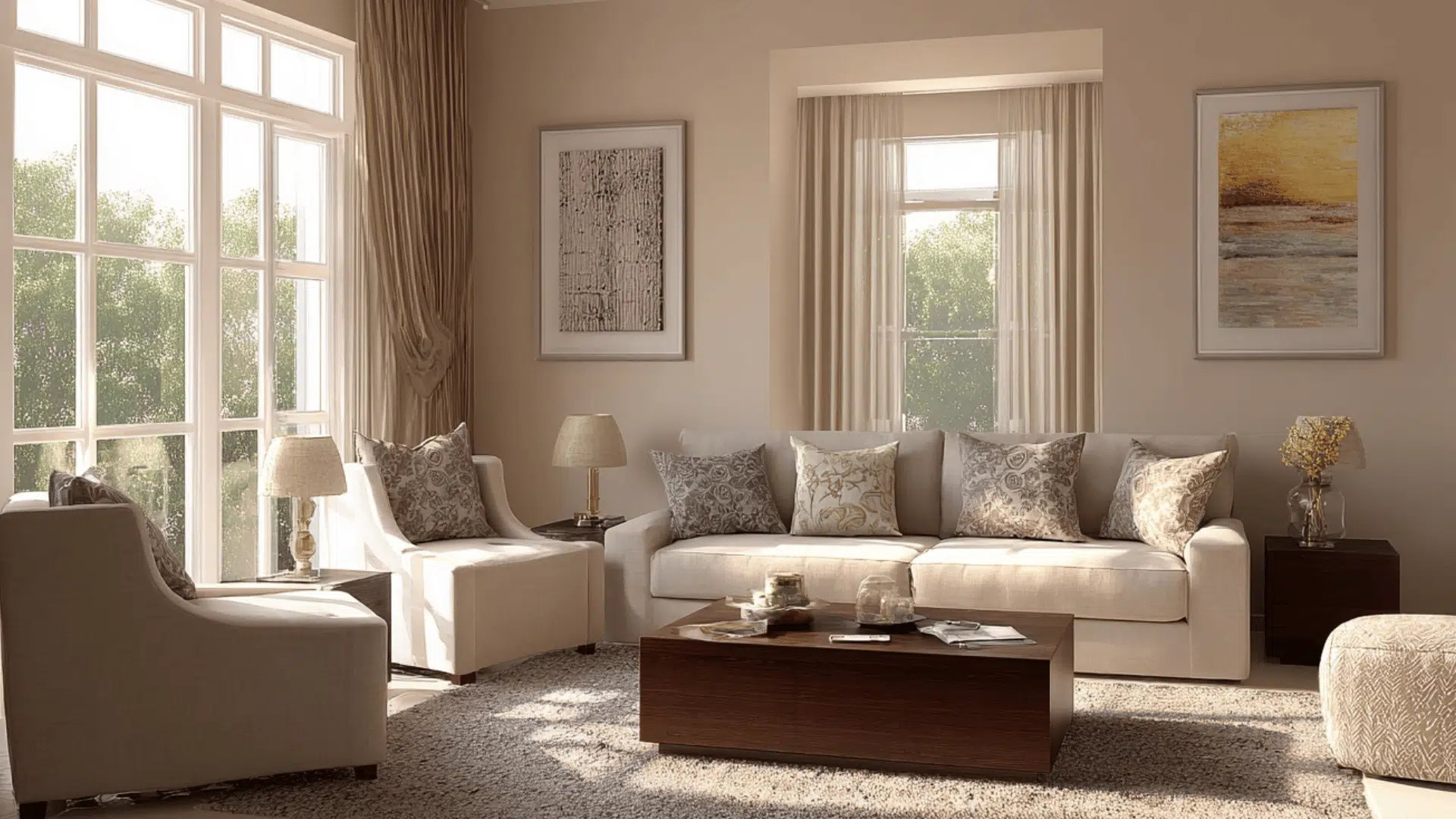
1. Warm Linen & Caramel
This room color scheme is all about comfort. Soft oat walls set a calm, neutral base, while caramel upholstery and warm brown accents add richness without overwhelming the space.
It works well with wooden furniture, woven textures, and natural light. If you want a living room that feels instantly cozy and put together, this palette is a solid starting point. Hard to get wrong, easy to love.
2. Navy, White & Gold
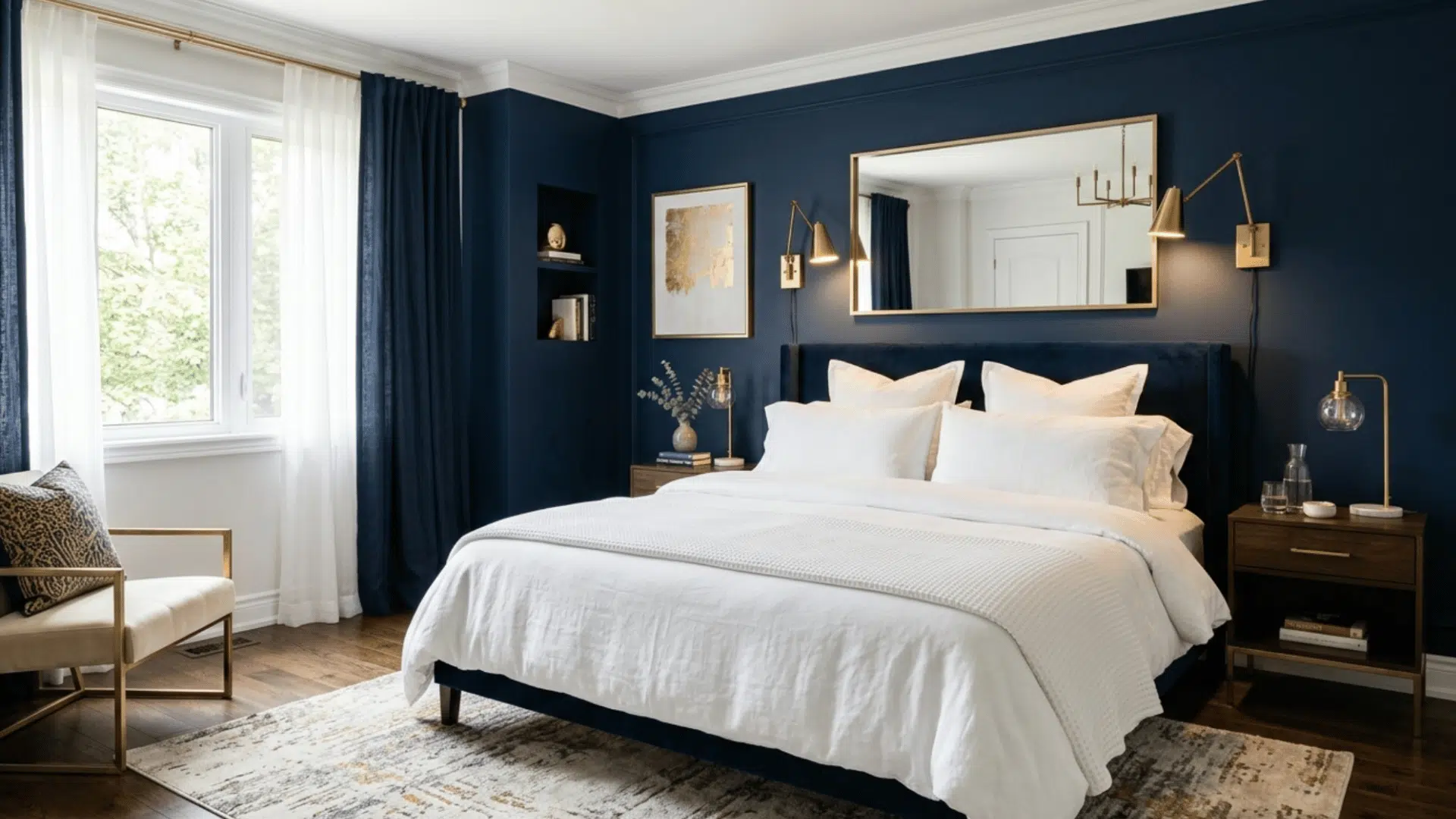
Navy walls paired with crisp white trim is a classic interior design color scheme that rarely goes out of style.
The gold or brass hardware pulls it all together, adding just enough warmth to keep the room from feeling too cold or clinical.
This works especially well in bedrooms where you want something that feels bold but still relaxing. Layer in white bedding and wood tones to keep it grounded.
3. Sage Green & Warm Ivory
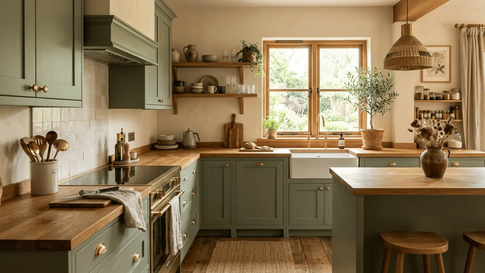
Sage cabinetry against ivory walls is one of those room color schemes that just keeps showing up, and for good reason. It feels fresh and earthy at the same time.
Add terracotta pots, warm wood countertops, or brass fixtures, and the whole kitchen takes on a natural, lived-in quality.
It photographs beautifully, too, which is probably why it’s all over social media right now. A genuinely great pick.
4. Blush Pink Monochrome
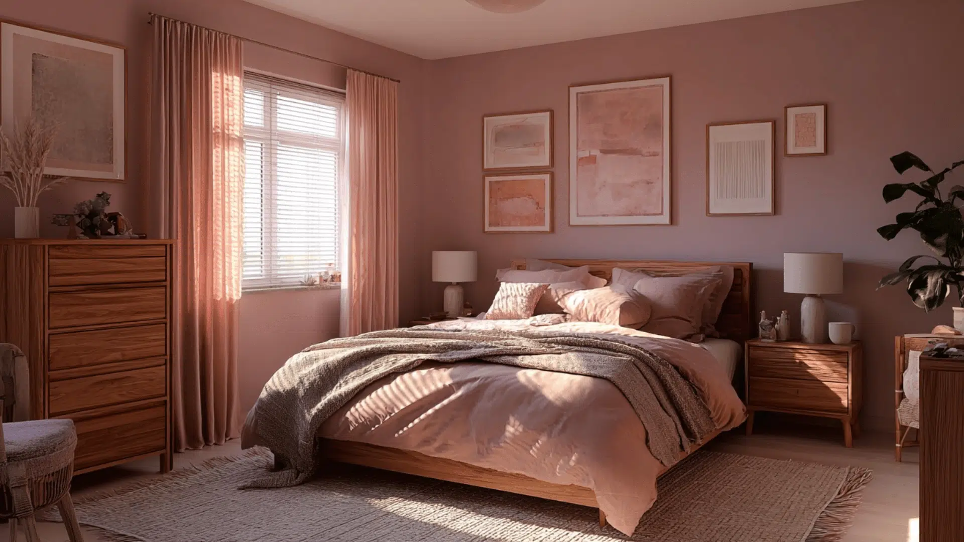
This one is softer than it sounds. Dusty rose walls paired with pale pink linen and deeper mauve accents create a tonal room color scheme that feels grown-up and refined rather than overly sweet.
The key is keeping the shades muted rather than bright. Think vintage rose, not bubble gum.
Pair it with aged brass or warm wood furniture, and you’ve got a bedroom that feels genuinely restful and personal.
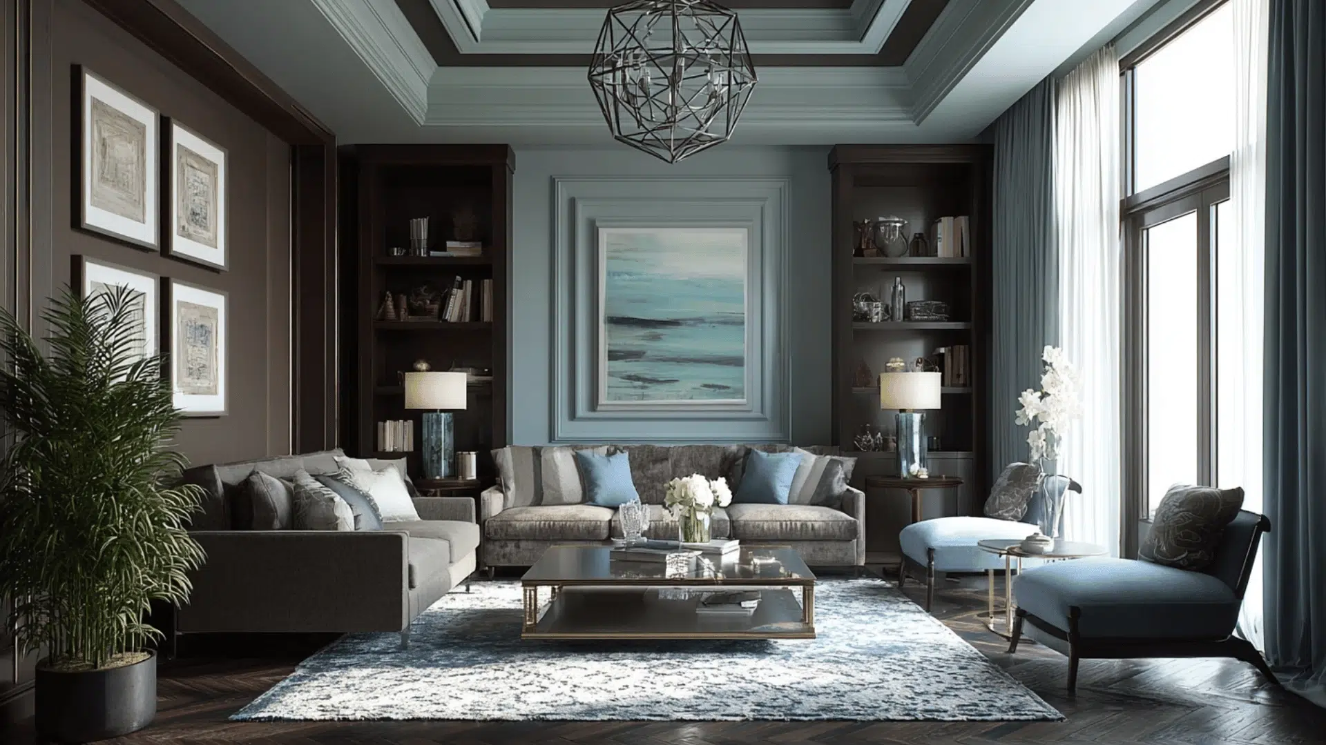
5. Charcoal & Forest Green
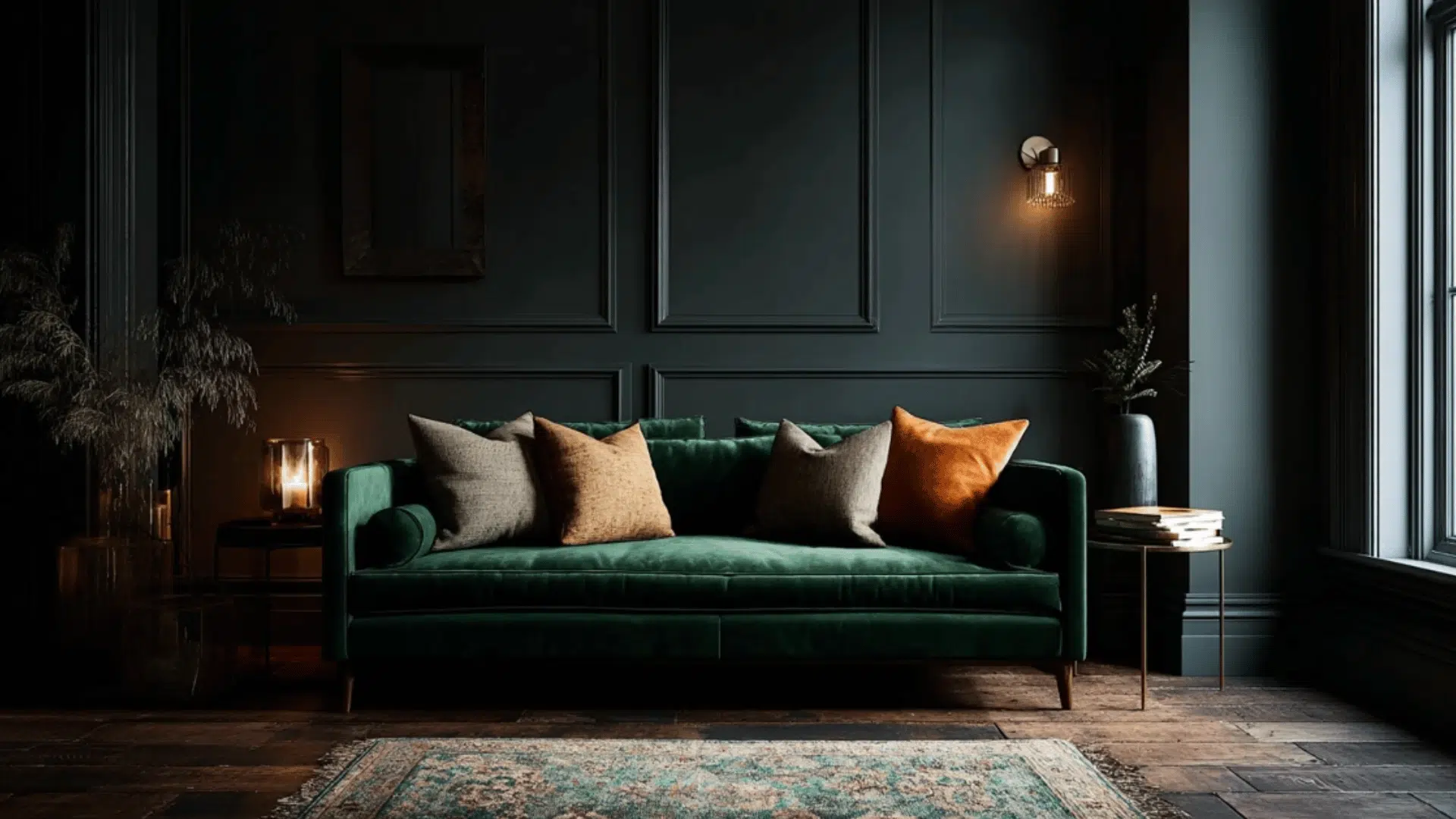
If you’re ready to go bold, this interior design color scheme delivers. Near-black walls combined with deep green velvet furniture create a moody, cocooning atmosphere that feels very current.
Natural linen cushions and warm lighting stop it from feeling too heavy. It’s a great choice for living rooms that don’t get much direct sunlight, where leaning into the darkness actually works in your favor rather than against it.
6. Greige Layering
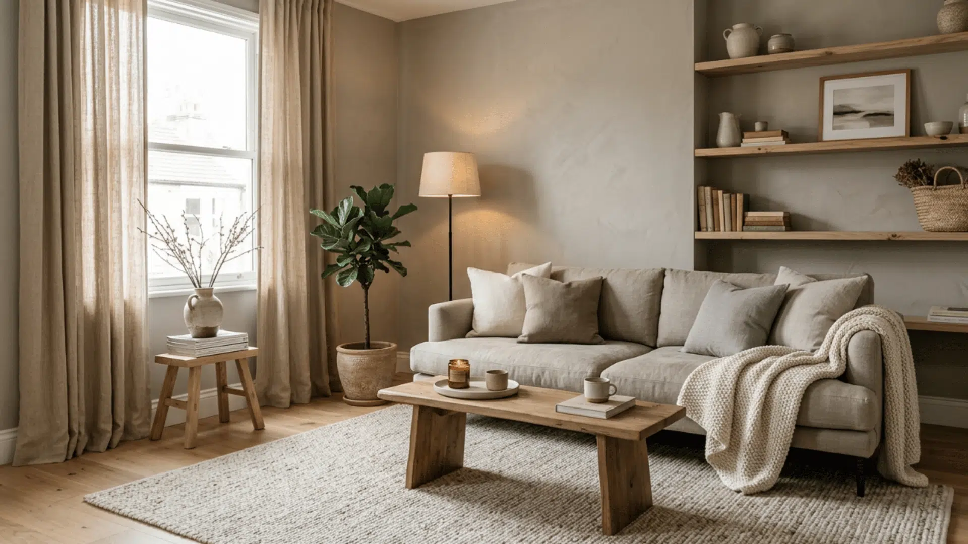
Greige is what you get when gray and beige meet in the middle, and it works in practically any room. This room color scheme relies on texture rather than contrast to create depth.
Think linen curtains, a wool rug, and raw wood shelving, all in slightly different warm neutral tones. It’s quiet, calming, and incredibly easy to live with.
If you’re not sure where to start with color, this is a genuinely safe and stylish option.
7. Terracotta & Cream
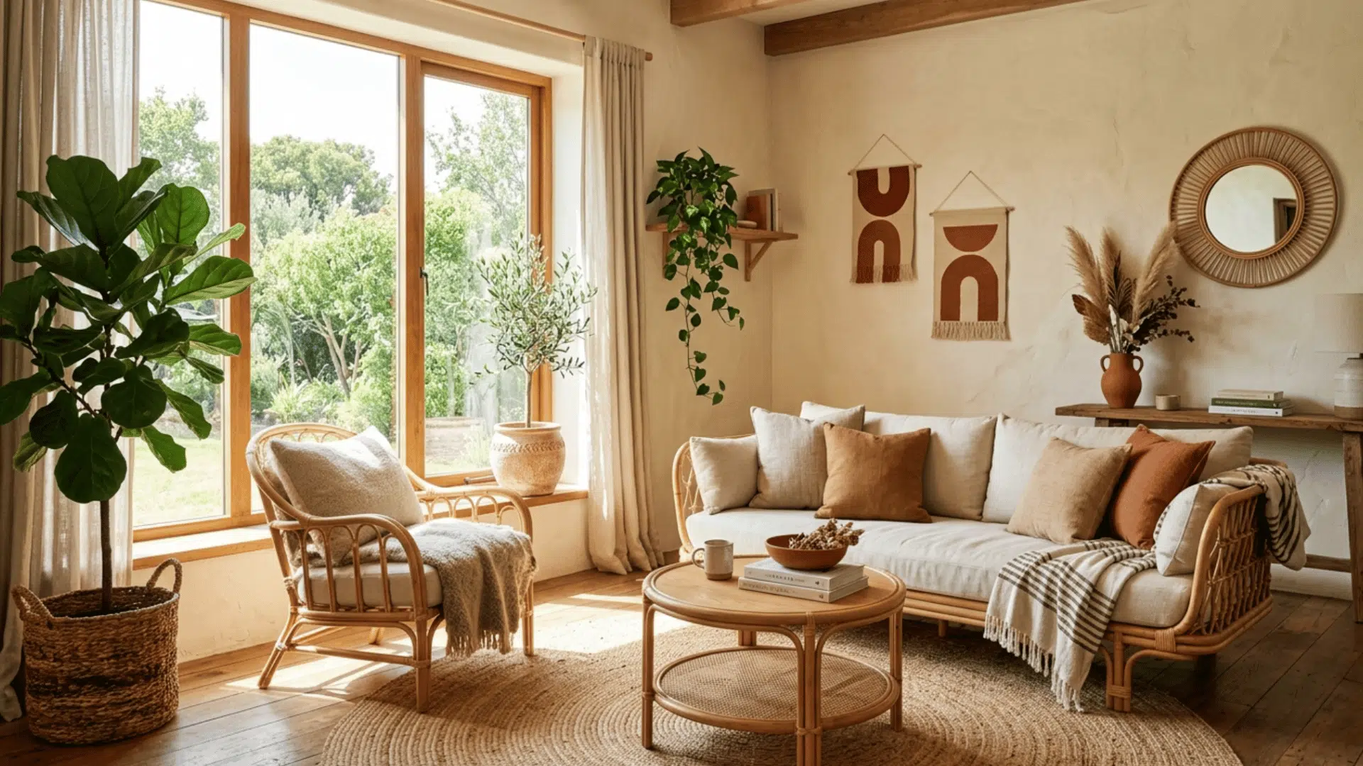
There’s something about terracotta that just feels warm and welcoming from the start. Paired with cream walls and natural textures like rattan and jute, this room color scheme brings a relaxed, sun-soaked quality to any living space.
It works especially well in rooms with good natural light. Add trailing plants and some worn leather, and the whole space takes on a casual, Mediterranean quality that feels easy and unpretentious.
8. Soft Blue & White with Sandy Accents
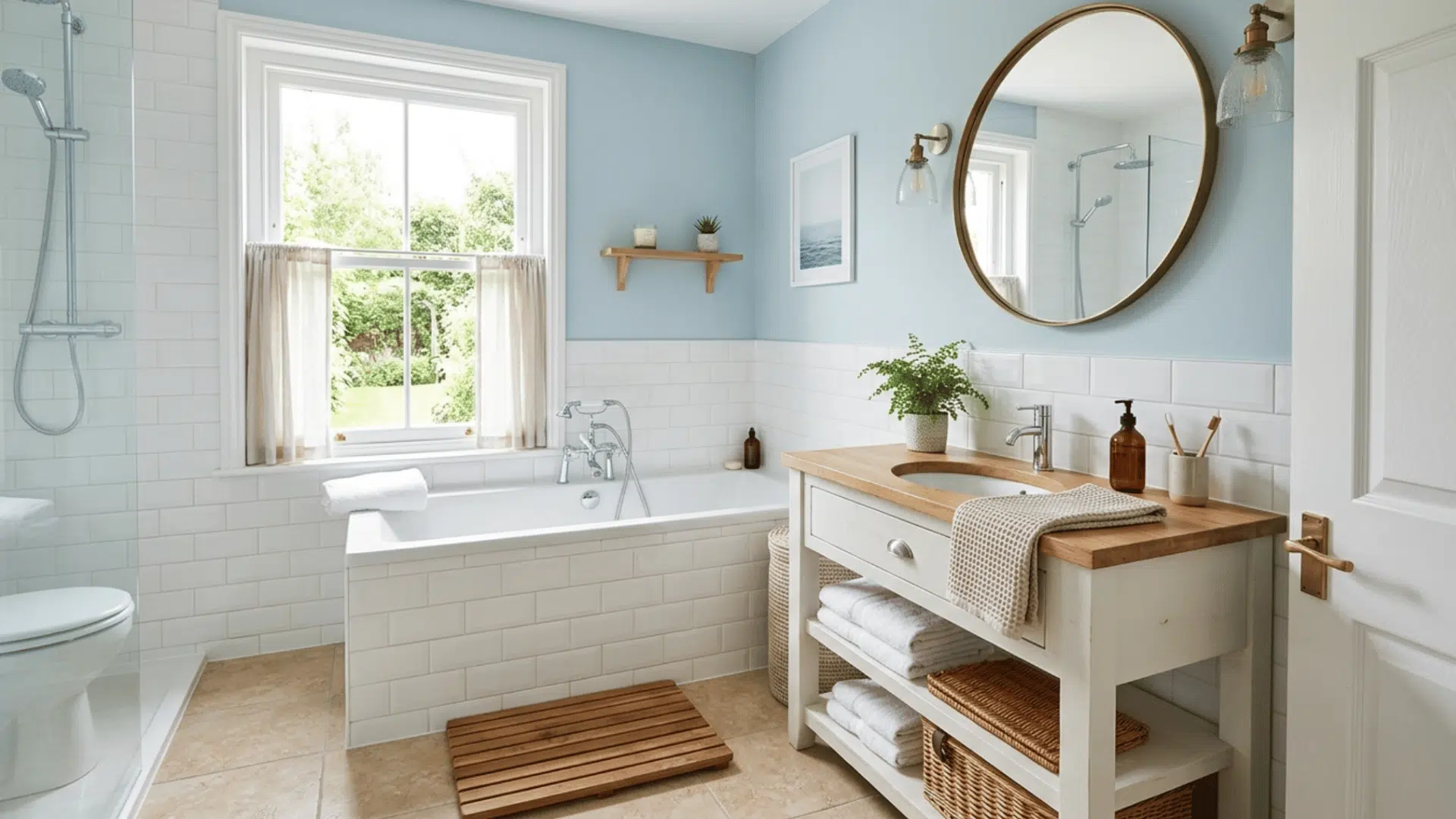
Pale blue paired with white is one of the most reliable color schemes for bathroom interiors. It’s clean, calm, and has a subtle coastal feel without being too themed.
The sandy accents, think warm towels, a wooden bath mat, or natural stone accessories, stop it from feeling too cold or stark.
This palette works in both small and large bathrooms and tends to feel fresh for a long time without dating quickly.
9. Deep Chocolate & Rust
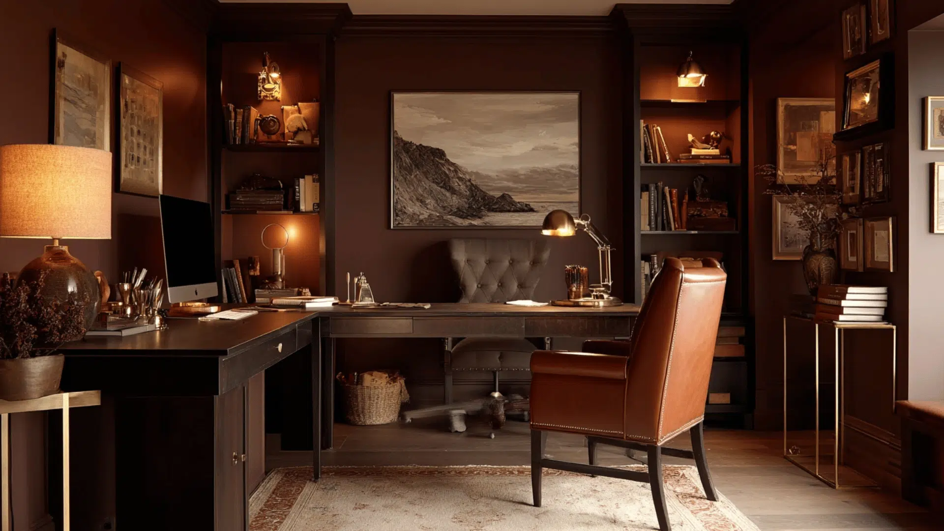
Dark chocolate walls might sound intense for a workspace, but they actually create a focused, grounded atmosphere that’s great for concentration.
The rust and warm cream accents keep the room color scheme from feeling too closed in. Add good task lighting and some greenery, and it becomes a space that feels serious but not sterile.
If you spend long hours at a desk, a palette like this can make the room feel much more comfortable.
10. Soft Olive & Warm White
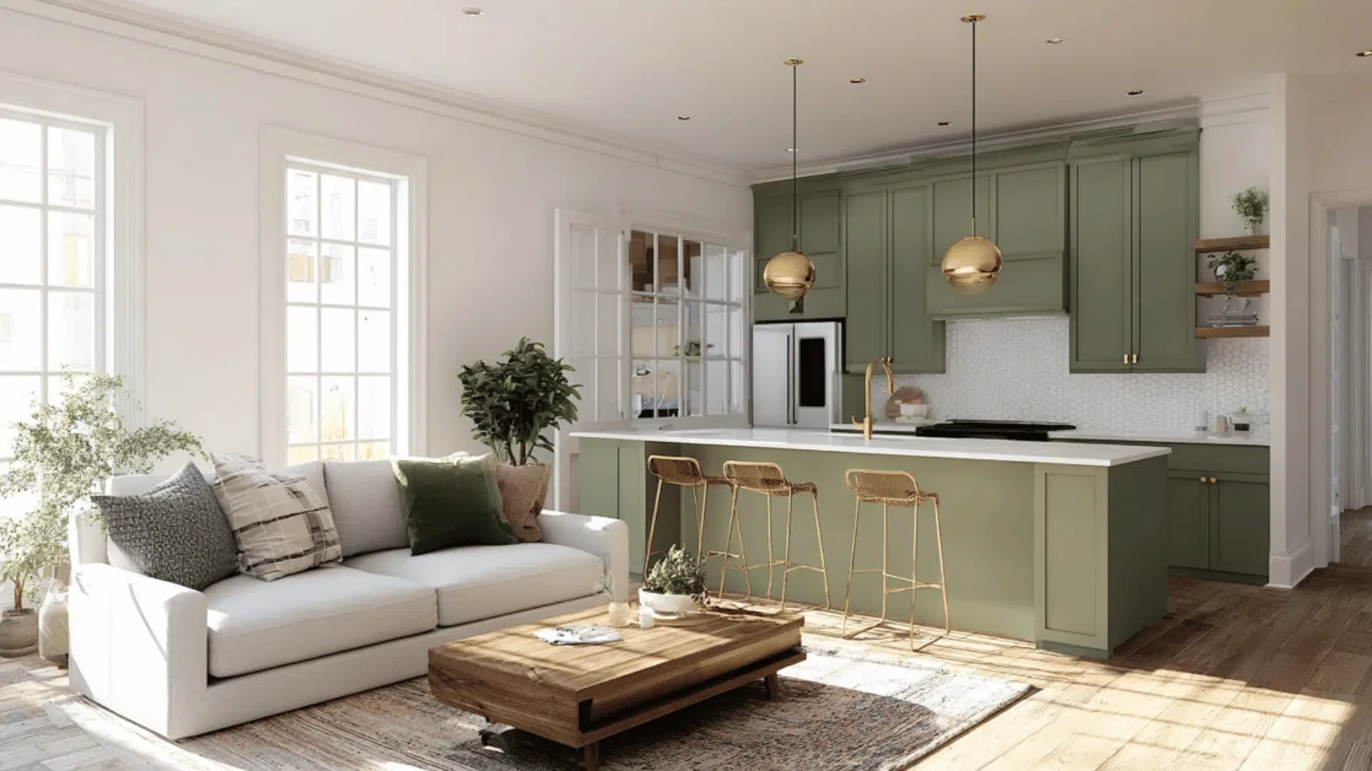
Muted olive green is one of those colors that works quietly in the background without demanding too much attention. Against warm white walls, this interior design color scheme feels sophisticated and grounded.
Natural wood floors and brass fixtures are the perfect finishing touch. It’s not as popular as sage yet, which means it still feels a little more individual.
A great option if you want something earthy but a bit more unexpected.
11. Jewel Purple & Marigold
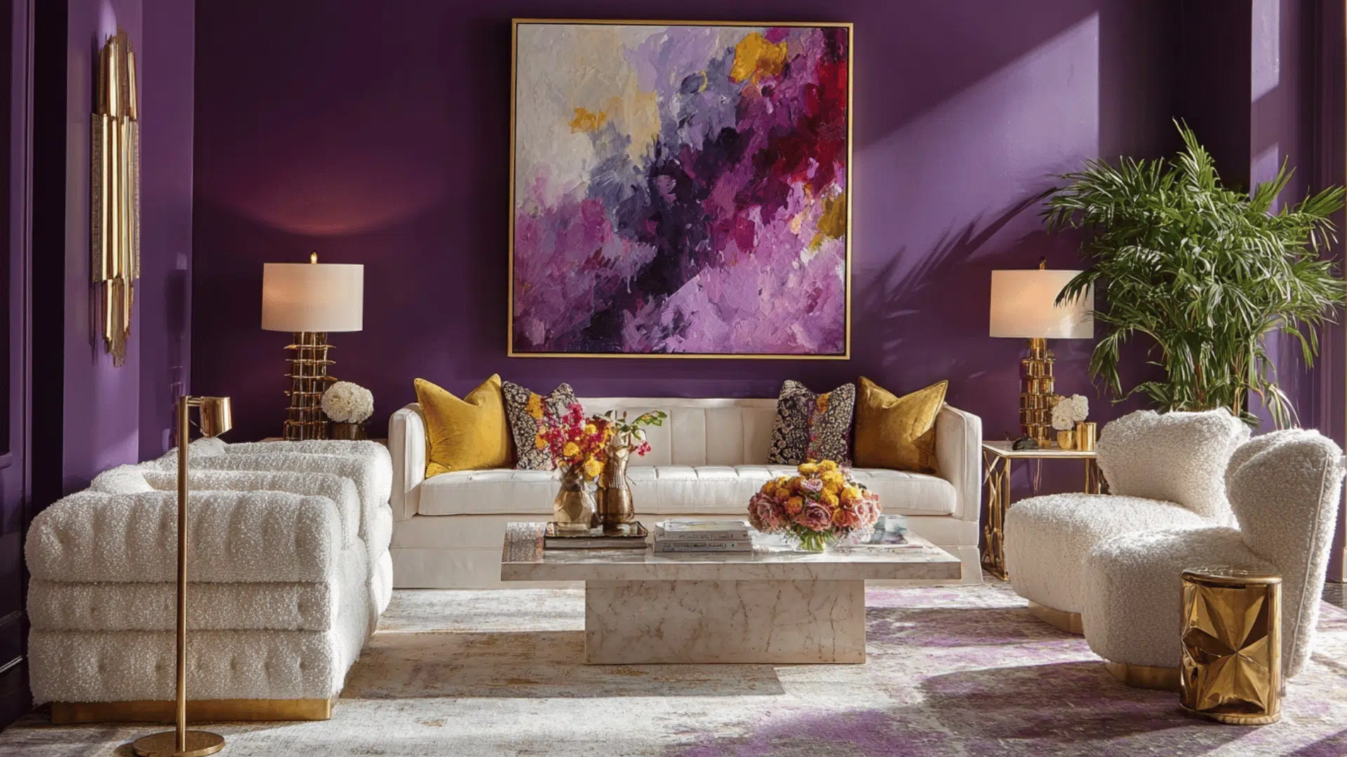
This room color scheme is for those who aren’t afraid of color. Deep amethyst walls against marigold yellow accents are a bold, complementary pairing that brings a lot of energy and personality to a living room.
Off-white soft furnishings give your eyes somewhere to rest. It takes confidence to commit to, but when it works, it really works.
Keep the furniture simple and let the color do all the talking in the space.
12. Scandinavian White & Black
Simple, clean, and enduring. This interior design color scheme uses pure white or warm off-white as the base with black frames, fixtures, or furniture as the only real contrast.
It works in any room and suits almost any architectural style. The trick is making sure the white has a warm undertone rather than a cool one, which can feel clinical.
Add natural wood and soft textiles to bring in warmth and stop the space from feeling too flat.
13. Earthy Green & Burnt Sienna
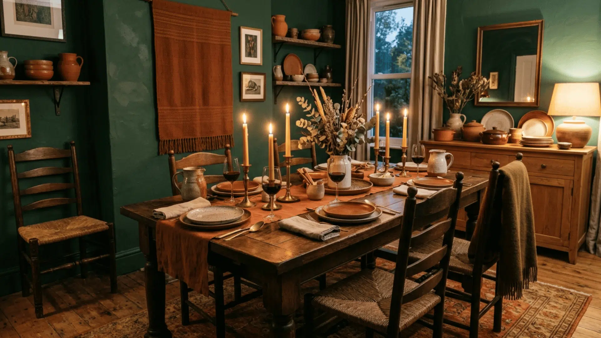
Green and burnt sienna sit opposite each other on the color wheel, making this a naturally bold room color scheme. But because both tones are earthy rather than bright, the contrast feels rich rather than jarring.
It’s a great pairing for a dining room where you want the space to feel warm, grounded, and a little special.
Deep green walls, rust-toned ceramics, and candles on the table create an atmosphere that’s genuinely hard to beat.
14. Midnight Teal & Deep Blue
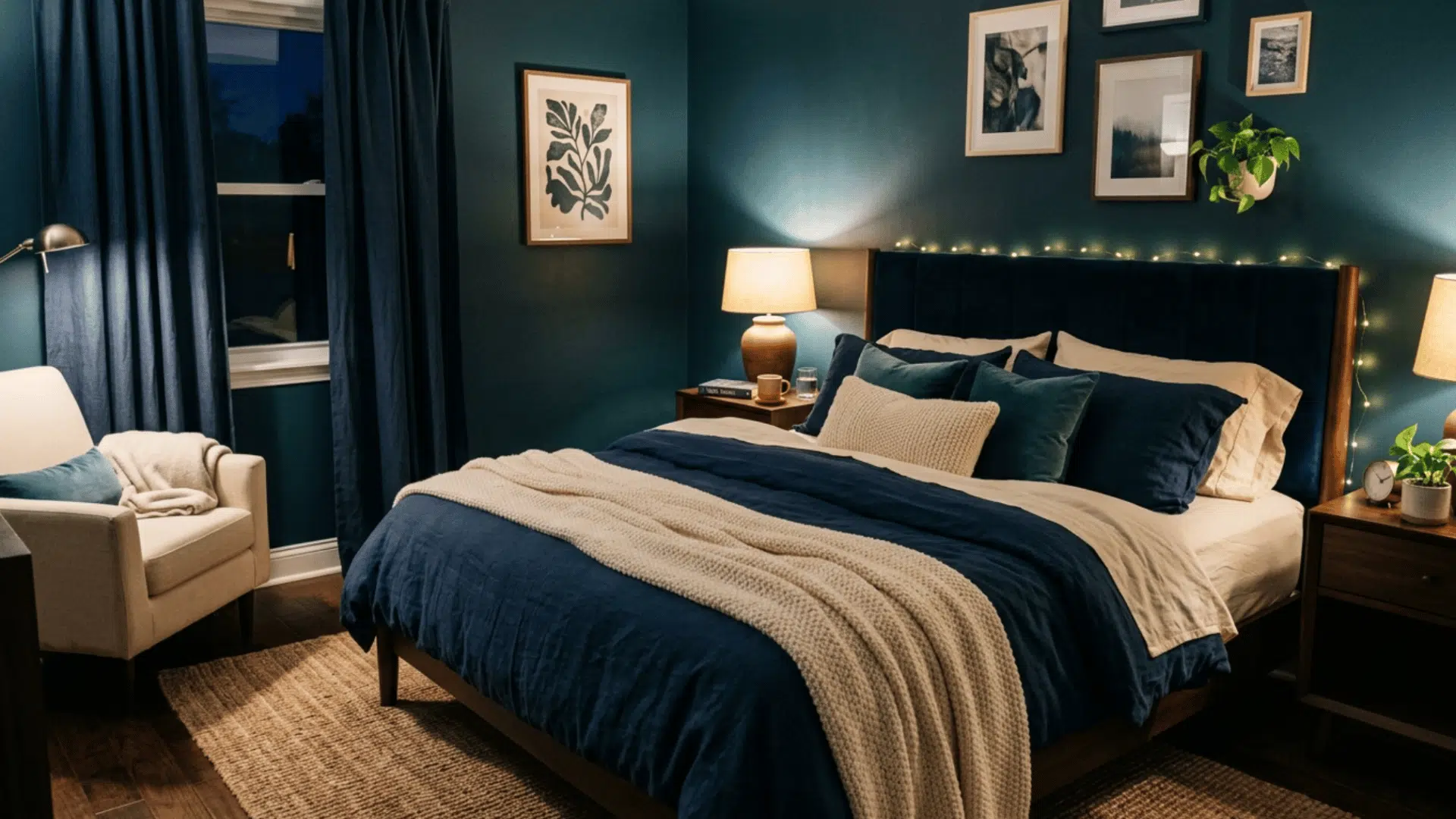
Two analogous cool tones layered together create a bedroom that feels like a proper retreat. This room’s color scheme is moody without being oppressive, especially when paired with cream linen bedding and warm lighting.
Midnight teal on the walls with deep blue in cushions or throws gives the space depth and interest. It’s a good option if you find all-dark rooms too heavy but still want something with real atmosphere and a sense of calm.
15. Pastel Pink & Mint
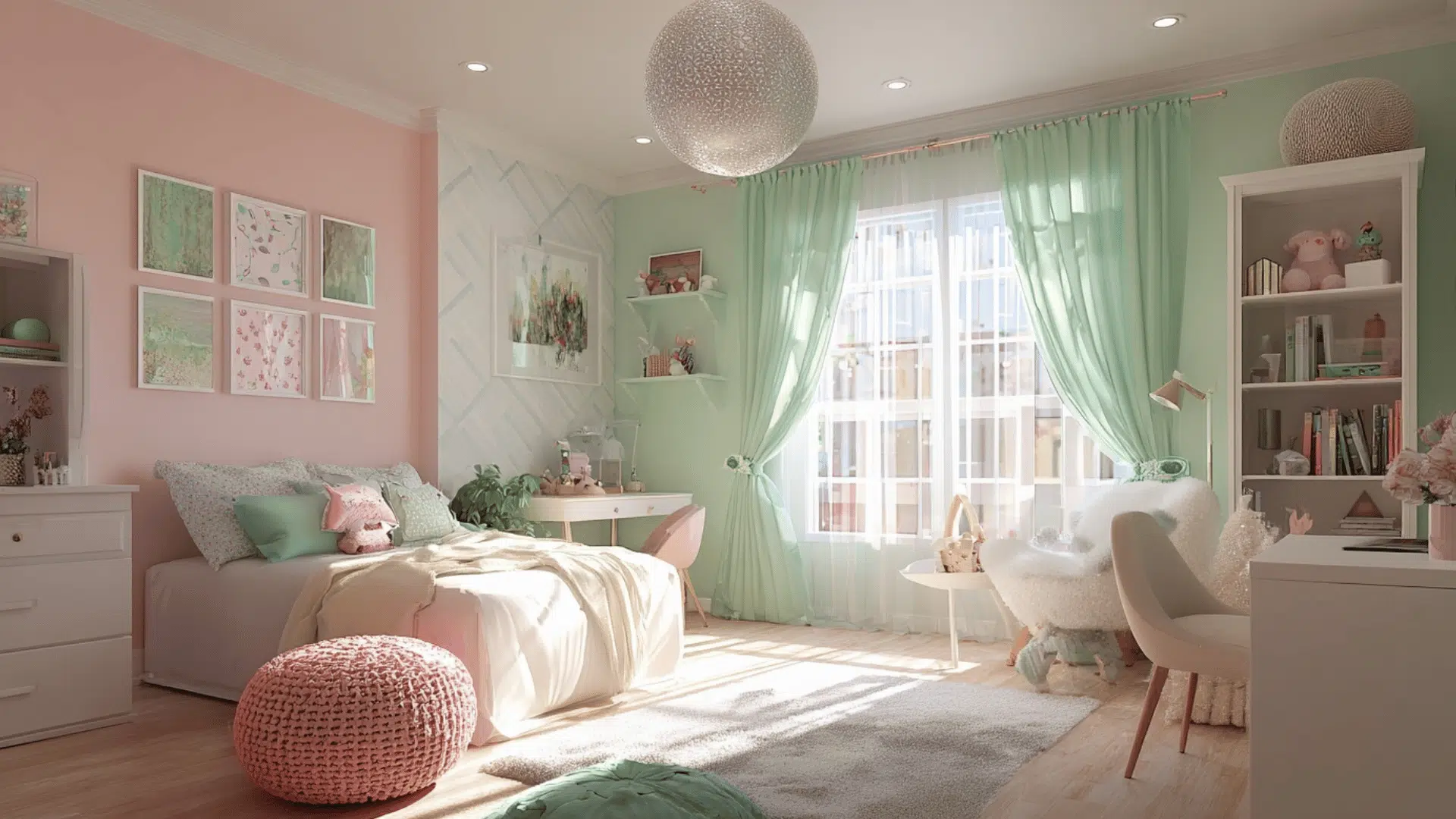
Soft blush and mint against a bright white base is a cheerful interior design color scheme that works well for kids’ rooms and nurseries.
It feels playful without being too loud and calm enough that it won’t make sleeping harder. The white base keeps it feeling fresh and stops the pastels from getting too sugary.
As the child grows, you can swap out accessories while keeping the walls, making this palette a practical long-term choice too.
16. Burnt Orange & Deep Navy
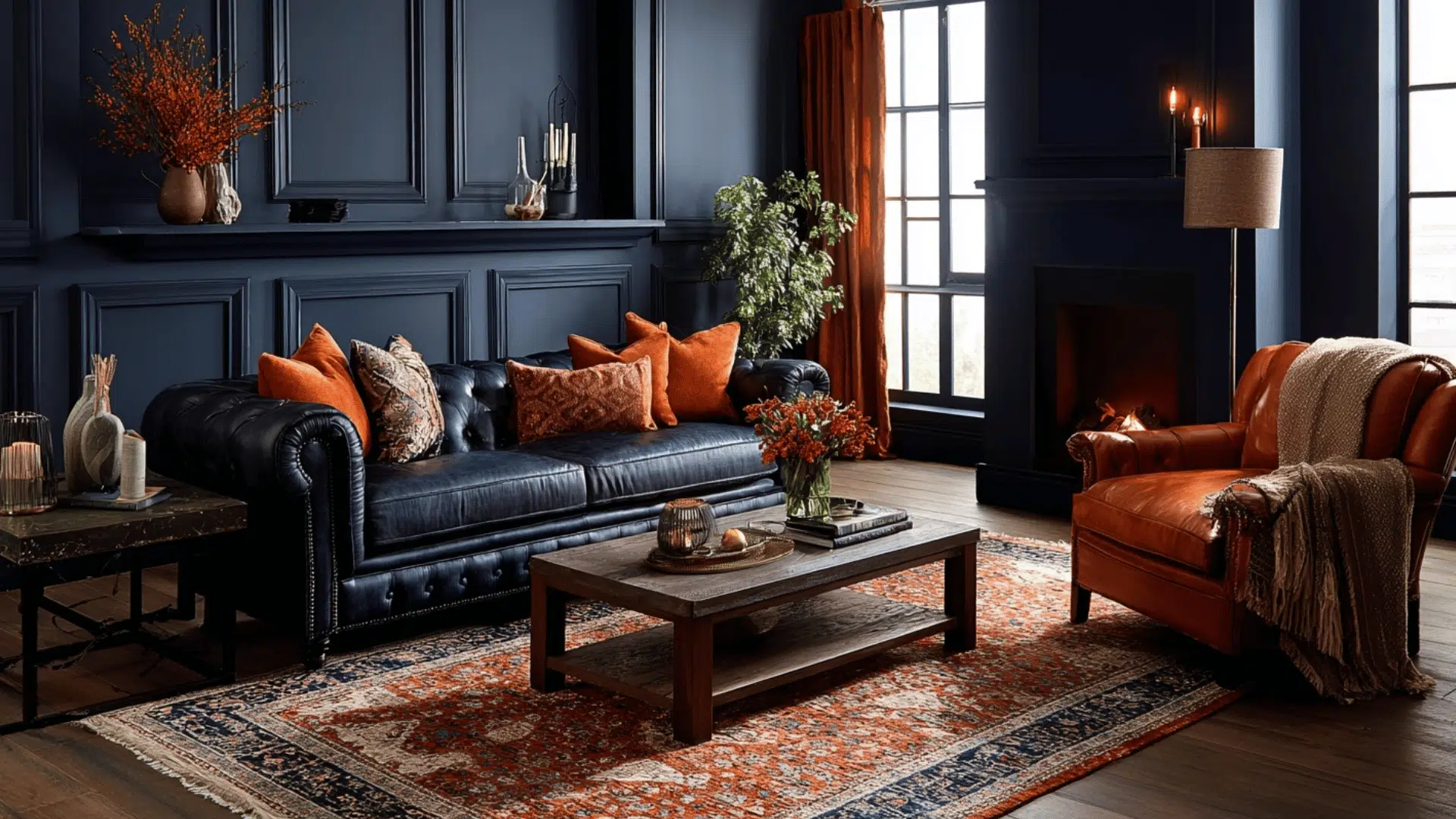
A bold, complementary interior design color scheme that balances warm and cool tones in a way that feels energetic but not chaotic.
Deep navy on the walls paired with burnt orange cushions, throws, or a statement armchair creates a rich, full-of-character pairing. Ground it with a neutral rug and warm lighting.
17. Deep Burgundy & Petal Pink
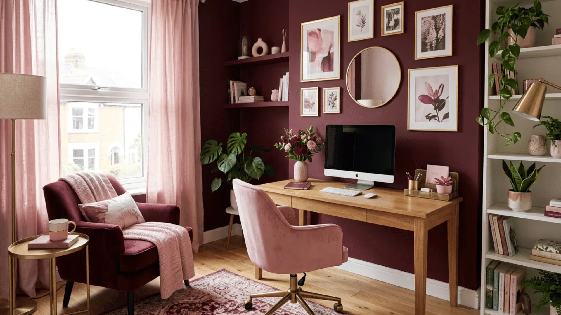
This is a tonal, analogous room color scheme that feels romantic and layered. Burgundy and petal pink sit close enough on the color wheel to feel cohesive, but the contrast between deep and light keeps it from feeling flat.
It would work really well in a bedroom or dining room. It’s also different enough from anything already in the list, so it would slot in nicely as a replacement.
18. Dark Mahogany & Deep Red
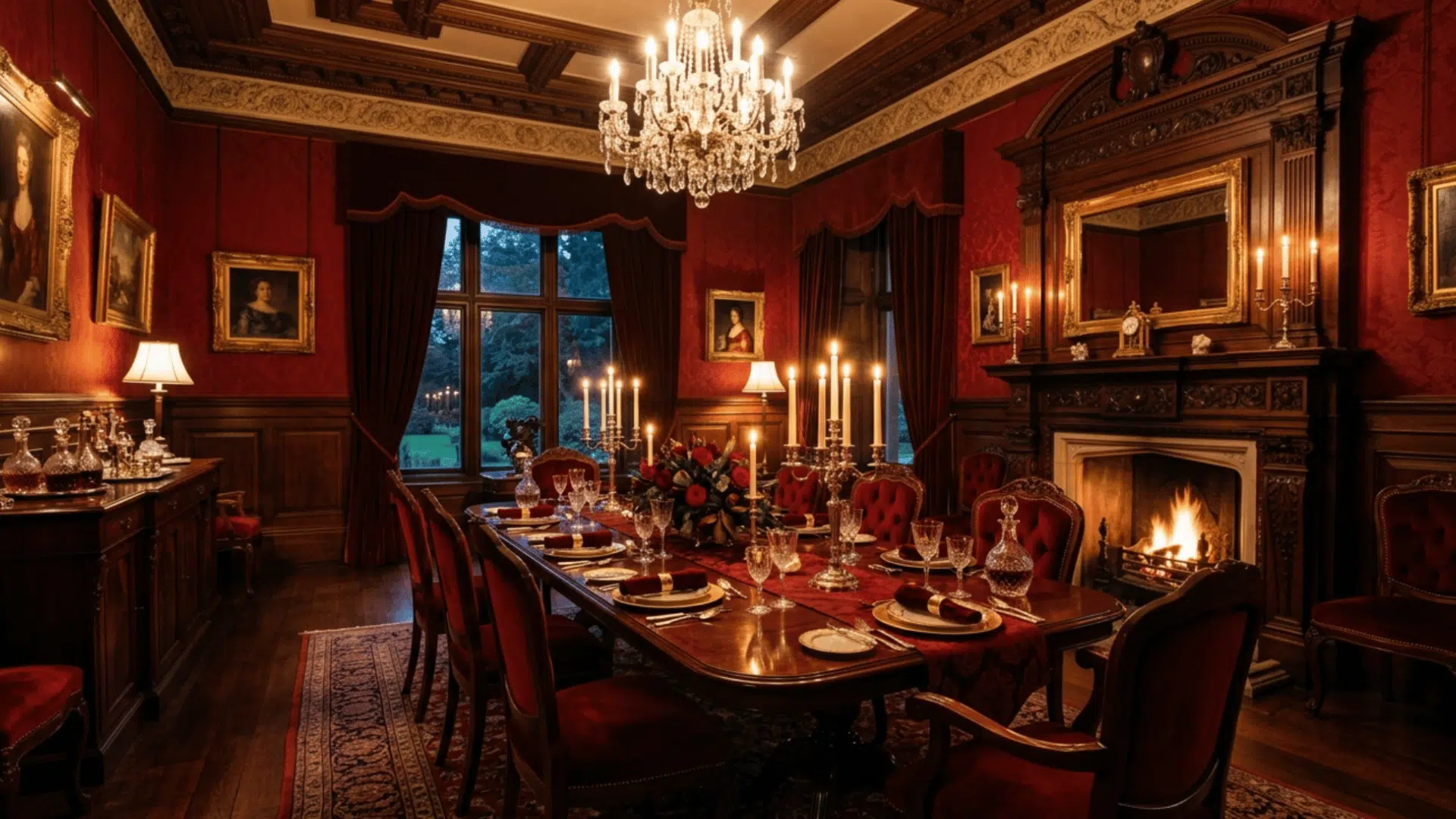
This room color scheme leans fully into old-world richness. Deep red walls, mahogany furniture, and gold candlelight accents create a dining room that feels special every single evening.
It’s a bold choice, but dining rooms can handle drama in a way other rooms sometimes can’t.
Keep the lighting warm and low, add some linen napkins and good tableware, and the whole space takes on a quality that makes even a regular weeknight dinner feel like a proper occasion.
19. Brown & Pale Blue
This is an interesting complementary-adjacent pairing that doesn’t often appear in interior design color schemes, which makes it feel fresh and a little unexpected.
The warmth of deep brown against the coolness of pale blue creates a natural tension that actually works really well in living rooms and bedrooms. It has an earthy, calm quality.
20. Sunshine Yellow & Honey Gold
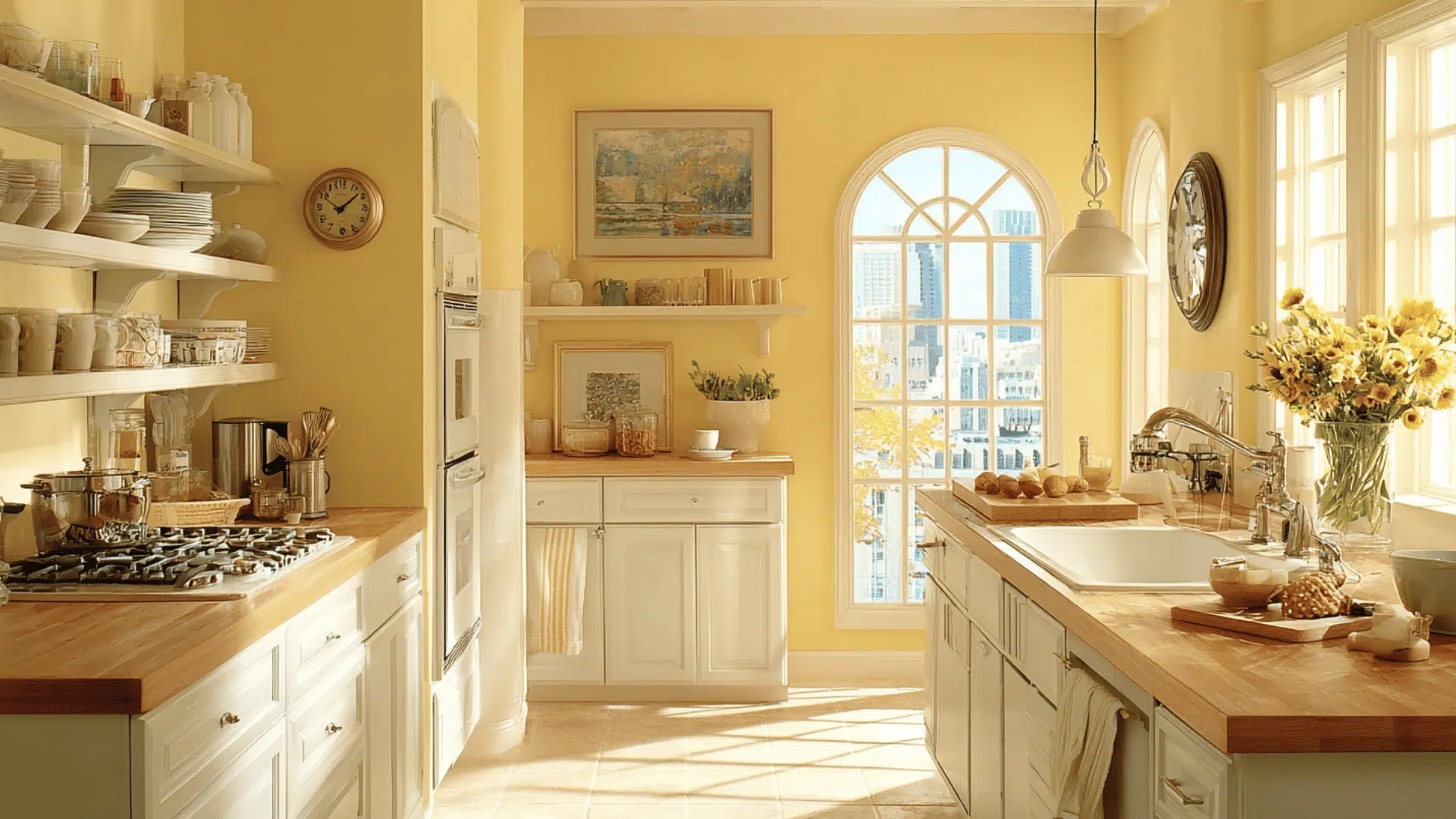
Pale lemon walls with butter yellow accents and warm honey gold hardware are a room color scheme that brings a lot of joy into a kitchen.
Yellow is genuinely appetite-stimulating and works well in spaces where you want energy and warmth rather than calm. It pairs well with white units and natural wood worktops.
Room Color Schemes by Room Type
Here’s a simplified table to help you quickly scan room color schemes based on each space. Each row has a clear direction along with matching interior design color schemes.
| Room Type | Color Scheme Ideas | Best Color Combinations | Why It Works |
|---|---|---|---|
| Living Room | Warm neutrals, navy + white, earthy terracotta | Beige + cream, navy + white, terracotta + off-white | Creates a welcoming space with both calm and bold options |
| Bedroom | Soft blues, sage greens, blush pink | Light blue + white, sage + beige, blush + gray | Helps build a relaxing and restful sleep environment |
| Kitchen | Bright whites, olive greens, two-tone cabinets | White + wood, olive + beige, white + navy | Keeps the space fresh, clean, and visually interesting |
| Bathroom | Spa aquas, marble white, moody dark tones | Aqua + white, white + gray, charcoal + black | Gives a clean, fresh feel or a bold and cozy look |
| Home Office | Focused blues, energizing greens, calm greige | Navy + white, green + wood, greige + cream | Supports focus while keeping the space comfortable |
Common Mistakes to Avoid
Even the best interior design color schemes can fall apart when these basics get overlooked.
- Picking paint before buying furniture: Your sofa, rug, and curtains should be your first priority. Paint is the easiest thing to match at the end.
- Ignoring undertones: That “white” wall might actually be pulling pink or yellow. Always check undertones against your other surfaces.
- Too many accent colors: More than three colors in a room start to feel busy and pull the scheme apart.
- Forgetting the ceiling: Ceilings are part of the room. A flat, brilliant white on a warm-toned room rarely looks right.
- Skipping paint samples: A color on a small chip looks completely different on a full wall in your specific lighting.
- Overlooking natural light: A color that looks perfect in the store can read completely differently in a north or south-facing room.
Final Thoughts
Color is one of the few things in a home you can change without knocking down a wall. And yet most people put it off, worried they’ll get it wrong.
The truth is, there’s no perfect choice, only the one that feels right for your space and the way you want to live in it.
Start small if you need to. A single accent wall, a new palette in the bathroom, and one bold choice in the kitchen. See how it feels. Go from there.
The right room color scheme is already out there for you. You just have to pick up the brush.

With a Master in Architectural Studies from University of Pennysylvania, Marwa Haydar has pioneered living spaces since 2005. Her expertise, initially honed in a prestigious architectural firm, is evident in her approach to creating environments. Marwa became part of our team in 2019 and has since been a driving force in our home improvement section, known for her practical yet stylish solutions. She’s been spearheading our design workshops since then, infusing her passion for teaching into her work. In her leisure time, Marwa enjoys exploring historic architecture and is an enthusiastic pottery hobbyist, further enriching her understanding of form and texture.