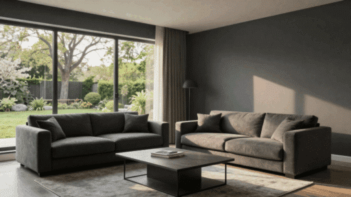
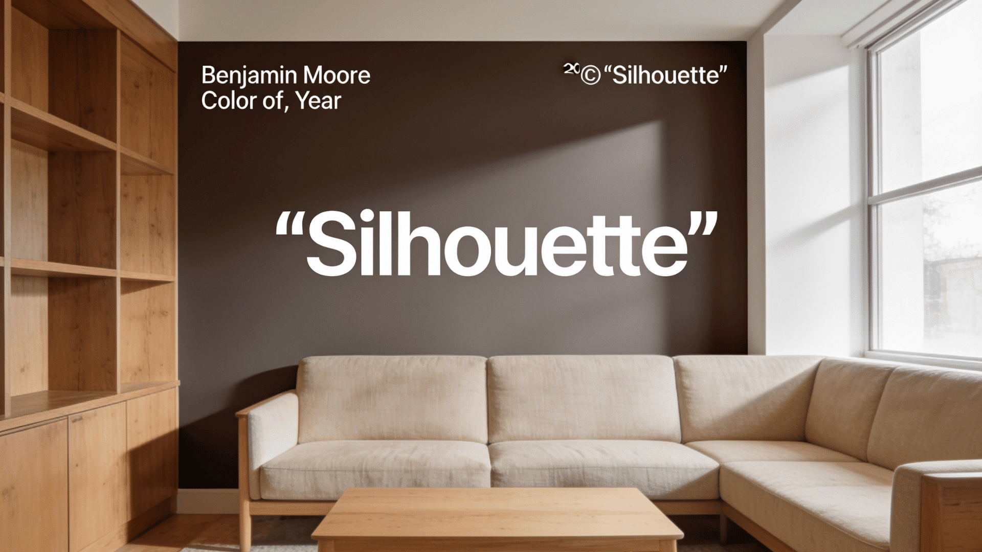

Benjamin Moore Color of the Year 2026 is Silhouette AF-655, a deep brown-gray shade with espresso warmth and charcoal depth.
It feels richer than beige, softer than black, and warmer than many dark grays.
That is why Silhouette feels like a bold shift from the pale neutrals many homes have used for years. It is not loud, but it does make a room feel more grounded, finished, and grown-up.
The best part is its range. It can look cozy in soft light, sharper beside white trim, and more intense in cooler rooms. Still, this is not a shade to choose from one online swatch.
In my experience, dark neutrals work best when planned with the entire room in mind, including lighting, flooring, trim, and furniture, and that’s exactly what this blog is about
What Is Benjamin Moore’s Color Of The Year 2026?
Benjamin Moore Color of the Year 2026 is Silhouette AF-655.
It’s a deep brown-gray neutral with espresso, burnt umber, and charcoal notes. It is the kind of dark shade that feels rich without going fully black.
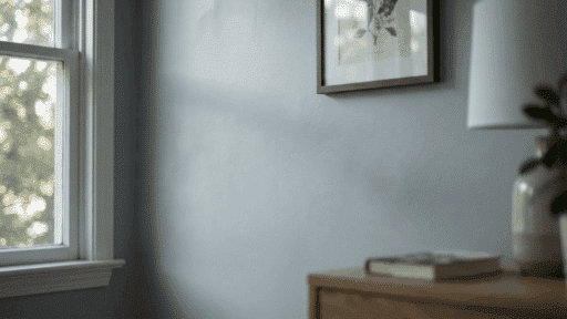
Silhouette can look warm and cozy in soft lighting, but more charcoal and intense in cooler rooms. That is what makes it useful, but also why it should be tested before painting a full space.
With an LRV of 10.18, it reflects very little light, so it works best where you want depth, contrast, and mood. Think doors, built-ins, bedrooms, dining rooms, offices, accent walls, or rooms with warm lighting and lighter decor.
| Detail | Answer |
|---|---|
| Color Name | Silhouette |
| Code | AF-655 |
| Brand | Benjamin Moore |
| Year | 2026 |
| Color Family | Deep brown-gray neutral |
| LRV | 10.18 |
| Best For | Doors, walls, offices, bedrooms, dining rooms, built-ins |
Benjamin Moore’s official Color Trends 2026 palette also includes
- Raindance 1572
- Swiss Coffee OC-45
- First Crush CSP-310
- Batik AF-610
- Narragansett Green HC-157
- Southwest Pottery 048
- Sherwood Tan 1054.
Quick Verdict: Silhouette AF-655 is best for people who want a dark neutral with warmth, depth, and a more finished look. It is not the best pick for rooms that need to feel bright and open.
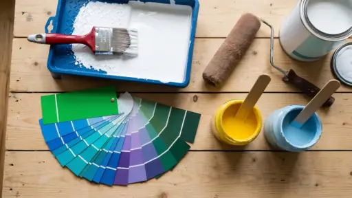
Before painting a full wall, test Silhouette on paint sample boards so you can move the color around the room.
What does Silhouette AF-655 Actually Look Like?
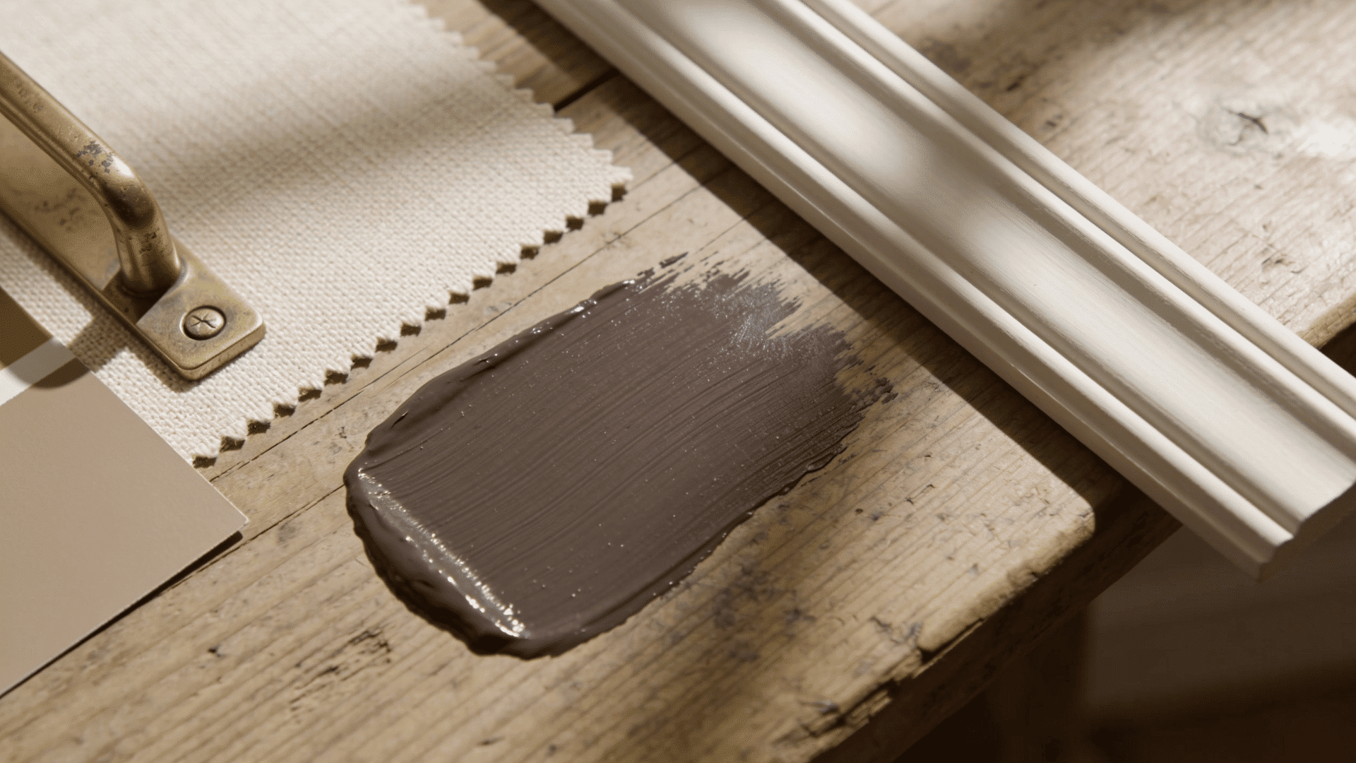
Silhouette AF-655 is not a proper flat brown, a cold gray, or a true black. It sits somewhere between deep espresso, soft charcoal, and muted brown-gray.
And that mix is what makes it feel richer than a basic dark neutral. In one room, it may look warm and have a coffee-like color. In another, it may feel smokier and more intense.
The final look depends on natural light, artificial lighting, trim color, flooring, and nearby furniture.
That is why I would suggest that Silhouette is a color you need and that you should definitely see in your own room before making a final decision.
Is Silhouette Brown, Gray, Or Black?
Silhouette is best described as a deep brown-gray neutral. It is warmer than black, softer than charcoal, and deeper than taupe.
- In warm light, it can look more espresso brown.
- In cool light, it can lean more charcoal gray.
- Warm white trim feels softer and more classic.
- Stark white, it may look sharper and more intense.
How Light Changes Silhouette
Lighting has a big effect on Silhouette because it has a low LRV of 10.18. LRV means Light Reflectance Value, or how much light a paint color reflects.
Since Silhouette reflects very little light, it can look deeper as the room gets darker.
| Lighting | How Silhouette May Look |
|---|---|
| Warm light | More espresso brown |
| Cool light | More charcoal gray |
| Low light | Almost black |
| Natural daylight | Softer brown-gray |
| Lamplight | Cozy and rich |
I would never choose Silhouette from an online swatch alone because dark colors change a lot once they are on real walls. Test two coats on more than one wall, then check it in daylight, evening light, and lamplight.
If the shade feels too cold at night, switch to warm white LED bulbs before changing the paint color.
Why Silhouette AF-655 Fits 2026 Interiors
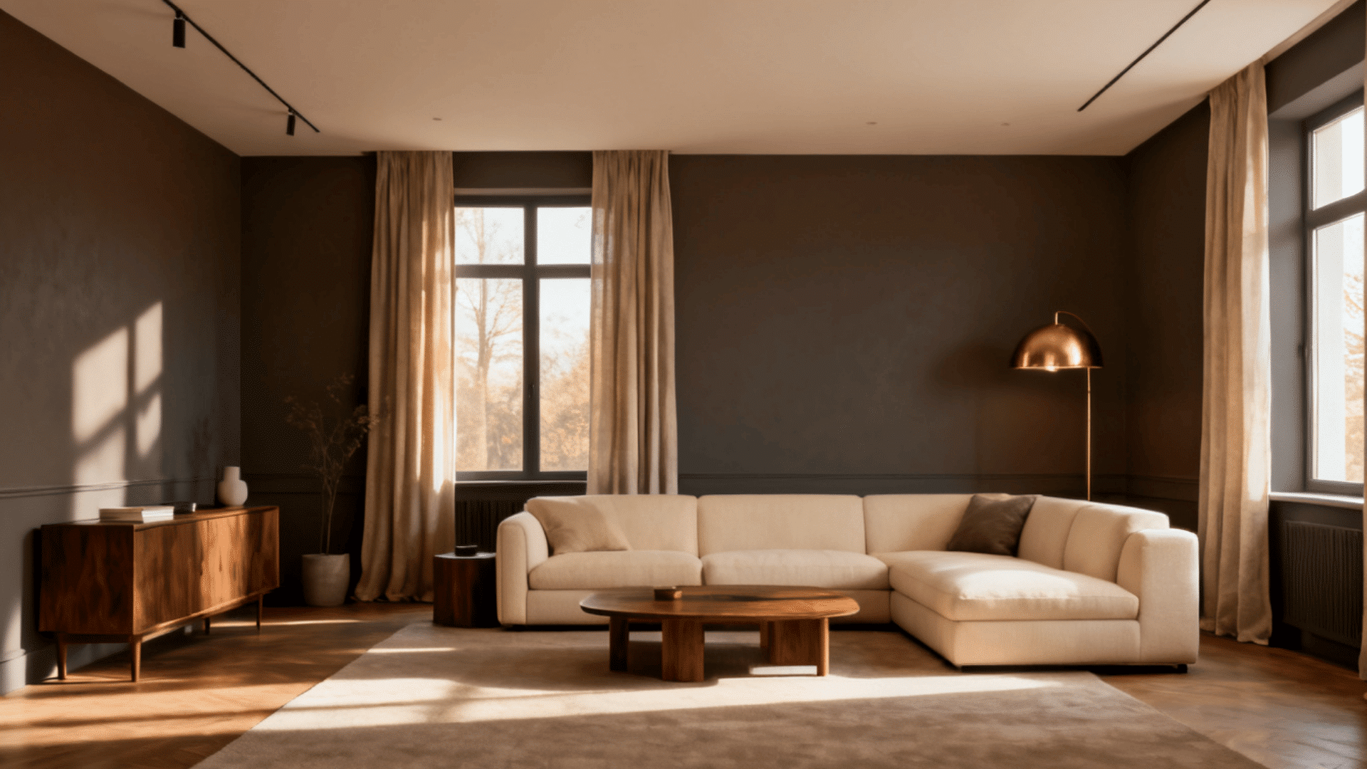
From what I have observed, Silhouette AF-655 makes sense as Benjamin Moore’s Color of the Year 2026 because interiors are moving toward warmer, deeper neutrals.
Benjamin Moore connects Silhouette with classic suiting and a well-dressed look. That idea fits the color well. It gives walls, doors, trim, cabinets, and built-ins a cleaner, more structured feel.
| Why It Was Chosen | What It Means For Your Home |
|---|---|
| Warmer dark neutrals are back | Rooms feel richer without using bright colors |
| It has espresso and charcoal notes | The shade feels warm but still sharp |
| It works like a neutral | Easier to pair with wood, cream, brass, and stone |
| It has a classic fashion link | Gives rooms a more finished, dressed look |
| It anchors the 2026 palette | Works with lighter, earthy, and moodier shades |
Is Silhouette AF-655 A Good Color For Your Home?
Silhouette AF-655 is a good color for your home if you want a dark neutral that feels warm, calm, and more grown-up than plain gray or beige.
- Since Silhouette has a low LRV, it needs the right lighting, trim, furniture, and textures around it.
- I would treat Silhouette as a statement neutral.
- It is strong enough to change the room, but still easy to pair with cream, tan, walnut, brass, stone, linen, leather, and warm white paint.
- Use Silhouette if you want the room to feel warm, cozy, grounded, modern, and a little more striking.
- It works well when the space already has soft lighting, natural materials, and at least one lighter surface.
- Think twice if your room has very little natural light, cool white bulbs, too much black furniture, low ceilings, or flooring with strong orange or red tones. In those spaces, Silhouette may feel heavier than expected.
My Take: Silhouette is a strong choice if you want mood, contrast, and warmth. It is not the best pick if your main goal is to make a room feel bright, open, or airy.
Best Rooms To Use Benjamin Moore Silhouette AF-655
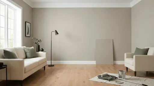
Silhouette can work in many parts of the home, but some spaces handle it better than others. If you are unsure, start with a door, a fireplace wall, a built-in, or a home office before painting the entire living room.
| Room | Best Use | Pair With | Risk Level |
|---|---|---|---|
| Bedroom | Bed wall or all walls | Oatmeal bedding, wood, warm lamps | Low |
| Home Office | Walls, shelves, or built-ins | Leather, walnut, framed art | Low |
| Dining Room | Full room or accent wall | Dark wood, candles, cream chairs | Medium |
| Living Room | Fireplace wall or media wall | Cream sofa, pale rug, brass | Medium |
| Reading Room | Bookcase wall or full room | Books, floor lamps, textured rugs | Low |
| Entryway | Front door, stair rail, or trim | Warm white, wood, simple hardware | Low |
1. Bedroom
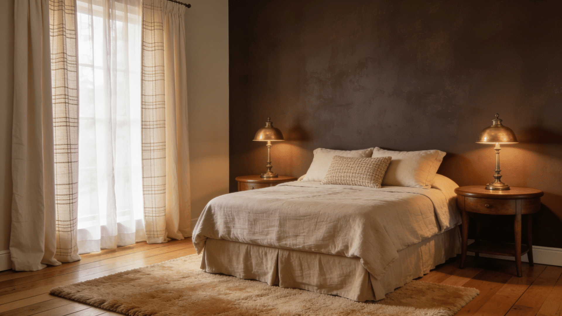
Silhouette works well in bedrooms because darker colors often suit spaces meant for rest.
Use it behind the bed if you want a soft feature wall without making the whole room feel too dark.
If the bedroom has natural light, warm lamps, pale bedding, or wood furniture, you can also use it on every wall for a cozy, wrapped feel.
In a bedroom, pair the dark wall with an oatmeal bedding set to keep the space soft and balanced.
2. Home office or reading room:
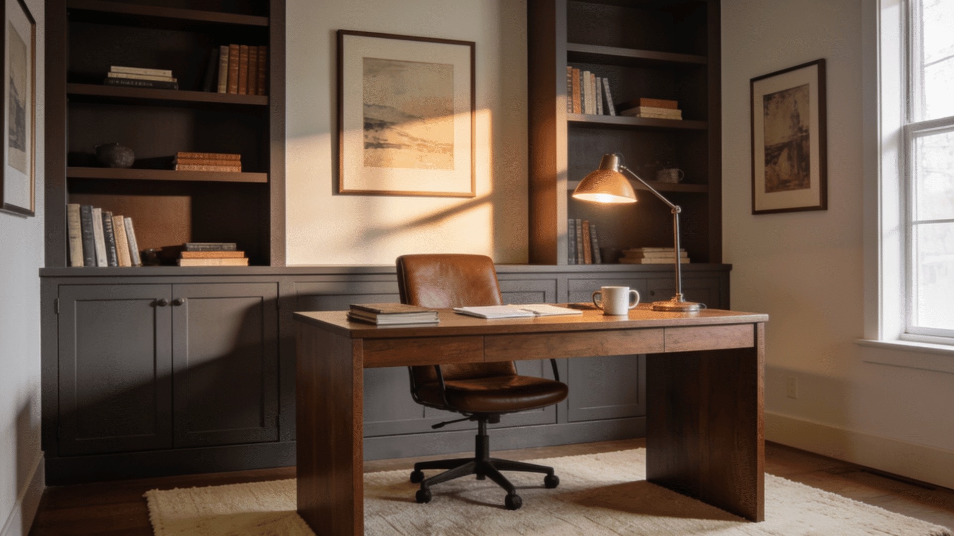
Silhouette is one of the easier dark neutrals to use in a home office or reading room because these spaces often feel better with depth.
It pairs well with shelves, desks, books, leather chairs, framed art, and warm task lighting. Keep the ceiling, rug, or curtains lighter so the space feels more focused rather than closed in.
A brass desk lamp works well in a home office because it adds warm light against the darker wall color.
3. Dining room:
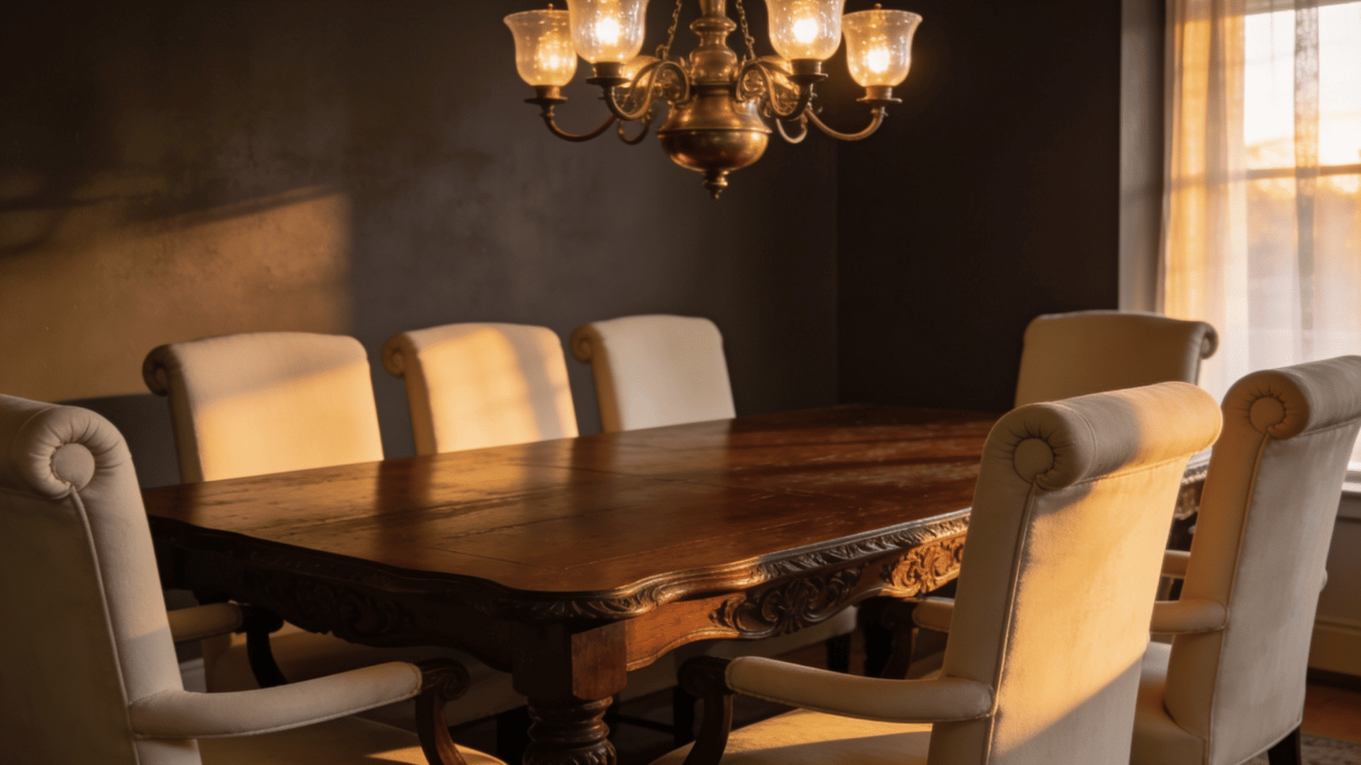
Silhouette can look especially good in a dining room because the color becomes richer in evening light.
Candlelight, warm bulbs, dark wood, cream chairs, and brass accents can make the space feel finished without looking too formal.
If the room is small, start with one wall before painting every surface in the same shade.
4. Living room:
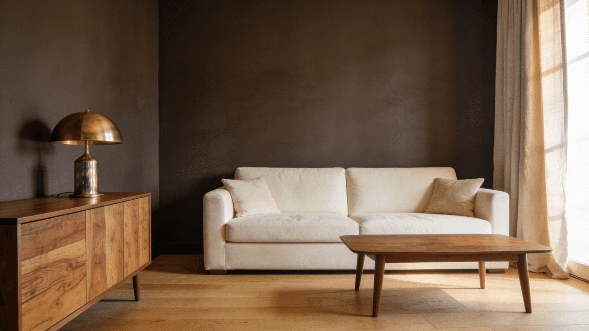
Silhouette works best in a living room when it is used with balance. Try it on a fireplace wall, media wall, or built-in shelving if you want a strong focal point.
If you use it on every wall, keep the sofa, rug, curtains, artwork, or ceiling lighter so the room does not feel too heavy during the day.
In a living room, a cream area rug can stop Silhouette from making the space feel too heavy.
For an entryway or door, Silhouette is a smart starting point. It gives you the depth of the color without the commitment of a full room.
How to Pair And Decorate with Silhouette AF-655
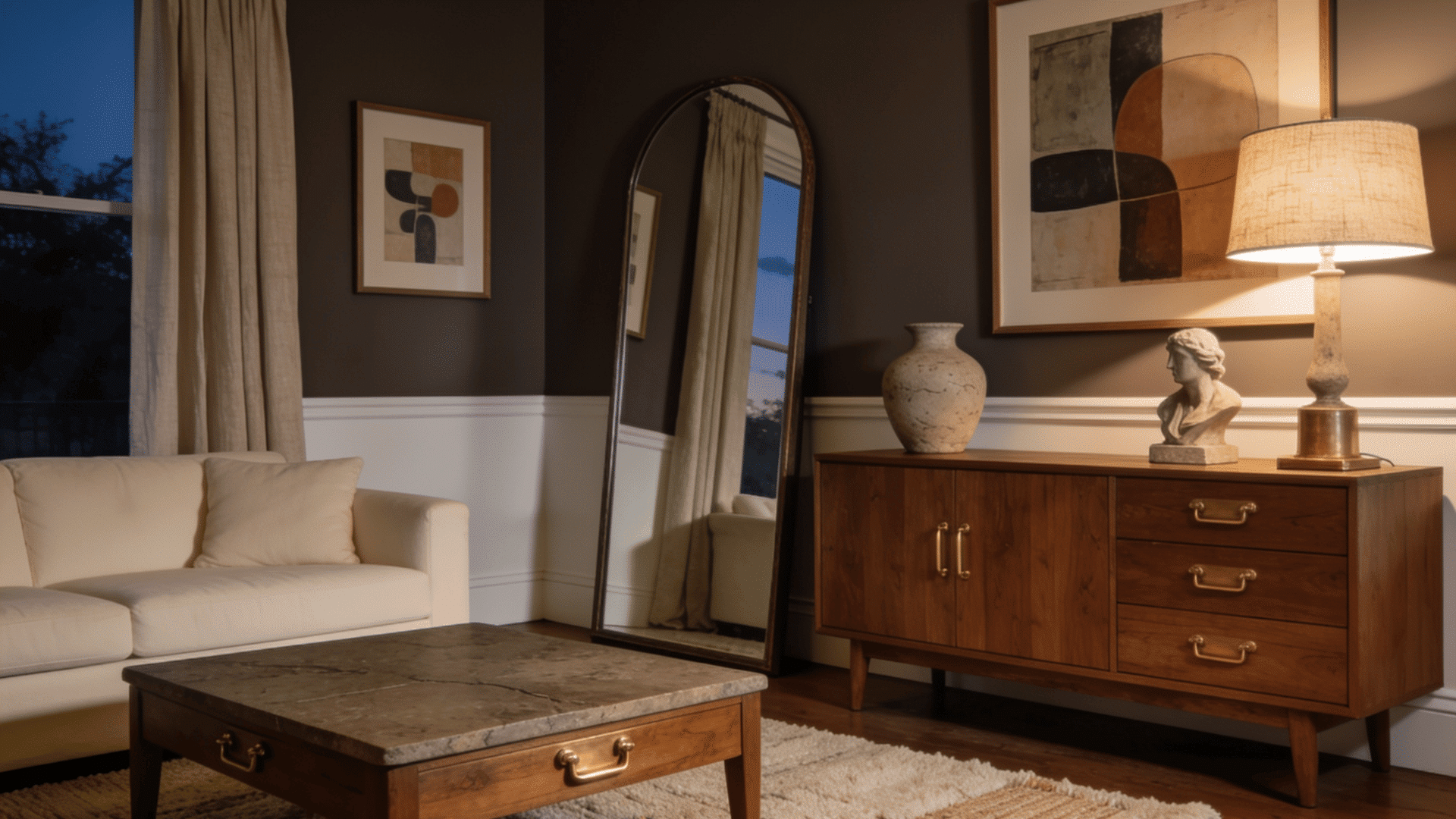
Silhouette AF-655 is deep, so the rest of the room needs balance. The best way to use it is to give it contrast, warm lighting, and enough texture.
My simple rule is this: if one large surface is dark, keep at least two large elements lighter. That could be trim, curtains, a rug, bedding, a sofa, or artwork. This keeps the room from feeling too closed in.
- Silhouette looks best when the surrounding pieces add contrast and warmth.
- For trim and ceilings, use warm white, soft cream, or Swiss Coffee because they create a cleaner edge around the dark wall color.
- For furniture, walnut, oak, leather, and cream upholstery help the shade feel warmer.
- Linen, wool, oatmeal, and off-white fabrics soften the darker walls, while brass, bronze, and aged gold add warmth without too much shine.
- Stone, pottery, framed art, mirrors, warm bulbs, table lamps, and wall lights also help break up the depth and bring out the brown notes.
- I would avoid pairing Silhouette with too many cold finishes at once.
- Cool white bulbs, gray floors, black furniture, and bright white trim can make it feel sharper than expected.
Best Colors To Pair With Silhouette AF-655
Silhouette pairs best with colors that either soften it or lean into its darker side. For a safer look, use warm whites, greiges, tans, and soft neutrals. For a richer room, add deep green, clay, muted red, or blue-green accents.
| Pairing | Mood | Best Use |
|---|---|---|
| Silhouette + Swiss Coffee | Soft contrast | Trim, ceilings, doors |
| Silhouette + Pashmina | Warm neutral | Bedrooms, offices, hallways |
| Silhouette + Fossil | Quiet and earthy | Nearby rooms, built-ins |
| Silhouette + Paris Rain | Calm contrast | Hallways, bedrooms |
| Silhouette + Sherwood Tan | Warm and grounded | Living rooms, dining rooms |
| Silhouette + Narragansett Green | Dark and rich | Libraries, powder rooms |
| Silhouette + First Crush | Softer and warmer | Guest rooms, dressing areas |
| Silhouette + Southwest Pottery | Earthy contrast | Art, rugs, tile, decor |
For trim, I would stay with a warm white instead of a stark white. Swiss Coffee is a strong choice because it gives contrast without making the silhouette look too harsh.
Use painter’s tape when testing Silhouette beside trim colors like Swiss Coffee so the contrast is easier to judge.
For accents, choose one main direction.
If you want a calm room, use cream, tan, and wood. If you want a moodier room, use deep green, brass, stone, and warm lamps.
Accent Wall, Full Room, Or Color Drenching?

The safest way to use Silhouette depends on how much light the room gets and how comfortable you are with dark paint. For a first try, start with a smaller surface before painting every wall.
- Accent Wall – This is the safest option for a bedroom, living room, fireplace wall, or media wall. It gives you the depth of Silhouette without making the whole space feel heavy.
- Door or Trim – This works well when you want a smaller update. Try it on an interior door, front door, stair rail, or hallway trim. It adds contrast without changing the whole room.
- Built-Ins – Silhouette looks polished on shelves, cabinets, and fireplace built-ins. I like this option because it makes the room feel more finished while keeping the walls lighter.
- Full Room – Use Silhouette on all walls when the space has natural light, warm lamps, lighter furniture, or pale flooring. Bedrooms, offices, dining rooms, and reading rooms can handle this well.
- Color Drenching – Color drenching means using Silhouette on the walls, trim, ceiling, and doors. I would only use this in a room where a darker mood feels planned, such as a powder room, den, or library.
Best Paint Finish For Silhouette AF-655
The finish can change how Silhouette looks. Matte makes it feel softer. Eggshell makes it more practical. Satin, pearl, and semi-gloss add more shine, so they work better on surfaces that get touched often.
| Surface | Best Finish | Why It Works |
|---|---|---|
| Bedroom Walls | Matte | Soft and calm |
| Office Walls | Matte Or Eggshell | Low glare |
| Living Room Walls | Eggshell | Easier to clean |
| Dining Room Walls | Eggshell | Gentle evening sheen |
| Doors | Semi-Gloss | Stronger and easier to wipe |
| Built-Ins | Satin Or Pearl | Smooth and durable |
| Ceiling | Matte | Less glare |
For large walls, I would choose matte or eggshell. Dark colors can show wall flaws more easily, and softer finishes help hide small marks.
For doors, trim, cabinets, and built-ins, satin, pearl, or semi-gloss makes more sense. These finishes are stronger, but they can show brush marks and dents, so the prep work matters.
Common Mistakes to Avoid With Silhouette AF-655
Silhouette can look beautiful, but it needs the right setup. Most problems occur when the room lacks enough contrast, texture, or warm light.
- Skipping samples: The color may look too dark, so test two coats before painting the full room.
- Using cool white bulbs: Cool lighting can make Silhouette feel flat or cold. Warm bulbs are a better choice.
- Adding too much dark furniture: Too many dark pieces can make the room feel heavy. Add cream, wood, or pale fabric for balance.
- Picking a shiny wall finish: It can show dents and wall flaws. Use matte or eggshell on larger wall areas.
- Ignoring trim color: Without contrast, the walls may feel boxed in. Use warm-white trim to clearly separate the shade.
- Forgetting texture: The room can feel flat without texture. Add linen, wool, leather, or stone.
The biggest mistake is treating Silhouette like a simple gray or brown. It has more depth than that. It needs a full-room plan, even if you only use it on one wall.
Final Take
Silhouette AF-655 is worth using if you want depth, warmth, and a darker neutral that still feels easy to live with. It is not the right color for every room, but it can work beautifully when the lighting, trim, furniture, and textures support it.
I like it most in bedrooms, offices, dining rooms, entryways, doors, and built-ins. It gives these spaces a more grounded and finished look without going fully black.
Before painting a full room, test it on more than one wall and check it at night. That is the step that will tell you if Silhouette feels rich in your space or too heavy.
Which room would you try first: a bedroom, an office, a dining room, or the front door?
Frequently Asked Questions
What Colors Are Similar To Silhouette AF-655?
Similar shades are usually deep brown-gray, espresso, charcoal, or warm black paints. Compare samples side by side because undertones can change fast.
Does Silhouette AF-655 Go With Brass Hardware?
Yes, brass works well with Silhouette because it warms up the dark brown-gray base. It looks especially good on doors, cabinets, and built-ins.
Can Renters Use Silhouette Without Painting Walls?
Yes, renters can use Silhouette through peel-and-stick wallpaper, painted furniture, dark curtains, framed art, bedding, or removable cabinet contact paper.

Alex Guerrero, a graduate with a Fine Arts degree from the Rhode Island School of Design, has been a visionary in the world of color and design for over 15 years. His professional journey began in the heart of the fashion industry in Milan, where he developed an acute sense for color harmonies and trends. Alex joined our team in 2018, offering fresh and innovative perspectives on color utilization in various spaces. Renowned for his ability to blend contemporary trends with timeless elegance. Outside of work, Alex is an accomplished painter and a volunteer art therapist, his artistic talents further enriching his professional insights.