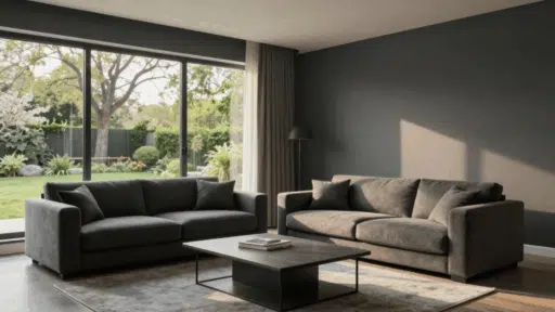
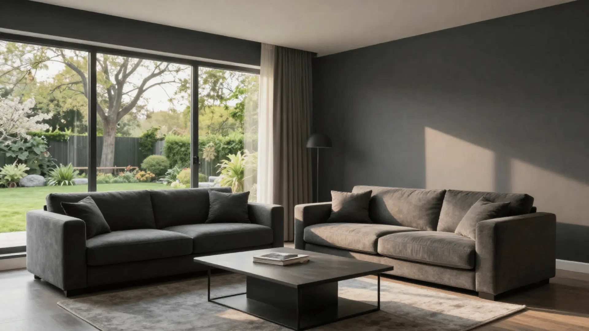

If you have been searching for a bold, moody paint color that still feels warm and welcoming, Sherwin-Williams Iron Ore might be exactly what your home needs.
This deep charcoal is one of the most popular paint colors in the US right now, and for good reason. It works on walls, cabinets, doors, and exteriors without ever looking flat or boring.
In this guide, I will tell you everything about the iron ore paint color from its exact color specs to its warm undertones. How it behaves in different lighting, which rooms it works best in, and which colors to pair with it.
By the end, you will know if Iron Ore is the right pick for your next project.
What is Sherwin-Williams Iron Ore (SW 7069)?
Sherwin-Williams Iron Ore carries the color code SW 7069. It is described as a soft, warm black with a deep charcoal tone. It is not a true black.
Instead, it sits between black and dark gray, which gives it a richer, more interesting look on walls and surfaces.
Sherwin-Williams officially groups Iron Ore in the Neutral color family. However, color science tells a slightly different story.
Its hue angle of 131.8 degrees places it in the Green-Yellow hue family.
That detail explains its subtle warmth, a quality that keeps Iron Ore from feeling cold or harsh the way a pure black might. It was also selected as Sherwin-Williams’ Color of the Month for March 2022.
That kind of recognition tells you this color has broad appeal across many design styles and homes across the country.
Now that you know what the color is, let us look at its exact technical specs so you have all the numbers in one place.
Iron Ore Paint Color: Full Technical Specifications
If you need the exact data for this iron ore paint color, whether for a design project, paint matching, or a color comparison, here is everything you need.
| Specification | Value |
|---|---|
| Product Name | Iron Ore |
| Color Code | SW 7069 |
| HEX Code | #434341 |
| RGB | 67 / 67 / 65 |
| LRV | 6 |
| Color Family | Neutral |
| Color of the Month | March 2022 |
What does LRV Six Mean for Your Room?
LRV stands for Light Reflectance Value. It tells you how much light a paint color bounces back into a room.
A score of one hundred is pure white, and zero is pure black. Iron Ore sits at six point eleven, which makes it very dark.
That low number means this color absorbs most of the light in a room. So if you paint a room with Iron Ore, you will want to plan for good lighting.
Overhead lights, floor lamps, and natural light all become more important when using such a dark shade.
Quick tip: Dark colors like Iron Ore with a low LRV tend to look their best in rooms that get plenty of natural light or have layered lighting. A dimly lit room will feel very cave-like with this color on all four walls.
Now that you know the specs, what really matters is how the color looks and feels in real life, which brings us to undertones.
Iron Ore Undertones: Warm, Not Cold
Yes, Iron Ore has undertones. This is one of the most important things to understand before you use this iron ore paint color in your home.
The color carries subtle warm green-yellow tones beneath its dark surface. These are the same tones confirmed by its hue angle data.
Why Warm Undertones Matter
Warm undertones are a big deal in dark colors.
A dark color with cool or blue undertones can feel cold and unwelcoming, especially in rooms with little natural light. Iron Ore avoids that problem.
Its warmth gives the space a softer, cozier feeling even when the walls are very dark.
These undertones also make Iron Ore easier to pair with other materials. Natural wood, linen, cotton, brick, and stone all work well next to it because they share similar warm qualities.
Brass and gold hardware also look beautiful against Iron Ore for the same reason.
Where to Use Sherwin-Williams Iron Ore in Your Home
One of the best things about this iron ore paint color is how many ways you can use it. It is bold enough to make a statement but warm enough to feel livable.
| Application | Why It Works |
|---|---|
| Accent walls | Creates a dramatic focal point without overwhelming the whole room |
| Kitchen cabinets | Pairs well with wood countertops, white quartz, and brass hardware |
| Exterior walls | Bold choice for modern homes; pairs well with white trim and black fixtures |
| Front doors | Makes a strong first impression; works with nearly any exterior palette |
| Bathroom vanities | Adds a high-end feel to an otherwise simple space |
| Trim and millwork | Creates a striking contrast when walls are a lighter color |
| Full rooms | Works in well-lit spaces to create an intimate, gallery-like feel |
Room-by-Room Guide
Every Corner of the house has a different feeling. This guide will show you how you can plan your home with iron ore color
1. Kitchen
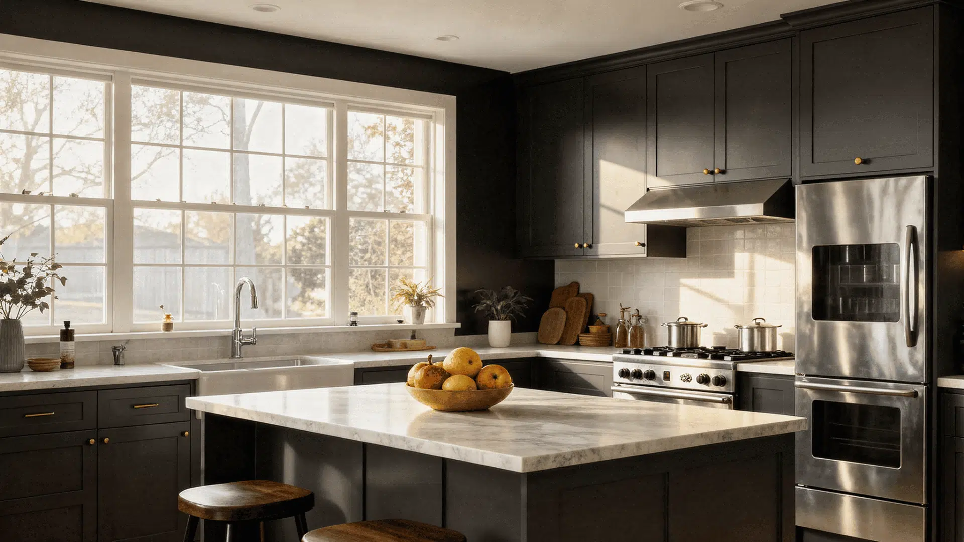
Iron Ore is especially popular for kitchen islands and lower cabinets.
Pair it with white upper cabinets for contrast, add wood or white quartz countertops, and finish with brass or matte black hardware.
The result is a kitchen that feels current and timeless at the same time.
Pro Tip: If your kitchen gets limited natural light, balance Iron Ore with light countertops and a bright backsplash to keep the space feeling open.
2. Bedroom
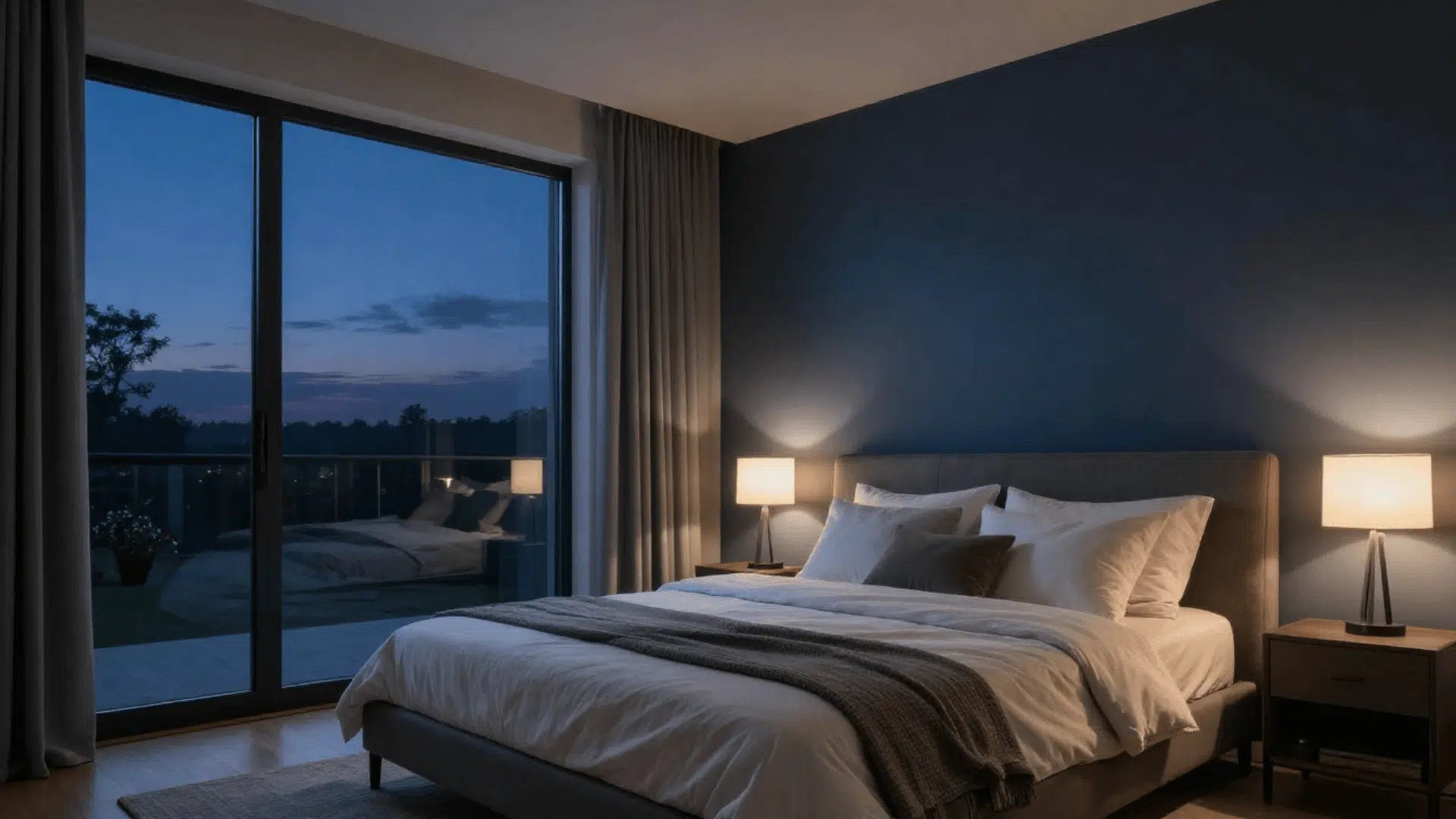
Use Iron Ore on one accent wall behind the bed for a dramatic effect without painting the whole room dark.
Or go all-in and paint all four walls if you want a cozy, cocoon-like sleeping space. Just make sure you have warm bedside lamps to balance the darkness.
Pro Tip: Layer soft bedding in cream, beige, or warm gray tones to create contrast and prevent the room from feeling too heavy.
3. Bathroom
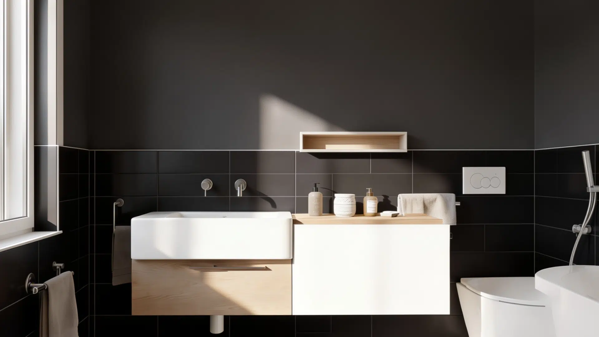
Painting a bathroom vanity with Iron Ore is one of the easiest weekend updates you can do.
It instantly upgrades the look from basic to something that feels custom and high-end. Pair it with white walls and gold fixtures for a sharp, modern contrast.
Pro Tip: Add a large mirror and good lighting to reflect more light around the room and enhance the rich color of the vanity.
4. Exteriors
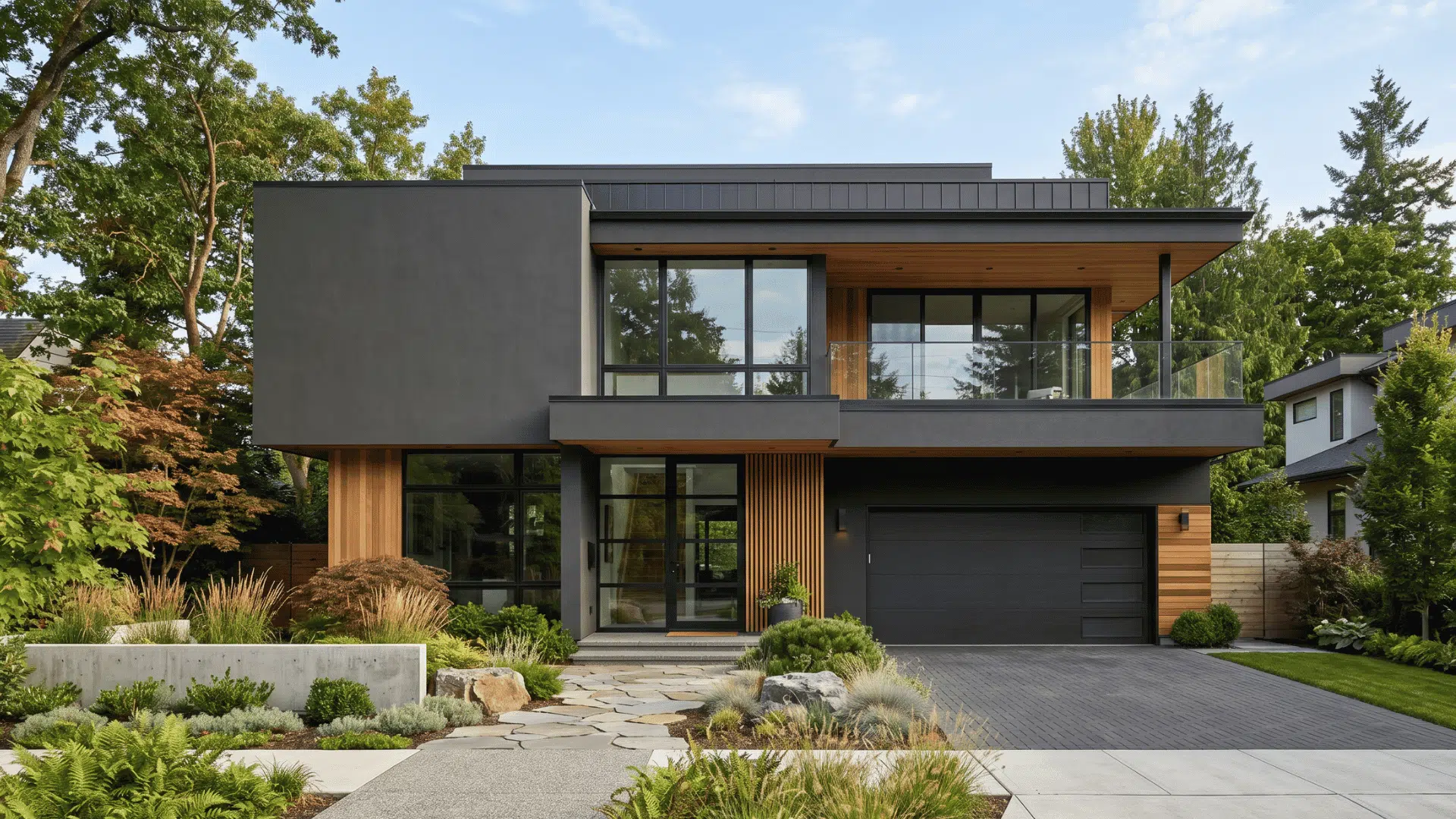
Iron Ore is excellent for modern exterior designs. It works best on contemporary homes with clean lines.
Pair it with crisp white trim and natural wood elements like decking or shutters. Black metal fixtures complete the look beautifully.
Pro Tip: Test the color on different sides of your home first, as natural sunlight can make Iron Ore appear lighter or darker throughout the day.
5. Living Rooms
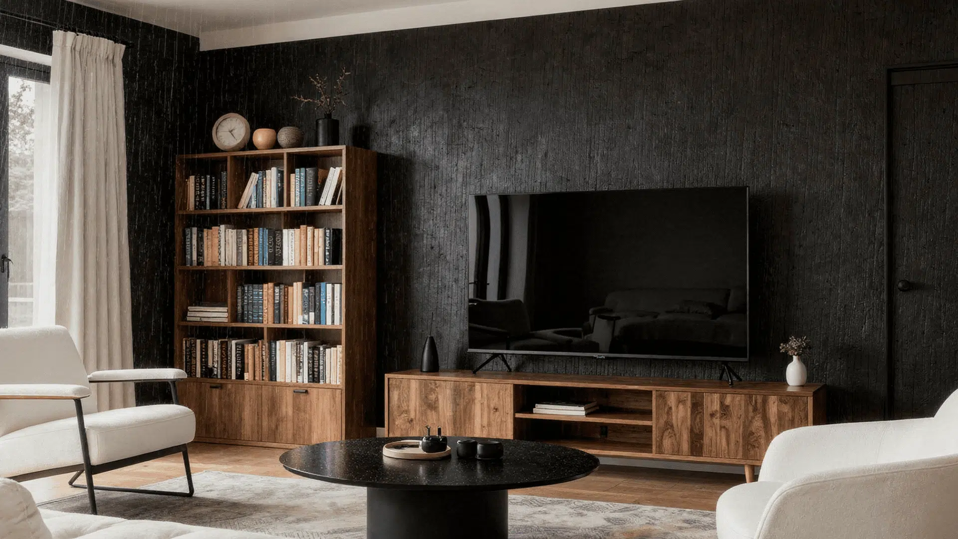
A living room with Iron Ore on one wall becomes a gallery-worthy space.
Either way, layer your lighting carefully and add warm-toned textiles and wood accents to keep the space from feeling too stark.
Knowing where to use Iron Ore is half the battle; the other half is knowing which colors to put next to it.
Pro Tip: Use multiple light sources such as floor lamps, table lamps, and wall sconces instead of relying on a single overhead fixture.
Coordinating Colors for Iron Ore Paint Color
Getting the color pairings right is what makes Iron Ore shine. Because of its warm green-yellow undertones, it works best alongside colors from similar warm families.
The most important thing to avoid is pairing it with colors that have strong blue undertones; those will clash with Iron Ore’s warmth.
Official Sherwin-Williams Coordinating Colors
This list will guide you on how to play with the iron ore color
| Sherwin-Williams Coordinating Color | Description |
|---|---|
| SW 7008 Alabaster | A soft off-white that pairs beautifully with darker colors and works well for trim, walls, and adjoining spaces. |
| SW 7005 Pure White | A crisp, bright white that creates strong contrast and gives spaces a clean, modern look. |
| SW Origami White | A warm white with subtle gray undertones that works especially well on ceilings and for creating a cohesive color palette. |
How to Paint With Sherwin-Williams Iron Ore
Dark paint colors need a little extra care to look great. Follow these tips, and your Iron Ore project will come out clean and even.
Coverage and Coats
Because Iron Ore is so dark, you will likely need two to three coats for full coverage. If you are painting over a lighter color, consider tinting your primer to a medium gray first.
A gray primer will reduce the number of topcoats needed and give you a much more even result.
Surface Prep
- Make sure all surfaces are clean and dry before you begin
- Fill any holes or cracks with spackle and sand them smooth. Dark colors show imperfections more clearly than light shades
- Tape off trim, edges, and hardware to get clean lines
Best Finishes for Iron Ore
Iron ore paints have various styles of finishes; identify which one suits your house.
Matte
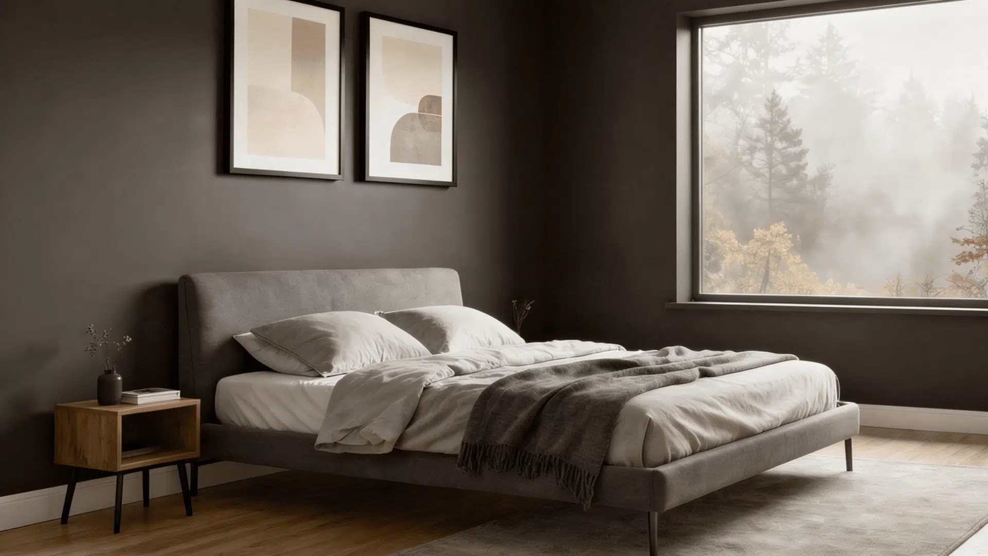
Best for walls. It gives a modern, velvety look with no unwanted reflection or shine.
Matte finish hides small wall imperfections better than any other finish, which makes it a smart pick for older walls that are not perfectly smooth.
Keep in mind it is harder to wipe clean.
Best Use: Living rooms, bedrooms, dining rooms, and low-traffic accent walls.
Eggshell
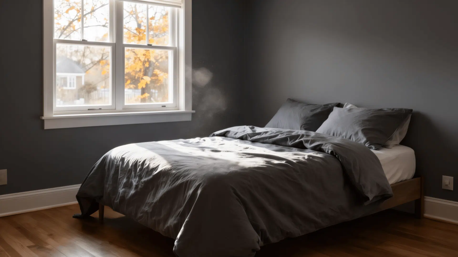
A slight sheen that is easier to clean while keeping the color deep and rich. Eggshell sits right between matte and satin on the sheen scale.
It holds up better to light scrubbing than flat paint, so it works well in living rooms, hallways, and bedrooms that see regular use.
Best Use: Hallways, family rooms, bedrooms, and other moderate-traffic spaces.
Satin
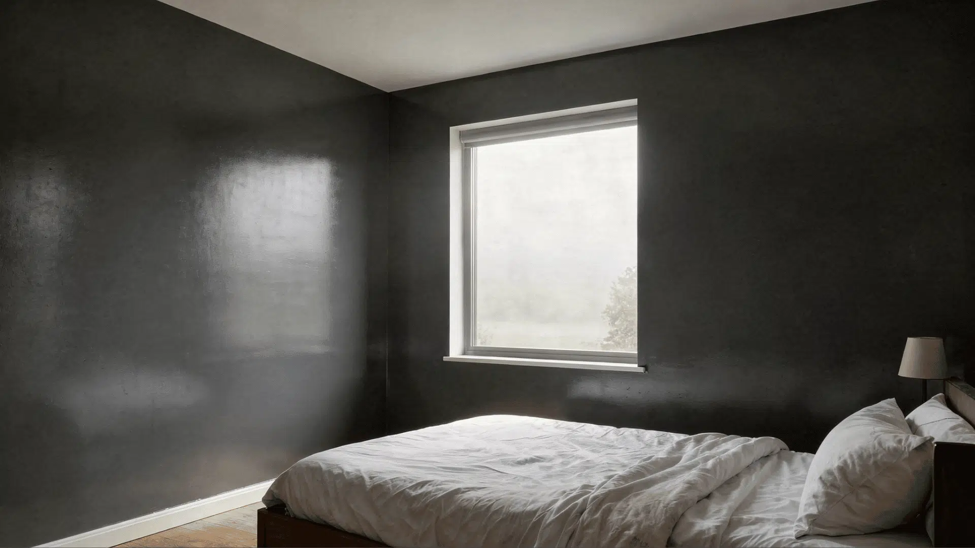
Great for doors, trim, and cabinets because it holds up well to daily use and cleaning.
Satin has a soft, low glow that catches light just enough to make woodwork and cabinetry look polished. It resists moisture and scuffs better than eggshell, making it a practical choice for busy areas.
Best Use: Interior doors, trim, mudrooms, cabinets, and high-traffic areas.
Semi-gloss
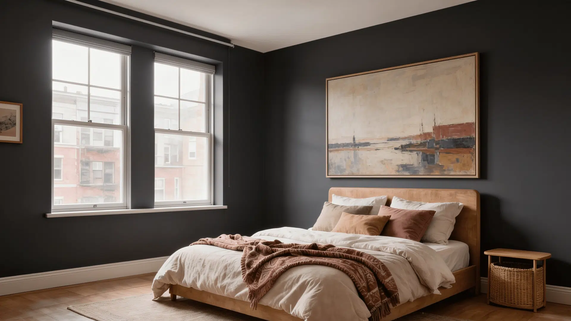
Use on kitchen cabinets and bathroom vanities where durability matters most. Semi-gloss is the toughest finish of the four.
It stands up to grease, steam, and repeated wiping without breaking down.
The higher sheen also reflects light back into the room, which helps brighten up dark cabinetry painted in Iron Ore.
Best Use: Kitchen cabinets, bathroom vanities, laundry rooms, and moisture-prone spaces.
Lighting Planning Before You Paint
Before you open the first can, walk through the room and think about your lighting setup. Iron Ore absorbs a lot of light, so a well-lit room with white walls can feel noticeably darker after painting.
Add floor lamps, increase bulb brightness, or plan for under-cabinet lighting in kitchens to keep the space from feeling too dim.
Warm-toned bulbs in the two thousand seven hundred to three thousand Kelvin range will work beautifully with Iron Ore.
Cool daylight bulbs at five thousand Kelvin or above will flatten the color and make it feel less inviting.
Before any big commitment, always test first. Here is how to do that properly.
How to Test Like a Pro
Paint or stick samples on at least two walls. Pick one in direct light and one in shadow so you can see how the color truly looks.
- Paint or stick samples on at least two walls, one that gets direct light and one that sits in shadow
- Look at the samples at different times of day: morning, afternoon, and evening
- Check the samples under your artificial lighting with lamps turned on
- Hold up any fabric swatches, wood samples, or tile you plan to use nearby
- Let all samples dry fully before making a decision dark colors can shift as they dry
Conclusion
Sherwin-Williams Iron Ore is one of the most versatile dark paint colors you can choose for your home.
Its soft, warm black tone works on accent walls, cabinets, vanities, and exteriors without ever feeling cold or flat. The subtle green-yellow undertones keep every space feeling welcoming, not harsh.
Remember its LRV of six, plan your lighting carefully, and pair it with off-white trim and warm metal hardware for the best results.
Do not skip the testing step. Buy a sample, live with it for a few days, and check it under your actual lighting before you commit.
Ready to get started? Head to your nearest Sherwin-Williams store and grab a sample today.
Frequently Asked Questions
Is Sherwin-Williams Iron Ore a True Black?
No, Iron Ore is not a true black. It is a deep charcoal with subtle warm undertones that give it a softer and more approachable appearance.
What Trim Color Goes Best With Iron Ore?
Soft white and off-white trim colors pair best with Iron Ore, creating contrast while maintaining a warm and balanced look throughout the space.
How Many Coats of Iron Ore do You Need?
Most projects require two to three coats of Iron Ore for rich, even coverage, especially when painting over lighter colors or unfinished surfaces.

Alex Guerrero, a graduate with a Fine Arts degree from the Rhode Island School of Design, has been a visionary in the world of color and design for over 15 years. His professional journey began in the heart of the fashion industry in Milan, where he developed an acute sense for color harmonies and trends. Alex joined our team in 2018, offering fresh and innovative perspectives on color utilization in various spaces. Renowned for his ability to blend contemporary trends with timeless elegance. Outside of work, Alex is an accomplished painter and a volunteer art therapist, his artistic talents further enriching his professional insights.